Get Premium
Dark mode theme is available exclusively for premium users. Learn more about the benefits of subscribing.
No fees, cancel anytime.

 Dark Mode Ad-Free Browsing Unlimited Content
 Ad-Free Browsing Unlimited Content Dark Mode
Join 1.2 million Panda readers who get the best art, memes, and fun stories every week!
Designers are supposed to make life easier and our homes more aesthetic; however, some of their "creations" leave us wondering—what are those people smoking? I get it; not everyone in the industry is Dieter Rams, and clients have an innate ability to behave like insufferable toddlers, but certain ideas should never leave the drawing board. From a cup that's impossible to drink from without poking your eyes out to staircases that lead to nowhere, this list, compiled by Bored Panda, showcases design fails that are as funny as they are impractical.
This post may include affiliate links.
So, how do we know if a particular design is good or bad? Jared Spool, an American writer, researcher, and usability expert, said the first test begins with a person walking up: they either know how to use it at that moment or they don't.
"If they don’t know how to use it," Spool said, "you have to look at the knowledge they came up with for the design — what we call current knowledge — as well as the knowledge that they need to achieve whatever their objective is."
"Whether that's getting money out of the automatic teller machine or looking at a radiological scan and diagnosing an anomaly in the chest cavity, they have to have knowledge to get that task done. If that knowledge is far away from the knowledge they currently have then they’re going to have to either learn how to do it or the design is going to have to be simplified so they no longer need that knowledge," he explained.
The space between the two is called the knowledge gap, and Spool said a design is intuitive (good) when that gap is very small.
"It could be so small that when I walk up to the design, I instantly know what to do because everything in my previous life’s experience has taught me how to deal with this, even if it’s something I’ve never seen before – I can walk up to an automatic teller machine that I’ve never seen before, and I can operate it because my experience with other automatic teller machines has told me what to do, for example," he said.
"Or I get trained, but that happens so quickly that I don't even notice it. There’s messaging on the screen, or there are helpful graphics and animations, and those things ... tell me what to do, and it takes me milliseconds to traverse that knowledge gap. That's intuitive. Something is intuitive when I walk up to it, and I know what to do."
I prefer the toilet bowl bottles with the curved top to better get under the edge.
That might sometimes sound like an impossible task because the world keeps changing, but Spool believes that humans don't.
"Humans haven't changed; we haven’t evolved one bit. In fact, here in the United States, it’s possible we’ve gone in the other direction," he said.
"Technology changes, but people stay the same, their behavior stays the same, their ability to respond to something stays the same. How big our fingers are, how fast we move, what our reaction times are, how quickly we interpret information, all of that has stayed the same. The problems that people have, they don't change – we still need to communicate, coordinate, and collaborate."
Spool continued to describe how this manifests in people's relationship with design.
"What I mean is on the process side of things people still want everything to be so easy that they don’t have to do any work. They don’t want to have to invest in figuring out what the design should be; they just want to be able to wave their hand and make it happen."
He has also observed "this constant reluctance to invest in good design" and believes it's partially because there's no pressure for it.
"A lot of organizations just don’t have this basic sense that design is going to make a difference, and that’s coupled with the fact that many people aren’t literate in design. By literate in design, I mean they can’t tell the difference between a good design and a bad design."
So when our grandparents struggle with a new device or app, it might not be their skills that are the problem—maybe the design just isn’t good enough.
This is deliberate. It is to prevent a fire if left standing empty but in reality it's a pain in the backside. I have a coffee "pot" like this
Following this logic, we can say that a good design renders intention well and matches what the users need. A bad design, on the other hand, doesn’t render intention well and doesn’t match what the users need.
"You can measure design on a scale of frustration to delight," Spool suggested. "When people have complained about a bad design it’s always because the design is frustrating them. When they’re enamored with a great design, it’s because it’s delighting them."
Planned obsolescence? Or maybe they are in cahoots with Duracell or Energizer?
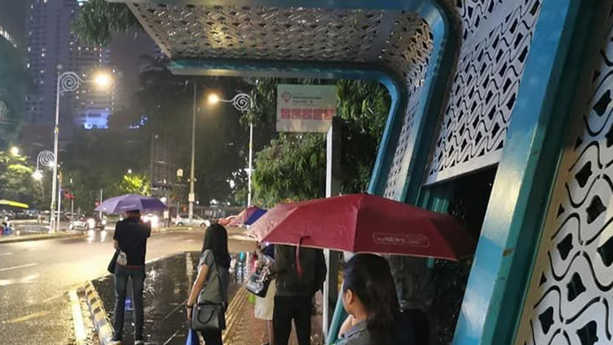
This seems deliberate, so homeless cannot take shelter. Looks like hostile architecture to me.
However, Spool said some organizations (designers) believe it's not important whether or not they frustrate their users, partially because they feel like the users don't have a choice.
"For instance, if you work in a company and you want to get reimbursed for the expenses that you made during travel, you can use the travel expense system, and if it’s incredibly frustrating, they don’t care because that’s the only way you’re going to get your travel expenses reimbursed," he said.
So it very well might be that we will continue seeing bad design and creating such lists no matter how far the craft itself progresses.
Ok, but...why did OP buy the darn thing if they knew it looked like that
HP in general. don't buy their products. this is the stuff you can 'see' they cheap out on and overcharge for.
I actually quite like this. It's a Novelty, while providing movable seating that cant go walkabout. If someone is daft enough to 'swing' into the table that is on them.
Left side is hot only. Right side is cold. Hands were constantly hitting the side of the sink because there was no room. Took forever to drain.
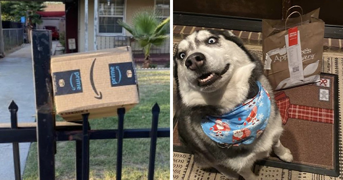
And perfect to reach for toddlers, dogs and heavy bags on the top.
Hate this design - subtlety / aesthetic over ease of use. A slightly (`20%) larger and brighter image & text is insufficient to be immediately obvious. Simply putting a high contrast border around the image, like others do, would make it immediately obvious. I invariably have to click a couple times to be sure what is selected.
Let's hope it's at a kindergarten so OP can learn some basic grammar.
Never use the hand dryers, they are dirtier than a toilet seat. I always have hand sanitizer with me.
That isn't as bad as the others, this is just esthetics. Doesn't mean I don't agree with the poster, but this design doesn't impact the function.

Unfortunately you’re still selling space to that “Cos” company with their giant moving ads that eff up the page and make it unviewable on mobile.
Yes, at the very least, ads should be unobtrusive. Sometimes they cover half of my cellphone screen.
Load More Replies...Unfortunately you’re still selling space to that “Cos” company with their giant moving ads that eff up the page and make it unviewable on mobile.
Yes, at the very least, ads should be unobtrusive. Sometimes they cover half of my cellphone screen.
Load More Replies...


 No fees, cancel anytime


")
")