ADVERTISEMENT

Logos—they’re the concentrated sweat and tears of brilliant artists crafting away to create the ‘perfect’ image representing their client’s brand. After hours and days of toil, deleted drafts, and angry coffee breaks, the final version’s ready. It’s being rolled out worldwide… and that’s when thousands of people report seeing a completely different image than they intended.

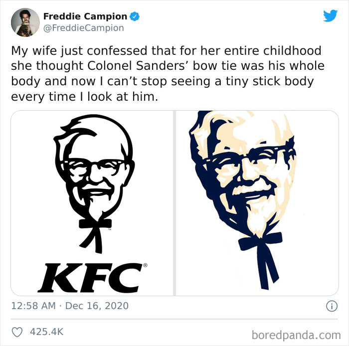
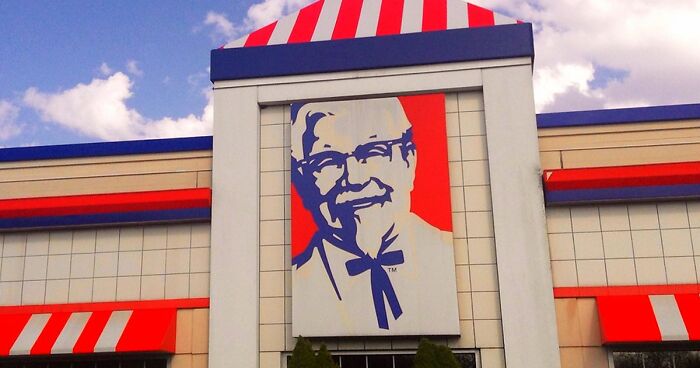
When Headspace content director Freddie Campion shared how his wife had thought that Colonel Sanders had a stick body instead of a bowtie in the KFC logo, other Twitter users pitched in with their own hilarious misinterpretations of well-known logos. Check ‘em out below and upvote your fave tweets, dear Pandas. Just don’t say we didn’t warn you—you’ll have a hard time unseeing these! Be sure to share your own misunderstood logo moments in the comments.

This isn’t the first time that Bored Panda has written about people misinterpreting the KFC logo and the stick body now being seared into our minds for a long, long time. I’d forgotten all about it a few months after learning the truth, but Freddie brought everything back. And I knew just who to talk to about all of this. Curious? Read on!

#1

Misunderstood-Logos

sasidechick Report

Elsker
Community Member
4 years ago Created by potrace 1.15, written by Peter Selinger 2001-2017

that's a really pretty logo!!

Fred and George Weasley
Community Member
4 years ago Created by potrace 1.15, written by Peter Selinger 2001-2017

oh dont forget the lion and the fish too <3

CatWoman312
Community Member
4 years ago Created by potrace 1.15, written by Peter Selinger 2001-2017

I see the animals before the tree

Lileigh Bean
Community Member
4 years ago Created by potrace 1.15, written by Peter Selinger 2001-2017

there's fishy's at the bottom :>

rehanne garvey
Community Member
4 years ago Created by potrace 1.15, written by Peter Selinger 2001-2017

I honestly don't understand how you can't see the animals 😂

Lisa
Community Member
4 years ago Created by potrace 1.15, written by Peter Selinger 2001-2017

Man I was trying to find the illustrator who created this logo but have yet to come across any credit in articles.

Amazon QT
Community Member
4 years ago Created by potrace 1.15, written by Peter Selinger 2001-2017

That’s some Strong Bev Doolittle right there!!! ♥️

View more comments
RELATED:
    #2

    Misunderstood-Logos

    GeekTrader Report

    Carmen Elena
    Community Member
    4 years ago Created by potrace 1.15, written by Peter Selinger 2001-2017

    I have to confess I saw a high-five guy too...

    Vic
    Community Member
    4 years ago Created by potrace 1.15, written by Peter Selinger 2001-2017

    I saw a turtle, to me a while to see the bunny..

    Load More Replies...
    glowworm2
    Community Member
    4 years ago Created by potrace 1.15, written by Peter Selinger 2001-2017

    That is adorable! Also, Annie's honestly has the most adorable products complete with the "Rabbit Seal of Approval."

    Jules G.
    Community Member
    4 years ago Created by potrace 1.15, written by Peter Selinger 2001-2017

    I would have thought they were penguins 😂

    HMDiva
    Community Member
    4 years ago Created by potrace 1.15, written by Peter Selinger 2001-2017

    When my brother was little, he insisted M&M candies were E&E 's because he was looking at them sideways 🙃

    cute little cat
    Community Member
    4 years ago Created by potrace 1.15, written by Peter Selinger 2001-2017

    it took me longer to see the bunny than the man

    Damon Tripodi
    Community Member
    4 years ago Created by potrace 1.15, written by Peter Selinger 2001-2017

    Don't tell anyone there's a magic trick that works just like that

    View more comments
    #3

    Misunderstood-Logos

    yoongiseggcup Report

    Rattle Battlesnake
    Community Member
    4 years ago Created by potrace 1.15, written by Peter Selinger 2001-2017

    yup, a bit late to the party but the bear is the symbol of Bern The legend goes that, in 1191, Duke Berthold V of Zähringen vowed to choose as namesake the first animal his hunt met in the wood, "Then they caught a bear first, which is why the city was called Bern; and so the citizens had their coat and shield, which was a black bear in a white shield, going upright"

    Andrew Gibb
    Community Member
    4 years ago Created by potrace 1.15, written by Peter Selinger 2001-2017

    it's because you roar like a bear when the chocolate hurts the roof of your mouth

    Pearl Of the SeaWing RainWings
    Community Member
    4 years ago Created by potrace 1.15, written by Peter Selinger 2001-2017

    Haha! Actually bc smthg to do with Bern... I don't remember well. But it sounds far fetched to me, so I'm going to adopt your theory instead!

    Load More Replies...
    Katie Lutesinger
    Community Member
    4 years ago Created by potrace 1.15, written by Peter Selinger 2001-2017

    Holy s- there was a BEAR this whole time?!

    Grumble O'Pug
    Community Member
    4 years ago Created by potrace 1.15, written by Peter Selinger 2001-2017

    The mountain is the Matterhorn, I believe

    IFXO
    Community Member
    4 years ago Created by potrace 1.15, written by Peter Selinger 2001-2017

    omg yes. I always wondered why the mountain had a huge cutout but never got my head around the fact that it actually is a bear. BEARY GOOD AT HIDING THINGS. (no pun intended)

    Amazon QT
    Community Member
    4 years ago Created by potrace 1.15, written by Peter Selinger 2001-2017

    This one has been my favorite logo bc of the Bear!!! 👍🏻

    View more comments

    Bored Panda spoke about Freddie’s thread with comedy writer, author, and musical comedian Ariane Sherine, who had previously gone viral for her tweet about her friend misinterpreting the KFC logo as well. Twitter users brought Freddie’s thread to her attention as well.

    I was incredibly curious to find out whether Freddie’s wife was Ariane’s friend. It sounded like too much of a coincidence. Maybe this was a sign from the Universe? Alas! Ariane confirmed to Bored Panda that there’s no connection between her friend and Freddie.

    ADVERTISEMENT

    “They’re clearly kindred spirits though! I should hook them up (though Freddie’s wife might not like that much!),” Ariane joked.

    #4

    Misunderstood-Logos

    Teeda100 Report

    fin_evander
    Community Member
    4 years ago Created by potrace 1.15, written by Peter Selinger 2001-2017

    I can't see anything other than a dead clown??? Is it just a clown with x's for eyes or what?

    Jules G.
    Community Member
    4 years ago Created by potrace 1.15, written by Peter Selinger 2001-2017

    I was about to write the same thing!

    Load More Replies...
    glowworm2
    Community Member
    4 years ago Created by potrace 1.15, written by Peter Selinger 2001-2017

    Yeah, I would have thought that clown was dead too. Those eyes are not helping either.

    DogMom
    Community Member
    4 years ago Created by potrace 1.15, written by Peter Selinger 2001-2017

    What restaurant is it? Some kind of off-brand McDonald’s?

    Phoenix
    Community Member
    4 years ago Created by potrace 1.15, written by Peter Selinger 2001-2017

    Not gonna lie I thought the clown was dead too

    Amazon QT
    Community Member
    4 years ago Created by potrace 1.15, written by Peter Selinger 2001-2017

    “He’s just sleeping , honey!”

    Michael Capriola
    Community Member
    4 years ago Created by potrace 1.15, written by Peter Selinger 2001-2017

    Made from real dead clowns. No substitutes or additives.

    View more comments
    #5

    Misunderstood-Logos

    clarkzip Report

    Mere Cat
    Community Member
    4 years ago Created by potrace 1.15, written by Peter Selinger 2001-2017

    Me too! Also, I had heard of 7 up embarrassingly long ago, before I finally made the connection with "Zup"...

    Load More Replies...
    Camden
    Community Member
    4 years ago Created by potrace 1.15, written by Peter Selinger 2001-2017

    For the longest time i called UPS "ups"

    el ellegun (ElleGun)
    Community Member
    4 years ago Created by potrace 1.15, written by Peter Selinger 2001-2017

    Grandmas at Czech Republic always used name zup when I was young

    View more comments
    ADVERTISEMENT
    #6

    Misunderstood-Logos

    girlfrommars Report

    Covid Pan Demic
    Community Member
    4 years ago Created by potrace 1.15, written by Peter Selinger 2001-2017

    Well, it's more or less a strawberry

    K Madd
    Community Member
    2 years ago Created by potrace 1.15, written by Peter Selinger 2001-2017

    My sister(3F) called it the "strawberry store"

    Marsha Brown
    Community Member
    4 years ago Created by potrace 1.15, written by Peter Selinger 2001-2017

    Good eye! At that age, seeing a strawberry in the logo is impressive. She might have artistic talent.

    View more comments

    I wanted to find out the best way to make myself forget that Colonel Sanders looks like he has a stick body and Ariane made my day with her quips. “Why try to unsee the stick body? Just accept it. Colonel Sanders is like a stick because he doesn’t eat his own products! That is not the body of a man who has eaten much fried chicken,” she shared.

    ADVERTISEMENT

    Unfortunately, acceptance seems like the only path forward, dear Readers. Hopefully, we’ll forget all about stick-Sanders over the next few months… until someone else makes a viral thread about the logo. With Freddie’s thread having gotten over 425k likes, KFC couldn’t ask for better exposure.

    According to Comedian Ariane, logo designers can try and minimize the chances of their illustrations being misinterpreted by running them past as many people as possible. The bigger the pool, the bigger the chance of spotting that something’s off. However, Ariane hopes they don’t do that because then there’d be no hilarious misunderstandings.

    #7

    Misunderstood-Logos

    of_utley Report

    Lisa
    Community Member
    4 years ago Created by potrace 1.15, written by Peter Selinger 2001-2017

    okay i get it, the white wine glass is a motor over water

    Kristy P
    Community Member
    4 years ago Created by potrace 1.15, written by Peter Selinger 2001-2017

    THANK YOU!!! I couldn't get past the giant boots! XD

    Load More Replies...
    Elsker
    Community Member
    4 years ago Created by potrace 1.15, written by Peter Selinger 2001-2017

    what i'm wondering; why do fish need restoring??

    Aria Whitaker
    Community Member
    4 years ago (edited) Created by potrace 1.15, written by Peter Selinger 2001-2017

    Populations can decline due to overfishing and/or pollution...

    Load More Replies...
    NWB
    Community Member
    4 years ago Created by potrace 1.15, written by Peter Selinger 2001-2017

    hahahaha took me a bit!

    peruchipac
    Community Member
    4 years ago Created by potrace 1.15, written by Peter Selinger 2001-2017

    Funny how our eyes can trick us and then we can't see anything else. I'm like that with song lyrics too.

    Starlee87
    Community Member
    4 years ago Created by potrace 1.15, written by Peter Selinger 2001-2017

    🤣 I didn't see that until you said it

    fuggnuggins
    Community Member
    4 years ago Created by potrace 1.15, written by Peter Selinger 2001-2017

    It'd be more effective without the motor, because it's the silhouette that's important because it is interpreted by a part of the brain that doesn't speak directly to consciousness - recognises shapes, facial expressions, postures, etc. - and so triggers an unconscious response (which you apply a conscious fiction or theory to in order to explain your reaction to yourself).

    sam thecat
    Community Member
    4 years ago Created by potrace 1.15, written by Peter Selinger 2001-2017

    I still don’t get the graphics. Is the restoration a drinking thing?

    View more comments
    #8

    Misunderstood-Logos

    b0nefather Report

    Beth Bartel
    Community Member
    4 years ago Created by potrace 1.15, written by Peter Selinger 2001-2017

    To me it looks like a whale standing on its tail fins

    Sportsgal
    Community Member
    4 years ago Created by potrace 1.15, written by Peter Selinger 2001-2017

    Thats what I saw too! Glad its not just me!

    Load More Replies...
    Becca Gizmo the Squirrel
    Community Member
    4 years ago Created by potrace 1.15, written by Peter Selinger 2001-2017

    Why didn't they use the red w as the w in worth? Never seen this logo until just now. I definitely thought it was a dancing squid or octopus before I read the title. Barely see the elephant.

    No Username
    Community Member
    4 years ago Created by potrace 1.15, written by Peter Selinger 2001-2017

    Took me a while to see it... And I used to live in Fort Worth! Only for like a year though

    Lisa
    Community Member
    4 years ago Created by potrace 1.15, written by Peter Selinger 2001-2017

    after the Pittsburgh one, this one displeases me.

    Davor Jelacic
    Community Member
    4 years ago Created by potrace 1.15, written by Peter Selinger 2001-2017

    Looks like a smiling whale with a tail dancing can can to me...

    Debrina Blackmoon
    Community Member
    4 years ago Created by potrace 1.15, written by Peter Selinger 2001-2017

    Now I want to see a hula dancing octopus!

    View more comments
    ADVERTISEMENT
    ADVERTISEMENT
    #9

    Misunderstood-Logos

    NickLewis37 Report

    James016
    Community Member
    4 years ago Created by potrace 1.15, written by Peter Selinger 2001-2017

    Now all I see is a duck

    Mewton’s Third Paw
    Community Member
    4 years ago Created by potrace 1.15, written by Peter Selinger 2001-2017

    I can see it if I force it, but I don’t think it’s so duckish that it’s impossible to unsee now.

    Load More Replies...
    I_am_not_human
    Community Member
    4 years ago Created by potrace 1.15, written by Peter Selinger 2001-2017

    I always thought it was a duck hitting a baseball like a half duck half person

    Capelli rosa e patate
    Community Member
    4 years ago Created by potrace 1.15, written by Peter Selinger 2001-2017

    His hat and his nose look like an open beak a tad. Took me a sec though, the duck he’s talking about might be somewhere else.

    Load More Replies...
    Covid Pan Demic
    Community Member
    4 years ago Created by potrace 1.15, written by Peter Selinger 2001-2017

    I'll never be able to see it normally agiain now

    Johnny Døpe
    Community Member
    4 years ago Created by potrace 1.15, written by Peter Selinger 2001-2017

    It’s a chicken who hates laying eggs 🥚 so it’s better to hit them with baseball bat

    Martin Kaine
    Community Member
    4 years ago Created by potrace 1.15, written by Peter Selinger 2001-2017

    Don't tell Harmon Killebrew that.

    View more comments
    #10

    Misunderstood-Logos

    chrisol72 Report

    Chancey
    Community Member
    4 years ago Created by potrace 1.15, written by Peter Selinger 2001-2017

    The Fed Ex logo was designed by Lindon Leader of Landon Associates and yes the arrow was intentional.

    Finn-Yego
    Community Member
    4 years ago Created by potrace 1.15, written by Peter Selinger 2001-2017

    I’ve never noticed either! Is it intentional?

    Victoria
    Community Member
    4 years ago Created by potrace 1.15, written by Peter Selinger 2001-2017

    The lower part of the E in Fed looks like a spoon

    Anarchy (they/them)
    Community Member
    4 years ago Created by potrace 1.15, written by Peter Selinger 2001-2017

    I don't know why you got downvoted, it really does. In fact I came here to say the same thing

    Load More Replies...
    Terry Gasca
    Community Member
    4 years ago Created by potrace 1.15, written by Peter Selinger 2001-2017

    I saw it almost immediately, Very Clever!!!

    fin_evander
    Community Member
    4 years ago Created by potrace 1.15, written by Peter Selinger 2001-2017

    I-Is that intentional?? If so, I applaud whoever came up with it

    SilverLining
    Community Member
    4 years ago Created by potrace 1.15, written by Peter Selinger 2001-2017

    Marketing student here - yes. This is intentional

    Load More Replies...
    Anna Repp
    Community Member
    4 years ago Created by potrace 1.15, written by Peter Selinger 2001-2017

    They also redraw that logo in other languages to preserve the arrow. In arabic version the arrow is facing left because the language is written right to left.

    View more comments
    #11

    Misunderstood-Logos

    nadiabirm Report

    Hamilton Lover
    Community Member
    4 years ago Created by potrace 1.15, written by Peter Selinger 2001-2017

    I thought it was teeth when I was little as well

    Byron Smith
    Community Member
    4 years ago Created by potrace 1.15, written by Peter Selinger 2001-2017

    New logo?? How old is the original poster? As mentioned, this is the first iteration of the yellow background from 1966... only the most iconic Batman logo ever.

    Caroline Nagel
    Community Member
    4 years ago Created by potrace 1.15, written by Peter Selinger 2001-2017

    I would see this logo regularly on the side of a building when the movie came out. It has taken me literally years to see the batman instead of a big mouth with weird yellow teeth.

    Terry Gasca
    Community Member
    4 years ago Created by potrace 1.15, written by Peter Selinger 2001-2017

    I still see teeth before I can recognize any bat design

    Annamay
    Community Member
    4 years ago Created by potrace 1.15, written by Peter Selinger 2001-2017

    I thought it was teeth until now. I'm 77

    mr. t-rex
    Community Member
    4 years ago Created by potrace 1.15, written by Peter Selinger 2001-2017

    That top middle tooth...

    View more comments
    #12

    Misunderstood-Logos

    thesporq Report

    Kenny Kulbiski
    Community Member
    4 years ago Created by potrace 1.15, written by Peter Selinger 2001-2017

    I still think they're antlers. I sure as hell don't see a straw hat.

    Load More Replies...
    Community Member
    4 years ago Created by potrace 1.15, written by Peter Selinger 2001-2017

    wait, that was a straw hat? I thought it was weird hair

    Purr·maid
    Community Member
    4 years ago Created by potrace 1.15, written by Peter Selinger 2001-2017

    I just thought it was his hair.

    glowworm2
    Community Member
    4 years ago Created by potrace 1.15, written by Peter Selinger 2001-2017

    I thought it was his hair for years! It didn't help that it was red.

    Dan rider
    Community Member
    4 years ago Created by potrace 1.15, written by Peter Selinger 2001-2017

    I thought they were some sort of tribal crown...

    Jacey Lynn
    Community Member
    4 years ago Created by potrace 1.15, written by Peter Selinger 2001-2017

    I just thought they were antlers too! Lol

    Bettye McKee
    Community Member
    4 years ago Created by potrace 1.15, written by Peter Selinger 2001-2017

    An honest mistake. They could have done a better job with the hat.

    View more comments
    ADVERTISEMENT
    ADVERTISEMENT
    #13

    Misunderstood-Logos

    willington Report

    Pamda Panda
    Community Member
    4 years ago Created by potrace 1.15, written by Peter Selinger 2001-2017

    Just in case anyone is curious, the Chinese symbols for New York are 纽约

    Serial pacifist
    Community Member
    4 years ago Created by potrace 1.15, written by Peter Selinger 2001-2017

    Just as I was reading this, my 10 yo daughter goes: What a cool Chinese sign.

    Camden
    Community Member
    4 years ago Created by potrace 1.15, written by Peter Selinger 2001-2017

    I didnt understand until this very moment what its supposed to represent

    View more comments
    #14

    Misunderstood-Logos

    HomerpaloozaJon Report

    Francis
    Community Member
    4 years ago Created by potrace 1.15, written by Peter Selinger 2001-2017

    so are parts of his eyes?!

    Nikki Sevven
    Community Member
    4 years ago Created by potrace 1.15, written by Peter Selinger 2001-2017

    What? You don't tuck your hat behind your eyes?

    Load More Replies...
    Becca Gizmo the Squirrel
    Community Member
    4 years ago Created by potrace 1.15, written by Peter Selinger 2001-2017

    Technically they are hovering. Those brows cast shadows.

    Mark Serbian, PK&RG,W
    Community Member
    4 years ago Created by potrace 1.15, written by Peter Selinger 2001-2017

    AND, according to the stripes on his uniform, his rank is "Commander", not "Captain"

    Dave P
    Community Member
    4 years ago Created by potrace 1.15, written by Peter Selinger 2001-2017

    and his striped show him at the rank of Commander. Someone is lying about their ranks as well

    TheDivineMsM
    Community Member
    4 years ago Created by potrace 1.15, written by Peter Selinger 2001-2017

    It's because he's so excited his eyebrows popped off

    IFXO
    Community Member
    4 years ago Created by potrace 1.15, written by Peter Selinger 2001-2017

    maybe he cut part of his hat out to show us his beautiful eyebrows 🤣

    View more comments
    #15

    Misunderstood-Logos

    racieta2 Report

    Average Grizzlies Fan
    Community Member
    4 years ago Created by potrace 1.15, written by Peter Selinger 2001-2017

    If that were true he would be a derpy little lion!

    CG2018
    Community Member
    4 years ago Created by potrace 1.15, written by Peter Selinger 2001-2017

    What is the white dot then? I can't unsee it as an eye...

    Cat
    Community Member
    4 years ago Created by potrace 1.15, written by Peter Selinger 2001-2017

    F**K I CAN'T UNSEE IT THAT WAY!!

    Deal _Anneal
    Community Member
    4 years ago Created by potrace 1.15, written by Peter Selinger 2001-2017

    i could see the wee crocodile now

    Tony Anderson
    Community Member
    3 years ago Created by potrace 1.15, written by Peter Selinger 2001-2017

    And suddenly it wasn't the worst logo in sports.

    Starlee87
    Community Member
    4 years ago Created by potrace 1.15, written by Peter Selinger 2001-2017

    I thought that was his mouth open w a little eye

    Elaine Dodge
    Community Member
    4 years ago Created by potrace 1.15, written by Peter Selinger 2001-2017

    That little white spot is not required in any way shape or form...especially as a sideways teardrop. But it was the client's request.

    M3era
    Community Member
    4 years ago Created by potrace 1.15, written by Peter Selinger 2001-2017

    Then that would look like a dinosaur

    View more comments
    #16

    Misunderstood-Logos

    magictwicks Report

    NWB
    Community Member
    4 years ago Created by potrace 1.15, written by Peter Selinger 2001-2017

    awww that is sweet!

    Daphne Dear
    Community Member
    4 years ago Created by potrace 1.15, written by Peter Selinger 2001-2017

    I was told it's "Jack and the boob eating fish."

    ADVERTISEMENT
    ADVERTISEMENT
    See Also on Bored Panda
    #17

    Misunderstood-Logos

    toho1988 Report

    Jacey Lynn
    Community Member
    4 years ago Created by potrace 1.15, written by Peter Selinger 2001-2017

    I can’t really see it as a D either.

    neonn_pieee
    Community Member
    4 years ago Created by potrace 1.15, written by Peter Selinger 2001-2017

    I always thought the D looked like a G. Still, that is how I see it even though I know it says Disney.

    Bunzilla
    Community Member
    4 years ago Created by potrace 1.15, written by Peter Selinger 2001-2017

    it took me a while to realize that was a d and not some sort of 6 or something. LIke I know the the company is called "Disney" but I never really understand that that was a D in the logo

    BoredDragon
    Community Member
    4 years ago Created by potrace 1.15, written by Peter Selinger 2001-2017

    Let’s watch a g-clef isney movie!

    tangy chip
    Community Member
    4 years ago Created by potrace 1.15, written by Peter Selinger 2001-2017

    but then it would be just Isney...?

    Maddie
    Community Member
    4 years ago Created by potrace 1.15, written by Peter Selinger 2001-2017

    Not until my sophomore year in high school did I finally understand it

    View more comments
    #18

    Misunderstood-Logos

    CBJ4Ever Report

    Mojones
    Community Member
    4 years ago Created by potrace 1.15, written by Peter Selinger 2001-2017

    If you have to explain it, it's bad designed. Read "elb" too.

    Silver Buckler
    Community Member
    4 years ago Created by potrace 1.15, written by Peter Selinger 2001-2017

    Bad news everyone... it is actually "ELB". It stands for "Expos Lance-Balle" which is "Expos Baseball" in French. Also, the reason they call the Montreal Canadiens "Habs" is short for "Habitants", which is why you have the "H" in the middle of the logo.

    Ben Smith
    Community Member
    4 years ago Created by potrace 1.15, written by Peter Selinger 2001-2017

    No...that’s not correct. It’s EB for Expos Baseball that forms a stylized M for Montreal. A simple google search confirms that.

    Load More Replies...
    Francis
    Community Member
    4 years ago Created by potrace 1.15, written by Peter Selinger 2001-2017

    for those that don't know the logo (like me) and yes i also read elb first and than saw the M 1200px-Mon...ab-png.jpg 1200px-Montreal_Expos_Logosvg-5fdcafe3842ab-png.jpg

    Petra Christovová
    Community Member
    4 years ago Created by potrace 1.15, written by Peter Selinger 2001-2017

    I do not see "M" even after the explanation.

    Al Jameson
    Community Member
    4 years ago Created by potrace 1.15, written by Peter Selinger 2001-2017

    Actually it *is* an e and a b, for "expos baseball", combined and stylized for form a capital M for Montreal.

    Bobert Robertson
    Community Member
    4 years ago Created by potrace 1.15, written by Peter Selinger 2001-2017

    It's an MEB for Montreal Expos Baseball

    John-Paul Cote
    Community Member
    4 years ago (edited) Created by potrace 1.15, written by Peter Selinger 2001-2017

    Montreal Expos Baseball, little red “e”, little blue “b”, and the whole thing is an “M”

    Calypso poet
    Community Member
    4 years ago Created by potrace 1.15, written by Peter Selinger 2001-2017

    Thank you! Now I can see the M! That logo sucks.

    Load More Replies...
    Blinding_Darkness
    Community Member
    4 years ago Created by potrace 1.15, written by Peter Selinger 2001-2017

    I can't see the m. I only see elb plz help

    Jacey Lynn
    Community Member
    4 years ago Created by potrace 1.15, written by Peter Selinger 2001-2017

    I thought the first one was a candy cane..

    View more comments
    #19

    Misunderstood-Logos

    JAG30997 Report

    PearlsNotSecretRapCareer
    Community Member
    4 years ago Created by potrace 1.15, written by Peter Selinger 2001-2017

    I just found this out. AND MY DAD'S AN F1 DRIVER.

    Orange
    Community Member
    4 years ago Created by potrace 1.15, written by Peter Selinger 2001-2017

    the stripes kinda look like a hair brush.

    YosemiteCat
    Community Member
    4 years ago Created by potrace 1.15, written by Peter Selinger 2001-2017

    Oh what I didn’t know this thanks

    AlexAlbon23
    Community Member
    4 years ago Created by potrace 1.15, written by Peter Selinger 2001-2017

    Bum bum bum, BUm bum bum-bum bum. *car noise* bum bum da da bum bum da bum bummmmmm da da da da bum bum bum Bum Bum(up)

    Jarno Flinkers
    Community Member
    4 years ago Created by potrace 1.15, written by Peter Selinger 2001-2017

    More people did so. I knew it because my dad pointed it out to me when I was a little kid getting addicted to this sport.

    あんぱんまん
    Community Member
    4 years ago Created by potrace 1.15, written by Peter Selinger 2001-2017

    thats what happens when they use optical illusions to create logos...

    View more comments
    #20

    Misunderstood-Logos

    Cmullett69 Report

    Jeffrey Alexander
    Community Member
    4 years ago Created by potrace 1.15, written by Peter Selinger 2001-2017

    the capital dome is going up its butt!

    Mary Maney
    Community Member
    4 years ago Created by potrace 1.15, written by Peter Selinger 2001-2017

    And the Washington monument is on its neck.

    Maverickw335
    Community Member
    4 years ago Created by potrace 1.15, written by Peter Selinger 2001-2017

    Thought the eagle looked like a “w”

    View more comments
    ADVERTISEMENT
    ADVERTISEMENT
    See Also on Bored Panda
    #21

    Misunderstood-Logos

    KatDalziel Report

    glowworm2
    Community Member
    4 years ago Created by potrace 1.15, written by Peter Selinger 2001-2017

    She is in fact a double tailed mermaid.

    Alexis D.
    Community Member
    4 years ago Created by potrace 1.15, written by Peter Selinger 2001-2017

    It's a Siren, actually. Going off the nautical theme of Captain Starbuck

    Load More Replies...
    Lil_Tae_29
    Community Member
    4 years ago Created by potrace 1.15, written by Peter Selinger 2001-2017

    In the hidden stuff in logo's video it said that it stands for the fact that she is infact a mermaid or a siren, im shocked too

    spirit wolf
    Community Member
    4 years ago Created by potrace 1.15, written by Peter Selinger 2001-2017

    She is Melusine, the alchemical siren and twin tailed mermaid. I would like to believe the connection is more than just face value.

    Ed
    Community Member
    4 years ago Created by potrace 1.15, written by Peter Selinger 2001-2017

    To understand what's going on, you need to see the original logo that was brown. Google it.

    Carlota
    Community Member
    4 years ago Created by potrace 1.15, written by Peter Selinger 2001-2017

    The double tailed siren is a medieval symbol used in boats the founders saw in a book about maritime legends, they decided to use it because Seattle is a port city and coffee is normally exported by boat

    Sara Holt
    Community Member
    4 years ago Created by potrace 1.15, written by Peter Selinger 2001-2017

    Pretty loose connection to the quality of the coffee. Just my opinion.

    Load More Replies...
    Rainbow Panda
    Community Member
    4 years ago Created by potrace 1.15, written by Peter Selinger 2001-2017

    The original showed a mermaid lady with two tails. 🧜‍♀️

    Morgan Coffee
    Community Member
    4 years ago Created by potrace 1.15, written by Peter Selinger 2001-2017

    The logo used to show her full tail with a sort of butt shape at the bottom as each side went up, but they changed it because some group of people somewhere thought it was dirty.

    Amazon QT
    Community Member
    4 years ago Created by potrace 1.15, written by Peter Selinger 2001-2017

    Bc they drew her with breast and her nipples were showing.

    Load More Replies...
    Jodi Adams
    Community Member
    4 years ago Created by potrace 1.15, written by Peter Selinger 2001-2017

    Interesting! https://www.forbes.com/sites/ronaldholden/2017/03/04/mermaid-siren-princess-how-the-starbucks-logo-evolved/

    View more comments
    #22

    Misunderstood-Logos

    AmerIndivis Report

    Lauren Ringel
    Community Member
    4 years ago Created by potrace 1.15, written by Peter Selinger 2001-2017

    There's a buck and a doe. The buck forms the outline of the doe.

    Load More Replies...
    Moriarty2
    Community Member
    4 years ago Created by potrace 1.15, written by Peter Selinger 2001-2017

    Where I live people have that on their trucks. I wondered why so many people were into dancing.

    Wombatred26
    Community Member
    4 years ago Created by potrace 1.15, written by Peter Selinger 2001-2017

    I thought I was the only one! A dancer with a wild cape!

    Load More Replies...
    Cain Hargreaves
    Community Member
    4 years ago Created by potrace 1.15, written by Peter Selinger 2001-2017

    I genuinely thought it was either Kokopelli dancing or a Dave Matthews Band logo for years before someone explained it to me

    *sigh*, The Yellow Teletubby
    Community Member
    4 years ago Created by potrace 1.15, written by Peter Selinger 2001-2017

    ok so the "ear" of the deer would be the devil woman's head. the nose part of the deer's face would be her arms doing that pregnant lady standing position that everyone does, and it's neck is her bump

    chezron
    Community Member
    4 years ago Created by potrace 1.15, written by Peter Selinger 2001-2017

    This always looked like a dancing crab to me.

    Jim Price
    Community Member
    4 years ago Created by potrace 1.15, written by Peter Selinger 2001-2017

    I thought it was affiliated with the community of Buckhead near where I live in Atlanta Georgia.

    Cheryl Fontaine
    Community Member
    4 years ago Created by potrace 1.15, written by Peter Selinger 2001-2017

    Perhaps because you didn't know at the time what brownings were used for...

    View more comments
    #23

    Misunderstood-Logos

    LordPengwyn Report

    BlackPearltheSeaWing/NightWing
    Community Member
    4 years ago Created by potrace 1.15, written by Peter Selinger 2001-2017

    I saw the mask face immediately. It took me longer to see the, um, other thing.

    Camden
    Community Member
    4 years ago Created by potrace 1.15, written by Peter Selinger 2001-2017

    to me it looks like a little boy sticking his leg out

    Itzkai34946
    Community Member
    4 years ago Created by potrace 1.15, written by Peter Selinger 2001-2017

    Why the f*ck does a salt shaker have a chefs hat?

    Purr·maid
    Community Member
    4 years ago (edited) Created by potrace 1.15, written by Peter Selinger 2001-2017

    Oh no, now I can't get that image out of my head.🙈

    Community Member
    4 years ago Created by potrace 1.15, written by Peter Selinger 2001-2017

    I really can’t see it. Can someone outline it for me?

    M Kate McCulloch
    Community Member
    4 years ago Created by potrace 1.15, written by Peter Selinger 2001-2017

    The sign is on the floor then? We are looking at something straight down?

    View more comments
    #24

    Misunderstood-Logos

    ginamarietracy Report

    CatWoman312
    Community Member
    4 years ago Created by potrace 1.15, written by Peter Selinger 2001-2017

    Real men drink sodas without hands.

    IFXO
    Community Member
    4 years ago Created by potrace 1.15, written by Peter Selinger 2001-2017

    wait until they find out it ain't a bottle o' soda!

    Moriarty2
    Community Member
    4 years ago Created by potrace 1.15, written by Peter Selinger 2001-2017

    This just looks like a Fallout logo.

    backatya
    Community Member
    4 years ago Created by potrace 1.15, written by Peter Selinger 2001-2017

    the same way people with no arms do

    Mewton’s Third Paw
    Community Member
    4 years ago Created by potrace 1.15, written by Peter Selinger 2001-2017

    To be fair, I never understood how people can smoke hands-free. It doesn’t get in your eyes and burn?

    View more comments
    ADVERTISEMENT
    ADVERTISEMENT
    See Also on Bored Panda
    #25

    Misunderstood-Logos

    DocBender Report

    Sleazy Weaver
    Community Member
    4 years ago Created by potrace 1.15, written by Peter Selinger 2001-2017

    Wow, that's such a great design! I saw both the letters & the picture straight away. It's simple & to the point but unique enough to be memorable. Sorry, as someone with a graphic design passion I'm geeking out over this! It's genius!

    Lori
    Community Member
    4 years ago Created by potrace 1.15, written by Peter Selinger 2001-2017

    I'm embarrassed to admit that, even though I grew up in Milwaukee and went to a LOT of games, I didn't see this until I was at least 40.

    Load More Replies...
    Dana
    Community Member
    4 years ago (edited) Created by potrace 1.15, written by Peter Selinger 2001-2017

    Yup, I am so proud every time I see it and make sure to tell anyone who might not know. Go Brewers, Bucks, Badgers, Admirals, and Packers!! For anyone who does not know, it is the logo for the Milwaukee Brewers and the glove is made up of the initials

    Tres D
    Community Member
    4 years ago Created by potrace 1.15, written by Peter Selinger 2001-2017

    It is one of the best team logos!

    Who? Me?
    Community Member
    4 years ago Created by potrace 1.15, written by Peter Selinger 2001-2017

    I was like what glove. Now all i see IS the glove.

    backatya
    Community Member
    4 years ago Created by potrace 1.15, written by Peter Selinger 2001-2017

    I thought it was a glove too

    dido74
    Community Member
    4 years ago Created by potrace 1.15, written by Peter Selinger 2001-2017

    What I saw first was ‘bm’ ... not ‘mb’ ... didn’t see baseball at all🤨

    Elaine Dodge
    Community Member
    4 years ago Created by potrace 1.15, written by Peter Selinger 2001-2017

    A friend wants to know... if it's for the 'Cubs' why is there an 'M' and a 'B'? 'B' for bear?

    Your Cousin Vinny
    Community Member
    4 years ago Created by potrace 1.15, written by Peter Selinger 2001-2017

    In line with your avatar/user pic, BM traditionally stands for Bowel Movement.

    Load More Replies...
    Jonathan Armstrong
    Community Member
    4 years ago Created by potrace 1.15, written by Peter Selinger 2001-2017

    Go Cubs! Been a fan all my life.(way before the 2016 win)

    Jonathan Armstrong
    Community Member
    4 years ago Created by potrace 1.15, written by Peter Selinger 2001-2017

    I know it isn't there logo. The dude said he was a cubs fans.

    Load More Replies...
    View more comments
    #26

    Misunderstood-Logos

    adamshapiro Report

    Aragorn II Elessar
    Community Member
    4 years ago Created by potrace 1.15, written by Peter Selinger 2001-2017

    You can create that sound by inserting your little finger into your ear up to the first joint and moving it up and down at a moderately rapid pace.

    Load More Replies...
    Tony Anderson
    Community Member
    3 years ago Created by potrace 1.15, written by Peter Selinger 2001-2017

    I don't believe this person thought this. Sure you can see it, but they tell you. You couldn't miss that.

    Turd Ferguson
    Community Member
    4 years ago Created by potrace 1.15, written by Peter Selinger 2001-2017

    I was born and raised in Atlanta and I can say that it has always been easier to see the Pac Man than the hawk.

    Tambot
    Community Member
    4 years ago Created by potrace 1.15, written by Peter Selinger 2001-2017

    Funny, I saw the hawk immediately; we are all wired so differently.

    Load More Replies...
    Sawdust
    Community Member
    4 years ago Created by potrace 1.15, written by Peter Selinger 2001-2017

    Sorta like Pac-Man swallowing a bitter pill.

    STress the Terrible
    Community Member
    4 years ago Created by potrace 1.15, written by Peter Selinger 2001-2017

    Croatian MP-special unit have the similar logo, and I'm still calling them "The Pacmans"...

    Average Grizzlies Fan
    Community Member
    4 years ago Created by potrace 1.15, written by Peter Selinger 2001-2017

    It is basically a silhouette of a hawk, hence the name Atlanta Hawks.

    Load More Replies...
    View more comments
    #27

    Misunderstood-Logos

    c_pittman_ Report

    Samantha Lomb
    Community Member
    4 years ago Created by potrace 1.15, written by Peter Selinger 2001-2017

    it looks like a griffin when you see it like that

    I_am_not_human
    Community Member
    4 years ago Created by potrace 1.15, written by Peter Selinger 2001-2017

    Wait that's not what that is I THOUGHT THAT WHEN I LOOKED AT IT TOOXD

    The Aussie Gal
    Community Member
    4 years ago Created by potrace 1.15, written by Peter Selinger 2001-2017

    -me looking at it for 30 mins trying to figure out what everyone is talking about-

    Declan Herendeen
    Community Member
    4 years ago Created by potrace 1.15, written by Peter Selinger 2001-2017

    this is news to me. i had no idea that was a tongue 😂 i’ve always seen it that way until now. wow i’m dumb

    Kathryn Baylis
    Community Member
    4 years ago (edited) Created by potrace 1.15, written by Peter Selinger 2001-2017

    Back in the seventies, the chain was called Food Town, and was only in North Carolina. No lion anywhere.

    Lindsay Ameye
    Community Member
    4 years ago Created by potrace 1.15, written by Peter Selinger 2001-2017

    Food Lion is actually the Belgian chain Delhaize, who's always had the lion as a logo. They must have taken over your local Food Town, together with other local supermarkets throughout the US.

    Load More Replies...
    View more comments
    #28

    Misunderstood-Logos

    birdlaw101 Report

    Marshk
    Community Member
    4 years ago Created by potrace 1.15, written by Peter Selinger 2001-2017

    I'm SO GLAD this one is here. I always thought it was a man delivering mail. I'm in my thirties and just realized it's an eagle lol

    Parmeisan
    Community Member
    4 years ago (edited) Created by potrace 1.15, written by Peter Selinger 2001-2017

    New to this logo (Canadian) and struggling to see it. In your interpretation, what is the eagle's head? A backpack?

    Load More Replies...
    Hamilton Lover
    Community Member
    4 years ago Created by potrace 1.15, written by Peter Selinger 2001-2017

    In there defense it could be a silhouette of trump. His hair is kinda similar

    Jim Price
    Community Member
    4 years ago Created by potrace 1.15, written by Peter Selinger 2001-2017

    Never had that issue. I'm old enough to remember when the logo was more realistic. For me the transition was seamless.

    E Menendez
    Community Member
    4 years ago Created by potrace 1.15, written by Peter Selinger 2001-2017

    I thought it was someone in a plague mask facing left.

    Dre Mosley
    Community Member
    3 years ago Created by potrace 1.15, written by Peter Selinger 2001-2017

    Really? I've never seen anything but an eagle with this one.

    J
    Community Member
    4 years ago Created by potrace 1.15, written by Peter Selinger 2001-2017

    I wouldn't have seen the eagle either!

    backatya
    Community Member
    4 years ago Created by potrace 1.15, written by Peter Selinger 2001-2017

    you don't need imagination to figure this one out

    Robert Sumner
    Community Member
    4 years ago Created by potrace 1.15, written by Peter Selinger 2001-2017

    Doubles as a motorcycle helmet for postal agents who ride their Captain America motorcycles to deliver that Express Mail!!

    Melissa Powell
    Community Member
    4 years ago Created by potrace 1.15, written by Peter Selinger 2001-2017

    I got this one right away, one of the few.

    View more comments
    ADVERTISEMENT
    ADVERTISEMENT
    See Also on Bored Panda
    #29

    Misunderstood-Logos

    StephaninAdam Report

    WilvanderHeijden
    Community Member
    4 years ago Created by potrace 1.15, written by Peter Selinger 2001-2017

    Yes, because it's healthy to drink water after a good game of soccer.

    Kelley Eidem
    Community Member
    4 years ago Created by potrace 1.15, written by Peter Selinger 2001-2017

    I'm not seeing a damn thing. Hep me. Hep me!

    Cathy Proctor
    Community Member
    4 years ago Created by potrace 1.15, written by Peter Selinger 2001-2017

    The t-shirts make up the black body,, the scoops at the ends are the necks and the poke out parts (outlined in white) are the sleeves

    Load More Replies...
    Mewton’s Third Paw
    Community Member
    4 years ago Created by potrace 1.15, written by Peter Selinger 2001-2017

    What an odd thing to call a t-shirt. Why the soccer?

    Tanja J
    Community Member
    4 years ago Created by potrace 1.15, written by Peter Selinger 2001-2017

    It might be because in Russian a t-shirt is called "footbalka", meaning soccer and not american football.

    Load More Replies...
    Kathy G
    Community Member
    4 years ago

    This comment has been deleted.

    Cathy Proctor
    Community Member
    4 years ago Created by potrace 1.15, written by Peter Selinger 2001-2017

    I never noticed the T shirts....I swear I have spent my life in total oblivion

    Karen Klinck
    Community Member
    4 years ago Created by potrace 1.15, written by Peter Selinger 2001-2017

    Because after you drink enough, you see double?

    Jim Price
    Community Member
    4 years ago Created by potrace 1.15, written by Peter Selinger 2001-2017

    Hydration is key both before and after such athletic events.

    JOOSSED4T
    Community Member
    4 years ago Created by potrace 1.15, written by Peter Selinger 2001-2017

    ***Offended Dutchman noises intensify***

    View more comments