Get Premium
Dark mode theme is available exclusively for premium users. Learn more about the benefits of subscribing.
No fees, cancel anytime.

 Dark Mode Ad-Free Browsing Unlimited Content
 Ad-Free Browsing Unlimited Content Dark Mode
Join 1.2 million Panda readers who get the best art, memes, and fun stories every week!
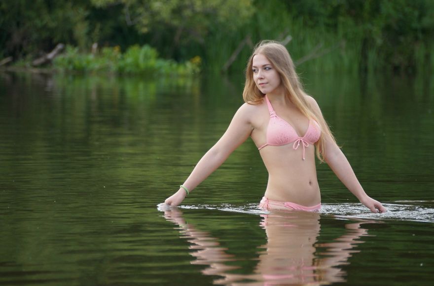
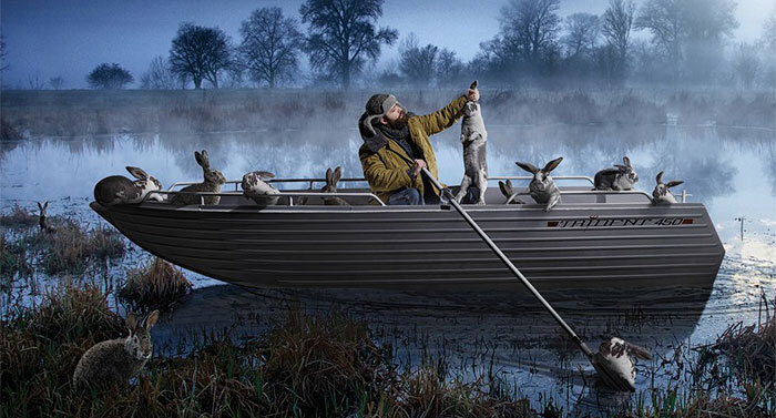
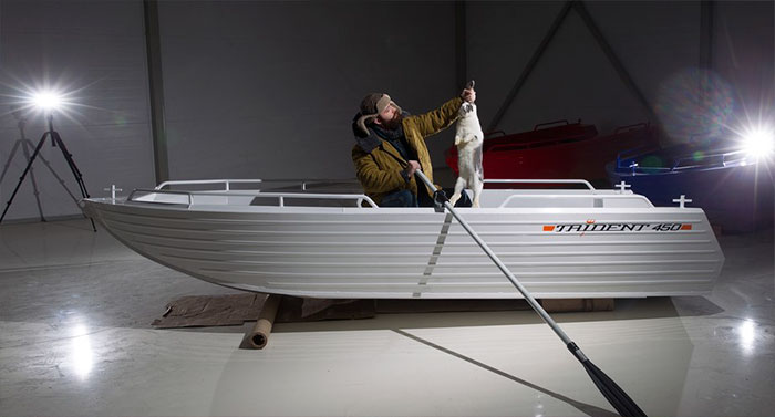
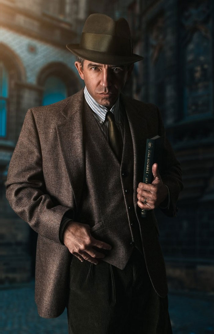
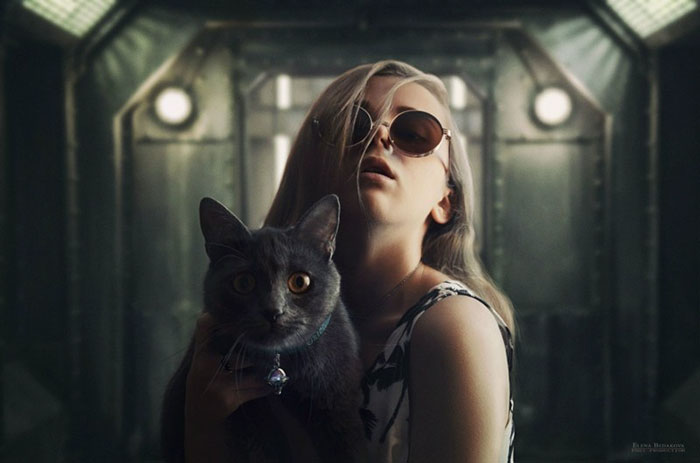
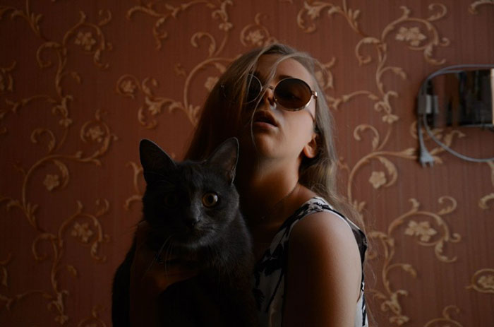
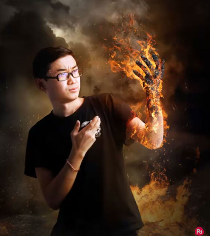
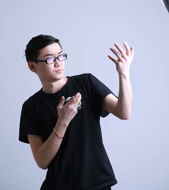
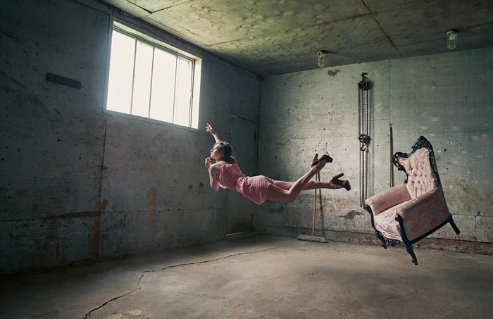
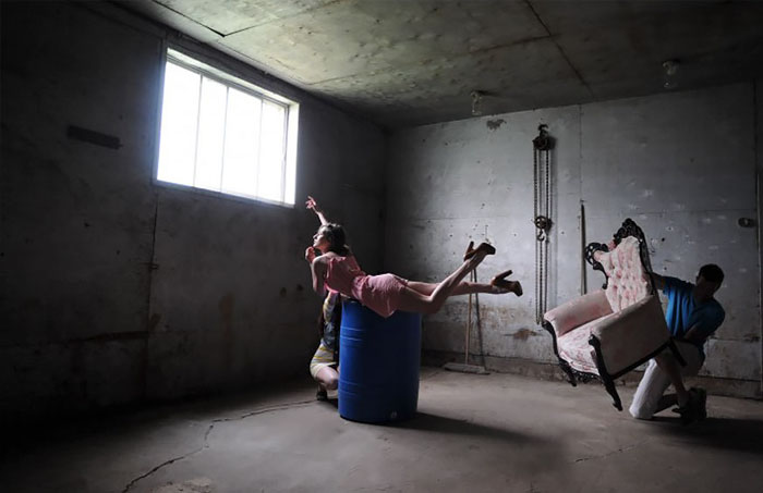
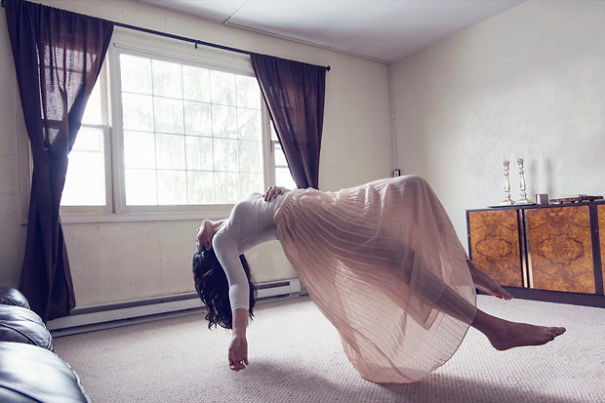
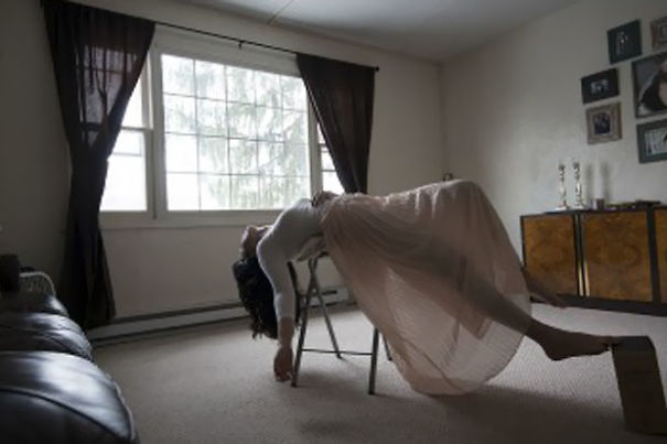
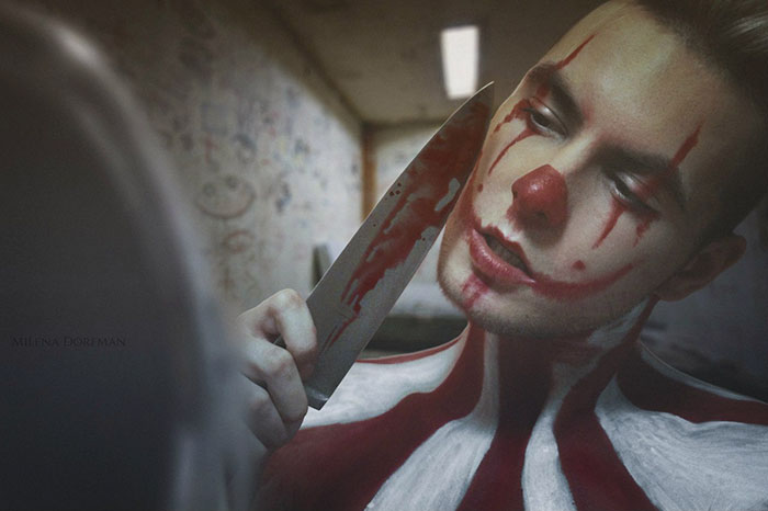
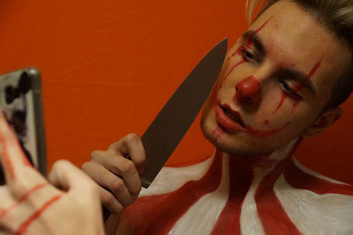
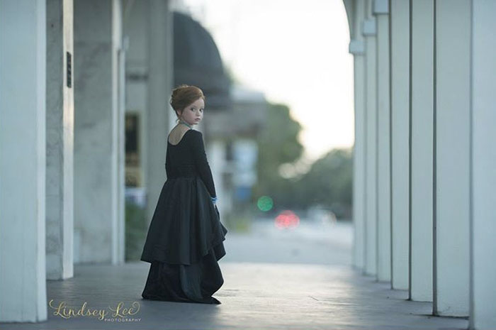
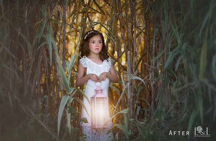
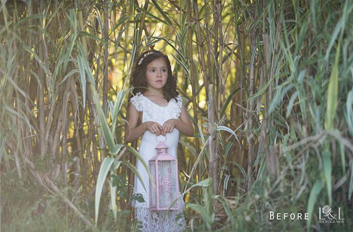
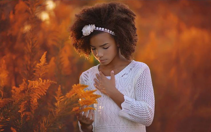
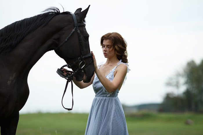
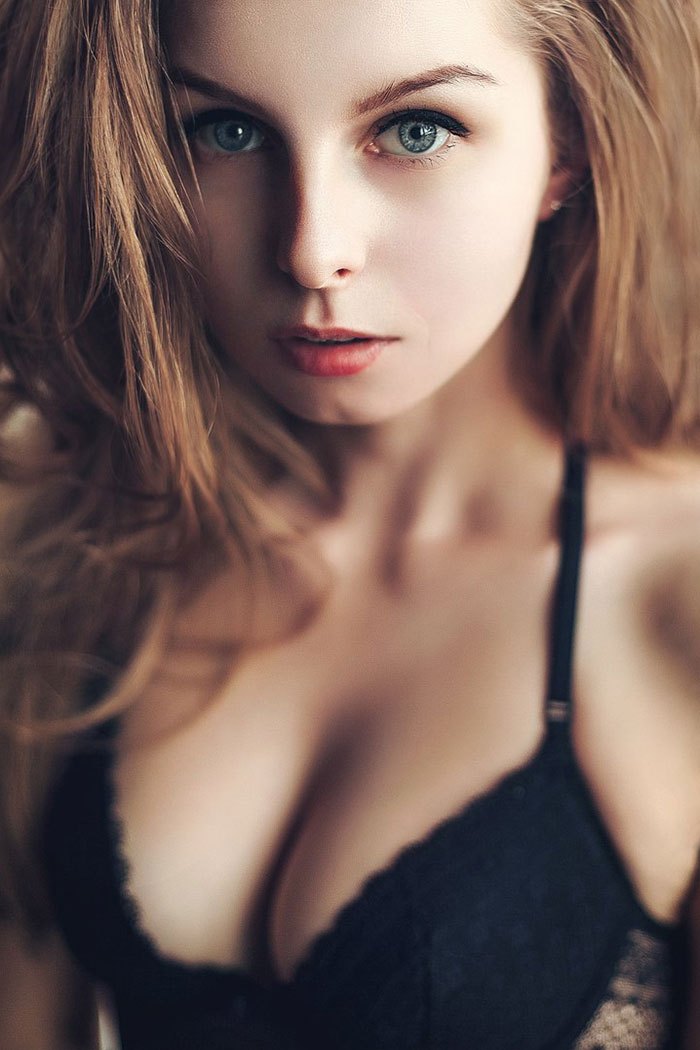
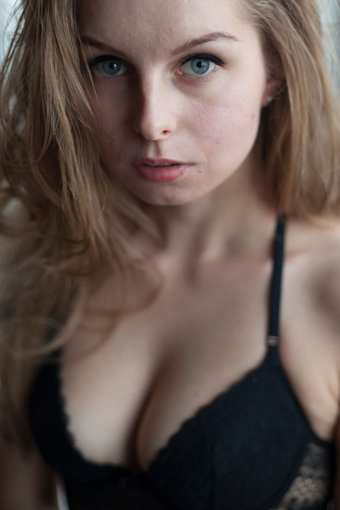
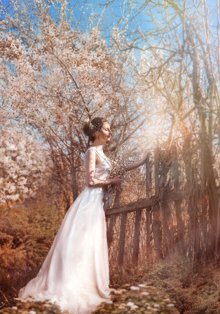
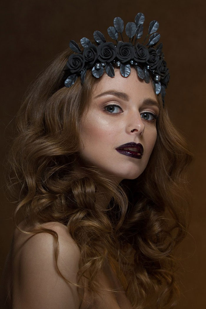
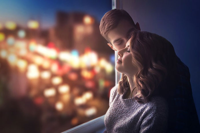
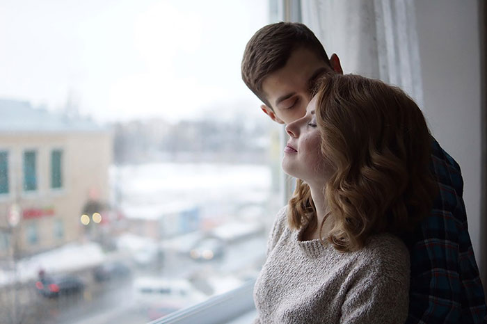
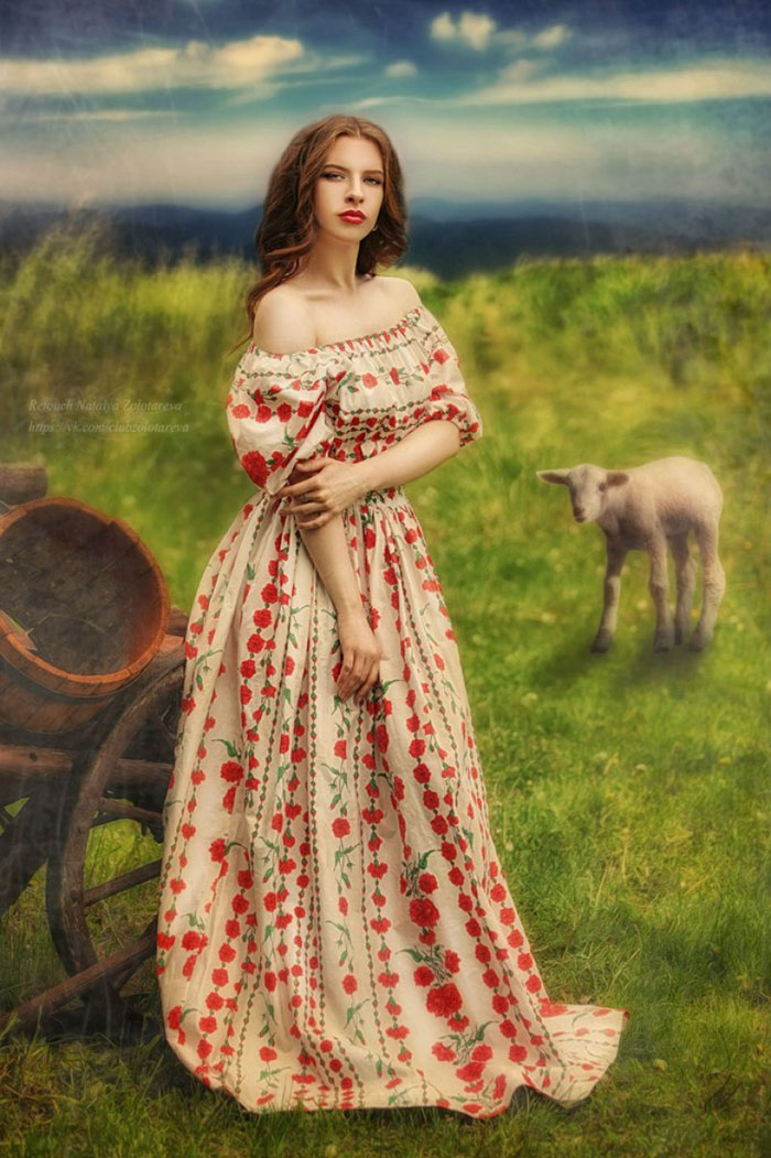
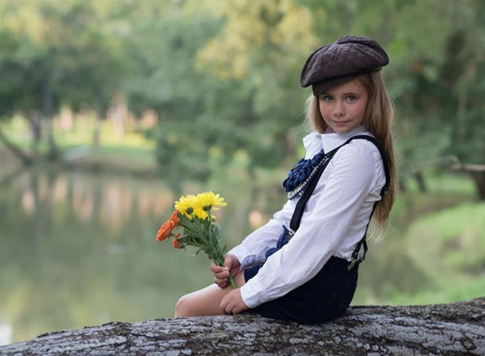
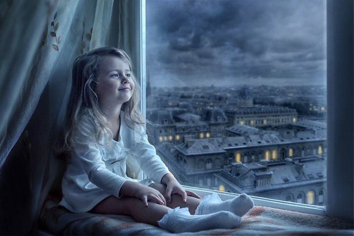
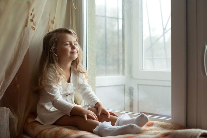
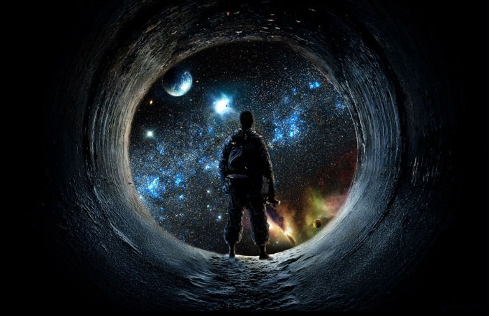
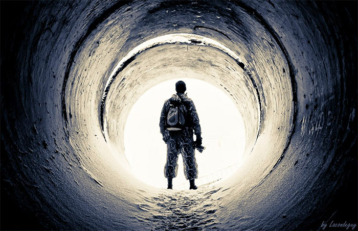
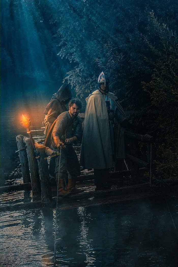
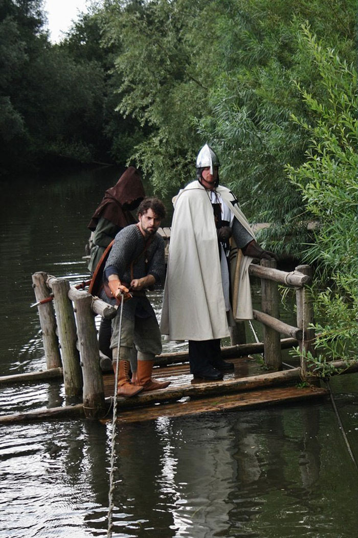
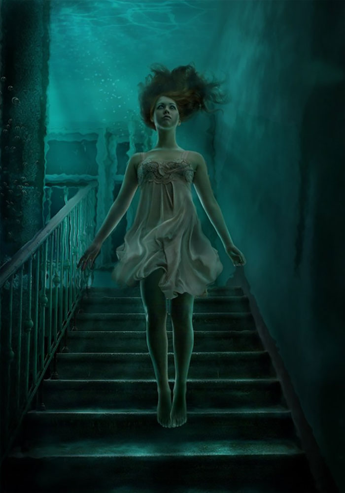
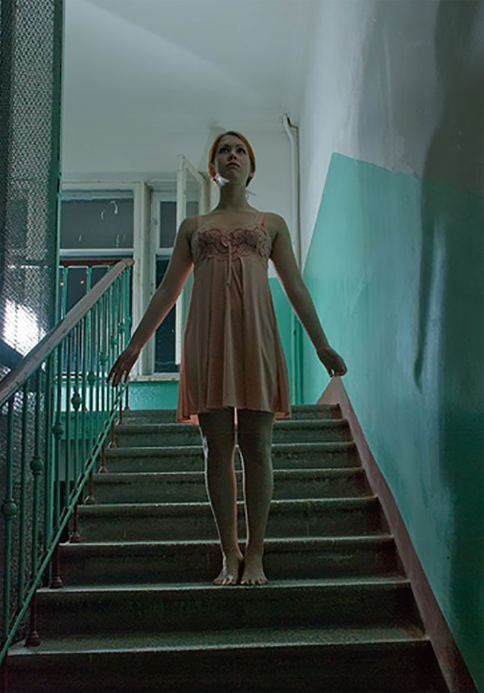
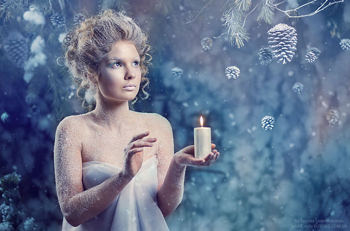
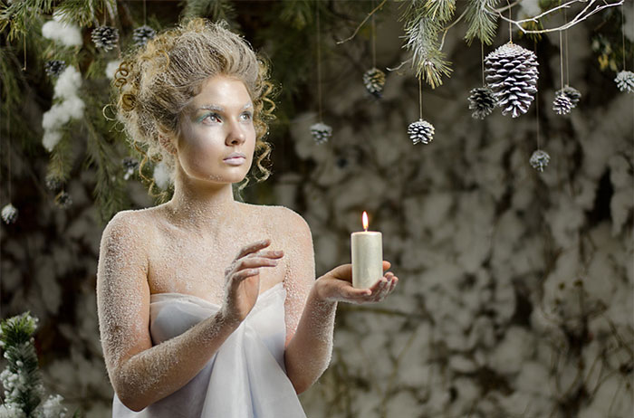
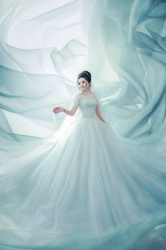
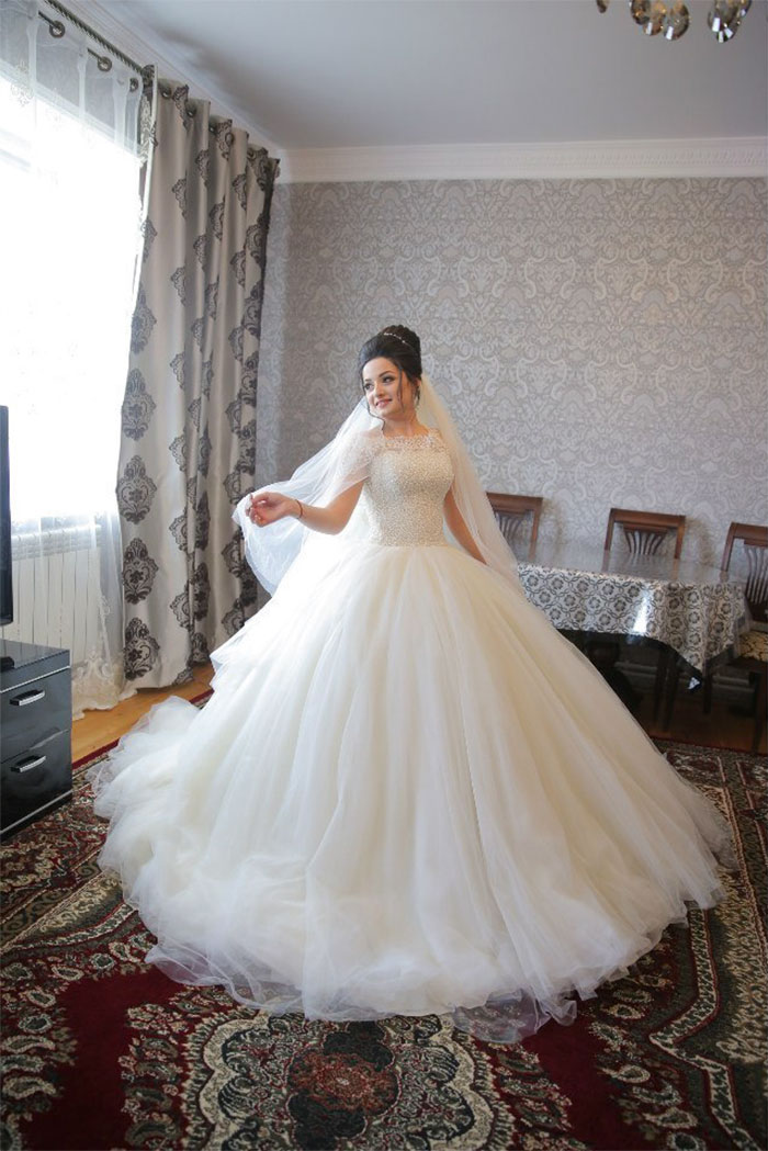
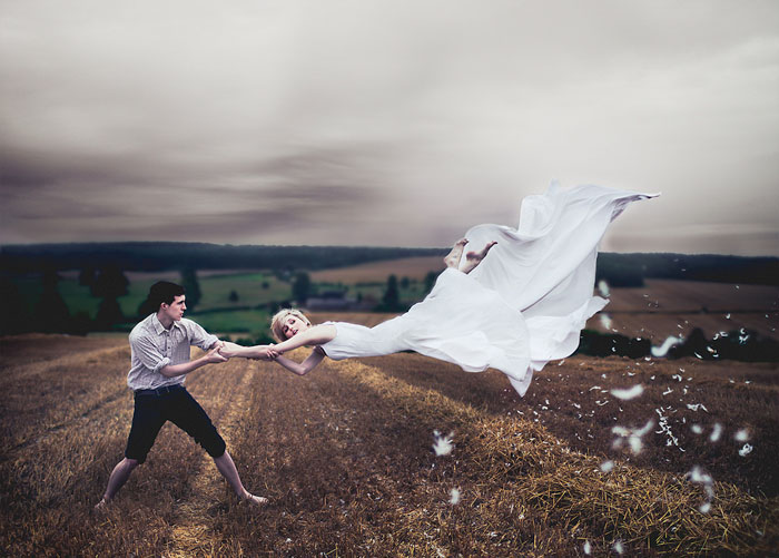
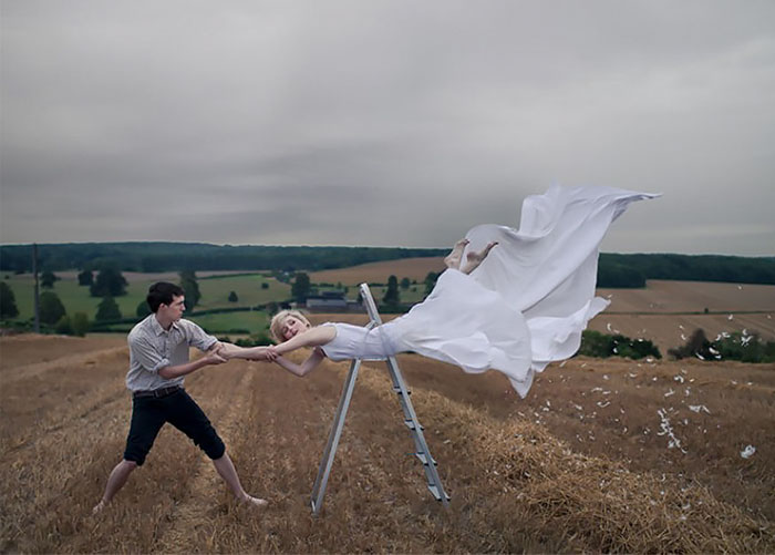
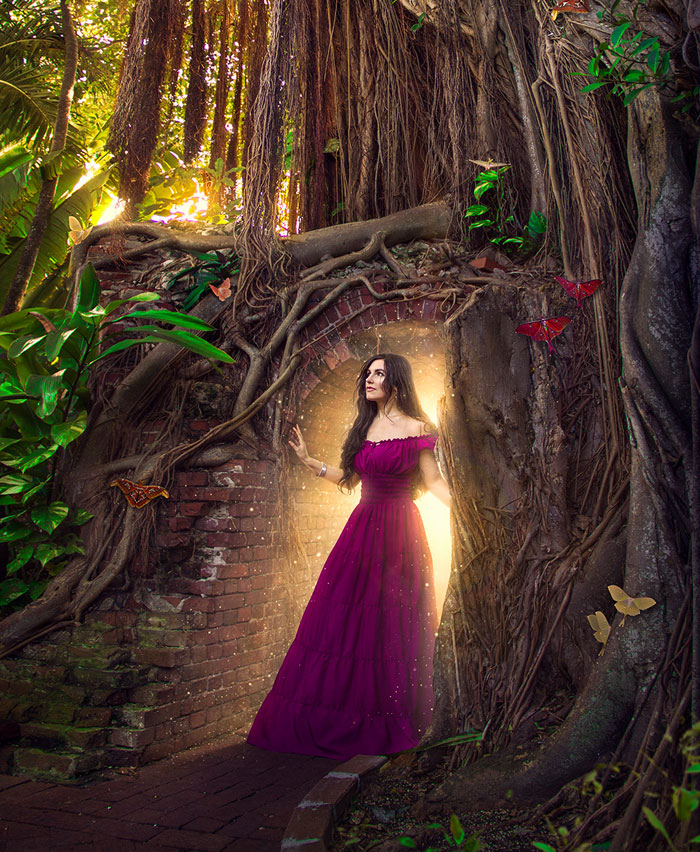
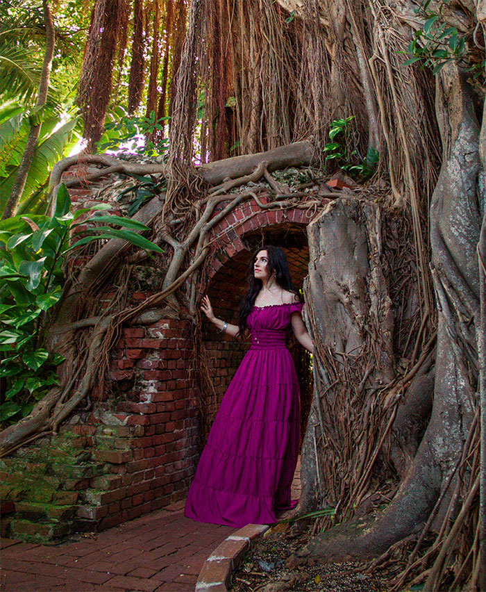
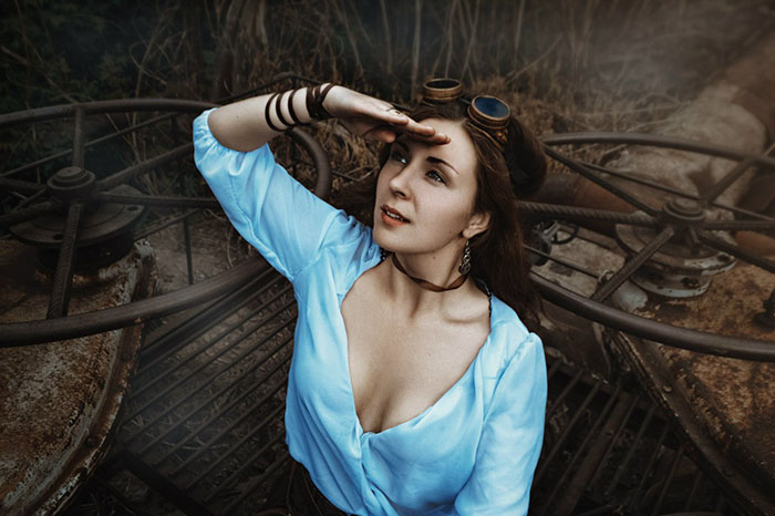
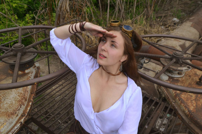
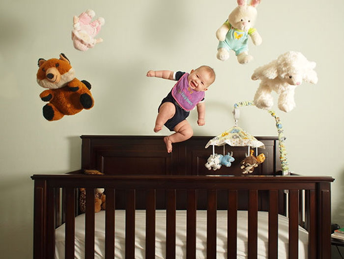
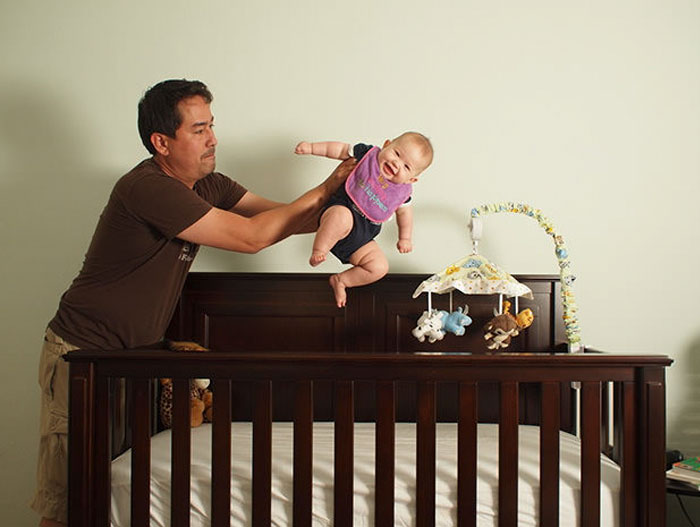
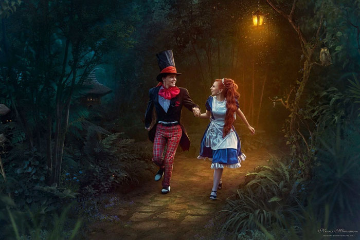
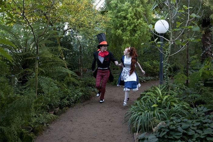
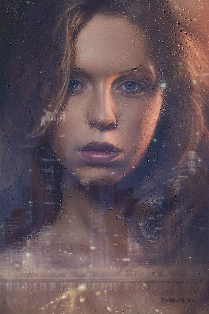
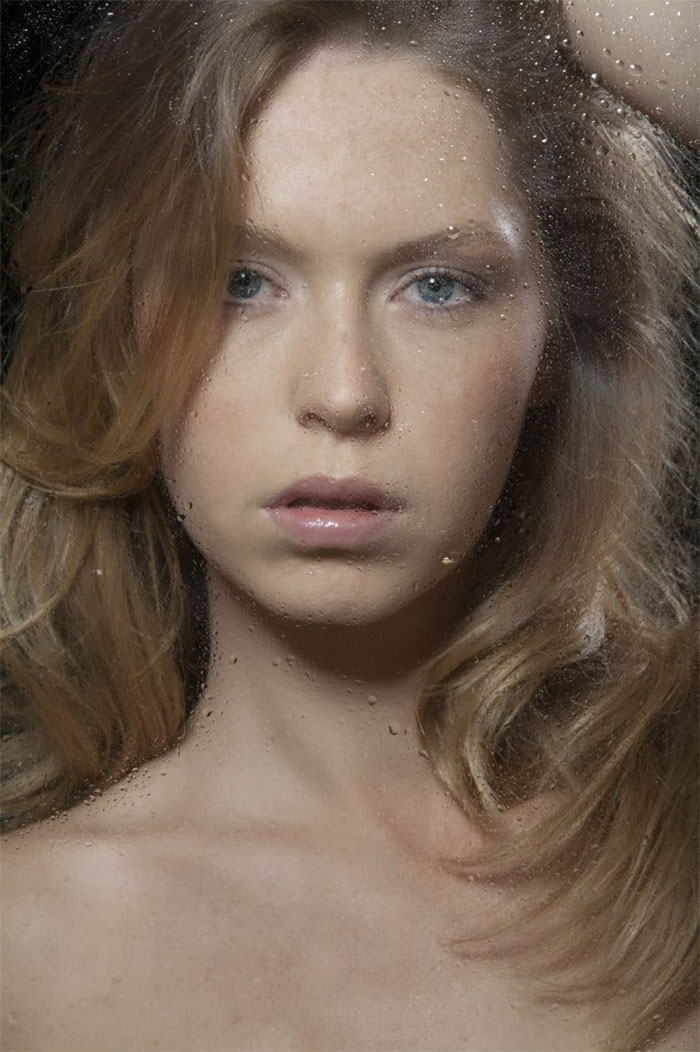
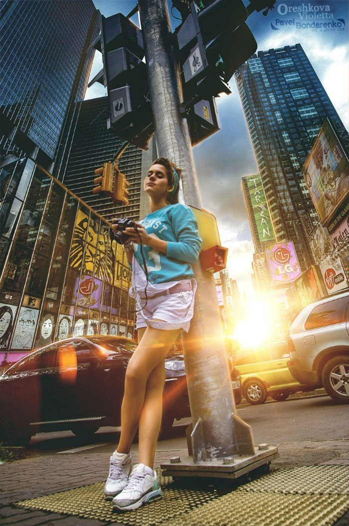
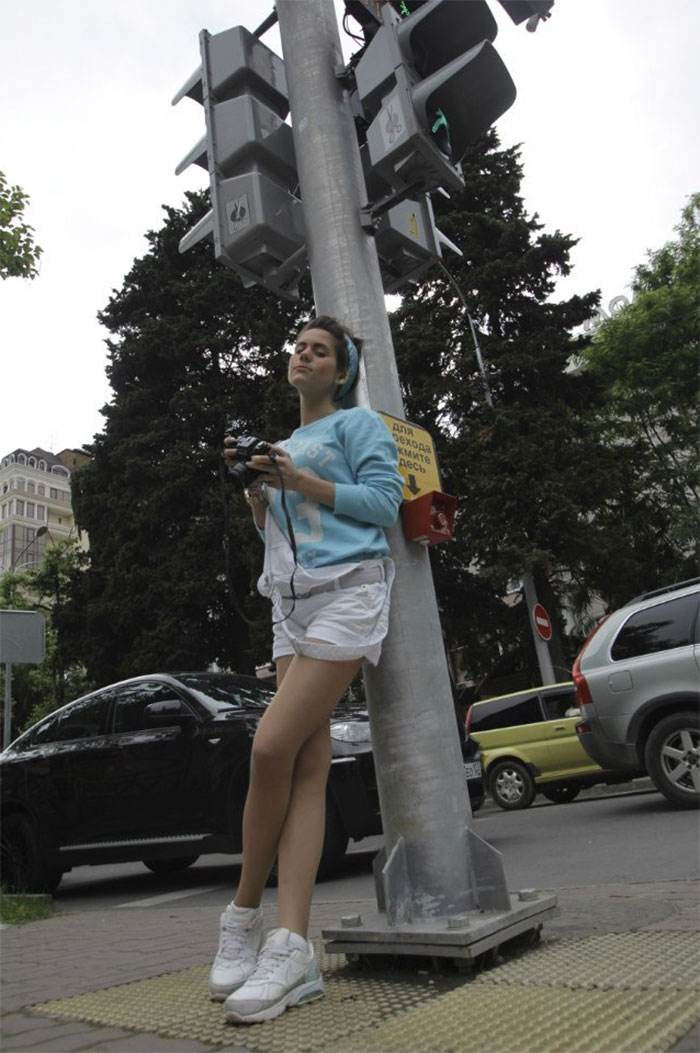
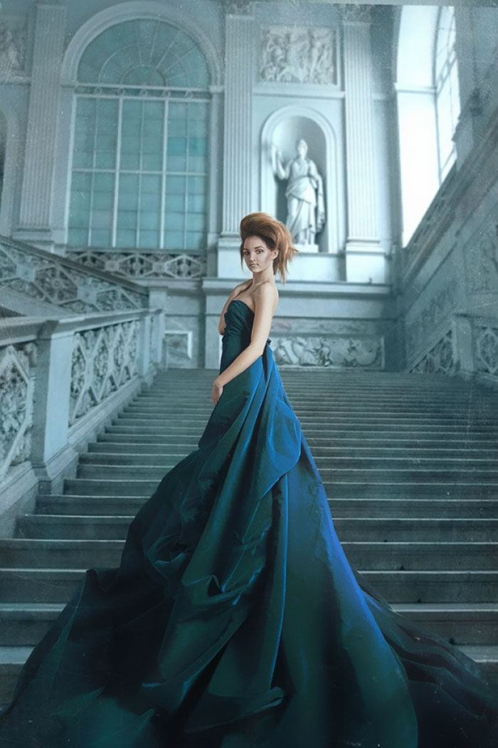
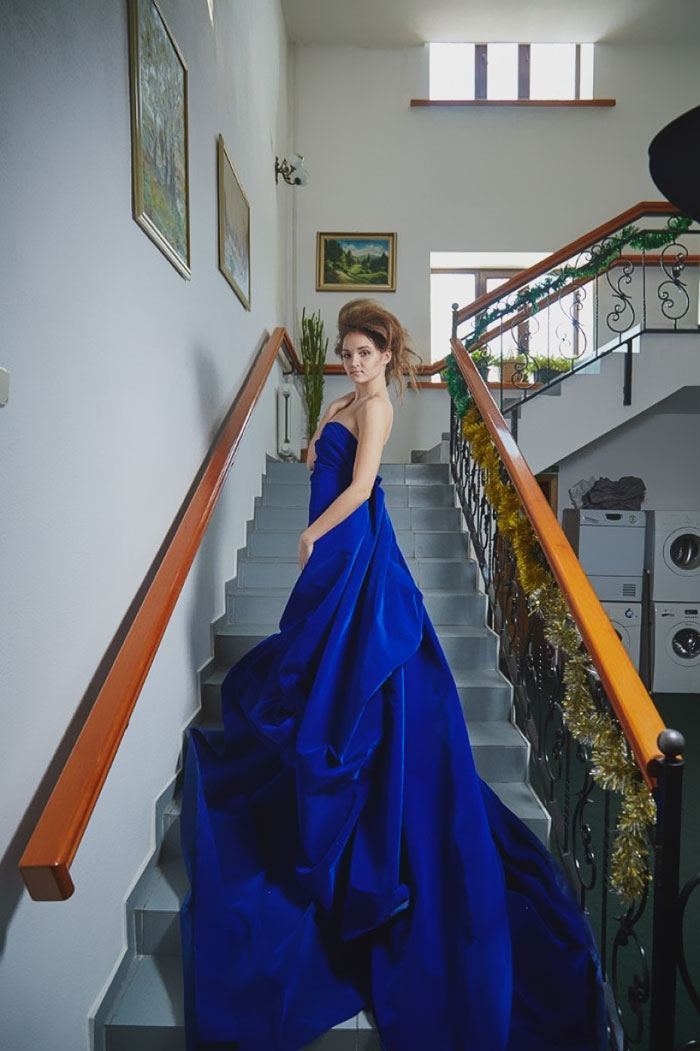
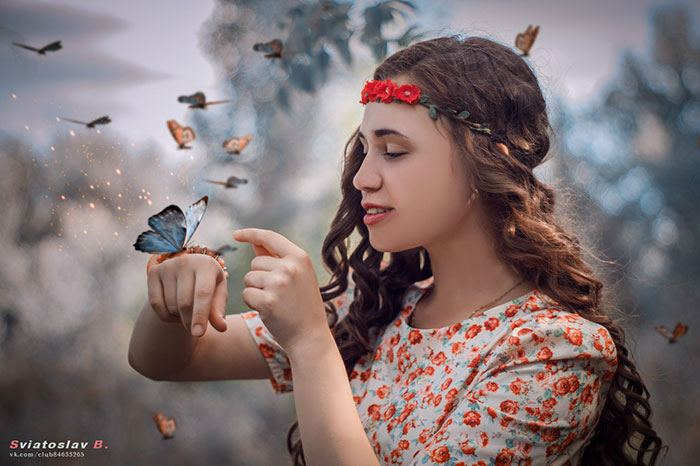
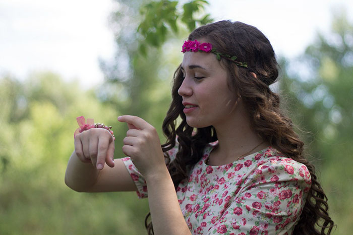
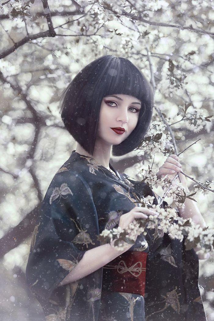
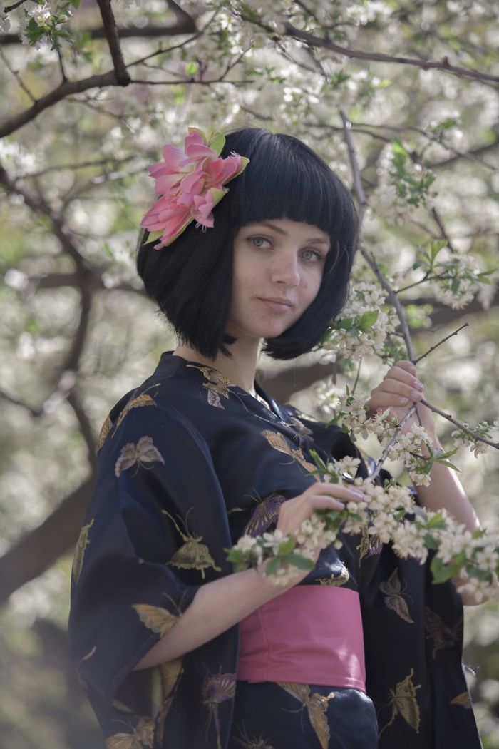
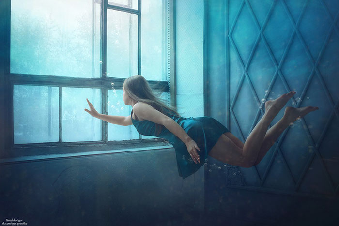
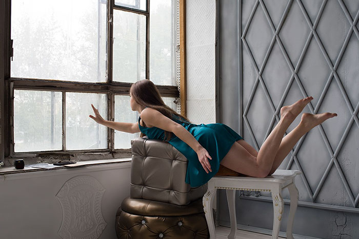
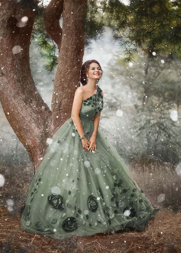
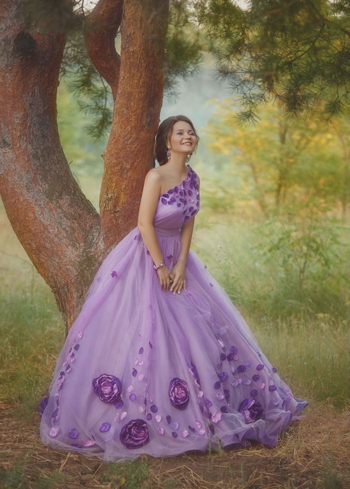
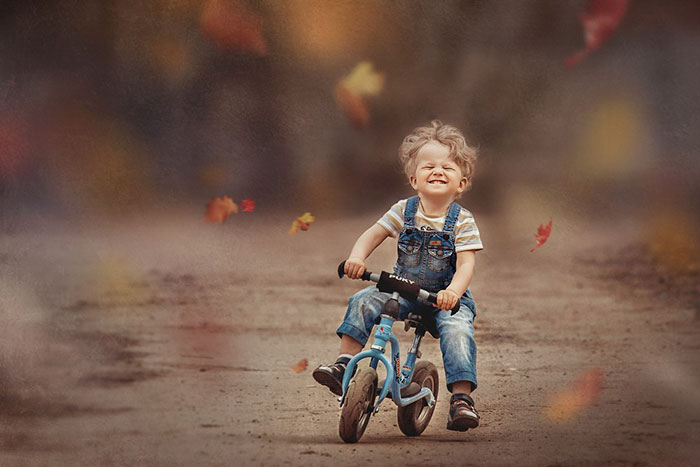
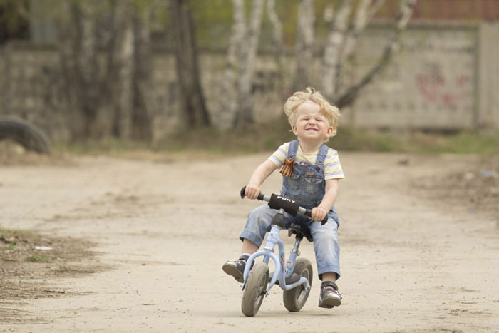
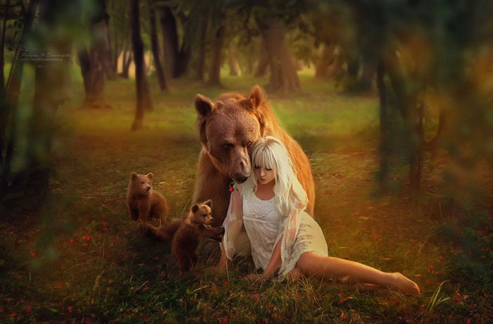
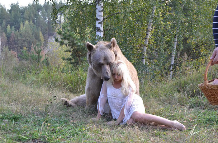
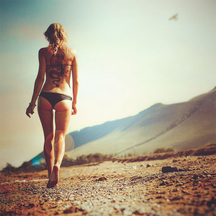
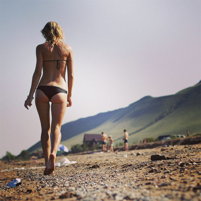
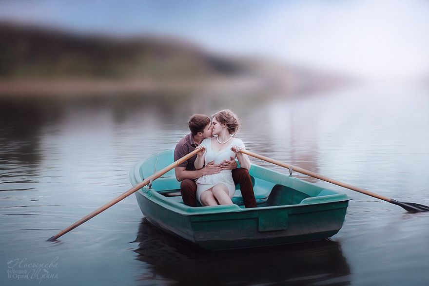
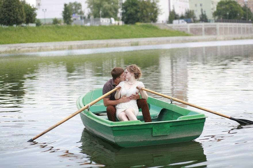
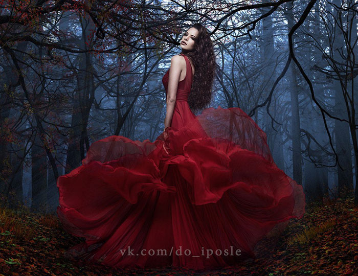
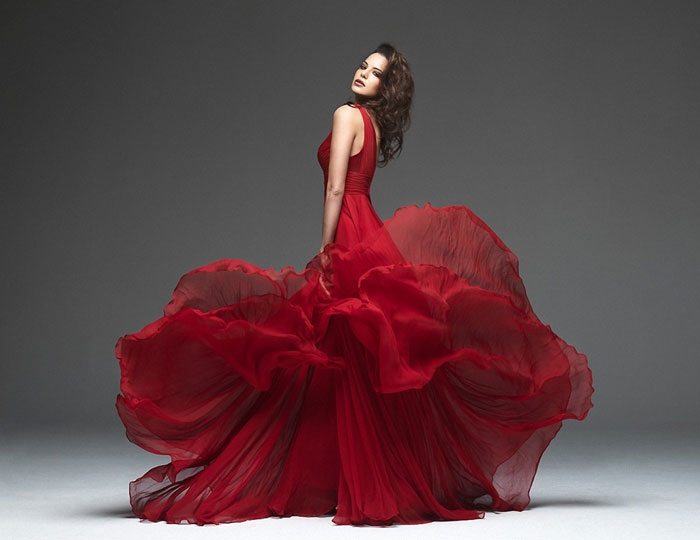
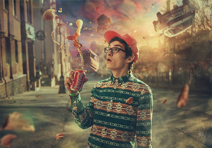
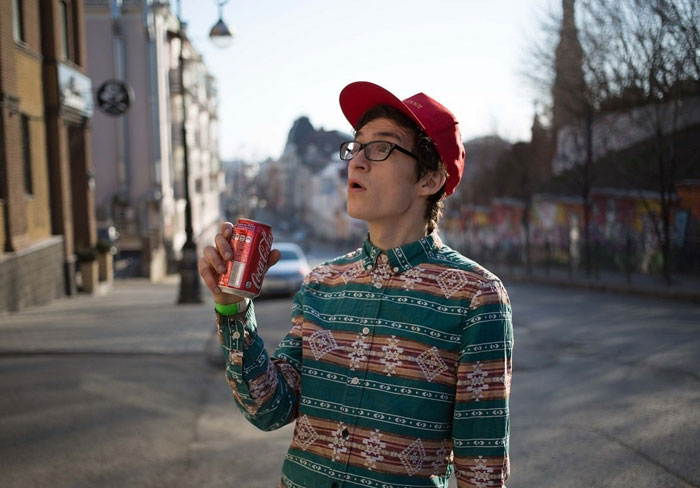
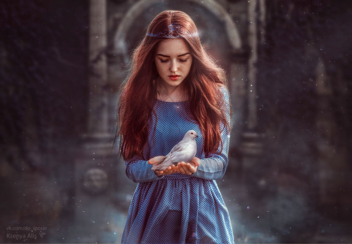
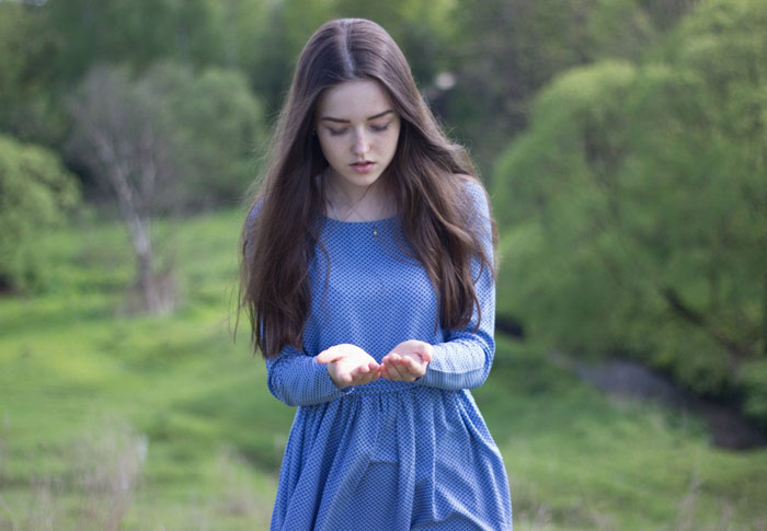
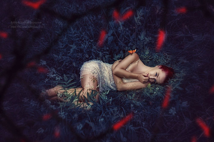
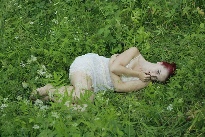
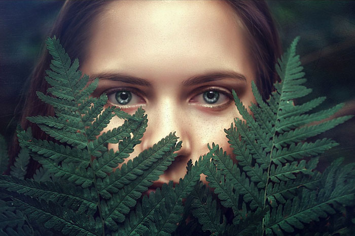
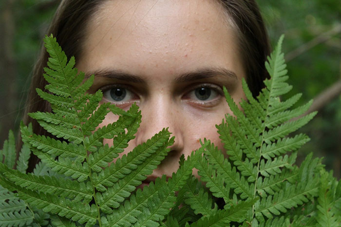
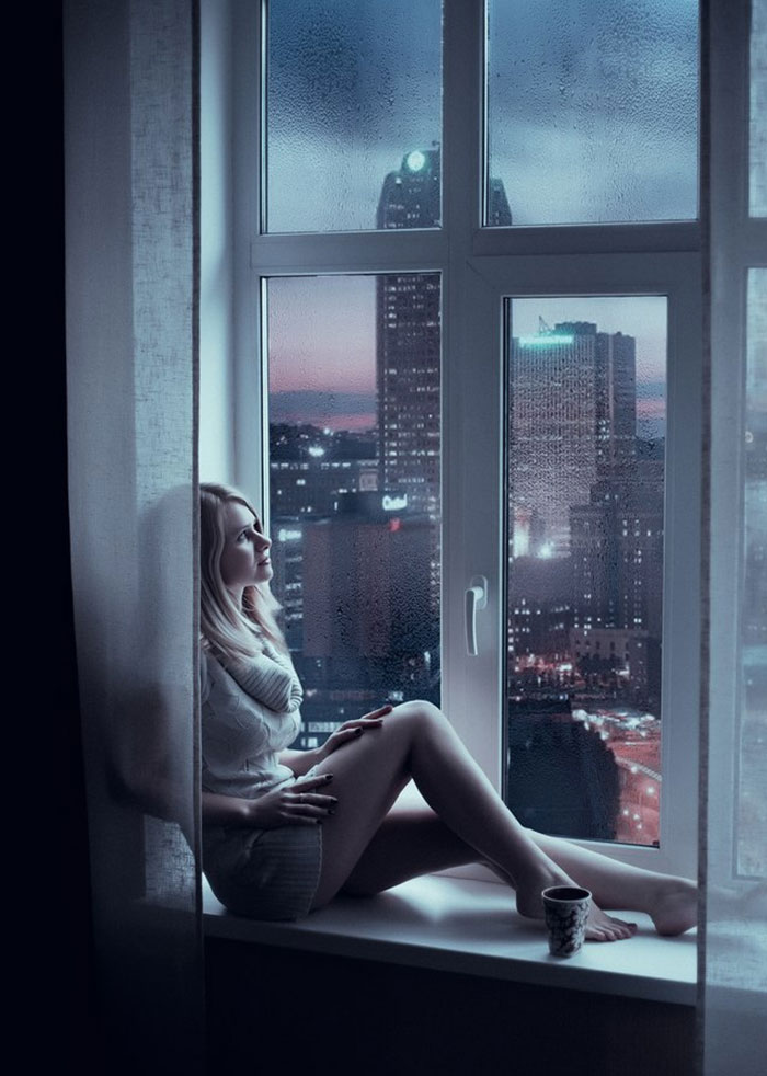
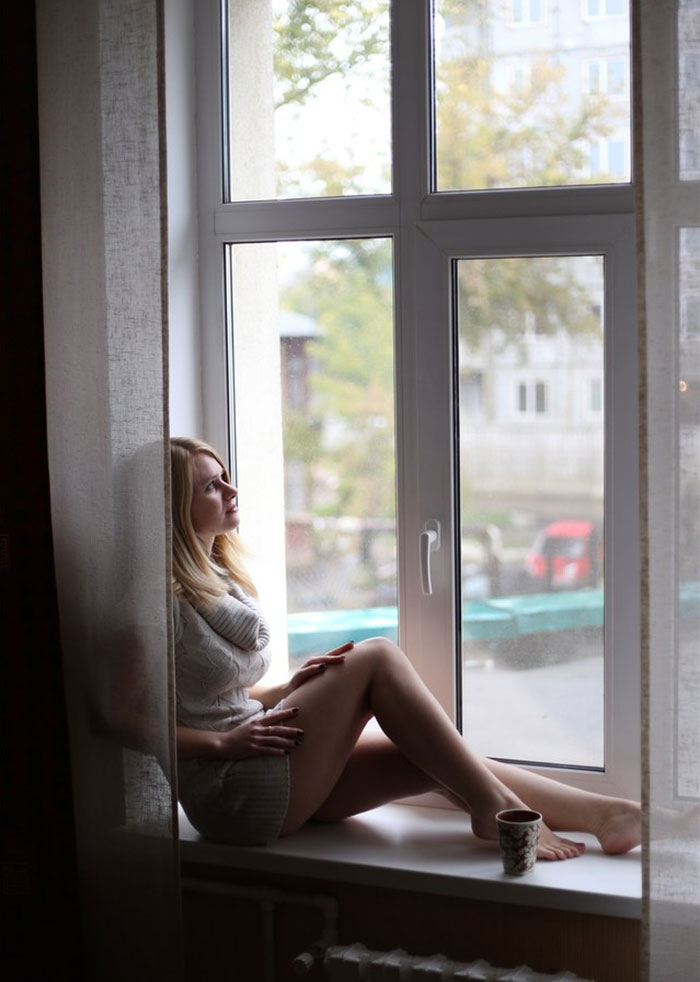
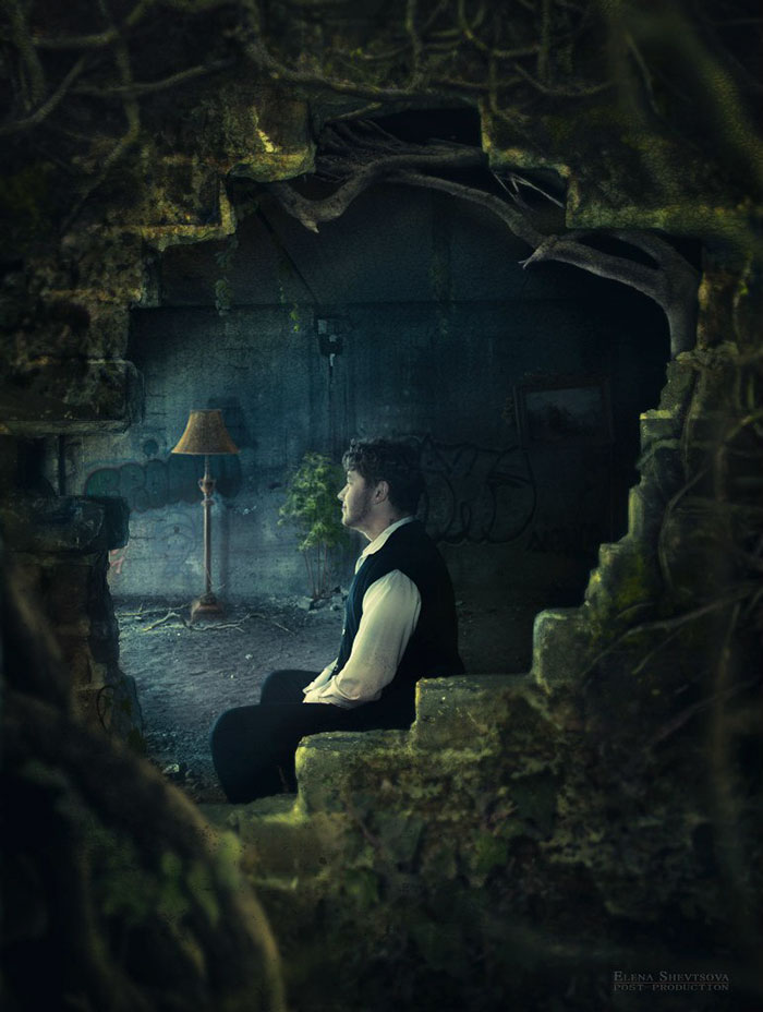
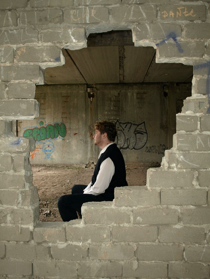
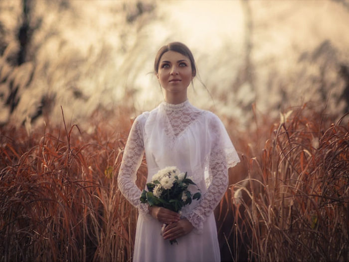
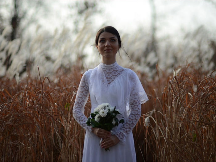
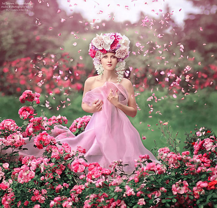
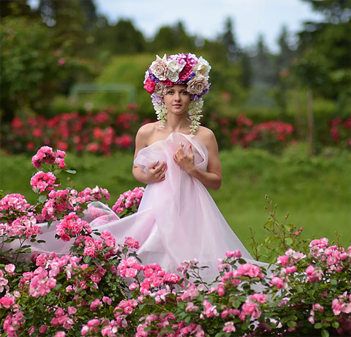
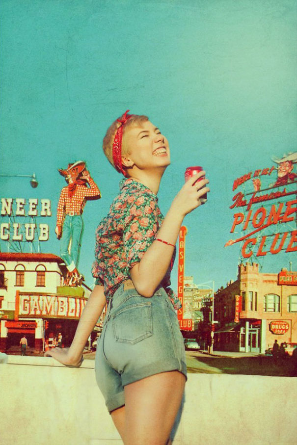
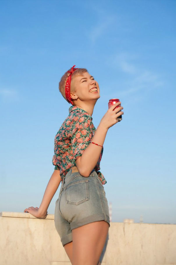
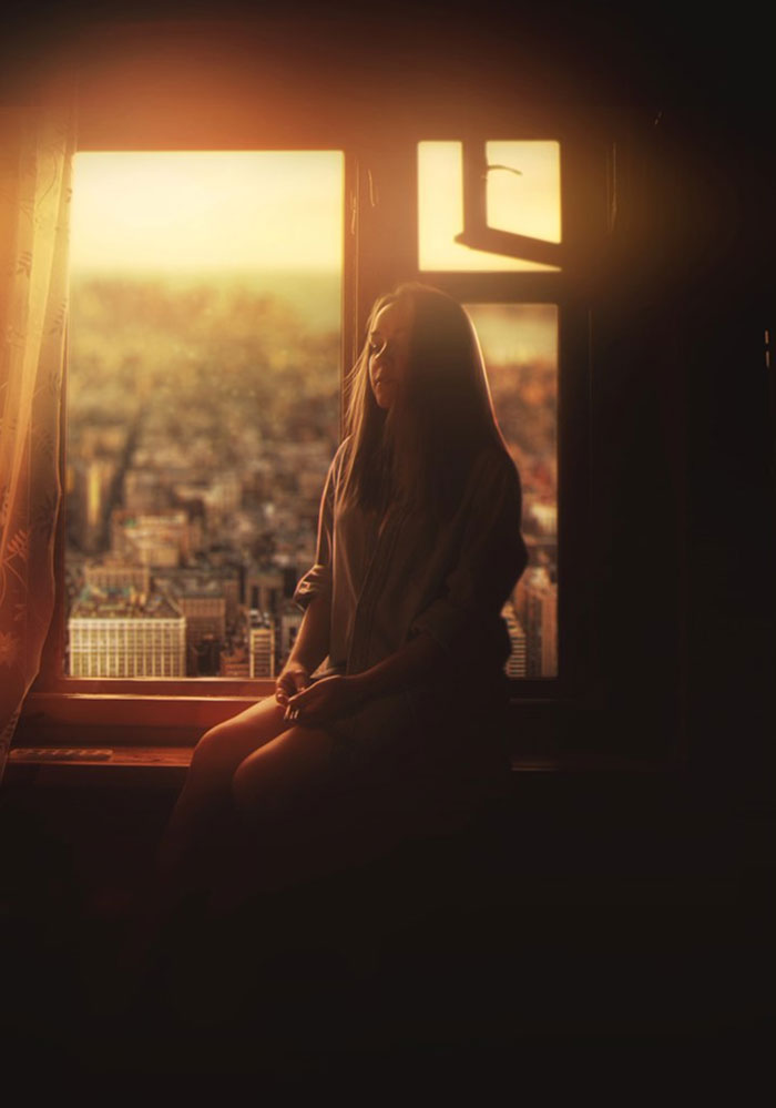
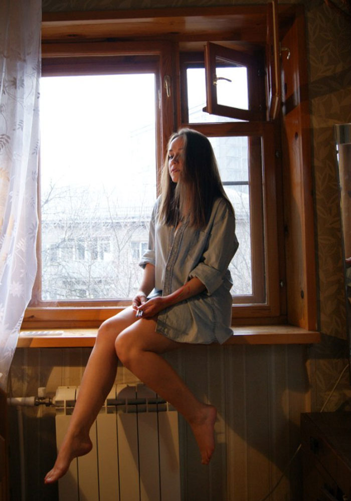
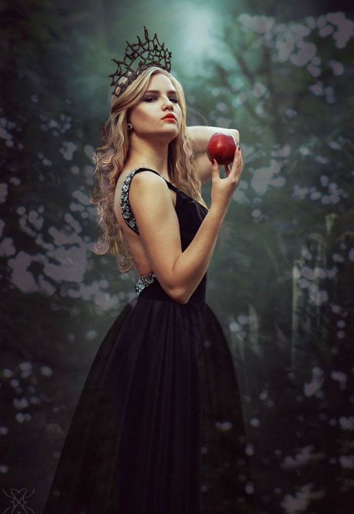
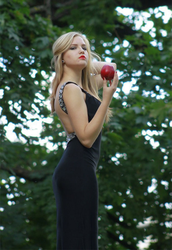
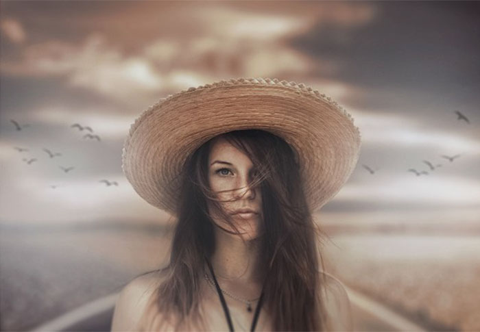
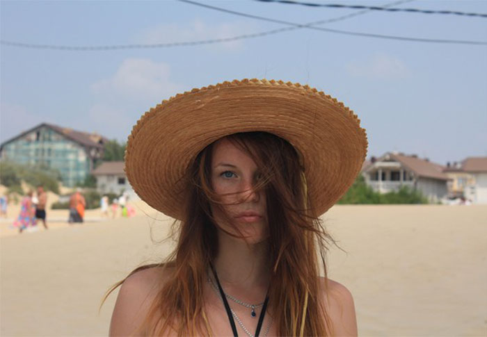
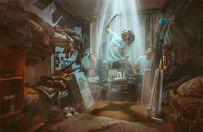
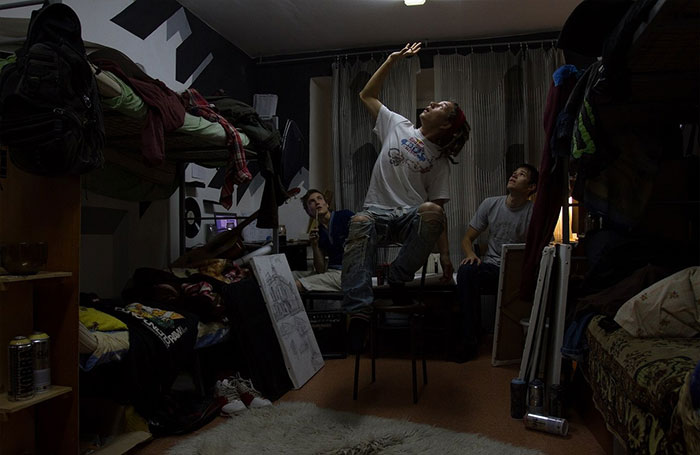
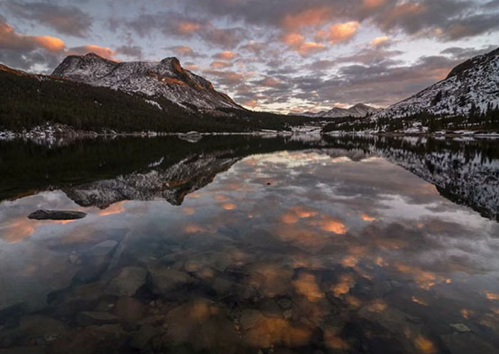
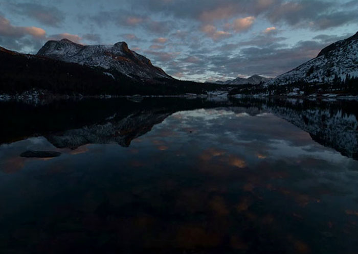
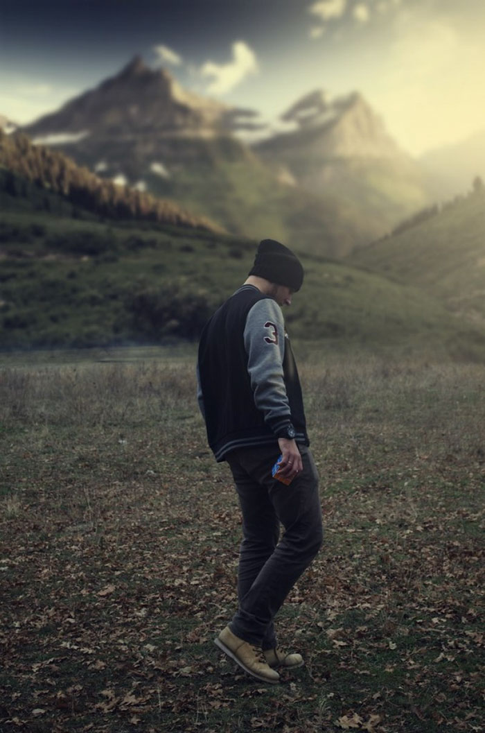
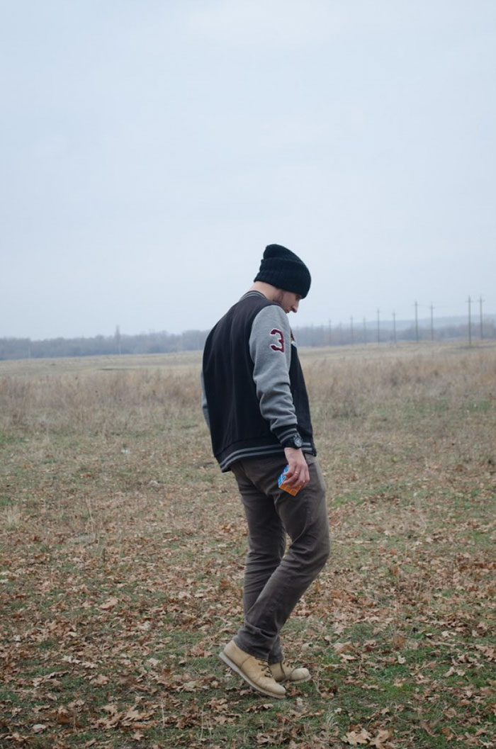
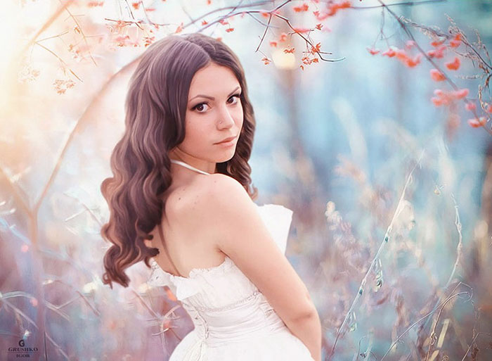
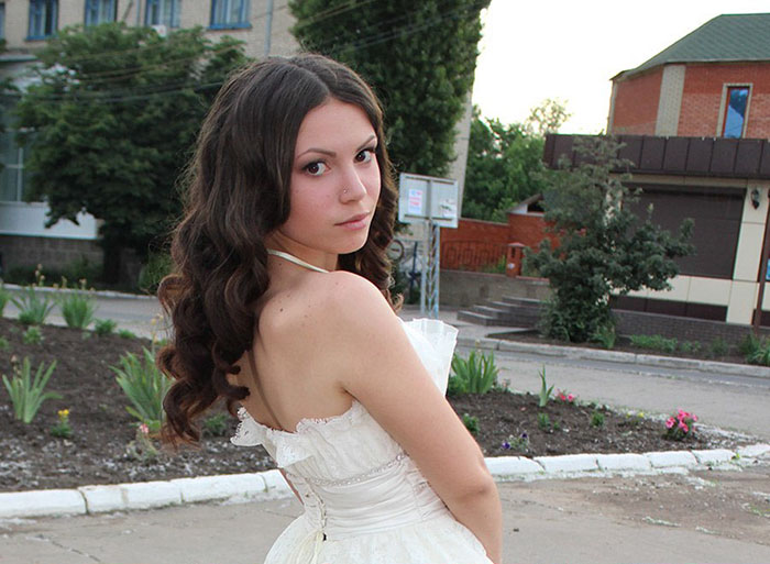
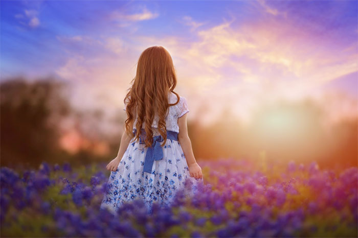
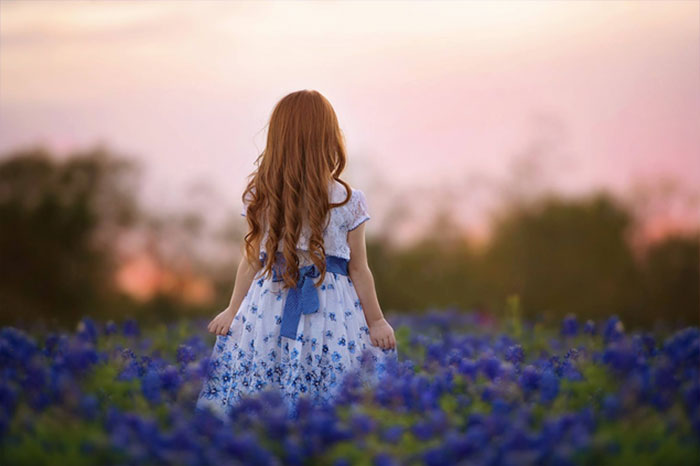
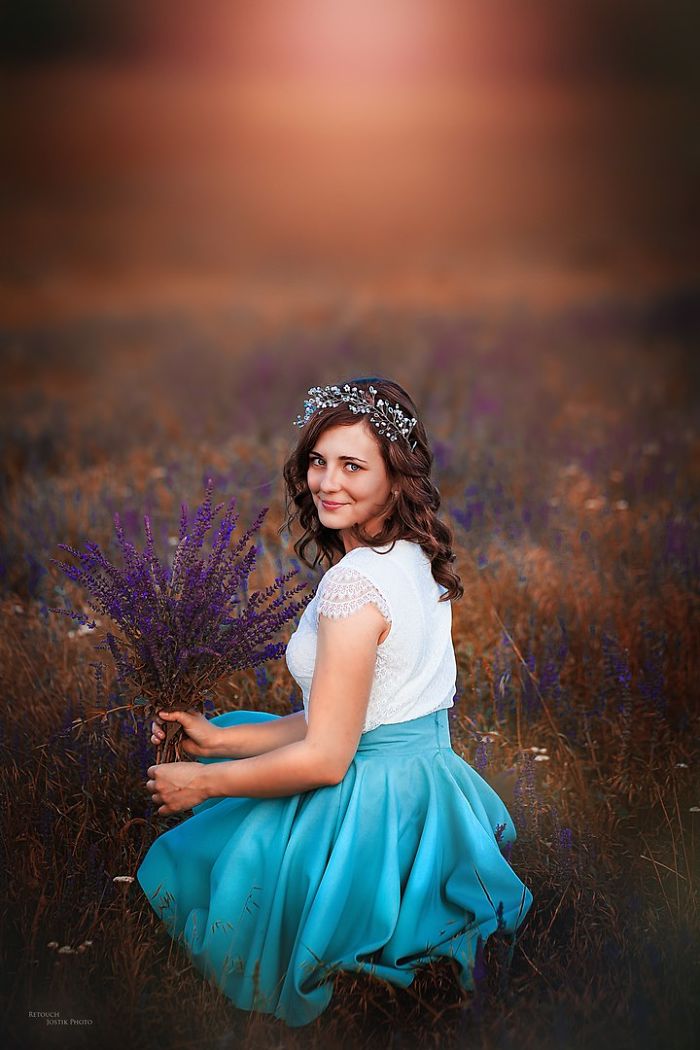
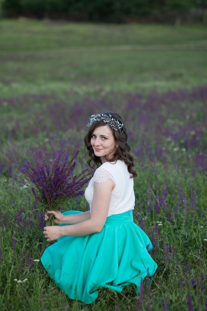
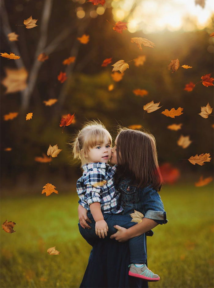
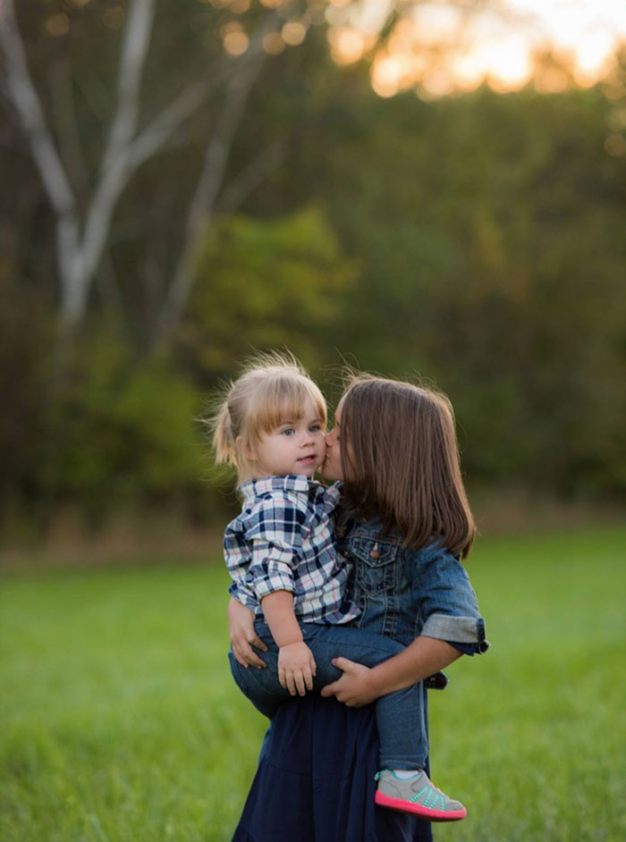
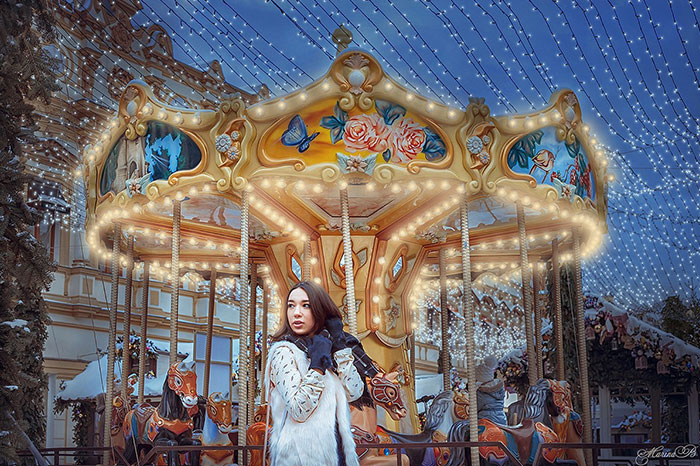
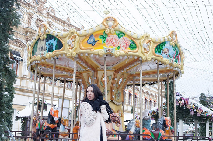
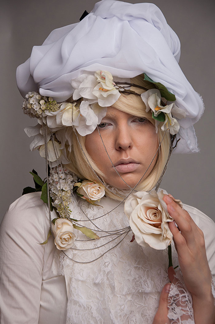
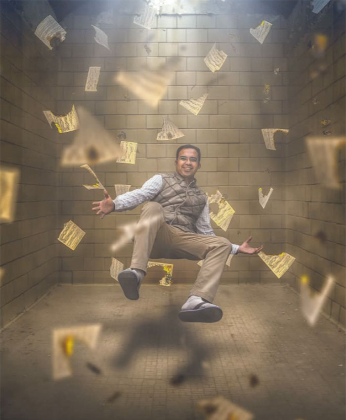
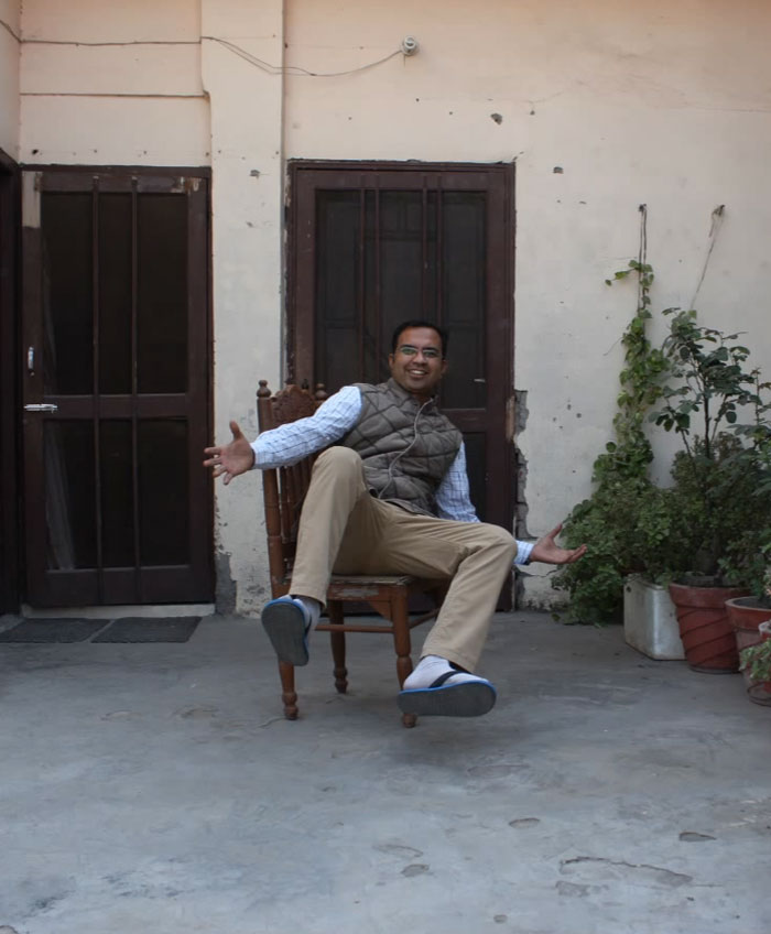
Adobe Photoshop was released 26 years ago, and since then you cannot trust anything you see. What may look like a simple amateur picture at first, could look like a stunning portrait after a photoshopper has done its magic.
Below, Bored Panda has put together a list of photos that prove the power of photoshop. The results are mind-blowing. Take a look and vote for your favorites.
Enjoyed this article? Check out these pics that show photography is the biggest lie ever.
(h/t: brightside)
This post may include affiliate links.
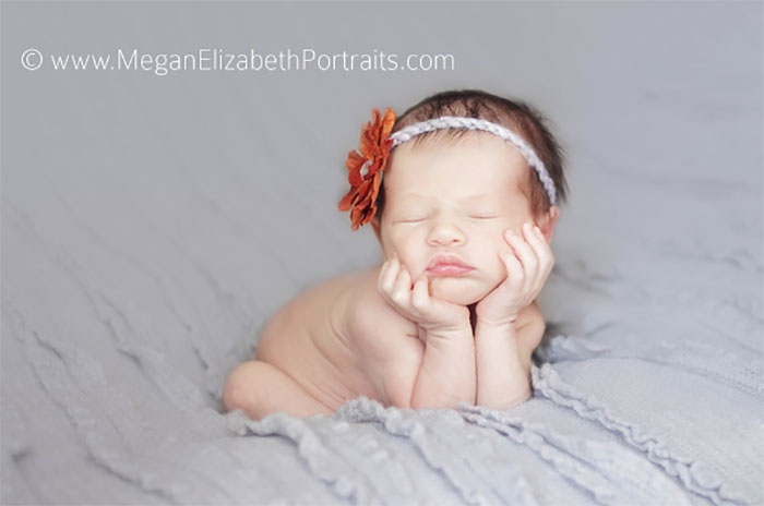
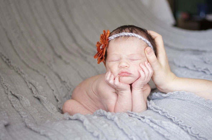
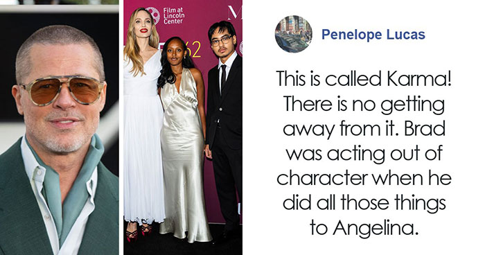
I love this! Clever editing. I was about to say that only the background and atmosphere changed, but also baby's hoodie has been made longer. I guess high waist pants were out of fashion? Lol.
Super nice! You can see how everything was planned beforehand and photoshopped parts really have a base in the original. I prefer this to pictures where the edited version doesn't look like the original at all.
I don't know, guys, I think I prefer {the sites that leave the comments section discreetly at the bottom}. {All the patronizing derision by people who followed a discouraging and leading clickbait headline, and don't know a PhotoShop filter from a coffee filter,} seems a little too artificial to me. Ahem. That is, these aren't created to mislead consumers, they're not selling you a lifestyle that'll attract butterflies and make your baby float in the air-- most of these are meant to be fantastic art. It's neat to see what they were working with beforehand. I understand the critiques of the ones that changed peoples' bodies, but the sour commentary on two thirds of the photos makes me glad BoredPanda didn't stumble on my digital work.
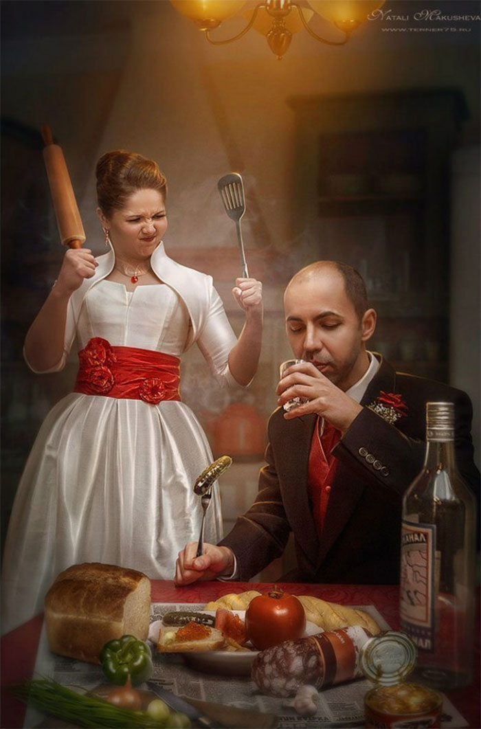
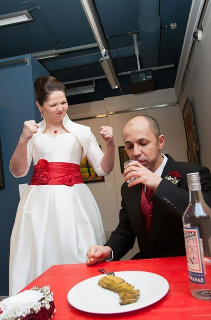
The shadows are off in this one though now they've added the lights
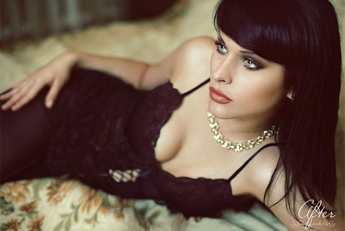
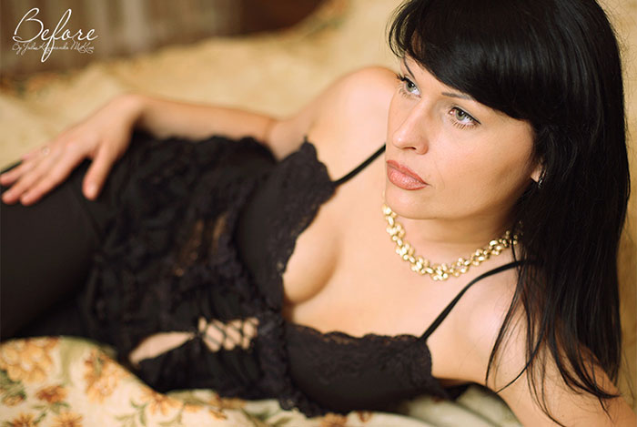
A bit too much facial editing with this one. Her nose is all FUBAR in the shopped version.
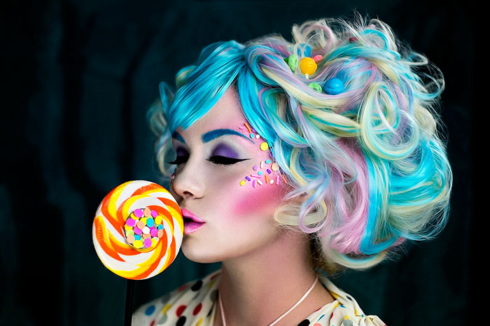
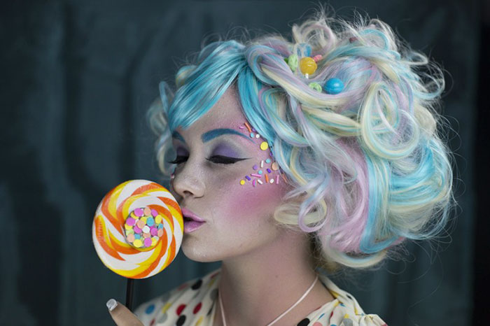
Saturation is ok, but the final one looks oversaturated in some parts, like the lollipop
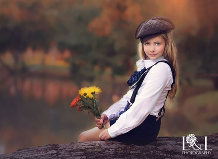
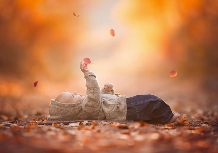
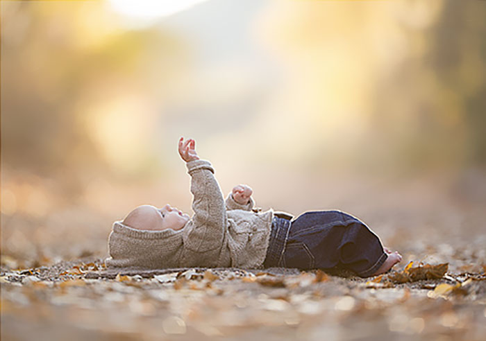
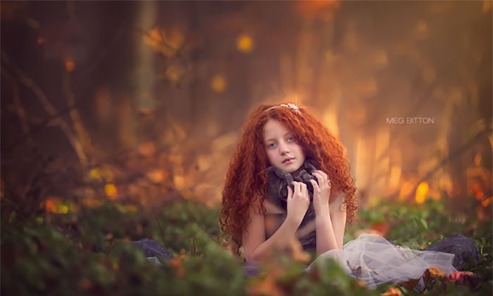
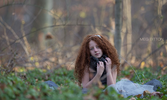
I understand the adjusting of the aesthetic to fall, and making it more artistic, but they should have left the hair instead of trying to make it fuller, and why remove that little rag or ribbon or whatever on his overalls? The new additional pocket looks super fake, and the rag/ribbon thing gave it visual interest.
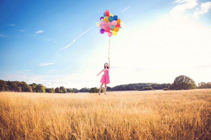
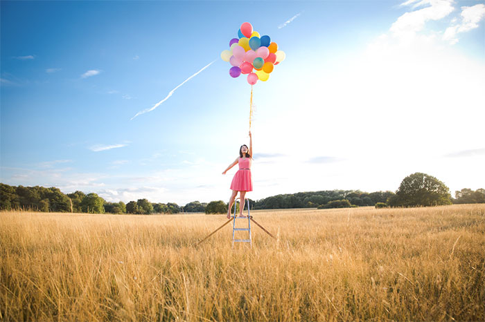
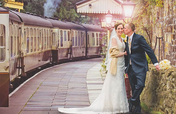
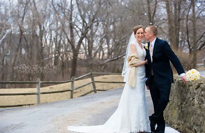
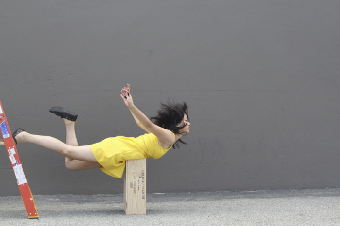
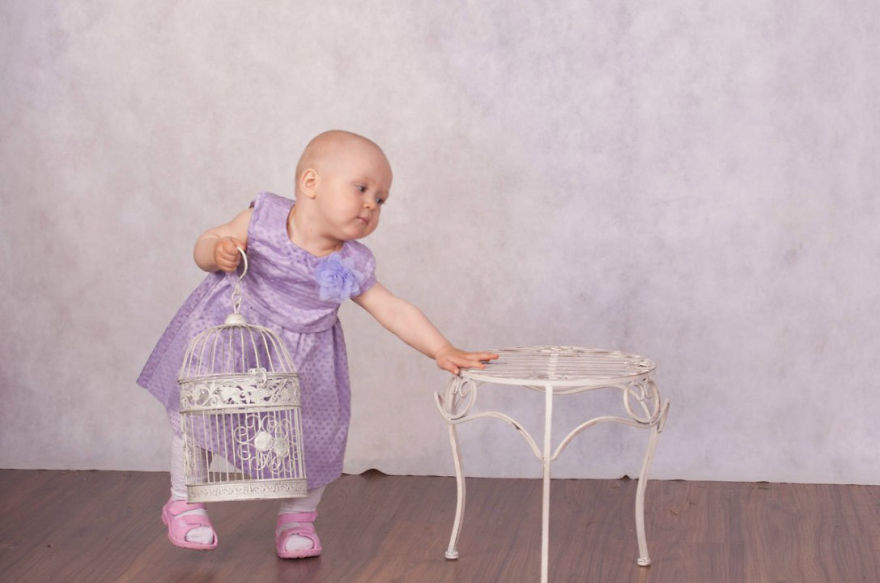
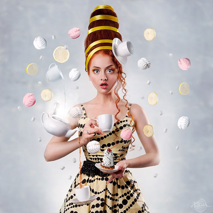
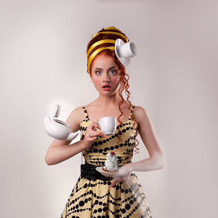
How did they get that teapot to float like that on the unedited one?!!
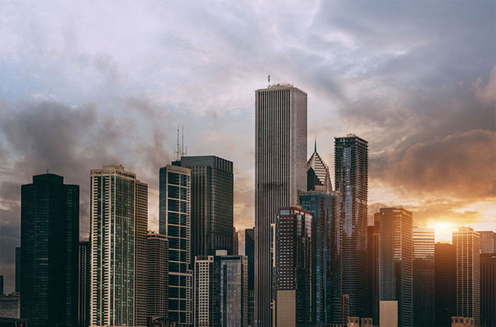
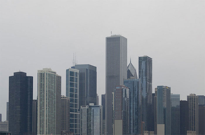
Hate the HDR-like glow around the building--a dead giveaway that the sky is artifical, but good otherwise.
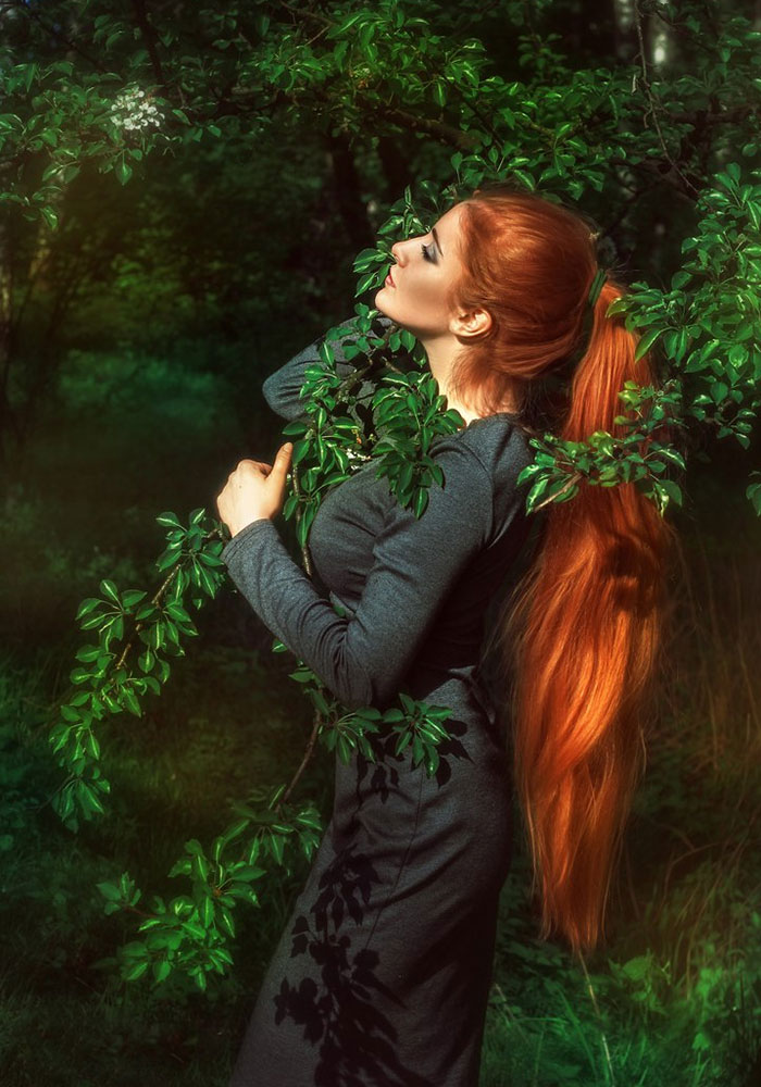
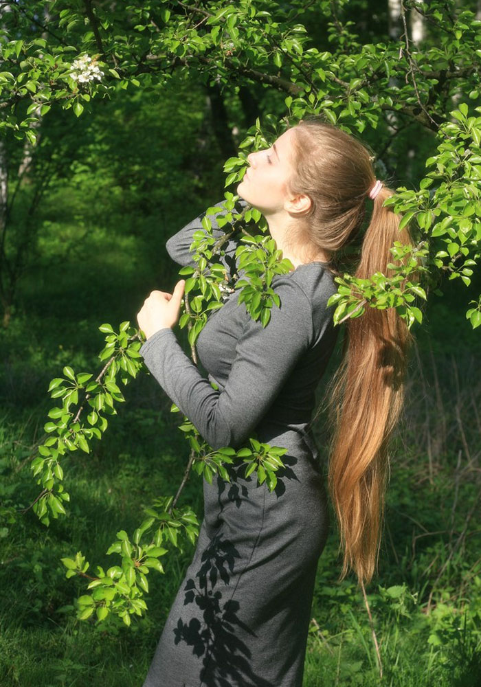
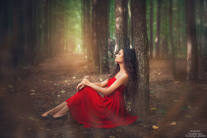
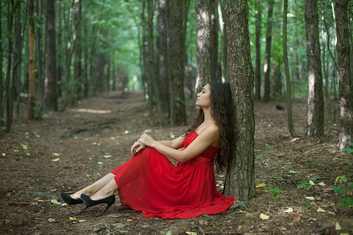
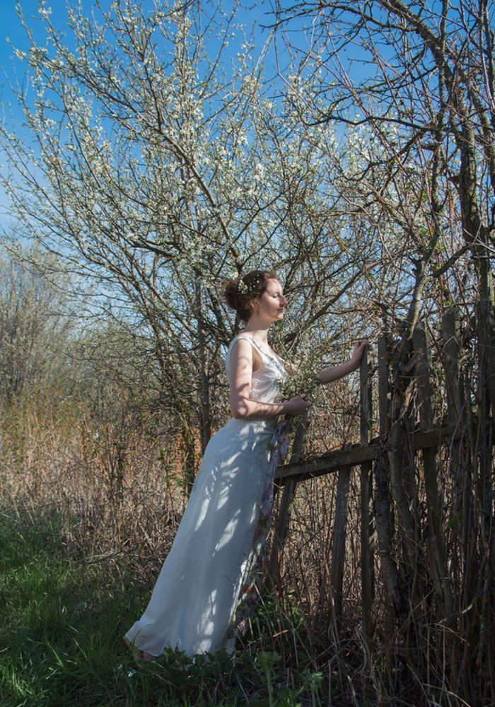
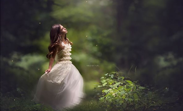
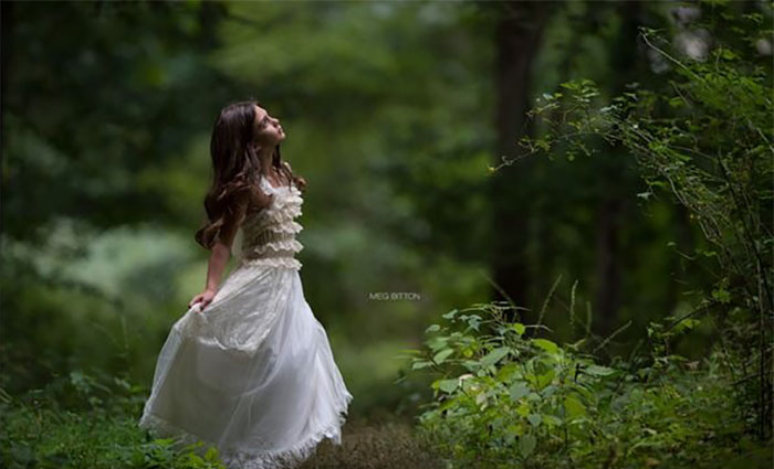
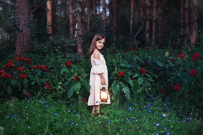
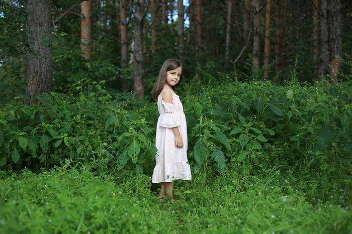
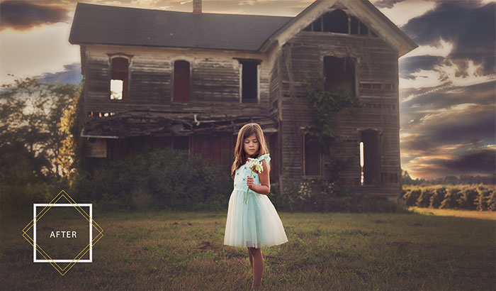
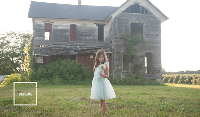
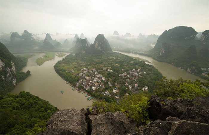
This one's good, though I'm not sure I agree with the decision to remove a bunch of the branches and the tree in the back right.
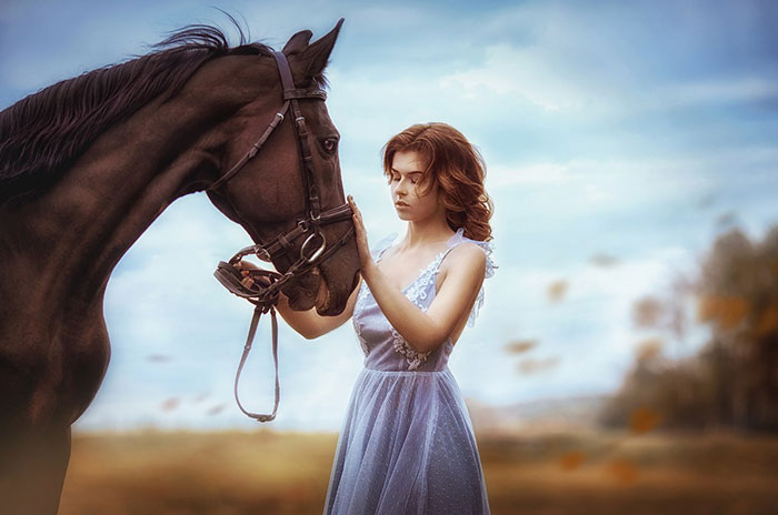
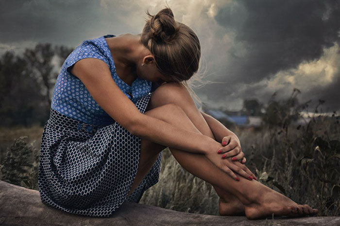
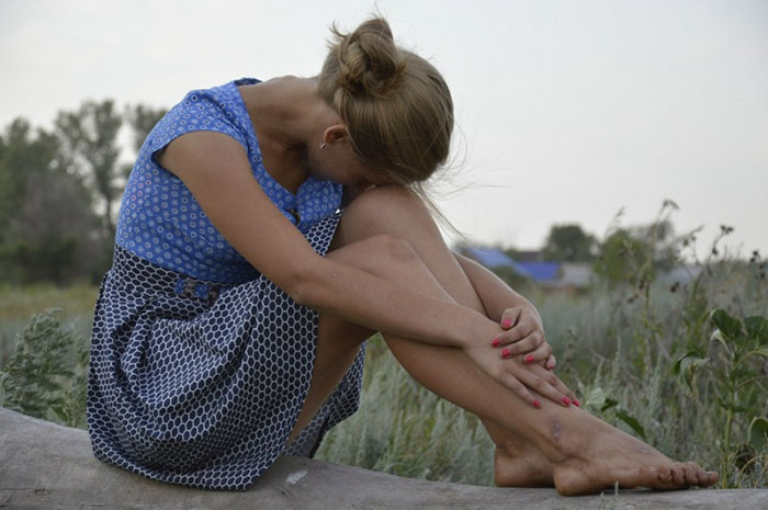
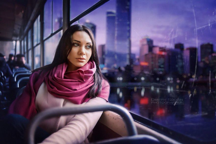
The tone and ambient light definitely needs to be adjusted on the woman to make this look believable.
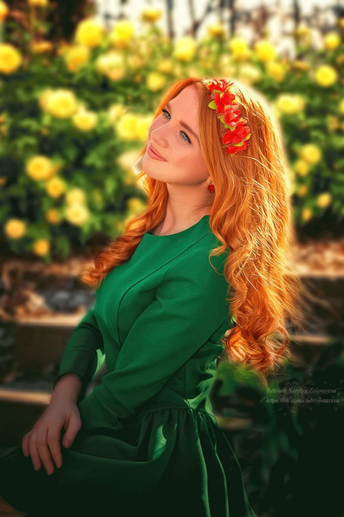
Odd that they made most of the greens more vibrant, but then changed the greenish brown water (a normal color), to a nastier-looking brown.
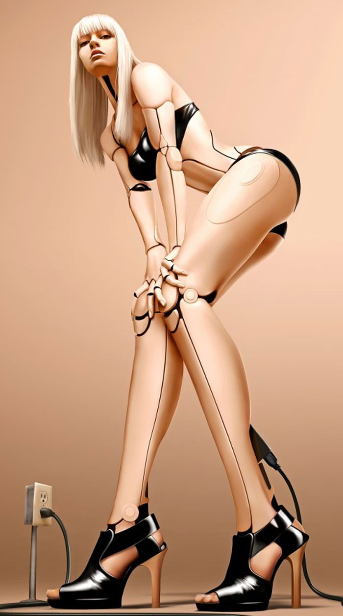
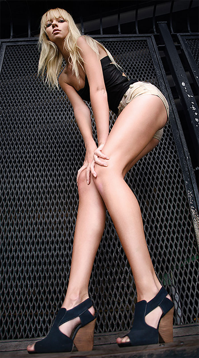
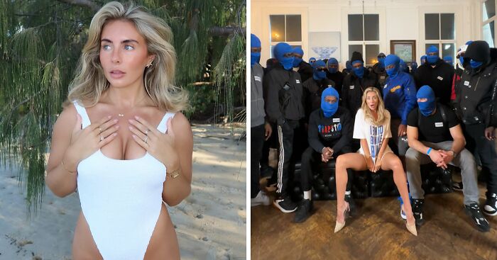
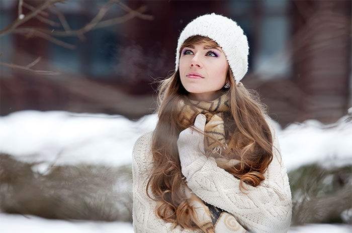
Even as a machine is preferred that you have larger breasts and slimmer waist
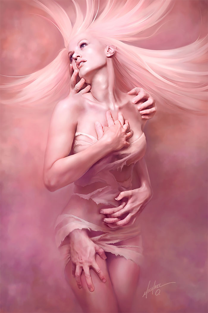
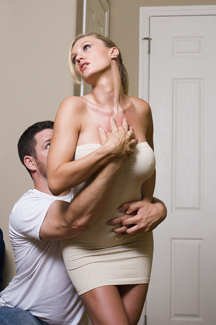
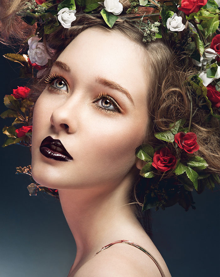
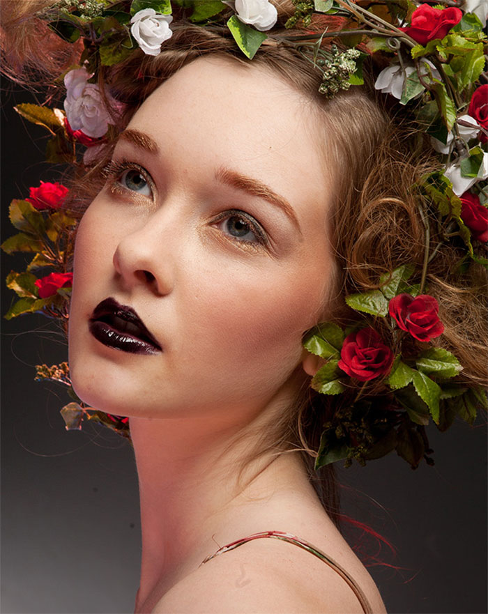
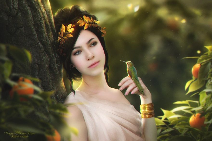
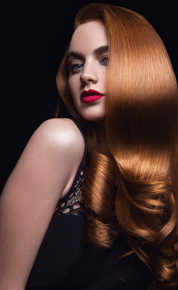
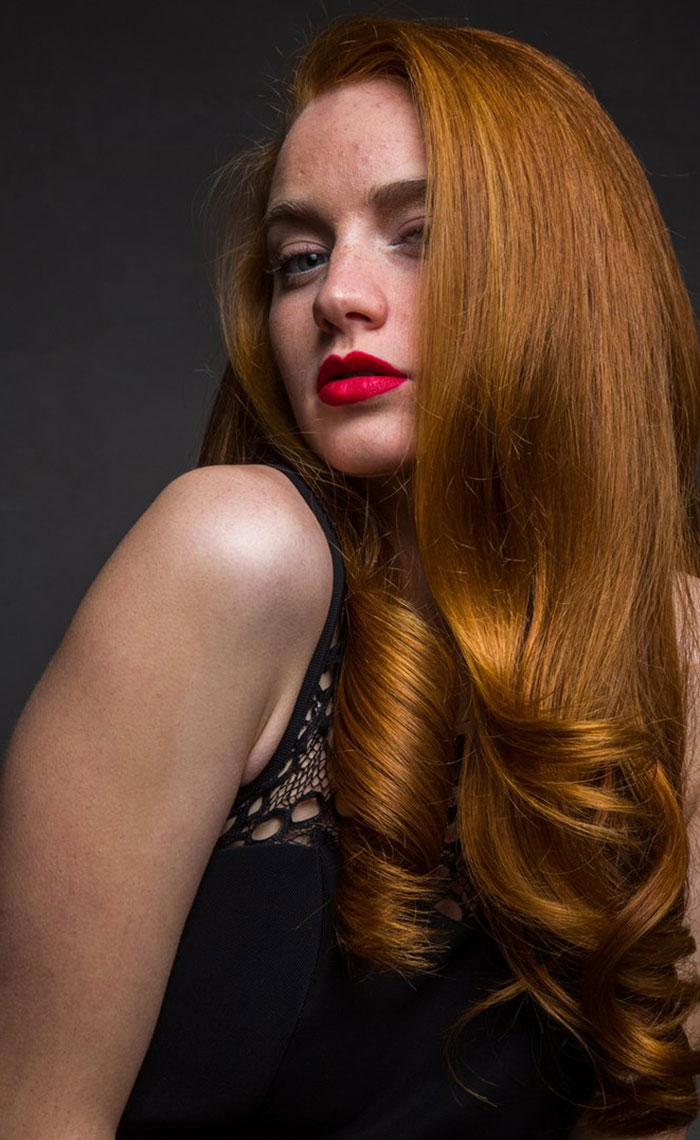
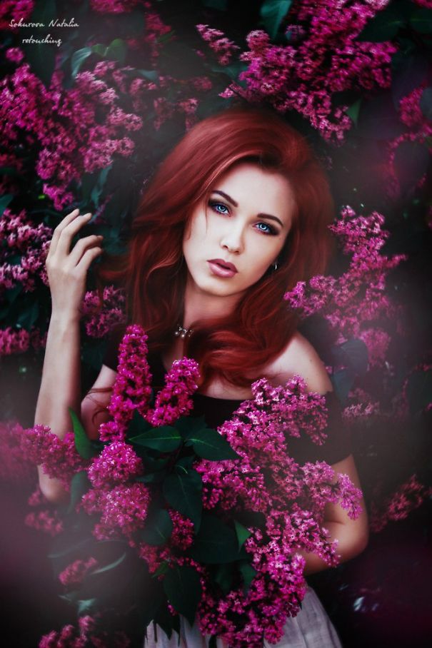
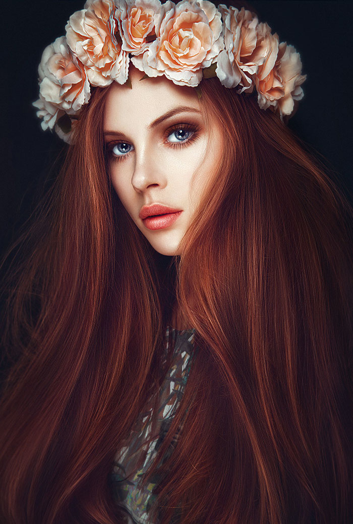
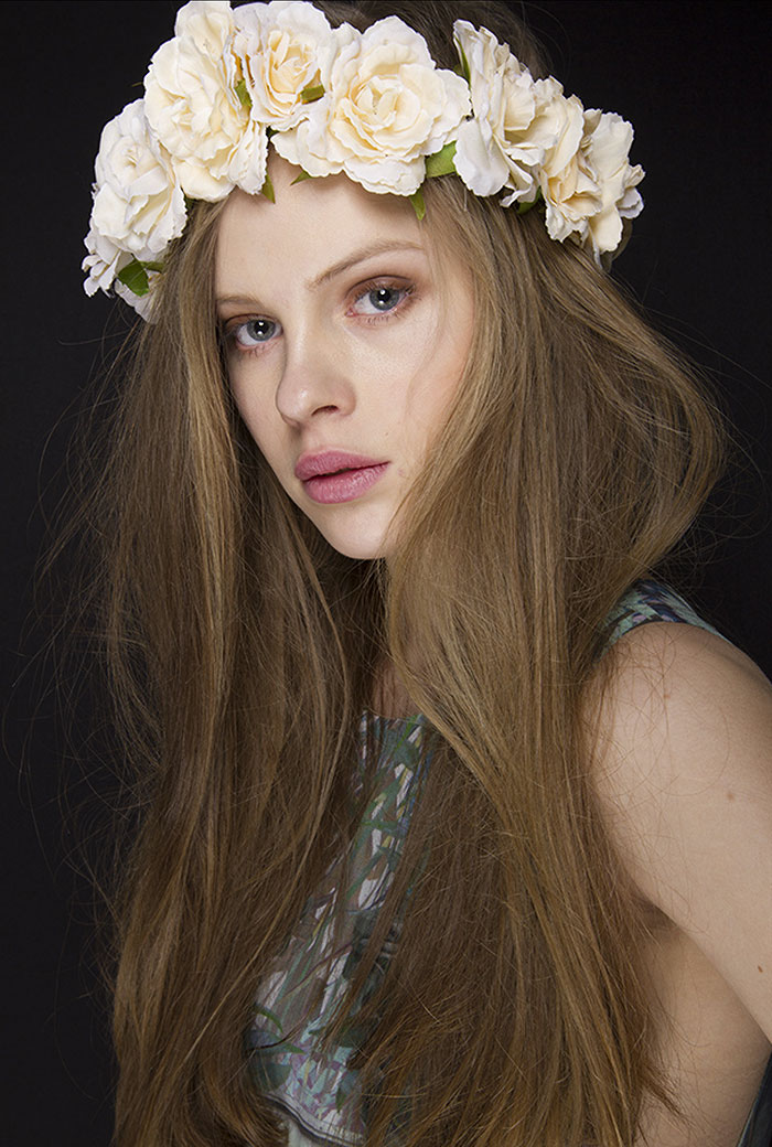
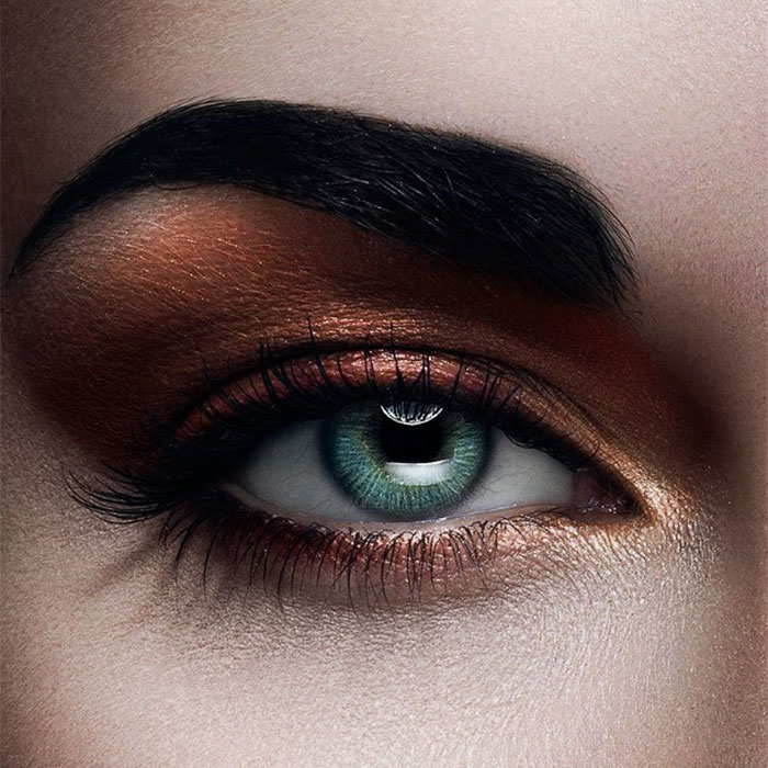
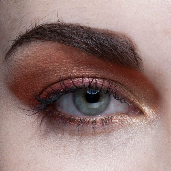
The eyes are Windows to the soul, and everyone's eyes are beautifully unique. I prefer her eyes natural. Otherwise beautiful!
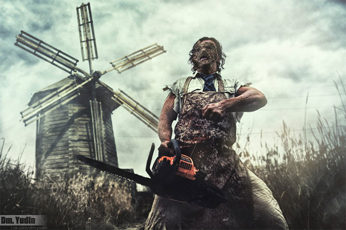
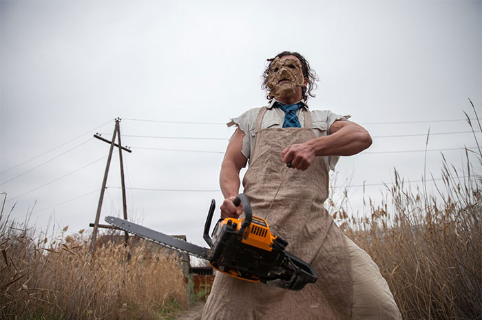
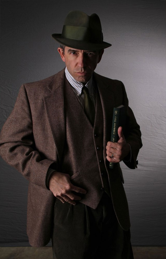
He forged on, thinking about the words he'd heard that night. "One does not simply walk into Mordor." Well, he'd done it anyway, and he was nearly there. It was only afterward that he realized he'd brought his Rubik's cube and left the Ring back in Rivendell. Dammit. He'd have to go back and start over.
The unedited photo was already perfect. The edit makes it look fake... I don't even understand why was it necessary...
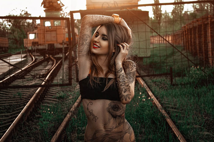
All tattoo parlours should have such features to help with decision making, ha!
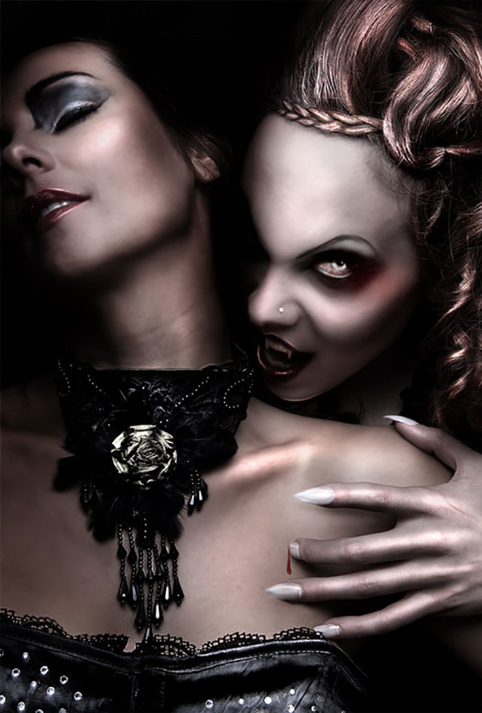
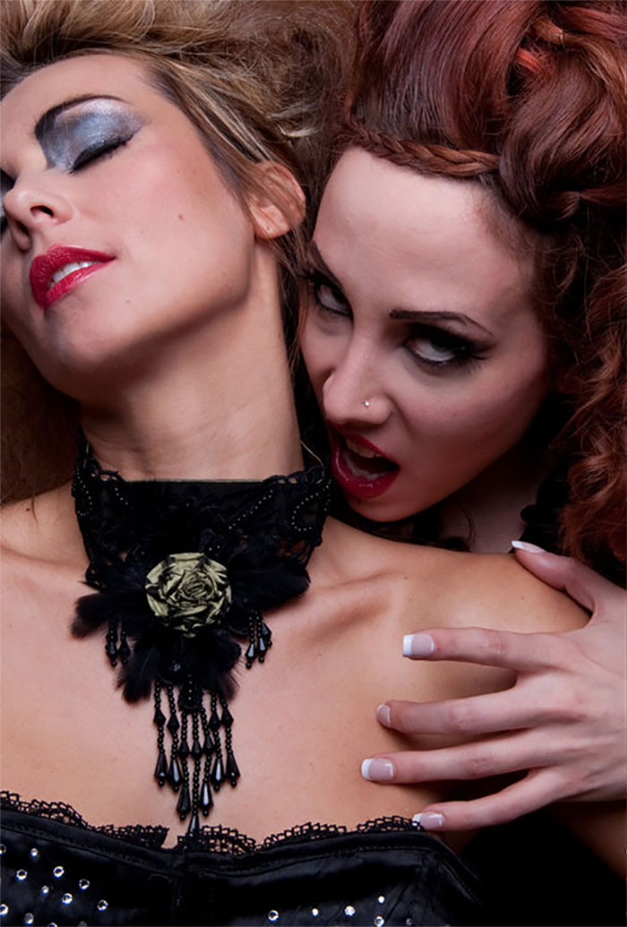
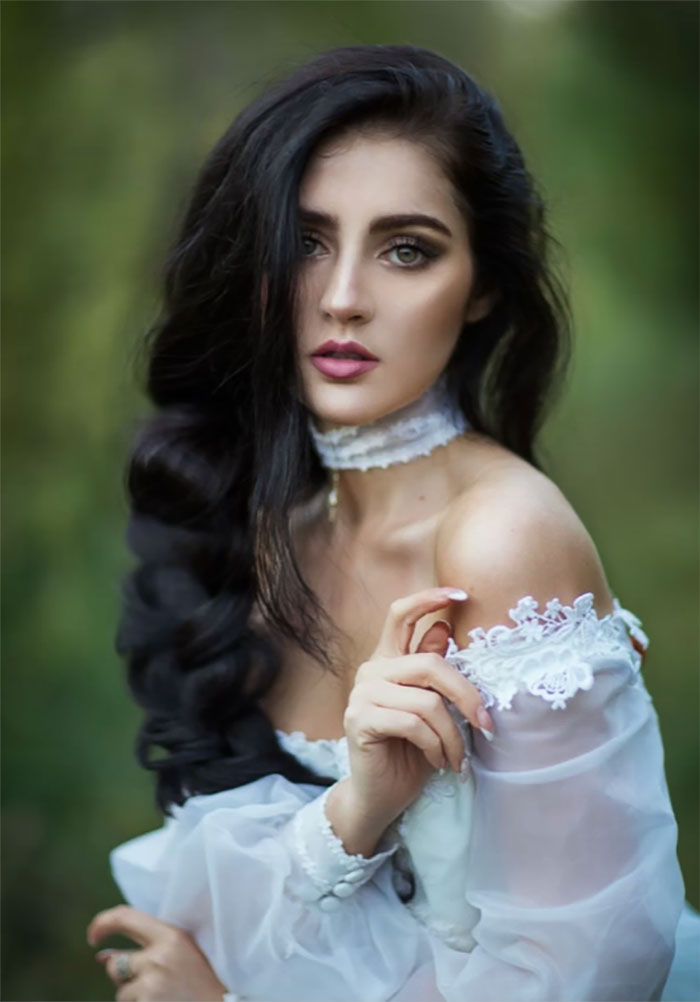
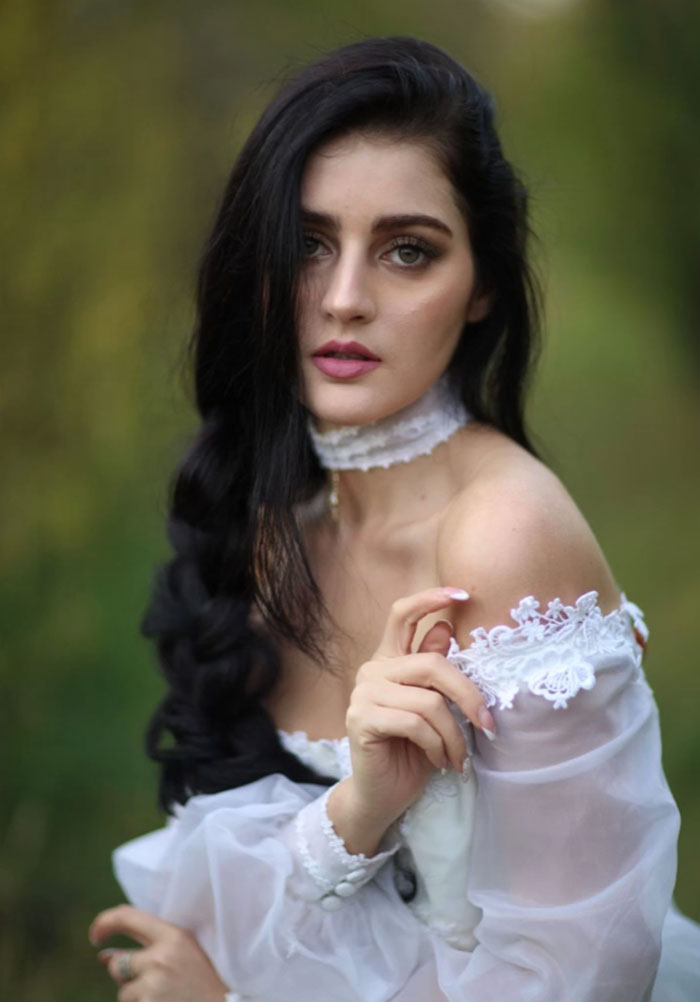
Wtf did they do to her beautiful neck??!! It looks awefully uncomftable in the eddited version!!!
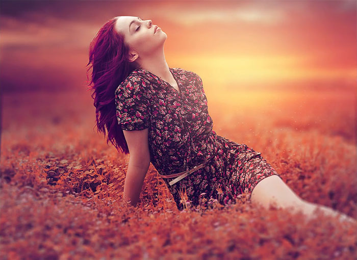
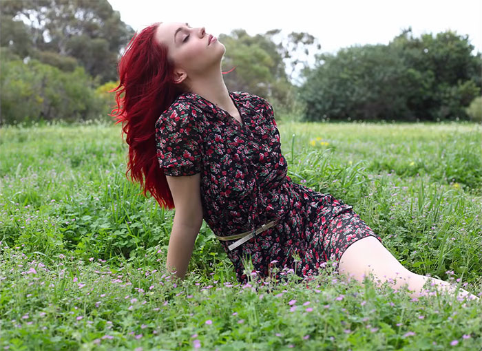
The original one is too beautiful... How could they ruin it with such harsh colors?
What? no ridiculous waist reduction and super boob enhancement? Pfft! amateurs!
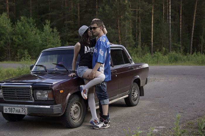
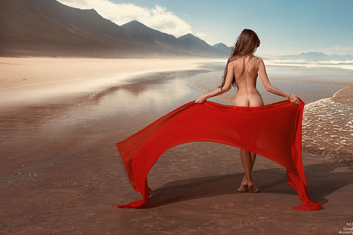
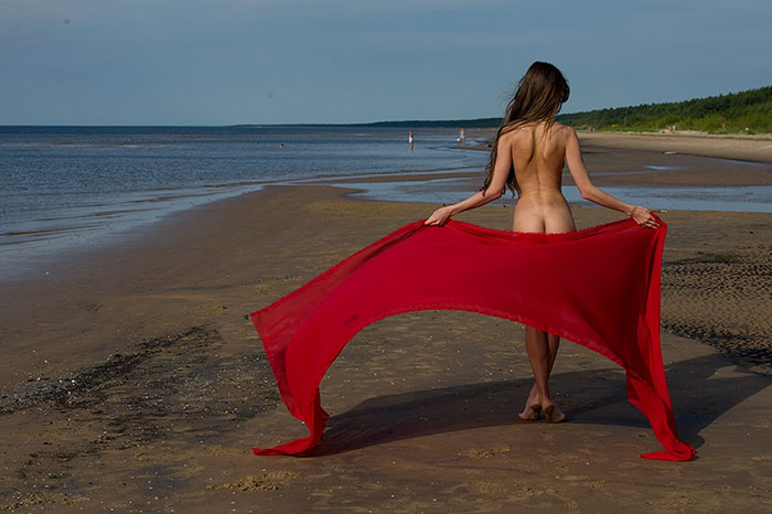
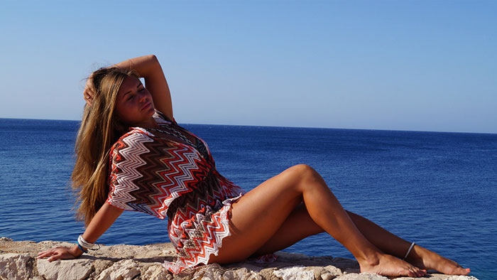
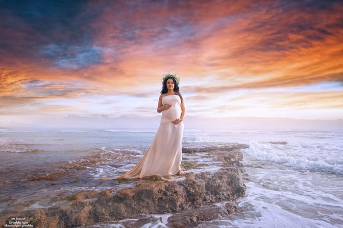
The first on is sooo much better. It has people and the second one they took away her tan lines why? It's part of beauty.
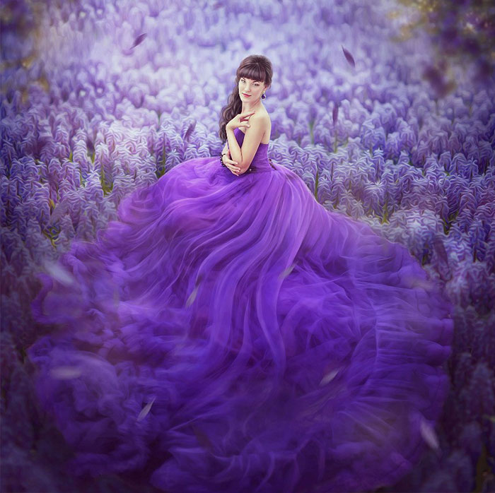
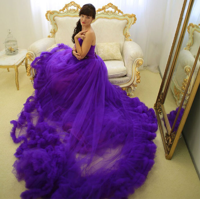
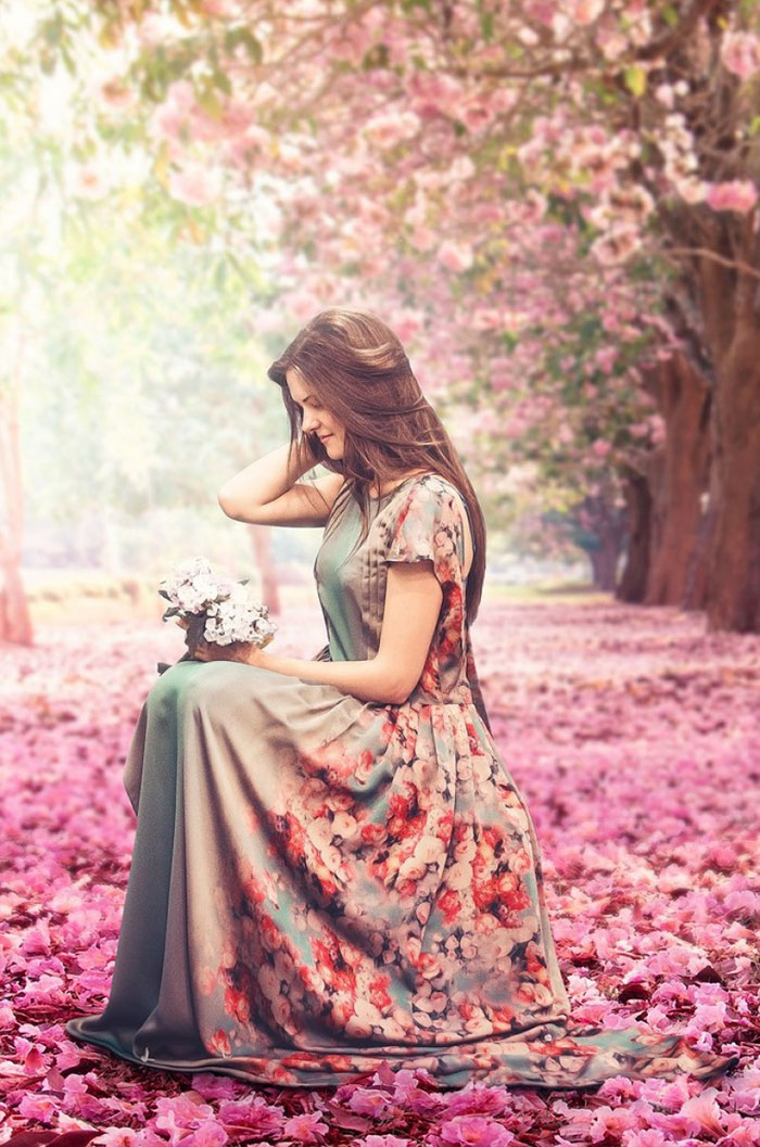
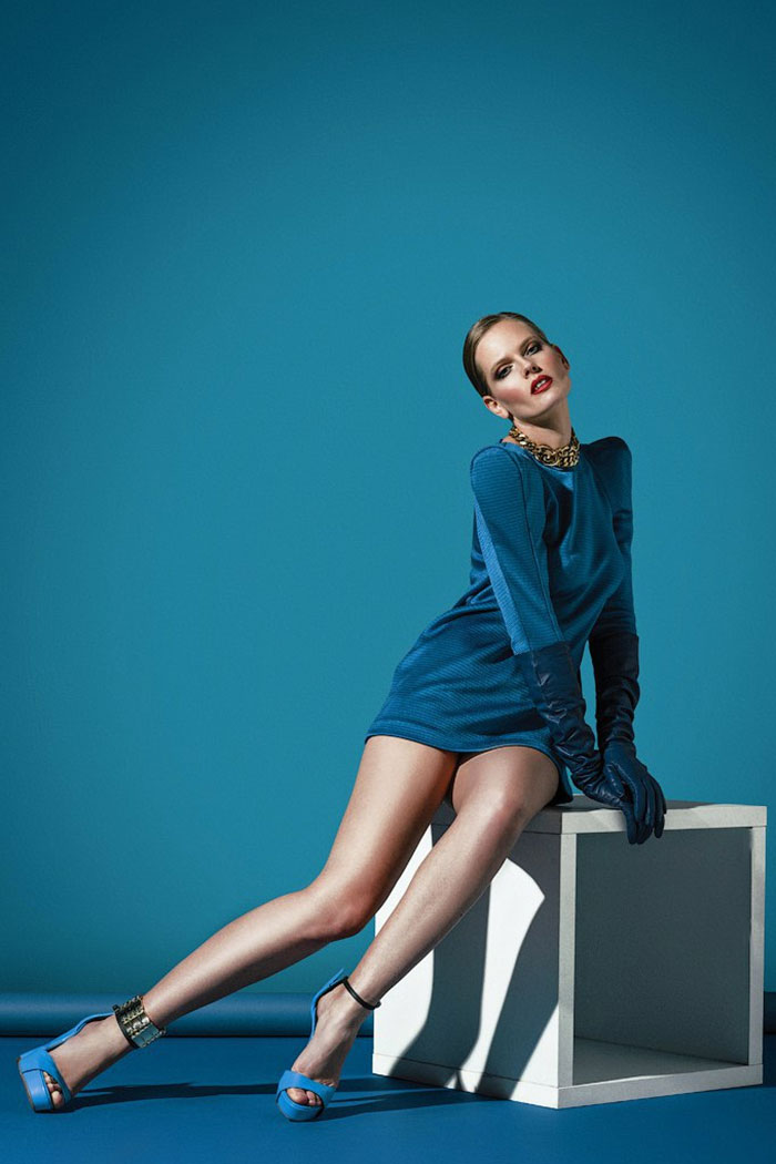
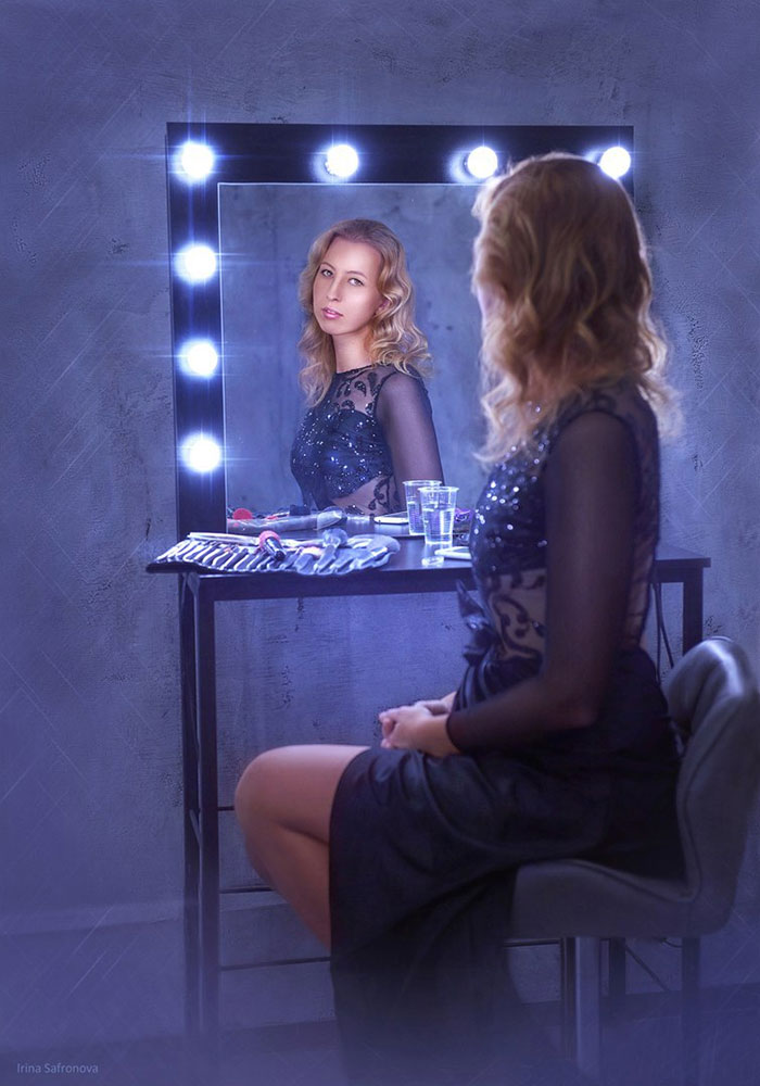
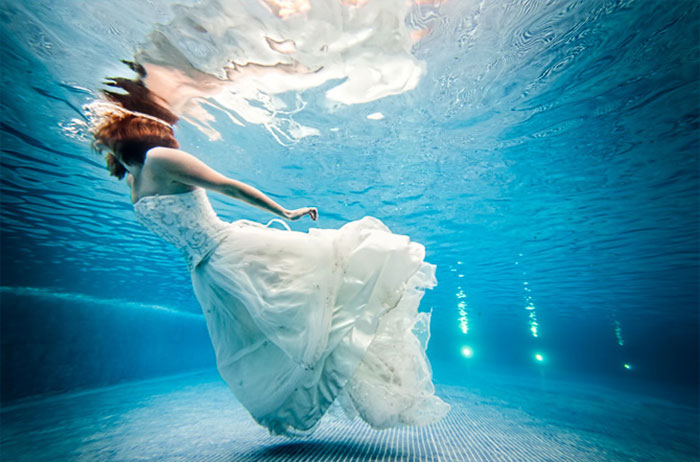
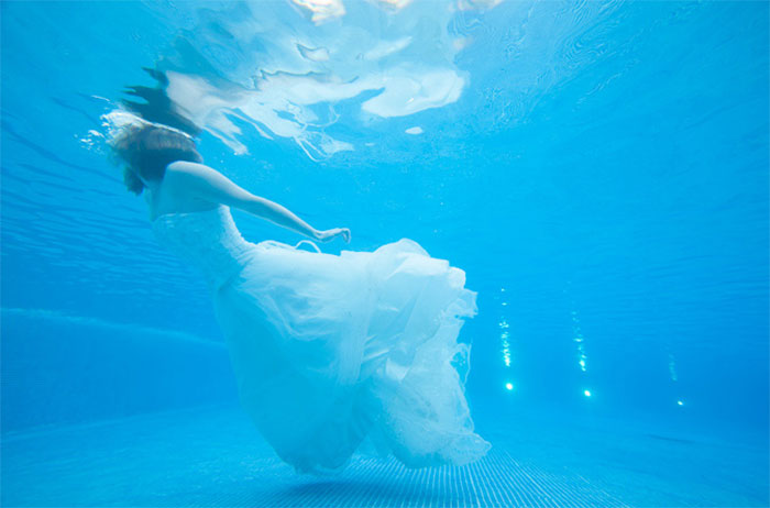
They have edited the dress in the reflection to provide more coverage under her breasts and now it doesn't match the dress in the foreground.
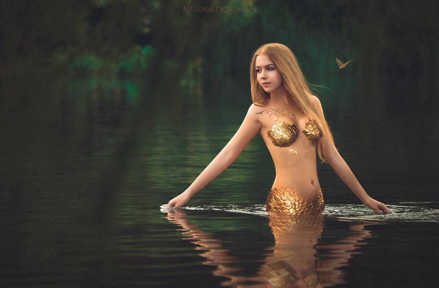
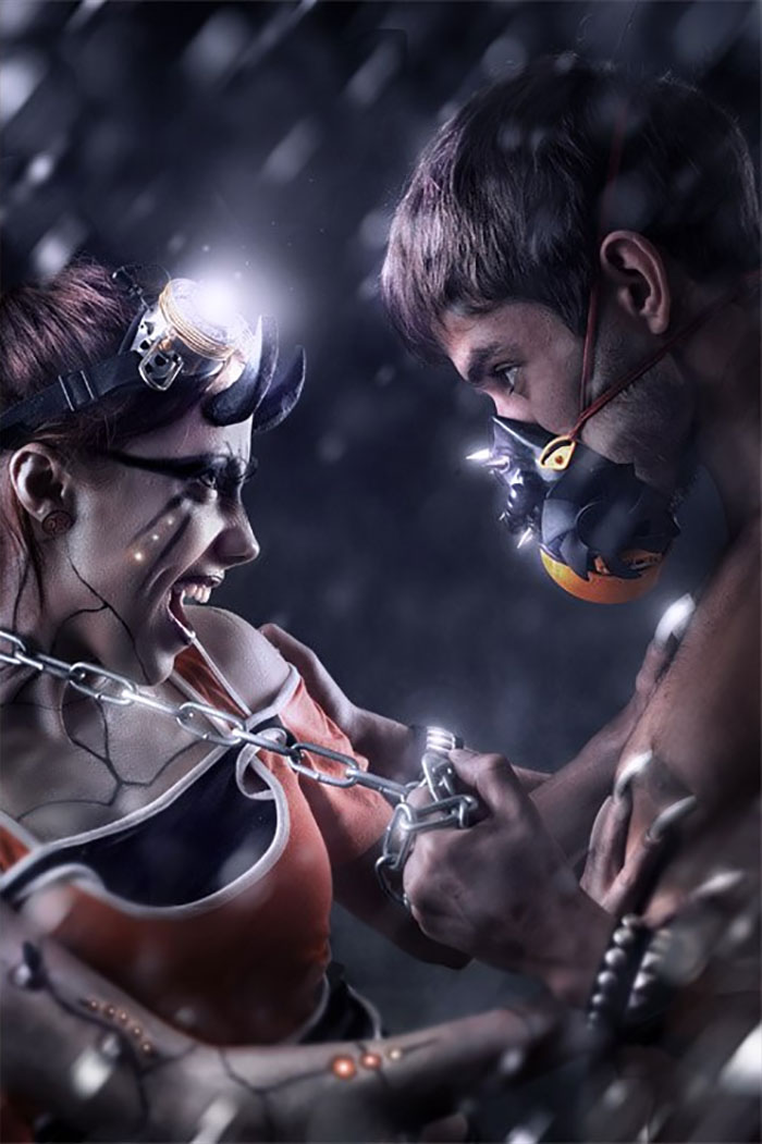
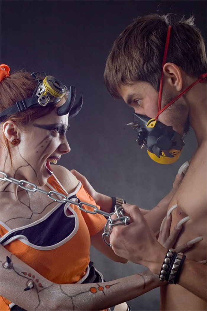
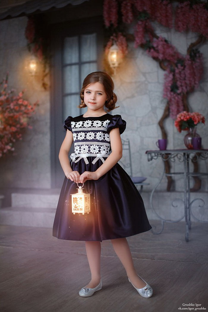
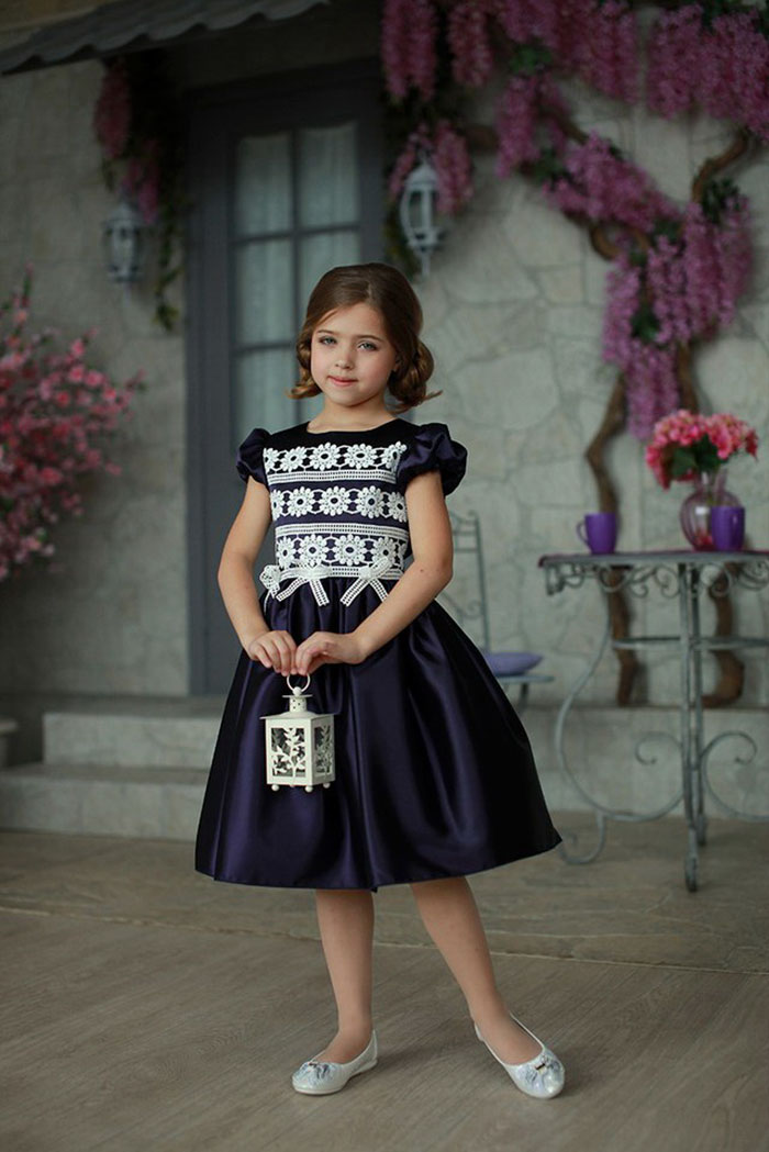
i'm sorry - but that looks like a child porn "commercial" :( couldn't you cover that poor girl's cheest a little bit?
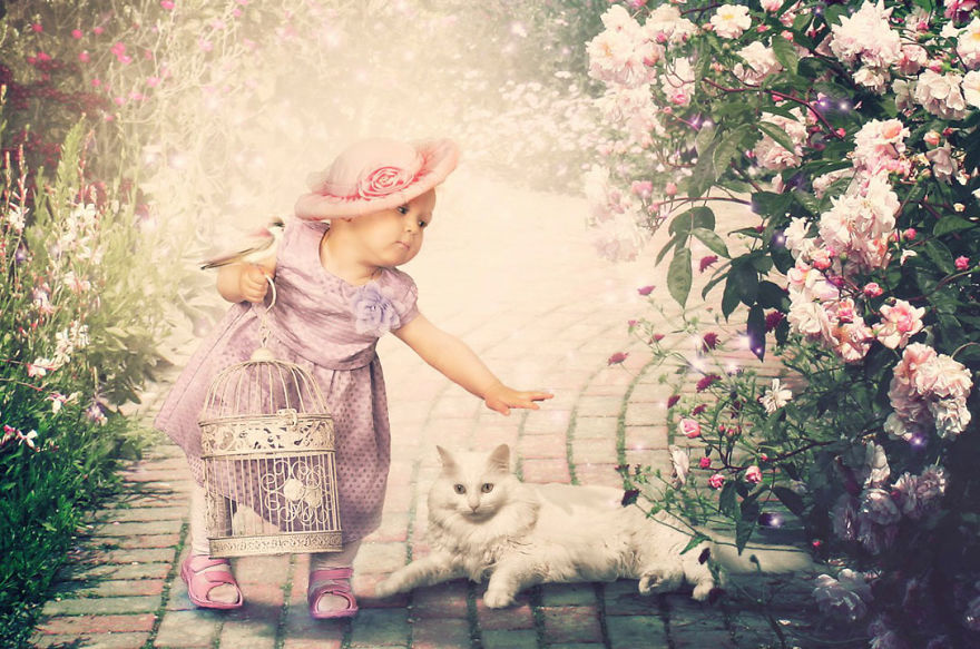
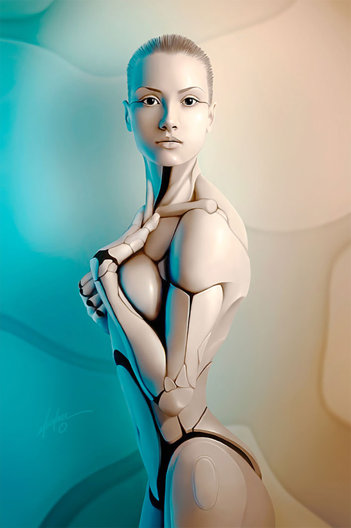
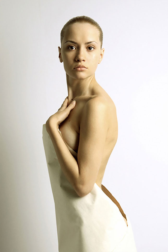
From a nice, pretty girl to a creepy doll in no time! Photoshop - not even once.
I'm torn. It's both very well done and absolutely horrifying (I'm neither a fan of dolls or babies). Clearly the porcelain-robot-child in the modified version is not looking at the cat we are being told to believe he/she is reaching out toward. The porcelain-robot-cat-statue appears to be similarly oblivious to its environment and the other entity next to it. The color matching seems pretty darn good though, except for the blown out solid whites in the background center. Hat isn't shadowing the head enough. Should be enough light occlusion to be as dark or darker than the underside of child's chin area and dress folds.
Now you know why there is a saying "believe half of what you see . . . ."
This is an interesting series, even though I do not find all pictures likewise enjoyable. My perception is that there are three kinds of pictures: 1) Fairytale-like alterings of surroundins that do not touch the picture's subject much. Most of them are very nice. 2) Transformations of the main subject. Many of them are over the top...in particularly, I do not get it while women almost always need to get artificial makeup and breast enlargements. 3) Post-productions that alter the meaning of a picture...some of them are inspirational, other seem unnecessary for the orignal was very nice already. Leasson learned? If you can, you should not always do...
FOR ALL THE SOFA-SIDE ARTISTS CRITICIZING EVERY PIECE: Has it ever occurred to you that the client asked for specific alterations/appearance? I see so many people nitpicking the appearance of these but, in the end, every artist knows the client will only pay for what THEY want.
People have been retouching images ever since cameras were invented, they just did it the slow way by hand by using double exposures, colouring over negatives to change the image that got developed, that sort of thing. And before then, everything was painted or hand drawn and often then copied onto blocks by carving so that the images could be printed. So much artistic license. There never really was a time where you could totally trust what was being depicted as being realistic. Even without retouching an image, simply shifting the position of the light source can totally change how the resulting image looks. Same with taking the photo from different angles. And then there is the whole science behind photos not looking identical to what the eye sees anyway because we often don’t see every blemish on a person’s face when we look at them. Our brains “photoshop” what we see for us!
I'm sad to see the majority of commenters completely missing the point of this gallery. I see it as a wonderful collection of pieces where you can really see the skill of each artist and the amount of work that they have put into it. These comparisons show how much they saw in an image that was, to some, devoid of all the magic and appeal. Instead, I see many individuals offended by reality augmentation, especially when portraits are concerned. I'm glad that you're fighting for body positivity and I'm always ready to join in for that, but you have to understand: this is art, not a Victoria's Secret catalogue. It's not meant to push beauty standards on anyone, it's created to take us to a different, magical and enchanting place for at least a second.
Not a single edited image looks real. They all look like Disney animation.
I am also a Photoshop expert. I can make your Photo same as shown in the slides. FREE OF COST. If you are intrested to editing your image. Mail your HQ photo to taranjeetsandhu78777@gmail.com
This is a hard one because Its true that lots of photos are photoshopped but just because a picture is beautiful or amazing we shouldn't assume that its edited. Lots of artist put a lot of work into there photos just to have people assume it photoshopped.
Very good drawing, I like your style! I recommend you fixthephoto.com which also makes professional digital drawing: sketches, comics, paintings, etc. Especially like them digital manipulations: the cat girl, Thor’s girlfriend and flying little girl. Look at them at site fixthephoto.com
I just love them, but a little less work at the bodies would be fine also.
Most of the comments on these photos make no sense at all. Almost all of the photos have been enhanced to make some magical or surreal setting and everyone is commenting on how they don't look as natural as the original. It's scary to see how many people are so oblivious that they can't see the intent of adding dramatic lighting or a fantastical background. And it's sad to see so many people miss the point of all this beautiful Photoshop work. I find it hard to believe that none of these people have ever wanted to replace their background with some place magical or change their hair into something surreal.
It's art. Just like painters interpret what they see, some photographers do the same with photos.
I would be curious to know how many of those with harsh critiques have actually used photoshop themselves, or are just bashing something they know very little about. As someone stated, often you do what the clients specify. If you had every tried to accomplish anything half as complicated as what is shown here, you would know that this is far beyond being lazy or uncreative. Most of what you see in movies and videos now is CG - computer generated - and that has stemmed from the processes first put forth by the use of photoshop. I have found that those who criticize most harshly don't know the first thing about how to use photoshop.
Lots of them are extremely creative, dreamy and show a great skill and impressive imagination. Some are like "Yeah, the lady is fine but you know what we should do? Turbobreast, needlewaist, bigasshair, and lets just make her face a little plastic, who needs all the natural creases eitherway, AMIRITE?"


 No fees, cancel anytime


")
")