182Kviews
29 People Who Realized Famous Logos Are Not What They Always Thought They Were
Logos—they’re the concentrated sweat and tears of brilliant artists crafting away to create the ‘perfect’ image representing their client’s brand. After hours and days of toil, deleted drafts, and angry coffee breaks, the final version’s ready. It’s being rolled out worldwide… and that’s when thousands of people report seeing a completely different image than they intended.
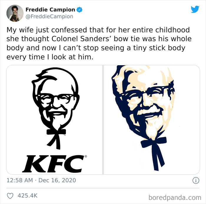
When Headspace content director Freddie Campion shared how his wife had thought that Colonel Sanders had a stick body instead of a bowtie in the KFC logo, other Twitter users pitched in with their own hilarious misinterpretations of well-known logos. Check ‘em out below and upvote your fave tweets, dear Pandas. Just don’t say we didn’t warn you—you’ll have a hard time unseeing these! Be sure to share your own misunderstood logo moments in the comments.
This isn’t the first time that Bored Panda has written about people misinterpreting the KFC logo and the stick body now being seared into our minds for a long, long time. I’d forgotten all about it a few months after learning the truth, but Freddie brought everything back. And I knew just who to talk to about all of this. Curious? Read on!
This post may include affiliate links.


I never noticed it until I watched a video on hidden things in logos.
Bored Panda spoke about Freddie’s thread with comedy writer, author, and musical comedian Ariane Sherine, who had previously gone viral for her tweet about her friend misinterpreting the KFC logo as well. Twitter users brought Freddie’s thread to her attention as well.
I was incredibly curious to find out whether Freddie’s wife was Ariane’s friend. It sounded like too much of a coincidence. Maybe this was a sign from the Universe? Alas! Ariane confirmed to Bored Panda that there’s no connection between her friend and Freddie.
“They’re clearly kindred spirits though! I should hook them up (though Freddie’s wife might not like that much!),” Ariane joked.


I wanted to find out the best way to make myself forget that Colonel Sanders looks like he has a stick body and Ariane made my day with her quips. “Why try to unsee the stick body? Just accept it. Colonel Sanders is like a stick because he doesn’t eat his own products! That is not the body of a man who has eaten much fried chicken,” she shared.
Unfortunately, acceptance seems like the only path forward, dear Readers. Hopefully, we’ll forget all about stick-Sanders over the next few months… until someone else makes a viral thread about the logo. With Freddie’s thread having gotten over 425k likes, KFC couldn’t ask for better exposure.
According to Comedian Ariane, logo designers can try and minimize the chances of their illustrations being misinterpreted by running them past as many people as possible. The bigger the pool, the bigger the chance of spotting that something’s off. However, Ariane hopes they don’t do that because then there’d be no hilarious misunderstandings.


Just in case anyone is curious, the Chinese symbols for New York are 纽约


Bad news everyone... it is actually "ELB". It stands for "Expos Lance-Balle" which is "Expos Baseball" in French. Also, the reason they call the Montreal Canadiens "Habs" is short for "Habitants", which is why you have the "H" in the middle of the logo.
No...that’s not correct. It’s EB for Expos Baseball that forms a stylized M for Montreal. A simple google search confirms that.
Load More Replies...for those that don't know the logo (like me) and yes i also read elb first and than saw the M 1200px-Mon...ab-png.jpg 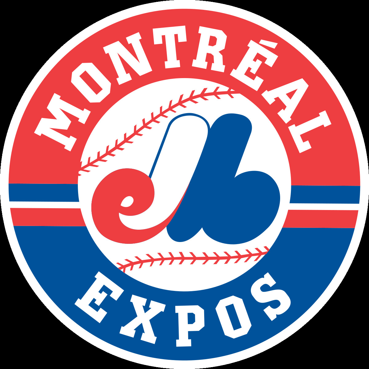
Actually it *is* an e and a b, for "expos baseball", combined and stylized for form a capital M for Montreal.
Montreal Expos Baseball, little red “e”, little blue “b”, and the whole thing is an “M”
Thank you! Now I can see the M! That logo sucks.
Load More Replies...I thought it was 2 penises and balls - one red and white with a blue line round the outside, the other one just blue ......
that's a really dreadful logo, you can't tell WHAT it says ! I too thought el
That's an "M"? They mangled it for no reason because it doesn't contain any baseball elements.
dude, i'm canadian and i just figured this out,i'm almost 50, i always thought it was ELB Lol
E is for Expo. J is for Jarry, the park where they used to play, b for baseball. All stuck together, it makes an M for Montréal.
I'm a French speaking Quebecer and never understood that logo until now. Thank you.
I didn't know the logo at all, I'm dutch and should never thought of the letter 'M' when I see this. "It's bad designed" as Mojones said.
I still see just the elb... oh! Montreal Expos! I got it... horrible design.
All I can see is elb.... ooooh! Montreal Expos. Got it. Horrible Design.
That's an 'm'? The designer, the agency and the client should have been fired.
Same here. But since I speak French I thought "elb" was some sort of acronym.
I always saw it as the M for Montreal, the red e for Expos and the blue b for baseball... still a bad design tho...
I always saw elb, also. I was today years old when I found out that it isn't. I also didn't associate it with Montreal. I had no idea what it was.
Me too. Me too.... the ELB. I thought it was some Canadian version of the MLB ???
Actually it *is* an e and a b, for "expos baseball", combined and stylized to form an M for Montreal.
My family is a from Montreal. Lemme tell ya, the day that the Expos ceased to exist was a sad day in my house. My dad literally cried.
Today was when I learned it is an 'M' and not ELB.... I am not young by any means...


I saw the mask face immediately. It took me longer to see the, um, other thing.


Wow, that's such a great design! I saw both the letters & the picture straight away. It's simple & to the point but unique enough to be memorable. Sorry, as someone with a graphic design passion I'm geeking out over this! It's genius!


Yes, because it's healthy to drink water after a good game of soccer.


Until Thanksgiving this year, I thought the NBC logo was a sunrise, but no! It's a peacock, to represent when they brought in colored television. That's why a little triangle (that I swear was NEVER there before) is out of the side of the purple thing. Needless to say, I was in shock for the rest of the week.
I laughed so hard when one idiot complained that NBC had changed its logo to have a rainbow in it in honour of gay pride and why couldn't they just shut up about politics, etc etc. Some people really aren't good at paying attention...
Load More Replies...The Canterbury clothing company logo is weird. I always saw the three 'c's, my friend always saw the three kiwis (then we realised it's both!)
