Get Premium
Dark mode theme is available exclusively for premium users. Learn more about the benefits of subscribing.
No fees, cancel anytime.

 Dark Mode Ad-Free Browsing Unlimited Content
 Ad-Free Browsing Unlimited Content Dark Mode
Join 1.2 million Panda readers who get the best art, memes, and fun stories every week!
15submissions
Finished
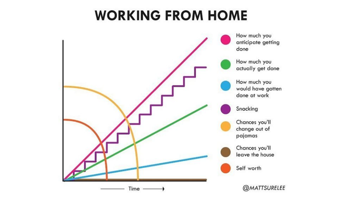
An insane amount of information bombards us every day. We've gotten kinda used to it, but our attention spans have suffered. The coronavirus has surely escalated it all, and we’re now blindly navigating the labyrinth of facts and fiction. Do we really need to know, like, every-thing?
This guy named Matt Shirley has a playful solution. Every day, he shares a snack-sized bite of infographics that perfectly summarizes the current situation. No matter the quarantine activity—binge-watching "Tiger King" or working from home, the graphs have it all summed up. It may feel a tiny bit too relatable, but in the end, we’re all just a part of Matt’s hilarious statistics.
After you’re done with this article, take a look at Bored Panda’s previous posts featuring Shirley’s charts from the times it was all a little less hectic. Here is part 1 and here waits part 2.
More info: Instagram | MattShirleyCharts.com | Facebook | Twitter | Patreon
Discover more in Guy Makes Honest And Funny Charts That Sum Up Our Lives And Here Are 30 Of The Best (New Pics)
Click here & follow us for more lists, facts, and stories.
This post may include affiliate links.
Bored Panda contacted Matt Shirley and asked the pro graph designer how the coronavirus has affected his chart art.
Matt told us that the current crisis has definitely altered his daily routine. “I was a freelancer and worked from home before crisis, but very little of my work was done at home and mostly in coffee shops around town.” Now that these have been shut down, Matt had to transition to not leaving his house. “It has put a damper on my social skills for sure. Plus, I miss getting coffee and having a place for work that’s not home.”
Matt’s graph art is what has earned him a solid fan base of 357K Instagram followers. The fact that people can instantly relate to Matt's charts is what has made them so popular on the internet. He believes that his ability to make things relatable goes back to childhood. “I had an intense desire to make people like me. So I really thought about what I did from other people's perspectives.” It might be “not a great thing for my mental health,” explained Matt, “but handy when you’re trying to come up with topics that people find interesting.”
Since coronavirus is pretty much the only thing people talk and think about, the topics of the jokes have to reflect that. “I've definitely tried to make jokes on other topics but people aren't in that headspace right now, which I understand completely,” said Matt.
The process of drawing a graph looks simple. Matt goes through iterations of what he thinks is funny and starts from there. Even if what people find funny is pretty subjective, the graph designer is sure that if it “makes me laugh, I like to think that others will laugh too.” And yes, he is still always trying to make a graph per day!


 No fees, cancel anytime


")
")


