ADVERTISEMENT

Even if you have a wealth of information, it can be of little to no use when it’s presented in a complex way. Spreadsheets with what seem to be never-ending numbers and formulas are often overwhelming and off-putting, which lowers the chances of anyone engaging or delving deeper into them. But if we dress up data in clever and beautiful charts, they instantly become inviting and impossible to ignore. 

It’s a true art form to display information in a way that is clear and understandable, so we’re celebrating it by sharing charts that are both fascinating and stunning in hopes that they encourage you, our dear Pandas, to learn something new today. Scroll down to see them for yourself, and don’t forget to upvote the ones you found the most interesting!

#1

France Lighthouse Map

Map of France at night showing locations of lighthouses illuminated as part of informative charts about parts of the world.

sand_1011 Report

RELATED:
    #2

    Never Noticed Giraffes Had Different Patterns

    Map of Africa showing regional giraffe patterns with color-coded chart examples of different giraffe coat markings.

    knowledgechop Report

    TotallyNOTAFox
    Community Member
    3 months ago (edited) Created by potrace 1.15, written by Peter Selinger 2001-2017

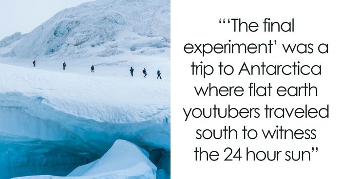
    Saw a news segment a few days ago - There are four different kinds of giraffes and they have variations like bears do (Brown bear, black bear etc.)

    View more comments
    #3

    A Cool Guide To The Most Reliable Car Brands

    Chart showing the most reliable car brands in 2023 with reliability scores from Consumer Reports data.

    Kayla Zhu Report

    Yrral Spavit
    Community Member
    3 months ago Created by potrace 1.15, written by Peter Selinger 2001-2017

    I have avoided American cars for years. The pic shows why.

    View more comments

    Visualizing information, that is, turning it into charts, graphs, maps, etc., is an important skill to have for anyone nowadays, as it can be used in many contexts and fields. 

    “Knowing how to develop and deliver a data-driven presentation is now a crucial skill for many professionals, since we often have to tell our colleagues stories that are much more compelling when they’re backed by numbers,” agrees researcher and consultant Alexandra Samuel.

    ADVERTISEMENT

    Almost any professional can make use of visual aids to understand data better themselves or make it more accessible to the general public or audience that doesn’t have the technical knowledge required to process it.

    #4

    The Most Expensive Healthcare Systems In The World

    Bar chart showing per-capita health expenditure in selected countries, highlighting the most expensive healthcare worldwide.

    knowledgechop Report

    Nathaniel He/Him Cis-Het
    Community Member
    3 months ago (edited) Created by potrace 1.15, written by Peter Selinger 2001-2017

    Tell me US residents why a national healthcare system would not work despite offering healthcare for everyone and being cheaper than the current system you have?

    View more comments
    #5

    A Cool Guide To The Wurst Of Germany

    Map of Germany showing different types of sausages with ratings, highlighting parts of the world and cultural food charts.

    SteveJB313 Report

    #6

    By Using This Form Of Transportation, We Can Protect The Environment, Improve Air Quality, And Reduce The Damage That Cars Cause In Cities

    Chart showing the world’s most bicycle-friendly cities ranked by weather, bike usage, safety, and infrastructure in 2022

    rankingroyals Report

    ocean todd
    Community Member
    Premium
    3 months ago Created by potrace 1.15, written by Peter Selinger 2001-2017

    Surprised US made the list! Barely.

    View more comments

    However, creating a clear presentation that visualizes data doesn’t just include putting a bar graph here and a pie chart there. That alone doesn’t guarantee a presentation that is easy to understand. To help professionals out, Harvard Business Review partnered with data and presentation experts to deliver a few pieces of advice on how to display your information like a pro. 

    ADVERTISEMENT
    #7

    Paris 2024 Achieves Gender Equality At The Olympics

    Chart showing the rising percentage of female athletes at the Olympics, highlighting gender equality progress in global sports.

    Pallavi Rao Report

    Steve
    Community Member
    3 months ago Created by potrace 1.15, written by Peter Selinger 2001-2017

    Go rapist! There, I fixed it for you, Jason Boyd.

    View more comments
    #8

    The Percentage Of Homes With Air Conditioning Across The World

    World map showing the percentage of homes with air conditioning across various countries and regions.

    Individual-Sun-9426 Report

    Ellinor she/they/elle
    Community Member
    3 months ago Created by potrace 1.15, written by Peter Selinger 2001-2017

    Not gonna lie, I live in the South of France and the 40°C weather made me SERIOUSLY consider buying AC.

    View more comments
    ADVERTISEMENT
    #9

    Number Of US Households That Own A Pet

    Bar chart showing number of U.S. households with pets like dogs, cats, birds, fish, reptiles, and small animals.

    zwei4 Report

    #10

    What Would You Add To The List?

    Timeline chart showing key moments that shaped the internet with dates and milestones in technology and communication.

    engineers_feed Report

    ADVERTISEMENT

    The first tip they give is to make sure that your data can be seen. Sometimes what is readable on your laptop might not translate the same way when projected on a screen. Your audience won’t be interested or learn something they can’t see. So try to rehearse the presentation with someone seated from the screen as far away as the actual audience.

    #11

    How People Move In America, Europe, And Asia During Weekday Trips

    Chart showing modal share percentages of how people get around by cars, public transport, and walking/biking in parts of the world.

    Pallavi Rao Report

    Cee Cee
    Community Member
    3 months ago (edited) Created by potrace 1.15, written by Peter Selinger 2001-2017

    Public transport has been decimated where I live. Used to have 6 buses an hour covering 2 routes. Now one bus an hour covering one route. Don't cycle anymore, too knackered. So car it is for shopping and getting dogs out to local dog walking spots.

    View more comments
    #12

    How Many Europeans Born Before World War 1 Are Still Alive?

    Map showing how many Europeans born before World War 1 are still alive, with data by country in an informative parts of the world chart.

    Mackelowsky Report

    Ivy la Sangrienta
    Community Member
    3 months ago Created by potrace 1.15, written by Peter Selinger 2001-2017

    D**n, Italy and France are doing something right. The diet maybe?

    View more comments
    #13

    Forests Are Essential Habitats For A Wide Range Of Plant And Animal Species

    Chart showing countries with the largest forests by forest area percentage of the world's forests in 2023.

    rankingroyals Report

    PeepPeep the duck
    Community Member
    3 months ago (edited) Created by potrace 1.15, written by Peter Selinger 2001-2017

    I took my bf to a secret spot recently in the rainforest Gold Coast area. To see trees that are over 300-400 years old, we got so lucky and saw a female lyre bird (only saw boys as a kid growing up and haven’t seen one myself in 20yrs+) so amazing. Forgot how great the rainforest is. Best part, no one has been to the secret spot by looks of the place too 😂 total bear Grylls style activities

    View more comments
    ADVERTISEMENT

    The following recommendation is to focus on the points that your data illustrates. Don’t leave your audience to decode the data presented to them.

    “Data slides aren’t really about the data. They’re about the meaning of the data,” explains presentation design expert Nancy Duarte. “It’s up to you to make that meaning clear before you click away. Otherwise, the audience won’t process—let alone buy—your argument.”

    #14

    Countries Where Cheek Kissing Is A Customary Greeting

    World map chart highlighting countries where cheek kissing is a common greeting, showing cultural parts of the world.

    vladgrinch Report

    #15

    How Many Earths Would We Need If The Entire Global Population Lived Like One Country? Based On Each Country’s Ecological Footprint

    Chart showing the number of Earths needed to sustain resource use by countries, highlighting parts of the world.

    voronoiapp.com Report

    sbj
    Community Member
    3 months ago Created by potrace 1.15, written by Peter Selinger 2001-2017

    This chart doesn't surprise me at all

    View more comments
    #16

    Countries That Consume Most Fossil Fuel

    Bar chart showing top countries by fossil fuel consumption in 2023, including coal, natural gas, and oil usage.

    voronoiapp.com Report

    Power puff scientist
    Community Member
    3 months ago Created by potrace 1.15, written by Peter Selinger 2001-2017

    Would be nice to also have the per capita number. For example China at number 1 has four times more people than US at number 2 but less than double the fossil fuel usage.

    View more comments

    Similarly, experts discourage sharing too many details at once. Present one, and they stress only one major point from each chart you show. To ensure that happens, ask yourself, "What is the single most important thing that I want my audience to take away from the data presented?"  

    Data-presentation guru Scott Berinato says, “The impulse is to include everything you know, [but] busy charts communicate the idea that you’ve been just that—busy, as in: ‘Look at all the data I have and the work I’ve done.’”

    #17

    A Cool Guide To The Carbon Footprint Of Major Travel Methods

    Bar chart showing carbon footprint of major travel methods with grams of CO2 emissions per passenger over 1 km.

    Bruno Venditti Report

    Roxy222uk
    Community Member
    3 months ago Created by potrace 1.15, written by Peter Selinger 2001-2017

    I’m not 100% convinced that a cruise ship counts as a ‘travel method’ as its role is really a hotel that floats, and people usually end up back where they started.

    View more comments
    #18

    The World Divided Into 4 Equal Parts

    World map showing parts of the world divided into four equal parts by population of 2 billion people each.

    Bobsytheking1 Report

    Rich Black
    Community Member
    3 months ago Created by potrace 1.15, written by Peter Selinger 2001-2017

    birth control needed. or the return of the 1 child policy.

    #19

    The Countries With The Highest Percentage Of Male Hair Loss Are Mainly In The Western Region

    Chart showing countries with the highest male hair loss percentages around the world, part of informative charts about parts of the world.

    rankingroyals Report

    Khavrinen
    Community Member
    3 months ago Created by potrace 1.15, written by Peter Selinger 2001-2017

    Does this mean if I move to Indonesia my hair will come back?

    View more comments

    While crafting a chart, it’s also advised to clearly label its components. Having watched the visualization for a long time, everything might be clear to you, but the audience will look at it for mere seconds. In those seconds, they need to be able to understand the chart clearly. To achieve this, use simple, clear, and complete language to identify the X and Y axes, pie pieces, bars, and other elements included. Avoid abbreviations that might be confusing to others.

    #20

    Most Common 4 Digit Pin Numbers From An Analysis Of 3.4 Million. The Top 20 Constitute 27% Of All Pin Codes

    Heatmap chart showing most to least common 4-digit PIN numbers analyzed from global data breaches.

    infobeautiful Report

    #21

    Tree Cover Of European Capitals

    Chart showing urban tree cover percentages in European capitals with population over 50,000 in parts of the world.

    GodGivenBirthRight Report

    Francois
    Community Member
    3 months ago Created by potrace 1.15, written by Peter Selinger 2001-2017

    To be fair, Iceland does not have much trees. Even less in the city.

    View more comments
    #22

    A Cool Guide About How Much Sugar Is In Fanta

    Map of Europe showing sugar content in Fanta Orange per 100ml by country with color-coded infographic and numeric values.

    Upbeat_Pangolin_5929 Report

    A dude who likes to drum
    Community Member
    3 months ago Created by potrace 1.15, written by Peter Selinger 2001-2017

    In the U.S. it’s 44g for a 12oz can and 73g for a 20oz bottle…

    View more comments

    Over 65% of the population are visual learners, so catering to them is crucial and also contributes to the success of your presentation. An additional tip that appeases visual learners is highlighting what is called an ‘Aha!’ zone—a number or piece of information that is essential to the point you are trying to make. Explaining it out loud and writing it, and highlighting it in your chart helps to reinforce the most important data takeaways.

    #23

    A Cool Guide To The Wettest And Driest Countries In The World

    Map chart showing the wettest and driest countries with average annual precipitation highlighting parts of the world.

    Pallavi Rao Report

    STress (I/me)
    Community Member
    3 months ago (edited) Created by potrace 1.15, written by Peter Selinger 2001-2017

    "So, Brunei has water AND oil?!?" (US writing note to itself)

    View more comments
    #24

    US Elevation Tiles

    3D elevation chart of the United States showing terrain variations in a colorful block-style map of parts of the world.

    newishtodc Report

    Arthur Waite
    Community Member
    Premium
    3 months ago Created by potrace 1.15, written by Peter Selinger 2001-2017

    Now, that makes you really think about the Gold Rush in 1849. That's a rough road!

    View more comments
    #25

    The 10 Highest Grossing Film Directors Of All Time

    Bar chart showing highest grossing directors worldwide with gross in billions and number of films as of November 2024.

    Icy_Smoke_733 Report

    Rich Black
    Community Member
    3 months ago Created by potrace 1.15, written by Peter Selinger 2001-2017

    america's greatest export in the global marketplace

    Lastly, experts advise presenting to your audience, not your data. People best receive the point you’re trying to make when you’re looking at them. Make critical points to your audience and only occasionally glance at your slides and data. 

    ADVERTISEMENT

    “When presented clearly and pointedly, data can elevate your point’s credibility and trustworthiness,” Harvard Business Review writes. “Presenting data poorly not only squanders that opportunity but can damage your reputation as a presenter. It’s a powerful t**l to draw out compelling truths—wield it wisely.”

    #26

    The World's Richest Pirates

    Chart showing the world’s richest pirates with their wealth in an informative parts of the world chart image.

    reddit.com Report

    JB
    Community Member
    3 months ago Created by potrace 1.15, written by Peter Selinger 2001-2017

    Uh...Zheng Yi Sao? I call BS!

    View more comments
    #27

    The Most Overworked Countries In The World

    Map showing the most overworked countries in the world with average hours worked by employees in 2023 charts.

    quindiassomigli Report

    #28

    Map Of Europe Made Up Of Its National Animals

    Illustrated map of the world showing animals representing different parts of the world in colorful informative charts.

    Ibis_Wolfie Report

    JB
    Community Member
    3 months ago Created by potrace 1.15, written by Peter Selinger 2001-2017

    France is just letting that dangle? Shouldn't it be blurred?

    View more comments
    #29

    Car Ownership Across The World

    Bar chart showing car ownership percentages across parts of the world, highlighting variations in household car ownership.

    Team_Finshots Report

    Stardust she/her
    Community Member
    3 months ago (edited) Created by potrace 1.15, written by Peter Selinger 2001-2017

    Really? Only 7.5%? I find it hard to believe tbh but then again, most of the population lives in rural areas

    View more comments
    #30

    USA vs. Europe Work Culture: Nearly 30% Of Europeans Took More Than 25 Vacation Days, While Only 6% Of Americans Took That Much Time Off According To A Survey Of 1,228 Employees

    Bar chart comparing vacation days taken last year by employees in Europe and the USA, highlighting parts of the world differences.

    toso_o Report

    TotallyNOTAFox
    Community Member
    3 months ago (edited) Created by potrace 1.15, written by Peter Selinger 2001-2017

    Well we in Europe have laws that guarantee at least 20 days of paid vacation per year with many countries having even more mandated

    View more comments
    #31

    Where Different Bears Can Be Found

    Map showing different bear species around the world with their conservation status for parts of the world charts.

    knowledgechop Report

    #32

    Rumored Lake Monsters

    Illustrated map of North American cryptids showing various mythical creatures across the United States and Canada.

    knowledgechop Report

    #33

    The World’s Oldest Individuals Are Those Who Have Lived The Longest Verified Lifespans

    Chart showing the oldest people in the world with verified ages from different countries and their lifespans.

    rankingroyals Report

    Yrral Spavit
    Community Member
    3 months ago Created by potrace 1.15, written by Peter Selinger 2001-2017

    Good thing they explained that the oldest are those who have lived the longest. I had no clue! :)

    View more comments
    #34

    Top 10 Countries With The Most Internet Users

    Top 10 countries with the most internet users in millions, showing global internet usage statistics and parts of the world data.

    gorillaz0e Report

    ocean todd
    Community Member
    Premium
    3 months ago Created by potrace 1.15, written by Peter Selinger 2001-2017

    Would be interesting to see this overlaid with total populations and ratios

    View more comments
    #35

    McDonald's Menu Prices Have Collectively Doubled Since 2014

    Chart showing McDonald's price increases from 2014 to 2024 for various menu items and parts of the world trends.

    carbon_finance Report

    #36

    42 Of The World’s 50 Deadliest Cities Are In One Region

    Chart showing the most dangerous cities in the world ranked by m****r rate per 100,000 inhabitants.

    OkinawaNah Report

    UKDeek
    Community Member
    3 months ago Created by potrace 1.15, written by Peter Selinger 2001-2017

    Where's Washington DC? Asking for a friend...

    View more comments
    #37

    Europe's Most Expensive Cities

    Chart showing Europe's most expensive cities in 2023 based on cost-of-living index with detailed country comparisons.

    Individual-Sun-9426 Report

    B.M.
    Community Member
    3 months ago Created by potrace 1.15, written by Peter Selinger 2001-2017

    ??? How ist this measured? I lived in Stockholm and in Hamburg and experienced the difference quite differently

    View more comments
    #38

    Animals That K*ll The Most Humans Per Year

    Chart showing animals that k**l the most humans worldwide, including mosquitoes, humans, snakes, and more.

    Dremarious Report

    Spark
    Community Member
    3 months ago (edited) Created by potrace 1.15, written by Peter Selinger 2001-2017

    And humans kíll 100,000,000 sharks every year - a hundred times more than mosquitoes kíll humans - and consider sharks to be cruel kíllers.

    View more comments
    #39

    Countries That Had People Displayed At Zoos

    World map highlighting countries where people were displayed at zoos, showing historical cultural insights and parts of the world.

    reddit.com Report

    JB
    Community Member
    3 months ago Created by potrace 1.15, written by Peter Selinger 2001-2017

    Yeah! Canada didn't have humans in zoos - we had them in a theme park called Quintland!

    View more comments
    #40

    Is It Legal To Cook Lobsters?

    Map showing legality of cooking lobsters alive across parts of Europe with highlighted countries in red and green.

    No_Significance_8874 Report

    #41

    Driving Direction In Europe, 1922

    Map of driving directions in Europe 1922, showing countries driving on left, right, and mixed sides in world charts.

    bezzleford Report

    #42

    A Cool Guide To Characters That Will Enter The Public Domain In The Near Future

    Chart illustrating when famous characters enter the public domain, highlighting key parts of the world and copyright timelines.

    Julia Wendling Report

    #43

    The World’s Leading Flower Bouquet Exporter

    Flower bouquet exports by country in 2021, showing global trends and values in parts of the world export data chart.

    knowledgechop Report

    #44

    Spain For The Win

    Map showing the most common holiday destinations in Europe by country with flags indicating Spain, Croatia, Türkiye, France, Greece, Italy, and Portugal.

    maps.interlude Report

    TotallyNOTAFox
    Community Member
    3 months ago Created by potrace 1.15, written by Peter Selinger 2001-2017

    I think Spain mainly means Mallorca for germans and brits

    View more comments
    See Also on Bored Panda
    #45

    Price Change In Various Goods & Services, 1997 To 2017

    Chart showing price changes in US consumer goods and services with inflation trends from 1997 to 2017 in parts of the world.

    smclark206 Report

    AP
    Community Member
    3 months ago Created by potrace 1.15, written by Peter Selinger 2001-2017

    From experience and the experience of others, college is an absolute scam. For anyone considering it, unless you are trying to be a doctor, look into a trade first.

    View more comments
    #46

    The Highest Grossing Animated Movies Of All-Time

    Bar chart showing highest grossing animated movies worldwide by lifetime gross revenue in dollars.

    Dremarious Report

    JB
    Community Member
    3 months ago Created by potrace 1.15, written by Peter Selinger 2001-2017

    This list is painfully outdated. It doesn't have Inside Out 2 and Ne Zha II just unseated that with 2.2 billion at the box office, and that's before the English dub has even finished in theatres.

    View more comments
    #47

    30 Years Of Population Change In Europe

    Map showing 30 years of population change in Europe with color-coded percentage growth and decline trends.

    Pallavi Rao Report

    David Paterson
    Community Member
    3 months ago (edited) Created by potrace 1.15, written by Peter Selinger 2001-2017

    That's bit weird, because Spain has the lowest birth rate.

    View more comments
    #48

    How Safe Do People Feel To Walk Alone At Night In Europe

    Map of parts of the world showing safety walking alone at night with scores by country in 2024 charts.

    dazedeu Report

    Joe Bloe
    Community Member
    3 months ago Created by potrace 1.15, written by Peter Selinger 2001-2017

    That's how people Feel how safe they are, not the actual level of violence on lonely people at light.

    View more comments
    #49

    Are One Of The 5 Big Cats In Your Country?

    World map chart showing distribution of the five big cats across different regions worldwide parts of the world.

    Lil_Moose_Man Report

    Carl Roberts
    Community Member
    3 months ago (edited) Created by potrace 1.15, written by Peter Selinger 2001-2017

    This map is wrong. There are no jaguars in the United States. The largest cat species in the U.S. is the cougar (aka mountain lion)

    View more comments
    #50

    Mean Age Of Women At Birth Of First Child

    Map showing mean age of women at birth of first child across parts of the world with colorful informative charts

    theworldmaps Report

    Gourdeous
    Community Member
    3 months ago Created by potrace 1.15, written by Peter Selinger 2001-2017

    Overlay this with cost of living and I would guess a correlation

    #52

    US Adults Who Say They Leave A Tip

    Chart showing American tipping habits across various services with percentages for always and often tipping for parts of the world insights.

    Alarming-Ad3529 Report

    AP
    Community Member
    3 months ago (edited) Created by potrace 1.15, written by Peter Selinger 2001-2017

    American, here. I went to a small burger place for food in WA state and it was a complete rip off. Not only was it astronomically expensive, but their computer system to pay did not give me any option to opt out of a tip. I was FORCED to leave a tip in the amount of their choosing. I hate tipping. Never tipping again. it's ridiculous especially when you go to places like these frozen yogurt parlors where you are serving and cleaning up after yourself. You'd better have outstanding customer service or be doing backflips at my table for me to leave a tip

    #53

    In The Ever-Evolving World Of Street Food, One Trend Is Reaching New Heights, Both Literally And Figuratively

    Chart showing ingredients and origins of popular vertical street foods from Turkey, Mexico, Lebanon, and Greece with visuals.

    knowledgechop Report

    #54

    The World’s Most Populous Countries With India Leading The Pack

    Chart showing global population distribution by country with data representing parts of the world in colorful blocks.

    knowledgechop Report

    DerpDerp3001
    Community Member
    3 months ago Created by potrace 1.15, written by Peter Selinger 2001-2017

    Seriously, you censored a country named after a river that has nothing to do with a slur?

    See Also on Bored Panda
    #55

    The Average Size Of Houses In The United States Has Increased, But The Number Of People Living Within Each House Decreased

    Chart showing average house and household size in the U.S. with growing square footage and decreasing family members.

    population connection Report

    Huddo's sister
    Community Member
    3 months ago Created by potrace 1.15, written by Peter Selinger 2001-2017

    In Australia, land size is generally smaller than 20 years ago, but house size is bigger. All these McMansions taking up whole blocks and subdivisions for townhouses has made a difference. The number of occupants on average I am curious about, because we have many immigrant families who live in multi generational homes, as well as many 20-30 year olds living with their parents for longer as they can't afford to buy their own home.

    View more comments
    #56

    Countries That Use One Time Zone

    World map highlighting countries that use only one time zone, showing global parts of the world in a clear visual chart.

    Huge_Friendship_6435 Report

    Ange Marsden
    Community Member
    3 months ago Created by potrace 1.15, written by Peter Selinger 2001-2017

    New Zealand should be marked on this map too...😪

    View more comments
    #57

    Interesting Percentages

    Map showing lactose intolerance percentages across parts of Europe with varying rates from 0% to 80% in different regions.

    maps.interlude Report

    Sofia
    Community Member
    3 months ago Created by potrace 1.15, written by Peter Selinger 2001-2017

    is the map in black and white or I got suddenly color blind?

    View more comments
    #58

    Studios That Have Released The Most Movies

    Pie chart showing studios that have released the most movies worldwide from 2013 to 2023 with estimated grosses.

    Dremarious Report

    JB
    Community Member
    3 months ago Created by potrace 1.15, written by Peter Selinger 2001-2017

    Ooo - now do one of companies most blackmailed by the Trump administration!

    #59

    Samsung Phone Usage Rate By Country

    Bar chart showing the share of Samsung phone users by country, highlighting parts of the world you might not have seen yet.

    Anna Fleck Report

    #60

    A Cool Guide Of Cartoon Network Shows

    Chart showing Cartoon Network generations from 1996 to 2020 with characters illustrating parts of the world entertainment history.

    TinyIke986 Report

    #61

    A Cool Guide To All The National Parks In The US

    Map of USA national parks highlighting key locations across the United States with informative charts about parts of the world.

    lizdoucette Report

    Space Invader
    Community Member
    3 months ago Created by potrace 1.15, written by Peter Selinger 2001-2017

    I would have preferred a map of the USA National Parks of the United Kingdom....

    #62

    Percent Of Adults Getting Less Than 7 Hours Of Sleep Per Day

    Choropleth map showing regional data variations across the United States, part of informative charts about parts of the world.

    doNOTbanthisaccont Report

    Margaret Wartime
    Community Member
    3 months ago Created by potrace 1.15, written by Peter Selinger 2001-2017

    It’s crazy how much better your physical and mental health is when you get enough sleep

    #63

    Countries By English Proficiency

    World map chart showing countries by English proficiency levels including very high, high, moderate, low, and very low indicators.

    AdIcy4323 Report

    #64

    United States Counties Where Selling Of Alcohol Is Completely Prohibited

    Map of United States counties where selling alcohol is completely prohibited highlighted in red, showing unique parts of the world.

    dphayteeyl Report

    David
    Community Member
    3 months ago Created by potrace 1.15, written by Peter Selinger 2001-2017

    One of those places is Bourboun County in Kentucky, in fact, 70% of Kentucky Bouron's are made in counties you cant sell alochol in

    See Also on Bored Panda
    #65

    Insightful Data

    Map showing percentage of Indian women in polygamous marriage by state, highlighting trends in parts of the world.

    Stats_of_India Report

    #66

    Now You Know Where You're Likely To See More People Get Fined

    Map chart showing number of people fined for smoking in public places across Indian states from 2019 to 2022.

    Stats_of_India Report

    Stardust she/her
    Community Member
    3 months ago Created by potrace 1.15, written by Peter Selinger 2001-2017

    Good, I live in one of the redder states and it’s really bad as you’ll have people hooked on nicotine in any form. Near my school there were a lot of cigarette butts and gutka packets strewn about and I unfortunately live in an area with a lot of smokers so the smell is truly wonderful

    View more comments
    #67

    Two Color Highways

    Map of Europe showing colors of highway signs by country, highlighting regional differences in parts of the world.

    maps.interlude Report

    #68

    Lithuania Leads With The Highest Index

    Map of Europe showing top countries by paper and pulp production index with year-over-year changes and highest producers highlighted.

    maps.interlude Report

    #69

    European Workers Working From Home Regularly

    Map of Europe showing percentages of employed people working from home regularly with highest in Finland and Ireland.

    landgeist.com Report

    Margaret Wartime
    Community Member
    3 months ago Created by potrace 1.15, written by Peter Selinger 2001-2017

    I’m so bad at WFH. 😅 I can NOT concentrate. Plus my kitties climb all over me.

    #70

    Popular Slang Across Decades

    Colorful chart showing popular slang terms by decade from 1980s to 2020s with definitions and illustrations in speech bubbles.

    AmbitionDue1421 Report

    Stardust she/her
    Community Member
    3 months ago Created by potrace 1.15, written by Peter Selinger 2001-2017

    This is not very skibidi sigma of bp, their L rizz has nothing on my aura farming. Gyatt

    View more comments
    #71

    Highest Rated Video Games Of The Last Decade (2015-2024)

    Chart showing top 10 highest rated video games worldwide with sales data and ratings from 2015-2024.

    NineTnk Report

    Elmo
    Community Member
    3 months ago Created by potrace 1.15, written by Peter Selinger 2001-2017

    Fair enough for BOTW, it's still a masterpiece 8 years on

    View more comments
    #72

    Paris 2024 Olympic Medal Compositions

    Paris 2024 Olympic medal compositions showing metal parts and weights in gold, silver, and bronze medals from around the world.

    ksh88 Report

    PataSata
    Community Member
    3 months ago Created by potrace 1.15, written by Peter Selinger 2001-2017

    That gold medal is a cheat, a ripoff, a fake.

    #73

    A Cool Guide To The Most Popular Grocery Store By State

    Map showing the most popular grocery store by state in 2024, highlighting parts of the world with informative regional stores.

    Dremarious Report

    David
    Community Member
    3 months ago Created by potrace 1.15, written by Peter Selinger 2001-2017

    1) Giant, Food Lion, and Stop and Shop are the same company, Ahold Delhaize, who bought them all, and they all share the same store brands now. 2) But Wegmans is not the most popular in NY, if you go by sales, they are 3, behind Stop and Shop and Shoprite, if you go by location number is keyfood . Wegmans is big in the Western and Central NY regions, but overall state numbers, its 3 or 4

    View more comments
    #74

    A Cool Guide To The Most Popular Laptop Brands In The US

    Bar chart showing most popular laptop brands in the U.S. in 2024 with percentage shares of respondents.

    Pallavi Rao Report

    cugel.
    Community Member
    3 months ago Created by potrace 1.15, written by Peter Selinger 2001-2017

    Now do the survey based on what people use on TV: Apple 245%, everything else 0%

    View more comments
    See Also on Bored Panda
    #75

    Cats Are Especially Popular On The West Coast. They Are The Second Most Popular Pet In The United States

    Chart showing the most popular pets in the United States by number of households owning dogs, cats, birds, and more.

    rankingroyals Report

    Anthony Elmore
    Community Member
    3 months ago Created by potrace 1.15, written by Peter Selinger 2001-2017

    A small, but non-zero amount of pet owners also own Leeches as pets. Yeah, that kind of leech. No, I don't know what you do with a leech. Yes, they are often kept in medical-jar style containers like you'd see an old-time doctor using. They are, for the record, ungodly expensive, too. The ones sold as pet leeches, anyways. You can go online and buy yourself a bucket full of leeches for a fraction of the price, but you sell it as a pet leech and suddenly it's price ranges you'd expect to see when buying a cat or dog.

    #76

    European Countries Where August 15 Is A Public Holiday

    Map showing European countries where August 15 is a public holiday, highlighting parts of the world with unique holiday observances.

    vladgrinch Report

    #78

    Google Chrome’s Rise To The Top

    Browser market share chart showing Google Chrome dominance and trends of Internet Explorer, Firefox, Safari, and Microsoft Edge.

    voronoiapp.com Report

    JB
    Community Member
    3 months ago Created by potrace 1.15, written by Peter Selinger 2001-2017

    It's almost like they have a monopoly on their Android system!

    View more comments
    #79

    A Cool Guide To McDonald's Locations Per Capita

    Bar chart showing McDonald's locations per capita by country in 2023, part of informative charts about parts of the world.

    JoshyTheLlamazing Report

    STress (I/me)
    Community Member
    3 months ago Created by potrace 1.15, written by Peter Selinger 2001-2017

    Countries with no McD's: Iceland (economical difficulties) and Bosnia&Herzegovina (defeated by chewap and plyeskawitza).

    View more comments
    #80

    A Cool Guide To The Most Popular Video Game Console In Each State

    Map showing the most popular video game consoles in each US state with Xbox, PlayStation, and Nintendo Switch icons.

    Dremarious Report

    #81

    Passports Have Existed For A Very Long Time

    Chart showing the world's most powerful passports ranked by number of visa-free travel destinations in 2023.

    rankingroyals Report

    Janissary35680
    Community Member
    Premium
    3 months ago Created by potrace 1.15, written by Peter Selinger 2001-2017

    What are the criteria by which "passport power" is ranked?

    View more comments
    #82

    The United States, As The Largest Importer Of T-Shirts

    Chart showing T-shirt imports by country in 2022 with percentages and billion USD values for top importing nations.

    rankingroyals Report

    JB
    Community Member
    3 months ago Created by potrace 1.15, written by Peter Selinger 2001-2017

    And now do "what percentage of landfill is discarded textiles?"

    View more comments
    #83

    With Its Remarkable Digital Presence, India Boasts The Highest Number Of Facebook Users

    Chart showing countries with the most Facebook users in millions, highlighting global social media usage by parts of the world.

    rankingroyals Report

    Sofia
    Community Member
    3 months ago Created by potrace 1.15, written by Peter Selinger 2001-2017

    I mean if you just count numbers is obvious that the most populated country has more people. Shouldn't be users/total people?

    View more comments
    #84

    Areas In The United States Can Be Accurately Represented By European Countries Of Equal Gdp

    Map comparing areas of the US to European countries by equal GDP and corresponding major cities shown.

    knowledgechop Report

    See Also on Bored Panda
    #85

    There’s Not A Town, City, County, Or Region In The World That Doesn’t Have Something Unique To Offer Regarding Local Culture

    Chart showing the world’s most popular cultural destinations with flags and rankings based on traveler feedback.

    rankingroyals Report

    Carl Roberts
    Community Member
    3 months ago Created by potrace 1.15, written by Peter Selinger 2001-2017

    Ah yes, Cuba, the world's most popular vacation destination /S

    View more comments