ADVERTISEMENT

You may not have considered it, but every room, outdoor area, or even staircase has the potential to become the most beautiful feature of your home. The trend of home makeovers has gained huge popularity, thanks to the endless possibilities for customization. With a little time, effort, and some research, you can transform your living space into something truly unique.

To provide you with some inspiration, we'd like to introduce you to the beforeafter.design Instagram account. This page showcases captivating before and after images that might inspire you to think of the possibilities of improving your own home.

Let us know in the comments, Pandas, whether you have ever thought about a home makeover and what you would like to improve!

#1

Rate 1-10 This Renovation! 🚽 By: @thibaultmao

beforeafter.design Report

JB
Community Member
2 years ago Created by potrace 1.15, written by Peter Selinger 2001-2017

This one's a real winner. Obviously simple, supremely effective.

2WheelTravlr
Community Member
2 years ago Created by potrace 1.15, written by Peter Selinger 2001-2017

Except for the lack of toilet paper, I agree.

Load More Replies...
Emma London
Community Member
2 years ago Created by potrace 1.15, written by Peter Selinger 2001-2017

Where is the toilet paper holder?

Billycat
Community Member
2 years ago Created by potrace 1.15, written by Peter Selinger 2001-2017

What's with all the random bits and bobs on the floor round the toilet, that's going to get gross quickly.

S. E. in Indiana
Community Member
2 years ago Created by potrace 1.15, written by Peter Selinger 2001-2017

I see we installed the mandatory magazine rack.

Emmydearest
Community Member
2 years ago Created by potrace 1.15, written by Peter Selinger 2001-2017

Too many things to move when you have to clean. No thank you.

Mia Black
Community Member
2 years ago Created by potrace 1.15, written by Peter Selinger 2001-2017

how come many small bathrooms get dark color and yet look brighter and no less small and cramped? our windowless bathroom is so small that a tall person bumps into the door with your knees while sitting. I'd love to make it prettier but any other light color just always makes it look tight and dirty. I don't dare to use darker colors.

Nadine Debard
Community Member
2 years ago Created by potrace 1.15, written by Peter Selinger 2001-2017

One wall/small touch only, use a glossy color, not matte, and use white/pale color everywhere else

Load More Replies...
Boring Pandae
Community Member
2 years ago Created by potrace 1.15, written by Peter Selinger 2001-2017

They fixed the leak by adding a plant under the faucet! Clever 😆

Nikki Sevven
Community Member
2 years ago Created by potrace 1.15, written by Peter Selinger 2001-2017

I absolutely love how they realized they could never obscure the pipes, so they integrated them into a statement wall. Really well done.

View more comments
RELATED:
    #2

    Check Out This #beforeandafter By: @cobrire 📷: @andreafadinifotografia

    beforeafter.design Report

    Take me to dinner first
    Community Member
    2 years ago Created by potrace 1.15, written by Peter Selinger 2001-2017

    It must be nice staying there watching the rain

    Chewie Baron
    Community Member
    Premium
    2 years ago Created by potrace 1.15, written by Peter Selinger 2001-2017

    I love sitting out and watching the rain. Especially when it’s summer, warm and you’re under something like above. It’s just perfect.

    Load More Replies...
    Omima mimi miki
    Community Member
    2 years ago Created by potrace 1.15, written by Peter Selinger 2001-2017

    oddly enough i like the first one - more grass

    Id row
    Community Member
    2 years ago Created by potrace 1.15, written by Peter Selinger 2001-2017

    Yep, having money gets stuff done.

    TonyTee
    Community Member
    2 years ago Created by potrace 1.15, written by Peter Selinger 2001-2017

    That’d be my hangout spot 😆😄

    Hendo
    Community Member
    2 years ago Created by potrace 1.15, written by Peter Selinger 2001-2017

    At least bung some colourbond on it so you can use it year-round

    Wolf_spirit
    Community Member
    2 years ago Created by potrace 1.15, written by Peter Selinger 2001-2017

    Ye know it kinda looks the same but still cool

    View more comments
    #3

    Swipe ➡️ Casa Picasso Located In Merida's Historic Downtown District, This 145 Square Meter House Is An Oasis In The City. Design: @workshop_arquitectos Photography: @tamarauribeph

    beforeafter.design Report

    TonyTee
    Community Member
    2 years ago Created by potrace 1.15, written by Peter Selinger 2001-2017

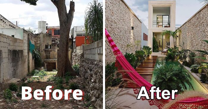
    I mean it’s a stunning transformation, but the tree still could’ve stayed put, just sayin. The layout and design would’ve been altered of course, but that would’ve been worth it to avoid chopping down a tree. If anything the tree would’ve been a nice addition. But I do gotta give credit where credit is due, it still looks beautiful.

    Betsy Ray
    Community Member
    2 years ago Created by potrace 1.15, written by Peter Selinger 2001-2017

    I think the tree had been badly hacked before. Major limbs removed, branches unbalanced. I have hired great arborists but sometimes you can't make it work.

    Load More Replies...
    Nikki Sevven
    Community Member
    2 years ago Created by potrace 1.15, written by Peter Selinger 2001-2017

    That's not a renovation; it's a demolish-and-rebuild.

    Take me to dinner first
    Community Member
    2 years ago Created by potrace 1.15, written by Peter Selinger 2001-2017

    They nailed at working with the space they had

    Tee Rat
    Community Member
    2 years ago Created by potrace 1.15, written by Peter Selinger 2001-2017

    I was thinking the same thing, but it looks like the tree is starting to rot from the inside out.

    Load More Replies...
    chiksxxx
    Community Member
    2 years ago Created by potrace 1.15, written by Peter Selinger 2001-2017

    Is it just me or does anyone else think it is not the same house?

    View more comments

    Lots of homeowners have made renovations or are thinking about doing them whether to enhance the functionality, aesthetics, or value of their properties. Before making any drastic changes, we tried to weigh the pros and cons. 

    To better understand, we have gathered a list of pros and cons that might help you decide if your plans for a small-scale or complete home makeover are worth pursuing. 

    ADVERTISEMENT
    #4

    Swipe ➡️ By: @jeanstofferdesign

    beforeafter.design Report

    Charlotte Dupre
    Community Member
    2 years ago Created by potrace 1.15, written by Peter Selinger 2001-2017

    No stove, less storage and open shelves: NO

    Honu
    Community Member
    2 years ago Created by potrace 1.15, written by Peter Selinger 2001-2017

    Yep. It looks lovely, but unless they put in a bunch of storage somewhere else, it's not very practical.

    Load More Replies...
    Vivian McBride
    Community Member
    2 years ago Created by potrace 1.15, written by Peter Selinger 2001-2017

    Ugh! Open shelves in a kitchen. The cleaning never ends! Looks over practicality.

    JB
    Community Member
    2 years ago Created by potrace 1.15, written by Peter Selinger 2001-2017

    Where's the rest of the kitchen? Range? Oven? Refrigerator?

    WonderWoman
    Community Member
    2 years ago Created by potrace 1.15, written by Peter Selinger 2001-2017

    It is pretty, but they lost the majority of their storage space. And open shelving is really only good in either pictures or for people with OCD about keeping it neat and uncluttered.

    Hendo
    Community Member
    2 years ago Created by potrace 1.15, written by Peter Selinger 2001-2017

    Aesthetically, it's gorgeous. Functionally, it's sh&t

    I’m A Black Cat
    Community Member
    2 years ago Created by potrace 1.15, written by Peter Selinger 2001-2017

    Covering hardwood floors with laminate should be penalised

    SandraG_lak
    Community Member
    2 years ago Created by potrace 1.15, written by Peter Selinger 2001-2017

    I get an Airbnb vibe from this. No stove, mini fridge, not much for dinnerware. Mostly decor.

    Tracy Wallick
    Community Member
    2 years ago Created by potrace 1.15, written by Peter Selinger 2001-2017

    I love the green cabinets and tile!

    JMil
    Community Member
    Premium
    2 years ago Created by potrace 1.15, written by Peter Selinger 2001-2017

    I strongly believe the green kitchen fad will be over soon and look dated.

    Load More Replies...
    Id row
    Community Member
    2 years ago Created by potrace 1.15, written by Peter Selinger 2001-2017

    It's really nice, but where did the stove go?

    View more comments
    #5

    @zoefeldmandesign Designs Are Amazing! Check Out This #powderroom

    beforeafter.design Report

    R
    Community Member
    2 years ago Created by potrace 1.15, written by Peter Selinger 2001-2017

    I loved the “before” window…

    Janet Howe
    Community Member
    2 years ago Created by potrace 1.15, written by Peter Selinger 2001-2017

    I don't care for the wallpaper, but the rest of it is nice.

    Pyla
    Community Member
    2 years ago Created by potrace 1.15, written by Peter Selinger 2001-2017

    Gets the Blanch Devereaux Seal of Approval

    View more comments
    ADVERTISEMENT
    #6

    Swipe ➡️ Check Out This #backyard Transformation! By: @lustliving

    beforeafter.design Report

    Id row
    Community Member
    2 years ago Created by potrace 1.15, written by Peter Selinger 2001-2017

    I would have turned the rest of the lawn into a pool.

    Chewie Baron
    Community Member
    Premium
    2 years ago Created by potrace 1.15, written by Peter Selinger 2001-2017

    If I’m not mistaken, I think this was from an episode of a home improvement show on BBCTWO.

    Baseball is Life
    Community Member
    Premium
    2 years ago Created by potrace 1.15, written by Peter Selinger 2001-2017

    I love this one!!

    Alexandra
    Community Member
    2 years ago Created by potrace 1.15, written by Peter Selinger 2001-2017

    Looks a lot better of course, but also a bit soulless.....

    okpkpkp
    Community Member
    2 years ago Created by potrace 1.15, written by Peter Selinger 2001-2017

    Behind an old house, I had a huge horse pasture and a hill full of oaks. Now I back up to a freeway. :(

    Ann McNeil
    Community Member
    2 years ago Created by potrace 1.15, written by Peter Selinger 2001-2017

    Cat likes it better.............

    View more comments

    When scrolling through these examples, the first thing we notice is obviously aesthetics. This is the primary reason for most renovations, but besides being aesthetically pleasing to the eye, it also increases the property value. 

    ADVERTISEMENT

    Renovating an old house or an apartment could be a good idea for improving functionality, such as optimizing floor plans, creating additional storage, or modifying layouts. And let's not forget the upgrade to a more energy-efficient home, which will save you money on heating and electricity bills. 

    #7

    Swipe ➡️➡️ Check Out This #bathroom Transformation! By: @decorartucasa.com_

    beforeafter.design Report

    Joelle Jansen
    Community Member
    2 years ago Created by potrace 1.15, written by Peter Selinger 2001-2017

    Another one with terrible tiles. Does nobody ever consider that this stuff needs to be cleaned?

    Id row
    Community Member
    2 years ago Created by potrace 1.15, written by Peter Selinger 2001-2017

    Someone with enough money to do that kind of renovation has money to hire someone to clean.

    Load More Replies...
    Bronze Republic
    Community Member
    2 years ago Created by potrace 1.15, written by Peter Selinger 2001-2017

    I'm not ha huge fan of galley kitchens, not to mention a galley bathroom!

    saltydog
    Community Member
    2 years ago Created by potrace 1.15, written by Peter Selinger 2001-2017

    Short people aint see s**t the mirrors too high

    MichelleDonut
    Community Member
    2 years ago Created by potrace 1.15, written by Peter Selinger 2001-2017

    I've lived in at least 2 apartments that had less total space than this bathroom 😥

    Colleen Glim
    Community Member
    2 years ago Created by potrace 1.15, written by Peter Selinger 2001-2017

    Toothpaste splashes on that rock wall are gonna be a PITA to clean

    Billycat
    Community Member
    2 years ago Created by potrace 1.15, written by Peter Selinger 2001-2017

    Nobody needs such a long bathroom. Wall tiles and stones are going to be gross quickly. The don't even understand the two sink thing. I've never had anyone urgently want or need to use a sink the exact same time as me.

    Janet Howe
    Community Member
    2 years ago Created by potrace 1.15, written by Peter Selinger 2001-2017

    It's an amazing transformation. Not to my taste, tho. I don't like the stone wall. I hope they'll have a really good exhaust fan. With the moisture that could collect in a bathroom, that stone would be a breeding ground for mold and mildew. The towels would gather moisture also. And where do you put your toothbrush? It's a nice show but not practical.

    View more comments
    #8

    Home Renovation By @luckyplot13

    beforeafter.design Report

    Laugh or not
    Community Member
    2 years ago Created by potrace 1.15, written by Peter Selinger 2001-2017

    Everything is better with a cat.

    Nimitz
    Community Member
    2 years ago Created by potrace 1.15, written by Peter Selinger 2001-2017

    There's a special place in hell for people who design stairs that need 2 different vacuum attachments to clean

    Janet Howe
    Community Member
    2 years ago Created by potrace 1.15, written by Peter Selinger 2001-2017

    The makeover is far more sophisticated now. Love the carpeting on the stairs. The cat adds a touch of class.

    Gg
    Community Member
    2 years ago Created by potrace 1.15, written by Peter Selinger 2001-2017

    Boring to boring? The tile doesn't match up or I dunno what I'm saying but it's not great.

    View more comments
    #9

    Rate This Before&after 1-10 🏠 By: @2bdesignbuild

    beforeafter.design Report

    Joelle Jansen
    Community Member
    2 years ago Created by potrace 1.15, written by Peter Selinger 2001-2017

    I wouldn't call demolishing a house and building a new one a "makeover", lol

    David
    Community Member
    2 years ago Created by potrace 1.15, written by Peter Selinger 2001-2017

    Agreed. It looks better but it looks like they just bulldozed and built new. Our new farmhouse circa 1980 looked much better than the one from the 40s (or older I think) that was taken down.

    Load More Replies...
    Marcos Valencia
    Community Member
    2 years ago Created by potrace 1.15, written by Peter Selinger 2001-2017

    Well, demolishing the whole thing and building a 3-store house is a little beyong restyling.

    I’m A Black Cat
    Community Member
    2 years ago Created by potrace 1.15, written by Peter Selinger 2001-2017

    It's been here before and I find it really bad how they just covered the sun for the neighbours

    aartdesigns
    Community Member
    2 years ago Created by potrace 1.15, written by Peter Selinger 2001-2017

    could be the lens or something, but the building seems to lean a tab to the right...

    Janet Howe
    Community Member
    2 years ago Created by potrace 1.15, written by Peter Selinger 2001-2017

    That was a complete tear down. It's nice but I couldn't live that close to another house. And what about the poor people in the house on the left? It was bad enough before. Now they have absolutely no view on that side of their house.

    Mimi M
    Community Member
    2 years ago Created by potrace 1.15, written by Peter Selinger 2001-2017

    Woulda preferred to see the uber-cute original properly reno'd.

    Anna Drever
    Community Member
    2 years ago Created by potrace 1.15, written by Peter Selinger 2001-2017

    I imagine the neighbours on the left wouldn’t appreciate losing all the light they used to have.

    View more comments
    ADVERTISEMENT
    ADVERTISEMENT

    The cons, as well as the pros, depend on your project, but they all include spending money. The expenses can quickly add up, so to avoid exceeding your budget, careful planning is important. 

    All renovations require time and can cause disruptions to your daily life, especially if unexpected issues arise. That will require a lot of decision-making, which could lead to stress buildup, as home renovations can be emotionally taxing.

    #10

    By: @vessetventures Check Out This Home Renovation!

    beforeafter.design Report

    Emmydearest
    Community Member
    2 years ago Created by potrace 1.15, written by Peter Selinger 2001-2017

    Why is the bed wearing a pair of panties?

    Megan Lauhon
    Community Member
    2 years ago Created by potrace 1.15, written by Peter Selinger 2001-2017

    Don't be silly. Look at that bandeau top its clearly a bikini!

    Load More Replies...
    Doo Wiki
    Community Member
    2 years ago Created by potrace 1.15, written by Peter Selinger 2001-2017

    We need to see the before-before picture (the one people were living in), not the gutted room in progress.

    Gg
    Community Member
    2 years ago Created by potrace 1.15, written by Peter Selinger 2001-2017

    Yeah this isn't really a before/after picture more a mid/done picture

    Load More Replies...
    Toni Epple
    Community Member
    2 years ago Created by potrace 1.15, written by Peter Selinger 2001-2017

    Why is there a visitors chair facing the bed?

    MichelleDonut
    Community Member
    2 years ago Created by potrace 1.15, written by Peter Selinger 2001-2017

    It's just a blah white room. How long til that artwork leaning on the headboard falls on your face? They need a larger, more colorful artwork actually nailed some distance above the headboard.

    Brie Sansotta
    Community Member
    2 years ago Created by potrace 1.15, written by Peter Selinger 2001-2017

    What?! Did they tear down the bldg. next door and put up a different one?

    Iva Kazalova
    Community Member
    2 years ago Created by potrace 1.15, written by Peter Selinger 2001-2017

    But I’m just curious, why are there all these skinny beams in the before? Are they structural support from the start or just for the renovation? 🧐

    Nonesuch
    Community Member
    2 years ago Created by potrace 1.15, written by Peter Selinger 2001-2017

    I take issure with the windows overlooking neighbors. Add blinds or drapes

    sinead
    Community Member
    2 years ago Created by potrace 1.15, written by Peter Selinger 2001-2017

    Ì can't stand grey decor. It's so cold, institutional and ugly.

    View more comments
    #11

    Check Out This Transformation! By: @b3ecreative

    beforeafter.design Report

    TonyTee
    Community Member
    2 years ago Created by potrace 1.15, written by Peter Selinger 2001-2017

    This one might be one of my favorites so far, it looks really nice to me and I wouldn’t mind this look at all in my own home

    Id row
    Community Member
    2 years ago Created by potrace 1.15, written by Peter Selinger 2001-2017

    Getting major 70's vibes off the 'after' pic. All that's missing is shag carpeting.

    Tracy Wallick
    Community Member
    2 years ago Created by potrace 1.15, written by Peter Selinger 2001-2017

    Cool remodel, but not a fan of the color scheme.

    Beans
    Community Member
    2 years ago Created by potrace 1.15, written by Peter Selinger 2001-2017

    The only thing I don't like is the wood planks on the bar peninsula. It's too much wood. And do they think like people don't spill stuff in kitchens? Like they seem like traps for spills.

    BlocksBuilds
    Community Member
    2 years ago Created by potrace 1.15, written by Peter Selinger 2001-2017

    I love it! It only needs a better carpet ( with more colors )and more colorful stools.

    Graham Cox
    Community Member
    2 years ago Created by potrace 1.15, written by Peter Selinger 2001-2017

    No no no. Is that one of those ' pallet-wood ' designs.

    Pyla
    Community Member
    2 years ago Created by potrace 1.15, written by Peter Selinger 2001-2017

    1973 called and wants its design back

    BarBeeGirl
    Community Member
    2 years ago Created by potrace 1.15, written by Peter Selinger 2001-2017

    The 70s are calling and they want their room back

    View more comments
    #12

    Check Out @westlanedesignco Powder Room Renovation! 🏠 Follow Them For More #interiordesign Content!

    beforeafter.design Report

    Brie Sansotta
    Community Member
    2 years ago Created by potrace 1.15, written by Peter Selinger 2001-2017

    What's the deal with the bottom of the cabinet?

    ADVERTISEMENT

    As long as you plan your budget, are mentally prepared, and are willing to navigate through the potential challenges, home renovations can be a rewarding experience. The final outcome of your efforts can transform your living space into a more functional, aesthetically pleasing, and valuable property.

    #13

    @everobinsonassociates Did It Again! Check Out This Renovation!

    beforeafter.design Report

    digitalin
    Community Member
    2 years ago Created by potrace 1.15, written by Peter Selinger 2001-2017

    I love the way this looks and everything, but please tell me it comes with air conditioning elsewhere? Window AC units are ugly, but when I'm sweltering in summer I don't care about aesthetics.

    Bronze Republic
    Community Member
    2 years ago Created by potrace 1.15, written by Peter Selinger 2001-2017

    Looks too imposing for my home taste.

    Gg
    Community Member
    2 years ago (edited) Created by potrace 1.15, written by Peter Selinger 2001-2017

    Looks like the mean lady boss' office in every romantic comedy

    Xenia Harley
    Community Member
    2 years ago Created by potrace 1.15, written by Peter Selinger 2001-2017

    I have to say, grey walls are not for me either. I moved into a very small house (under 800 sq ft) and all the walls were grey! It looks so much better repainted a light off white! Especially small spaces, no to grey. So I like the after just for getting rid of the grey.

    924tz2f5ys
    Community Member
    1 month ago Created by potrace 1.15, written by Peter Selinger 2001-2017

    Windows look amazing now! It’s interesting that they chose to get rid of any radiator covers. Im assuming there is central ac or they have one of the wall units now?

    Janet Howe
    Community Member
    2 years ago Created by potrace 1.15, written by Peter Selinger 2001-2017

    Pretty, but not my style of furniture.

    Nonesuch
    Community Member
    2 years ago Created by potrace 1.15, written by Peter Selinger 2001-2017

    A professionals office. Psychiatrist? Realtor? Attorney?

    View more comments
    ADVERTISEMENT
    #14

    By: @vessetventures Check Out This Home Renovation!

    beforeafter.design Report

    Sergy Yeltsen
    Community Member
    2 years ago Created by potrace 1.15, written by Peter Selinger 2001-2017

    Looks amazing, but do they really normally have the lamp blocking the TV screen? Would get annoying af quickly having to move it each time you want to watch the squint box.

    im under ur bed hon
    Community Member
    2 years ago Created by potrace 1.15, written by Peter Selinger 2001-2017

    aww i liked the bricks before... not a fan of white living rooms tbh

    Plebbit
    Community Member
    2 years ago Created by potrace 1.15, written by Peter Selinger 2001-2017

    Something is very off with the second image. It makes me uncomfortable. Is it AI? Why do I find it so off-putting? It's not really my style, but that's not the issue.

    R
    Community Member
    2 years ago (edited) Created by potrace 1.15, written by Peter Selinger 2001-2017

    A front door in the living room? I could never ever live like that. It’s like having a toilet in the kitchen! Ok we have all the weathers on one day sometimes. And need a lot of winter clothes, shoes and so on. And then summer clothes and shoes. Add rainy weather clothes and shoes (one set for cold rainy weather and one set for warm rainy weather). Imagine the chaos with kids. My entry is one big changing station that is always full of sand and shoes.

    2x4b523p
    Community Member
    2 years ago Created by potrace 1.15, written by Peter Selinger 2001-2017

    It is typical in parts of England. Many houses like that still around in my area. They are usually rows of cottages and the entrance is right off the pavement without front garden, literally three steps from road.

    Load More Replies...
    JuniorCJ82
    Community Member
    2 years ago Created by potrace 1.15, written by Peter Selinger 2001-2017

    Get rid of the table lamp directly in front of the tv. Make it an end table lamp.

    Colleen Glim
    Community Member
    2 years ago Created by potrace 1.15, written by Peter Selinger 2001-2017

    Agreed. Take the tv off the wall and put it on the credenza. I HATE wall mounted tvs. You get a crick in your neck trying to watch them

    Load More Replies...
    Nonesuch
    Community Member
    2 years ago Created by potrace 1.15, written by Peter Selinger 2001-2017

    They got rid of the brick. Rug is too small. Not very much natural light or color.

    Nikki Sevven
    Community Member
    2 years ago Created by potrace 1.15, written by Peter Selinger 2001-2017

    Not my taste. It looks like part of a hotel lobby.

    DumYum
    Community Member
    2 years ago Created by potrace 1.15, written by Peter Selinger 2001-2017

    Uncomfortable couch, no place for your coats and shoes. No storage in this tiny space.

    View more comments
    #15

    Swipe ➡️ @zoefeldmandesign Did It Again! Check Out This #bedroom Renovation

    beforeafter.design Report

    Chewie Baron
    Community Member
    Premium
    2 years ago Created by potrace 1.15, written by Peter Selinger 2001-2017

    Just because it’s not your personal taste doesn’t mean it’s not a good transformation.

    Load More Replies...
    StevieLove
    Community Member
    2 years ago Created by potrace 1.15, written by Peter Selinger 2001-2017

    The overhead lampshade looks like a dirty Ace bandage.

    2WheelTravlr
    Community Member
    2 years ago Created by potrace 1.15, written by Peter Selinger 2001-2017

    I totally agree. If a designer tried to foist that on me, I'd have kicked them to the curb.

    Load More Replies...
    Emmydearest
    Community Member
    2 years ago Created by potrace 1.15, written by Peter Selinger 2001-2017

    Those animal printed things are really out of place in that floral, romantic room.

    LMr
    Community Member
    2 years ago Created by potrace 1.15, written by Peter Selinger 2001-2017

    The cheetah print kills it.

    Doo Wiki
    Community Member
    2 years ago Created by potrace 1.15, written by Peter Selinger 2001-2017

    Anything is better than a mattress on the floor.

    Megan Lauhon
    Community Member
    2 years ago Created by potrace 1.15, written by Peter Selinger 2001-2017

    I'm always down for maximalisim! I love this.

    Brie Sansotta
    Community Member
    2 years ago Created by potrace 1.15, written by Peter Selinger 2001-2017

    YEEEK on the wallpaper, window shades, ceiling whatever it is, and foot stools!

    Anna Drever
    Community Member
    2 years ago Created by potrace 1.15, written by Peter Selinger 2001-2017

    Omigosh that’s beautiful! 💕

    View more comments
    #16

    Amazing Home Renovation! By: @frameworkstudio.my

    beforeafter.design Report

    Black Cat
    Community Member
    2 years ago Created by potrace 1.15, written by Peter Selinger 2001-2017

    This is nice, but out of place with the rest of the street.

    ValdaDeDieu
    Community Member
    2 years ago Created by potrace 1.15, written by Peter Selinger 2001-2017

    The roofline just lost all of its charm. Not a fan of flat concrete.

    Load More Replies...
    April Caron
    Community Member
    2 years ago Created by potrace 1.15, written by Peter Selinger 2001-2017

    I think they’re gonna regret that flat roof… the clouds are already rolling in!

    Teresa Spanics
    Community Member
    2 years ago Created by potrace 1.15, written by Peter Selinger 2001-2017

    It is possible that the roof is slanted towards the back.

    Load More Replies...
    Ramona Brunswick
    Community Member
    2 years ago Created by potrace 1.15, written by Peter Selinger 2001-2017

    The overhead electric lines were "remodeled' to someplace else?

    Diane H
    Community Member
    2 years ago Created by potrace 1.15, written by Peter Selinger 2001-2017

    They just stepped forward to take the picture

    Load More Replies...
    924tz2f5ys
    Community Member
    1 month ago Created by potrace 1.15, written by Peter Selinger 2001-2017

    Incredible way to maximize the property.

    Mary Ballard-Johansson
    Community Member
    2 years ago Created by potrace 1.15, written by Peter Selinger 2001-2017

    I'm not a fan of neighbors' houses that you can reach into to turn off the light when you are trying to sleep.

    Arturo De la Rosa
    Community Member
    2 years ago Created by potrace 1.15, written by Peter Selinger 2001-2017

    yes, removing cars always makes the space look better, put them back in and it will look the same

    Mia Black
    Community Member
    2 years ago Created by potrace 1.15, written by Peter Selinger 2001-2017

    I hope this means you got rid of the cars and use your bike now because otherwise the cars are now maybe blocking the street or pedestrian way....

    View more comments
    ADVERTISEMENT
    #17

    Bathroom Before And After! By @vizslacosmos

    1,015 likes Report

    TonyTee
    Community Member
    2 years ago Created by potrace 1.15, written by Peter Selinger 2001-2017

    Some of these bathroom makeovers are making the bathrooms look like the nicest part of the house xD

    R
    Community Member
    2 years ago Created by potrace 1.15, written by Peter Selinger 2001-2017

    Smaller mirror, less storage space and yellow light that’s impossible to use as lightning for makeup. It’s horrible. Add that wood thing under the sink, imagine cleaning it.

    Sabra Faire
    Community Member
    2 years ago Created by potrace 1.15, written by Peter Selinger 2001-2017

    If I bang my hip on the corner of the cupboard under the sink one more time....

    Load More Replies...
    Colleen Glim
    Community Member
    2 years ago Created by potrace 1.15, written by Peter Selinger 2001-2017

    Before picture is weird. After picture is not much better

    Midnightoil
    Community Member
    2 years ago Created by potrace 1.15, written by Peter Selinger 2001-2017

    Really no change. Off kilter. No thanks.

    Celtic Pirate Queen
    Community Member
    2 years ago Created by potrace 1.15, written by Peter Selinger 2001-2017

    It doesn't look like the bathtub/shower is to the right, so why not extend the vanity to the wall?

    Janet Howe
    Community Member
    2 years ago Created by potrace 1.15, written by Peter Selinger 2001-2017

    It still looks weird as h*'ll. It makes no sense to me.

    Nonesuch
    Community Member
    2 years ago Created by potrace 1.15, written by Peter Selinger 2001-2017

    A wider vanity which expands across the entire back wall would create more storage. Lighting is not appropriate. Maybe matching sconces on either side of mirror.

    Graham Cox
    Community Member
    2 years ago Created by potrace 1.15, written by Peter Selinger 2001-2017

    I like the fact that they reused many items. This is therefore an inexpensive but very effective makeover. Well done. Anyone can throw money at a project.

    Kat Min
    Community Member
    2 years ago Created by potrace 1.15, written by Peter Selinger 2001-2017

    First one I like (apart from the weird grass under the cupboard. Just put a bin there, like normal people) Natural materials and not looking like a hotel

    View more comments
    ADVERTISEMENT
    #18

    Swipe ➡️ Check Out This #bathroom Transformation! By: @housetohomeatlast

    beforeafter.design Report

    David
    Community Member
    2 years ago Created by potrace 1.15, written by Peter Selinger 2001-2017

    I was with you right up until that ridiculous sink. I prefer to wash both hands at the same time.

    Mimi M
    Community Member
    2 years ago Created by potrace 1.15, written by Peter Selinger 2001-2017

    Please get rid of that nightmare sink.

    Brie Sansotta
    Community Member
    2 years ago Created by potrace 1.15, written by Peter Selinger 2001-2017

    Unless it's a bidet, how do you reach the TP? Oh! I guess it's just for a standing man

    Ruby Begonia
    Community Member
    2 years ago Created by potrace 1.15, written by Peter Selinger 2001-2017

    Anything would've looked better !

    Iva Kazalova
    Community Member
    2 years ago Created by potrace 1.15, written by Peter Selinger 2001-2017

    Is that a pooping timer in the corner?

    Michelle K
    Community Member
    2 years ago Created by potrace 1.15, written by Peter Selinger 2001-2017

    Probably a "half bath". Sink is only good for washing hands.

    LadyHermit
    Community Member
    2 years ago Created by potrace 1.15, written by Peter Selinger 2001-2017

    Hourglass in the toilet...... seems legit 🤣

    Vicki Cunningham
    Community Member
    2 years ago Created by potrace 1.15, written by Peter Selinger 2001-2017

    Seriously? Washing your hands must splash water all over the walls and floor.

    View more comments
    #19

    Check Out This Renovation By @b3ecreative

    beforeafter.design Report

    PeepPeep the duck
    Community Member
    2 years ago Created by potrace 1.15, written by Peter Selinger 2001-2017

    I really like the old design better for practical reasons, it just needed redecoration not a complete make over.

    ValdaDeDieu
    Community Member
    2 years ago Created by potrace 1.15, written by Peter Selinger 2001-2017

    But it's so much more spacious in the new iteration. Feels luxurious.

    Load More Replies...
    Deborah Anne
    Community Member
    2 years ago Created by potrace 1.15, written by Peter Selinger 2001-2017

    I like the fresh clean open look of the new space.. I never understood anybody putting wallpaper in a bathroom One of the most humid areas of the home

    Anna Drever
    Community Member
    2 years ago Created by potrace 1.15, written by Peter Selinger 2001-2017

    The after just looks soulless and meh.

    Safy
    Community Member
    2 years ago Created by potrace 1.15, written by Peter Selinger 2001-2017

    Not a fan of all the white, but I love the design. I don't use my closets much as is. I have a dresser and a small closet would suffice for my dresses. I love a deep soaking tub, and a spacious standing shower - this is beautiful to me, I'd go with blue tones though for tile. :)

    Janine Randall
    Community Member
    2 years ago Created by potrace 1.15, written by Peter Selinger 2001-2017

    When will the all white trend go away?

    Joelle Jansen
    Community Member
    2 years ago Created by potrace 1.15, written by Peter Selinger 2001-2017

    I pity whoever has to clean the grout between those tiles. Why are they so uneven? Free housing for mold?

    View more comments
    #20

    Home Renovation By @luckyplot13

    beforeafter.design Report

    S. E. in Indiana
    Community Member
    2 years ago Created by potrace 1.15, written by Peter Selinger 2001-2017

    The before wouldn't have been too bad if they would have just picked up all the stuff they left out.

    Josh
    Community Member
    2 years ago Created by potrace 1.15, written by Peter Selinger 2001-2017

    Did color impregnate your daughter and murder your wife? I can't understand why you hate color so much otherwise.

    Nikki Sevven
    Community Member
    2 years ago Created by potrace 1.15, written by Peter Selinger 2001-2017

    WTF do people have against color nowadays?

    LadyHermit
    Community Member
    2 years ago Created by potrace 1.15, written by Peter Selinger 2001-2017

    "Love" generic modernist, minimalist white spaces with generic designer deco pieces and abstract art.

    Ramona Brunswick
    Community Member
    2 years ago Created by potrace 1.15, written by Peter Selinger 2001-2017

    A bare bulb for lighting isn't great. New picture doesn't show any lighting at all. Yes, removing the clutter will improve the look of any space.

    ADVERTISEMENT
    #21

    Check Out @cinque Latest Amazing Home Renovation!

    beforeafter.design Report

    Stary_cat
    Community Member
    2 years ago Created by potrace 1.15, written by Peter Selinger 2001-2017

    The book shelf need more books!

    Bell-acose
    Community Member
    Premium
    2 years ago Created by potrace 1.15, written by Peter Selinger 2001-2017

    You gotta earn that!

    Load More Replies...
    Leonel Roque
    Community Member
    2 years ago Created by potrace 1.15, written by Peter Selinger 2001-2017

    Why did they keep that ugly mirror?

    Sans Serif
    Community Member
    2 years ago Created by potrace 1.15, written by Peter Selinger 2001-2017

    I think it's a different ugly mirror! 8-)

    Load More Replies...
    Emma London
    Community Member
    2 years ago Created by potrace 1.15, written by Peter Selinger 2001-2017

    Thank goodnes they saved the book shelf!

    Sheila McCarthy
    Community Member
    2 years ago Created by potrace 1.15, written by Peter Selinger 2001-2017

    I just wish the pics were taken at the same angle for better comparison.

    Nimitz
    Community Member
    2 years ago Created by potrace 1.15, written by Peter Selinger 2001-2017

    Staging furniture, no books. Changed 2 cabinet doors, took off 2 small sections of mirror, crack filled, painted, put down peel 'n still vinyl over top the hardwood. Looks like a property that was renovicted and then the price massively increased, or flipped further destroying the property market.

    Brie Sansotta
    Community Member
    2 years ago Created by potrace 1.15, written by Peter Selinger 2001-2017

    Now this did not cost much and made a big difference.

    Beck
    Community Member
    2 years ago Created by potrace 1.15, written by Peter Selinger 2001-2017

    This was in a different post but a different angle

    Ann McNeil
    Community Member
    2 years ago Created by potrace 1.15, written by Peter Selinger 2001-2017

    Is that a mirror to the right of the shelves, or did they cut the wall out into another room?

    Junebugjump!
    Community Member
    2 years ago Created by potrace 1.15, written by Peter Selinger 2001-2017

    I was do confused by that mirror!

    View more comments
    ADVERTISEMENT
    #22

    Check Out This #homerenovation By: @cohenfumerohouse

    beforeafter.design Report

    Nimitz
    Community Member
    2 years ago Created by potrace 1.15, written by Peter Selinger 2001-2017

    Not a renovation, a restoration with upgrades after water damage

    ValdaDeDieu
    Community Member
    2 years ago Created by potrace 1.15, written by Peter Selinger 2001-2017

    Splitting hairs. A full-blown reno, possibly after purchase as-is. See the kitchen where none used to be? Unless it's yours?

    Load More Replies...
    2WheelTravlr
    Community Member
    2 years ago Created by potrace 1.15, written by Peter Selinger 2001-2017

    I actually like this one, the removal of the wall probably took away some kitchen storage, but the open plan and the beautiful wood tones really work for the space.

    Wheelie Bin
    Community Member
    2 years ago Created by potrace 1.15, written by Peter Selinger 2001-2017

    Glad to see I’m being useful

    David
    Community Member
    2 years ago Created by potrace 1.15, written by Peter Selinger 2001-2017

    Those chairs taking me back to the 60s

    LMr
    Community Member
    2 years ago Created by potrace 1.15, written by Peter Selinger 2001-2017

    This is fabulous. Homage to this home era. <3 <3

    Vicki Cunningham
    Community Member
    2 years ago Created by potrace 1.15, written by Peter Selinger 2001-2017

    Not a fan of mid century modern. Not even when it was mid century.

    Janet Howe
    Community Member
    2 years ago Created by potrace 1.15, written by Peter Selinger 2001-2017

    Well, it obviously needed something, but this wasn't it. Is the retro 70s a thing now?

    Graham Cox
    Community Member
    2 years ago Created by potrace 1.15, written by Peter Selinger 2001-2017

    I hope they have the three pottery ducks flying across the wall.

    View more comments
    #23

    Photographer: @openhousefoto Developer: @vinnynazerian Check Out This #luxuryhome Transformation!

    beforeafter.design Report

    Nizumi
    Community Member
    2 years ago Created by potrace 1.15, written by Peter Selinger 2001-2017

    And that's not grass. It's astroturf.

    Load More Replies...
    Spocks's Mom
    Community Member
    2 years ago Created by potrace 1.15, written by Peter Selinger 2001-2017

    I just can't bring myself to like astroturf. They didn't even do a good job laying it. I would of thought sod at first, but it really looks like fake grass. Also, this is another tear down that I wouldn't typically consider a remodel. The pool is nice, though.

    Cathy Hinz
    Community Member
    2 years ago Created by potrace 1.15, written by Peter Selinger 2001-2017

    Umm, not a make over. More like a do over. Take everything down leaving only the pool. I call this starting over.

    Graham Cox
    Community Member
    2 years ago Created by potrace 1.15, written by Peter Selinger 2001-2017

    Exactly, that is major works. Major expense. Shouldn't even be in this article.

    Load More Replies...
    Agfox
    Community Member
    2 years ago Created by potrace 1.15, written by Peter Selinger 2001-2017

    Where I lived about 10 years ago, a guy paid $10,000 (Australian Dollars) to have a palm tree that size put in the front yard of his renovated house

    Midnightoil
    Community Member
    2 years ago Created by potrace 1.15, written by Peter Selinger 2001-2017

    The pool is the same, just cleaned up. I would have preferred to keep a midcentury modern look and added footage on a single level. Looks bulky and unprofessional IMHO now. Nope.

    April Caron
    Community Member
    2 years ago Created by potrace 1.15, written by Peter Selinger 2001-2017

    I’ll take the guest house on the left, please!

    Diane Ream
    Community Member
    2 years ago Created by potrace 1.15, written by Peter Selinger 2001-2017

    I'm getting "Big Love" vibes from this.

    Trish Panda
    Community Member
    2 years ago Created by potrace 1.15, written by Peter Selinger 2001-2017

    For all the people crying over the tree... sometimes they have to be removed off of residential properties because they are causing issues with pipe work underground or the foundation. It sucks but it happens.

    gracefullikeagazelle
    Community Member
    2 years ago Created by potrace 1.15, written by Peter Selinger 2001-2017

    I doubt that anyone in this thread is physically "crying" over the palm tree but your wording speaks volumes about where your past, present and future reside😶

    Load More Replies...
    Janet Howe
    Community Member
    2 years ago Created by potrace 1.15, written by Peter Selinger 2001-2017

    So are we calling tearing down 2 garages and building 3 new houses a makeover? Oh yeah. It made over the entire neighborhood. LOL.

    View more comments
    #24

    Check Out This New Staircase! ♥️ By: @zoefeldmandesign

    beforeafter.design Report

    similarly
    Community Member
    2 years ago Created by potrace 1.15, written by Peter Selinger 2001-2017

    Books on stairs are not artistic. It's a trip and fall hazard. Also, I don't recommend triangular stairs. Just use a properly landing.

    Steven Orndorff
    Community Member
    2 years ago Created by potrace 1.15, written by Peter Selinger 2001-2017

    To put that winder step in they would have had to completely redo the steps. I have a hard time believing it is the same space

    Load More Replies...
    digitalin
    Community Member
    2 years ago Created by potrace 1.15, written by Peter Selinger 2001-2017

    Personally, I like the open railing. Enclosed, staircase can feel claustrophobic. But they're definitely leaning into a different vibe.

    David
    Community Member
    2 years ago Created by potrace 1.15, written by Peter Selinger 2001-2017

    that blotchy wall finish is intentional? It looks like the mud work guys sanded the high spots and you are still waiting on the painters. I am also confused why you changed the nice square landing to an awkward triangle shaped one.

    Doo Wiki
    Community Member
    2 years ago Created by potrace 1.15, written by Peter Selinger 2001-2017

    Nope. Too industrial. Looks like it should be in the hallway of an apartment building.

    Take me to dinner first
    Community Member
    2 years ago (edited) Created by potrace 1.15, written by Peter Selinger 2001-2017

    Never understood books on stairs, but there is something nice about it

    Cathy Hinz
    Community Member
    2 years ago Created by potrace 1.15, written by Peter Selinger 2001-2017

    I don't like the newer look. Seems too closed in.

    View more comments
    ADVERTISEMENT
    See Also on Bored Panda
    #25

    @zoefeldmandesign Did It Again!

    beforeafter.design Report

    Nimitz
    Community Member
    2 years ago Created by potrace 1.15, written by Peter Selinger 2001-2017

    Looks like the family of 10 coulda used that storage space that was replaced with... Nothing.

    digitalin
    Community Member
    2 years ago Created by potrace 1.15, written by Peter Selinger 2001-2017

    Yeah, I liked the before. I would have maybe replaced the island and updated the lighting, but it looks WAY more functional.

    Load More Replies...
    Daycare Attendant Sun
    Community Member
    2 years ago Created by potrace 1.15, written by Peter Selinger 2001-2017

    I...I kinda prefer the before. I love the warm colors and rustic feel of it.

    ERIKA H.
    Community Member
    2 years ago (edited) Created by potrace 1.15, written by Peter Selinger 2001-2017

    Although I like the design on this one, I notice they lost a ton of storage space in the kitchen. I made this mistake in my kitchen remodel. Never get rid of your storage space for aesthetic, you'll pay the price later 🥴

    Nikki Sevven
    Community Member
    2 years ago Created by potrace 1.15, written by Peter Selinger 2001-2017

    It was a nice, big kitchen that looked easy to work in, and you made it cramped, plus got rid of 75% of the storage. The breakfast bar is redundant when your dining table is right f'ing there.

    Cathy Hinz
    Community Member
    2 years ago (edited) Created by potrace 1.15, written by Peter Selinger 2001-2017

    Not a fan. I don't like the open cupboard concept and the loss of storage space is awful. Great for the current owner, but the resale value will not go well. The charm was removed as well.

    Pixie
    Community Member
    2 years ago (edited) Created by potrace 1.15, written by Peter Selinger 2001-2017

    I like the table and chairs, but I wouldn't have wanted to lose the storage space! And where is the fridge now?

    Rebecca O’Donnell
    Community Member
    Premium
    2 years ago Created by potrace 1.15, written by Peter Selinger 2001-2017

    Looking straight past the island is the refrigerator, Pixie.

    Load More Replies...
    April Pickett
    Community Member
    2 years ago Created by potrace 1.15, written by Peter Selinger 2001-2017

    Where's the refrigerator? I hope there is a huge pantry with a fridge, microwave, and storage.

    Janet Howe
    Community Member
    2 years ago Created by potrace 1.15, written by Peter Selinger 2001-2017

    Another fail. Now there's no storage.

    View more comments
    ADVERTISEMENT
    See Also on Bored Panda
    #26

    Swipe➡ To See The Final Result!🏚🏠 By: @mr.texjones

    beforeafter.design Report

    Brie Sansotta
    Community Member
    2 years ago Created by potrace 1.15, written by Peter Selinger 2001-2017

    The outside view needs a makeover!

    MichelleDonut
    Community Member
    2 years ago Created by potrace 1.15, written by Peter Selinger 2001-2017

    TV overlapping the curtains looks odd.

    MomaBear
    Community Member
    2 years ago Created by potrace 1.15, written by Peter Selinger 2001-2017

    The window on the left is bigger in the ‘before’ photo!

    Ann McNeil
    Community Member
    2 years ago Created by potrace 1.15, written by Peter Selinger 2001-2017

    It's similar, but I don't think its the same room. How can they fit a door and another curtain rod in the space beside the window? There's not enough room in the first picture. And in the first picture, the right hand window has space between it and the wall. In the 2nd photo, the window is right up against the wall.

    Ginny Crouse
    Community Member
    2 years ago Created by potrace 1.15, written by Peter Selinger 2001-2017

    And what happened to the radiator?

    View more comments
    #27

    Check Out @cinque Latest Amazing Home Renovation! ♥️🏠

    beforeafter.design Report

    Take me to dinner first
    Community Member
    2 years ago Created by potrace 1.15, written by Peter Selinger 2001-2017

    I'm not sure if it's my screen, but that kinda looks like a project still

    Kharyss
    Community Member
    2 years ago Created by potrace 1.15, written by Peter Selinger 2001-2017

    After pic looks “bitty”. Lots of mismatched units with nothing to tie them together.

    Joey
    Community Member
    2 years ago Created by potrace 1.15, written by Peter Selinger 2001-2017

    A stove should not be put in a corner. It should be where the sink is now, and the sink should be under the window - that would also give more countertop and cabinet space. Bad solution. And too many different materials and surfaces and textures.

    DumYum
    Community Member
    2 years ago Created by potrace 1.15, written by Peter Selinger 2001-2017

    Maybe the only way to vent the hood fan? Overall layout make no sense and it is not pleasing to the eye.

    Load More Replies...
    Doo Wiki
    Community Member
    2 years ago Created by potrace 1.15, written by Peter Selinger 2001-2017

    Who tiles a ceiling???? Who CAN tile a ceiling? My arms hurt looking at it.

    aartdesigns
    Community Member
    2 years ago Created by potrace 1.15, written by Peter Selinger 2001-2017

    The color scheme does not look thought out, or it's not finished...

    April Caron
    Community Member
    2 years ago Created by potrace 1.15, written by Peter Selinger 2001-2017

    The ceramic ceiling tiles in the first pic are hurting my head with just the thought of one of them coming loose and crashing down on my head. Is it just me?

    2WheelTravlr
    Community Member
    2 years ago Created by potrace 1.15, written by Peter Selinger 2001-2017

    Oh goody, another kitchen without storage space. /s

    Pickles, Pennies, & Ponies
    Community Member
    2 years ago (edited) Created by potrace 1.15, written by Peter Selinger 2001-2017

    I like it. I think the pink/peach (can't really tell) cabinets breaks up the monotony of it all and gives the kitchen a focal point. The curtain under the sink is like a throw back to the 40s and 50s. I think it softens the kitchen and is cute.

    View more comments
    ADVERTISEMENT
    See Also on Bored Panda
    #28

    Check Out This #homerenovation By: @everobinsonassociates

    beforeafter.design Report

    Tracy Wallick
    Community Member
    2 years ago Created by potrace 1.15, written by Peter Selinger 2001-2017

    TBH, I liked the 'before' better. They sucked all the color out of the room.

    Pickles, Pennies, & Ponies
    Community Member
    2 years ago (edited) Created by potrace 1.15, written by Peter Selinger 2001-2017

    I agree, plus, the before kind of gave me a beach house vibe.

    Load More Replies...
    Ima Manimal
    Community Member
    2 years ago Created by potrace 1.15, written by Peter Selinger 2001-2017

    If “boring AF” was the goal, they succeeded.

    Doo Wiki
    Community Member
    2 years ago Created by potrace 1.15, written by Peter Selinger 2001-2017

    I like BEFORE. AFTER is too sterile.

    Alexandra
    Community Member
    2 years ago Created by potrace 1.15, written by Peter Selinger 2001-2017

    Love all those windows....such a super space!

    Black Cat
    Community Member
    2 years ago Created by potrace 1.15, written by Peter Selinger 2001-2017

    Yes, it's not hard to make a room look good when you've already got lovely architectural features.

    Load More Replies...
    Iva Kazalova
    Community Member
    2 years ago Created by potrace 1.15, written by Peter Selinger 2001-2017

    I think the sage scheme is very calming

    Cathy Hinz
    Community Member
    2 years ago Created by potrace 1.15, written by Peter Selinger 2001-2017

    Good lord, what is with the grey pallet? So devoid of all color, emotion and personality. I would have stayed with the original. Updated the furniture a bit maybe.

    chiksxxx
    Community Member
    2 years ago Created by potrace 1.15, written by Peter Selinger 2001-2017

    I showed all of these pictures to my house designer - everything is photoshopped. Just try and you will see tiny differences. It is all good commercial

    Nikki Sevven
    Community Member
    2 years ago Created by potrace 1.15, written by Peter Selinger 2001-2017

    Nope. The 'before' at least had a personality. The 'after' is sterile and uninviting.

    Jaya
    Community Member
    2 years ago Created by potrace 1.15, written by Peter Selinger 2001-2017

    Are we sure they didn't switch them up by accident? The before looks so great, the after looks so boring.

    View more comments
    #29

    By: @vessetventures Check Out This Home Renovation!

    beforeafter.design Report

    April Caron
    Community Member
    2 years ago Created by potrace 1.15, written by Peter Selinger 2001-2017

    Awesome! At least now I stand half a chance of not falling down the stairs and killings myself.

    Plebbit
    Community Member
    2 years ago Created by potrace 1.15, written by Peter Selinger 2001-2017

    This doesn't really count as a makeover. This is just unfinished vs finished

    Ann Michaels
    Community Member
    2 years ago Created by potrace 1.15, written by Peter Selinger 2001-2017

    They are all like they a bought damaged houses and redid them.

    Load More Replies...
    ADVERTISEMENT
    See Also on Bored Panda
    #30

    Photographer: @openhousefoto Developer: @vinnynazerian Check Out This #luxuryhome Transformation!

    beforeafter.design Report

    Bill McDowall
    Community Member
    2 years ago Created by potrace 1.15, written by Peter Selinger 2001-2017

    Yet another "not a renovation" photo. And, BTW, where were the bananas? I had no idea of the scale of most of these.

    ValdaDeDieu
    Community Member
    2 years ago Created by potrace 1.15, written by Peter Selinger 2001-2017

    This was fantastic. Glad they kept the tree. Looks like at least $200K was poured into this for a 500K profit return.

    Load More Replies...
    Cathy Hinz
    Community Member
    2 years ago Created by potrace 1.15, written by Peter Selinger 2001-2017

    Does not belong in this thread. Not a renovation but a demo and build new.

    Ramona Brunswick
    Community Member
    2 years ago Created by potrace 1.15, written by Peter Selinger 2001-2017

    The "after" looks gorgeous! Pretty sure the "before" house was completely torn down.

    Wednesday
    Community Member
    1 year ago Created by potrace 1.15, written by Peter Selinger 2001-2017

    I like the paving with the grass

    JB
    Community Member
    2 years ago Created by potrace 1.15, written by Peter Selinger 2001-2017

    And the front of the house/poolhouse. Big reno. Nice.

    Leesa DeAndrea
    Community Member
    2 years ago Created by potrace 1.15, written by Peter Selinger 2001-2017

    I see this happening a lot where I live. They don't care about the building. They just want the land. Tear down the old buildings and build new.

    View more comments
    ADVERTISEMENT
    See Also on Bored Panda
    #31

    Check Out @cinque Latest Amazing Home Renovation!

    beforeafter.design Report

    April Caron
    Community Member
    2 years ago Created by potrace 1.15, written by Peter Selinger 2001-2017

    This is the same room with the book shelves (with Hardy any books on them) and the fireplace… as in the previous post!

    Graham Cox
    Community Member
    2 years ago Created by potrace 1.15, written by Peter Selinger 2001-2017

    That is a different view of a previous example. There can't be two bookcases like that in existence.

    Nikki Sevven
    Community Member
    2 years ago Created by potrace 1.15, written by Peter Selinger 2001-2017

    For covering up the wood floor with laminate instead of stripping and refinishing it, you're no different from the idiots who covered up their wood floors with vinyl tile or wall-to-wall.

    Vanessa Richardson
    Community Member
    2 years ago Created by potrace 1.15, written by Peter Selinger 2001-2017

    Okay, so I’m just now realizing that all of these renovations are done by the same company or whatever, bc there’s like 8 of these that use the same ceiling lights and many have the same mirrors, rattan cabinet doors, wood ceilings etc.

    Beck
    Community Member
    2 years ago Created by potrace 1.15, written by Peter Selinger 2001-2017

    I like the before floor.

    Nonesuch
    Community Member
    2 years ago Created by potrace 1.15, written by Peter Selinger 2001-2017

    They swapped hardwoods for laminate! Yikes!!!

    Wednesday
    Community Member
    1 year ago Created by potrace 1.15, written by Peter Selinger 2001-2017

    i'm generally opposed to engineered hardwood. save your talking points. actual hard wood can last over a hundred years. it doesn't even need extensive care to last that long

    Seadog
    Community Member
    2 years ago Created by potrace 1.15, written by Peter Selinger 2001-2017

    Looks like real wood flooring was covered with laminate flooring. What a waste

    Connie Miller-Fender
    Community Member
    2 years ago Created by potrace 1.15, written by Peter Selinger 2001-2017

    So nice. Breezy and light. Beautiful ceiling and fixtures.

    View more comments
    #32

    Check Out This Transformation! By: @decor.by.demree

    beforeafter.design Report

    WJW _
    Community Member
    2 years ago Created by potrace 1.15, written by Peter Selinger 2001-2017

    Not the same apace. An entire room was replace with a staircase.

    Nikki Sevven
    Community Member
    2 years ago Created by potrace 1.15, written by Peter Selinger 2001-2017

    Before and after photos are completely useless when you take them from two different angles. Your point is to show the changes you made, and you're not accomplishing that.

    Ann McNeil
    Community Member
    2 years ago Created by potrace 1.15, written by Peter Selinger 2001-2017

    I wonder if they're taken from different ends of the same kitchen.

    Nancy Lynch
    Community Member
    Premium
    2 years ago Created by potrace 1.15, written by Peter Selinger 2001-2017

    Where's the fridge? You have to have the fridge near to the cooking area. Bad design.

    Janet Howe
    Community Member
    2 years ago Created by potrace 1.15, written by Peter Selinger 2001-2017

    This is definitely an improvement.

    Gg
    Community Member
    2 years ago Created by potrace 1.15, written by Peter Selinger 2001-2017

    That oven hood would drive me nuts

    View more comments
    #33

    Photographer: @openhousefoto Developer: @vinnynazerian Check Out This #luxuryhome Transformation!

    beforeafter.design Report

    JB
    Community Member
    2 years ago Created by potrace 1.15, written by Peter Selinger 2001-2017

    Believe this is an overhead of the earlier post of redone house/poolhouse

    Saint Tim the Godless
    Community Member
    2 years ago Created by potrace 1.15, written by Peter Selinger 2001-2017

    Anyone can do this with a million dollars. Am I supposed to be impressed that they can pay other people with better taste to do tons of work?

    SandraG_lak
    Community Member
    2 years ago Created by potrace 1.15, written by Peter Selinger 2001-2017

    Everything is so crammed onto the lot. I prefer a larger lawn compared to a larger house.

    Nimitz
    Community Member
    2 years ago Created by potrace 1.15, written by Peter Selinger 2001-2017

    This looks like one of those pics where they're showing you a megapastor's $20+ million "humble" home

    Ann McNeil
    Community Member
    2 years ago Created by potrace 1.15, written by Peter Selinger 2001-2017

    We've seen this before, just not from this view.

    Ginny Crouse
    Community Member
    2 years ago Created by potrace 1.15, written by Peter Selinger 2001-2017

    LOL. I was trying to figure out what I was looking at. Didn't realize it was an overview.

    Janet Howe
    Community Member
    2 years ago Created by potrace 1.15, written by Peter Selinger 2001-2017

    Well, they've managed to fill up the entire lot with their McMansion built.

    Wicked Adi
    Community Member
    2 years ago Created by potrace 1.15, written by Peter Selinger 2001-2017

    well yeah I too have 500k in my pocket...

    digitalin
    Community Member
    2 years ago Created by potrace 1.15, written by Peter Selinger 2001-2017

    Wow! It's amazing what a few million dollars can do.

    View more comments
    ADVERTISEMENT
    See Also on Bored Panda
    #34

    Check Out This Before ➡️ After! By @sandsresidential What Do You Think Of This Transformation?

    beforeafter.design Report

    Betsy Ray
    Community Member
    2 years ago Created by potrace 1.15, written by Peter Selinger 2001-2017

    Camera angle makes a huge difference.

    ValdaDeDieu
    Community Member
    2 years ago (edited) Created by potrace 1.15, written by Peter Selinger 2001-2017

    And modernizing the furniture! They reused the table and that's good. Kept the floors, changed out the frosted glass. Nice.

    Load More Replies...
    Bleau
    Community Member
    2 years ago Created by potrace 1.15, written by Peter Selinger 2001-2017

    At least they kept the coffee tab

    Gg
    Community Member
    2 years ago Created by potrace 1.15, written by Peter Selinger 2001-2017

    Change it back! Change it back!

    Nimitz
    Community Member
    2 years ago Created by potrace 1.15, written by Peter Selinger 2001-2017

    Bland generic 2005 replaced with bland generic 2020, plus bad paintings. I don't know how, but I know this is the home of a Karen and Richard

    jmdirks
    Community Member
    2 years ago Created by potrace 1.15, written by Peter Selinger 2001-2017

    Just new furniture and rug

    Seadog
    Community Member
    2 years ago Created by potrace 1.15, written by Peter Selinger 2001-2017

    More white walls. What's wrong with having some color?

    Sandra Bartsch
    Community Member
    2 years ago Created by potrace 1.15, written by Peter Selinger 2001-2017

    Third option please!! The large pictures make the walls look even bigger.

    Ginny Crouse
    Community Member
    2 years ago Created by potrace 1.15, written by Peter Selinger 2001-2017

    Basically just different furniture.

    View more comments
    ADVERTISEMENT
    See Also on Bored Panda
    #35

    Beautiful Bedroom Before&after! By: @flygirlhsr

    beforeafter.design Report

    LMr
    Community Member
    2 years ago Created by potrace 1.15, written by Peter Selinger 2001-2017

    ..... so moved in, is the look?

    2WheelTravlr
    Community Member
    2 years ago Created by potrace 1.15, written by Peter Selinger 2001-2017

    Yep, this is "BEFORE the build is complete", and "AFTER the move-in". So many of these are simply ridiculous.

    Load More Replies...
    LMr
    Community Member
    2 years ago Created by potrace 1.15, written by Peter Selinger 2001-2017

    .....so moved in, is the look

    Spocks's Mom
    Community Member
    2 years ago Created by potrace 1.15, written by Peter Selinger 2001-2017

    This "before" pic is actually just a work in progress pic.

    digitalin
    Community Member
    2 years ago Created by potrace 1.15, written by Peter Selinger 2001-2017

    Oh look! A new chair!

    Wednesday
    Community Member
    1 year ago Created by potrace 1.15, written by Peter Selinger 2001-2017

    if it's a gas fireplace, I'd rather tear it out and have the space. effing useless and not even all that attractive.

    Nimitz
    Community Member
    2 years ago Created by potrace 1.15, written by Peter Selinger 2001-2017

    Once again, peel 'n stick vinyl and a paint job. Another renoviction or flip to screw someone else over for profit

    #36

    @aadraftingsolutions Did It Again! Check Out This #homerenovation 🏠

    beforeafter.design Report

    Nimitz
    Community Member
    2 years ago Created by potrace 1.15, written by Peter Selinger 2001-2017

    Reducing green space should be a crime. This is definitely a fashion crime

    digitalin
    Community Member
    2 years ago Created by potrace 1.15, written by Peter Selinger 2001-2017

    I agree in general, but some cases like a) drought areas, or b) elderly who cannot take care of it there are factors that we may not be aware of. Looks like they added some parking to get the card off the street.

    Load More Replies...
    Kharyss
    Community Member
    2 years ago Created by potrace 1.15, written by Peter Selinger 2001-2017

    So they built a second floor extension over the old garage, painted, replaced the windows and converted the loft. Creating a house that’s out of character for the street and losing a front garden.

    Timbob
    Community Member
    2 years ago Created by potrace 1.15, written by Peter Selinger 2001-2017

    I like the before better !

    #37

    Check Out @cinque Latest Amazing Home Renovation!

    beforeafter.design Report

    Emmydearest
    Community Member
    2 years ago Created by potrace 1.15, written by Peter Selinger 2001-2017

    What kind of photo is that?! Half a furniture, half a bathtub, half a window, half a chandelier, half a door...

    Cathy Hinz
    Community Member
    2 years ago Created by potrace 1.15, written by Peter Selinger 2001-2017

    I agree, the angles for most the photos in this thread are awful. Show me half a room close up, then show me the same room from a different angle and place in the room or just a close up of a toilet/sink.

    Load More Replies...
    ADVERTISEMENT
    #38

    Amazing Home Renovation By @bonbuildinggroup

    beforeafter.design Report

    Emmydearest
    Community Member
    2 years ago Created by potrace 1.15, written by Peter Selinger 2001-2017

    And the smallest possible nook for the toilet. Wow, comfortable...

    Alvia Vseobecna
    Community Member
    2 years ago Created by potrace 1.15, written by Peter Selinger 2001-2017

    too much black... just boxes in the room more

    Pixie
    Community Member
    2 years ago Created by potrace 1.15, written by Peter Selinger 2001-2017

    This is a strange arrangement. The bathtub seems to be in such an inconvenient place. And I don't understand what is going on in the space to the right of the tub area.

    Sparkleybright
    Community Member
    2 years ago Created by potrace 1.15, written by Peter Selinger 2001-2017

    I think the space to the right of the tub is the shower area. It looks like a long thin drain on the floor, and the rainfall shower head is not centered over the tub. I like it, except for the very small area for the toilet.

    Load More Replies...
    ADVERTISEMENT
    #39

    @zoefeldmandesign Did It Again! Check Out This #diningroom #renovation

    beforeafter.design Report

    Nimitz
    Community Member
    2 years ago Created by potrace 1.15, written by Peter Selinger 2001-2017

    What? I can't here you! It's too LOUD in here!

    April Caron
    Community Member
    2 years ago Created by potrace 1.15, written by Peter Selinger 2001-2017

    Yeah. There’s definitely too much going on in this space now.

    Load More Replies...
    Jude Corrigan
    Community Member
    2 years ago Created by potrace 1.15, written by Peter Selinger 2001-2017

    It's like living inside a barcode!

    #40

    Amazing Home Renovation By @bonbuildinggroup

    beforeafter.design Report

    Timbob
    Community Member
    2 years ago Created by potrace 1.15, written by Peter Selinger 2001-2017

    If one is doing a “before” and “ after”, shoot it from the same location.

    Cathy Hinz
    Community Member
    2 years ago Created by potrace 1.15, written by Peter Selinger 2001-2017

    Can't even tell if it is in the same house because of the angle

    #41

    Check Out This #beforeandafter By @2bdesignbuild Millwork By @2btimelesskitchens 📸 @birdhousemedia

    beforeafter.design Report

    TonyTee
    Community Member
    2 years ago Created by potrace 1.15, written by Peter Selinger 2001-2017

    It looked a hell of alot better before.

    Ansi
    Community Member
    2 years ago Created by potrace 1.15, written by Peter Selinger 2001-2017

    I decorate my home in a scandinavian minimalist style. But even I think this is too empty and plain... 😲

    Nimitz
    Community Member
    2 years ago Created by potrace 1.15, written by Peter Selinger 2001-2017

    And then the rent was increased by 60%

    April Caron
    Community Member
    2 years ago Created by potrace 1.15, written by Peter Selinger 2001-2017

    Ya really need some upper cabinets… or at least a shelf.

    Sparkleybright
    Community Member
    2 years ago Created by potrace 1.15, written by Peter Selinger 2001-2017

    What did they do with all their "stuff". That's a lot of knick-knacks to just disappear.

    digitalin
    Community Member
    2 years ago Created by potrace 1.15, written by Peter Selinger 2001-2017

    I think we had that exact couch in the 90s. Better than the invisible couch in the second photo.

    View more comments
    ADVERTISEMENT