People Are Sharing Design Examples That Show How Important Proper Spacing Really Is And Here’re 30 Of The Funniest Ones
Word spacing and kerning might seem like small details, heck, most of the time you probably don't even pay attention to them, but they play an important role in creating easy-to-read texts. Because if you mess these things up, believe me, the meaning of the message can change dramatically.
To show you that even grammatically correct phrases might not reach their readers, Bored Panda has compiled a list of some of the funniest typography fails ever. We're talking landlords reaching agreements with ten ants, bull tit anuses, and much more exciting stuff. So continue scrolling and enjoy.
This post may include affiliate links.
I'm Glad Kids Are Learning An Excitement For Animals At Such A Young Age


Hand lettering artist, graphic designer, and pun enthusiast Joshua Harris — aka The A Board Dude — told Bored Panda that proper spacing and kerning can be the difference between "click here" and "dick here" so it's pretty important. "This is of course a rare (and hilarious) instance of kerning gone wrong, but in day-to-day use, it's as critical as good vocabulary," Harris said.
"If you want to create optically and aesthetically pleasing logos or posters designs, each character and ligature needs to be balanced harmoniously," he explained. "Each font is pre-programmed with its own kerning which is based on the old-school method of wooden letterset printing presses with each letter sitting on its own individual block. Essentially, each digitized character has an invisible block surrounding it — that's where the issues start."
Good News!

According to Harris, the tricky letters to pay attention to are A, K, V, W, Y, and F, L, T. "When paired or combined with other letters you have to ensure the negative (white) space is approximately uniform between each letter. A good rule of thumb is to imagine the gaps being filled with water — you want each 'pocket' to have the same amount to create a balanced word," he said, adding another guideline to follow when looking at lowercases, "Two straight letters (lowercase L and I, for example) need the most space; straight and round letter combinations need a bit less, and two round letters need even less than that."
"Another useful trick if there's still something off with your word — flip it upside down and review the spacing again."
Harris acknowledged that kerning your words and phrases can quickly become a tedious and laborious job, so it's important to have fun with it. Otherwise the whole process might become a bit of a drag. "With hand lettering, you can be looser with your designs but when it comes to professional logos and products it's wise to have these skills in your toolkit."


When You Eat Too Much Curry For Lunch...

The Pupper Level Sounds Way More Fun To Be Honest.

A whole garage full of parked pups? Show me the way. I’ll bring treats and pats for all the good doggos.
A Trophy

Brilliant Deliberate Keming

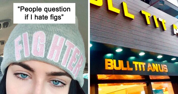
My Hat Has An Awkward Space In It That Makes People Question If I Hate Figs Lol

Howto Piss Off Your Designer

The D Could Have Gone On Either Side.

Bull Titan U.S.

Hit There

Really Smart Keming For A Local Hospital


Good Luck On Anals!

How Did They Get A Cow Into That Vending Machine!

You Had Meat. "Hello"

Thanks A Bunch Don


W I Semen Still Seek Him

Does all church graphic designers trained their skills in one awkward school?
You Want Me To Do What?

Clippy! This is a family website. Put the mouse in the house! (To paraphrase Gunther.)
Inside The Booklet That Came With My Polaroid Sunglasses

Bum Gel

The Final Countdown.

And now the famous Europe hit will never sound the same anymore :/
T U E S D A Y S

Obvous Plant is a deliberate joke, never to be taken seriously. Hell, by now I thought someone would have made an Obvious Plant "best of" post on here.
It's from the Obvious Plant company, so it's meant to be that way.
Wait, you go from graduation to horse funeral to drug intervention? This people must be rich then
Wow! They’ve already catered TWO horse funerals? If they’re French, they turned them into barbecues! (Kidding! Jeez, get a sense of humor, will ya!)
Don’t have to be French, horse meat is eaten in various countries other than France too. Also in NL, although not very common. If properly prepared, it’s quite tasteful actually. A bit between beef and deer.
Load More Replies...Jim is the reincarnation of one of the dead horses. ps: there's something odd going on in that town anyway. Two dead horses in a week, exactly a year after another dead horse, and clearly some drug induced poltergeist stuff going on.
Who is Jim? Why a drug intervention? A quiet night alone? WHAT WITH ALL THE HORSE FUNERALS!?!?!?!
What is happening there and where can I find that place? I'd like to have a "Return of Jim" party please
Today, I'ts Doudy

[intentionally Bad] My Friend Is A Creative Director And Bought These For To Give To His Team When They Earn It
![[intentionally Bad] My Friend Is A Creative Director And Bought These For To Give To His Team When They Earn It](https://static.boredpanda.com/blog/wp-content/uploads/2020/10/5f8d70db1bf8c_aYcy9mb8EOCa2-PG_YHQSGPgOOp04cxKmwsDt3Q7508__700.jpg "[intentionally Bad] My Friend Is A Creative Director And Bought These For To Give To His Team When They Earn It")
No U

I Just Stumbled Upon This Subreddit Which Is Crazy Because I Discovered And Showed All My Friends This Yesterday.


Not Sure If I'd Want To Consume It That Way

Note: this post originally had 65 images. It’s been shortened to the top 30 images based on user votes.


I wonder why BP staff delete comments when called out on something. Like the OBVIOUS PLANT post that is always fake products.
Why words on BP like "A.N.A.L" are starred? Are those a bad words?
these were hilarious but the fact that so many of them were in churches and younger schools is mildly concerning haha
