30 Times Companies Left Many People Disappointed After Changing Their Logo Design
Times change, opinions evolve (or devolve), and businesses need to adapt. Whether they want it or not, modernity creeps up on everyone—and there are plenty of successful examples of such adaptations. Companies change their policies to fit the times, ensure their values match society's, and in general, receive praise for their efforts to pull their business practices into modernity.
However, in some cases, the desire to renew oneself with the times comes with a few steps backwards. A good example would be a change in a company's logo—those are usually easier to redesign than inner workings or policy, but they also display some movement forward, so plenty of businesses jump at the chance to showcase their newfound modern outlook.
However, sometimes eagerness to appear more in with the times and attempts to modernize the look of well-established brands end up creating something that feels flat and without any of the original flair. In some cases, it can be a change of color scheme, going from a bright and vibrant design to a black-and-white and muted logo that doesn't look anything like its source. And sometimes it's the overall simplification of the logo's design that turns it unrecognizable—older companies tended to have detailed logos, which were great to look at, but with the times and automatization, the logo ends becoming more flat (a good example would be Warner Bros' logo).
While the conversation about logos and their usability is nothing new, a comment from a Twitter user Liz Franczak sparked a now-viral discussion if the simplified logos had gone too far. An in this article, we compiled some of these redesign mishaps. Clearly the companies were aiming for the modern feel, but the end result often left the customers disappointed.
This post may include affiliate links.
Bored Panda
Warner Bros.
Gmail
Yea, I realized that. It's hard to differentiate the logos now that they all have the minimalist look and the same color scheme.
Burger King
Honestly I like the older Burger King logo, but then again that is just what I'm used to.
Pringles
Nickelodeon
J.m. Smucker
Petco
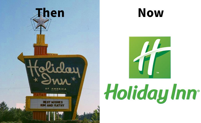
Holiday Inn
Didn't this happen a long time ago? I remember back in like 2010 I became familiar with the "now" icon.
Bmw
General Motors
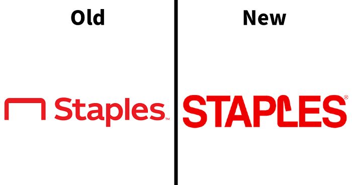
Staples
I think that's meant to be a staple... Also, it looks like it has deployed incorrectly. Points go to the original logo. No appeals.
Load More Replies...These are the wrong way round! The one on the left is the new logo, and the one on the right the old one.
I've only ever seen the one on the right. If there's a new one, it would be the one on the left.
Load More Replies...The loop on the L would have been nicer in the middle of the S twice in that word or a little rounder choice of font. This is going to bother people with OCD and professional designers
I actually like the new version better - stronger and the actual staple as a letter is sharp and easily remembered
First one that's not so bad. Well, except the "L" looks like it caused a jam.
It's the other way around.... The good one (on the right) is the old one. Insane.
Starbucks
Mountain Dew
Wendy's
Pepsi
Best Western
Olive Garden
International House Of Pancakes
Los Angeles Rams
You can argue the new logo is clever if you already know they are the Rams, but no one is going to look at that logo cold and think "Rams". Modern or not, the first one is clearly a ram.
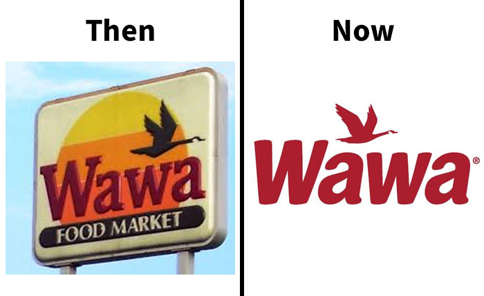
Wawa
Wawa is in Florida now and it is literally THE BEST convenience store/deli.
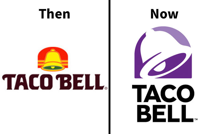
Taco Bell
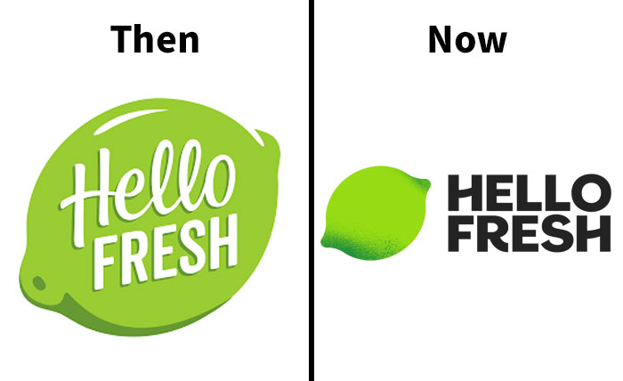
Hellofresh
Yves Saint Laurent
Syfy
Syfy sounds a bit to much like Syphilis if you read it without context in my language. ^^'
Blue Point Brewing Company
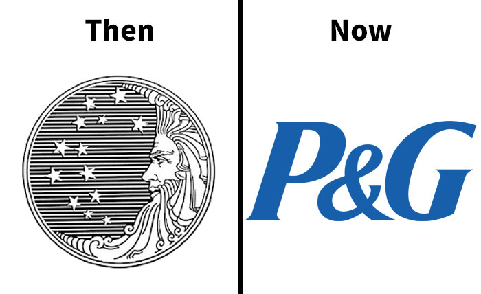
Procter & Gamble
It was changed because back in the late 70's some sort of group thought the logo was Satanic because of the 13 stars causing decrease revenues. I remember this because as a kid I was so upset; thinking how stupid these people were because I love pretty much anything celestial.
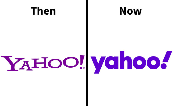
Yahoo!
tbh I don't liek the letters with lines at the edges. Just like google's old logo
Airbnb
Citroën
The Metropolitan Museum Of Art
Burberry
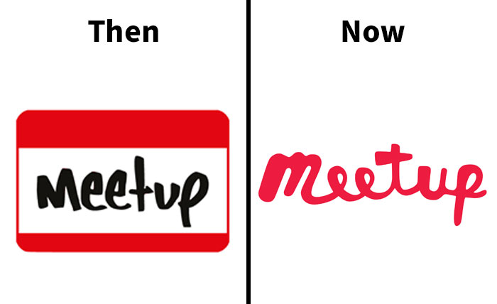
Meetup
The first one looks like a name badge with handwriting on it. The second one looks like someone had five seconds to make a logo but couldn't get any fonts to load in Photoshop so they scribbled on a napkin with a red Sharpie.
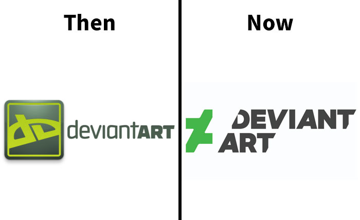
Deviantart
Black & Decker
Berluti
Disney Channel
Us Open
Where’s the tennis ball? You know, the whole point of the damn thing?
Northwest Airlines
Balmain
Bt Group
Balenciaga
Are all the high end fashion logo's designed by the same person?
My personal theory is that all those graphic designers went to art school in the 2000s and were taught that "the simpler the better" — which they implemented very carefully, for they hadn't notice that a new generation had arisen in the mean time, a very nostalgic one who loved nothing more than slightly outdated designs and small things that stay the way they always were.
Decisions to change and update are most likely based on brand positioning research conducted among consumers, i.e. what is the essence of our brand and how can that be communicated instantly with a tiny image? I've worked on the inside of that industry and the dive into the minds and emotions of consumers is fascinating and revealing of who we are.
Load More Replies...A lot of these are just "get rid of the classy, elegant serifed font and replace it with a homogenous sans serif font." Which, as a graphic designer, I dislike. Too many of the logos look alike now.
I thought that. The font and colours are pretty much all the same.
Load More Replies...*company needs new logo* Designer: How about bland bold black font on a white background?
Be honest: if you grew up with all the ones on the right, and they were changed to the ones on the left, would you feel the new ones are all better?
Load More Replies...It's odd to call some these 'logos' when they're just text - Balenciaga, Balmain Paris, Burberry. A logo seems to imply some kind of artistic, symbolic element, that would be recognizable even without reading the brand name, like the US Open, the Taco Bell bell, even Black+Decker or a stylized font, Meetup or even Syfy or Yahoo to a degree. But hey ... I'm not in the graphic design game so what do I know.
I've been a graphic designer for almost 20 years now so my perspective may be different. I think many people here prefer the old versions simply for nostalgia. "It was the original / the one from my childhood so it's superior." In my humble opinion many of the originals were dated (or plain bad designs) and the new ones are way better. Serif fonts are not as fashionable now and can be hard to read depending of the style.
New ADA regulations require fonts to be Sans Serifs. Serifs are those little lines at the ends of letter. Serif fonts are typically thinner and harder for the blind to read. Hence the reason many logos are becoming thicker and more blocky. It's so the blind can read easier. All ATMs are already required to be Sans Serif with at least 14pt font. Background must also sharply contrast text coloring.
If you really want to dive deep into website compliance, look up WCAG 2.1 requirements.
Load More Replies...As a visually impaired person I like the move to simpler, cleaner logos. It makes it much easier for me to identify the brand without all the fluff.
I never realized, they actually changed some of the logos, I guess I got super used to it and forgot
These new logos fit on cell phone screens and they look better on apps. They are adapting to the environment but some should have kept the old designs and especially at the restaurant like Wendy's. Jeez my dad drives around and he can't see where Burger King is anymore. Thanks for pulling a fast one on the world and taking our memories away. Companies now care less about the customer and the younger generation is so rude to people and a lot of that has to do with making the world a boring looking place. Why care about a business like Pepsi if they don't bother to spell their name on the can. Best Western signs look so cheap now, they match the new app logo outside on the street. We are going lose our society to bad design.
I found that in at least 50% of the examples, I preferred the original version. San serif wording makes new ones all look too similar. I really miss the Smucker's little strawberries as well.
Not being American I didn't recognise half of them... before or after!
I must say I like the THEN on almost every one, only a couple NOWs
Removed the 3d look. Minimalism. Some are better, some are ... less.
My personal pet peeve is the National Instruments logo, it went from being noticeable and different to being something that anyone could accidentally create.
Largely. Also if you're anywhere close to purchasing either it's pretty clear what they are.
Load More Replies...I think it also has to do with budget. Less graphic means less money spent on mass products.
I don't like change. In fact, most of the above were much better. Why change? If it ain't broke, don't fix it!
They got to butcher all them logos and then they think it looks good
why are so many comments getting downvoted? if you don’t agree with someone’s opinion then leave it alone or engage in a discussion. and why the heck are nostalgic comments getting downvoted?
I dont know if they mean flat in a bad way or not? I think this is interesting as hell! (might be because I work with design and logos) The trend now is flatter logos with few colors. A logo should be simple, so it's not a bad thing I think. Most of these look more "modern" and better than the old ones in my opinion.
Agree. Spent 20 something years managing brands. It’s a lot more complex than people imagine (corporate guidelines, multi media, global vs local presence, diversity, trademark properties yadda yadda)
Load More Replies...I don’t think these have ‘lost their charm’ at all, merely a reflection of current aesthetic style; clean, simple, unambiguous.
My guy. Enough. The point of this post is to show people the difference between the original and the new one and get peoples opinion on them. Not to show how the new logos, although that is a part of it.
Load More Replies...My personal theory is that all those graphic designers went to art school in the 2000s and were taught that "the simpler the better" — which they implemented very carefully, for they hadn't notice that a new generation had arisen in the mean time, a very nostalgic one who loved nothing more than slightly outdated designs and small things that stay the way they always were.
Decisions to change and update are most likely based on brand positioning research conducted among consumers, i.e. what is the essence of our brand and how can that be communicated instantly with a tiny image? I've worked on the inside of that industry and the dive into the minds and emotions of consumers is fascinating and revealing of who we are.
Load More Replies...A lot of these are just "get rid of the classy, elegant serifed font and replace it with a homogenous sans serif font." Which, as a graphic designer, I dislike. Too many of the logos look alike now.
I thought that. The font and colours are pretty much all the same.
Load More Replies...*company needs new logo* Designer: How about bland bold black font on a white background?
Be honest: if you grew up with all the ones on the right, and they were changed to the ones on the left, would you feel the new ones are all better?
Load More Replies...It's odd to call some these 'logos' when they're just text - Balenciaga, Balmain Paris, Burberry. A logo seems to imply some kind of artistic, symbolic element, that would be recognizable even without reading the brand name, like the US Open, the Taco Bell bell, even Black+Decker or a stylized font, Meetup or even Syfy or Yahoo to a degree. But hey ... I'm not in the graphic design game so what do I know.
I've been a graphic designer for almost 20 years now so my perspective may be different. I think many people here prefer the old versions simply for nostalgia. "It was the original / the one from my childhood so it's superior." In my humble opinion many of the originals were dated (or plain bad designs) and the new ones are way better. Serif fonts are not as fashionable now and can be hard to read depending of the style.
New ADA regulations require fonts to be Sans Serifs. Serifs are those little lines at the ends of letter. Serif fonts are typically thinner and harder for the blind to read. Hence the reason many logos are becoming thicker and more blocky. It's so the blind can read easier. All ATMs are already required to be Sans Serif with at least 14pt font. Background must also sharply contrast text coloring.
If you really want to dive deep into website compliance, look up WCAG 2.1 requirements.
Load More Replies...As a visually impaired person I like the move to simpler, cleaner logos. It makes it much easier for me to identify the brand without all the fluff.
I never realized, they actually changed some of the logos, I guess I got super used to it and forgot
These new logos fit on cell phone screens and they look better on apps. They are adapting to the environment but some should have kept the old designs and especially at the restaurant like Wendy's. Jeez my dad drives around and he can't see where Burger King is anymore. Thanks for pulling a fast one on the world and taking our memories away. Companies now care less about the customer and the younger generation is so rude to people and a lot of that has to do with making the world a boring looking place. Why care about a business like Pepsi if they don't bother to spell their name on the can. Best Western signs look so cheap now, they match the new app logo outside on the street. We are going lose our society to bad design.
I found that in at least 50% of the examples, I preferred the original version. San serif wording makes new ones all look too similar. I really miss the Smucker's little strawberries as well.
Not being American I didn't recognise half of them... before or after!
I must say I like the THEN on almost every one, only a couple NOWs
Removed the 3d look. Minimalism. Some are better, some are ... less.
My personal pet peeve is the National Instruments logo, it went from being noticeable and different to being something that anyone could accidentally create.
Largely. Also if you're anywhere close to purchasing either it's pretty clear what they are.
Load More Replies...I think it also has to do with budget. Less graphic means less money spent on mass products.
I don't like change. In fact, most of the above were much better. Why change? If it ain't broke, don't fix it!
They got to butcher all them logos and then they think it looks good
why are so many comments getting downvoted? if you don’t agree with someone’s opinion then leave it alone or engage in a discussion. and why the heck are nostalgic comments getting downvoted?
I dont know if they mean flat in a bad way or not? I think this is interesting as hell! (might be because I work with design and logos) The trend now is flatter logos with few colors. A logo should be simple, so it's not a bad thing I think. Most of these look more "modern" and better than the old ones in my opinion.
Agree. Spent 20 something years managing brands. It’s a lot more complex than people imagine (corporate guidelines, multi media, global vs local presence, diversity, trademark properties yadda yadda)
Load More Replies...I don’t think these have ‘lost their charm’ at all, merely a reflection of current aesthetic style; clean, simple, unambiguous.
My guy. Enough. The point of this post is to show people the difference between the original and the new one and get peoples opinion on them. Not to show how the new logos, although that is a part of it.
Load More Replies...
 Dark Mode

 No fees, cancel anytime


