Get Premium
Dark mode theme is available exclusively for premium users. Learn more about the benefits of subscribing.
No fees, cancel anytime.

 Dark Mode Ad-Free Browsing Unlimited Content
 Ad-Free Browsing Unlimited Content Dark Mode
Join 1.2 million Panda readers who get the best art, memes, and fun stories every week!
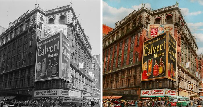
I am a photographer, I've been shooting for a long time now, but decided to get into colorizing years ago. I've always thought time travel would be fun, but changing the course of time is a pain, and it's just not worth it.
When I colorize, I'm a time traveler—seeing the up-close detail and filling in the color. My finished pieces will look as if I went back in time and shot it with my own camera. Many of them have the look of a classical painting.
This group of pictures is just New York City. Some of these buildings are gone, but you can still find some of them now.
More info: mikesavad.com | twitter.com | Instagram
This post may include affiliate links.
Now it looks like a painting of some sort. Yet, the details are amazing
In this instance the black and white one gives more of that rainy day feeling. In my opinion anyway.
It is nicely done, but for me these are more "art" then "historically correct". There was not so much color these days, and in a lot of photo's a blue sky with clouds was added.
The contrast is gone in this one. The stones of the street should shimmer, and not in this "brown light"
Nice photos. In my opinion there is a little too much colorization- too saturated? Not sure if that was the intention.
Right? I would think in the height of the industrial revolution everything would look dirty, sooty, grey. More like the original photos. Certainly not "that" much color.
Load More Replies...These are nice, but at this point of distortion it's more like a painting than a colorized photo. I would change the title
They do point out in the bio/description that some of these look more like classical paintings.
Load More Replies...According to the author, everything should look like a painting, but these clouds are too realistic (looks copy paste from a photo) and often steel the spotlight from the other parts of the picture.
Load More Replies...Nice photos. In my opinion there is a little too much colorization- too saturated? Not sure if that was the intention.
Right? I would think in the height of the industrial revolution everything would look dirty, sooty, grey. More like the original photos. Certainly not "that" much color.
Load More Replies...These are nice, but at this point of distortion it's more like a painting than a colorized photo. I would change the title
They do point out in the bio/description that some of these look more like classical paintings.
Load More Replies...According to the author, everything should look like a painting, but these clouds are too realistic (looks copy paste from a photo) and often steel the spotlight from the other parts of the picture.
Load More Replies...


 No fees, cancel anytime


")