Get Premium
Dark mode theme is available exclusively for premium users. Learn more about the benefits of subscribing.
No fees, cancel anytime.

 Dark Mode Ad-Free Browsing Unlimited Content
 Ad-Free Browsing Unlimited Content Dark Mode
Join 1.2 million Panda readers who get the best art, memes, and fun stories every week!
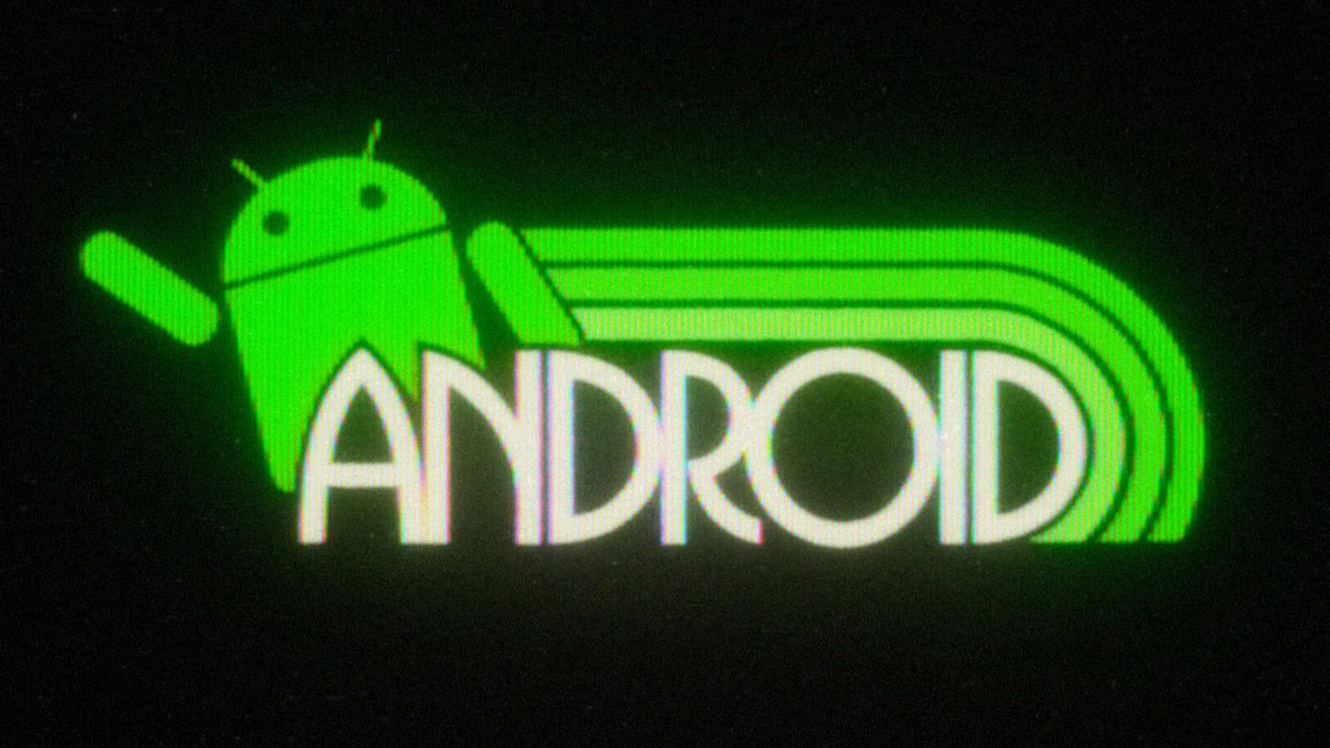
Kostya Petrenko is a graphic designer who brings a fresh twist to the world of logos, creating retro-inspired designs that look like they belong to a bygone era. His unique style takes familiar logos, like Google, Duolingo, and Instagram, and reimagines them with a vintage touch, drawing influence from the bold, playful designs of the '80s and '90s.
Every redesign features the striking gradients, thick fonts, and vibrant color schemes that were popular in the '80s. To enhance the nostalgic vibe, Kostya adds a retro CRT TV filter, giving the designs the appearance of flickering on the old tube televisions we remember from our childhood.
More info: Instagram | behance.net | kxd-studio.com | tiktok.com
This post may include affiliate links.
Bored Panda reached out to Kostya to learn more about his creative process and journey. The artist shared that he has been exploring graphic design for about a year and a half. "I was always fascinated by retro graphics, so one day I decided to try creating something myself using an online graphics editor. I really enjoyed the process, so I got Adobe software and started learning every day."
When designing a logo, Kostya almost always begins by drawing inspiration from the 1980s. "Once I have a solid idea in mind, I begin digital sketching in Illustrator. After a couple of hours, when I’m happy with the design I bring the vector file into After Effects to animate it."
A good logo stays relevant and memorable over time. Kostya believes that fun, creative, and colorful designs—especially from the 1980s—capture this timeless quality. "I think a timeless logo is fun, creative, and colorful. I’ve seen so many incredible 80s logos and I honestly don’t understand why companies got rid of them."
Looking ahead, Kostya shared that he would love to work with major companies like Google. "However, really I enjoy working with any brand that wants to give their logo a retro touch."
Why not just use the logo Polaroid (founded 1937) actually had back then?
This seems more appropriate to the Rockstar energy drink than the game maker.
Like Polaroid, Adobe already had an 80's logo. The company was founded in 1982. Adobe-Logo...76-png.jpg ![]()
Again....Microsoft already existed in the 80's ,and therefore obviously had an "80's logo"
While Max didn't exist in the '80s, HBO definitely did. This ought to be built on their '80s logo, which was all caps.
Creative! Yes, some of these entities existed in the 80s, but the artist is reimagining the current design through the lens of nostalgia which is quite clever, and nicely done.
I agree with what you're saying but even though there's a crossover between generational aesthetics a lot of these hit as smack bang in the middle of the 70s
Load More Replies...The comments that say , oh why not just take up on their actual 1980s logo…….They are really missing the point.


 No fees, cancel anytime


")
")