Get Premium
Dark mode theme is available exclusively for premium users. Learn more about the benefits of subscribing.
No fees, cancel anytime.

 Dark Mode Ad-Free Browsing Unlimited Content
 Ad-Free Browsing Unlimited Content Dark Mode
Join 1.2 million Panda readers who get the best art, memes, and fun stories every week!
Unless you’re a graphic designer or a person with an eye for arts and, well, design, you don’t think too much about it. We mean about the fact that the milk carton you have in your fridge was actually designed by someone or that the writing on your toothpaste tube is actually the product of somebody’s meticulous work. That is, you really don’t think about it until you encounter a case of bad graphic design. Then, the failed designs are glaringly obvious and utterly hilarious, making us think our thoughts sequencing around the key phrase, How on Earth did it pass the inspection? But, since most of us are human here and share the same passion for laughing at incredibly hilarious design fails made by someone else, we invite you to laugh at them together with this awesome list full of graphic design fails from hell.
So, the fact is you’ll find such crazy examples of bad design here, you wouldn’t have thought they were possible in the first place. After all, they are the fruits of somebody’s work; then someone had to approve them, then do the final layouts, and release these poor graphic designs into the wild. Again, How on Earth? Well, sure, some human errors can always slip through the cracks unnoticed, but these are just poor excuses for doing the job you were supposed to be good at. Anyway, more laughing stock for us!
Now, our top picks of the funniest design fails await you just a teensy bit below, so scroll on down and check them out. However, you probably shouldn’t check out this article while working, because once you start soaking in these bad designs, you won’t be able to stop until you’ve finished with the whole bunch - a hundred and five submissions!
Oh, right, before you start - don’t forget to give your vote for the Bad Graphic Design contest winners and share this article with your graphic designer friends; we’re sure they will appreciate this cringefest.
This post may include affiliate links.
Do not exceed 20 children. Do not exceed 20, children. If you do have 20 children, for God's Sake don't let them drive.
This toilet is exclusively for trans people with 3 legs or very short legs
My boyfriend finds timothee chalamet attractive (I think he needs to take better care of his hair) and I really want to send him the second pic
This was not created by a graphic designer, who would have immediately realized that (1) the background needed to be less opaque to increase contrast for legibility, (2) three different fonts is one too many, (3) the tagline does not need quotation marks, (4) having all the text centered looks amateur, (5) the logo needs to be more coherent, and (6) the graphic is weird, badly cropped, and not relevant in any way to the product. Did I miss anything?
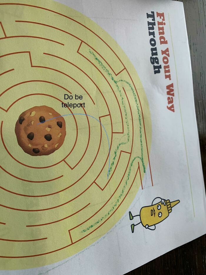
Hark! Methinks it doth be a woeful occasion to have thy eyes!
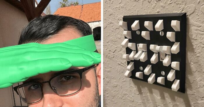
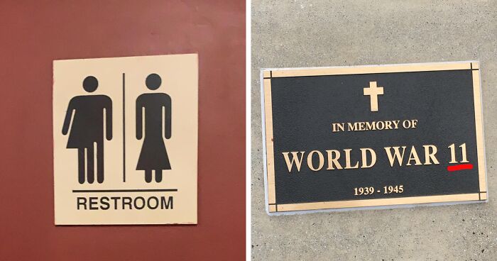
That's painful, but at least they did not try to make a venn diagram out of it.
Be Una Polo Geti Cally You = Be unapologetically you and cringe hard
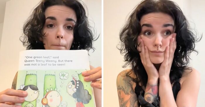
guess they figured... "Nah, let it go as is. The kid can't read yet anyway".
Pibu zzarger? I am personally offended by this statement about my hedgehoggy mother in my planet’s language!
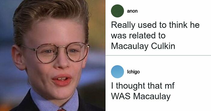
Took me a minute to realize “Win River Plumbing” was not the intended name.
When you realise it say 'Twin Rivers' you can magically see the 'T' & the 'S'.
My brain insisted on singing the righthand part in Harry Belafonte's voice.
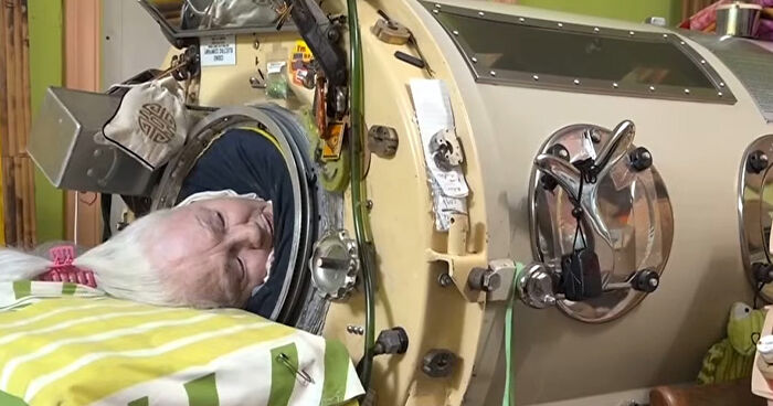
…Are you sure the person is still alright? That pulse looks ominous
Owner: "The sign will be this *scribbles*" Contractor: "Say no more*


 No fees, cancel anytime


")