Since the last time we wrote about Terrible Maps, a project that is dedicated to sharing maps no one asked for or needs, they've kept themselves rather busy. So it's only natural we created a follow-up article about the cartographers who are so bad, they're actually good. After all, what is the Internet for if not to poke fun at politics and our geographical illiteracy?
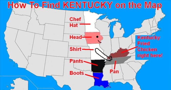
From hilarious guides on how to find the state of Kentucky to showing how many Switzerlands fit in Brazil, continue scrolling and check out these gems and tell us which one would you hang on your office wall!
More info: Facebook | Instagram
This post may include affiliate links.


OK. We can clearly see these are bad maps. But how to know you're looking at a good one? Brant Scheidecker, a sales engineer at Cartegraph, highlighted some of the main essentials for accurate and easily interpretable map use.
"Every map should have a title. It allows the user to assess the purpose of the map quickly; allowing them to determine if it meets their needs," Scheidecker wrote.
Next, origin. A fancy name for a compass or the North arrow. "This allows the user to determine the maps reference to the earth. While most maps these days have North being straight up, occasionally you will encounter a map that has a skewed orientation, perhaps to better fit it on the physical medium it's presented on (i.e. paper), or simply because it’s easier to interact with the map in that orientation."

When it comes to the source, it's a two-fold element. "It allows the map maker to provide the map viewer an idea where the data the map is representing is from; a necessity in determining the accuracy of a map. It also allows the map maker a way to cite the source of their data, avoiding all those pesky cries of plagiarism and the ensuing lawsuits," Scheidecker explained. "You have better uses for your time, like ensuring the rest of the T.O.S.S.L.A.D. elements are on your maps."
Let's not forget the legend (the area where a user can determine what a particular color or symbol represents on the map). "Without a legend, a user cannot successfully interpret what your map is trying to represent, 'Does the red skull and crossbones over my favorite restaurant mean what I think it means?'"

You should also know when was the map that you're analyzing made. If it was created in 1962 and shows commuter levels in Chicago—it might not be such a valid source for the traffic data you are looking for today, unless you are feeling nostalgic, Scheidecker joked.
There you have it. You may now have become a cartographic genius, but you should be able to tell if you're looking at a terrible map or not!


I don't understand why Iceland is not green, but Spitsbergen is


Quite ashamed --- is that green or yellow colourcoded?
Load More Replies...I feel bad about this, but I always forget about the islands between Australia and Japan. I know they are huge and millions of people live there, but still...
I'm an American and I care about disasters anywhere, including places referred to in foul ways by certain presidents. What is happening off the coast of Greece right now is so sad...
Like it says, so sad. All joking aside, so am I and so do I. Unfortunately, America gets a bad reputation because the idiots are the loudest.
Load More Replies...I don't think people in, say, Eritrea or Indonesia will agree with this map...
This map shows how most Americans think about the rest of the world (meaning: they don't know or care). Unfortunately, It's accurate. I have tears in my eyes right now because it is true.
Load More Replies...I see so many places that haven't been brought USA democracy. Are, are there countries out there that we haven't invaded....er am helped yet?
And then theres Portugal, where no tragedy hapens so it aint on the map o.o
This is more like "How terrible it is to America when a tragedy happens"
Clearly the red countries are very upset because Iceland has somehow tragically collided with Ireland.
I am sad that most people don't know what Malaysia is-and I also feel so ashamed.
well I guess I should be grateful that I live in the yellow bit at the bottom of the s**t in Africa.
What the hell. This peace of bingo bongo sucks. I know it’s really accurate but we need to do better though :/
I think they are saying we are nosey and need to know everything going on everywhere even if it doesn't (or shouldn't) concern us.


No surprise, if the person with this opinion is a believer, that the Earth is flat...


Nah. We see a giant a*s bible for most of those middle states. Oh and guns. Lots and lots of guns.

i don't even want to try saying that one. you know which one I'm talking about.


According to my dots in MS Paint over each: 132. Might be wrong, but I am not doing it again. EDIT: Did it again and Beto River is right, I missed 10 at some point. Thank you Beto!

I understand mistaking it with Iraq or Afghanistan, but how the f**k did they go to Africa and the Balkans? A couple are even in the UK, for crying out loud.

Note: this post originally had 150 images. It’s been shortened to the top 30 images based on user votes.


The main reason almost all of these maps are so terrible are the emoji, which (apart from they're extremely annoying) sometimes cover text.
I can now recognize Rokas Laurinavičius' posts after the first three entries.
Many of these maps would only be considered terrible from a geological point of view. A lot of them are demographic which, I find fascinating.
Found the anti-intellectual, liberal-hating conservative crusader who’s going to change us all by mocking us...
Load More Replies...The main reason almost all of these maps are so terrible are the emoji, which (apart from they're extremely annoying) sometimes cover text.
I can now recognize Rokas Laurinavičius' posts after the first three entries.
Many of these maps would only be considered terrible from a geological point of view. A lot of them are demographic which, I find fascinating.
Found the anti-intellectual, liberal-hating conservative crusader who’s going to change us all by mocking us...
Load More Replies...