ADVERTISEMENT
Article created by: Justinas Keturka

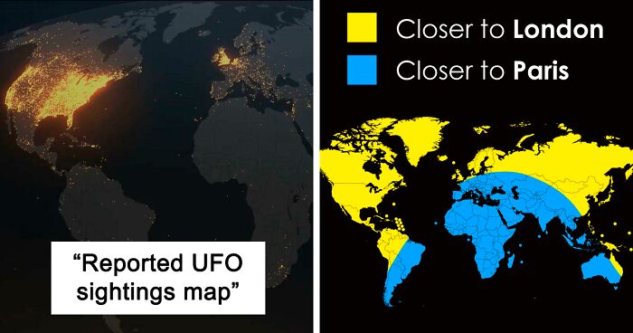
For me, maps are the perfect fusion of art, information, insight, and entertainment. They help us navigate both physically and in the realm of ideas. What separates a good map and a great one is that the latter doesn’t stop with just mapping the territory: it expands the borders of our imagination.

There’s hardly a better place to see original, unusual, and interesting maps than this subreddit right here. Though we can’t mention the name (thanks, internet police!), it’s a veritable treasure chamber for cartographers, amateur and professional alike! Having celebrated its 10th birthday this spring, the online group now boasts more than 1.6 million members, pulling in thousands of new ones on a steady basis. Content is king and these redditors, including the founder, land surveyor Patrick McGranaghan, make some truly marvelous maps.

Featured here you’ll find some of the freshest and greatest new maps. Pack your bags, put on your safari hats, and let’s go on an adventure, Pandas! Just remember to upvote the maps that you enjoyed the most, the ones that taught you something new, and the ones that gave you a fresh perspective on the world.

Patrick, the founder of the subreddit, revealed to Bored Panda what makes a good mapmaker and whether we all need to be tip-top artists. A lot depends on the purpose of the map itself, however, the main goal is to make it as informative and easy to understand as possible. Art skills? Not as important. (Though certainly a plus!)

"There are many different reasons one chooses to make a map. Sometimes for navigation, sometimes for showing statistical phenomena, and sometimes for fantasy. While artistic skill helps, it is not absolutely necessary. The important thing is to make it easy for users to glean useful information. Most maps should have a thesis or a story it is going to tell and this needs to be told through the map," he said.

Hungry for more magnificent maps? Then you’ll want to have a scroll through Bored Panda’s previous articles about map-lovers and their creations here: [Unrolls 5 parchments with ancient symbols and drawings] Part 1, Part 2, Part 3, Part 4, and Part 5.

More info: Reddit | Twitter | Tumblr

#1

The Journey Of An Arctic Fox Who Walked From Norway To Canada In 2018

Map showing sea ice concentration and movement rate near Ellesmere Island, Greenland, and Spitsbergen with dates and stopovers.

oglach Report

RELATED:
    #2

    The Baltic Way. On 23 August 1989, Two Million People Joined Their Hands To Form A Human Chain Spanning 675.5 Km Across The Three Baltic States. The Protest Was Against The Soviet Occupation, And To Support The Independence Movements Of The Three States

    Map of the Baltic Way human chain through Estonia, Latvia, and Lithuania showing historical borders and routes.

    SteO153 Report

    #3

    A Map Art Piece I'm Working On Of Paris' Latin Quarter

    Detailed hand-drawn city map showcasing intricate streets and buildings, an example of unusual maps changing perspective.

    CamTron89 Report

    #4

    No One Lives In The Green Part Of New Zealand,the Population Density There Is 0 People Per Km And That Is About 78% Of New Zealand Land

    Map showing parts of New Zealand with no inhabitants per square kilometer, highlighting unusual and informative map data.

    Felixheifgwofbebrjwh Report

    ADVERTISEMENT
    #5

    Zealandia, The 8th Continent That's Almost Entirely Submerged

    Map showing Zealandia, the Earth's eighth continent, mostly underwater near Australia and New Zealand, with key features highlighted.

    JamesWinter83 Report

    ADVERTISEMENT
    #6

    Rivers Of Italy

    Colorful unusual map of Italy displaying detailed river networks and regions on a black background, showcasing informative geography.

    JoeFalchetto Report

    #7

    Territories Where Married Gay Couples Can Buy Rifles To Protect Their Marijuana Plants

    World map highlighting territories where married gay couples can buy rifles to protect owned m*******a plants, unusual map perspective.

    born_in_cyberspace Report

    #8

    Wolf Distribution In Italy Since 1900

    Map series showing changes in wolf population in Italy from 1900 to 2020 with illustrative wolves in the 2020 map.

    d-williams Report

    ADVERTISEMENT
    #9

    Reported UFO Sightings Map. Last 115 Years

    World map showing reported UFO sightings from 1906 to 2014 with high concentration in the United States and parts of Europe.

    Sketchder Report

    ADVERTISEMENT
    #10

    The Easternmost Point Of Brazil Is Closer To Africa Than To Its Westernmost Point

    Globe showing unusual map distances between South America and Africa with highlighted borders and kilometers marked.

    Thessiz Report

    #11

    The Longest Possible Train Travel In The World

    Satellite map showing an unusual route across Europe and Asia highlighted with an orange line in an informative maps collection.

    gutturalEland9936 Report

    #12

    Existence Of Pangaea Proven With Evidence Of Similar Fossils Across Continents

    Map showing fossil evidence linking continents, illustrating unusual geological connections in an informative perspective-changing map.

    No_Woodpecker259 Report

    ADVERTISEMENT
    #13

    Closer To Paris Or To London?

    World map showing areas closer to London in yellow and closer to Paris in blue, an unusual map perspective.

    atlasova Report

    ADVERTISEMENT
    #14

    Countries That Have Yet To See True Temperature Extremes

    Map showing European countries that have never had temperatures above 35°C, highlighting Iceland and Ireland in green.

    jack_urian Report

    #15

    After Tokyo 2020 This Map Remains The Same. All Men’s Water Polo Gold Medal Winners Since 2000 Were Born Inside This Circle

    Map showing multiple marked locations across Central Europe and the Balkans, part of unusual informative maps collection.

    ASR004 Report

    #16

    Variations Of The Given Name “Paul”

    Map showing variations of the name Paul across European languages, illustrating unusual and informative linguistic differences.

    PaulOshanter Report

    ADVERTISEMENT
    #17

    Land Reclamation In The Netherlands

    Comparison of maps showing land and water changes in the Netherlands from 1300 to today, illustrating unusual geographic shifts.

    Wrub229 Report

    ADVERTISEMENT
    #18

    Butter Or Olive Oil? Based On Actual Per Capita Consumption

    Map showing per capita consumption of butter versus olive oil across Europe, highlighting regional preferences in unusual maps.

    Landgeist Report

    #19

    The Strait Of Gibraltar

    Satellite view map showing detailed landforms and coastal regions with mountains and plains as an unusual informative map example.

    eastofnowhereco Report

    #20

    Europe If The Sea Level Rose 100m

    Map of Europe with country borders highlighted against a blue sea, illustrating an unusual perspective on geography.

    oneletterh Report

    ADVERTISEMENT
    See Also on Bored Panda
    #21

    Share Of Young People Aged 25 -34 Living With Parents

    Map showing the share of young people aged 25-34 living with parents across Europe with percentage data.

    silviucodreanu Report

    ADVERTISEMENT
    See Also on Bored Panda
    #22

    Number Of Prisoners Per 100 000 People In European Countries

    Map showing the number of prisoners per 100,000 people in Europe with color-coded data for prison rates.

    theworldmaps Report

    #23

    Traditional Hats Of Europe

    Map of Europe showing traditional hats worn in each country, an unusual map highlighting cultural headwear differences.

    Xrodo33 Report

    ADVERTISEMENT
    See Also on Bored Panda
    #24

    Sun Tanning vs. Skin Whitening

    World map showing Google search trends from 2004 to today for sun tanning versus skin whitening by country.

    sam_3758 Report

    #25

    Languages Of Europe Using Lemon And Citrus

    Map of Europe showing countries that use the term lemon or citron with color-coded variations for unusual maps perspective

    Due-Fee-4521 Report

    ADVERTISEMENT
    See Also on Bored Panda
    #26

    Percentage Of People Who Trust Climate Scientists, 2020

    World map showing percentage of people trusting climate scientists, featuring unusual and informative data from global regions.

    SkinlessFather Report

    ADVERTISEMENT
    See Also on Bored Panda
    #27

    How Do You Sneeze?

    Informative and unusual map showing different ways to say sneeze across Europe, changing perspective on language diversity.

    atlasova Report

    #28

    Percentage Of Indians With Toilet 2014 vs. 2017

    Map showing the percentage of Indian households with toilets in 2014 and 2017, highlighting changes over time.

    Cultural_Editor_4250 Report

    #29

    Countries That Are Obligated To Defend The United States And Vice Versa

    World map showing countries obligated to defend the United States, highlighting unusual and informative geopolitical alliances.

    MeronDC Report

    ADVERTISEMENT
    See Also on Bored Panda
    #30

    North America Compared To Jupiter

    Close-up view of Jupiter’s surface showcasing cloud formations and the Great Red Spot in an unusual space map perspective

    AmericaRUserious Report

    ADVERTISEMENT
    See Also on Bored Panda
    #31

    Countries Where It's Illegal To Smack Children!

    World map highlighting countries where it is illegal to spank or smack children, an unusual and informative map perspective.

    atlasmapper Report

    #32

    Countries Whose Local Names Are Extremely Different From The Names They're Referred To In English

    Map highlighting countries with their names displayed in native or local languages, showcasing unusual and informative perspectives.

    benjaneson Report

    #33

    Nearly Half Of American Will Have Obesity By 2030

    Map showing projected U.S. obesity rates by 2030 with most states exceeding 50% obesity, highlighting health trends.

    pouya02 Report

    ADVERTISEMENT
    #34

    Number Of Cigarettes Smoked Per Smoker Per Day In European Countries

    Map showing the number of cigarettes smoked per smoker per day in Europe, an informative and unusual map perspective.

    NotTheThreeBit Report

    ADVERTISEMENT
    #35

    Percentage Of Obese Population Per Country In Europe

    Color-coded map of Europe showing percentage data with informative and unusual maps highlighting regional differences.

    BlejiSee Report