When most of us think about the word “data'' our eyes glaze over as a million Excel cells appear in our minds, putting us to sleep. So clever folks out there rolled up their sleeves and got to work, making visual depictions of data that help us better understand the world.
This online group shares various cool and interesting maps that help put all sorts of facts and figures into context. So get comfortable, prepare to brush up on some geography, and get to scrolling. Be sure to upvote your favorite posts and share your thoughts and observations in the comments section below.
This post may include affiliate links.
Good Political Maps Of Oceania Are Hard To Come By


Kiwis breathe a sigh of relief that they are not being overlooked for a change
The Literal Meaning Of Every Country's Name In Africa

Endings Of Places In Poland

This is the result of an old dialectal boundary. and another fun fact: In Northeastern Germany you will find lots of places that end in -ow, showing that the old Slawic Tribes were living in that area, way before any of today's national borders.
If you have ever taken a casual look at an average map of the world, you have no doubt been struck by the sheer size of Russia and, to a lesser extent, Canada. This does make sense, as these are the largest countries on the planet, however, did you know that a little feature of mapmaking called Mercator projection makes them look significantly larger than they really are?
This comes from the Flemish geographer and cartographer Gerardus Mercator, who created a “cylindrical” map to represent the world in 1569. After all, unless you are looking at a globe, most maps are drawn, painted, or printed on a rectangular surface. Imagine the tube-like maps pirates are always dragging around and you have a pretty good depiction of an early Mercator map.
Average Color Of US State Based On Satellite Imaging

I wonder why that is? Seems like quite a coincidence.
Load More Replies...The fact that so many people misunderstand this map shows that people don't get out of their house enough. Looking at this map you can tell where the deserts are and where the Mississippi River and Missouri Rivers run. Not everything is about American politics. Political parties should be classified terrorist organizations. Except they spread fear to manipulate voters to vote for them.
As someone from a tan/brown state, being in a green state is such a culture shock. People actually see that beauty all the time? My state is beautiful, but our beauty is very different.
I really relate to that. I grew up in Arizona but moved to Washington State. Huge difference!
Load More Replies...Covering up a bad comment! Do me a favor and don't view the one at the bottom. Also my state is greyish-green! Would you look at that!
All you're doing when you post a comment like this is drawing more attention to it. Please don't! Just downvote and report.
Load More Replies...This is...an odd map. What "color" are they supposed to be? Purple?
You might be color blind if you see purple. It's the average color of the land from the sky.
Load More Replies...The greener states have more forest/vegetation, the browner states are more arid/desert/plains :) it’s just showing the average colour of the terrain from each state. You could call it “mildly interesting.”
Load More Replies...Satellite imagery. It says in the description, if u actually read it (so yes, vegetation, which is a function of hydration/precip)
Load More Replies...Coming from Washington State - "The Evergreen State" - I was very pleasantly surprised during a recent visit to (northern) Alabama by how green it is. The landscape is heavily forested with oak trees and pine, and in light of that I can clearly see why Alabama on this map is greener shaded than Washington State.
What’s The Most Popular Sport In Each Country?

Correct usage of football ⚽️ /s ☺️ not that I care about sports, just find the wordusage peculiar..
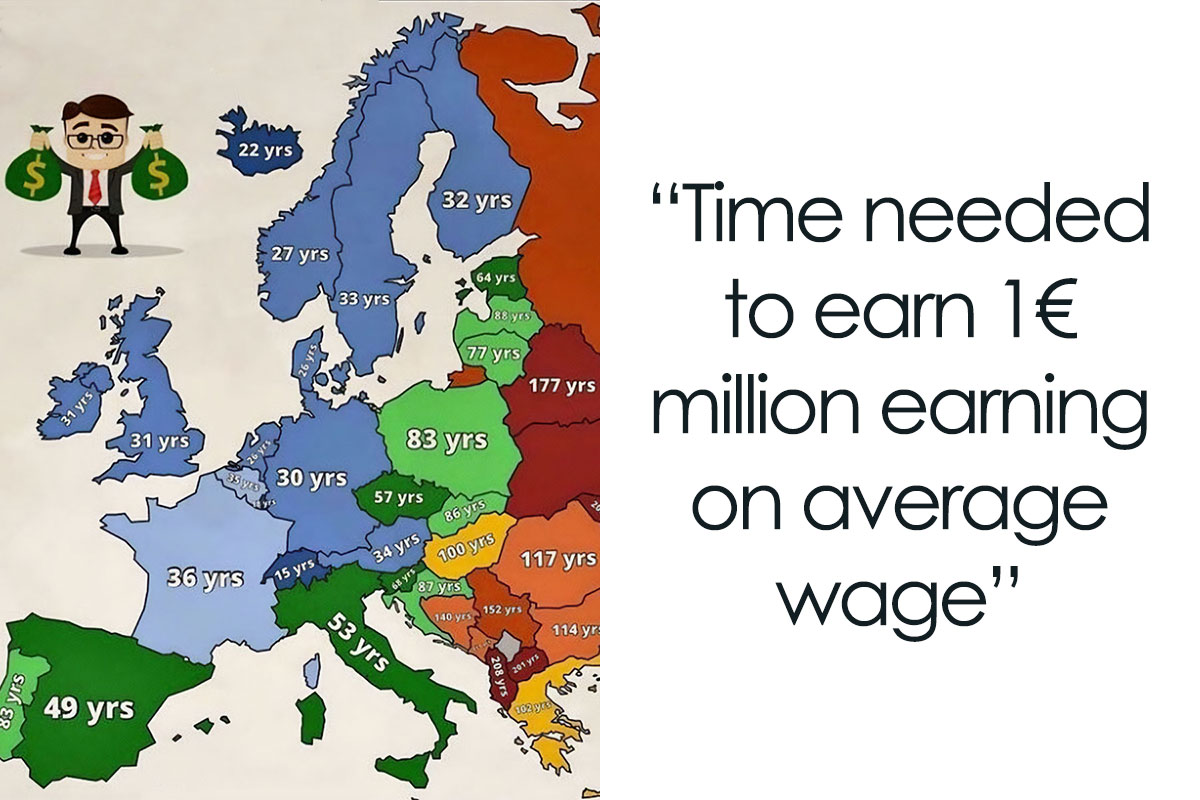
Time Needed To Earn 1€ Million Earning On Average Wage

After all, the real landmasses on the planet, which are spherical, don’t translate 1-to-1 on a rectangular map. Certain sections end up stretched and, as a result, appear to be a lot larger than they actually are. Mercator chose to “focus” the map on the northern hemisphere, where locations closer to the “top” of the map would end up seeming larger. Hence Russia and Canada being absolutely gigantic on so many maps.
Population Density In China

How Many % Of People Would Not Want To Live Next Door To Lgbt People?

World Map According To China In 1799

In fact, at the time, these maps were specifically created to aid in marine navigation. While it’s quite irrelevant to us, early seafarers could use a Mercator map to get a “straight” bearing when sailing to a new location. On a map that doesn’t use Mercator projection, the bearing would be a curve, representing the curve of the globe.
U.S. States That Have Banned The Most Books (In Autumn 2022)
")
At least it started backfiring in Utah, banning the bible from schools. For content of murder, violence, sexual things etc.
Percentage Of Population (25-64yrs) In Europe That Cant Speak Any Foreign Language
 In Europe That Cant Speak Any Foreign Language")
English is mandatory here in Germany, additionally there are usually choices for french and spanish on top
Europe’s National Animals

This sort of map has simply stuck around for hundreds of years, leading many people to draw somewhat incorrect conclusions about the real size of things. We are lucky that Russia and Canada really are the two largest countries, so the distortions don’t seem as bad. Other examples of distortion are the similarity between the UK and Madagascar, despite the latter being nearly twice as large.
Belief In Life After Death In Europe

Average Money Spent On Weddings In US States

This is absolutely wild. Looking at California....this is more than I spent in the last 10 years for various vacations. I'm from Germany, and those vacations included USA & Hawaii, Australia, New Zealand, the Seychelles, Mauritius and countless trips within Europe. (Yes, I'm counting my expenses.) I would never ever exchange these experiences with a one-time party. Absolutely absurd!
Roman Coin Hoards, From The 'Coinage In The Roman Empire' Project — 'Hoards Containing Coinage In Use In The Roman Empire Between 30 B.c. And A.d. 400.'

Even more comically, due to its northerly position, Alaska appears to be roughly the size of Australia, despite the fact that the land down under is almost five times larger. You can find an excellent gif depicting the presented and real size of various nations here.
When Is Weekend


Asia's Counting System. How Do You Say The Number 57

Blue and yellow are reasonable, the rest seems overly complicated. Edit: Orange, not yellow ^^
Unemployment Rates In Italian Provinces

Male Body Hair Distribution Of Indigenous Human Populations Around The World

Sex Ratio

And yet, men are treated as the default despite being a smaller percent of the population in the majority of countries.
Percentage Of Light vs. Brown Hair In European Countries

Most Wasteful Countries In The World

Dog Owning States vs. Cat Owning States

Air Polution In Europe

Whoa... What's happening in nort Italy, Poland and around the Balkans? Why is it so bad there?
US States By Violent Crime Rate

Would be interesting to know how this compares to other parts of the world too
The Countries With The Most Island

The islands in Sweden are very very small but numerous. That's why they don't show up on most maps.


The Most Consumed Type Of Meat By Country Including Fish & Seafood

Nope, according to 'The Swedish Board of Agriculture', it's poultry meat (when not including sausages, ham and kassler). When you include them (and assuming they are 100% pork meat, pork is #1 by approximately 3,5x compared to fish.
The Most And Least Happy Countries In The World

Projection Of Water Stress Level By Country In 2040

Highest Temperature Recorded In Europe Countries

These maps are misleading. They should have shown the point where it was reached and the temperature by zones. As it appears on the map it seems that all of Spain reached 47 degrees when it was in the south of Spain and probably in the northern half the temperatures were. By far lower
Note: this post originally had 54 images. It’s been shortened to the top 30 images based on user votes.

When I joined bp, I struggled in comprehending what I was looking at relating to these kind of maps...but when I finally got a 💡 inside my brain, I instantly fell in love with 'em...🗺️🌏🌎🌍🗺️
If you want more stuff like this I believe Visual Capitalist does a lot of them.
Load More Replies...Well, the etymological map was good. The rest are completely moosecock as far as I could tell by looking at the sources. If they documented them. Oh, FSM, please guard me from taking it seriously again :)
