Get Premium
Dark mode theme is available exclusively for premium users. Learn more about the benefits of subscribing.
No fees, cancel anytime.

 Dark Mode Ad-Free Browsing Unlimited Content
 Ad-Free Browsing Unlimited Content Dark Mode
Join 1.2 million Panda readers who get the best art, memes, and fun stories every week!
A map can take you on a journey, transporting you across continents and cultures all with a single glance.
What started as a simple map drawing on a clay tablet centuries ago in Babylon has slowly evolved alongside us. For the longest time, maps were purely used for navigation — even when we moved them online through GPS.
But today, they do so much more. Modern maps are helping us navigate human behavior, global trends and everyday habits that shape our lives.
For example, did you know how many racoons have taken over Germany? Or how many people lock their doors across America?
Some cartographers are blending art, math, and technology to uncover these very patterns in raw data, and then sharing their findings online.
Many of these maps have been shared on Reddit, where a growing community with around 1.8 million weekly visitors posts and discusses thousands of maps every day. From there, we have narrowed down a list of some of the most interesting ones worth a closer look.
This post may include affiliate links.
Thankfully, here in the UK and EU we will never have to experience the Cyber truck on our roads.
We had the chance to speak with Danny Dorling, a renowned geographer and cartographer, about his work and his passion for maps.
He believes cartography is a way to see the world differently. “It’s about seeing the world. And choosing how to depict it - and other people!”
A professor of Geography at the University of Oxford, Dorling says maps are a way to make sense of complex information visually. “I was very bad at reading as a child and even worse at writing. I liked maths, pictures and graphs - hence maps,” he says on the importance of maps to him.
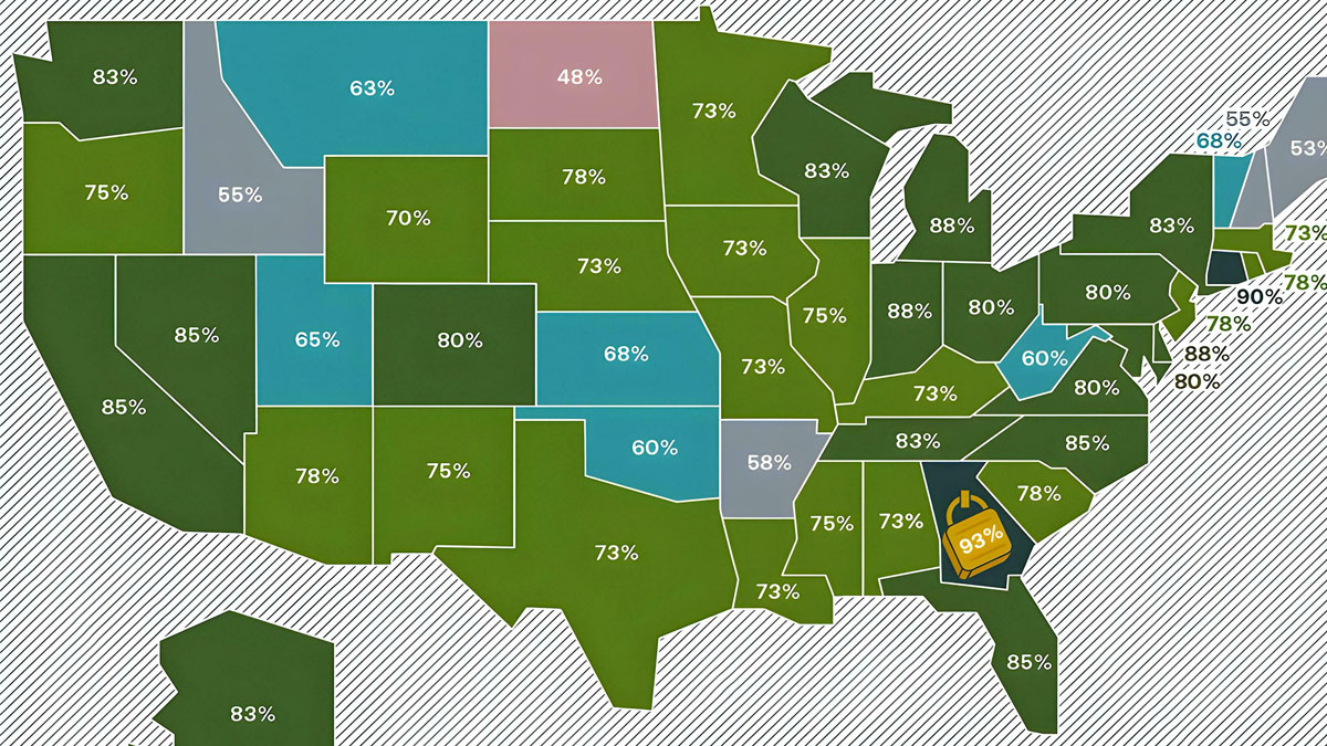
Curious why it's so much lower in the eastern areas? Economics, geography, or something else?
Before every pub quiz, the first thing I do is go online and hunt for maps — maps of countries and cities, but also maps highlighting lesser-known global trends and data that I would never have found interesting if it was presented as a part of a graph or a table. It also helps me remember the data long after I’ve shut off my screen.
This lasting impression is a powerful advantage of using maps.
That is why every time there is an election season, political parties make sure to fully utilize this tool since they know that maps can easily influence and attract public views.
They installed huge mirrors on the northern mountain range to reflect sunlight onto the town square IIRC
Based on the immigration numbers they probably messed up the math for Germany
As Penn State researcher Anthony Robinson found in his research, maps can quickly go viral online, start conversations and shape opinions in general.
He believes that such kind of maps — whether about a serious issue or even satirical — tap into human emotion and make information simpler. These ideas are also easily shareable, which is another reason that they are so widely used by parties and the media.
Whatever the reason may be, it is no surprise that maps capture attention in a way that plain text or numbers often cannot.
Given how much public transport s***s outside of big cities here in Germany I'm surprised that it isn't higher
Dorling explains that creating a map that tells the full story is not always easy. One of the biggest challenges is convincing people why it is necessary to transform the data in the first place. “Then explaining to them how it works,” he adds.
He compares the challenges of making maps to that of making graphs.
“A cartogram transformation, usually to population, is just as dramatic a change to the underlying projection. It usually completely alters what is needed despite the data being identical.”
What it means is that even though the actual data does not change, the way you present it can change how people understand the exact same thing. The same numbers, but a different perspective.
Does "the rich" mean anyone richer than them? Because there's a lot of 'rich' people in Europe by a few standards.
Okay, to clarify: It shows the nations to which the people of this countries emmigrated to the most - The french went to Canada the most, the italians to Brazil, etc. - The wording is backwards to what the map shows so to say
Maps also have a way of starting controversies. The classic world map that most of us grew up with — the Mercator projection — recently started trending online as people realised that it severely misrepresents the size and shape of continents. For example, Greenland looks the same size as Africa, even though Africa is actually about 14 times larger in reality.
Once the discussion started, a revised world map made by a college student quickly went viral on Reddit, and was shared by several news websites. It gave everyone a fresh perspective, highlighting where people actually live instead of just how much land each country takes up.
In an interview with Business Insider, the student said: “I just have a passion for maps and thought I could help educate people with this one. I think viewing the world in this way is helpful in geo-politics because it's a true representation of the part of the world that's most interesting to us: the people on it!”
Ireland really doesn't seem right from everything I've seen there and know about it. I'm guessing large software companies and music bands who get lucrative tax breaks are skewing the figures.
Experts believe that cartographers have always used storytelling when designing maps. Many ancient maps were aligned with traditions or cultural narratives, which is why they worked — they helped people make sense of the world in a way numbers alone could not.
But in today’s world of endless scrolling and short attention spans, what kinds of maps actually grab our attention?
Research says that the way a map is designed including the colors, the size of things, even how it is presented can actually make us feel something. Maps carry all kinds of emotions — they show how we experience and connect with places.
Simple yet colorful maps can make people pause for a moment, and try to understand the stories behind the data. It may even make them do a further deep dive into an interesting topic, making maps more memorable and engaging.
Ugh I can’t believe they really changed it. I grew up on the Gulf of Mexico, in America. I will never call it the gulf of America. So stupid
Fertility? Or birth? Cause that looks like a lot of very religious states (not all), but many of the religions don’t believe in abortion or birth control. Which is why I’m curious as to how they came to their conclusions.
As promised, at least the NHS has been well funded since Brexit, right? [/s, just in case]
Nah, we're good, thanks. You can keep that for yourselves.


 No fees, cancel anytime


")
")