Get Premium
Dark mode theme is available exclusively for premium users. Learn more about the benefits of subscribing.
No fees, cancel anytime.

 Dark Mode Ad-Free Browsing Unlimited Content
 Ad-Free Browsing Unlimited Content Dark Mode
Join 1.2 million Panda readers who get the best art, memes, and fun stories every week!
I am a professional photographer and retoucher. I love to colorize old vintage photos and restore them. Let me know if you have any rare photos you want to restore and colorize!
I am passionate about what I do! Whether you want a beautiful portrait of your children, family, pet, an event or wedding photographer, a high school senior portrait photographer, or just a great business headshot, you can contact me. More information can be found in the links below.
More info: Facebook | Instagram | nedimphotography.com
This post may include affiliate links.
I was born and raised in Bosnia, and my love for art, especially photography, led me to start my journey in Germany in 1998, where I lived for a decade. I am passionate about bringing old photos to life, as it's intriguing to see how they looked at that time in color.
To restore all the photos, I use Photoshop, which is quite time-consuming. Sometimes, I conduct research on the era of life, colors, etc., while other times I create a few different color versions and keep the one that feels best.
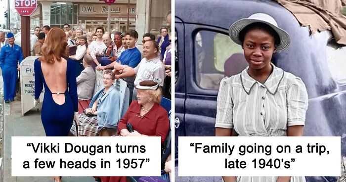
Photograph by Dorothea Lange.
I like this. Sometimes a busy B&W photo can be overwhelming to look at.
How do you know, they are moving, were you there ???
Load More Replies...An African-American family leaves Florida for the North during the Great Depression. There are many pictures (from different angles) of this family and car online and this is one of them: https://www.smithsonianmag.com/history/long-lasting-legacy-great-migration-180960118/ .
Jack Delano (what I found) https://www.google.com/search?q=Jack+Delano&source=lmns&bih=929&biw=1920&hl=en&sa=X&ved=2ahUKEwiO9cb5ipv3AhVjhHIEHYekC4QQ_AUoAHoECAEQAA
Load More Replies...I can’t help but laugh at this, their faces make me think of my family trips….Are we there yet?? We’re lost, aren’t we??! Why didn’t you ask for directions?? Who tied the cargo like this?? No more bathroom stops!! You better go now or prepare to hold it! Who made the mess in the back seat?! 😆
Another beautiful work. But I think again the parts not colored get too much inconsistent. Like the tires, the sack, hats and dress. I guess even grey or black and white stuff on the real world have some touches of color, like some yellow warmth from the sun, or some brown dirty patches, etc.
In my line of work, passion, and skill are essential. At times, it can be challenging to restore a beloved photo that is badly damaged, but I always try my best, and if necessary, I get creative and recreate the missing parts to make it look seamless.
I would advise anyone pursuing photography to always take their time. A photo speaks volumes about the photographer and the subject, so it's essential to put in the necessary effort. It's also crucial not to let negative criticism discourage you, as it can make you stronger and better.
The Black and white photo was poor quality but I did the best I could.
Through my work, I not only honor the past but also preserve it for future generations. By breathing new life into old photographs, I create a connection between the past and the present and remind us of the beauty that exists in both. My art serves as a testament to the power of photography and the importance of preserving history.
I am overwhelmed by the shades of blue.All of the colors are oversaturated. Clothes of the 40s and 50s were not so flamboyant. I remember couples wearing more conservative beige and light brown. The early 50s were a time of pastels and geometric shapes after the big shoulders of the 40s.
OP wildly overestimates their own talent. "Mastered" is hardly the word I would choose. The skin tones are flat and unnatural for most of the subjects and the colors wildly oversaturated. Several of them look like they forgot to colorize parts of the photo, creating a jarring effect. Stick with it OP, you have promise. But don't let it be clouded by hubris.
I appreciate the effort. But absolutely agree. I would be highly disappointed if I commissioned worked and received an image that looked like any one of the above.
Load More Replies...Very interesting, but the colors were overdone, perhaps there is a reason !!!
Be it still photos or movies, I'm not a fan of colorization. It's a piece of history. Leave it alone.
Totally agree, don't get why you're being down voted. I probably will be too. History needs respect not people guessing what it looked like in colour.
Load More Replies...As someone who actually has "mastered" the art of digital restoration with formal training and 15 years of professional exp, you should really stay in your lane lol. Try a bit harder to understand detail colors and era specific trends before saying "master"
I like these. I think the vivid colors give the photos a dream-like quality.
That is a good way, to describe the finish product !!!
Load More Replies...I usually prefer black and white because colors can be so distracting. B & W film could provide a different depth of tones. These were interesting, but didn't feel accurate.
I like them. They’re not like the originals, they’re their own thing. Kids going to church wearing colors like spring flowers. It invites a new look at an old item, it doesn’t replace the old, but is an interesting cover of an older song, so to speak.
To add to the comments on the colours, especially the blues being a bit oversaturated, the sky replacement in some of the images seem somewhat awkward. Good effort though.
I like them and think if you want to be supportive of other people's art you should say something positive as well. It's fine to criticize constructively but every one on here sounds like a bunch of snobby a-holes
Your work is astounding. I have a question how do you know what the actual colors are from black and whote photos?
You don't know the colors, hence the very modern colors on the colorized pics.
Load More Replies...Lousy title. I'm not sure if the author or a rogue editor is responsible: if the latter, I hope the author is suitably disgruntled, since photo restoration and colourising black and white photos are two very different things, which can of course both be applied to the same photos, but "Restore Vintage Photographs By Adding Colors To Them" is nonsense!
Hey, @Nedim: I like your work and the way it brings the subjects to life. Hope you continue to refine your skills. I'd like to see more.
They won't. They just downvote you for defending yourself but notice it's the same few all the way through. You can pretty much match the downvotes to the critics . Don't give up these are great
Load More Replies...OP wildly overestimates their own talent. "Mastered" is hardly the word I would choose. The skin tones are flat and unnatural for most of the subjects and the colors wildly oversaturated. Several of them look like they forgot to colorize parts of the photo, creating a jarring effect. Stick with it OP, you have promise. But don't let it be clouded by hubris.
I appreciate the effort. But absolutely agree. I would be highly disappointed if I commissioned worked and received an image that looked like any one of the above.
Load More Replies...Very interesting, but the colors were overdone, perhaps there is a reason !!!
Be it still photos or movies, I'm not a fan of colorization. It's a piece of history. Leave it alone.
Totally agree, don't get why you're being down voted. I probably will be too. History needs respect not people guessing what it looked like in colour.
Load More Replies...As someone who actually has "mastered" the art of digital restoration with formal training and 15 years of professional exp, you should really stay in your lane lol. Try a bit harder to understand detail colors and era specific trends before saying "master"
I like these. I think the vivid colors give the photos a dream-like quality.
That is a good way, to describe the finish product !!!
Load More Replies...I usually prefer black and white because colors can be so distracting. B & W film could provide a different depth of tones. These were interesting, but didn't feel accurate.
I like them. They’re not like the originals, they’re their own thing. Kids going to church wearing colors like spring flowers. It invites a new look at an old item, it doesn’t replace the old, but is an interesting cover of an older song, so to speak.
To add to the comments on the colours, especially the blues being a bit oversaturated, the sky replacement in some of the images seem somewhat awkward. Good effort though.
I like them and think if you want to be supportive of other people's art you should say something positive as well. It's fine to criticize constructively but every one on here sounds like a bunch of snobby a-holes
Your work is astounding. I have a question how do you know what the actual colors are from black and whote photos?
You don't know the colors, hence the very modern colors on the colorized pics.
Load More Replies...Lousy title. I'm not sure if the author or a rogue editor is responsible: if the latter, I hope the author is suitably disgruntled, since photo restoration and colourising black and white photos are two very different things, which can of course both be applied to the same photos, but "Restore Vintage Photographs By Adding Colors To Them" is nonsense!
Hey, @Nedim: I like your work and the way it brings the subjects to life. Hope you continue to refine your skills. I'd like to see more.
They won't. They just downvote you for defending yourself but notice it's the same few all the way through. You can pretty much match the downvotes to the critics . Don't give up these are great
Load More Replies...


 No fees, cancel anytime


")
")