Get Premium
Dark mode theme is available exclusively for premium users. Learn more about the benefits of subscribing.
No fees, cancel anytime.

 Dark Mode Ad-Free Browsing Unlimited Content
 Ad-Free Browsing Unlimited Content Dark Mode
Join 1.2 million Panda readers who get the best art, memes, and fun stories every week!
Visibility is hugely important to brands, which is why they want to see their logo everywhere, but there’s a price to pay for such widespread exposure, not just financially but ecologically as well.
As you can see below however, there’s a simple way to reduce these costs, and that’s by using less ink. The idea, called Ecobranding, is a new conceptual experiment aimed at making brands more eco-friendly while at the same time saving millions of dollars in production costs. From McDonald’s and Apple to H&M and FedEx, the streamlined examples you can find here maintain the essence of each specific logo while simultaneously making it more cost-effective for both the manufacturer and the environment. How do you think they compare to the originals? Let us know in the comments below.
More info: Ecobranding (h/t: designtaxi)
1.1Mviews
Share on FacebookThis will never fly. Nice idea though. Corporations spend millions of dollars and decades to establish an recognizable logo and they won't go changing it without more millions of dollars and more years of research to decide if it's worth it.
I think you are right Ben. We humans resist change once we are accustomed to something we can identify with. I did not see any of the above that I would appreciate better than the existing labels.
Load More Replies...They look way better with the eco friendly touch to them! Like did you see the coca cola one!! LOVE IT!!
They look better, but it is nightmare for graphics and if you will optimalised it for small object, it would dissapear...
Load More Replies...UPS, H&M, Coca-Cola, and Luis Vuiton will not print right at a smaller scale. Some of the lines are too fine and too close to other parts of the logo, so the thin lines will end up running into the rest of the logo during the printing process.
Very good point. Companies use to want clean logos when printed small on stationary and business cards, and now they create logos that will scale down and look good in the icon for their apps.
Load More Replies...This will never fly. Nice idea though. Corporations spend millions of dollars and decades to establish an recognizable logo and they won't go changing it without more millions of dollars and more years of research to decide if it's worth it.
I think you are right Ben. We humans resist change once we are accustomed to something we can identify with. I did not see any of the above that I would appreciate better than the existing labels.
Load More Replies...They look way better with the eco friendly touch to them! Like did you see the coca cola one!! LOVE IT!!
They look better, but it is nightmare for graphics and if you will optimalised it for small object, it would dissapear...
Load More Replies...UPS, H&M, Coca-Cola, and Luis Vuiton will not print right at a smaller scale. Some of the lines are too fine and too close to other parts of the logo, so the thin lines will end up running into the rest of the logo during the printing process.
Very good point. Companies use to want clean logos when printed small on stationary and business cards, and now they create logos that will scale down and look good in the icon for their apps.
Load More Replies...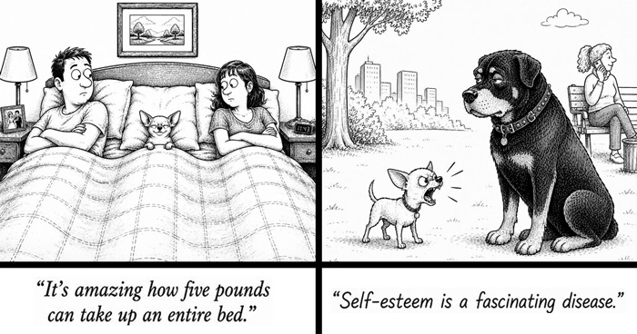


 No fees, cancel anytime


376
109