Get Premium
Dark mode theme is available exclusively for premium users. Learn more about the benefits of subscribing.
No fees, cancel anytime.

 Dark Mode Ad-Free Browsing Unlimited Content
 Ad-Free Browsing Unlimited Content Dark Mode
Join 1.2 million Panda readers who get the best art, memes, and fun stories every week!
What makes a logo great? Is it the colors? Maybe the shapes used? Or maybe it's something that works on a whole different level, hidden from plain sight? We're talking here about the logos you've seen so many times, you probably stopped paying attention to what they actually mean.
Check out these 15 famous brand logos which, despite being well known, still manage to hold a secret or two within.
Which one surprises you the most? Let us know in the comments!
(h/t: demilked)
This post may include affiliate links.
This one is extra cool because the logo actually includes every letter used in the company’s name.
I've often wondered about this logo.... and now I know. How creative!
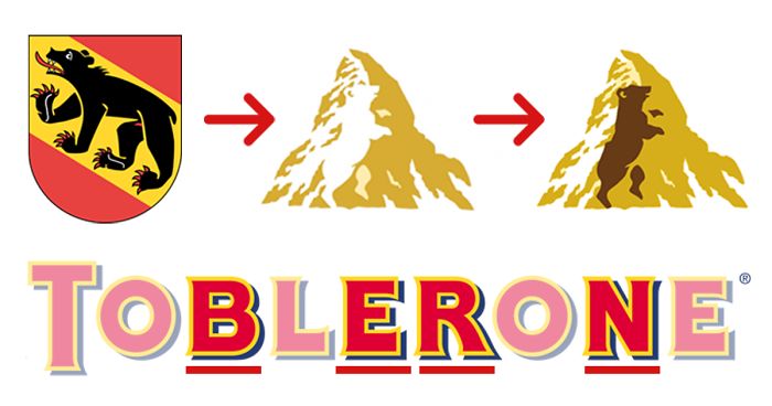
"Toblerone" chocolates come from Switzerland and they really make it show not only by having Bern (city where Toblerone is made) in the name, but also a bear's silhouette placed inside the mountain logo.
When Mr. Tobler invented it, he knew that the swiss market would be too small and he designed the brand name for export: tobler One, the number one chocolate. (that's what they told us at the history museum in Bern during a special exhibition on bernese inventions.)
"FedEx" hid a small arrow between letters E and x, which represents the forward momentum and efficiency.
Letter B in the red circle shows a person wearing Beats headphones.
I think they should have left at least the little eye on the logo... it is cute though.
The obvious bit is the arrow connecting a to z, but what’s usually missed is that the logo is smiling.
I actually always thought it was just a smile! Never saw the arrow, so never made the "a to z" connection.
Ice cream maker is famous for producing 31 different flavors of their product. They even put that number in their logo.
It’s actually a stylized version of famous woodblock print The Great Wave off Kanagawa.
The letter P is actually a pin.
Car manufacturer’s logo stands for the first letter of their name, right? Not only so, it also represents a successful deal between a car dealer and a customer.
Yep, that's your bottom right there.
The letters make the shape of a conductor of the orchestra.
Unilever’s logo is actually made up of icons representing different aspects of sustainable living.
No, they didn't. Look at the upper left. That's a huge oil splash. ^_-
Load More Replies...Mmm well. thats ironic, they have a lot of earth destructive brands :(
Maybe you didnt notice the drawing of the bird?
Load More Replies...They use uncertified palm oil which contributes to the deforestation of the Borneo & Sumatra rainforests, killing orang-utans, tigers, hippos, and other irreplaceable fauna and flora specific to that region.
Sustainable living? How about you get your palm oil from SUSTAINABLE sources if you're so supportive of sustainable living!
Italian car manufacturer's logo is jam-packed with stuff, the key feature being a serpent eating a man.
What the author DIDN'T explain is this: The red cross is typical Christian symbol of medieval heraldry and used extensively throughout the crusaides. Back then, it didn’t mean “medic”, it meant: Run for your life. The man in the serpents mouth is a bit more controversial. It’s a symbol called a biscione, and the man in the image is alternatively described as a child (the modern interpretation) or a Saracen or Moor (aka: a Muslim). So the whole serpent motif is all about the Christians Crusaders’ defeat of the infidels. Hey - I didn't make it, I'm only trying to explain it. lol
Clever use of typography merges both letters, N and W, into one.
Double T in the title creates The Eiffel Tower.

Some of these are extremely creative, some I knew, but ALWAYS I marvel at the most creative ones I see during everyday life. Advertising is interesting, the obvious and the subliminal.
I think a number of these are pretty far fetched, like BERN in Toblerone being intentional.
Most of these are very different from the companies' explanations on their websites
We sell leather products. If you want to see it, you can take a look. You will surely like it. https://famousjackets.co.uk/product/13-reasons-why-justin-foley-jacket
We sell leather products. If you want to see it, you can take a look. You will surely like it. Click Here
I love to read the post blog because author write this blog in a right manner. You can now done the booking of the air tickets in a cheap cost with Delta Airlines Flights
When you ship with us, we’ll work diligently to optimize your car’s route and keep our carbon footprint as low as possible. Together, we will deliver your vehicle scratchless. Check out our Online Quote Calculator to secure an affordable, 100%-transparent quote in seconds and book with us today! Stop wasting time and money for unknown companies that don’t get results. Happiness guaranteed auto transport city! Hire and fly towards your destination.
Although you've got some great things about auto transport, vehicle transport, car transport but i would like to understand more about vehicle shipping services and method and the way to avail these services properly for car shipping from one state to and another state within the auto shipping industry visit Ship-A1 for the most recent services and for the correct guide with none hassle. https://www.shipa1.com/
This seems quite nice information regarding auto transport, vehicle transport, car transport but to know about more auto shipping that what are the latest vehicle shipping services are there in the town and what are the new method for car shipping you should visit auto transport city for the latest services and method in the town https://www.autotransportcity.com/.
FEI Fédération Equestre Internationale - a horse head inside logo. fei.org


 No fees, cancel anytime


")
")


