Get Premium
Dark mode theme is available exclusively for premium users. Learn more about the benefits of subscribing.
No fees, cancel anytime.

 Dark Mode Ad-Free Browsing Unlimited Content
 Ad-Free Browsing Unlimited Content Dark Mode
Join 1.2 million Panda readers who get the best art, memes, and fun stories every week!
What you see and what you think are real might actually be ingenious illusions crafted to trick you. Editing, staging, and outright faking photos, whether for fun or propaganda, is nothing new—humanity has been doing it since the invention of photography. And our team here at Bored Panda has the proof.
We have curated this list of some of the most important historical photographs that were faked either for enjoyment or for the sake of someone’s secret agenda. It’s a mind-blowing experience that might reshape how you see the past and make you more skeptical of what you see online.
This post may include affiliate links.
The most famous photo of the Loch Ness Monster was taken in 1934 by a London gynecologist named Robert Kenneth Wilson. It showed a long neck and small head rising out of the water, exactly what people imagined a plesiosaur would look like. The photo ran in newspapers worldwide and became the defining image of Nessie for decades.
It was completely fake. In the 1990s, one of the conspirators confessed in his last moments. They'd built a toy submarine, attached a carved wooden head and neck to it, and floated it around while taking pictures. The "monster" was about a foot tall.
The intent behind editing photos matters a ton! Some people choose to fake or edit their pictures purely for the joy of entertaining themselves and others. However, others have political, social, or other agendas in mind when they stage or edit images. In the former case, everyone (except the incredibly naive and gullible) is in on the joke. In the latter case, the trickery is crafted to try to fool even the most intelligent, observant, and educated members of society.
On the one hand, being skeptical about the information and images you come across online is healthy: you’re less likely to be tricked by someone’s misinformation (false info spread accidentally) or disinformation (false info spread intentionally to deceive).
On the other hand, if you are skeptical of everything, manipulative and malicious actors who traffic in fake news can turn that skepticism against you for their goals. You might run into situations in the future where you mistrust legitimate information simply because you know that disinformation exists somewhere. This is known as the liar’s dividend.
One of the most famous portraits of Abraham Lincoln is also one of the most scandalous because that dignified, statesmanlike body doesn't actually belong to him. Placed side by side, the deception becomes obvious: Lincoln's unmistakable face has been lifted from a separate photograph and grafted onto a portrait of John C. Calhoun, one of the most prominent anti-abolition politicians in American history.
The irony is almost too much to handle. Lincoln, the president who signed the Emancipation Proclamation, is depicted in his most iconic full-length portrait literally wearing the body of a man who spent his career defending slavery.
This dramatic shot of a plane exploding and a pilot falling to his demise looks like it was captured in the heat of combat. It wasn't. Wesley David Archer staged it using models of tiny planes and figures photographed to look like the real thing.
The blurriness and grain of early film photography actually helped sell the illusion. Details that might give away the miniatures get lost in the low resolution. From a distance, a model plane on fire looks close enough to the real thing, especially when people want to believe what they're seeing.
Archer wasn't trying to fool anyone exactly because this was part of his war diary, a way to illustrate experiences or create dramatic scenes that would have been impossible to photograph in actual combat. But once images like this enter circulation, context gets lost.
Yeah, the smoke has no freeze-frame quality to it but the plane and falling body do? It looks "off" at first glance.
The liar’s dividend is, in a nutshell, a situation where a malicious actor will claim that real, legitimate information is either misinformation or disinformation.
“This approach has the benefit of muddying the waters so that people, especially those who traffic in misinformation, are able to evade or blunt scrutiny embedded in accurate words or actions that are then not believed by others,” Encyclopædia Britannica explains.
“In a world in which information can easily be falsified, a politician might claim that they did not do or say what they in fact did or said. The mistrust in the mainstream news media, for instance, allows political actors around the world to evade or blunt legitimate scrutiny of their words, decisions, or actions. The liar’s dividend pays off for those who sow mistrust and then use that same mistrust to their own advantage.”
For example, in this day and age of widely available generative artificial intelligence, this might mean that a corrupt person might claim that genuine photo, video, and audio evidence incriminating them was faked by AI. They are using the mere existence of AI deep fakes to protect their illegal and unethical behavior.
During Theodore Roosevelt's 1912 presidential campaign as the Progressive Party candidate, someone created a composite photo showing him riding a moose. The party's nickname was the "Bull Moose Party," after Roosevelt declared he felt "as strong as a bull moose" despite being shot during the campaign.
The image was political propaganda and humor rolled into one. Everyone knew it was fake but it was meant to be obvious. The photo played up Roosevelt's outdoorsman image and the party's mascot at the same time. It circulated as a novelty, not as deception.
In 1920, photos of fairies taken by two young cousins, Frances Griffith and Elsie Wright, became a global sensation. The girls had photographed the "fairies" while playing in the garden behind Elsie's house in Cottingley village. Photographic experts examined them and said they were genuine.
Despite skeptics pointing out problems with the photos, they became some of the most famous images in the world. Even Arthur Conan Doyle, creator of the hyper-logical Sherlock Holmes, championed them as real. The girls stuck to their story for decades.
It wasn't until the late 1970s that the photos were definitively debunked. The cousins finally admitted they'd cut fairy illustrations out of a children's book, propped them up with hatpins, and photographed them. The "experts" who'd authenticated the images had been fooled by paper cutouts.
Arthur Conan Doyle had lost his son only two years before. Grief does funny things to people.
Canadian Prime Minister, William Lyon Mackenzie King, had a photo of himself with King George VI and Queen Elizabeth during their 1939 visit to Canada. King liked the shot but had one problem: he wanted to be alone with the Queen in the frame.
So he had King George VI edited out. The published version showed just King and Queen Elizabeth, making it look like a more intimate moment. It was a weird flex, cropping out the actual king to make yourself look more important.
Basic media literacy revolves around the idea that before you believe or reshare any claim you find online, you stop, step back, and evaluate the information and its source. Of course, this is hard to do day to day.
We are bombarded with an endless stream of information, opinions, and images on social media and in the news every single day. What’s more, most of us have serious responsibilities and commitments (work, studies, parenting, volunteering, care, etc.) that eat up most of our time and energy. So, for many people, double-checking every single claim for veracity is impractical. Therefore, it is best to gauge the source's reliability instead.
Check the author’s reliability and trustworthiness. Look at their posting history. See if they properly reference and credit the information they cover or if they try to spin their emotional and divisive opinions as cold, hard facts. Think about what the source might be trying to make you feel, and what their goal would be.
Who benefits if the information you hear or read makes you feel a certain way, say, angry, anxious, upset, frustrated, or even outraged? Does the source correct false info? How transparent are they?
Long before Photoshop, Victorian photographers were already experimenting with visual storytelling in remarkably sophisticated ways. This composite image shows a young woman at her spinning wheel, drifting into a daydream of domestic life.
The image is a beautifully crafted example of Victorian combination photography, where multiple negatives, hand-painted elements, and careful darkroom work were combined to create a single image telling a story.
Stalin set out to erase his enemies from existence. Nikolai Yezhov, head of the Soviet secret police and architect of the Great Purge that sent hundreds of thousands to their end, stands confidently beside Stalin in the original photograph. In the doctored version below, he's simply gone, replaced by empty waterfront, as if he never existed at all.
The practice of removing fallen officials from photographs and historical records was standard procedure in Stalinist Russia, creating what George Orwell essentially documented in 1984 as the "memory hole."
This comical memento mori shows photographer Leonard de Koningh playing with early photographic techniques. He created the double exposure by exposing half the plate, having his subject change poses and clothing, then exposing the other half. The result is seamless; you can see the trick happening, but can't spot where the two images meet.
If you do happen to have the time and inclination to dig a little deeper, cross-reference the information you find with multiple sources.
A good rule of thumb is to avoid resharing information that plays on your emotions, feels either too good or too bad to be true, or validates most or all of your beliefs.
It is better to slow down and evaluate the information rather than rush to reshare claims that might misinform your family, friends, and strangers alike.
NASA released the dramatic image on the left showing the space shuttle bursting through pristine white clouds against a perfect blue sky. It looks incredible and is the kind of shot that ends up on posters and in textbooks.
The image on the right shows what the original photo actually looked like. Gray, murky, flat. NASA enhanced the colors, boosted the contrast, and cleaned up the clouds to make it more visually striking for public consumption.
This kind of editing sits in a gray area. NASA wasn't faking the shuttle launch or creating something that didn't happen, they were just making a real photo more dramatic. But it raises questions about what counts as documentary photography versus promotional material.
There is far, far more difference here than simply "enhancing the colours, boosting the contrast, and cleaning up the clouds". Everything except the shuttle itself is a completely different image.
Ralph Lauren ran an ad campaign where they photoshopped a model so thin her hips were narrower than her head. The proportions were physically impossible, and she looked like a cartoon character, not a human being.
When people pointed out how disturbing it was, Ralph Lauren initially tried to shut down criticism by issuing copyright takedown notices against blogs that posted the image. That made it worse. The backlash exploded, forcing the company to apologize and admit they'd gone too far with the retouching.
A photo labeled as baby Adolf spread through American and British newspapers in 1933. The kid looked evil with a dark scowl, greasy hair, and twisted expression. Papers ate it up, asking readers if they could see the future dictator in the infant's face.
It wasn't Adolf. The German consulate had to write newspapers to correct them. Five years later, an Ohio woman named Harriet Downs saw the photo and recognized her own son, John May Warren. The original picture showed a normal-looking baby, and they realised someone had doctored it by darkening shadows to make him look sinister.
Once you’ve looked through these photos and read all their backstories, we’d like to hand the discussion over to you, dear Pandas.
Which of these edited and staged historical photos did you genuinely think were real before you came across this list? Are there any important fake vintage images that you think we missed?
How do you gauge the reliability of a claim, photo, or source these days? How good would you say you are at spotting photo-edits and AI deep fakes?
Days after 9/11, a photo started circulating online showing a tourist on the observation deck of the World Trade Center with a plane visible in the background, supposedly seconds before impact. The story claimed it was found on a camera recovered from the rubble.
It fell apart fast. People noticed the plane was the wrong type, the date stamp showed the wrong season, and the tourist's clothing didn't match September weather. Eventually a guy from Hungary came forward and admitted he'd made it as a hoax.
But the image took on a second life. It became one of the early internet memes, with people photoshopping the "tourist guy" into other disasters and historical events like the Hindenburg, the Titanic, and dinosaur extinctions, you name it.
Everything's bigger in the Midwest, at least according to the postcards. This 1908 creation by photographer W.H. Martin is absurd, it's impossible, and it was absolutely meant to make you chuckle.
Martin was a master of the "tall tale postcard," a hugely popular genre in early 20th-century America that played on regional pride and good old-fashioned exaggeration. By combining negatives, cutting and pasting prints, and manipulating scale, he produced dozens of images featuring impossibly giant produce, fish, and livestock.
Tyrrell's, a crisps (potato chips) brand here in The UK has used this technique in their ads the last few years... (I didn't watch live TV for a decade before that, so the ads may have run a lot longer).
This famous photo shows construction workers casually eating lunch on a steel beam 850 feet above New York City during the building of Rockefeller Center. For decades, people assumed it was a candid shot capturing the everyday bravery of Depression-era workers.
It was staged. The photo was a publicity stunt orchestrated to promote the new building. The workers were actual construction guys, not models, but they were positioned there specifically for the camera. It was meant to generate buzz and show how bold and modern the project was.
This iconic image of General Ulysses S. Grant heroically surveying his troops at City Point, Virginia is compelling, dramatic, and completely fake. The photograph is actually a Frankenstein's monster of three separate images stitched together: Grant's head came from one portrait, the horse and body belonged to Major General Alexander McCook, and the background showing Confederate prisoners was taken at an entirely different location.
The composite was created by L.C. Handy in 1902, decades after the Civil War ended, probably to create a more marketable, dramatic image of the famous general than any authentic photographs could provide.
For years, it circulated as a genuine wartime photograph, fooling historians and the public alike. It wasn't until careful analysis revealed inconsistencies in lighting, scale, and perspective that the deception was exposed.
This postcard belongs to a popular genre called "Exaggerations" or "Tall Tales" that took off during the Golden Age of picture postcards in the US. The timing wasn't accidental as these hit the market right after the US allowed messages to be written on the address side of postcards, making them cheaper and easier to send.
Beyond being a precursor to Surrealism, these manipulated photos served a practical purpose: regional marketing. This one promotes Watertown, Wisconsin's famous stuffed geese, and other towns used these exaggerated images to create myths about their agricultural dominance.
We tend to think of photo manipulation as something shady, but back in the day people found this entertaining. This photomontage by Alfred Stanley Johnson Jr is a good example as it's clearly impossible but also clearly a joke. The caption "We Stopped Here" is a fun little quip, too.
Johnson pieced together individual images, sometimes overlapping them, to create this chaotic moment frozen in time. Your brain automatically fills in the story: the crash, the passengers flying through the air, what happened before and after.
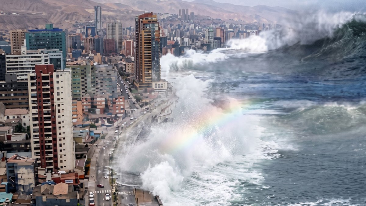
This dramatic image circulated widely after the 2004 Indian Ocean tsunami, claiming to show the wave approaching land. It looks terrifying, but it's completely fake.
The image is a composite, likely combining photos from different locations at different times. The real tsunami was devastating enough, but it didn't look like this Hollywood disaster movie shot.
The fake spread rapidly online and through email forwards during the immediate aftermath of the disaster. People were desperate for information and images, and this one was dramatic enough to seem real.
Mussolini wanted a photo of himself on horseback looking powerful and commanding. The original shot included a handler holding the horse, which was a practical necessity, but not very heroic.
So the handler was airbrushed out. The published version showed Il Duce alone, mastering the horse through sheer force of will. Never mind that someone off-camera was actually keeping the animal under control.
That horse needed a handler to control it? It looks rather placid to me...
This dramatic WWI image shows Australian soldiers charging forward across a battlefield, supposedly during a counter-attack at Zonnebeke. It became one of the iconic photos of Australian forces in the war.
Photographer Frank Hurley created it by combining multiple negatives. The dramatic composition was impossible to capture in a single shot with the camera technology of the time, so Hurley built it in the darkroom.
Hurley defended his composites by arguing they showed the truth of war better than any single photograph could. Individual shots were limited by exposure times and couldn't capture the chaos and scale of battle. His manipulated images, he claimed, gave viewers a more accurate sense of what combat actually felt like, even if the specific moment never happened exactly as shown.
Roger Fenton's famous Crimean War photograph has been questioned for over a century. Two versions exist: one with cannonballs scattered across the road, one with most of them pushed to the side. The debate is which came first, and whether Fenton staged the more dramatic version by dragging cannonballs onto the road for effect.
One documentary filmmaker thinks he did exactly that. The evidence is circumstantial but suggestive. If true, it would make this one of the earliest examples of war photography being manipulated for impact, just years after the medium was invented.
This iconic image of British soldiers going over the top has been reproduced countless times as documentation of WWI trench warfare. There's just one problem: it's a movie still, not combat photography.
The image was staged for a film, meaning these soldiers weren't actually advancing into no man's land under fire, they were actors or soldiers performing for a camera in a controlled setting. But because it looked authentic and captured what people imagined the war to be like, it circulated as if it were real.
A *lot* of the 'movie footage' of World War I was filmed in New Jersey.
West German Chancellor Willy Brandt met with Soviet leader Leonid Brezhnev in 1971 during negotiations. The German press ran the photo showing both men relaxed, drinking and smoking together, evidence that the talks were going well and the atmosphere was friendly.
The Soviet press published a heavily edited version. They airbrushed out the alcohol bottles, cigarettes, and glasses. What had been a casual, boozy meeting became a sober, formal diplomatic encounter. Soviet leaders couldn't be shown drinking or smoking in official photos as it undermined the image of disciplined communist leadership.
Looks like a completely different photo taken at a different time at the same event.
Move over, Mary Poppins because this German couple was floating over cityscapes decades before Disney got the idea. Obviously, Photoshop didn't exist yet, but that didn't stop creative minds from manipulating images long before the digital age.
Using double exposures, cut-and-paste techniques, and careful darkroom trickery, early photographers and printers produced fantastical scenes like this one for postcards, advertisements, and pure entertainment.
This particular image is part of the Rijksmuseum's "Fake!" exhibition in Amsterdam, which explores the long history of photographic deception.
Disney got the idea from P.L. Travers, the original author of the books.
This is one of the most iconic images of WWII—Soviet soldiers raising the hammer and sickle over the Reichstag in Berlin, symbolizing Germany's defeat. But the photograph we know was manipulated by Soviet propagandists before publication.
Photographer Yevgeny Khaldei staged the flag-raising to begin with, arriving after the actual battle with a flag made from tablecloths. But the bigger changes came in the darkroom. Smoke was added to make the scene more dramatic. More notably, one soldier's wrist was retouched to remove a second watch, evidence of looting that didn't fit the heroic narrative the Soviets wanted to tell.
The image became a propaganda cornerstone, printed in newspapers worldwide and turned into posters and monuments. The manipulations weren't revealed until much later.
The most famous photo from Iwo Jima wasn't the first flag raising. Marines put up a small flag after taking the island, and someone snapped some photos that weren't particularly dramatic. Officers decided they wanted a bigger, more visible flag, so they sent one up.
Photographer Joe Rosenthal heard about the replacement flag and rushed to get the shot. The resulting image became one of the most iconic war photographs ever taken.
The iconic Beatles album cover shows the four band members crossing the street in single file. In the original, Paul McCartney is holding a cigarette. An American poster company later edited it out, apparently without asking anyone's permission.
Removing the cigarette was part of a broader trend of sanitizing images for American audiences, especially anything that might be marketed to kids. The logic was that showing smoking promoted unhealthy behavior, so better to just erase it entirely.
The Soviet space program loved group photos of their cosmonauts lined up together. But when Grigoriy Nelyubov got kicked out of the program for drunk and disorderly conduct, he was airbrushed out of the official photos entirely.
This was standard practice in the Soviet Union. Fall out of favor, and you disappeared from the historical record, literally erased from photographs. Stalin did it to purged officials, and the space program did it to embarrass cosmonauts. The message was clear: mess up badly enough and it's like you never existed.
He looks like a sh1t-disturber... Not taking the photo opp seriously. Can imagine his superiors would not have been impressed.
Mathew Brady, one of the most famous Civil War photographers, created this group portrait of Union generals with William Tecumseh Sherman. General Francis P. Blair on the far right wasn't actually there, Brady added him later using composite photography.
Getting all these high-ranking officers in one place at the same time was basically impossible during wartime. Brady's solution was to photograph them separately and combine the images. It let him create an official group portrait that would've been logistically nightmare to arrange for real.
This was standard practice for Brady and other photographers of the era. They saw it as practical problem-solving, not deception. The goal was to document who these important figures were and show them together, even if "together" meant assembled in the darkroom rather than in the same room.
This was building on a common practice among painters. Very often the artist would depict all the more famous commanders from a particular war/campaign all together, even though they were probably never all together at one time. There's even a rather famous one of these paintings of these guys.
Photos of Lee Harvey Oswald posing in his backyard with a rifle and communist newspapers became key evidence after Kennedy's assassination. They seemed to prove that Oswald was the shooter and had the weapon.
Conspiracy theorists have claimed for decades that the photos were faked. They point to shadows and lighting that supposedly don't match up, arguing someone pasted Oswald's head onto another person's body. Some say his chin looks wrong, or that shadows fall in physically impossible directions.
In 1861, Boston jewelry engraver William Mumler developed a self-portrait and noticed a shadowy figure floating beside him. He figured it was leftover from an earlier negative on the same plate, but friends said it looked like his late cousin. The spiritualist community called it the first photograph of a ghost. Mumler saw an opportunity and became the world's first spirit photographer, getting rich off grief-stricken clients who'd lost relatives in the Civil War.
Critics came after him hard. Some spiritualists accused him of fraud, pointing out that his "spirits" resembled living people who'd recently sat for portraits. Professional photographers were furious that he was making their profession look like a con. In 1869, after he moved to New York, police charged him with fraud.
Even the man who brought down the Iron Curtain wasn't immune to a little official retouching. Gorbachev's distinctive port-wine stain birthmark was airbrushed out of his official Soviet portrait, leaving behind a suspiciously smooth forehead.
The reasoning was almost certainly rooted in old Soviet aesthetics; leaders were expected to project an image of physical perfection and authority, and a prominent birthmark didn't fit the carefully constructed visual language of Communist power.
Fake photographs didn't just trick people, they also let them imagine what might be possible. This photomontage by Theodor Eismann is a "toekomstbeeld" (vision of the future), showing a world where cars could fly. Other images in the exhibition show similar fantasies: cityscapes with sky rails and zeppelins pasted in, or airborne visitors floating over Boston, Hamburg, and The Hague like something out of a dream.
The color in Eismann's photograph is just as fake as the flying car. It was added during printing with a limited range of inks, chosen by the designer rather than captured by the camera.
The Princess of Wales disappeared from public view in late 2023 and early 2024. The palace said she was recovering from abdominal surgery, but that didn't stop speculation about where she was and what was really going on.
When Kensington Palace released a Mother's Day family photo to calm things down, it backfired. News agencies immediately issued warnings not to use the image after spotting heavy editing. Princess Charlotte's hand looked wrong, among other problems. It violated guidelines for news images.
Kate apologized, saying "like many amateur photographers, I do occasionally experiment with editing." A few weeks later she announced she had cancer, which explained the absence and shut down most of the conspiracy theories. But the botched Photoshop job turned what could've been a minor embarrassment into a major story, feeding exactly the kind of speculation the palace was trying to avoid.


Some of these were obviously intended as jokes, not fakes being put out as real.
One I particularly like is the famous photo of Bernhardt Holtermann standing beside the biggest ever gold nugget with his hand on the nugget. A publicity photo, Holtermann and the gold nugget named after him were photographed in two different cities, and combined in the darkroom.


 No fees, cancel anytime


 From Germany, Early 20th Century")


