Get Premium
Dark mode theme is available exclusively for premium users. Learn more about the benefits of subscribing.
No fees, cancel anytime.

 Dark Mode Ad-Free Browsing Unlimited Content
 Ad-Free Browsing Unlimited Content Dark Mode
Join 1.2 million Panda readers who get the best art, memes, and fun stories every week!
We get used to seeing big-name brands like Pringles or Warner Bros everywhere. Like it or not, we form deep and even emotional ties with their qualities, logos, and characteristics. So when these companies decide to shake things up and change their "face" with a great brand refresh, the public takes notice. And since the stakes are this high, an obvious step in the wrong direction fires up our inner critic and almost begs us to poke fun at the results.
The margin for error is thin when it comes to redesigns, but it’s not only brands that get impacted by the obvious flaws designers didn’t pick up from the start. From products to artwork to our favorite animated shows, some updates simply go awry. In fact, they have even inspired one subreddit to go on a quest to shed light on some of the most unfortunate ones.
Aptly titled 'Crappy Redesign', this online community prides itself on sharing only the cream-of-the-crop examples of terrible changes in our favorite brands — and they mercilessly shame them online. Below, we have gathered some of the best cases from the community to share with you all. So continue scrolling, upvote the ones you loved hating most and let us know what you think of them in the comments!
Psst! If you're in the mood for some more poor design madness, check out our earlier pieces here, here, and here.
This post may include affiliate links.
Fred and Daphne look like they took too much cocaine and can taste sound.
Load More Replies...I still have murderous intents for the person who created the new ones.
Why the hell do almost all modern cartoons look like they were drawn by someone who failed art school? Like the same someone for every show, they all share the same bad "style", which appears to be a lame attempt to copy edgier styles from the 90's like Ren & Stimpy or Courage the Cowardly Dog.
Is that actually the current design, no mistake? This doesn't look like Porky, it looks like a completely different guy
I think this was the design for the New Looney Tunes Show. They were going back to Porky’s original design.
Load More Replies...He kind of went back towards his original look porky-pig-...8efb76.jpg 
The problem is not that he has become fat, but that his charisma seems to have completely vanished. His eyes dammit!
They were trying to get him fat, so they can get bacon 😭
This is to this date probably the worst redesign I've ever seen. I cannot grasp how this design could ever pass trough multiple layers of confirmation and release to public.
I used to be able to scan my icons and find what I was looking for automatically. Now I am forever opening the wrong app by accident. BOO!!!
Load More Replies..."We have stylized icons that are recognisable at a glance. Quick make them all almost identical so people have to stop and look!"
I have to stare at my google apps folder on my phone for the longest time to see what they actually are.
At least they tell you they are Google apps, you might have several different email apps, document readers, messaging apps ect with similar logos. These all tell you immediately that the version you're looking for is Google with the colours.
Nah, I only use the Google apps cuz they are cleaner than any others. These icons are so dumb cuz at first glance they all look the same and blend together.
Load More Replies...Google of the past: "Don't be evil." Google of the present: "We're totally evil."
Admittedly I'm okay with the first three. I still know that's mail, calendar, and drive. WTF is the fourth one? I mean it's docs but I wouldn't get that looking at it. Vague camera shaped thing wouldn't strike me as hangouts either.
We managed to get in touch with the creator of the 'Crappy Redesign' subreddit, Patrick, who was kind enough to have a little chat about the community, its background, and the common redesign trends that get featured on the group. When asked what inspired the subreddit in the first place, he told us that one post on the multi-million-member strong subreddit named 'Crappy Design' is to blame.
"It all started when I saw a post in 'Crappy Design' about a redesigned Tucan. When I went into the comment section, I saw that a user had commented 'r/CrappyRedesigns', Patrick told Bored Panda. "I could not believe that such a subreddit didn't yet exist, so I created it.” And from the looks of it, he didn’t look back.
"The subreddit, to my huge surprise, blew up immediately and received thousands of members in under a day! I couldn't believe it," the creator added. "Currently, the subreddit has close to 8k members. I never expected it to grow that big!"
Seriously, have you seen the unsee juice? I need it.
Load More Replies...You realise the top one is itself a redesign, right? The original was much nicer and friendlier.
I think you refer to the cartoon version of the 90's. Actually, if you want to refer to the very first comics version (the true original), they were kind of gnarly and violent.
Load More Replies...the funny thing id, the show's actually pretty good. also, the redesigns aren't that bad. the thing is that they are all supposed to be different species of turtle, which is something i find quite interesting.
I thought the show sucked, personally. Then again, I’m nostalgic for the Nickelodeon show from the 2010s.
Load More Replies...I think this one is ok. It looks like each turtle has its own character now, not just a different colour cloth.
Dude have you not see the Nickelodeon show from 2010s???
Load More Replies...I don't think this deserves to be on this list, as it's not bad, it's just not what people are used to. The brothers now have distinctive silhouettes, their designs tell you more about them as individuals, and having them be different species of turtles is a fun and creative idea that hasn't been done before.
Ok but, as an artist who has watched this show, it has some genuinely AMAZING 2D animation. The lighting, colors, and battle choreography are truly fantastic while the expressions and poses are hilariously over-the-top. If you're looking into animation, it's a good show to study.
i haven't watched it in a while because it's terrible but i'm pretty sure rafael is like the leader now instead of leonardo
Rafael is the eldest sibling and thus de facto leader, but Leonardo was supposed to develop into his leader role. At least, that's what I remember
Load More Replies...How many times have I squirted lotion on the floor. And don't get me started on how the dispenser gets gunked up.
Load More Replies...It holds less, so you're paying more for less lotion, and to top it off, the dang nozzle doesn't dispense the lotion so much as dribble it out, unless it gets a bit clogged--in which case, it will shoot across the room at 25 miles an hour.
For God's sake, don't picture any animals. People might think the company had something to do with animals. Now it clearly has something to do with everything and anything, you get to guess.
Ever since this online community was created over two years ago, it has served as the perfect outlet for design enthusiasts to vent their frustrations. With the tagline "Cal Arts Galore", Patrick and the whole moderator team invites its members to share and poke fun at the unfortunate examples they come across online, as well as participate in meaningful discussions.
"The year is 2050, Cal Arts has taken over all forms of creative expression. Can be referred to oversimplified logos/etc..." writes the moderators in the description. The cases featured on the forum include some of the worst redesigns that range from cartoons to objects to our beloved brands and services. This online community is very open to new members and posts, as long as they follow some basic guidelines.
Well that particular Native American was known for her kneecaps. Google it if you don’t get it, it WAS a long time ago.
Load More Replies...The artist who painted the Butter Maiden was a very famous Native American painter. They erased his best known work. Patrick DesJarlait. Look him up.
Why? There was no racial mentions on it. Just a person doing person things. It's part of her culture. It's the same as a white person on a bottle dressed in sweats and a t shirt.
Load More Replies...Approprite in history, keep the land , get rid of the Natives Shameful
Seems like they made it too realistic, huh? Exactly what they did. Stole the land, removed the Natives. Absolutely shameful.
Load More Replies...I dont' understand about removing "Land". It's from Minnesota where the motto is "Land of 10,000 Lakes". Why would they remove "Land"? I do think it's dumb they removed the "Native American" (which is not the preferred term, but white people like to think they are correct in using it).
Load More Replies...Why? I think you're imagining something else, but it's just butter.
Load More Replies...Perhaps they thought that using an image of a Native American was tone deaf. They renamed Squaw Peak in Phoenix, the football team is no longer "redskins", they took Uncle Tom off the rice - personally I'm ok with this if it indicates that we (as in Anglos/Europeans) are waking up to the idea that the previous behaviour made already-marginalised people feel even more marginalised.
The difference here is that the image was painted by an Ojibwe artist portraying a woman in an authentic costume in an authentic setting. If that's still racist, what are Native American artists supposed to do? Paint paintings only for other Native Americans? (I am not being facetious - you can get heat for displaying Native American art on your walls at home, even if you bought it directly from the artist or were given it as a gift).
Load More Replies...From artistic and interesting to boring and wouldn't even catch my eye 🙄
I’m getting really sad when lookin on this. It’s like someone took a soul from the first logo and crushed it to pieces… much like when old, cozy cafee in narrow cobble stone street with comfortable chairs and candles on every little table, smelling like freshly ground cafee and cheesecake for miles gets replaced by white empty room smelling of chlorine.
BUT NOT offensive like the "original"'/I mean -- REALLY???
Load More Replies...So many of my favorite games companies have gone from logos that invite you to play to awful corporateness. It is always a sign that the focus has gone from the game to "how much money can we squeeze out of you?"
Similarly, compare the logos for Psygnosis (publisher of early TT games) before and after they became Sony-owned 'Studio Liverpool'. A similarly ornate and beautiful identity usurped by the peak of lazy late-90s logo design.
Outline next. Then just orange arc, then orange line, then black line and then just transparent background with nothing on it. All in the name of all-solving minimalism.
The fading away of the fox is supposed to symbolize their dwindling user base
Load More Replies...I like the whole fox thing, and the new logo has lost it. Might as well be ‘swirl’ browser now.
The last logo is the Mozilla family logo, not the Firefox logo. The browser's is still the fifth one.
Humanity: Erasing animals from the digital world as well as the real world (smh)
The number one rule on the subreddit is in the name — the post needs to be an example of a crappy redesign. Although when the brand refresh is very minimal (the moderators provided Google’s redesign as an example), it "doesn't change anything because they're similar to the older design." But if the update is clear and very poorly executed, members need to put the before and after images on both sides in the right order. The last thing to consider before posting is that the redesign must be official and made by the company listed.
i thought that !! it looks like an old school tech company now.
Load More Replies...I reject that, that cannot be meant to be Bob the Builder! It can't be! It looks awful, and nothing like him.
NO WE CAN'T!! This is too much :'(
Load More Replies...I never watched the original, but against popular opinion, the new design LOOKS better, but I can understand how those watching the og could be upset.
growing up watching the 1st one, i was so mad when i saw the second one!
I hate all the animations that have been changed to that weird 3D style!
The old one is so much better the modern one looks like a whole different thing
Cause the cgi is so old, like late 90s very early 2000s? I remember watching those as a kid, and also old school MLP, now it's all weird like this
Load More Replies...What's the last one from? I sometimes use Barbie movies to terrorize my boyfriend, and ice never encountered goggle eyes Barbie so far
Had to google it: it's Barbie Video Game Hero! I believe the goggle eyes barbie is barbie's character in a game
Load More Replies...Okay but the second one was such a funny show. I used to watch it with my older brother.
Barbie Life Of The Dream House (2d pic) is a really good show
Bored Panda was also curious to learn more about the community and what the past two years have been like for the subreddit. Patrick opened up that a few things have changed since he created the group. "The activity in the subreddit has decreased a lot since then, but we do still receive posts every now and then."
"Volunteers have largely taken over with the moderation, so I don't really take care of it anymore," he continued. "It was pretty stressful to manage such a large group for the first time though." But even in the most challenging times, he’s grateful for the people who joined him on this journey. "I really want to thank all the people who joined the subreddit! You really made this an interesting experience for me."
i read about this, it was considered one o fhe biggest marketing fails ever, cost them about 40milliion on the redesign and updating packages/ adverts. then their sales went down because people didn't know it was tropicana OJ. they then had to go back to the original design
But I don't want to spend 50 bucks on orange juice
Load More Replies...I don't know this brand, but it looks like they have turned from selling real organic food to something made of artificial flavors with an extra addition of fake-colorants.
I'm not making fun of the fact that you dont know the brand like at all!!!! Just the thought of smuckers making organic food has me rolling on the floor, they make the most processed sugar filled c**p ever in the world.
Load More Replies...I expect with the new logo there mission statement has synergy and integration in it.
Load More Replies...No, No, No! So much for the warm fuzziness of tradition that Smuckers jams & jellies used to evoke. The new logo looks like they were taken over by an investment bank.
They now do coffee & pet food as well as the jams & jellies.
Load More Replies...This looks like the Stop & Shop brand logo. Does anyone know how research anymore???
They did not change the Smucker's logo. They changed the logo for the parent company, J.M. Smucker's. The company now owns many brands, including pet food, so they are trying to better represent their portfolios. This new logo doesn't appear on food labels.
Exactly. The jar of jelly still looks like the first one.
Load More Replies...Wait they changed it? The jelly in my fridge still has the "old" one and I got it last week
OK, the first one sells a food product and the second one has something to do shapes and colors of....something.
Oh no. Noooo! Did they also change the cute clicking sound when he blinks his eyes?
I hope so becsuse it'd be a horrifying combination if they didn't 😟
Load More Replies...All the charm and fun and originality seems to have been swapped out for creepy, dead-eyed, sadness. Just because you can, doesn't mean you should 😭☹️
No, not moley! The cartoons original style was crisp and distinctive, this is "my first 3D project" stuff.
The vast majority of the posts that end up shared on the group feature oversimplified logos. When asked about this modern trend in the design world, Patrick said he’s not sure where it came from. "Companies are trying to appear more trendy by redesigning logos, but unfortunately, it quite often results in an oversimplification of the logo," he added.
To the creator, however, 'Crappy Redesign' means more than only oversimplified logos. "Crappy Redesigns can be seen everywhere, whether it is a drop in quality of a product in order to reduce manufacturing costs or another way of making a device less repairable for consumers. I would hope to see different types of Crappy Redesigns in the subreddit in the future. Not just oversimplified logos all the time."
I feel sorry for the woman who thought she was ‘restoring’ this. The publicity is bound to have had an effect on her.
Supposedly, she wasn't done when they came in a took it out of her house. She was out of town.
Load More Replies...It was painted by a 81 year old woman from a small village. Many small town churches in Spain are taken care off, cleaned by women like her. Her intentions were good but...
Load More Replies...Disagree. This redesign is amazing. It has brought me much joy and many laughs.
And possible converts to christianity to look at this.
Load More Replies...That defiant old lady who "restored" the fresco had the last laugh. The abomination became such a tourist draw it saved their dying little town.
This redesign is actually better, especially with all the new platforms it will go on and all the “icon” needs that are extremely problematic when they included bevels, embosses, and drop shadows. Keep the original on the films and in animations, but use the new one everywhere else.
It was designed by Pentagram. Check out the case study before commenting. The logo had been optimised for various platforms eg small scale digital use. The previous iteration, introduced in 1993, was highly detailed and hard to use at a small scale and in digital contexts, which are increasingly important but they have still retained a 3D version (not shown here to cause more outrage) for use on screen. The logo can be adapted (colour, texture, background) to fit in with different styles. Pentagram have also designed a custom font based on the logo. You really need to check out the project as a whole before judging... https://www.pentagram.com/work/warner-bros
The latter is still better that the logo they had in the 1970s.
It saves money on ink costs. They are iconifying their logo, just like most other companies. In the simplest terms with the least detail necessary.
Load More Replies...As you’re scrolling through this list, you may feel a sense of frustration when seeing these well-known products and brands fail so epically with their redesign. But the truth is that sometimes it’s not only the design flaws that make our blood boil. Turns out, there’s a deeper problem in the way our brains are wired — we humans simply don’t like change.
As growth marketer Kushaan Shah explained in a piece on Medium, two factors contribute to the consumer-fueled backlash when it comes to brand redesigns. The first one is the visual disruption: "How different is the logo from the old logo? Does it pass the internet maturity test?" The second one is identity integration: "How integrated is the brand to our own identity?"
Two rebranding away from Hydra. Getting there, at last.
Load More Replies...Now it's worldwide, no longer restricted to one nation. Soon they'll be universal!
I noticed it no longer has the bald eagle that represents the US, not the words "United States of America."
Load More Replies...They really need a logo? Are they going to try to sell me something?
The first: A government agency. The second: All I hear is the Dark Vader theme.
They no longer want to advertise that they're associated with the United States of America.
which itself wasn't original as it's the stacked plot of the radio emissions of pulsar CP-1919.
Load More Replies...That's not Ms. Frizzle, it's her sister. I get what you're saying, but at least they have the decency to make her a different character.
Exactly. Miss Frizzle even makes appearances in the show with her and the new class, still voiced by the amazing Lily Tomlin.
Load More Replies...Ms. Frizzle didn't journey through Arnold's ENTIRE digestive track with her students on the Magic School Bus to be treated like tHIS
It's precisely that kind of callous disregard for her students safety and privacy that got her put on administrative leave, Jen!
Load More Replies...That's her daughter or niece or such. Come on now. Ms. Frizzle is a classic.
The Jackson's chameleon got a glow up though. Identifiable as something other than a small dragon!
This is by for the worst... turning a sweet, little humble bee into something anorexic with meth-eyes.
Some things should not be turned into 3D because the drawn originals had a charm you just cannot translate.
I blame this and all the other terrible cgi redesigns on the OGCreepy Pixar CGI baby
Brands that got a positive first reception to a redesign "capitalize on something we know in psychology as the familiarity heuristic — a well-documented shortcut our brains take that makes us feel calm with the familiar, and apprehensive about novel experiences — regardless of their advantages," Shah said, explaining that brands who opt to visually disrupt usually receive all the outrage.
Kangaroos actually do stand and jump leaning forward - more like the redesign than the original. red_kangar...ee7419.jpg 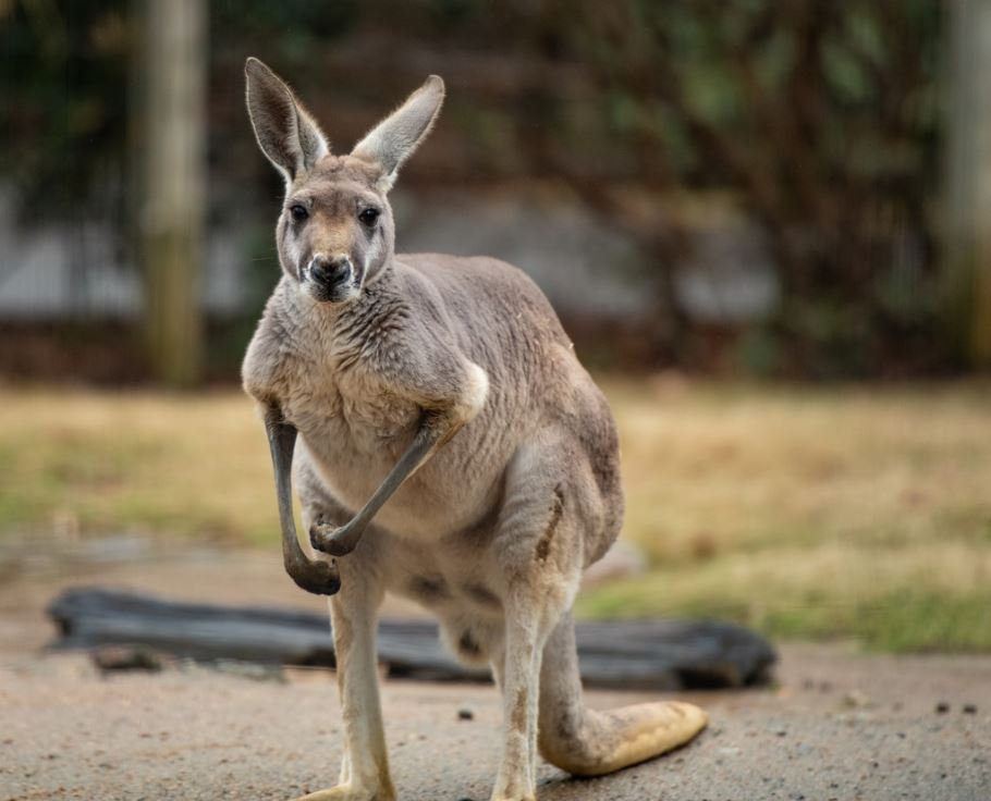
I'm worried about those calling the kangaroo "he". This kangaroo has a pouch (in both designs) so it must be FEMALE (I mean we're here criticizing the designs, we ought to at least pay attention to them.)
how he lifts his a*s to get properly f****d by the redesign XD
Went for looking like a VERY VERY bad Thumper Cartoon to something that at least looks something like a Kangaroo.
Load More Replies...I'll always prefer the old ones. Bring back so many memories of my childhood.
Welcome to the age of over stimulation of children.
Load More Replies...I can get lost in traditional animation. 3D animation just reminds me that it is "awesome CGI" at every turn.
They look like babies now. Even my train obsessed son like the previous ones and not this redesign
You must admit some of them were scary though, my son was terrified of Cranky lol :D
Load More Replies...The new design looks more than fine to me. The old one was almost terrifying.
When it comes to identity integration, Shah mentioned a study conducted by Pennsylvania State University called "The Starbucks effect". After surveying 632 college students and asking them to respond to various redesigns, it was found that consumers who are strongly committed to a brand tend to react more negatively toward new logos, while more casual customers typically view the redesigns as a positive development. "When we see a brand that we’ve built an emotional relationship with modify its logo or design," Shah added, "we panic."
That was my first thought. It's not Intel inside anymore.
Load More Replies...Appropriate. It has become somewhat two dimensional in its programming over the years.
The old History Channel had depth and learning, exposure to the past. The new History Channel is 2 dimensional and lame.
The History Channel - Where the Truth is History. (Credits to Southpark)
What was the point of this redesign? I can just see a bunch of execs sitting around a conference room saying “The logo we’ve used for years was great in every way - the majestic “H” and bold type perfectly conveyed the breadth of our program and everyone recognized it. BUT we felt a new one was needed because other companies do it and we wanted to be part of the ‘in crowd’ and show everyone we, too, can spend a lot of money on an unnecessary project, which now requires us to pretend we’re thrilled with this boring, generic redesign that has accomplished exactly nothing.”
If the contents have already beed messed up, who cares the logo anymore...
Probably to save money. Printing in one colour is a lot cheaper than printing in four colours.
Most of these are due scaling for small mobile screens.
Load More Replies...I like better the new one. It still keeps the essence from the old one, but on a cleaner, clearer way.
When I was traveling in India I found a place called Pizza Hat. It actually makes more sense.
This is my favourite comment on the page and should be on top. Pizza hat!
Load More Replies...lol they aint been the same in a minute anyway.... god i miss the old pizza hut. id order some right now if it was the same as back in the day
"Redesigns take time, effort, and an investment into an identity and visual cue that will stay with the company for the foreseeable future. They’re rarely done on a whim and rarely done without a conversation that spans many layers of a company."
"What we’ve learned above is that there is at least one easy way to avoid backlash altogether and thrive: Make your logo changes simple. Focus on colors and symbols that your customers recognize. Remove ambiguity," Shah suggested.
Teen titans was a great cartoon with fun interesting episodes and characters you grew to like. Go is just... throwaway fluff.
Cartoon Network has a bad habit of turning its mature audiences shows into dumb down baby versions of it take as total drama and ThunderCats
Go is WAY BETTER than the original. Having never seen the original as a child, it is...stupid. really, really fuxking stupid. Teen Titans Go! Is the same level of stupid, but they lean into it instead of pretending to be deep, dark, or brooding. Teen Titans Go! Lets you have fun with the stupidity instead of cringing.
I like the new ones better and after all, they're two whole different shows.
As people have noted, these aren't re-designs. They're characters from two completely different shows with vastly different tones and purposes and still exist concurrently. One did not replace the other
As far as I know, Liberty Media bought F1 and re-branded them. But I'm not 100% sure. Maybe someone else could confirm
Load More Replies...I prefer the new one. The old one was good, but the new one is also a great design. It reads "F1", and it looks like a track with a finish line.
Are logo designs are being done by AI bots so that nobody has to pay artists to do them?
Founded by people who were excited about their products and services and what they were doing and we're open thinkers = unique logos Give over to corporate CEOs who love clean lines and uniformity = logo equivalent of a simple plain work suit that they make all their workers wear
Load More Replies...I recognize first one anywhere - won't bother to look second one twice
I love to see people spending time and money to create something that DOES NOT MATTER.
It really really does though. Especially of you have as much users as Google has. A tiny fragment of better performance can make millions along the way.
Load More Replies...Exactly. Youll be thought subconciously that THIS icon means photos after several weeks of use. And after you subconciously know it, its wired and you have to unwire (=harder and less comfortable) that if you want to use another app.
Load More Replies...The butchering of the characters' personalities are even worse. Instead of having a suspicious amount of skills and a cryptic background like Classic Grandpa Max, the Reboot is just a lazy old man who thinks with his stomach
Yea, either way dumbed down, or so impossibly smart. It's not possible for the characters in some shows to know so much, yet they know the whole world. But forget it all in a single episode once there's an actual problem 😕
Load More Replies...A disgrace... Its like kids don't deserve quality cartoons only cheap chibby c**p
This mfn character. Whoever voices Norman now needs to retire from ‘acting’. Swear to god, listen and you will understand. This voice makes me miss Jar Jar Binks.
Seriously! I always said his voice was like nails on a chalkboard...and then they redid the show. The new voice, if it's even possible, is so so much worse. I'll take the old one back! We told my toddler we don't get that show anymore, lol
Load More Replies...Is that even the same character?? Don't know him from John Doe, but if that IS supposed to be the one from the top, UGH.
The boring, lazily designed backgrounds are the worst. And my 4-year old once commented that none of the characters have nostrils and asked how they breathe! He's right about the nostrils. Check it out, it's creepy...
Well I do not agree with this one ... I like yellow and it will make their planes stand up much more than the boring white and blue livery
I like the yellow better but it also looks like a flying peep...
Load More Replies...When the plane goes down, they'll have an easier time spotting it from space.
Yeah this hurt! Petition! Rise up! SUPER WHY DEMANDS JUSTICE!!!!!
Is this another chemistry joke that I am too dumb to understand?
This is horrific design, especially from a company that sells design software. The irony!
What is it? I see it changed, but I can't figure out what's that? Doesn't look like a brand to me.
Yeah. You cant expect completely different people to draw the exact same way some old dude back then did
Load More Replies...The original one makes Clifford look warm and fluffy, the new one - not so much.
The art doesn't bother me so much as - ahem -- WHERE IS CLEO in the new series?!!! I love Cleo because I love poodles (and how she wasn't a stereotypical poodle she loved getting messy). I haven't seen her in the new one and it makes me sad :(
looks like much bigger heads on the kids, to me. I liked the old Emily Elizabeth.
That's hilarious! I nearly spit out my drink, thank you :) And indeed it does totally look like that!
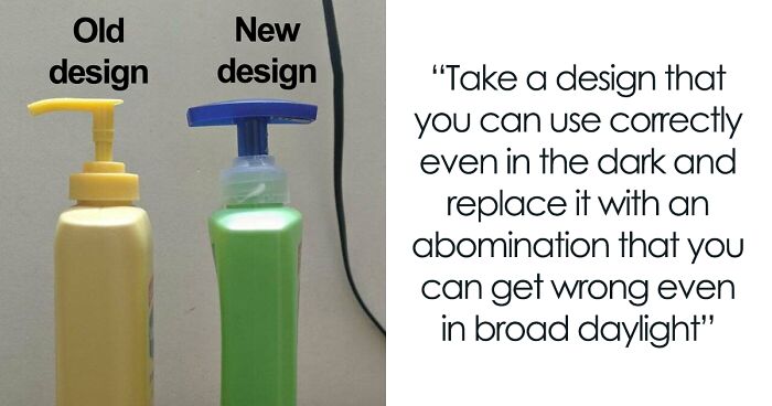
Load More Replies...Some bright spark never heard that "form follows function." The purpose of making the previous bottle narrower in the neck was to make the bottle easier to grasp for pouring. The new bottle will be much harder to hold onto because the neck is thicker. DUH. Does nobody ever try out these designs?
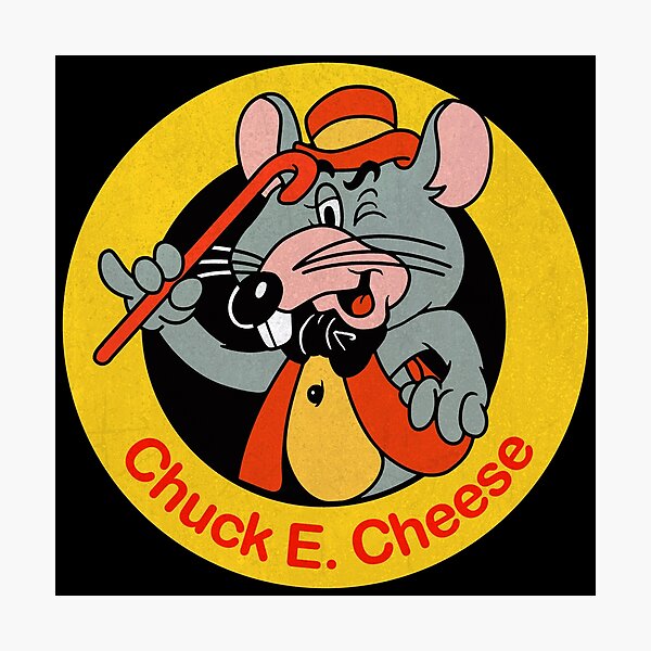
Thats it! Ill meet you at chuck e cheese for a family brawl!
Load More Replies...I love the screaming berry! I cracked up. The rest of the design... eeeehhh
Load More Replies...It's cute but why ditch the cow? It's milk for goodness sake.
Load More Replies...So where do milk and birds fit in? Never milked a bird as far as I know
What this tells me is that people simply don't like change. Most of the other examples are going from more descriptive to less descriptive, but this one goes the other way and still people don't like it. You can't please people.
I thought it was a good redesign. A little les balanced with 12-4 o'clock having so much negative space. But the bright primary colors draw the eye and hold it longer.
Load More Replies...Hungry Jacks in Australia has modernised the original Burger King logo yet retains the shape and style of it. 1200px-Hun...80-png.jpg 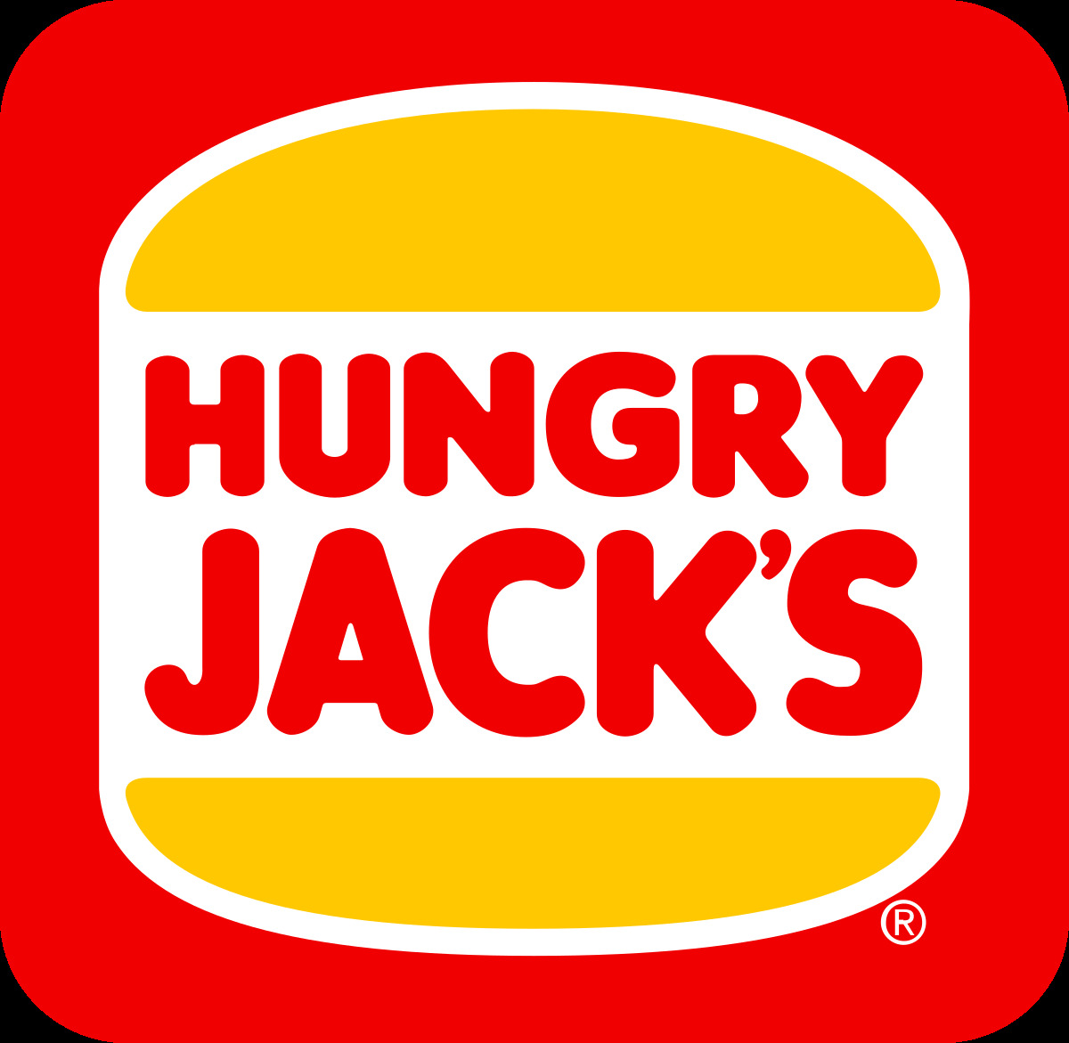
But they're going back to the old one! They just built a new Burger King near me and all the signage has the vintage logo. It's freaking my kids out. ;D
Same! My BK actually changed back to the old logo.
Load More Replies...This seems like it is pretty much the opposite of some of the ones above (Firefox, Pizza Hut, WB, History Channel) in that this one is going from a 'flat' profile to one with some depth and dimension with a slight color gradient and the beveled edges of the "A" (I'm not a designer so not sure I'm using those terms correctly). Seems like this would be an improvement based on the critiques of the ones above.
Aldis still raised their prices recently....now pizza is over $3...used to be $2...
OH MY GOSH!!! its an A????? I've only seen the new one so i had no clue!! yes this is horrible.
In Austria Aldi is called Hofer. The logo is exactly the same, only difference is that it says Hofer instead of Aldi. I never understood the A in the logo as a kid.
Load More Replies...And in 10/15 years, we'll have the exact same list. Except the now new and redesigned logo will be considered better.
Sure, there are lots of ways how to screw things up even more.
Load More Replies...I have so little emotional investment in corporate logo design that I can't even imagine giving a c**p about any of this. And yet, I scrolled the whole thing. I should probably get to work...
Waste waste waste a buck, mess the logo up. Verily horribly awfully wrong. Let traditions get lost in a snap!
So...things change? And you can't stand it? That's the first sign of becoming old.
Oh my gosh yess! The newest my little pony design is horrifying compared to the original
Load More Replies...


 No fees, cancel anytime


")


, Little Mole And Friends Becomes Little Bad Cgi And Panda???!")


")
")