401Kviews
35 Architects Who Did Not Think Their Projects Through, Shared On This Twitter Page
When you have a planner drafting your house, a roof over your head is the bare minimum you expect. I wouldn’t call a set of windows a luxury either. But in reality, even in the most precise universe of architecture and engineering, errors happen. And the results are the monstrosities you’re about to see.
Thanks to the Twitter page “Bad Planning,” we have quite a split collection to look at. The page sarcastically describes itself as “a celebration of all the ‘smelly’ stuff imposed on our environment.” It adds that: “Perpetrated by Architects, Planners, Surveyors, Engineers & other environmental ne’er do wells.” Whoever created this page appears genuinely unforgiving.
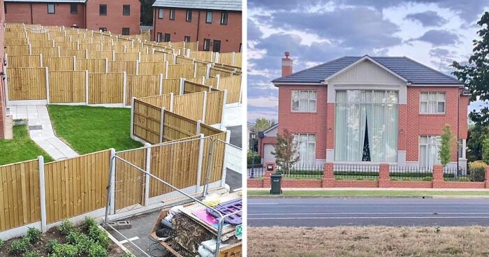
Get ready to meet ‘Fencemageddon,’ heaters rising up the stairway, the house of all the planet’s windows, and other peculiar specimens. Scroll down, enjoy and upvote your favorites as you go!
This post may include affiliate links.


If you are upset, you just had to do it the French way : unite to create a company that will buy and preserve the building.
In order to find out how bad planning and design examples like these end up in public and private spaces, we have to break down where they start from. Maybe it’s a client who ordered a questionable design and turned it into reality. Maybe it’s a designer who forgot the functional part of the design. Or it may well be the planners who didn’t take what was needed into account.
“We never realize how much even the smallest detail can affect our everyday lifestyle,” Laura Vanagaite, a Portugal-based graphic designer, told Bored Panda. She shared a couple of insights of what happens and why when objects, buildings, and spaces are designed with such big flaws. “Every single object we use from the morning until the night is designed specifically on how it is supposed to be. But that is not always the case. Functionality is the number one rule in the design and architecture world,” Laura explained.


“But sometimes,” Laura said, “some creative choices are made that make the function not the priority.” And that is where the confusion happens. “From what we have seen in the past, some design solutions are made without thinking of the actual client, a person that will use the product. It applies to everything: website or app design, interior design, furniture, architecture and spatial planning.”
Laura also said that if any of the end product is made without thinking much about the user, it loses its value. “For example, a person downloads an app, it looks nice, the design is modern, it looks beautifully done, but the letters are done in a light color and it is hard to understand what information needs to be filled in. The client gets annoyed and decides to delete the app. In this case, the designer should have thought about the app function and how user-friendly it would be.”


“Another example can be spatial planning,” the graphic designer said. “Let's say that the architects were hired to create a modern working space for a tech company. The finished result looks modern, innovative and... not enough space for the workers to sit properly. Sitting areas are a crucial part of offices because the physical health of the workers determines how productive they will be.”


According to Laura, these types of mistakes can be found in every area: “maybe the logo was wrongly designed and did not reflect the values of the company, maybe the cutlery was designed without thinking about whether left-handed people would be able to use it.”
She also stressed the fact that every designer should think first about the function and the person who will be using the product. “Whether it is a simple app or a huge architectural building, you as the professional should ask ‘What does the client need and what issues do I need to solve to make it easier for them to use it?’” Laura concluded.


Yep. Big smudge on the lower right, lighter rectangle on the upper middle-left, vertical pixel artifacts around the windows when you zoom in, and the perspectives of the windows don't match up (compare the left sides of the window frames between the upper left and the lower left windows)
Load More Replies...The schools of architecture need to show these all to students…how not to do your job
There's probably a conference about it somewhere near a handy clean cheap and dull hotel.
Load More Replies...And the windows are uneven, too, in addition to being randomly placed.
This is clearly PHOTOSHOP....you can see where the used the wrong color gray to cover up windows
Whatever is behind the patched over windows on the right bothers me most.
What about the stupid bush partially blocking one window? Its like someone decided no one would notice the windows if there was landscaping covering the mistake and passed out drunk halfway through planting.
Any one notice the windows are all off a smidge except the 3rd is evenly above the second, Window dressing on the third floor is not going to be a problem!


In my language, it's the Devil who is in the details. We always try to see the bad in every thing, to see the clouds behind the silver lining, in order to be prepared for when the smallest defect in the greatest plan will make everything backfire and fail miserably.


We call this bedroom, “the wind catcher”. Lively during storms.


I think this is more about height of smoke evacuation legislation. it’s still ugly


All the rainwater, where does it go? What about droughts? And flooding?


=.= Hello again this picture. This is a building that was converted into a hotel, and this door is a fire safety legal requirement for all hotels. It indicates the level of the fire exit and blocks inescapable floors. Placed there so in the event of an emergency people don't run all the way down the stairs, end up in the basement with no exit, and die horribly.

My dad was on a jury for someone who flew a small plane under one of the bridges, before the motorway actually opened. Seeing this photo makes me think that he’d have been ok, even when it did open.


Well, no games this side of the fence, that is fine. Why would the sign apply to the other side of the fence? That’s not how signs work.


That door had a bad breakup with the one across the street and now can't even look at it anymore.


I ended up having to look at older farmhouses and cabins after this to see good architecture and style.
One of them actually made my eyes all wonky which made mean little nauseous.
Load More Replies...This is named inappropriately. Should say, “what happens when no one was willing to fork over money for an actual architect.”
I think a better title is what happens when you hire a terrible contractor. Most of these photos are not because of the Architect - they are either a terrible contractor or people with bad taste in renovating.
Load More Replies...I'm far more concerned with the floor plan than I am with the exterior. So many newer houses seem as thought they weren't designed to actually be lived in.
Every building project should be submitted to Prince Charles for approval, in order to avoid... All that s**t.
