Get Premium
Dark mode theme is available exclusively for premium users. Learn more about the benefits of subscribing.
No fees, cancel anytime.

 Dark Mode Ad-Free Browsing Unlimited Content
 Ad-Free Browsing Unlimited Content Dark Mode
Join 1.2 million Panda readers who get the best art, memes, and fun stories every week!
If you haven’t laughed enough today, coming across this article is a sign, pandas. You need to scroll through some embarrassing and hilarious sign fails!
As we all know, it’s usually wise to get a second opinion on, well, anything. But especially before publicly posting a sign in your place of business, you should have a proofreader and someone with a slightly dirty mind look it over first. Below, you’ll find some signs that probably shouldn’t have been given the green light, courtesy of the There Was An Attempt subreddit. So enjoy scrolling through, and be sure to upvote the ones you find painfully hilarious!
This post may include affiliate links.
Signs are a very important part of our daily lives. They inform us of where we’re allowed to (and not allowed to) park our cars, which direction leads to the famous monument we’re trying to see while on vacation, and they alert us that our favorite restaurant will be open for limited hours during the holiday season. But if we look closely at the signs around us, we might also realize how hilarious they can be.
The There Was An Attempt subreddit has a wide variety of content, but one corner of the community is centered around sign fails. Typos, grammar errors and unfortunate, unintentional innuendos have ended up on many signs around the world. And lucky for us, some people were kind enough to snap photos and plaster these signs on the internet.
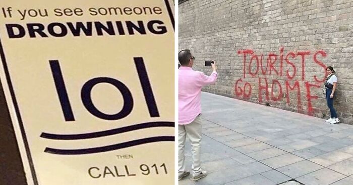
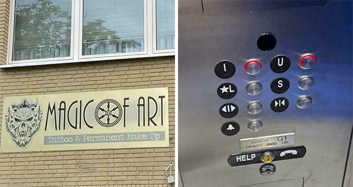
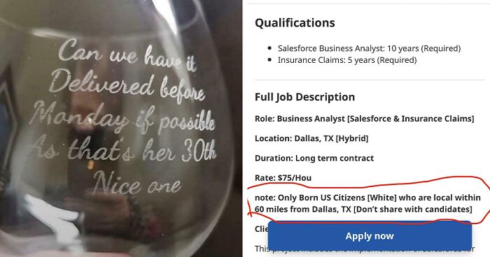
It's funny, I had to go back and check the top of the pic for information before I understood this one. I am guessing the designers didn't try this out on some people before they OK'ed it? Even after I know what it is, my brain takes me to reptilian aliens.
Designing signage may sound like an extremely simple task. If you want it to alert customers that “Restrooms are this way,” or that the “Wifi Password is cutekitten,” that’s probably all that your sign needs to state. Short and sweet, straight to the point. But as you can see from this list, designing a sign is easier said than done.
According to Conquest Graphics, when it comes to what makes a great sign, there are a few factors to consider: the placement or the environment the sign will be in, what material will be best for the sign’s environment, what messaging will attract and relate to audiences, and creating a clear, easy to read and eye-catching design.
The first step in creating a sign (that won’t completely flop or go viral for how unfortunate it is) is to choose the right type of sign. Do you need a sandwich board, a hanging banner, a poster to hang in your shop’s window or a billboard? The experts at Conquest Graphics note that wall decals and floor graphics are ideal for interior use or storefronts, while banners and yard signs are better for places where potential customers will be driving by frequently.
Who exactly are these people at our party, why are they asking when the action starts and why is there a bowl full of keys?
Messaging is definitely important when it comes to signs as well. Proofread, proofread, and have 5-10 other people read your sign’s message aloud before hitting print. You never know what kind of connotation your words will have until you hear from the peanut gallery. Plus, it’s easy for our eyes to overlook a typo. But customers are excellent at spotting them. Consider who your audience is, and try to craft a message that they’ll find charming. It may be appropriate to use puns or jokes in your signage; it just depends on what kind of message you want to send to your customers.
Keeping the environment in mind is also crucial when designing a sign, as you want the colors to pop and the message to be easily recognizable from where customers will be walking or driving by. If the text is a strange font or too small, the entire message will be lost. When it comes to your color scheme, choose color combinations that are appealing but won’t blend in with their background.
It’s also wise to keep the design of a sign simple to ensure that the message is effective. Get straight to the point, and don’t use unnecessary words. Use enough space between design elements to make sure everything can be easily deciphered, and don’t add too many images or details. “Less is more when it comes to many things, but especially with sign design,” the experts at Conquest Graphics say.
Great Grandpa used to cut bait on a fishing boat. He was first an apprentice, the a journeyman and finally became a master baiter.
It’s also key to be consistent with your brand. You want all of your advertisements and messages to have the same logo and color scheme, so they’re easily recognizable. This makes designing additional signage much easier, and it helps customers associate an image with your brand. Eventually, viewers of your signs will know they’re yours immediately, without even having to read the entire message first.
"Call if you see someone doing something inappropriate to a Bulbasaur"
We hope you’re enjoying this list of unintentionally hilarious signs, pandas. Whether you’re in charge of posting signs in your own workplace or you’re grateful you’ve never had to do so, keep upvoting the pics that you can’t help but chuckle at. Then, if you’re interested in checking out even more signs that might have cost some people their jobs, you can find another Bored Panda article featuring funny sign fails right here!
Theres a place near where I work that fits (the town is called comfort) it's called "comfort lube and liquors drive thru". Just why?
Theres a place near where I work that fits (the town is called comfort) it's called "comfort lube and liquors drive thru". Just why?


 No fees, cancel anytime


")
")