ADVERTISEMENT

What makes a logo great? Is it the colors? Maybe the shapes used? Or maybe it's something that works on a whole different level, hidden from plain sight? We're talking here about the logos you've seen so many times, you probably stopped paying attention to what they actually mean.

Check out these 15 famous brand logos which, despite being well known, still manage to hold a secret or two within.

Which one surprises you the most? Let us know in the comments!

(h/t: demilked)

#1

Toyota

Toyota

This one is extra cool because the logo actually includes every letter used in the company’s name.

Toyota Report

Yvonne Bernal
Community Member
9 years ago Created by potrace 1.15, written by Peter Selinger 2001-2017

I've often wondered about this logo.... and now I know. How creative!

Thiago ßauer
Community Member
9 years ago Created by potrace 1.15, written by Peter Selinger 2001-2017

Toyota logo is a pagan bull-head idol symbol. The bull-head relates back to Taurus the astrology sign and also the Age of Taurus (4500 to 1900 BC). It is one of the 4 land animals of the zodiac. Idols with a bull head are some of the most prominent rival gods to Christ in history. The pagan god Moloch (Molech) of the Old Testament was depicted as a bull-head god.

Load More Replies...
Cesi Baca
Community Member
9 years ago Created by potrace 1.15, written by Peter Selinger 2001-2017

Yeah I don't think so.....this is reaching a bit. The "T" actually looks nothing like a T. Same with the Y

Costel Ionache
Community Member
9 years ago Created by potrace 1.15, written by Peter Selinger 2001-2017

if you want to find something you believe is like you think , you will find

Jack Hudson
Community Member
5 years ago Created by potrace 1.15, written by Peter Selinger 2001-2017

Although you've got some great things about auto transport, vehicle transport, car transport but i would like to understand more about vehicle shipping services and method and the way to avail these services properly for vehicle shipping from one state to and another state within the auto shipping industry visit Ship-A1 for the most recent services and for the correct guide with none hassle. 1579791010...4a1c72.jpg 1579791010-5e6fc0a4a1c72.jpg

Anja
Community Member
6 years ago Created by potrace 1.15, written by Peter Selinger 2001-2017

Toyota started by making sewing machines, hence the logo is a thread going through a needle

Anja
Community Member
6 years ago Created by potrace 1.15, written by Peter Selinger 2001-2017

Toyota started by making sewing machines, hence the logo is of a needle going through a thread

View more comments
RELATED:
    #2

    Toblerone

    Toblerone

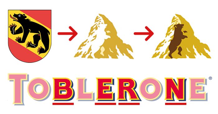
    "Toblerone" chocolates come from Switzerland and they really make it show not only by having Bern (city where Toblerone is made) in the name, but also a bear's silhouette placed inside the mountain logo.

    Toblerone Report

    Muriel Zora
    Community Member
    9 years ago Created by potrace 1.15, written by Peter Selinger 2001-2017

    When Mr. Tobler invented it, he knew that the swiss market would be too small and he designed the brand name for export: tobler One, the number one chocolate. (that's what they told us at the history museum in Bern during a special exhibition on bernese inventions.)

    Tobias Coehoorn
    Community Member
    9 years ago Created by potrace 1.15, written by Peter Selinger 2001-2017

    Nope, has nothing to do with a "number One". It's a combination of the name Tobler and the honey-flavored ingeedient Torrone. That's why it's called Toblerone. And it was not designed from the beginning for the export. The Matterhorn image with the bear was added later – this time indeed for the export. The Matterhorn is not visible from Berne nor from every other place in the canton of Berne.

    Load More Replies...
    Line Gramhart
    Community Member
    9 years ago Created by potrace 1.15, written by Peter Selinger 2001-2017

    Is it just me or does the snow on the mountain look more like a unicorn?? 🦄

    GlitterGlitch
    Community Member
    9 years ago Created by potrace 1.15, written by Peter Selinger 2001-2017

    what is that red line sticking between the bare's hind legs?

    Nicole Blaser
    Community Member
    9 years ago Created by potrace 1.15, written by Peter Selinger 2001-2017

    It's really what you think it is :) the red line belongs officially to the emblem of Bern, my beloved hometown.

    Load More Replies...
    Shirley Bond
    Community Member
    9 years ago Created by potrace 1.15, written by Peter Selinger 2001-2017

    clever and another I had never noticed

    Heather Riseborough
    Community Member
    9 years ago Created by potrace 1.15, written by Peter Selinger 2001-2017

    Didn't Einstein patent it, when he was working in the patent office?

    View more comments
    #3

    Fedex

    Fedex

    "FedEx" hid a small arrow between letters E and x, which represents the forward momentum and efficiency.

    FedEx Report

    Yvonne Bernal
    Community Member
    9 years ago Created by potrace 1.15, written by Peter Selinger 2001-2017

    I like it better with the arrow colored in.

    GlitterGlitch
    Community Member
    9 years ago Created by potrace 1.15, written by Peter Selinger 2001-2017

    it should be more like a question mark ? as in where is my package

    Costel Ionache
    Community Member
    9 years ago Created by potrace 1.15, written by Peter Selinger 2001-2017

    is hidden indeed :)), in plain sight

    Martin
    Community Member
    9 years ago Created by potrace 1.15, written by Peter Selinger 2001-2017

    So are we supposed to believe there is a secret scoop of vanilla ice cream in the letter 'e'

    Cody Eriksen
    Community Member
    9 years ago Created by potrace 1.15, written by Peter Selinger 2001-2017

    Never saw it... EVER! *mind Blown*

    Pam Altschwager
    Community Member
    9 years ago Created by potrace 1.15, written by Peter Selinger 2001-2017

    It also has a spoon in the Fed. Bottom of letter e.

    View more comments
    ADVERTISEMENT
    #4

    Tour De France

    Tour De France

    Tour de France Report

    Dan Burge
    Community Member
    9 years ago Created by potrace 1.15, written by Peter Selinger 2001-2017

    This one isn't hidden, it's extremely obvious! LOL! Everyone's know this since day one.

    Dan Burge
    Community Member
    9 years ago Created by potrace 1.15, written by Peter Selinger 2001-2017

    This one isn't hidden! Its supposed to be extremely obvious! LOL!

    Gwenyth Perl
    Community Member
    4 years ago Created by potrace 1.15, written by Peter Selinger 2001-2017

    what does anyone know what this means ?

    Kayla Velten
    Community Member
    9 years ago Created by potrace 1.15, written by Peter Selinger 2001-2017

    Actually there's a little more to this logo. The head of the cyclist is a dot, like the top of a sideways i. The black lettering on the bike spells 'Oui', which is french for 'yes'

    View more comments
    #5

    Beats

    Beats

    Letter B in the red circle shows a person wearing Beats headphones.

    beatsbydre Report

    Yvonne Bernal
    Community Member
    9 years ago Created by potrace 1.15, written by Peter Selinger 2001-2017

    I think they should have left at least the little eye on the logo... it is cute though.

    Wesley Danes
    Community Member
    9 years ago Created by potrace 1.15, written by Peter Selinger 2001-2017

    This logo is stolen from Braun. http://thecreatorsproject.vice.com/nl/blog/de-logos-van-airbnb-beats-en-medium-komen-allemaal-uit-een-designboek-uit-1989

    Jessy Mullings
    Community Member
    9 years ago Created by potrace 1.15, written by Peter Selinger 2001-2017

    Is it, really ? More like it is a b on one side and a d on the other, which makes beats and dre...

    Okiemute Notoma-Lott
    Community Member
    9 years ago Created by potrace 1.15, written by Peter Selinger 2001-2017

    That's what I was thinking. I remember when I saw the first commercials for this, a b on one side and a d on the other = beats by dre.

    Load More Replies...
    GlitterGlitch
    Community Member
    9 years ago Created by potrace 1.15, written by Peter Selinger 2001-2017

    he should have a sad face since he paid a lot of money for cheap c**p

    Ilyushka
    Community Member
    9 years ago Created by potrace 1.15, written by Peter Selinger 2001-2017

    OHHHHHHHH that's clever! ;D

    #6

    Amazon

    Amazon

    The obvious bit is the arrow connecting a to z, but what’s usually missed is that the logo is smiling.

    Amazon Report

    Terri-Lynn Macartney
    Community Member
    9 years ago Created by potrace 1.15, written by Peter Selinger 2001-2017

    I actually always thought it was just a smile! Never saw the arrow, so never made the "a to z" connection.

    Mike Bateman
    Community Member
    9 years ago Created by potrace 1.15, written by Peter Selinger 2001-2017

    I guess I'm backwards, I never saw the arrow, I always saw the smile.

    Yvonne Bernal
    Community Member
    9 years ago Created by potrace 1.15, written by Peter Selinger 2001-2017

    What's usually missed is correct.... I NEVER would have even guessed that the arrow is smiling. - I doubt I'll ever miss it again!

    Yvonne Bernal
    Community Member
    9 years ago Created by potrace 1.15, written by Peter Selinger 2001-2017

    Amazon sells everything (almost) from "A to Z" - hence the (smiling) arrow pointing from the letters A → Z

    Load More Replies...
    Emerson Swope _ Student - PineHollowMS
    Community Member
    4 years ago Created by potrace 1.15, written by Peter Selinger 2001-2017

    it is saying you can find things you need letters A to Z in the alphabet

    thisisanalt
    Community Member
    4 years ago Created by potrace 1.15, written by Peter Selinger 2001-2017

    everyone knows its smiling i never knew that tho

    Ray Brister
    Community Member
    6 years ago Created by potrace 1.15, written by Peter Selinger 2001-2017

    Prime Video arrow is Pride, Prime Original arrow is I'm In.

    View more comments
    #7

    Baskin Robbins

    Baskin Robbins

    Ice cream maker is famous for producing 31 different flavors of their product. They even put that number in their logo.

    Baskin Robbins Report

    Yvonne Bernal
    Community Member
    9 years ago Created by potrace 1.15, written by Peter Selinger 2001-2017

    Better hope they don't get an "extra" flavor!

    Karolina Stopyra
    Community Member
    9 years ago Created by potrace 1.15, written by Peter Selinger 2001-2017

    32 would fit too :) With right part of "B" and right part of "R" :) But I can see that 33 would be a problem :P

    Load More Replies...
    MEMES
    Community Member
    9 years ago Created by potrace 1.15, written by Peter Selinger 2001-2017

    i already know cause it's says baskin robin 31 n my mind blown magic

    Bella Rees
    Community Member
    9 years ago Created by potrace 1.15, written by Peter Selinger 2001-2017

    i thought it said bi flavours...as in bisexual...

    Yugan Talovich
    Community Member
    9 years ago Created by potrace 1.15, written by Peter Selinger 2001-2017

    In California in the 60s, we called it 31 Flavors. The name Baskin Robbins came along later.

    Jim Phoenix
    Community Member
    9 years ago Created by potrace 1.15, written by Peter Selinger 2001-2017

    I notice the 31 in it but I thought it had its' establishment date, instead of the flavor count.

    View more comments
    ADVERTISEMENT
    #8

    Quiksilver

    Quiksilver

    It’s actually a stylized version of famous woodblock print The Great Wave off Kanagawa.

    Quiksilver Report

    Dan Burge
    Community Member
    9 years ago Created by potrace 1.15, written by Peter Selinger 2001-2017

    Are you guys serious!? Its a mountain and a wave. Clear as day. Snowboard and surf gear. Not "hidden" at all.

    Ilídio Pinto
    Community Member
    9 years ago Created by potrace 1.15, written by Peter Selinger 2001-2017

    did you notice that on the painting is a mountain too??

    Load More Replies...
    Lisa
    Community Member
    9 years ago Created by potrace 1.15, written by Peter Selinger 2001-2017

    I thought Quicksilver's logo is an iron :/

    Martin
    Community Member
    9 years ago Created by potrace 1.15, written by Peter Selinger 2001-2017

    Tsunami. Death. Celebrate.

    Mustafa Putra
    Community Member
    9 years ago Created by potrace 1.15, written by Peter Selinger 2001-2017

    Thought that was a face with a helmet ._.

    Mariam mayu
    Community Member
    9 years ago Created by potrace 1.15, written by Peter Selinger 2001-2017

    Is quicksilver a japanese brand ?? Because the painting is japanese :o

    Gail Dur-Bolanio
    Community Member
    9 years ago Created by potrace 1.15, written by Peter Selinger 2001-2017

    And if you put to quicksilver logos together it becomes the heart logo of Roxy

    GreyMushroom
    Community Member
    9 years ago Created by potrace 1.15, written by Peter Selinger 2001-2017

    Wait... it was not a bottle-opener? God modern art is great.

    View more comments
    ADVERTISEMENT
    #9

    Pinterest

    Pinterest

    The letter P is actually a pin.

    Pinterest Report

    Jewel Farmer
    Community Member
    9 years ago Created by potrace 1.15, written by Peter Selinger 2001-2017

    I always thought it was a needle and thread. Huh... *shrugs*

    Rayna MacGuyer
    Community Member
    9 years ago Created by potrace 1.15, written by Peter Selinger 2001-2017

    Looks more like a flat head thumbtack

    Jace
    Community Member
    9 years ago Created by potrace 1.15, written by Peter Selinger 2001-2017

    Gee, and here I thought it was stylized text.

    Greg Williams
    Community Member
    3 years ago Created by potrace 1.15, written by Peter Selinger 2001-2017

    Thanks for sharing an Interesting news keep sharing more interesting news.

    charlease K
    Community Member
    7 years ago Created by potrace 1.15, written by Peter Selinger 2001-2017

    it's clearly a cheese burger with ham in in - DUH

    Lilya
    Community Member
    9 years ago

    This comment is hidden. Click here to view.

    You guys seriously didn't notice that? You must be idiots... 😒

    #10

    Hyundai

    Hyundai

    Car manufacturer’s logo stands for the first letter of their name, right? Not only so, it also represents a successful deal between a car dealer and a customer.

    Huyndai Report

    Rune Barrett
    Community Member
    9 years ago Created by potrace 1.15, written by Peter Selinger 2001-2017

    Yea of course. Just as the sky is blue because carrots are orange and orange is Trump because of orange. Or the other way around. Your comparison makes as much sense as mine.

    Yvonne Bernal
    Community Member
    9 years ago Created by potrace 1.15, written by Peter Selinger 2001-2017

    And here I only thought it was an "H". Good grief.

    GlitterGlitch
    Community Member
    9 years ago Created by potrace 1.15, written by Peter Selinger 2001-2017

    well it is an H but also men shaking hands.

    Load More Replies...
    Ahmad Barakat
    Community Member
    9 years ago Created by potrace 1.15, written by Peter Selinger 2001-2017

    the Toyota alphabetic rule applies too in that one

    View more comments
    ADVERTISEMENT
    See Also on Bored Panda
    #11

    Levi's Jeans

    Levi's Jeans

    Yep, that's your bottom right there.

    levi's Report

    Tiny Dynamine
    Community Member
    9 years ago Created by potrace 1.15, written by Peter Selinger 2001-2017

    Now we know you're making these up.

    Rune Barrett
    Community Member
    9 years ago Created by potrace 1.15, written by Peter Selinger 2001-2017

    Or it is because MCdonalds are the real owner. Or a pidgeon maybe? Again this is a long shot. This post is good at that. Cmon panda! You are better than this.

    Rayna MacGuyer
    Community Member
    9 years ago Created by potrace 1.15, written by Peter Selinger 2001-2017

    It's the shape of two butt cheeks, aka what your Levi's jeans go in

    Load More Replies...
    View more comments
    #12

    London Symphony Orchestra

    London Symphony Orchestra

    The letters make the shape of a conductor of the orchestra.

    lso.co.uk Report

    Brooke Weber
    Community Member
    9 years ago Created by potrace 1.15, written by Peter Selinger 2001-2017

    I think it's just a stylized L-S-O

    Dan Burge
    Community Member
    9 years ago Created by potrace 1.15, written by Peter Selinger 2001-2017

    OK, this is a good one. We will leave on a happy note :)

    #13

    Unilever

    Unilever

    Unilever’s logo is actually made up of icons representing different aspects of sustainable living.

    unilever Report

    Daria B
    Community Member
    9 years ago Created by potrace 1.15, written by Peter Selinger 2001-2017

    No, they didn't. Look at the upper left. That's a huge oil splash. ^_-

    Load More Replies...
    Arty
    Community Member
    9 years ago Created by potrace 1.15, written by Peter Selinger 2001-2017

    "sustainable living"...Unilever? ahahaha! :D

    Juan Molina
    Community Member
    9 years ago Created by potrace 1.15, written by Peter Selinger 2001-2017

    Mmm well. thats ironic, they have a lot of earth destructive brands :(

    Jace
    Community Member
    9 years ago Created by potrace 1.15, written by Peter Selinger 2001-2017

    I thought it represented the homogenization of the marketplace by owning as many brands as possible.

    Ariane Paninski
    Community Member
    9 years ago Created by potrace 1.15, written by Peter Selinger 2001-2017

    haha..sustainable living with unilever..good joke

    Cathy O'Keeffe
    Community Member
    9 years ago Created by potrace 1.15, written by Peter Selinger 2001-2017

    They also forgot to mention animal testing😢

    GlitterGlitch
    Community Member
    9 years ago Created by potrace 1.15, written by Peter Selinger 2001-2017

    Maybe you didnt notice the drawing of the bird?

    Load More Replies...
    Linden Robinson
    Community Member
    8 years ago Created by potrace 1.15, written by Peter Selinger 2001-2017

    I see a spoon, what the hell does that have to do with anything?

    Šimon Špaček
    Community Member
    8 years ago Created by potrace 1.15, written by Peter Selinger 2001-2017

    Am I only one who spotted Firefox logo there?

    View more comments
    ADVERTISEMENT
    See Also on Bored Panda
    #14

    Alfa Romeo

    Alfa Romeo

    Italian car manufacturer's logo is jam-packed with stuff, the key feature being a serpent eating a man.

    alfaromeo Report

    Yvonne Bernal
    Community Member
    9 years ago Created by potrace 1.15, written by Peter Selinger 2001-2017

    What the author DIDN'T explain is this: The red cross is typical Christian symbol of medieval heraldry and used extensively throughout the crusaides. Back then, it didn’t mean “medic”, it meant: Run for your life. The man in the serpents mouth is a bit more controversial. It’s a symbol called a biscione, and the man in the image is alternatively described as a child (the modern interpretation) or a Saracen or Moor (aka: a Muslim). So the whole serpent motif is all about the Christians Crusaders’ defeat of the infidels. Hey - I didn't make it, I'm only trying to explain it. lol

    Kelly
    Community Member
    9 years ago Created by potrace 1.15, written by Peter Selinger 2001-2017

    The red cross represents the city of Milan, the serpent is called 'biscione' and is the symbol of the Visconti family, lords of the city.

    Load More Replies...
    Arkadin
    Community Member
    9 years ago Created by potrace 1.15, written by Peter Selinger 2001-2017

    On the right, is the flag of the city of Milan. On the left, it is the representation of the beginning of the Visconti family, the legend that the first one was saved from a big snake when he was a baby. Do not improvise, when you do not know something, better keep your mouth shut.

    Arkadin
    Community Member
    9 years ago Created by potrace 1.15, written by Peter Selinger 2001-2017

    Ooops, of course it is the opposite, my mistype

    Load More Replies...
    Godspeed
    Community Member
    9 years ago Created by potrace 1.15, written by Peter Selinger 2001-2017

    It can also mean that this Italian car will break down just like English cars do and the cost to repair it feels like you are being eaten alive. That's my two cents :P

    Brontosonto
    Community Member
    9 years ago Created by potrace 1.15, written by Peter Selinger 2001-2017

    The "biscione" is also a symbol of Milan

    Brontosonto
    Community Member
    9 years ago Created by potrace 1.15, written by Peter Selinger 2001-2017

    The red cross is from the flag of Milan, city where Alfa Romeo was founded.

    Gwenyth Perl
    Community Member
    4 years ago Created by potrace 1.15, written by Peter Selinger 2001-2017

    i do its a dragon or a snake eating a man

    May Day
    Community Member
    5 years ago Created by potrace 1.15, written by Peter Selinger 2001-2017

    I thought the serpent was a dragon breathing fire :-)

    Mónica Elisabeth Sacco
    Community Member
    9 years ago Created by potrace 1.15, written by Peter Selinger 2001-2017

    The logo used by Alfa-Romeo, originally a Milanese car manufacturer, is the actual coat of arms of Milano city, inherited from the Visconti duches, being the last one Filippo Maria Visconti. His duchy was inherited by his illegitimate daughter Bianca Maria Visconti, who married condottiere Francesco Sforza (her father's choice, after having rejected other more noble unions like the dukes of Ferrara, for the sake of a better protector of the Milano duchy). The Sforzas kept the Viscontis coat of arms , known as the "biscione" (the great snake, "bissa" in Milanese dialect) that eats sometimes a boy or baby, other times, a man. It represents the prophet Jonah as being swallowed or thrown upo by a sea serpent or Leviatan.

    View more comments
    #15

    Northwest Airlines

    Northwest Airlines

    Clever use of typography merges both letters, N and W, into one.

    Northwest Airlines Report

    Octavio Díaz
    Community Member
    9 years ago Created by potrace 1.15, written by Peter Selinger 2001-2017

    Don't forget the little triangle is pointing NW

    Tessa
    Community Member
    9 years ago Created by potrace 1.15, written by Peter Selinger 2001-2017

    Depends on how you look at it... It can also points south or northeast

    Load More Replies...
    Dan Burge
    Community Member
    9 years ago Created by potrace 1.15, written by Peter Selinger 2001-2017

    ...you're starting to make me doubt your intelligence, boredpanda. These are not hidden, they are so obvious its painful. Did you know the golden arches of the McDonalds logo is actually a hidden "M" for McDonalds???

    Lars Torp
    Community Member
    9 years ago Created by potrace 1.15, written by Peter Selinger 2001-2017

    Also the logo makes a compass pointing to the north west

    Marvin Torres
    Community Member
    4 years ago Created by potrace 1.15, written by Peter Selinger 2001-2017

    how about the arrow pointing to the northwest?

    Sophie G
    Community Member
    9 years ago Created by potrace 1.15, written by Peter Selinger 2001-2017

    had any1 .ed out yet th@ the arrow's....ohnevermindhihi

    Wayne Coughlan
    Community Member
    9 years ago Created by potrace 1.15, written by Peter Selinger 2001-2017

    what is also relevant here is the arrow head is pointing in the compass direction of northwest

    View more comments
    #16

    Galeries Lafayette

    Galeries Lafayette

    Double T in the title creates The Eiffel Tower.

    Galeries Lafayette Report

    Greg Williams
    Community Member
    3 years ago

    This comment has been deleted.

    Martin
    Community Member
    9 years ago Created by potrace 1.15, written by Peter Selinger 2001-2017

    Looks like Eiffel needs some viagra

    Rune Barrett
    Community Member
    9 years ago Created by potrace 1.15, written by Peter Selinger 2001-2017

    Or maybe: Double T in the title COULD create The Eiffel Tower, but most likely this is incidental

    Murielle Mercier
    Community Member
    9 years ago Created by potrace 1.15, written by Peter Selinger 2001-2017

    It is not incidental... Eiffel tower is the emblem of galeries lafayette, you can see it in every ad. I even thought it was so obvious I don't know how one can miss it...

    Load More Replies...