Get Premium
Dark mode theme is available exclusively for premium users. Learn more about the benefits of subscribing.
No fees, cancel anytime.

 Dark Mode Ad-Free Browsing Unlimited Content
 Ad-Free Browsing Unlimited Content Dark Mode
Join 1.2 million Panda readers who get the best art, memes, and fun stories every week!
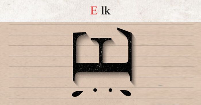
Federico Babina describes himself as an architect/multitasking designer. And rightfully so, as he creates various illustration projects shown on his Instagram or website.
However, today, one project in particular has caught our attention, and it's Wildphabet. Here, the artist reimagined letters as animals they represent. This playful project challenges us to play with our surroundings and always try to find new ways to explore them.
So, without further ado, we invite you to discover the hidden animal kingdom among the well-known alphabet letters.
More info: Instagram | federicobabina.com | youtube.com
This post may include affiliate links.
Unfortunately, alligator snouts are ) shaped, while crocodile snouts are > shaped, apart from the saltwater crocodile, whose snout is ) shaped. Not detracting from the skills shown here at all.
There are a few of these where I live, don't see them too much but they are SO BIG it's INSANE
that story about sticking his head in the sand - it's strictly for the birds
If you meet one on the towpath - go round the other way. They're sort of determined
I'm sure the artist wasn't too lazy to think of another sort of Sloth ...
I can never remember, are they black stripes on a white background, or white stripes on a black background ?
Was a little disappointed when I found the letters jumbled.. looks like our mind looks for an order if we are used to it... The Alphabet looks great though...!
This is neat, I wonder if they could be used for kids to help learn the alphabet? Easier to remember what each character means this way. Especially if a few of them could be rotated the correct way, for less confusion for the learner, and still look like the animal. Most of them are already the right way up. I know (C)at could easily be rotated for example. Others, not so much, but that's probably still okay. Either way, this alphabet might be really helpful for learning!
Too many of them are just slapping the head of an animal on the letter that barely represents them. The style itself is nice, but the execution on most of these is pretty weak.


 No fees, cancel anytime

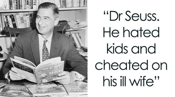
")

")
")
")
")
")
")
")
")
")
")
")
")
")
")
")
")
")
")


")
")
")
")


")
")
")
")


")