ADVERTISEMENT

Visual clarity and good signage are paramount! All your hard work and good intentions can go down the drain if you can’t communicate well… Or if you think that you’re a better graphic designer than you really are.

If your sign, book cover, poster, menu, or other visual masterpiece raises more questions than answers when people read it normally, your monstrosity might just end up being shamed in the popular DDOI online community. We’ve collected some of the most epic text fails to share with you. You’ll find them below. Oh, and remember to scare your artist friends with the worst of the bunch!

#1

Run For Half, Autism Marathon

A brightly painted blue wall with "RUN FOR HALF AUTISM MARATHON" and a runner within a puzzle piece. Message Layout Fails.

MoaningMushroom Report

Ye Olde Dirty Grumpy
Community Member
9 hours ago Created by potrace 1.15, written by Peter Selinger 2001-2017

Similar to the British sds about HALVING all homeless by now. Homelessness punished by drawing and quartering

View more comments
RELATED:
    #2

    Don’t Rat Open Inside

    A message layout fail: a cardboard sign on a rat cage reads Don't Rat Open Inside, with a white rat peeking out.

    Cool_Researcher4794 Report

    Beady El
    Community Member
    Premium
    9 hours ago Created by potrace 1.15, written by Peter Selinger 2001-2017

    Despite all my rage…

    View more comments

    Even if you’re not a graphic designer, artist, or creative professional, you can immediately tell when a sign or book cover is ‘off.’ In a nutshell, visual communication needs to be as brief and clear as possible.

    You need to pick a good font, make sure the colors don’t clash, and that the kerning (that’s the space between characters) doesn’t confuse your target audience or create some unfortunate letter combinations.

    ADVERTISEMENT

    At its core, good signage leads to greater visibility and professional credibility, and better brand awareness and recognition.

    #4

    Focus If I On My Can't Of The Then I Tiger Outcome Must

    A banner with a tiger eye and target image, featuring a confusing message layout: FOCUS IF I CAN'T OF THE TIGER OUTCOME MUST. Message layout fails.

    kronograf Report

    Colleen Glim
    Community Member
    9 hours ago Created by potrace 1.15, written by Peter Selinger 2001-2017

    This doesn’t make any sense regardless of how you try to read it

    View more comments
    #5

    Burbur Gerger?

    A restaurant sign with message layout fails, displaying BURBUR GERGER instead of BURGER, next to a white table.

    haerien Report

    Magnell
    Community Member
    6 hours ago Created by potrace 1.15, written by Peter Selinger 2001-2017

    Sounds like something Trump would say...

    View more comments
    ADVERTISEMENT
    #6

    Feed Me And Tell Me Tacos I'm Pretty

    A neon sign reading FEED ME AND TELL ME TACOS I'M PRETTY, a message layout fail, over a metal counter.

    LaChazzz Report

    Reemerger
    Community Member
    4 hours ago Created by potrace 1.15, written by Peter Selinger 2001-2017

    Welcome to The Taco Whisperer! Shall we get you started with eight pints of sugary slop while you chose your artery-clog du jour, sweetie?

    View more comments

    You have barely a moment to transmit your message to your target audience. So, if there’s any messiness or confusion in your design, you’re already failing at your task. If you’re an entrepreneur, business owner, or content creator, you are pushing potential customers away and harming your brand, reputation, and profitability.

    ADVERTISEMENT

    However, some failures are so egregious that they deserve to be called out. The ones that we’ve compiled and featured here are examples of what to avoid doing at all costs.

    #7

    No Added Apple Sugar Cake

    A product label showing NO ADDED APPLE SUGAR CAKE, a message layout fail that's confusing due to text placement.

    zipniko Report

    Reemerger
    Community Member
    4 hours ago Created by potrace 1.15, written by Peter Selinger 2001-2017

    Probably contains a fraction of a nibble of apple, chemically stripped of any nutritional value or resemblance to an actual apple. So "No added apple - Sugar cake" is accurate.

    View more comments
    #8

    Be Pet Gay Dogs

    A window displays rainbow flags with the words BE GAY and PET DOGS written on them, a message layout fail.

    HvyMtl1sLfe Report

    #9

    Bunk Single Metal Pine Beds Beds Beds Beds

    A white truck with confusingly stenciled blue text that reads BUNK SINGLE METAL PINE over BED BED BED BED. A message layout fail.

    nomanslandishome Report

    ADVERTISEMENT

    How you represent your brand, business, product, or services visually likely creates the very first impression your target audience has of you. To put it bluntly, if that impression is unfavorable, you’ll have a tough time attracting customers.

    ADVERTISEMENT

    If your sign’s a mess, your posters are confusing, and your logo is unreadable, why should your customers trust you over your competitors? In other words, a lack of visual clarity raises questions about your overall quality. And, stating the obvious, you don’t want your customers to raise these questions about you. You want to instantly create a positive impression of trustworthiness and quality.

    #11

    Can't Your Can't Your, Hear Horn See Finger 😔

    A white car with a funny message layout on its rear window: DRIVER IS OLD, CAN'T YOUR HEAR HORN, CAN'T YOUR SEE FINGER, HAVE A NICE DAY. This fail is a funny message layout.

    reddit.com Report

    #12

    Don’t Do Park Park Here Here

    A wooden sign on a lattice fence with the confusing text: DON'T DO PARK PARK HERE HERE, an example of message layout fails.

    reddit.com Report

    ADVERTISEMENT

    Good design means creating quality work within certain constraints.

    Clarity and brevity aside, brands should also try to make their advertising interesting, catchy, and fun. So, designers should definitely toy around with the font size, colors, kerning, etc., while still keeping things simple and readable.

    ADVERTISEMENT

    You also have to keep the brand’s overall identity in mind when working with signage. Some visual design ideas might be objectively great, but they might not work well with the company or clients you’re currently working with.

    #13

    He's A Free

    A man holds a sign with a message layout fail: I AM A FREE I AM NOT MAN A NUMBER. Fails include awkward phrasing.

    brodino_maiuscolo Report

    Ye Olde Dirty Grumpy
    Community Member
    9 hours ago Created by potrace 1.15, written by Peter Selinger 2001-2017

    The Prisoner TV show, and the Iron Maiden song that references it. I still like Bring Your Daughter to the Slaughter

    View more comments
    #14

    I’m Not Human Data

    Red graffiti reads I'M HUMAN NOT DATA on a white wall, highlighting a message layout fail.

    djelijunayid Report

    #15

    So I Fart Old Dust

    A rustic wooden sign reading So I Fart Old Dust, exemplifying message layout fails. This humorous fail sign is on a pegboard.

    OldActuary2297 Report

    Colleen Glim
    Community Member
    9 hours ago Created by potrace 1.15, written by Peter Selinger 2001-2017

    Another one that makes its point both ways

    View more comments
    ADVERTISEMENT

    To be clear, everyone makes mistakes. Even veteran industry professionals. So, it’s never a good idea to publish the first draft of, well, anything, no matter how confident you feel about it. Take a break, spend some time away from your design, then look at it with fresh eyes.

    Changing the medium through which you review and edit your work also impacts any potential mistakes that you notice. Switch to a different screen. Print out your work and look at it on paper. Do whatever you need to do to distance yourself from your work and look at it from a fresh perspective, as your target audience would.

    Never miss a story that brings joy to the world. Follow on Google News

    #16

    Ghafy Oapoo Dslru A N

    A banner displaying God Has A Plan For You, but the Message Layout makes it hard to read. A fail in design.

    disboicito420 Report

    Magnell
    Community Member
    6 hours ago Created by potrace 1.15, written by Peter Selinger 2001-2017

    Hell yeah.. .let's dust off and bring back Cuneiform

    View more comments
    ADVERTISEMENT
    ADVERTISEMENT
    #18

    Please Snacks Open Inside

    A message layout fail: a wooden box with text Please Snacks, Open Inside, next to strange planters and a candy jar.

    drunkbettie Report

    LakotaWolf (she/her)
    Community Member
    Premium
    9 hours ago Created by potrace 1.15, written by Peter Selinger 2001-2017

    I don't want those cursed snacks, thanks XD With those things on the cupboard, it'd be like opening the Pharaoh's tomb and getting cursed XD

    View more comments

    You also need to be open to editing your work based on feedback. Ask your colleagues, family, friends, and complete strangers for their honest opinions on your work. Then, hone in on the constructive criticism while ignoring unhelpful feedback.

    No matter how amazing you are at your job, true professionals recognize their limits and the value of getting impartial viewers’ opinions. (Even if their comments can sometimes be tough to take!)

    #19

    Tameawkenuay

    A clear brochure holder displays light blue flyers with a lighthouse logo and the words TAMEAW KENUAY. A message layout fail.

    Amutking Report

    #20

    Hi Do Not Mix Please The Beans

    A sign reads "GREAT PRICE Hi do not mix Please the beans" showing a message layout fail.

    fearless_moth56 Report

    ADVERTISEMENT
    ADVERTISEMENT
    #21

    Insiemh!viblat?*

    A message layout fail, with the letters INSIEMH! and VIBLAT?* arranged confusingly on white papers on a dark wall.

    fearless_moth56 Report

    Vincent Bevort
    Community Member
    35 minutes ago Created by potrace 1.15, written by Peter Selinger 2001-2017

    Ther is really no reason to down vote this comment in any way

    View more comments

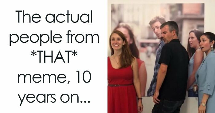
    The inspiration for the DDOI online group comes from the massively popular TV series ‘The Walking Dead.’

    The show had a promotional poster that, due to the bizarre spacing, warped the message written on a door. The signage here was so hilariously bad that it became a meme and spread online.

    #23

    Yarn Factory Dragon Store

    A store sign reading Yarn Factory Dragon Store, partially obscured by a pole, exemplifies message layout fails.

    Busy_Introduction_94 Report

    V
    Community Member
    9 hours ago Created by potrace 1.15, written by Peter Selinger 2001-2017

    A yarn factory dragon store does sound like my kids Nd of shop.

    View more comments
    ADVERTISEMENT
    #24

    Save A Useless Tree Toilet Paper

    A sign with a tree growing from a toilet paper roll says Save a Tree, Use less Toilet Paper. A message layout fail.

    mbelf Report

    ADVERTISEMENT

    The DDOI online community is practically legendary by now. It has been calling out hilarious and nonsensical visual design fails since 2014.

    Now, nearly 12 years after the group was started, it continues to draw in a massive crowd of gawking internet users and people eager to call out bad signs. At the time of writing, the subreddit gets 36k visitors per week.

    #25

    It’s Gada Mey!

    A door with white letters GA DA ME Y, creating a message layout fail. The letters are misaligned on a purple background.

    leftnotracks Report

    Roman Arendt
    Community Member
    9 hours ago Created by potrace 1.15, written by Peter Selinger 2001-2017

    Gada Mey has a nice ring to it. Could be an old timey woman's name.

    View more comments
    #26

    Hot Smoke Fish Chicken Pork Pull Chop Pork

    A messy, handwritten sign reading "Hot Fish Pork Chop" and "Smoke Chicken Pull Pork" displaying a message layout fail.

    breakfree89 Report

    ADVERTISEMENT

    The essence of the DDOI online group is sharing visual designs, signs, posters, and other examples of text that, when read regularly from top to bottom and left to right, end up confusing, nonsensical, and funny.

    The subreddit revolves around English posts, and the mistakes should be instantly obvious. The moderators who run the group that the community should avoid forcing anything or posting something that could be easily faked or staged.

    Meanwhile, posters are encouraged to share the incorrect way of reading the text in the title of their post.

    ADVERTISEMENT
    ADVERTISEMENT

    Which of these hilariously bad sign fails made you wince and cringe the hardest, and why?

    What are the worst examples of visual media that you’ve personally seen in your local area? In your opinion, what can all creative professionals do to become more self-aware of the quality of their work?

    Share your thoughts with all the other readers in the comments.

    #31

    Tranfa Silshion Vafes Natival 🤌

    A car with a sticker displaying a message layout fail, featuring poorly spaced and misspelled words in gold and white text.

    RariCalamari Report

    ADVERTISEMENT
    #32

    God U Rip

    A gray truck with messages painted on the back window. The messages show layout fails.

    jaweissavl Report

    Colleen Glim
    Community Member
    9 hours ago Created by potrace 1.15, written by Peter Selinger 2001-2017

    It’s nice to be warned before you engage with the stupid

    View more comments
    ADVERTISEMENT
    #33

    If This Is… You’re All You Do… Missing Most Of The Gym

    A gym column sign with a confusing message layout reads: IF THIS IS ...YOU'RE ALL YOU DO... MISSING MOST OF THE GYM. A clear example of message layout fails.

    Maka91 Report

    #34

    What What What

    A digital sign in a large public space with a message layout fail, displaying repeated text like "SAVE ON WHAT MATTERS MOST."

    Diligent_Office7179 Report

    ʁɨɂɥɒ
    Community Member
    2 hours ago Created by potrace 1.15, written by Peter Selinger 2001-2017

    It feels like a song ,🎵 save on save on. What what what, save on save on, what what what. Matters most... Save on save on. What what what🎵

    View more comments
    #35

    Think Trash Pink Cancer

    A pink dumpster with text reading "think trash pink cancer" on its side, a message layout fail.

    FreshySqueeze Report

    V
    Community Member
    9 hours ago Created by potrace 1.15, written by Peter Selinger 2001-2017

    Is that Pink Panthers cousin?

    View more comments
    ADVERTISEMENT
    ADVERTISEMENT
    #37

    No Move So, Because Ok Lazy. To Leave Alone

    A message layout fail: a sign on a cage says, "Upside down Turtles No move because Lazy. So, OK to leave alone."

    Jesus_GB Report

    Ye Olde Dirty Grumpy
    Community Member
    9 hours ago Created by potrace 1.15, written by Peter Selinger 2001-2017

    No, flip them over. This is part of the Voight-Kampf test in Blade Runner.

    View more comments
    #38

    Pflugerqb Villegyn

    A poorly laid out sign for "PFLUGER OB VILLE GYN" at night, glowing pink and blue, on a brick building, resulting in a message layout fail.

    Broke-Down-Toad Report

    #39

    Happy And She Am I Called His Name Asher

    A message layout fail on a green wall: Happy am I... his name Asher. ...and she called, causing confusion.

    Cambers-175 Report

    Elladine DesIsles
    Community Member
    9 hours ago Created by potrace 1.15, written by Peter Selinger 2001-2017

    "And Leah said, Happy am I, for the daughters will call me blessed: and she called his name Asher." Genesis 30:13, King James Bible.

    View more comments
    ADVERTISEMENT
    ADVERTISEMENT
    #41

    I Now Was I'm 67

    A glittery birthday cake topper reading I Now Was I'm 67, highlighting message layout fails due to poor design.

    Apprehensive_Emu9588 Report

    Magnell
    Community Member
    6 hours ago Created by potrace 1.15, written by Peter Selinger 2001-2017

    we had our own stupid sh!t.. let the kids enjoy theirs... I get my daughter all kinds of silly stuff with 6-7 on it... looking forward to remind her of it all when she is 20+

    View more comments
    #42

    Boga Arme Ds

    A cabinet with BOARD GAMES spelled out, but the letters are arranged as a message layout fail: BOGA ARME DS.

    Po3ito Report

    Ye Olde Dirty Grumpy
    Community Member
    9 hours ago Created by potrace 1.15, written by Peter Selinger 2001-2017

    Dys was the closest the Greeks had to a devil. The opposite of Concordia or Harmony. Dont arm him.

    View more comments
    #43

    Wet Be Floor! Careful!

    A handwritten sign on lined paper pinned to a white board reads, Wet Be Floor! Careful! An example of message layout fails.

    BrokeTheInterweb Report

    ADVERTISEMENT
    #44

    If We Burn You Us Burn With

    A protest sign with a phoenix and text, If We Burn You Burn With Us, illustrating a message layout fail.

    Grammargambler Report

    Beady El
    Community Member
    Premium
    9 hours ago Created by potrace 1.15, written by Peter Selinger 2001-2017

    If burn we do, with us you will burn.

    View more comments
    ADVERTISEMENT
    #45

    Enjoy Mouth Popcorn Your Watering

    Popcorn display with a humorous layout fail: a sign reads "Enjoy mouth Popcorn Your watering" next to bags of popcorn.

    Odd_Sir_5922 Report

    #46

    Lucky Fried Geandma Skewers

    A street sign for Lucky Grandma Fried Skewers, showing a layout fail with the logo resembling KFC's Colonel Sanders.

    cuavas Report

    #47

    Suti Shime

    A sushi sign with the words SU SHI TI ME awkwardly split by a stack of sushi rolls, an example of message layout fails.

    jqn87 Report

    Dave Nalesnik
    Community Member
    34 minutes ago Created by potrace 1.15, written by Peter Selinger 2001-2017

    As a sushi fan and non-Japanese speaker, I would totally believe that sutishime was a thing

    View more comments
    ADVERTISEMENT
    #48

    Do Not For Any Block Amount The Aisle Of Time

    A poorly laid out sign reads DO NOT FOR ANY BLOCK AMOUNT THE AISLE OF TIME. A Message Layout Fail.

    RunnySmoky Report

    Roman Arendt
    Community Member
    9 hours ago Created by potrace 1.15, written by Peter Selinger 2001-2017

    I wish my grocery store had an aisle of time...

    View more comments
    ADVERTISEMENT
    #49

    Free Artificial Colours, From Flavours And Preservatives

    Close-up of a Mars bar wrapper with a message layout fail, where the torn edge obscures key information.

    robster98 Report

    Anonymous Anonymous (SCPFanIGuess)
    Community Member
    9 hours ago

    This comment is hidden. Click here to view.

    Free from artificial colours, flavours & preservatives

    #50

    Please Skate, Do Not Board, Ride In Store

    Two signs on a shelf, one says PLEASE DO NOT RIDE, the other SKATE BOARD IN STORE. A message layout fail.

    SanaJisu Report

    ADVERTISEMENT
    #52

    We Am Arebitious

    A blue banner in an office with a message layout fail, reading "WE AM ARE BIT IOUS." Hilarious visual for message layout fails.

    WENUS_envy Report

    Ye Olde Dirty Grumpy
    Community Member
    9 hours ago Created by potrace 1.15, written by Peter Selinger 2001-2017

    Is this a school or a prison? Well, a school is an institution, and nobody wants to be in an institution... cant remember the movie. Prisons have "blocks"

    View more comments
    ADVERTISEMENT
    #53

    Walz More Resign Ice

    A man holding two signs: one says "WAIZ RESIGN" and the other "MORE ICE," showcasing a message layout fail.

    Joes___Garage Report

    Geoffrey Scott
    Community Member
    49 minutes ago Created by potrace 1.15, written by Peter Selinger 2001-2017

    Or, how to ensure your clientele is comprised of people who pride themselves on not spending money.

    View more comments
    #55

    Don’t Don’t Don’t Let Let Let The The The Bad Bad Bad Days Days Days Win Win Win

    A light green sign on a wooden door reads "Don't let the bad days WIN" with flowers. An example of message layout fails.

    evilducky6 Report

    ADVERTISEMENT
    #56

    You Are The We Ever Best Dad Saw

    A wooden saw-shaped sign reads, You are the BEST DAD we ever SAW, showcasing a message layout fail.

    StratInTheHat Report

    ADVERTISEMENT
    #57

    The MA Good RI Satan

    Stained glass with text THE GOOD SA- on left and MA- RI- TAN on right. A message layout fail.

    superyoshi013021 Report

    #58

    I Stand And Kneel For The For The

    A bumper sticker on a car reads I STAND FOR THE (American flag) 
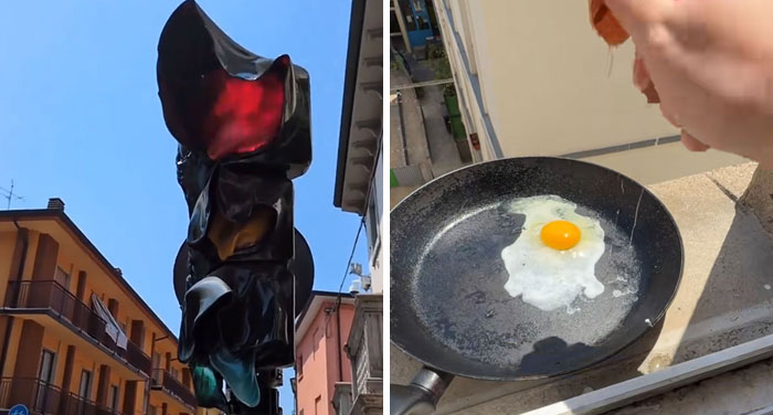
& KNEEL FOR THE (cross), an example of message layout fails.

    BugsBub Report

    General Anaesthesia
    Community Member
    4 hours ago (edited) Created by potrace 1.15, written by Peter Selinger 2001-2017

    "When Fáscìsm comes to America, it will be wrapped in the flag and carrying a cross" - Sinclair Lewis

    View more comments
    ADVERTISEMENT
    #60

    Welcome Bienvenido To A Trinidad & Tobago

    A welcome sign for Trinidad & Tobago at an airport, illustrating a message layout fail.

    Nkosi868 Report

    ADVERTISEMENT
    #61

    Fourskin Co. Season

    A black metal sign for Four Season Skin Co. with two birds forming a circle, a message layout fail.

    calebthelee Report

    #62

    Make Not Art Trash

    Art room with a banner reading Make Art Not Trash. This message layout results in a fail.

    rawfodoc Report

    GalPalAl
    Community Member
    3 minutes ago Created by potrace 1.15, written by Peter Selinger 2001-2017

    Should have taken their own advice. They made trash, not art

    View more comments
    ADVERTISEMENT
    #64

    Leftovers Smorgs To Take Only Cannot Be Go Can Be What You Taken Purchased Can Eat

    A poorly laid out sign with message fails due to bad message layout. It says Leftovers Cannot be Taken, Smorgs To Go Can Be Purchased, Take Only What You Can Eat.

    yeehaw1005 Report

    ADVERTISEMENT
    #65

    Made With Climate Plant Organic Positive Powered Chickpeas Goodness Protein

    A close-up of a food container with poorly laid out text, a prime example of message layout fails.

    sToTab Report

    #67

    Don’t My Beautiful Deport ❤️ Latinas

    A truck's rear window with the message "Don't Deport My Beautiful Latinas," an example of message layout fails.

    jack_wolf7 Report

    ADVERTISEMENT
    #68

    Lov Ray More Pard Eh

    Palms displaying tattoos of words "LOVE MORE" and "PRAY HARD" across fingers, an example of message layout fails.

    puzl_qewb_360 Report

    ADVERTISEMENT
    #69

    No You Perfect One Have Said To Be =)

    Graffiti reads NO one you Perfect Have Said to be :) 
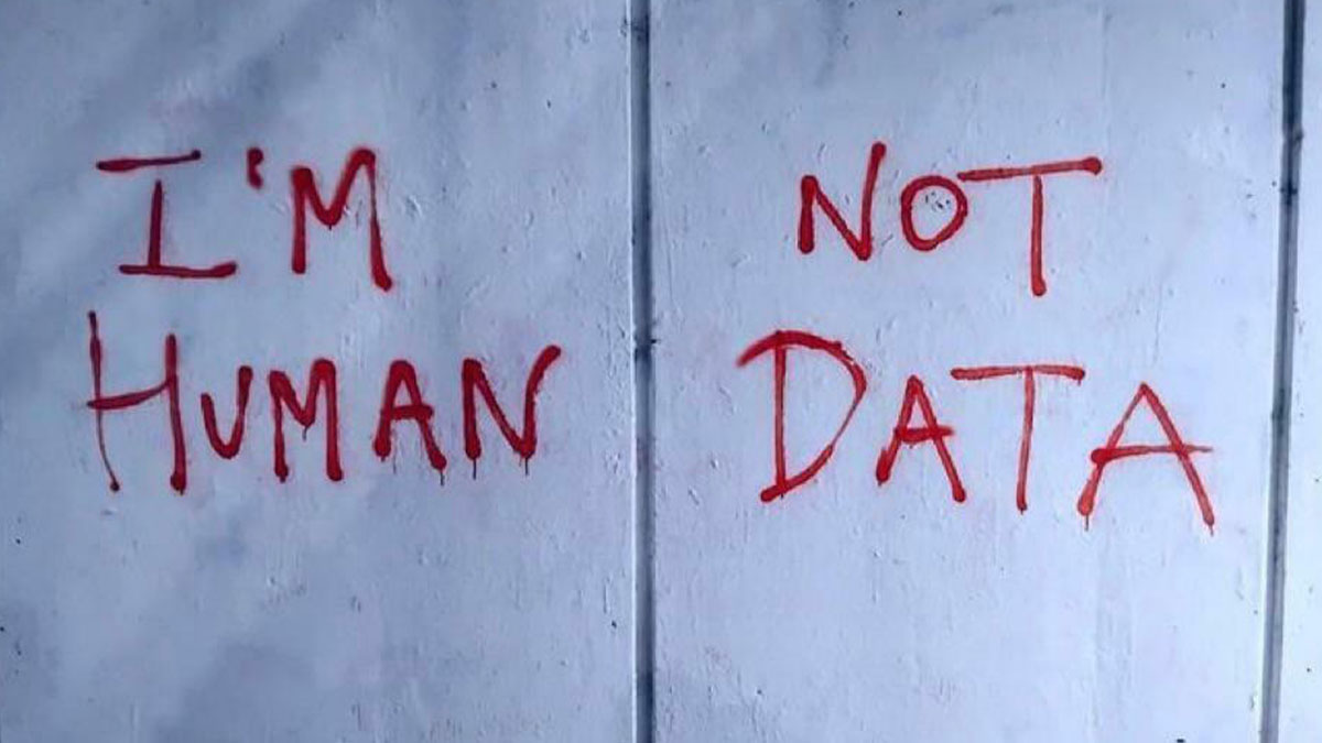
as a message layout fail on a concrete wall.

    encrcne Report

    #70

    Always Forgotten Remembered Never

    A person holding a purse with Twilight characters Bella & Edward and the text Always Forgotten, Never Remembered, a message layout fail.

    Boomerloomerdoomer Report

    Colleen Glim
    Community Member
    9 hours ago Created by potrace 1.15, written by Peter Selinger 2001-2017

    I’d love to forget them. Sadly, they keep popping up

    View more comments
    #71

    Printed Soy With Ink

    A label stating Printed with Soy Ink. An example of message layout fails due to poor visual hierarchy with the word "ink" inside a soy drop.

    Daniel_XXL_69 Report

    ADVERTISEMENT
    #72

    Date 5 The 4 Save 26 (Supposed To Say Save The Date 5/4/26)

    Overhead shot of a couple on a beach with SAVE THE DATE text in the sand, a message layout fail.

    lisahanniganfan Report

    ADVERTISEMENT
    #73

    One I Gonna Wings Day Am Grow

    A woman's back tattoo of bat wings with text that reads "one day I gonna wings am grow." A clear message layout fail.

    FuckerJames Report

    #74

    Sandwich Take Salad Away

    A poorly laid out lightbox sign reading Sandwich Salade Take Away, demonstrating message layout fails.

    RatatouilleinParis Report

    Beak Hookage
    Community Member
    1 hour ago Created by potrace 1.15, written by Peter Selinger 2001-2017

    noooo don't take my salade away I'm hungry.

    #75

    Don’t Bad Game Open Inside

    A man in a sheriff's uniform with text, "DONT BAD GAME OPEN INSIDE." A message layout fail.

    lolwhatmufflers Report

    ADVERTISEMENT
    #76

    Welcome Tattoo To The Street

    A snow-covered street at night, blocked by a banner reading Welcome to the Tattoo Street, a message layout fail.

    man_120 Report

    ADVERTISEMENT
    #77

    Jloves Ecares Sheals Uhelps Ssaves

    A church sign with Jesus written vertically and love, cares, heals, helps, saves written horizontally. An example of message layout fails.

    pukkuro Report

    Ye Olde Dirty Grumpy
    Community Member
    9 hours ago Created by potrace 1.15, written by Peter Selinger 2001-2017

    Christianity is a money laundering scheme. Ask John Oliver

    View more comments
    #79

    We Are Bus Drivers Hiring Bus Conductors

    A bus with a hiring sign, poorly spaced to read WE ARE BUS DRIVERS HIRING! BUS CONDUCTORS, illustrating message layout fails.

    valfsingress Report

    ADVERTISEMENT
    #80

    If Your Drink Reading This Water

    Pink graffiti on a concrete wall reads, If your reading this... Drink Water, a message layout fail.

    Far_Performance_4013 Report

    LakotaWolf (she/her)
    Community Member
    Premium
    8 hours ago Created by potrace 1.15, written by Peter Selinger 2001-2017

    The sentiment is heartfelt and well-placed; the words themselves, however, are not XD

    ADVERTISEMENT
    #81

    Jataorfo Paveieod Nernnt Seal

    A sign with poor message layout says JA PA NE SE TA VE RN OR HE NT AL FO OD, a fail.

    HAVARDCH95 Report