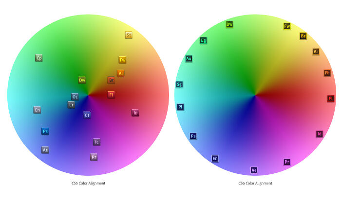
In a world full of bland buildings, boring advertisements, and beige clothing, it can be extremely satisfying when you encounter a visual feast. Whether that’s vibrant produce beautifully arranged at the farmer’s market, stunning bouquets of flowers, or a billboard that’s cleverly designed, you can’t help but appreciate it.
And if you’re looking for some aesthetically pleasing inspiration today, pandas, you’ve come to the right place. We visited r/Design and compiled a list of their most popular posts below. From clever magazine covers to gorgeous doors, we hope you enjoy these images. And be sure to upvote the ones that would have definitely grabbed your attention too!
This post may include affiliate links.

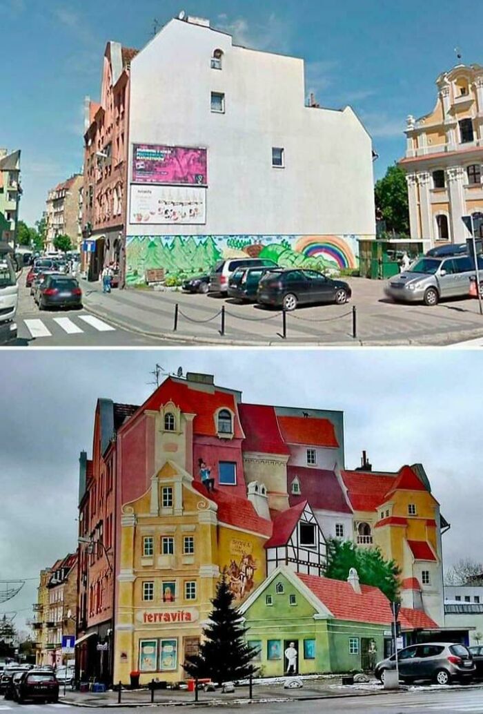
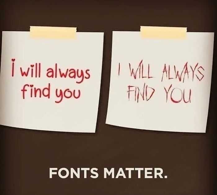
Before & After Paint Job
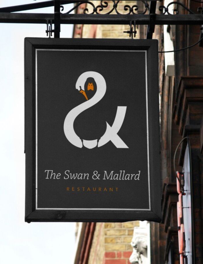
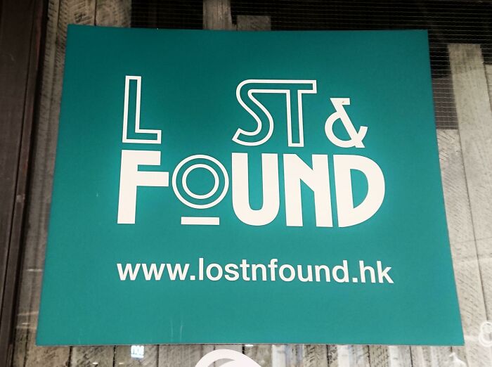
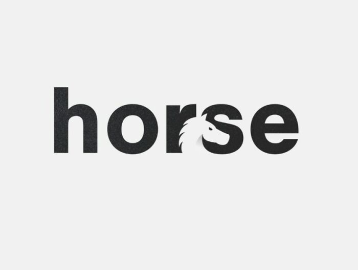
Nice Logo
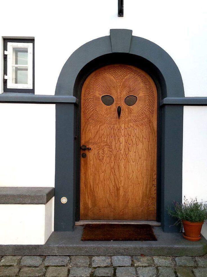
Owl Door In Copenhagen, Made In 1930
I Thought This Belonged Here
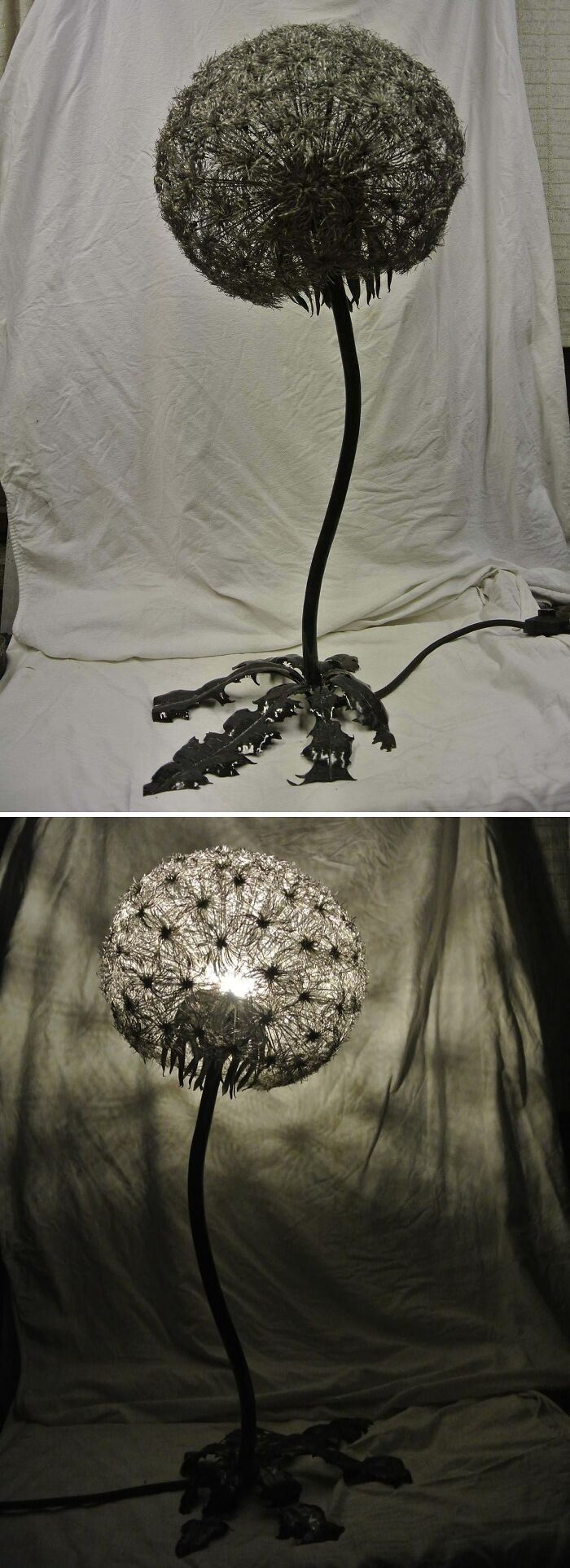
A Steel Dandelion Lamp I Designed And Built In 2016
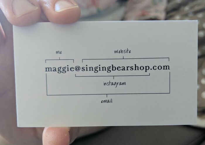
The Back Of This Business Card
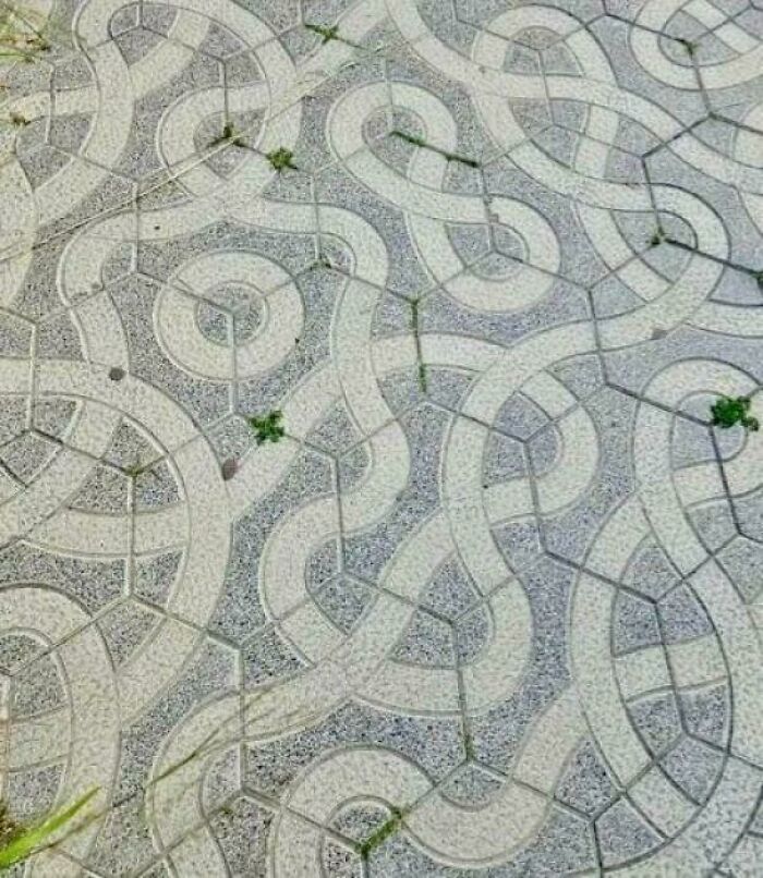
All The Tiles Are The Same
What A Powerful Design
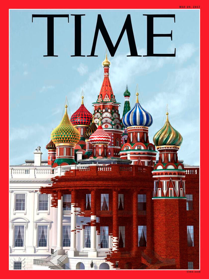
The New Cover Of Time
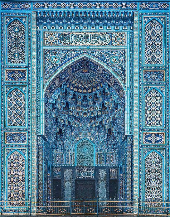
Persian Mosque
It always infuriates me how islamophobes in my country are always like "those backward crazy muhammads who live in dilapidated desert huts and build b0mbs in them" while every picture of a mosque I've seen is the most wonderful work of art.
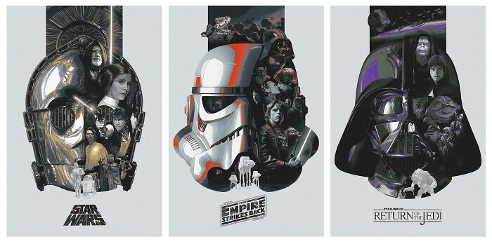
Today I Achieved A Long Time Dream. My Artwork Has Been Officially Licensed By Lucasfilms!
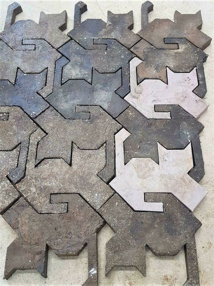
Cat-Shaped Paving Stones
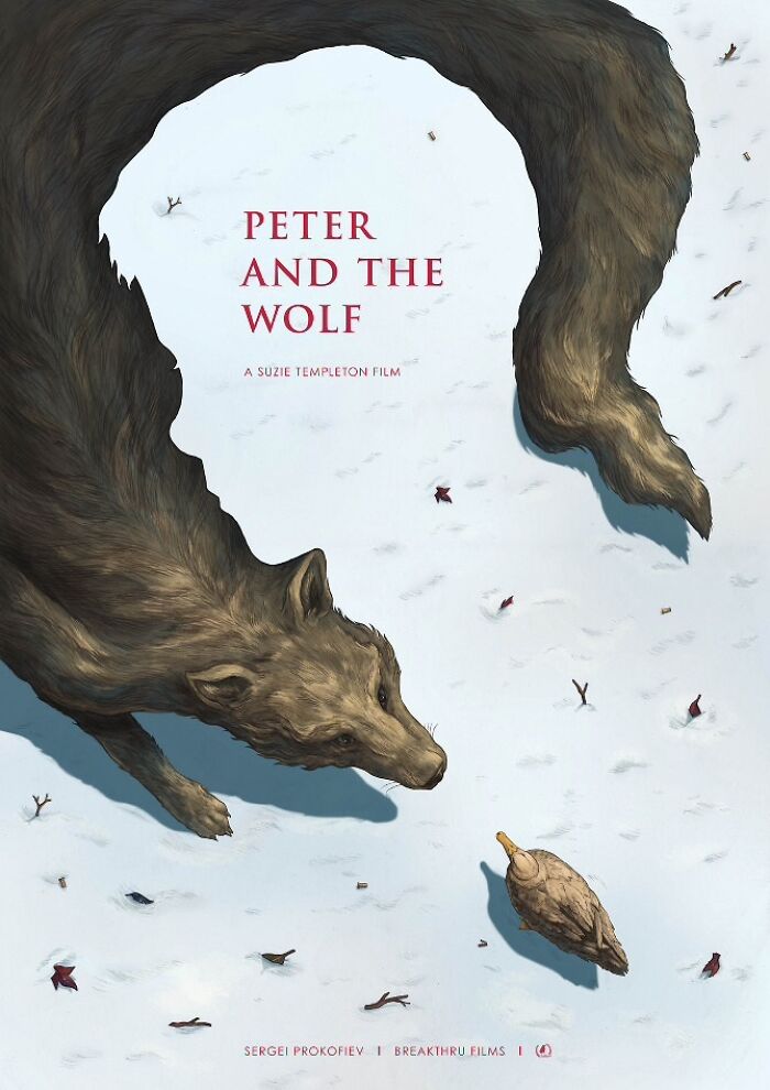
This Poster For Peter And The Wolf
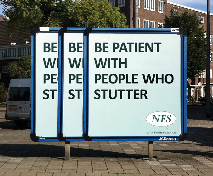
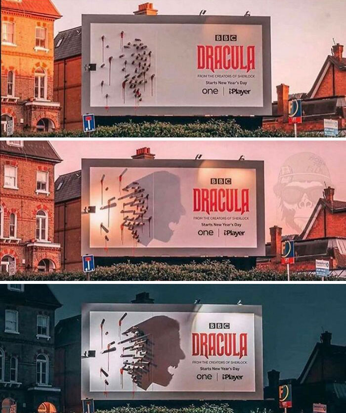
Now This Is Really Clever Design
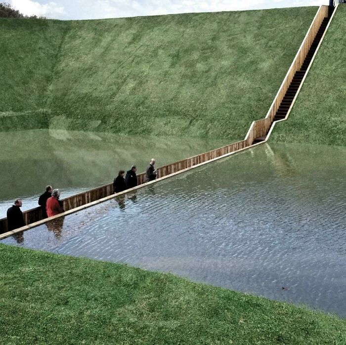
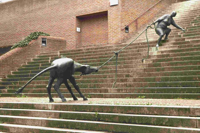
Moses Bridge, Netherlands
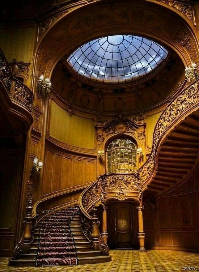
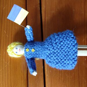
Ukraine - Lviv, Staircase In The House Of Scientists
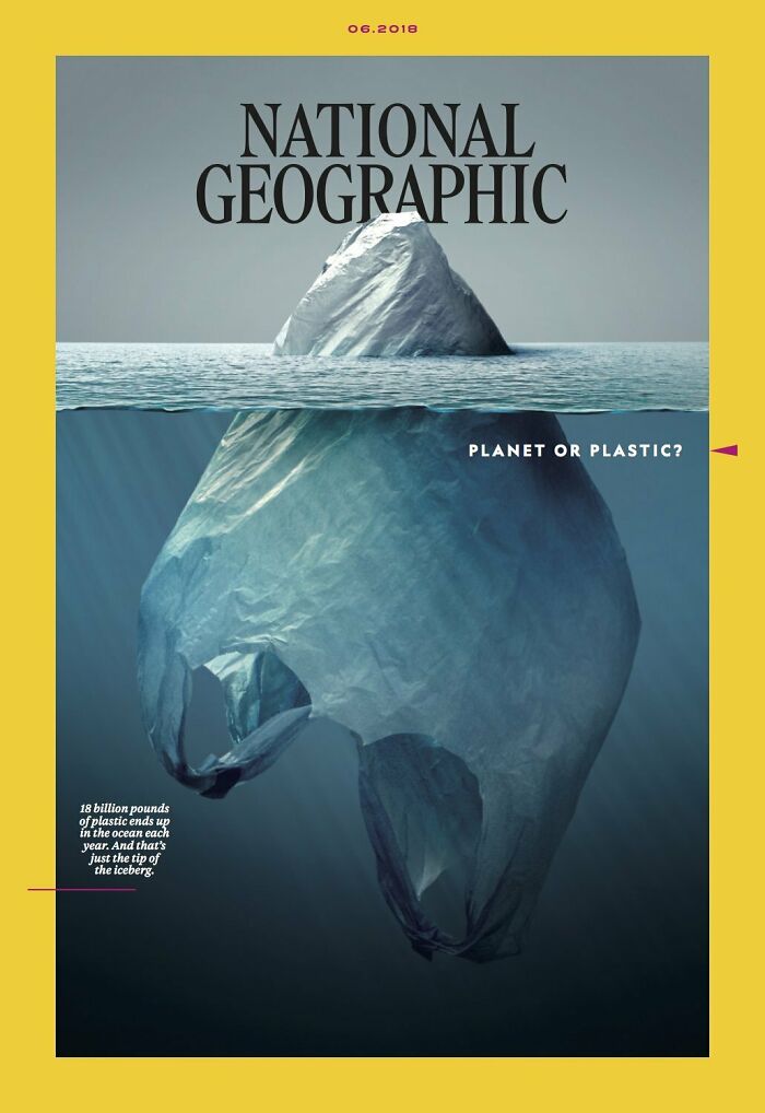
National Geographic Cover
This Is Actually Just A Handrail
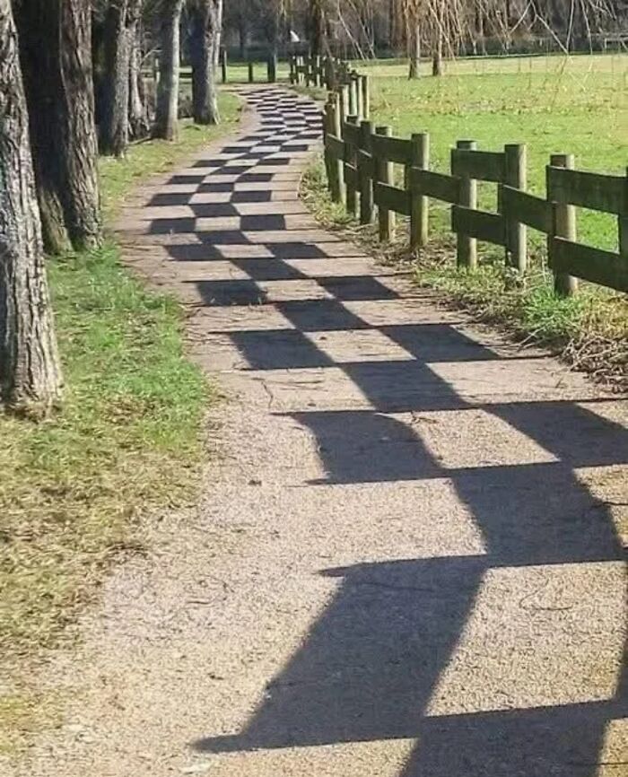
Road Combined With Shadows
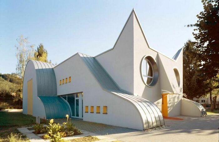
Cat Shaped Kindergarten, Germany
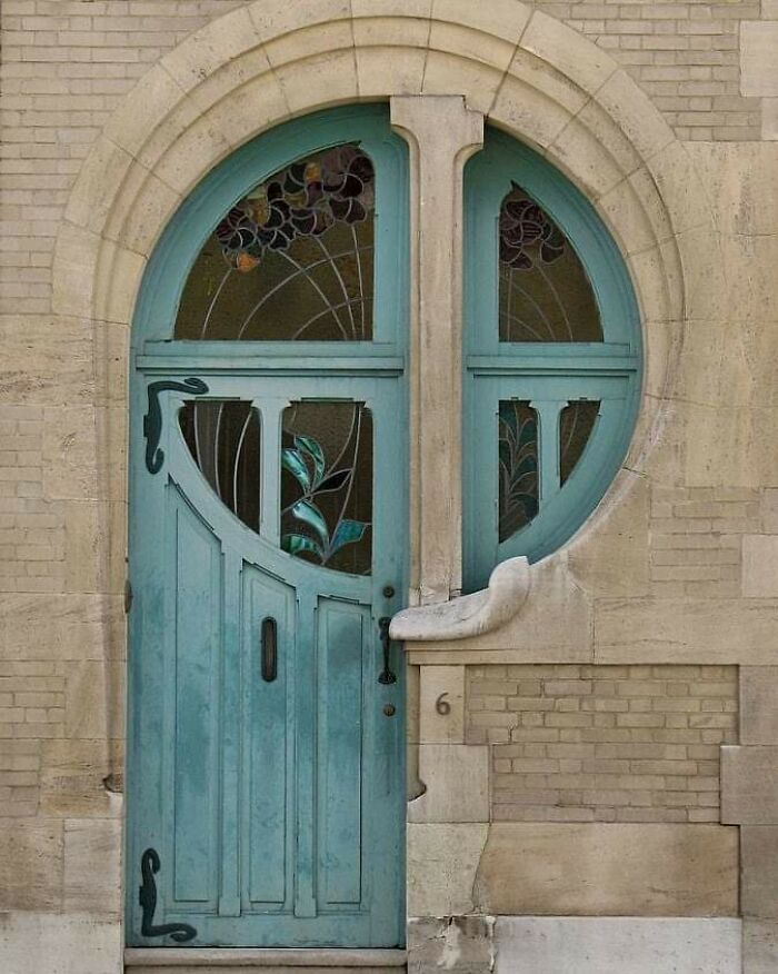
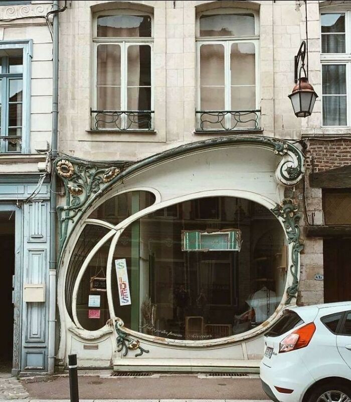
European Door
That is not just an «European door» 🙄 that is a unique hundred year old masterpiece by a great craftsman. But sure, that is how European doors look like

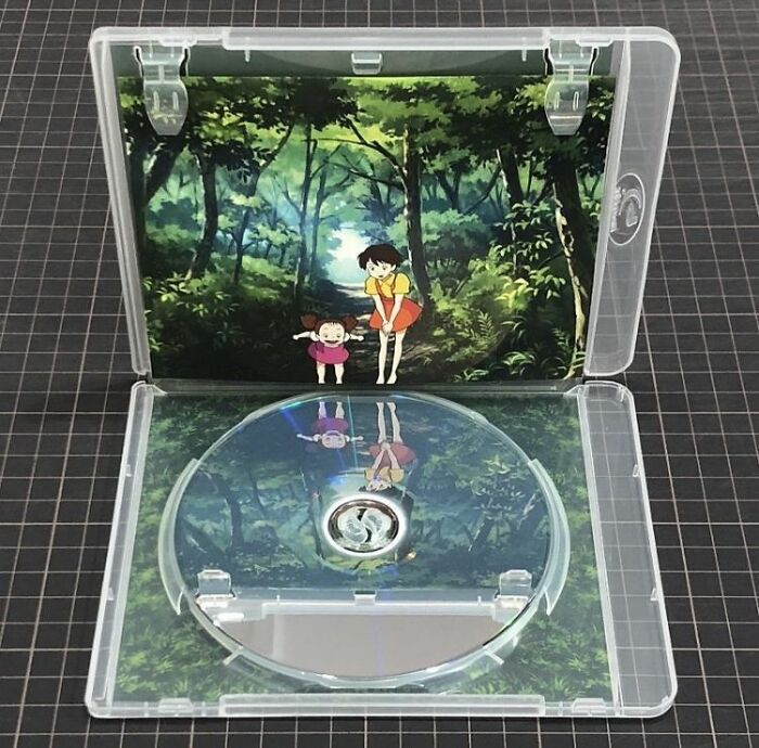
The Design Of This DVD Case
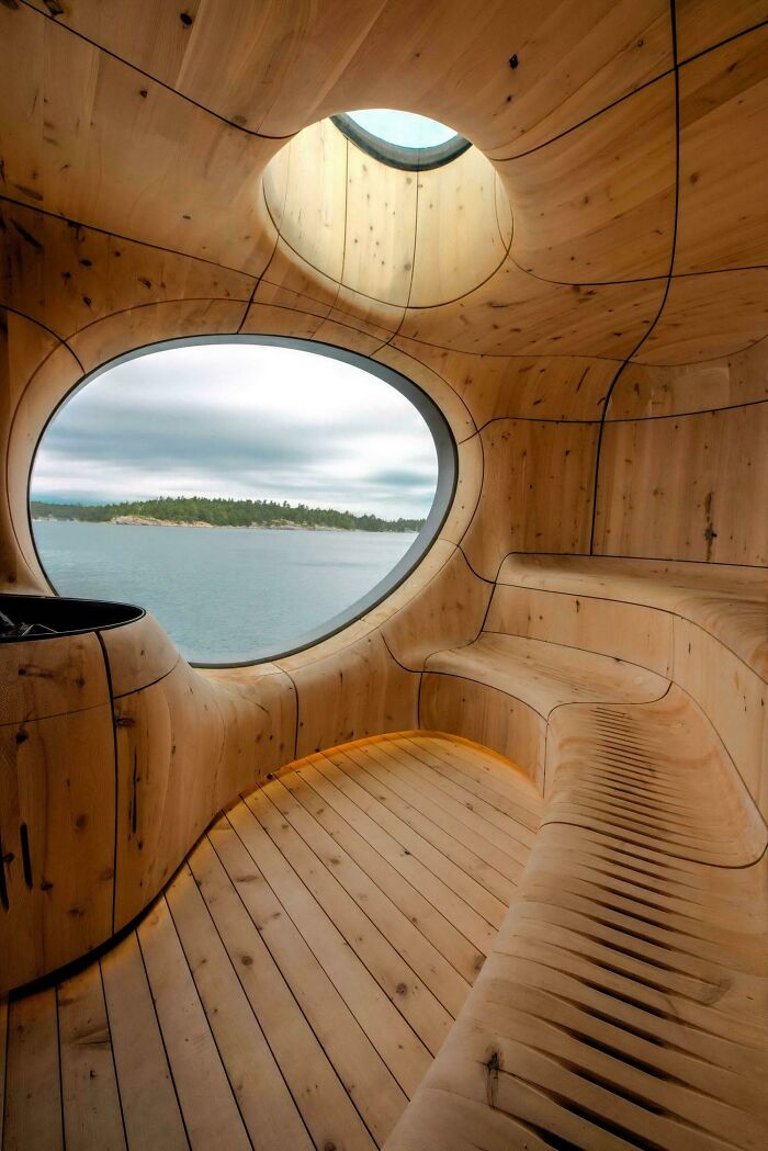
This Sauna In Finland
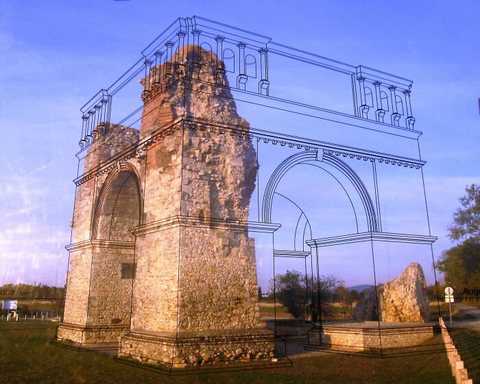
What A Great Way To Help People Visualize
Interesting Design
This Is Awesome
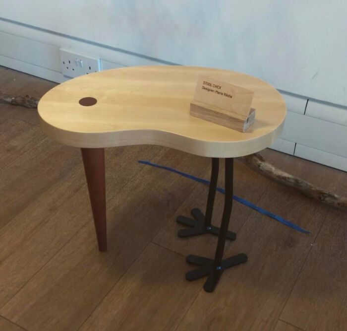
Just Sit Back And Enjoy This Bird Table
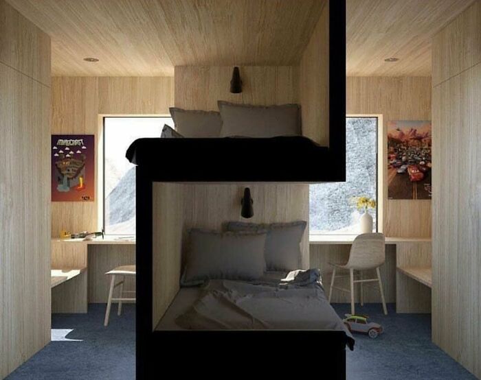
Dorm Room Design For Privacy
I've seen this quite a few times now and it's never been identified as a dorm room. It's supposed to be a kid's room.

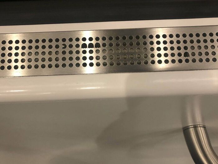
Secret Pacman
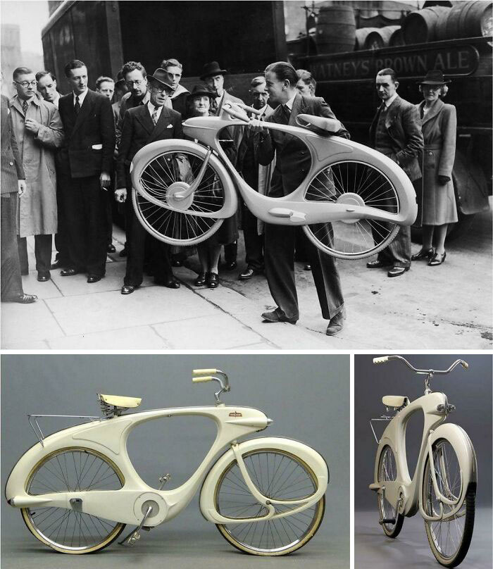
Bicycle From … 1946
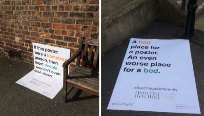
Amazing Placement
The reason people don't look down is because they *do* notice the homeless person and anyone whose lived in a city knows that making eye contact with a homeless person is likely to cause problems. Many are mentally unwell and will react aggressively or start spouting nonsense at you.

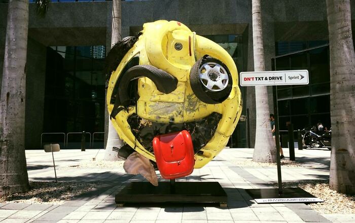
Local Artist, Rudolf Kohn, Transformed A Mangled Car Into An Emoji As An Anti Texting & Driving Psa In Miami
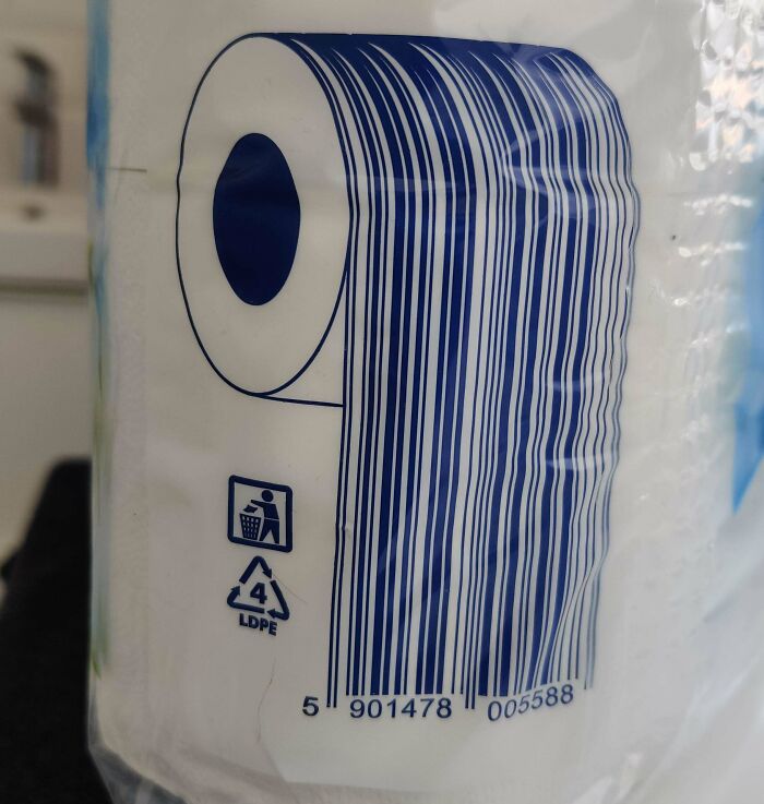
This Is How You Make A Barcode For Toilet Paper
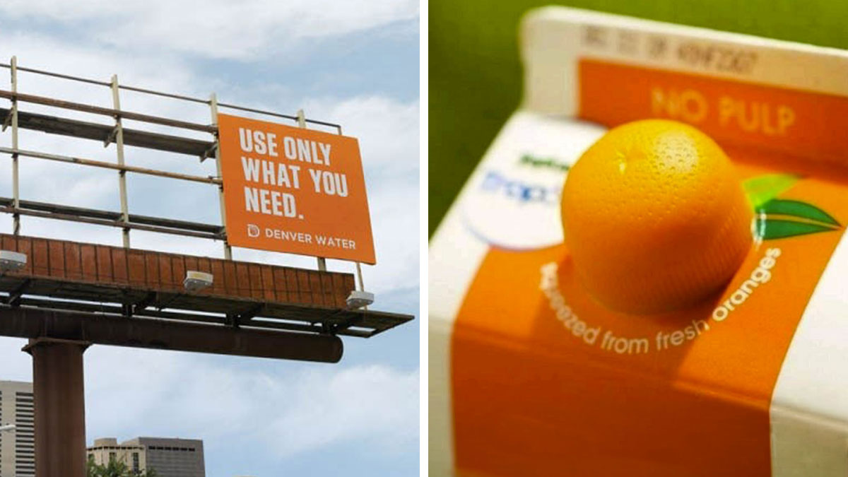
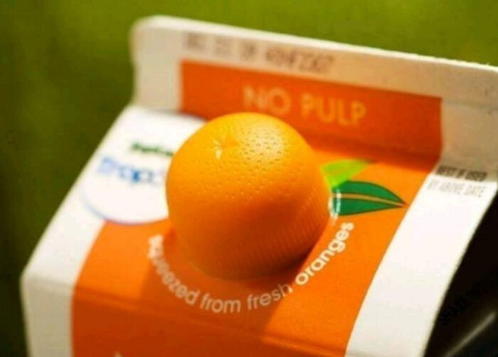
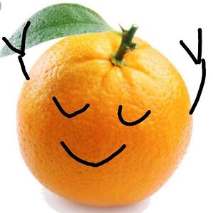
🍊
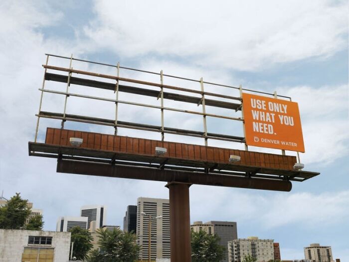
Take Only What You Need
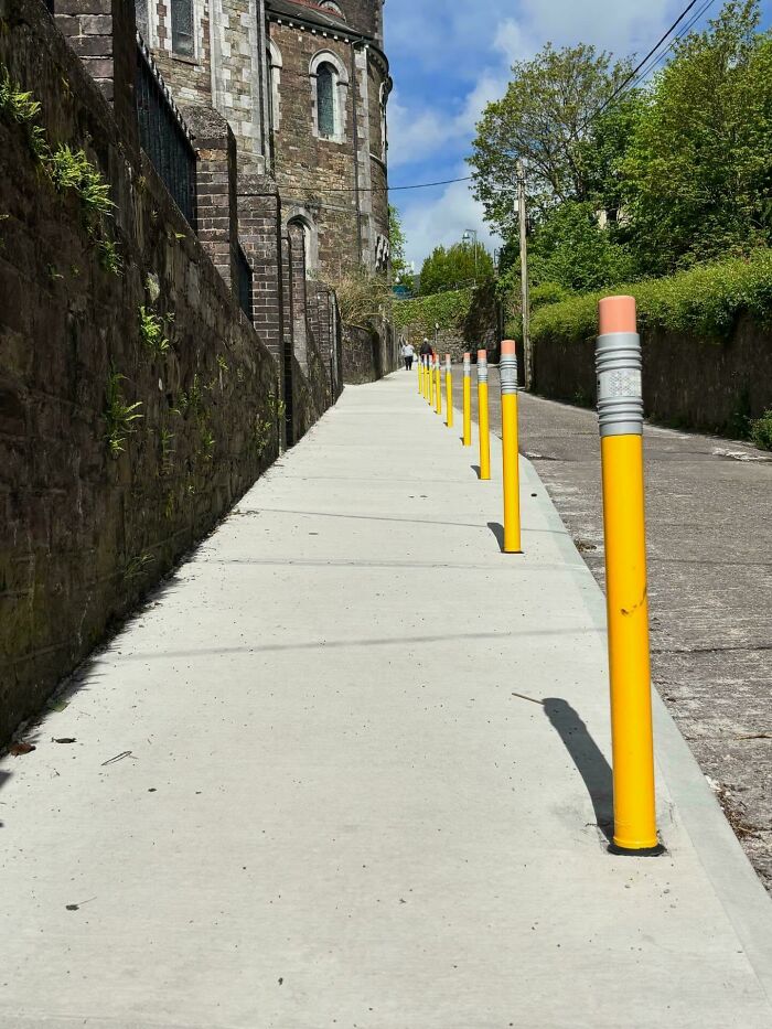
In Ireland We Have Begun To Use These Bollards Designed To Look Like Pencils To Protect Footpaths Outside Of Schools
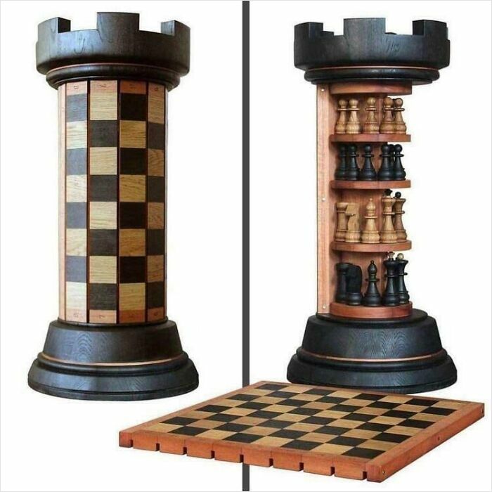
A Unique Rook Tower Chess Board
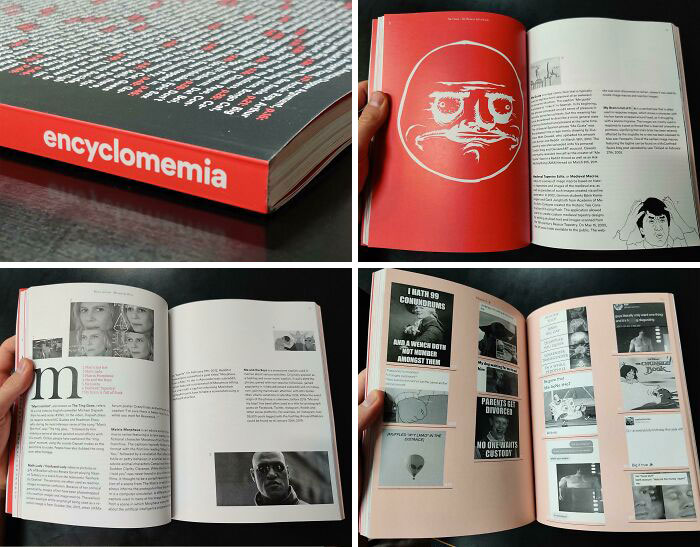
I Made An Encyclopedia About Memes In A Class For University
Wow. That's a commitment and very impressive they were able to do this for a class.

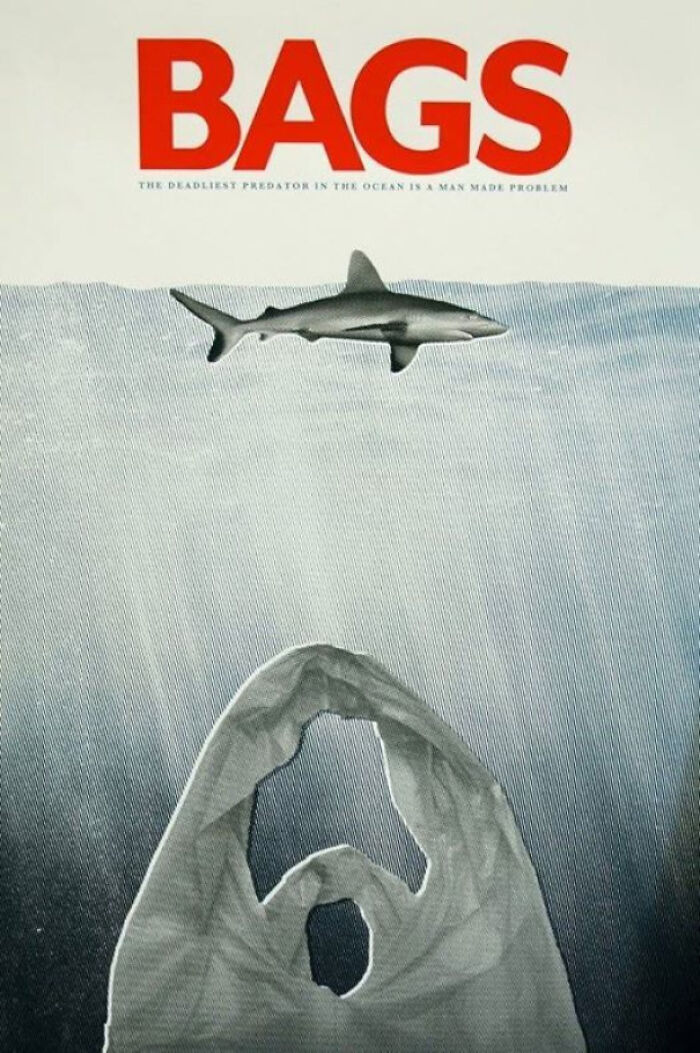
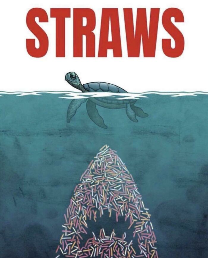
Play On The Jaws Poster, Showing The Problems Of Plastic Bags
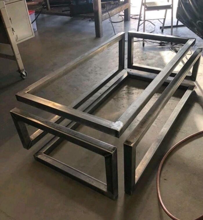
When I Realized It Was All One Piece Of Metal
Technically, it's a bunch of metal pieces welded together, but still nice

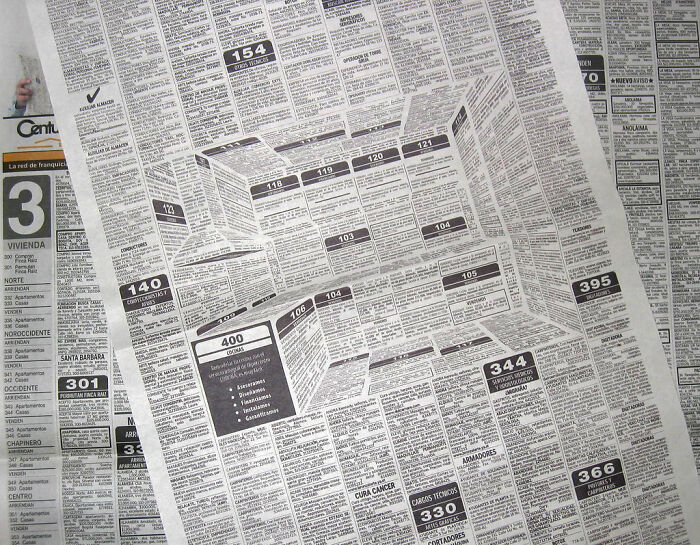
3D Classifieds Kitchen Ad
Trippy! I love it! It feels like it's drawing you into that kitchen.

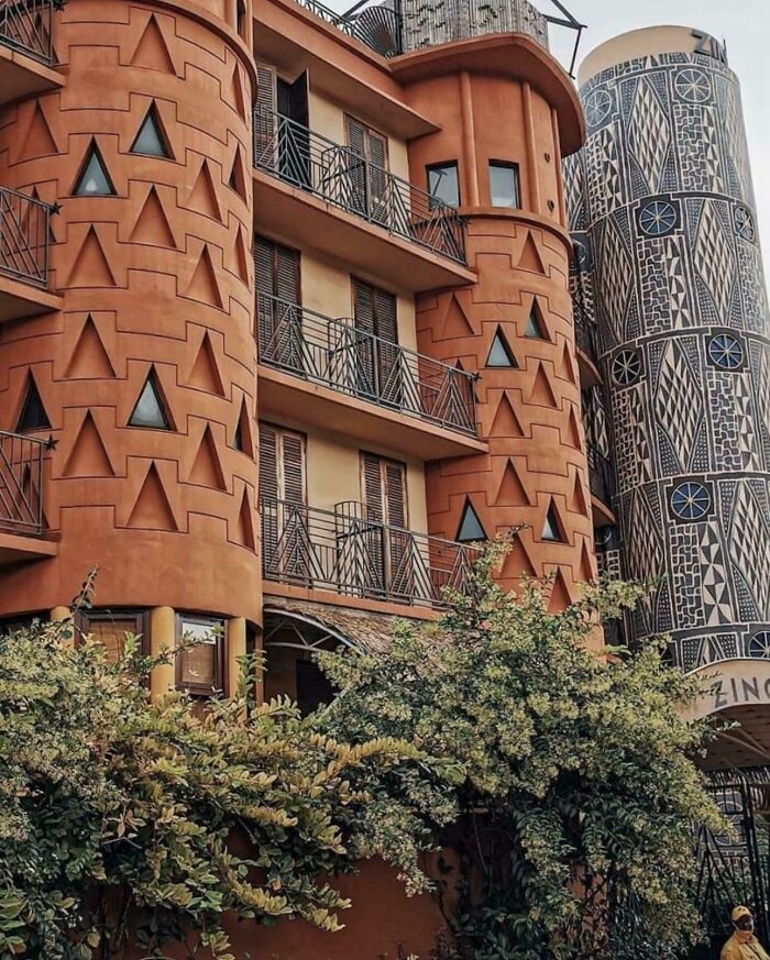
Hotel Zingana, Cameroon
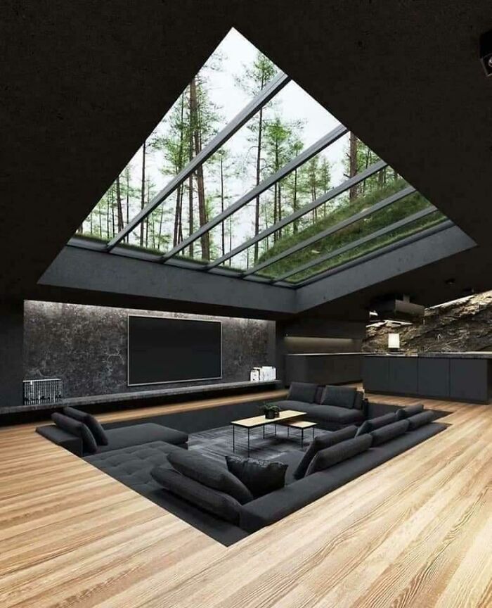
Great Way To Camouflage A Great Design
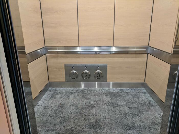
My Workplace Elevator Has Foot Buttons To Press When Your Hands Are Full
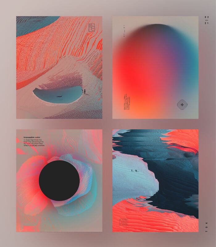
I'd Never Thought About Black As An Enhancement For Color Perception In Ambient, I'm Amazed By This
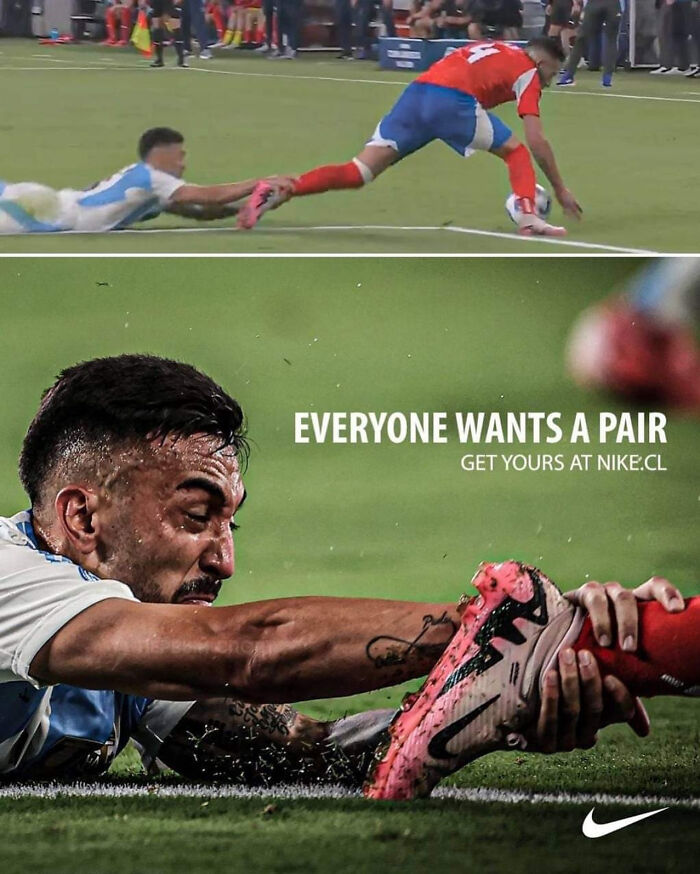
Ad For Nike In Chile
Beautiful
Well Designed Post/Image I Recently Saw
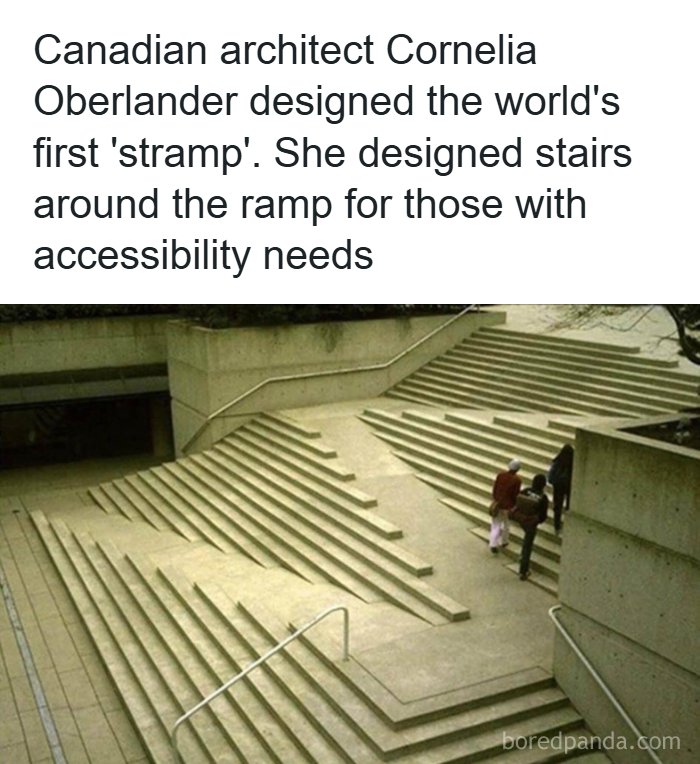
Design For Accessibility (And Aesthetics!)
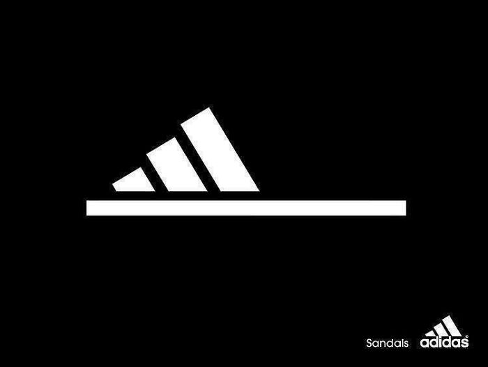
Adidas Sandals Ad
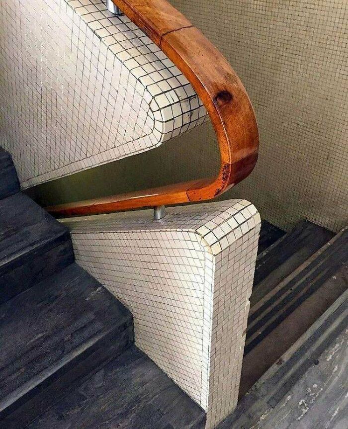
The Way Gio Ponti Designed This Stairway Handle
I love the look, but I also know I would absentmindedly leave my hand on there the whole time and crack my knuckles against the tiles when I got to the landing.

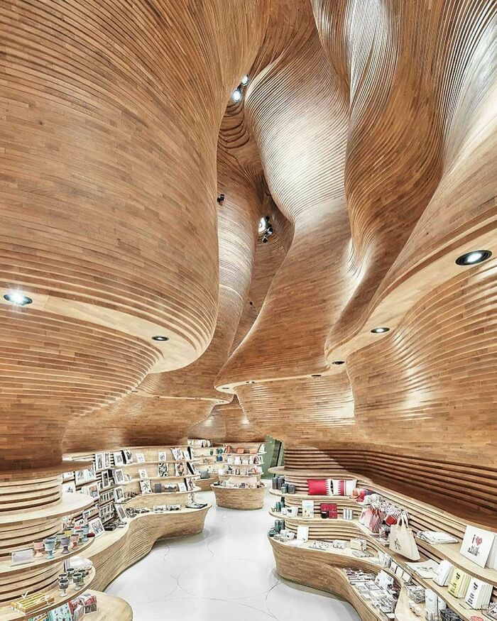
The Gift Shop Inside The Qatar National Museum
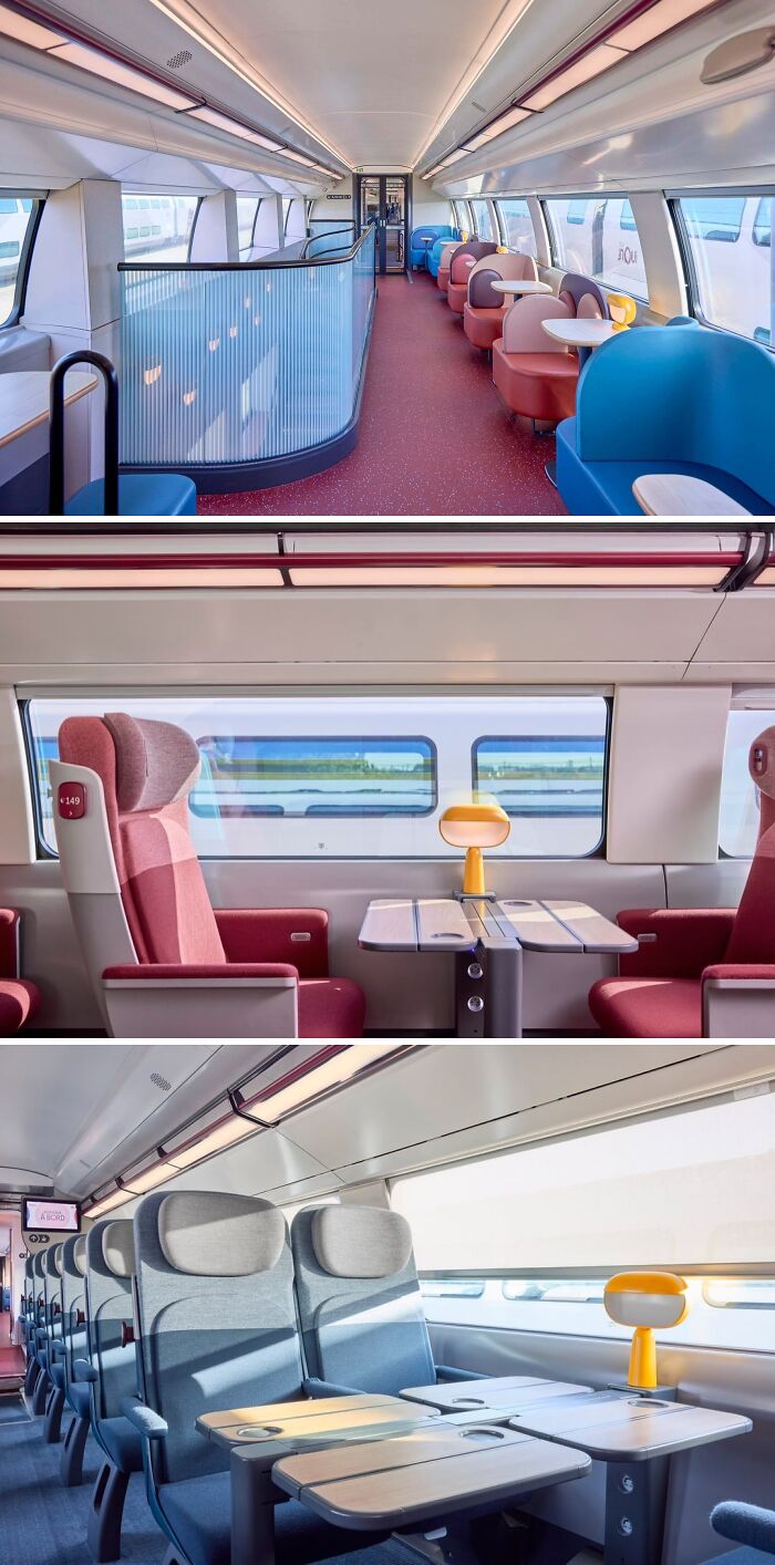
Interior Design For The New French High-Speed Trains
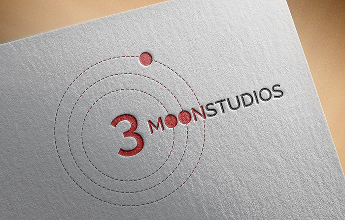
"3 Moon Studios" - Logo Design
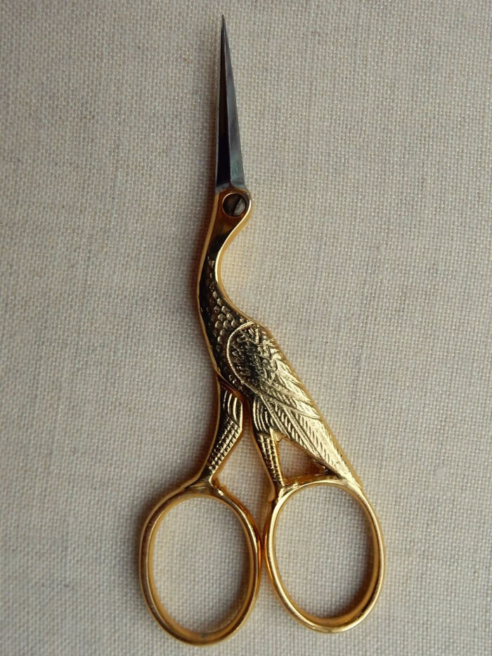
A Scissor By Jean Marie Roulo, 1930
It's now a common design for embroidery scissors, i have several blue and purple ones.
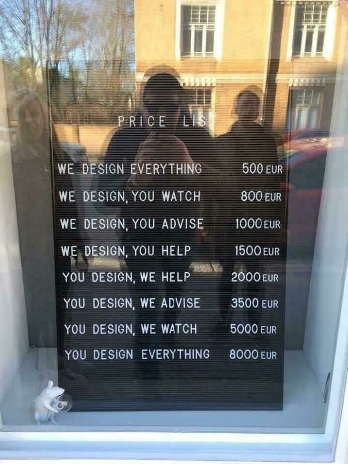
Design
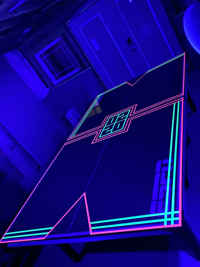
A Ping Pong Table I Decorated With Florescent Tape For My New Year’s Eve Black Light Party!
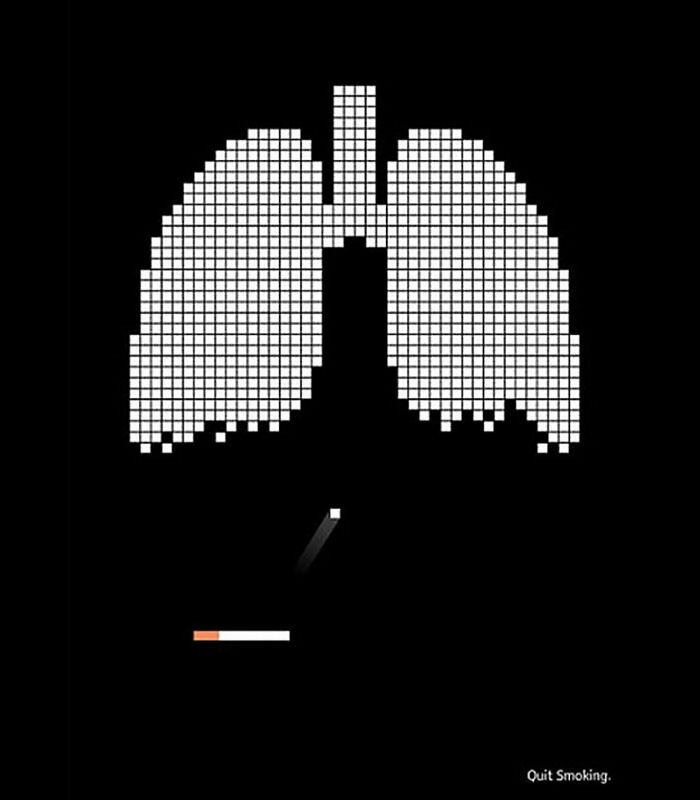
Clever Advertisement For An Anti-Smoking Campaign
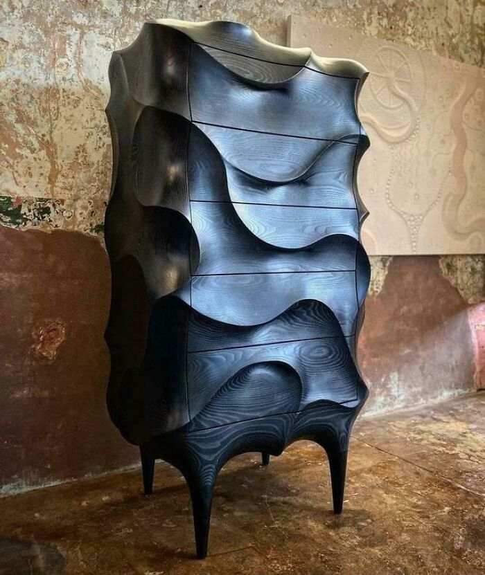
Dresser
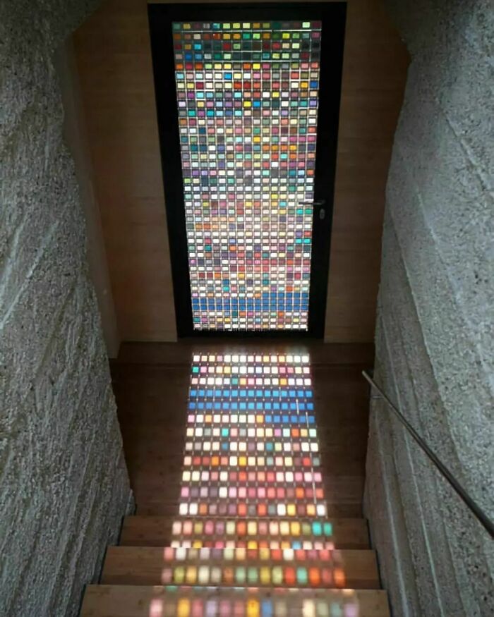
Pantone Swatch Stained Glass Door
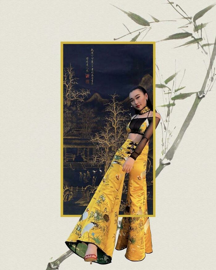
Made This Outfit And Edit Since I Didn’t Have A Nice Backdrop During Quarantine! :)
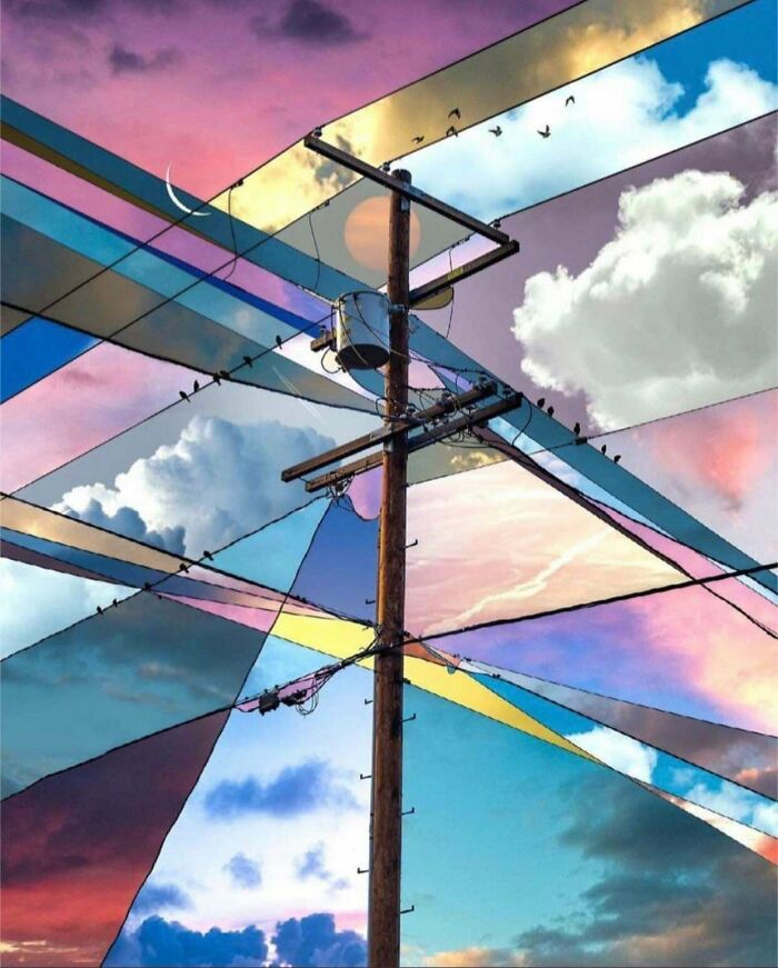
It's Amazing How A Bit Of Contrast In The Image Makes The Straight-Edged, Geometric, And Functional Design Of A Telephone Pole Look So Beautiful. This Is A Series Of Photos Collage From The Same Location Taken At Different Hours Of The Day
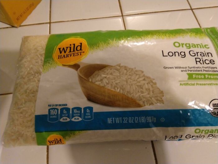
The Rice In This Picture Is Actual Rice In The Bag
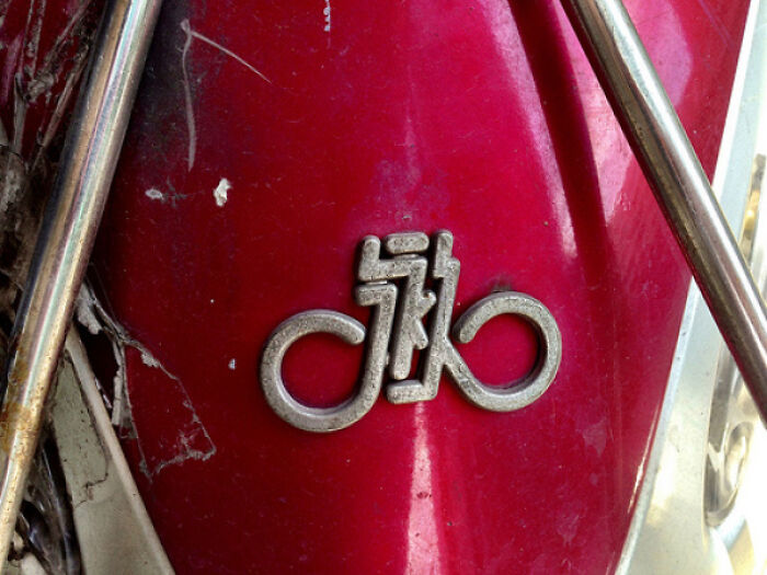
The Logo Of The Shanghai Bicycle Brand Yongjiu ('forever') Is So Elegant. It's Simply The Chinese Name (永久), Combined With The Infinity Symbol, Which Also Creates A Bicycle. Penned In 1980
Just Finished This Piece
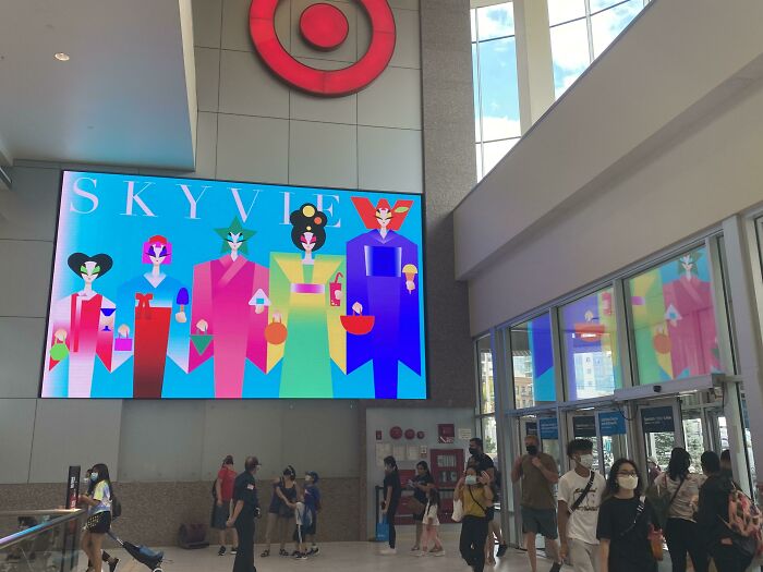
My Asian Heritage Design Was Picked Up By Skyview Mall In NYC. I’m Very Blessed ❤️
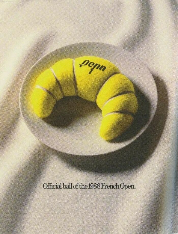
Penn Tennis Print Advertisement For The 1988 French Open
I Think This May Be My Favorite Piece Of Packaging I've Designed So Far. Really Love How It Turned Out
This Is Just Genius!
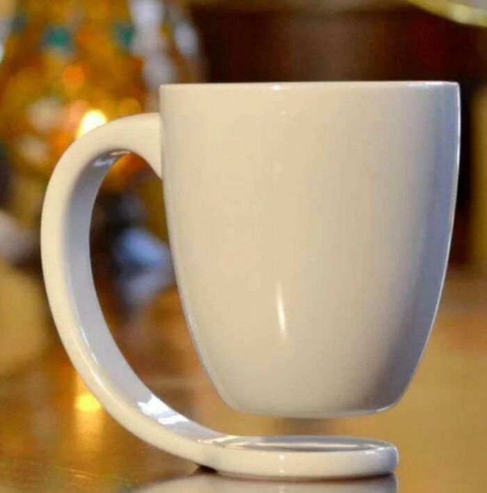
This Coffee Mug
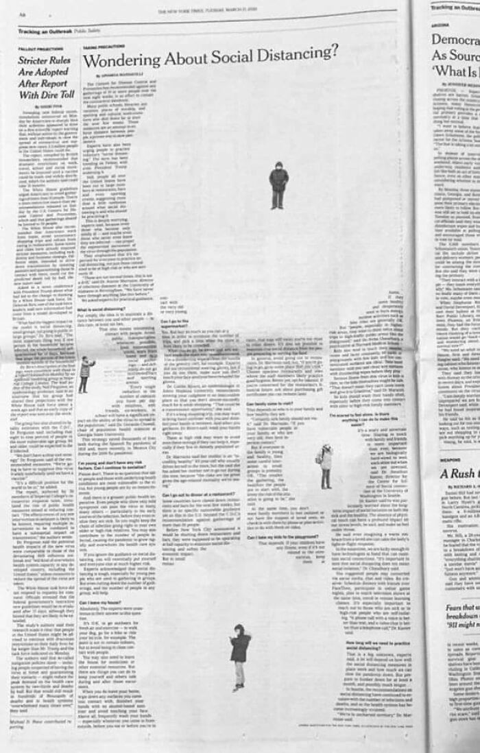
Newspaper Social Distancing Design
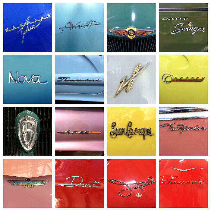
Went To A Car Show Recently And Loved Seeing The Unique Typography On The Classic Rides
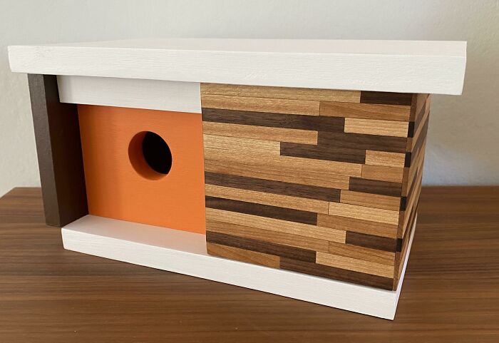
New Birdhouse I Made For A Client!
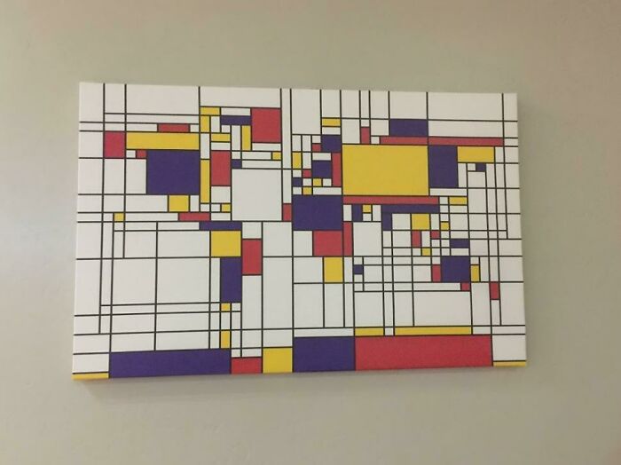
Abstract World Map
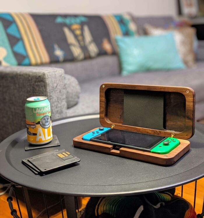
I Made A Custom Switch Case Out Of Walnut
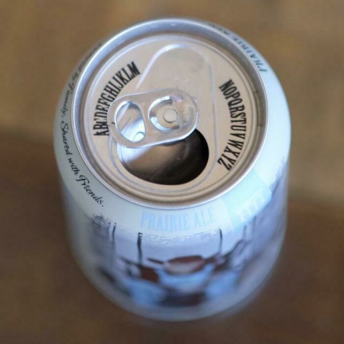
Can With Alphabet On Lid Lets You Point Tab At Your Initial To Know Which Beer Is Yours
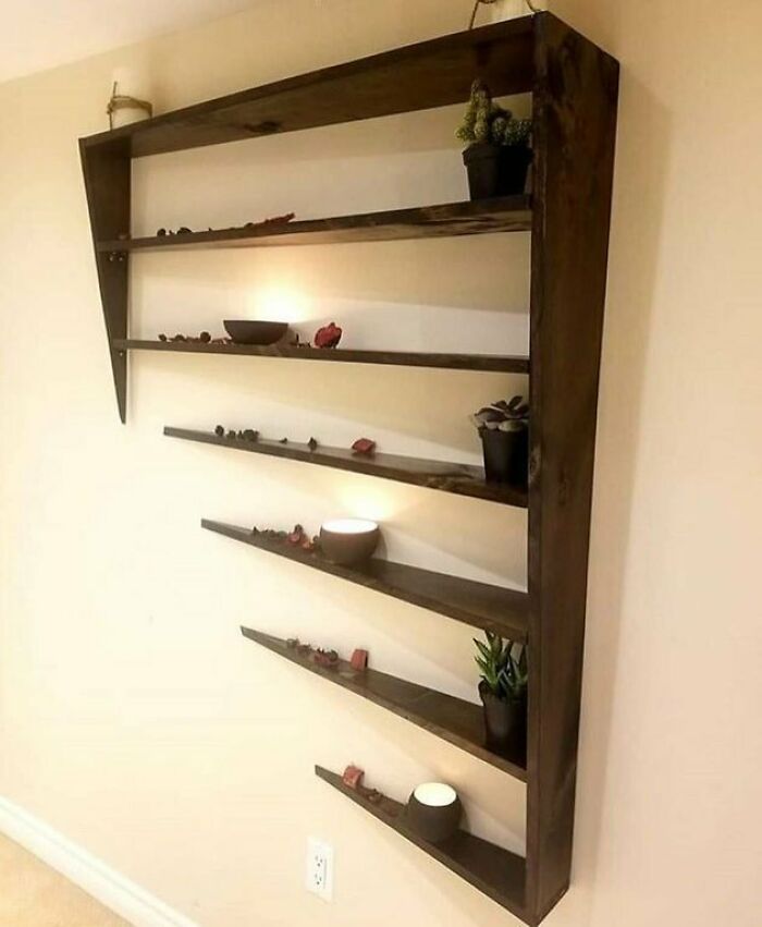
This Shelf Is Designed To Look Like It Is Phasing Into A Wall
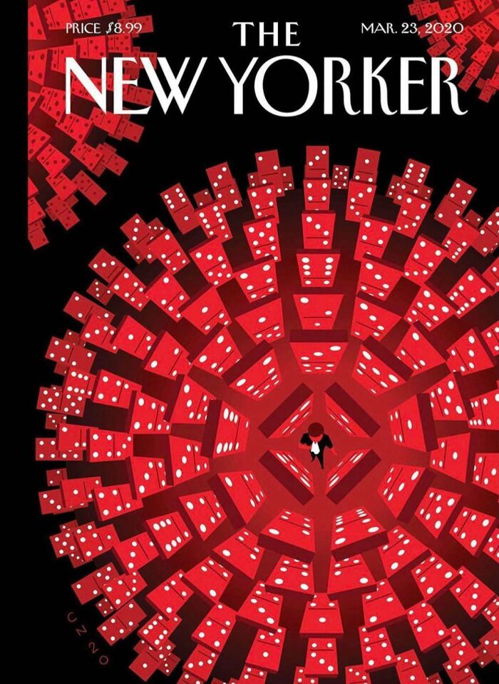
New Yorker Cover For Coronavirus
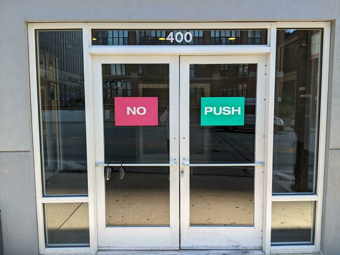
Beautiful? No. Effective? Very
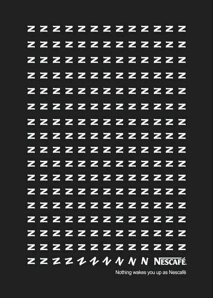
Nescafe Zzzzz - "Nothing Wakes You Up As Nescafe." Print Ad Design
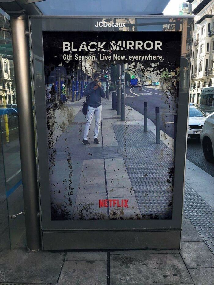
This Is How You Advertise
Some Of My Recent Obsession With Red/Orange
My Grandmother Had This In Her Living Room And She Gifted To Me. Just Wanted To Appreciate The Beauty
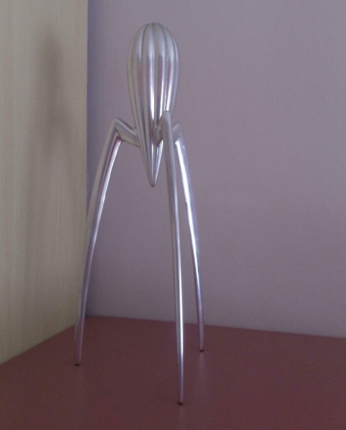
Juicy Salif by Philippe Starck, one of his most famous works
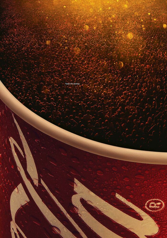
People Are The Product In Coca-Cola’s Bubbly New Print
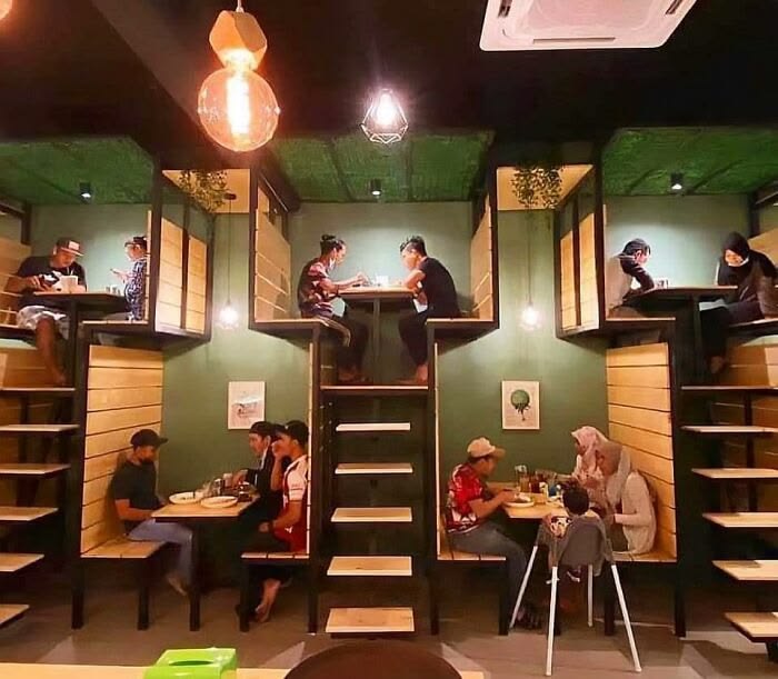
Stacked Seating At A Restaurant
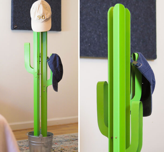
I Made A Metal Cactus For My Hats 🌵
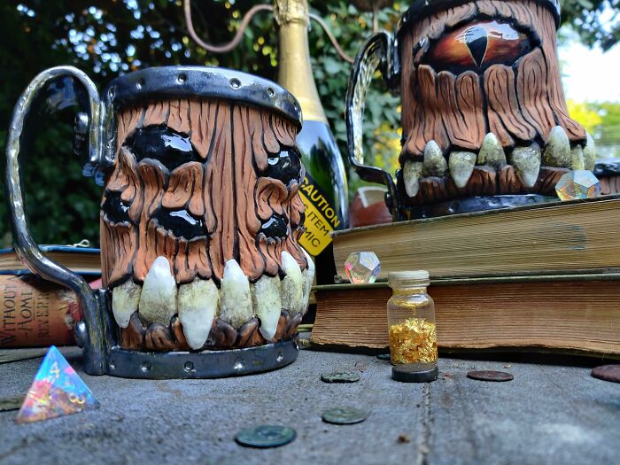
I Design Monster Mugs
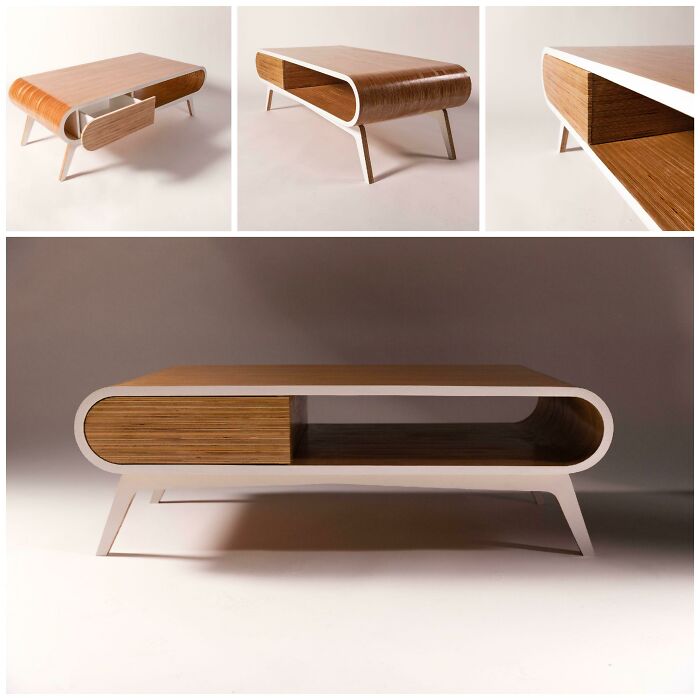
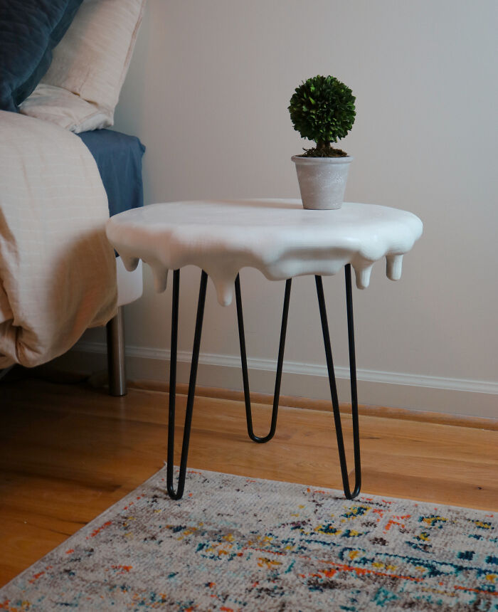
Thought You Guys Might Like This Table I Designed And Built!
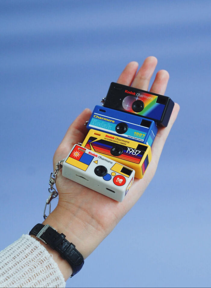
Kodak’s Launched A New Digital Camera That Fits Right In Your Palm
A Nicely Designed Ad In My Opinion
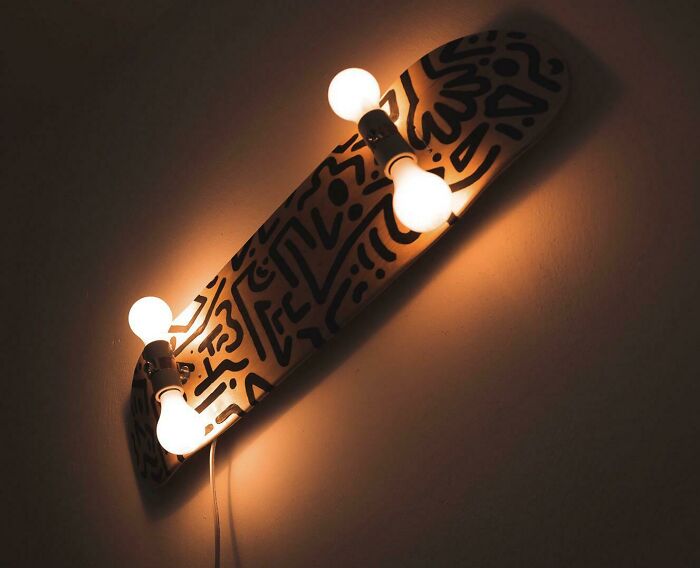
I Made A Skateboard Lamp!
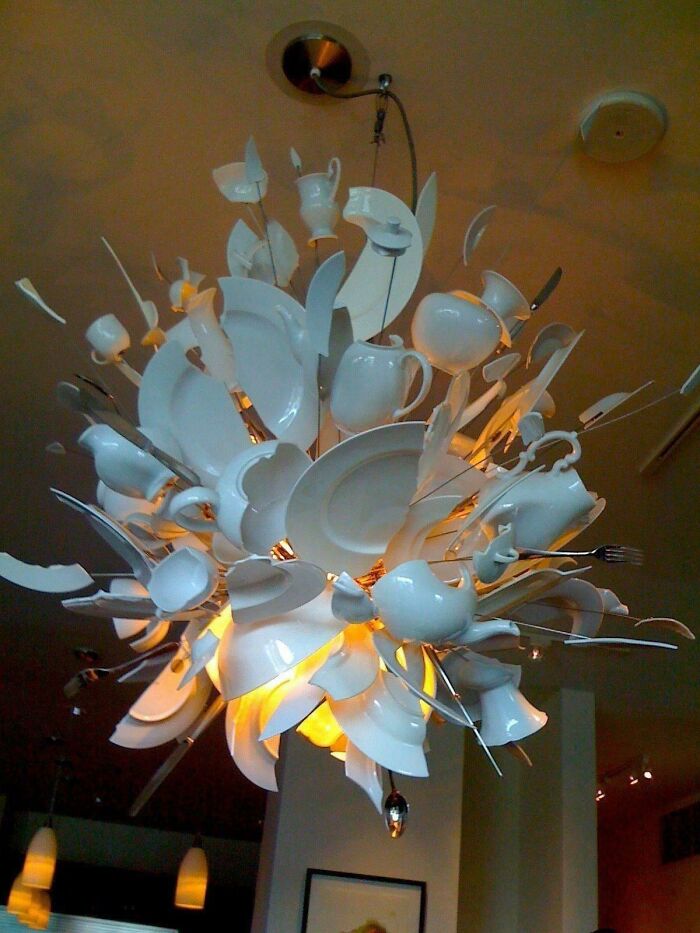
Blasting Tea Party
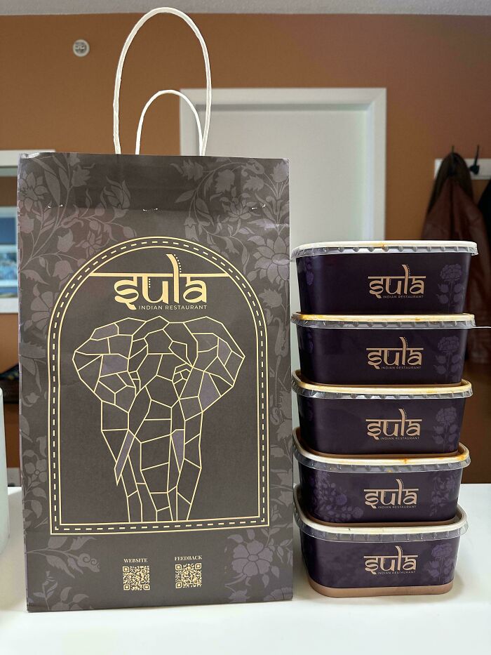
Delivery Packaging From Indian Food Restaurant
OMG. I’m posting a second comment because I noticed an irritating flaw in the design. Apparently the restaurant’s name is ‘Sula’, as per Reddit. This entire time I thought it was ‘iula’. Why? Because the first letter is letter i in Hindi. It’s quite obviously Hindi, not English, which would be obvious to those who know the language. Moreover, the line at the top? That’s how you write in Hindi. So i thought the word was a mix of Hindi and English letters. In case anyone wants a better design that mixes Hindi and English, as comparison, look at the logo of the company “Soch”. There is no ambiguity with soch.
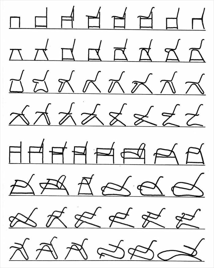
C H A I R S
Heres For The People Who Like Flat Design
I Like This. It's So Simple
My Footwear Design Entry For A Local Competition
Folks, Don’t Forget The Important Stuff
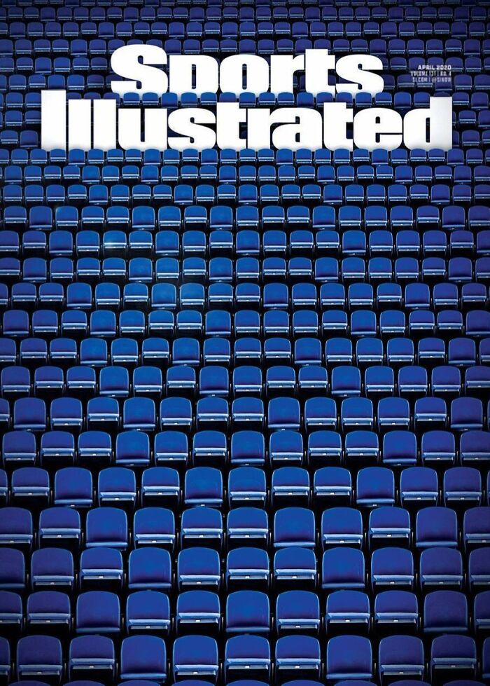
This Cover From Sports Illustrated
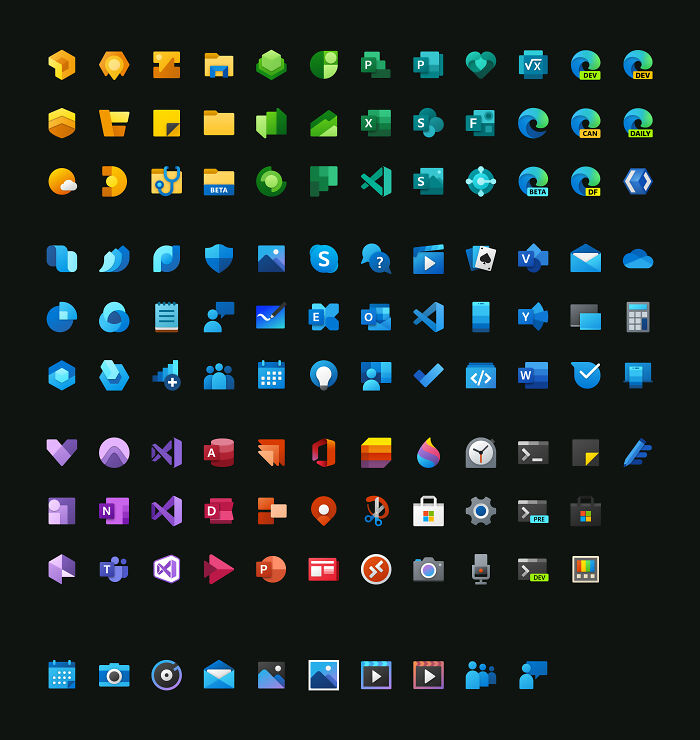
All The Microsoft's Fluent Design Icons
Very pretty. Seeing them all lined up like this, though? Yeah - no wonder I can't get to grips with them. Once upon a time, icons on a computer conveyed meaning. Most of these don't.