ADVERTISEMENT

The real world is very complex, unlike what you see in movies and on TV. Our planet, with its varied cultures and societies, is not unlike a giant, cosmic onion. There are lots of different layers of nuance to unravel. Sometimes, all it takes is one good map or chart to make you see things from a fresh new perspective and think outside the box.

That’s where the ‘Amazing Maps’ Instagram account comes in. It crunches data and then creates aesthetic world maps to educate and entertain social media users around the globe. Today, we’re featuring some of the curators’ top maps to show you things from a different point of view. Keep scrolling to learn something new.

Meanwhile, Bored Panda reached out to Georgi Pamyatnih, the founder of 'Amazing Maps,' with a few questions about his awesome project. Check out what he told us below.

More info: Instagram | Website

#1

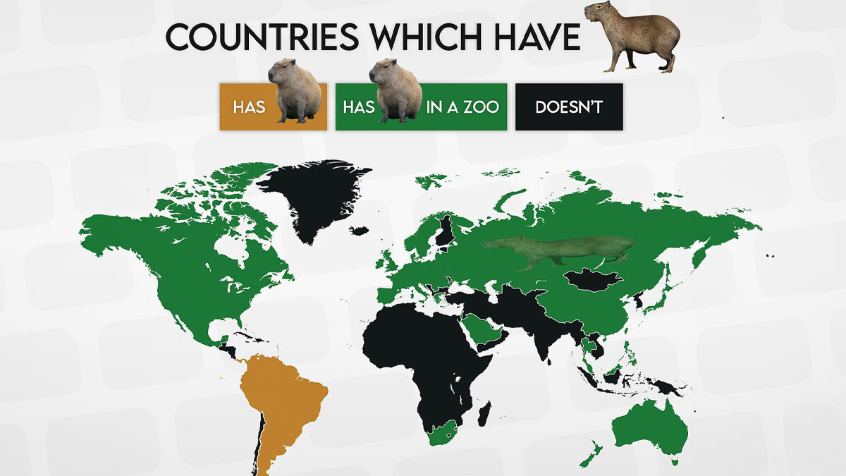
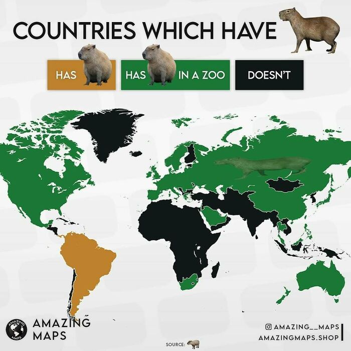
World map showing countries with capybaras, color-coded by presence in the wild or in zoos, from amazing maps collection.

amazing__maps Report

Ugh, do I have to?
Community Member
1 year ago

This right here is vital information.

View more comments
RELATED:
    #2

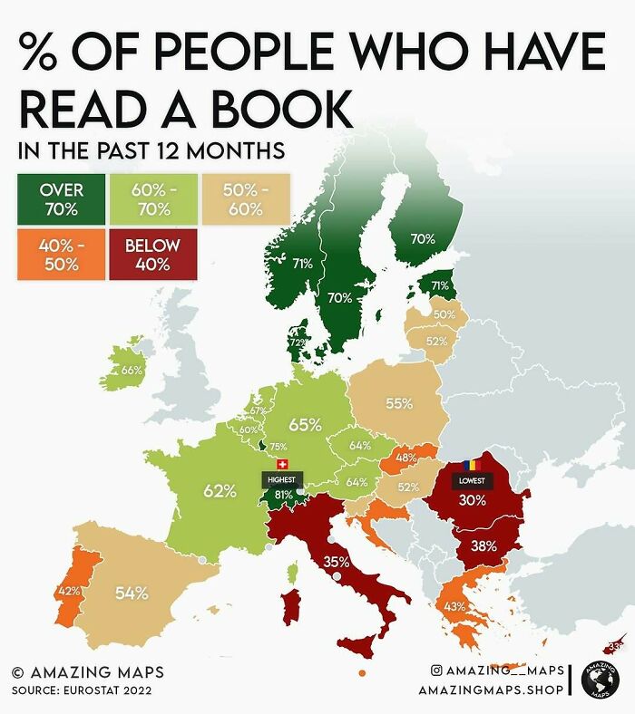
    Map showing percentage of people in Europe who have read a book in the past 12 months according to amazing maps data.

    amazing__maps Report

    Mr. Nurse Man
    Community Member
    1 year ago

    While I'm sure there's bound to be somone who's gonna make a "now do one about the US" comment, I think it's interesting to see a perspective of what countries in Europe read.

    View more comments
    #3

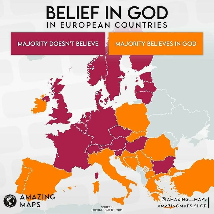
    Map showing belief in God across European countries, highlighting where the majority believes or doesn’t believe in God.

    amazing__maps Report

    BeesEelsAndPups
    Community Member
    1 year ago

    Interesting how well this correlates with the map about people who read books

    View more comments
    #4

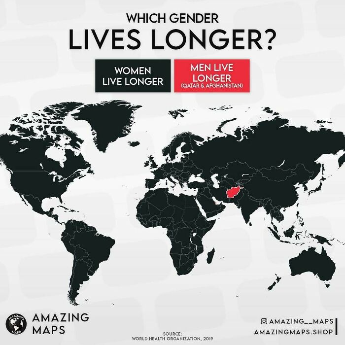
    World map showing which gender lives longer by country, highlighting men in Qatar and Afghanistan with a red color.

    amazing__maps Report

    Janet Sparrow
    Community Member
    1 year ago

    Afghanistan? I wonder if that’s because women are killed for being rebellious or forced to have many children and die in childbirth? Scary.

    View more comments
    ADVERTISEMENT
    #5

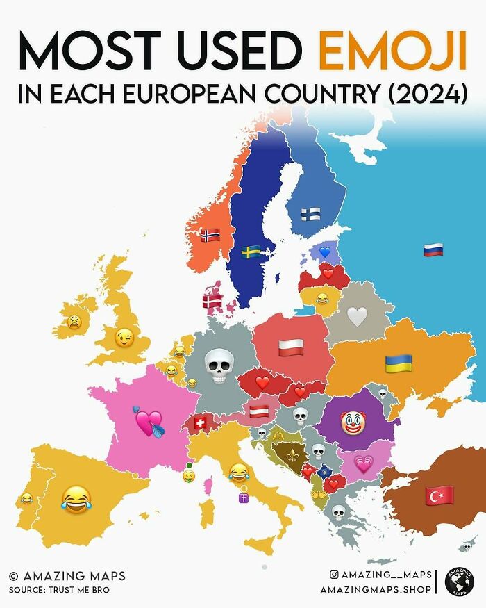
    Map of Europe showing the most used emoji in each country in 2024 from amazing maps collection.

    amazing__maps Report

    Ham Fright
    Community Member
    1 year ago

    You OK Germany?

    View more comments
    ADVERTISEMENT
    #6

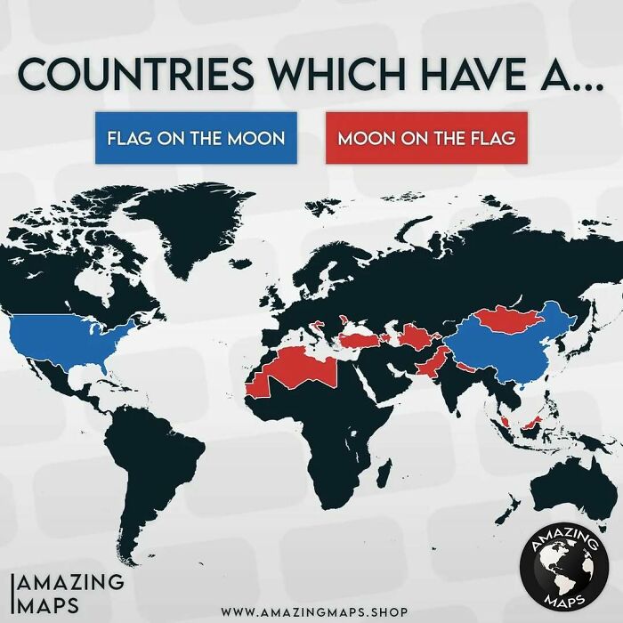
    World map highlighting countries with a flag on the moon or moon on their flag in an amazing maps style.

    amazing__maps Report

    Glix Drap
    Community Member
    Premium
    1 year ago

    So no one has done the double yet.

    View more comments
    #7

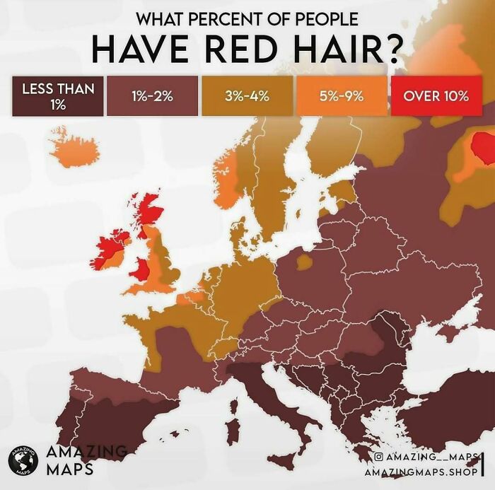
    Map of Europe showing the percentage of people with red hair using color-coded regions in an amazing maps style.

    amazing__maps Report

    Gingersnap In Iowa
    Community Member
    1 year ago

    In my house it's 50%! 😁

    View more comments
    #8

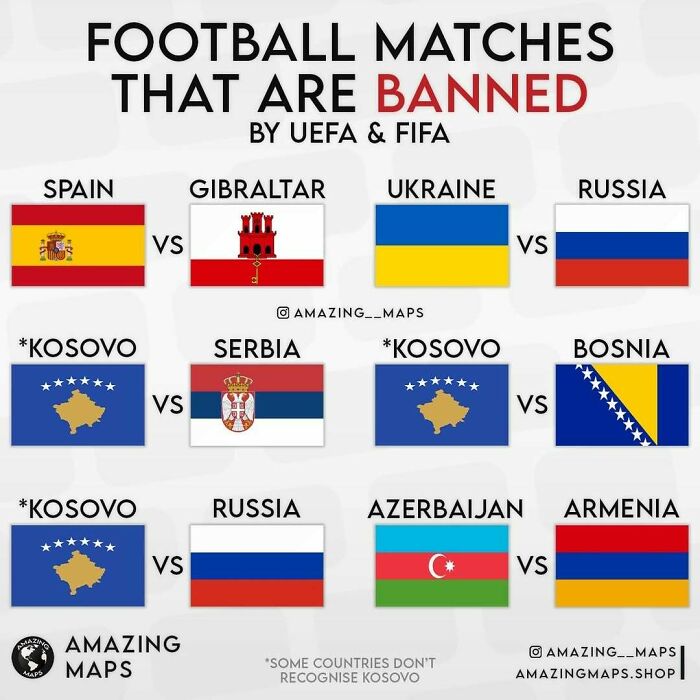
    Map showing football matches banned by UEFA and FIFA between countries, highlighting geopolitical conflicts and restrictions.

    amazing__maps Report

    Janet Sparrow
    Community Member
    1 year ago

    Is this because of the potential for violence due to historical bad feelings?

    View more comments
    ADVERTISEMENT
    #9

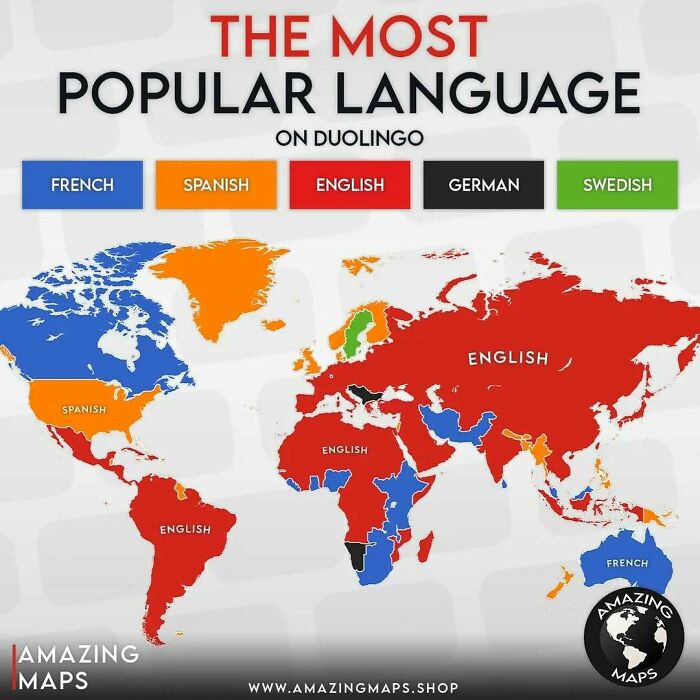
    World map showing the most popular language on Duolingo by country, highlighting English, Spanish, French, German, and Swedish.

    amazing__maps Report

    Tuuli Siljamaki
    Community Member
    1 year ago

    I found you, New Zealand!

    View more comments
    ADVERTISEMENT
    #10

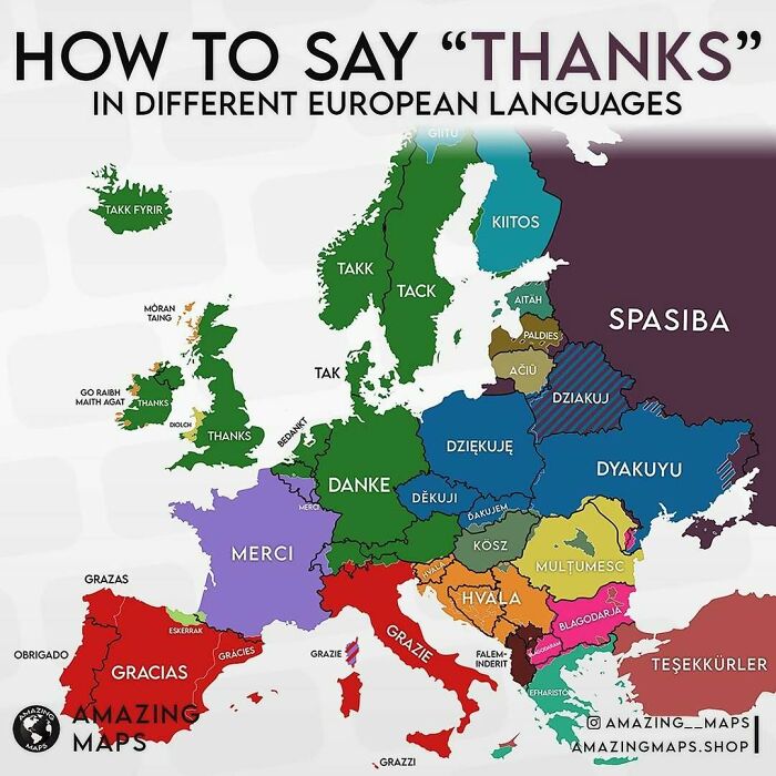
    Map of Europe showing how to say thanks in different languages, an amazing map illustrating cultural language diversity.

    amazing__maps Report

    Dread Pirate Roberts
    Community Member
    1 year ago

    I couldn't help thinking of "Am I the a*****e?" when I read "aitah" 😆

    View more comments
    #11

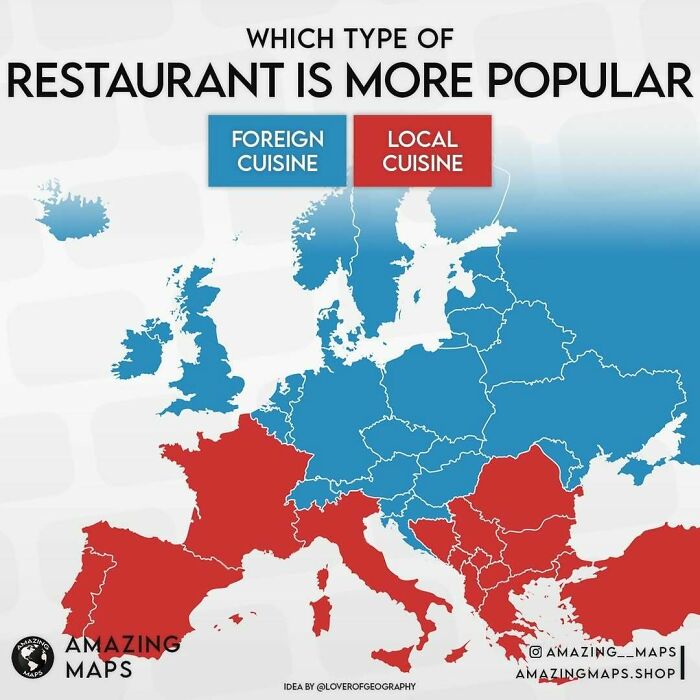
    Map showing popularity of foreign versus local cuisine restaurants across Europe, highlighting food preferences from Amazing Maps.

    amazing__maps Report

    Raymond Core
    Community Member
    1 year ago

    I like both types of British cuisine; fish AND chips. How can France and England be so different with their gastronomy?

    View more comments
    #12

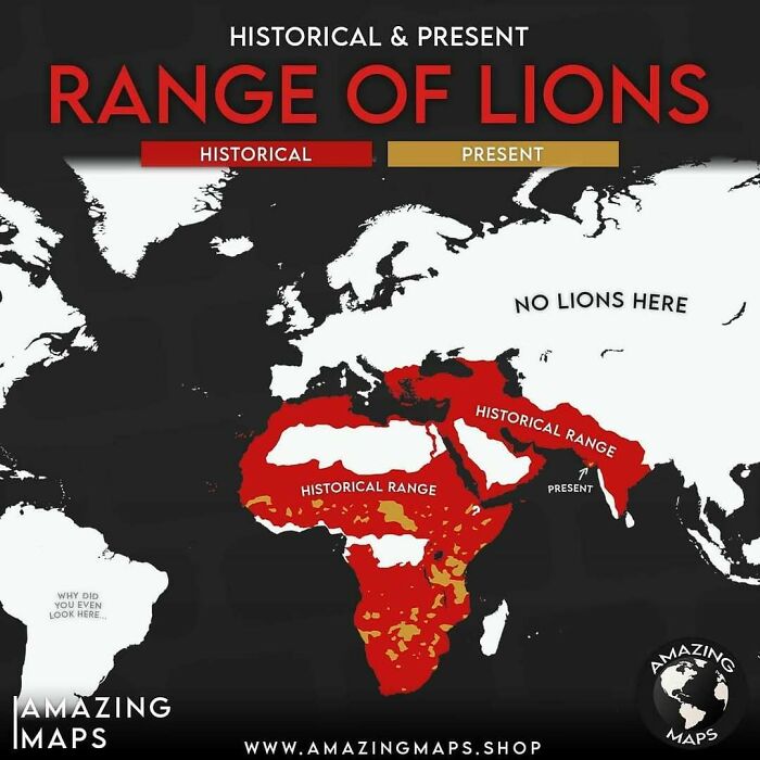
    Map showing the historical and present range of lions across Africa, Europe, and Asia with highlighted areas in red and gold.

    amazing__maps Report

    Dee Rutherford
    Community Member
    1 year ago

    😢

    View more comments
    ADVERTISEMENT
    #13

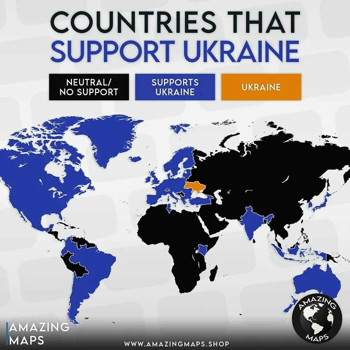
    World map showing countries that support Ukraine, highlighting support levels with colors in an amazing maps visualization.

    amazing__maps Report

    Verena
    Community Member
    1 year ago

    Russia "neutral/no support" has incorrect vibes ...

    View more comments
    ADVERTISEMENT
    #14

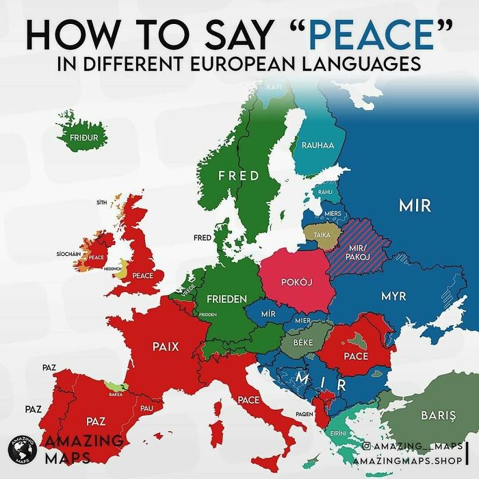
    Map showing how to say peace in different European languages, part of amazing maps collection that changes world perspective.

    amazing__maps Report

    Glix Drap
    Community Member
    Premium
    1 year ago

    Fred be upon you Fred.

    View more comments
    #15

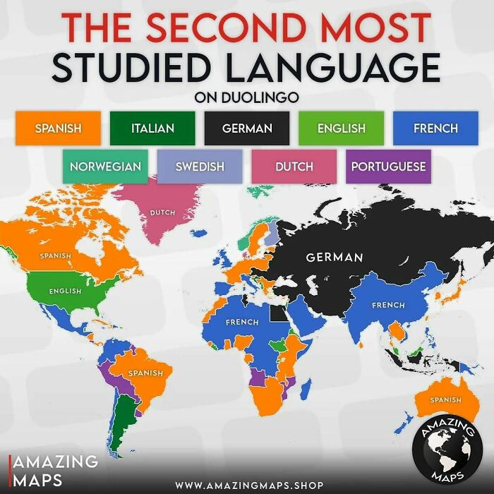
    World map showing the second most studied languages by country on Duolingo with colors for each language.

    amazing__maps Report

    Anko Tijman
    Community Member
    1 year ago

    Dutch in Greenland —- Shouldn’t that be Danish?

    View more comments

    Never miss a story that brings joy to the world. Add us on Google

    #16

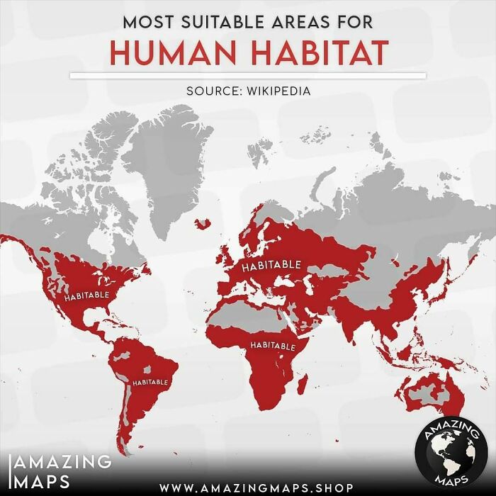
    Map highlighting the most suitable habitable areas for human habitat across continents in an amazing maps style.

    amazing__maps Report

    Judes
    Community Member
    1 year ago

    OMG, NZ. Are you alright?

    View more comments
    ADVERTISEMENT
    #17

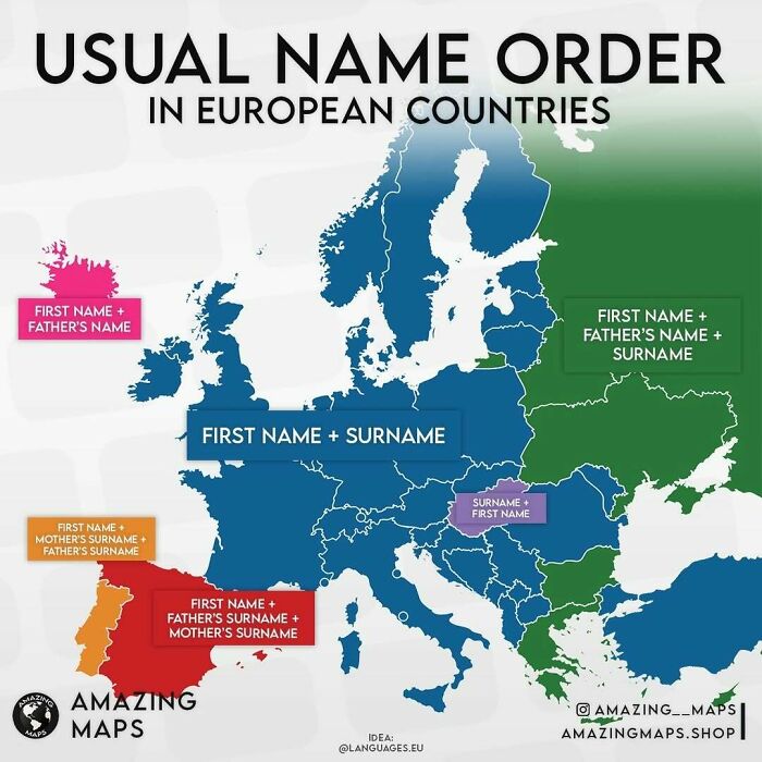
    Map showing usual name order in European countries with color codes for different naming conventions, from Amazing Maps collection.

    amazing__maps Report

    michael Chock
    Community Member
    1 year ago

    Iceland. You just love to be a little off.

    View more comments
    ADVERTISEMENT
    #18

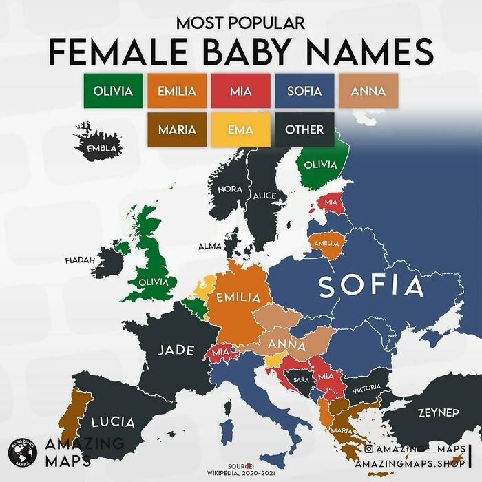
    Map of Europe showing the most popular female baby names by country, featuring color-coded regions and top names.

    Most popular female baby names for 2020/2021 in Europe

    amazing__maps Report

    Glix Drap
    Community Member
    Premium
    1 year ago

    Portugal has a funny name for baby girls - Amazing Maps.

    View more comments
    #19

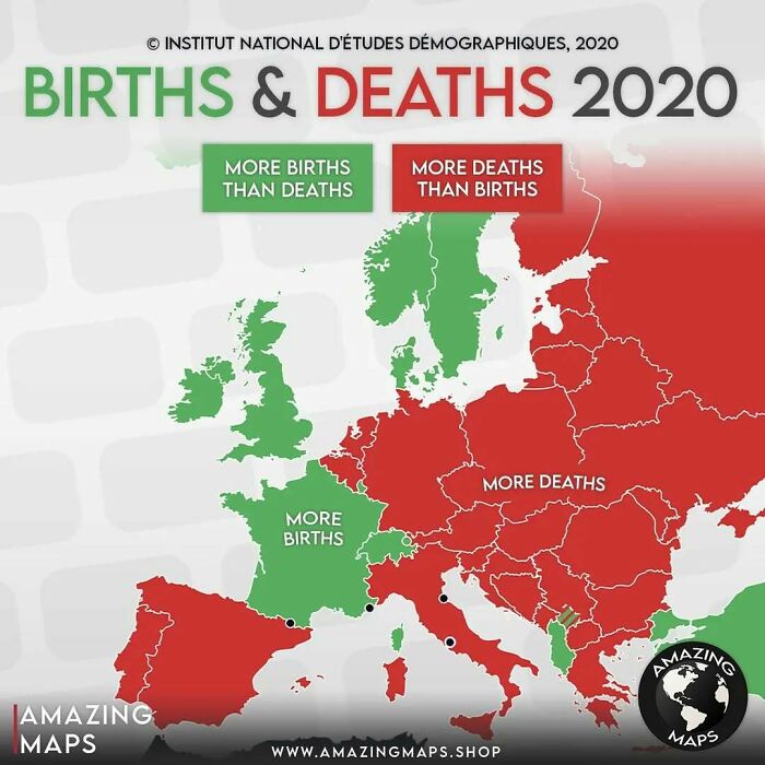
    Map of Europe showing births versus deaths in 2020 with regions highlighted for more births or more deaths.

    amazing__maps Report

    Heir of Durin
    Community Member
    1 year ago

    Coincidently, France’s most used emoji was a heart!!

    View more comments
    #20

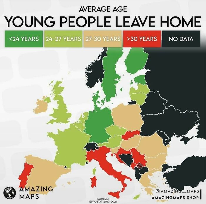
    Map showing average age when young people leave home across Europe with color-coded age ranges from amazing maps collection.

    amazing__maps Report

    Foxglove🇮🇪
    Community Member
    1 year ago

    Because housing is getting so expensive, too many young people can't afford to move out

    View more comments
    ADVERTISEMENT
    #21

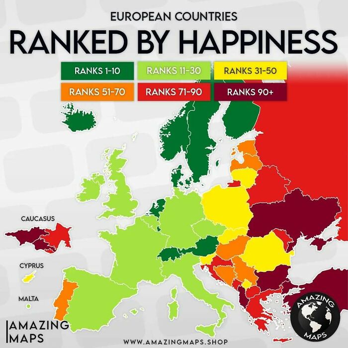
    Map of European countries ranked by happiness using color codes from the Amazing Maps collection showing regional happiness levels.

    amazing__maps Report

    Jihana
    Community Member
    1 year ago

    Ukrainians are unhappy. I wonder why....

    View more comments
    ADVERTISEMENT
    #22

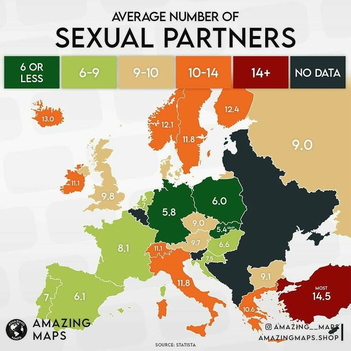
    Map showing the average number of s****l partners across European countries with color-coded data ranges.

    amazing__maps Report

    Gingersnap In Iowa
    Community Member
    1 year ago

    Oh my...I might be a w***e.

    View more comments
    #23

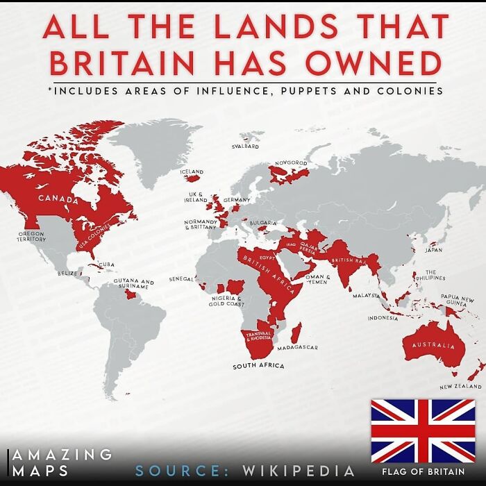
    Map showing all the lands Britain has owned, highlighting colonies, areas of influence, and puppet states in red around the world.

    amazing__maps Report

    KD90210
    Community Member
    1 year ago

    ...followed by all the lands that Britian then lost 😂

    View more comments
    #24

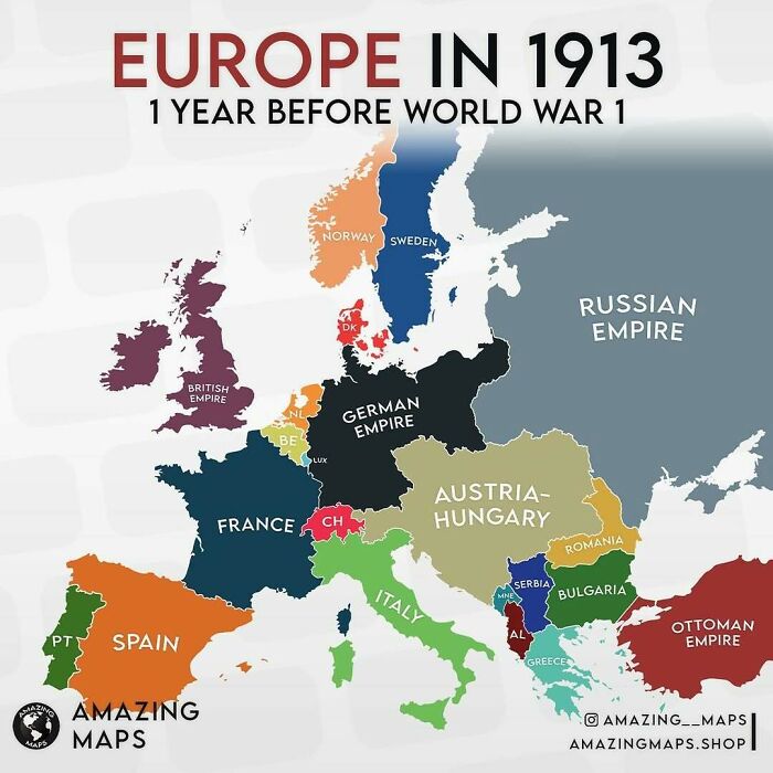
    Colorful historical map of Europe in 1913 showing empires and countries before World War 1, an amazing maps visual.

    amazing__maps Report

    This panda says ur worth it
    Community Member
    1 year ago

    France rlly didn’t change too much

    View more comments
    ADVERTISEMENT
    #25

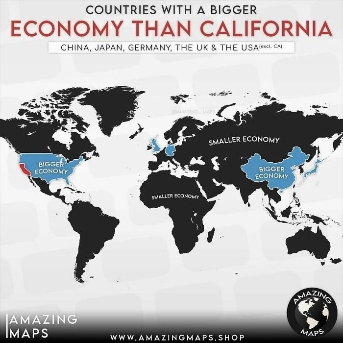
    World map highlighting countries with bigger economies than California including China, Japan, Germany, the UK, and the USA.

    amazing__maps Report

    Spencer's slave no longer
    Community Member
    1 year ago

    New Zealand is off on holiday again.

    View more comments
    ADVERTISEMENT
    #26

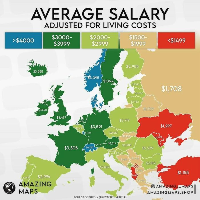
    Map of average salaries in Europe adjusted for living costs using color coding from the Amazing Maps series.

    amazing__maps Report

    Verena
    Community Member
    1 year ago

    Information about hours worked is essential here

    View more comments
    #27

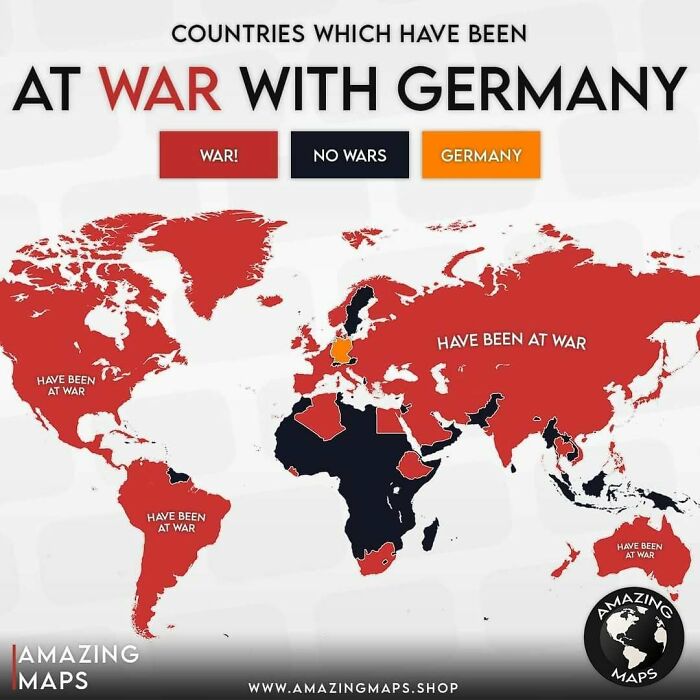
    World map highlighting countries that have been at war with Germany, shown in red for amazing maps insight.

    amazing__maps Report

    Egodeist
    Community Member
    1 year ago

    Can we just agree on one spot for NZ? I don't care where, but all this movement is making me dizzy and the plates keep falling off the shelves!

    View more comments
    #28

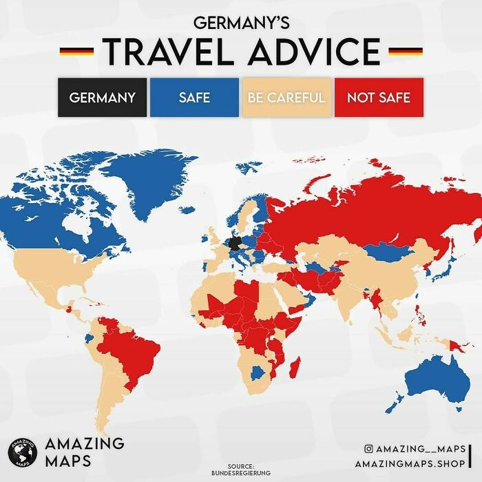
    Map showing Germany's travel advice categorizing countries as safe, be careful, or not safe based on German travel guidelines.

    amazing__maps Report

    7cs56n9t6w
    Community Member
    Premium
    1 year ago

    The Czech Republic is one of the safest countries in the world.

    View more comments
    ADVERTISEMENT
    #29

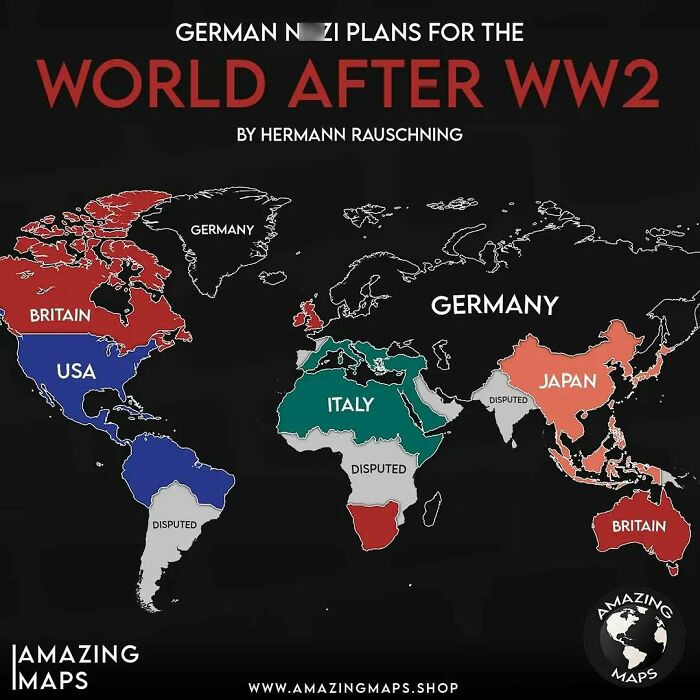
    Map showing German N**i plans for the world after WW2 with countries color-coded by intended control zones.

    amazing__maps Report

    persephone134
    Community Member
    1 year ago

    All those forbidden words, according to BP.

    View more comments
    ADVERTISEMENT
    #30

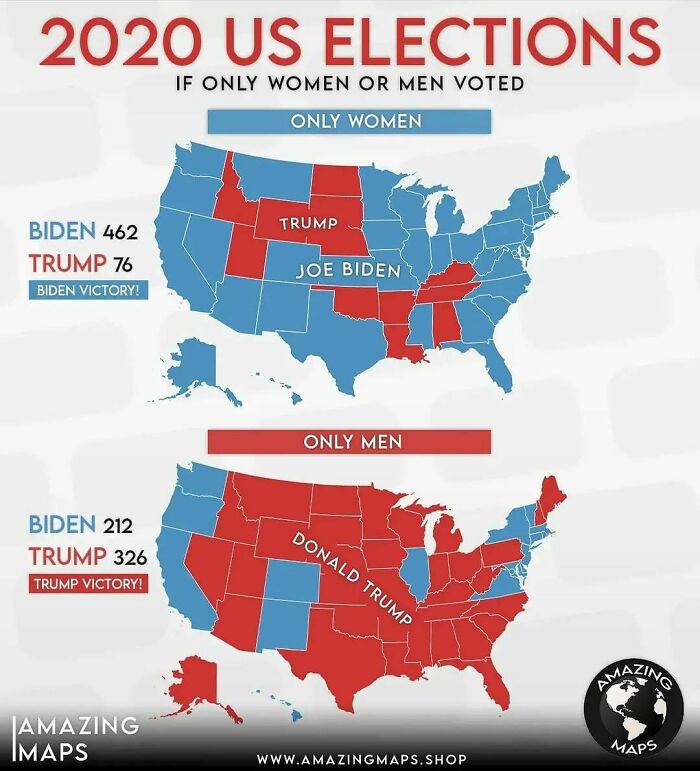
    Map showing 2020 US election results if only women or only men voted, highlighting electoral differences in amazing maps.

    amazing__maps Report

    Timbob
    Community Member
    1 year ago

    Wi think we should only let women vote from now on !

    View more comments
    #31

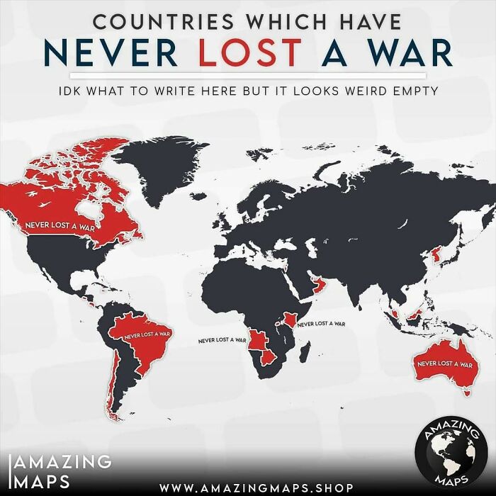
    Map showing countries that have never lost a war, highlighting key regions in red with a focus on amazing maps insights.

    amazing__maps Report

    KD90210
    Community Member
    1 year ago

    Didn't Australia lose against the Emus?

    View more comments
    #32

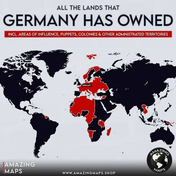
    Map highlighting all the lands Germany has owned, including colonies and territories, in an amazing maps style.

    amazing__maps Report

    Abel
    Community Member
    1 year ago

    NZ is now South Japan.

    View more comments
    ADVERTISEMENT
    #33

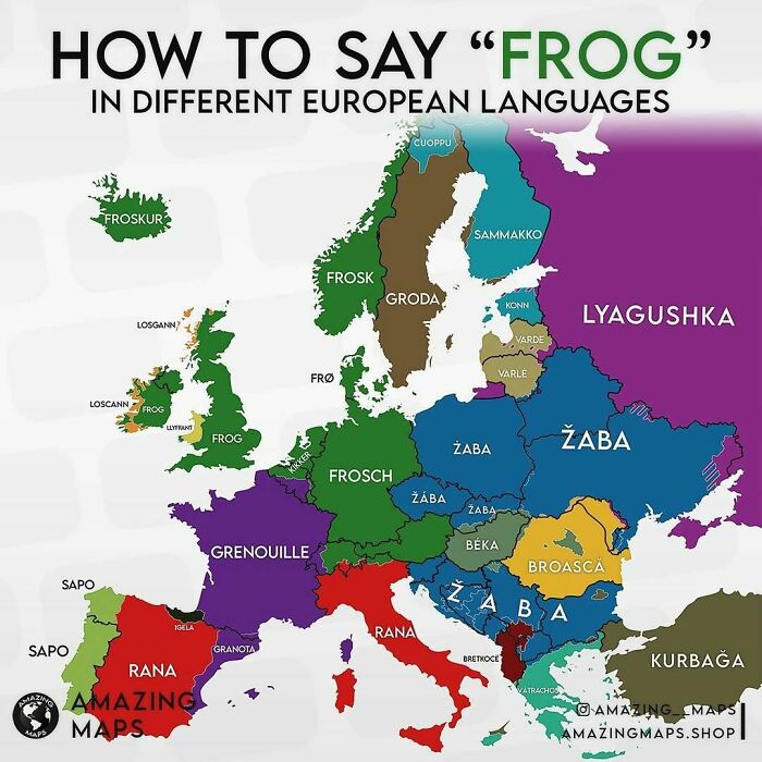
    Map showing how to say frog in different European languages, highlighting linguistic diversity across the continent.

    amazing__maps Report

    KD90210
    Community Member
    1 year ago

    Fun Fact: Kermit the frog in Spain is actually called La Rana Gustavo. Now I look at Kermit and think, well yes you do look like a Gus.

    View more comments
    ADVERTISEMENT
    #34

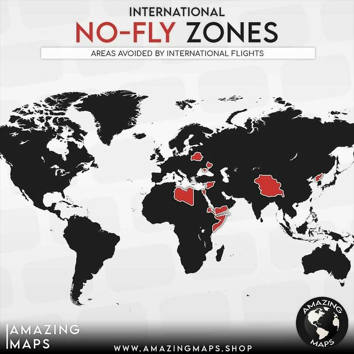
    World map highlighting international no-fly zones avoided by flights, showing restricted areas in red for amazing maps.

    amazing__maps Report

    TMMITW
    Community Member
    1 year ago

    NZ is the wandering country.

    View more comments
    #35

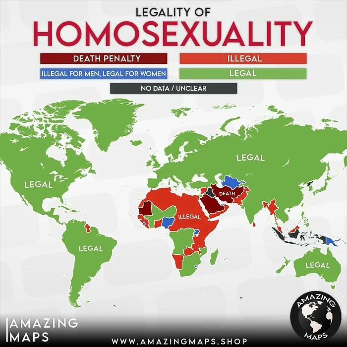
    World map showing the legality of homosexuality by country, highlighting regions with d***h penalty, illegal, and legal status.

    amazing__maps Report

    persephone134
    Community Member
    1 year ago

    New Zealand switched oceans.

    View more comments
    #36

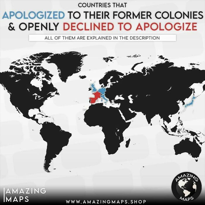
    World map showing countries that apologized or declined to apologize to their former colonies, part of amazing maps.

    Germany apologized to Namibia in 2004 for the Herero Gen*cide.
    Belgium apologized for the colonial-era abduction of mixed-race children in 2019.
    Italy apologized to Libya in 2008 and handed a $5bn investment compensation.
    The Netherlands apologized to Indonesia in 2013 for the executions done after WW2.
    Britain apologized to Kenya in 2013 and gave a compensation of £20mil.
    Japan offered multiple apologies for its imperial past including the atrocities in Korea.

    In France Macron said "We admit but we do not apologize" about the colonial crimes in Algeria.
    In 2019 Mexico urged Spain to apologize for the colonial abuses but Madrid "firmly rejected".

    amazing__maps Report

    Ellinor she/they/elle
    Community Member
    1 year ago (edited)

    And Macron got a HUGE backlash from the population on that one (deserved)

    View more comments
    ADVERTISEMENT
    #37

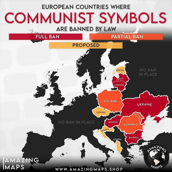
    Map of European countries with full, partial, and proposed bans on communist symbols by law, highlighting regional restrictions.

    amazing__maps Report

    Ace
    Community Member
    Premium
    1 year ago

    All of them ex-communist, ex soviet bloc, I wonder why?

    View more comments
    ADVERTISEMENT
    #38

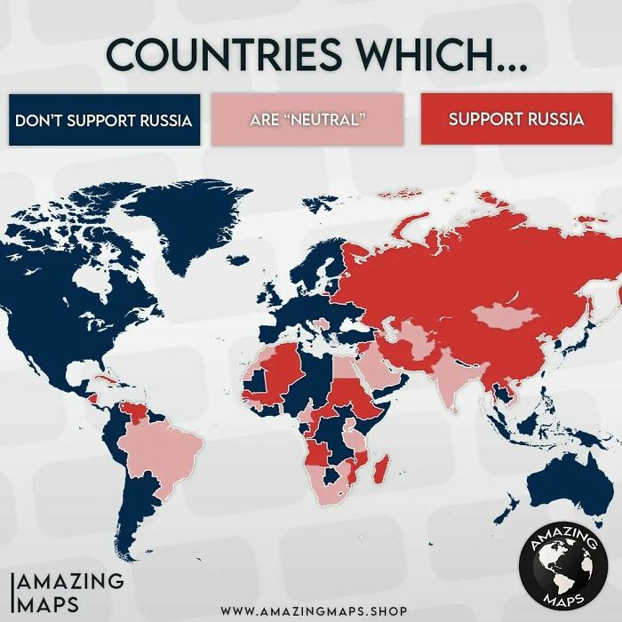
    World map showing countries that support, oppose, or remain neutral toward Russia in an amazing maps graphic.

    amazing__maps Report

    michael Chock
    Community Member
    1 year ago

    President orange changes his mind weekly, so US should be striped or neutral.

    View more comments
    #39

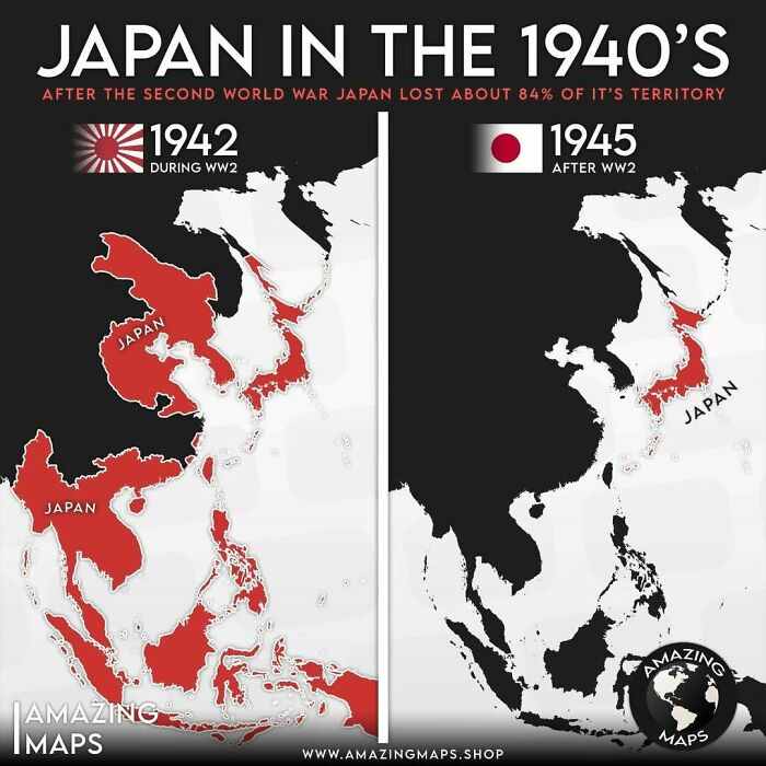
    Map showing Japan's territory in the 1940s before and after World War II highlighting territorial changes.

    amazing__maps Report

    CP
    Community Member
    1 year ago (edited)

    They gained all that territory during WW2. This doesn't make sense. They were pretty much the same size before and after. WW2 started when Japan invaded Manchuria. I don't see how anyone could say WW2 and the Manchurian invasion are separate.

    View more comments
    #40

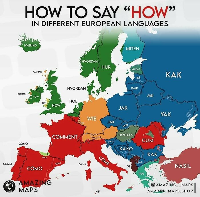
    Map showing how to say the word how in different European languages, highlighting linguistic diversity across countries.

    amazing__maps Report

    Ellinor she/they/elle
    Community Member
    1 year ago (edited)

    It must be very confusing for the English-Speaking people when they travel in Romania.

    View more comments
    ADVERTISEMENT
    #41

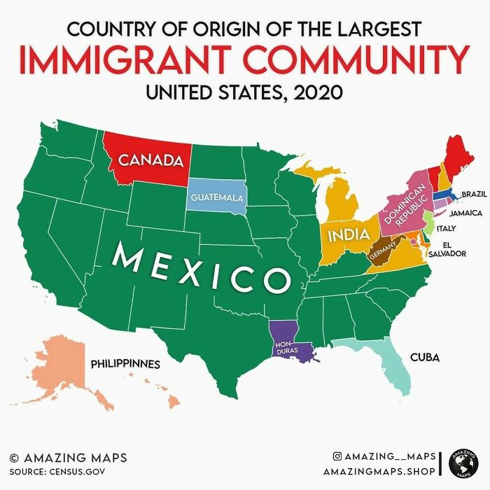
    Map showing the country of origin of the largest immigrant community in each US state in 2020, highlighting diversity by region.

    amazing__maps Report

    Russell Bowman
    Community Member
    1 year ago

    I can see it now ... Filipinos stepping off the airplane in Alaska ... shouting "What the heck"

    View more comments
    ADVERTISEMENT
    #42

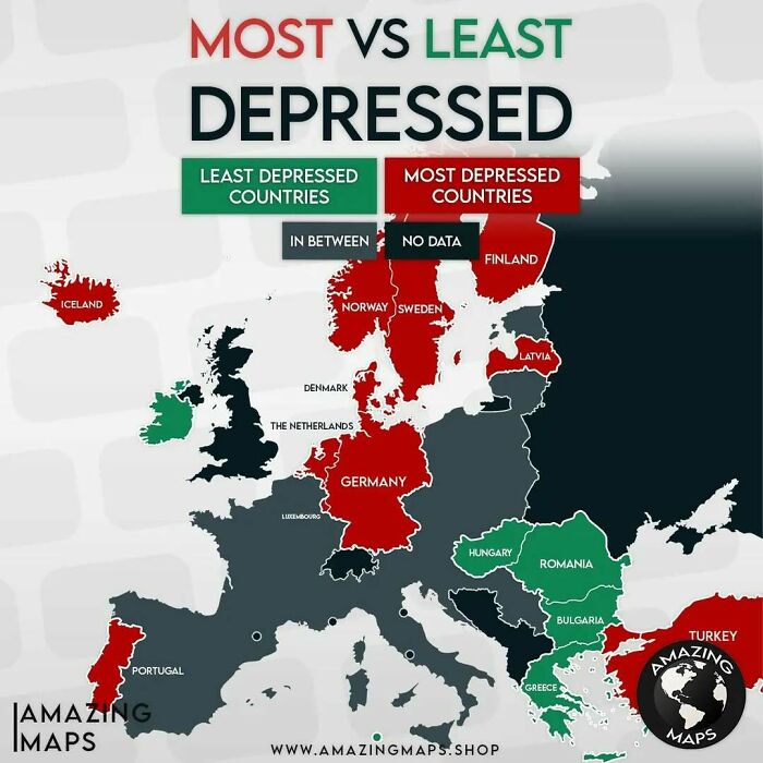
    Map of Europe showing the most and least depressed countries with color-coded regions highlighting mental health trends.

    Above 8% in red and below 4% in green

    amazing__maps Report

    Francois
    Community Member
    1 year ago

    Strange? A lot most depressed countries are also high on happiest countries e.g. Finland, Netherlands etc

    View more comments
    #43

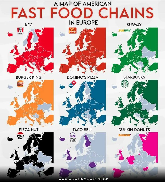
    Maps showing the presence of major American fast food chains across European countries with color-coded regions.

    amazing__maps Report

    Verena
    Community Member
    1 year ago

    Pizza Hut is (was) pronounced as Pizza Hout, with the ou from you, in Germany. Translating to Pizza Hat/Cap. The symbol looking like a fancy hat contributed to that. Today most people realize hut = cabin

    View more comments
    #44

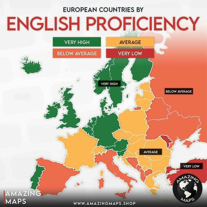
    Map of European countries color-coded by English proficiency levels from very high to very low.

    amazing__maps Report

    Vanessa Panerosa
    Community Member
    1 year ago

    Spain is a bit of a toss up - they along with England had their fun conquering the globe. They can just go to the half that is Spanish speaking. Además, toda la gente en Esapaña ya habla inglés en mi opinión, solo no lo quiere 🤣

    View more comments
    ADVERTISEMENT
    #45

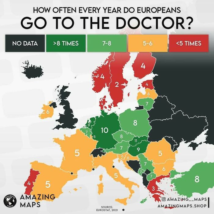
    Map showing how often Europeans visit the doctor yearly, highlighting variations across countries with data from Eurostat 2021.

    amazing__maps Report

    CD King
    Community Member
    1 year ago

    Why in the world do you need to see a doctor 10 times in one year??? Obviously is you are chronically ill or elderly… but everyone else?

    View more comments
    ADVERTISEMENT
    #46

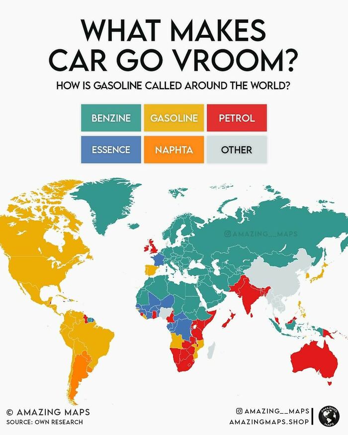
    Map showing how gasoline is called around the world with color-coded regions in an amazing maps illustration.

    amazing__maps Report

    Norm Gilmore
    Community Member
    1 year ago (edited)

    My goodness. That's the best yet. Kiwi slowly making our way around the world just seeing the sights...

    View more comments
    #47

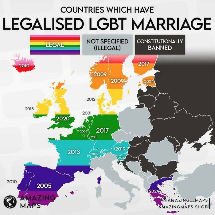
    Map showing countries in Europe that have legalized LGBT marriage, categorized by legal status and year of legalization.

    amazing__maps Report

    Sandra Moon
    Community Member
    1 year ago

    UK legalised single s*x marriage in 2014, not 2020. My wife and I tied the knot immediately

    View more comments
    #48

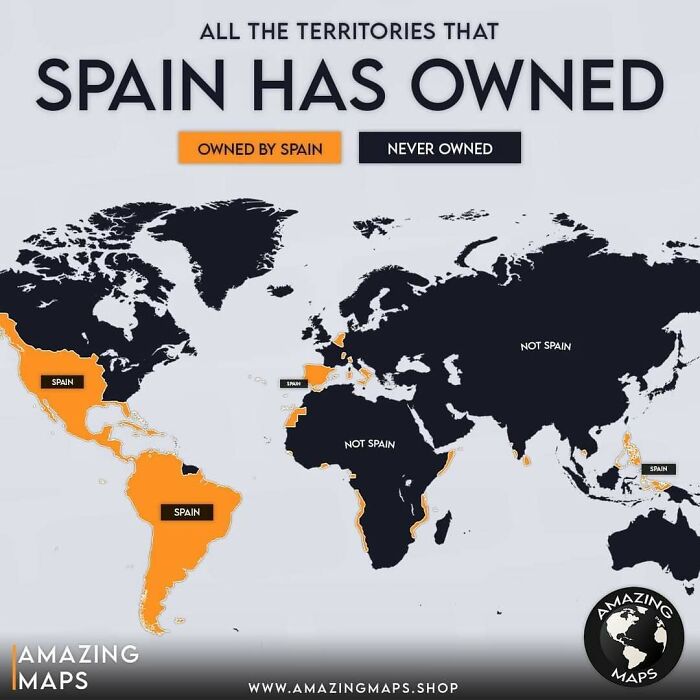
    World map showing all territories historically owned by Spain, highlighted in orange, with remaining areas in dark blue.

    amazing__maps Report

    Anony Mouse
    Community Member
    1 year ago

    Can anyone find NZ? Or has it made it to the moon maybe?

    View more comments
    ADVERTISEMENT
    #49

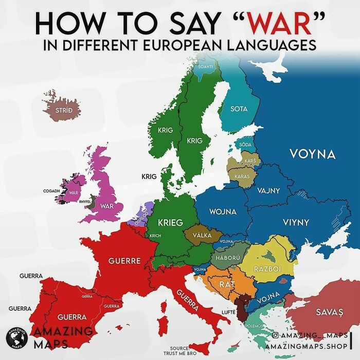
    Map showing how to say war in different European languages with countries color-coded and labeled with terms.

    amazing__maps Report

    Rick Murray
    Community Member
    1 year ago

    Razboi? Sounds like an inner city rapper.

    View more comments
    ADVERTISEMENT
    #50

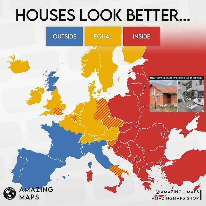
    Map of Europe showing regions where houses look better outside, inside, or equal, highlighting cultural differences in house appearances.

    amazing__maps Report

    FreeTheUnicorn
    Community Member
    1 year ago

    I disagree about Scotland, and about England, I'd reverse them.

    View more comments
    #51

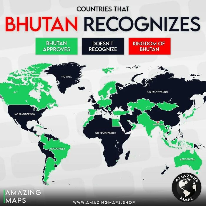
    World map showing countries that Bhutan recognizes, with color coding for approval, non-recognition, and Bhutan territory.

    amazing__maps Report

    Peluka.uy
    Community Member
    1 year ago

    WTF 🤔

    View more comments
    #52

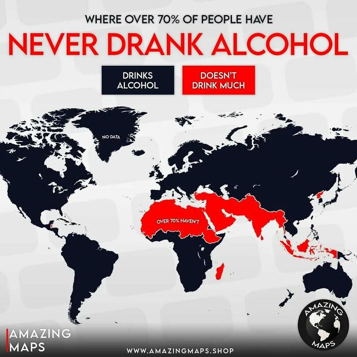
    World map highlighting regions where over 70% of people have never drank alcohol, shown in red for amazing maps insight.

    amazing__maps Report

    Raymond Core
    Community Member
    1 year ago

    I live in Thailand and it holds the record for the most drink-driving deaths. Wide-spread alcoholism is an acknowledged problem in the Kingdom.
    View more comments
    ADVERTISEMENT
    #53

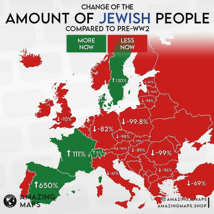
    Map showing change in amount of Jewish people in Europe compared to pre-WW2 with areas marked more or less now.

    amazing__maps Report

    Pandemonium
    Community Member
    1 year ago

    Tragic.

    View more comments
    ADVERTISEMENT
    #54

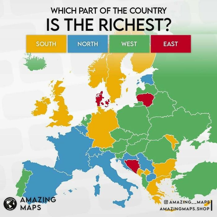
    Map highlighting the richest parts of European countries by region using color coding, from Amazing Maps collection.

    amazing__maps Report

    Helen Rohrlach
    Community Member
    1 year ago

    So closest side to Germany?

    View more comments
    #55

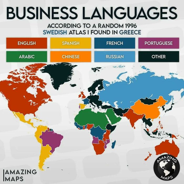
    Business languages map showing dominant languages worldwide with color codes, sourced from a 1996 Swedish atlas found in Greece.

    amazing__maps Report

    Pandemonium
    Community Member
    1 year ago

    I love this one just for the attribution

    #56

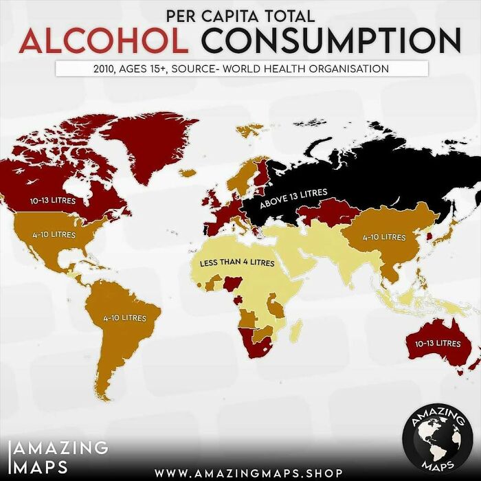
    Map showing per capita alcohol consumption worldwide with regions color-coded by average liters consumed, illustrating global consumption patterns.

    amazing__maps Report

    Verena
    Community Member
    1 year ago

    Pure alcohol? Per year? Per month?

    View more comments
    ADVERTISEMENT
    #57

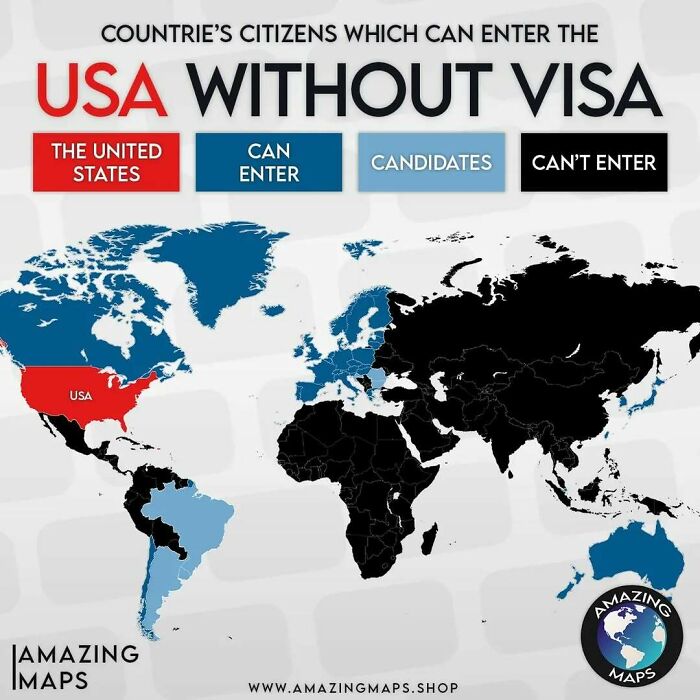
    World map showing countries whose citizens can enter the USA without a visa, using color-coded visa access status.

    amazing__maps Report

    Helen Rohrlach
    Community Member
    1 year ago

    New Zealand back in the Indian Ocean.

    View more comments
    ADVERTISEMENT
    #58

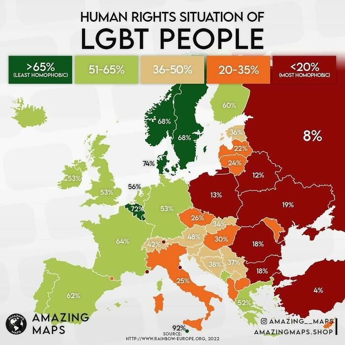
    Map showing human rights situation of LGBT people across Europe with color-coded homophobia levels and percentages.

    amazing__maps Report

    TotallyNOTAFox
    Community Member
    1 year ago

    And getting lower in Germany each year due to ongoing hypocrisy from parties that claim to fully support LGBQT citizens

    #59

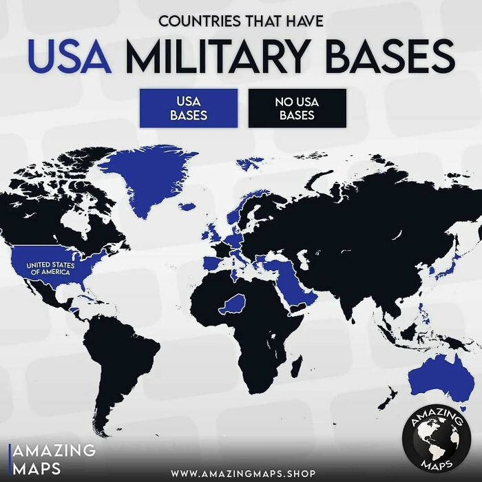
    World map highlighting countries with USA military bases in blue and others in black for amazing maps insight.

    amazing__maps Report

    Norm Gilmore
    Community Member
    1 year ago

    No bases as such but the US does operate military aircraft from Christchurch NZ to supply McMurdo base in Antarctica, and NZ shares information with it's allies from Waihopi Station.

    View more comments
    #60

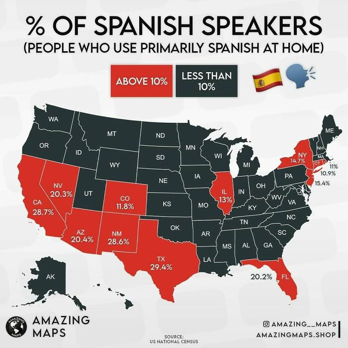
    US map showing percentage of Spanish speakers by state, highlighting areas with above 10% usage at home in red.

    amazing__maps Report

    ADVERTISEMENT
    #61

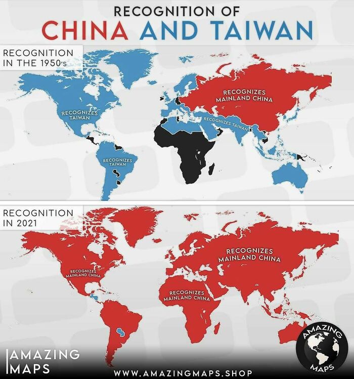
    World map showing changes in countries recognizing China and Taiwan from the 1950s to 2021 – amazing maps infographic.

    amazing__maps Report

    Confused Capybara
    Community Member
    1 year ago

    Probably the least diverse map on the list...

    View more comments
    ADVERTISEMENT
    #62

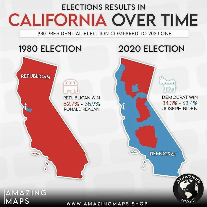
    Map showing California election results in 1980 Republican win and 2020 Democrat win, highlighting political changes over time.

    amazing__maps Report

    Pandemonium
    Community Member
    1 year ago

    Progress

    View more comments
    #63

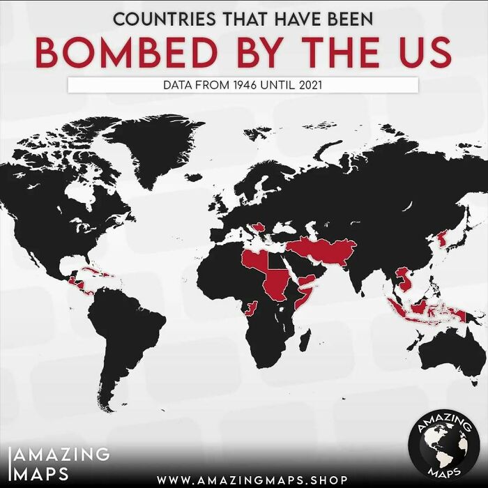
    World map highlighting countries bombed by the US from 1946 to 2021 in an amazing maps visualization.

    amazing__maps Report

    Auntriarch
    Community Member
    1 year ago (edited)

    If NZ has any sense they'll move again

    View more comments
    #64

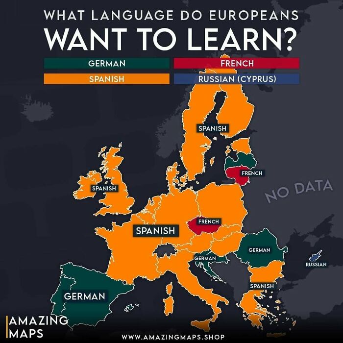
    Map showing what language Europeans want to learn, highlighting Spanish, German, French, and Russian preferences.

    amazing__maps Report

    nottheactualphoto
    Community Member
    1 year ago

    Cyprus is in the Black Sea! Who knew?

    ADVERTISEMENT
    #65

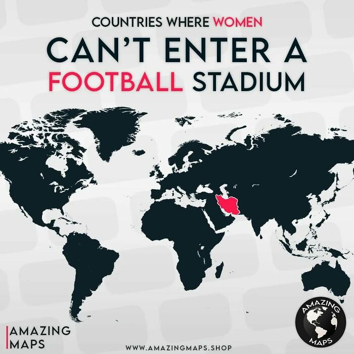
    World map highlighting countries where women are banned from entering football stadiums in amazing maps series.

    amazing__maps Report

    S. K.
    Community Member
    1 year ago

    Not even to watch an e*******n?

    ADVERTISEMENT
    #66

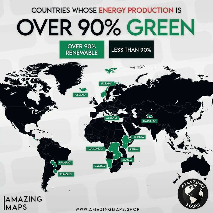
    Map showing countries with over 90% green energy production highlighted in green across the world.

    amazing__maps Report

    Peluka.uy
    Community Member
    1 year ago

    Uruguay and Paraguay are switched

    View more comments
    #67

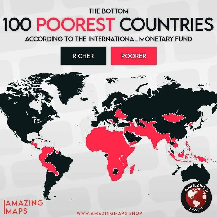
    World map highlighting the bottom 100 poorest countries in red according to the International Monetary Fund data.

    amazing__maps Report

    Agfox
    Community Member
    1 year ago

    Definitely not correct for Indonesia, it's GDP in 2025 is 17th highest in the World &, for example, higher than the GDP of many of the European Countries classified as 'Richer' on this map https://www.imf.org/external/datamapper/NGDPD@WEO/OEMDC/ADVEC/WEOWORLD/APQ. Also, https://en.wikipedia.org/wiki/List_of_countries_by_GDP_(nominal)

    #68

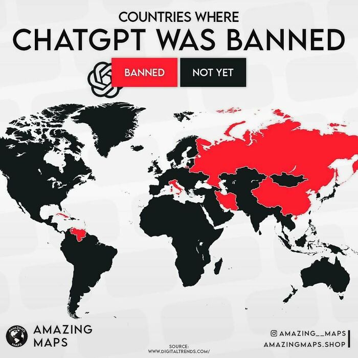
    World map highlighting countries where ChatGPT is banned in red, featured in amazing maps collection.

    amazing__maps Report

    Heir of Durin
    Community Member
    1 year ago

    “Not yet” haha! Well tell us how you really feel!

    View more comments
    ADVERTISEMENT
    #69

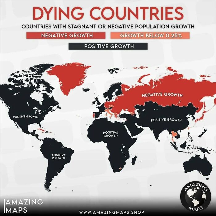
    World map showing countries with negative or stagnant population growth contrasted with those having positive growth.

    amazing__maps Report

    Pandemonium
    Community Member
    1 year ago

    Maybe old data because I've read that South Korea very quickly gained status as a shrinking nation after transitioning from an emerging to an "emerged" economy

    View more comments
    ADVERTISEMENT
    #70

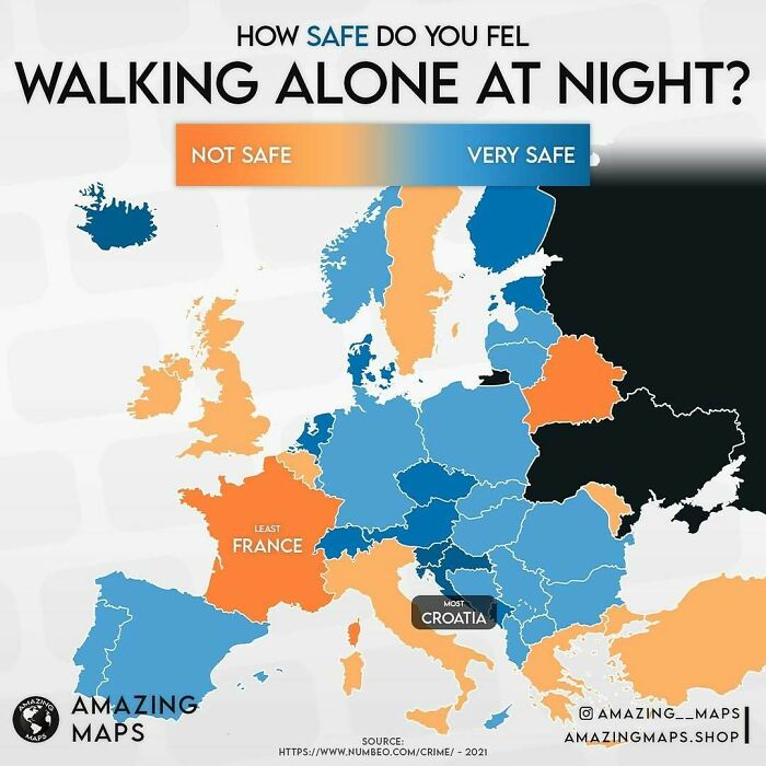
    Map showing how safe people feel walking alone at night in Europe, highlighting safety variations by country with colors.

    amazing__maps Report

    nottheactualphoto
    Community Member
    1 year ago

    Cyprus is on the march again.

    View more comments
    #71

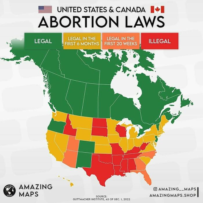
    Map of United States and Canada showing abortion laws with color-coded legal status for an Amazing Maps collection.

    amazing__maps Report

    persephone134
    Community Member
    1 year ago

    The land of the free, huh?

    View more comments
    #72

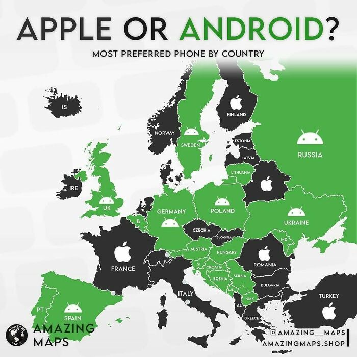
    Map of Europe showing Apple or Android as the most preferred phone by country, highlighting tech preferences with amazing maps.

    amazing__maps Report

    Fabrice Neyret
    Community Member
    1 year ago

    totally wrong. France is 80% Android , 20% iOS.

    View more comments
    ADVERTISEMENT
    #73

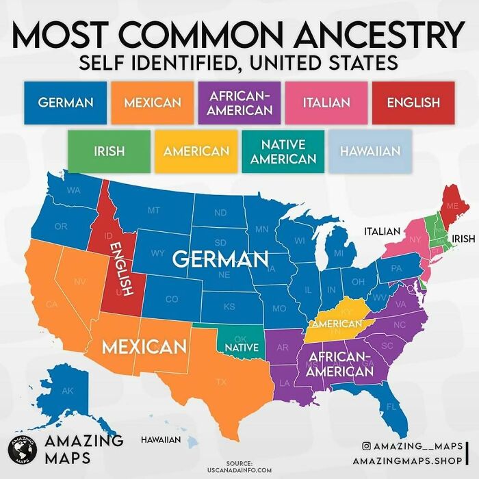
    Color-coded map showing the most common ancestry in each US state with a focus on German, Mexican, and African-American origins.

    amazing__maps Report

    Silly Dino
    Community Member
    1 year ago (edited)

    Wow Hawaii has the most native Hawaiians out of all the states!

    View more comments
    ADVERTISEMENT
    #74

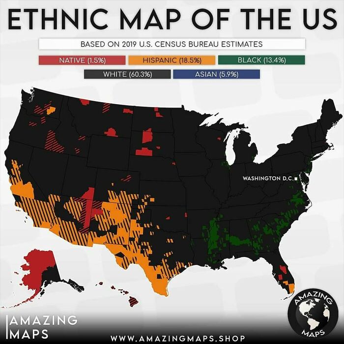
    Ethnic distribution map of the US showing Native, Hispanic, Black, White, and Asian populations based on 2019 census data.

    *No county has a majority Asian population but Asians still make up for 5.9% of the total population, that's why I decided to add them

    amazing__maps Report

    persephone134
    Community Member
    1 year ago

    White is black, black is green, Asian is invisible.

    View more comments
    #75

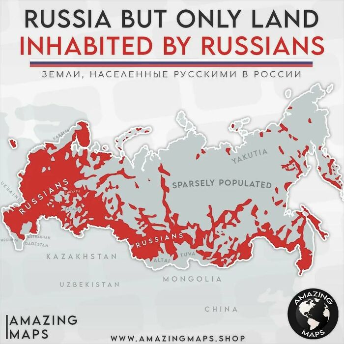
    Map highlighting land inhabited by Russians in Russia, illustrating population distribution in an amazing maps style.

    amazing__maps Report

    Remi (He/Him)
    Community Member
    1 year ago

    There are a lot of language minorities in Russia, many of which are endangered

    View more comments
    #76

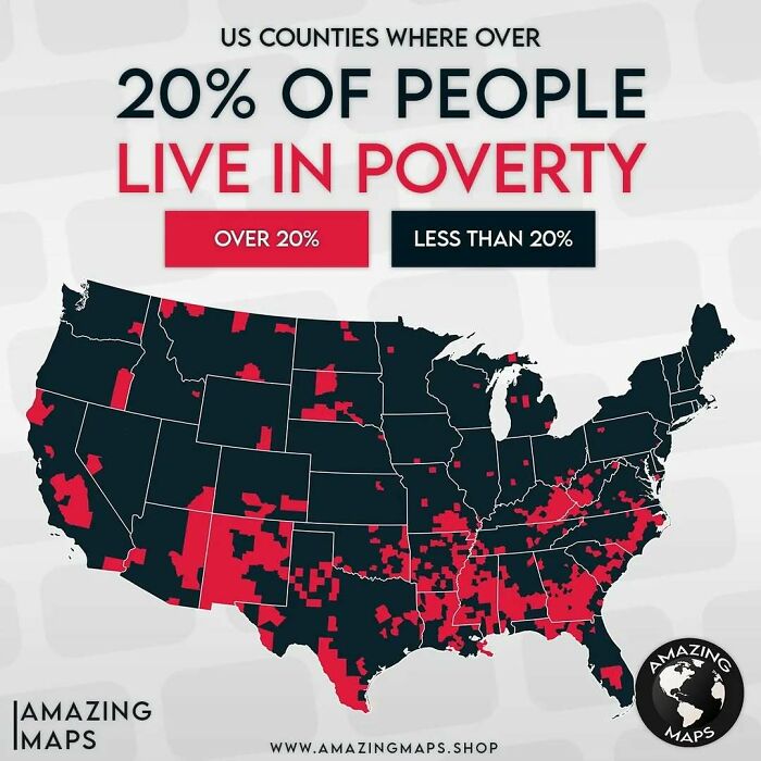
    Map showing US counties where over 20 percent of people live in poverty, highlighting regional poverty distribution across the country.

    amazing__maps Report

    Shane S
    Community Member
    1 year ago

    And the majority of those vote for the political party of the wealthy. Voting against their own self interest. That’s how you use culture wars to get rich, folks!

    View more comments
    ADVERTISEMENT
    #77

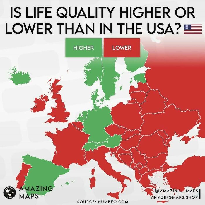
    Map showing life quality in Europe compared to the USA with countries colored higher or lower, an amazing map perspective.

    amazing__maps Report

    LittleTeapot
    Community Member
    1 year ago

    Yeah. This seems suspect - what factors were used to determine this? Give me the deets!

    View more comments
    ADVERTISEMENT
    #78

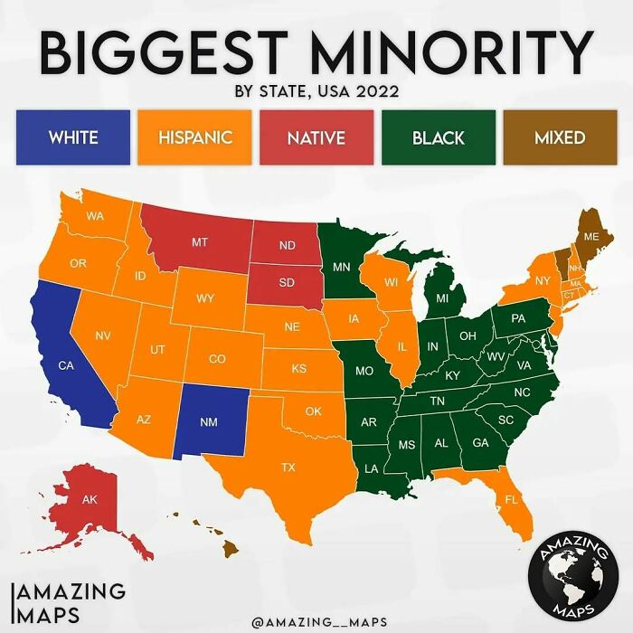
    Map showing the biggest minority by state in the USA 2022, highlighting Hispanic, Black, White, Native, and Mixed groups.

    amazing__maps Report

    ohjojo (you/your's)
    Community Member
    1 year ago

    I think I'm confused. whites are the minority in California? meaning there's fewer whites than a combination of all the other categories?


    View more comments
    #79

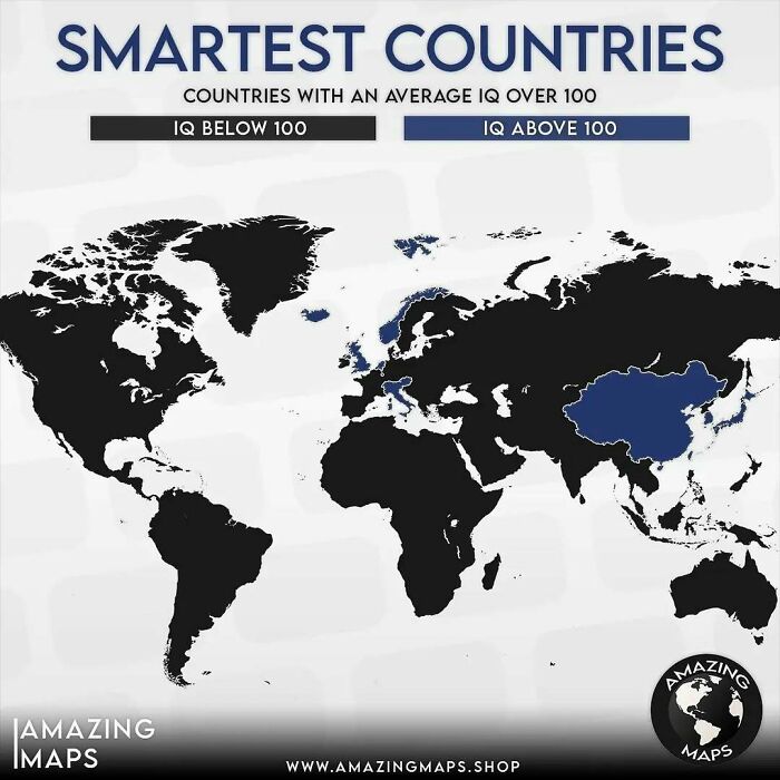
    World map highlighting smartest countries with average IQ above 100 in blue, from Amazing Maps collection.

    amazing__maps Report

    Spencer's slave no longer
    Community Member
    1 year ago

    I want to know where us kiwis are off to this time...

    View more comments
    #80

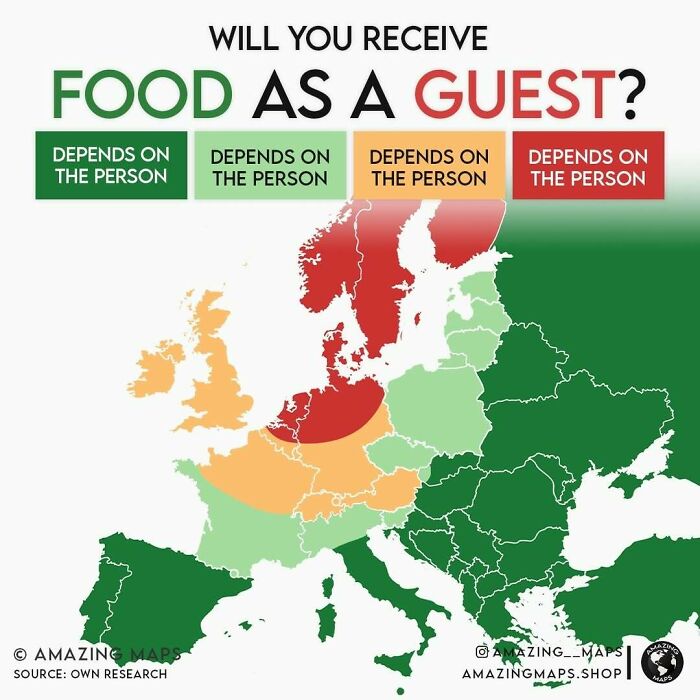
    Map showing likelihood of receiving food as a guest in Europe, part of amazing maps that change how you see the world.

    amazing__maps Report

    Confused Capybara
    Community Member
    1 year ago

    ?

    View more comments
    ADVERTISEMENT