ADVERTISEMENT

Every day we use a wide range of apps, devices, and products without even thinking about where they really come from. In reality, some designer probably spent a ton of time figuring out how to create the best item, which is how it eventually landed in your hands.

The problem is that some products clearly aren’t made properly, or maybe it’s that the person creating them just wanted to watch the world burn. That’s why we filled this list with crazy design fails that show just how bizarrely some things are created, so that you know what to avoid in the future.

#1

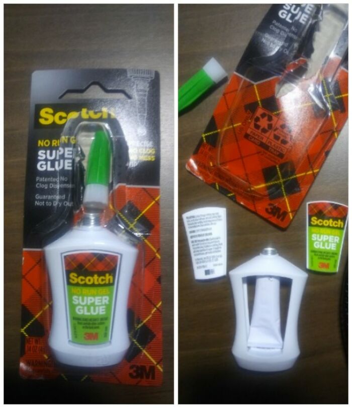
I Chose The Bottle Because A Tube Wasn't Enough! This Trojan Trickery Is An Offence Coming From A Brand With Recognition

A mostly empty plastic bottle of glue, a terrible product design that tricks customers into buying less product.

PoorGeno Report

RELATED:
    #2

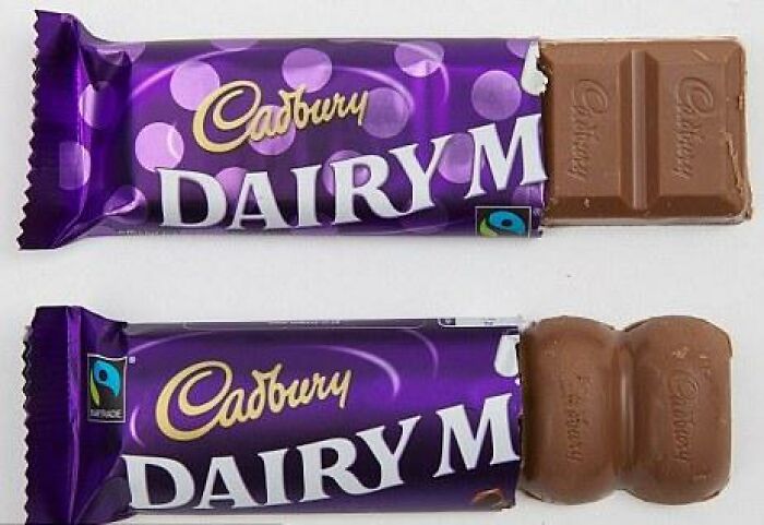
    Shrinkflation Used By Cadbury To Literally Cut Corners. The Bottom Chocolate Bar Is More Than 8 Percent Smaller

    Two chocolate bars with different shapes, a clear example of terrible product design

    Flying_Dutchmen_13 Report

    #3

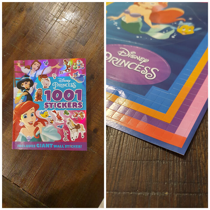
    1001 Stickers And 768 Of Them Are Useless Squares. Thanks Disney

    A Disney Princess sticker book showing a terrible product design with misaligned sticker pages

    [deleted] Report

    Multa Nocte (she/her 8647)
    Community Member
    Premium
    24 minutes ago Created by potrace 1.15, written by Peter Selinger 2001-2017

    What a crappy thing to do to children.

    Designing something people can use starts with figuring out how it should look, feel, and function. According to Miro, a collaborative platform for working with AI, whether someone is creating a virtual or physical product, they need to understand consumers and align the item’s design with the company’s objectives.

    ADVERTISEMENT

    Before writing any code or even inventing anything, businesses must bring together User Experience (UX) and User Interface (UI) specialists to conduct research, perform business analysis, marketing, and eventually to define all the design elements. This last step matters because even the most innovative ideas can fall flat if users find the product absurd, weird, or hard to use.

    #4

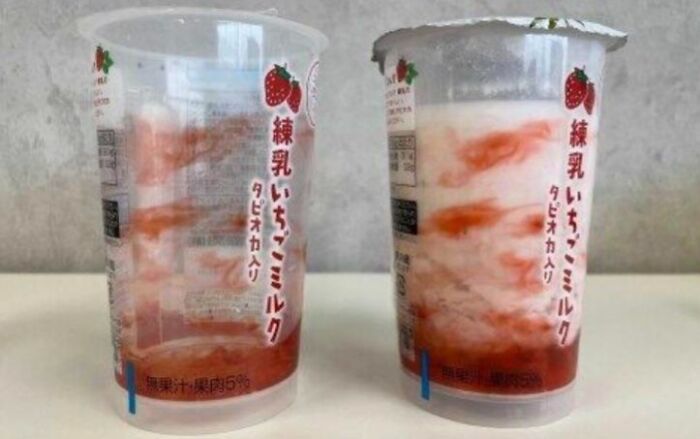
    Cup Design That Makes The Drink Look Like It Has Actual Fruit

    A clear plastic cup next to one printed with fake strawberry graphics as terrible product design

    St-Paerikus Report

    #5

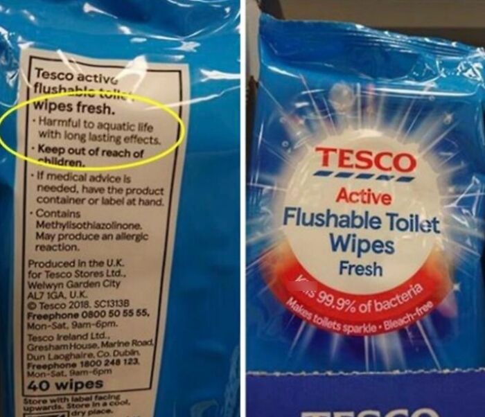
    Labelling Wipes That Are Toxic For Aquatic Life And Non-Degradable As ‘Flushable’

    Tesco flushable toilet wipes with a warning label saying harmful to aquatic life, a terrible product design.

    Joe__Soap Report

    BarkingSquirell
    Community Member
    54 minutes ago Created by potrace 1.15, written by Peter Selinger 2001-2017

    Everyone knows to not flush wet wipes (I hope.)

    View more comments
    ADVERTISEMENT
    #6

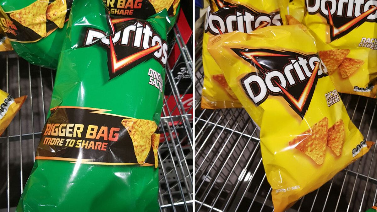
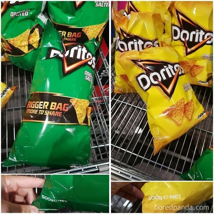
    Both Weigh 500g But The Green One Is In A 30% "Bigger Bag More To Share"

    A 500g green Doritos bag labeled as a bigger share bag next to a normal yellow one, showing terrible product design.

    AApickleAA Report

    ADVERTISEMENT

    The most important element of any product is its visual appeal because it shapes a consumer’s first impression, builds trust, and communicates the brand's identity. That’s why innovators should focus on layout, colors, and typography, as that can draw people in at first glance.

    Another essential part of product design is its functionality, which demonstrates how well it works. Every invention should be intuitive, reliable, efficient, and smooth to use, or customers might not want to try it again. That’s why designers need to spend a lot of time researching, prototyping, and testing every bit of the item before rolling it out to the public.

    #7

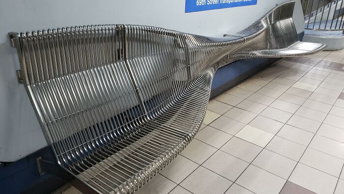
    Designed For Dissuading The Homeless. Literally Just Uncomfortable For Everyone Else

    Uncomfortable wavy metal bench at a transit station illustrating Terrible Product Design

    Machdame Report

    #8

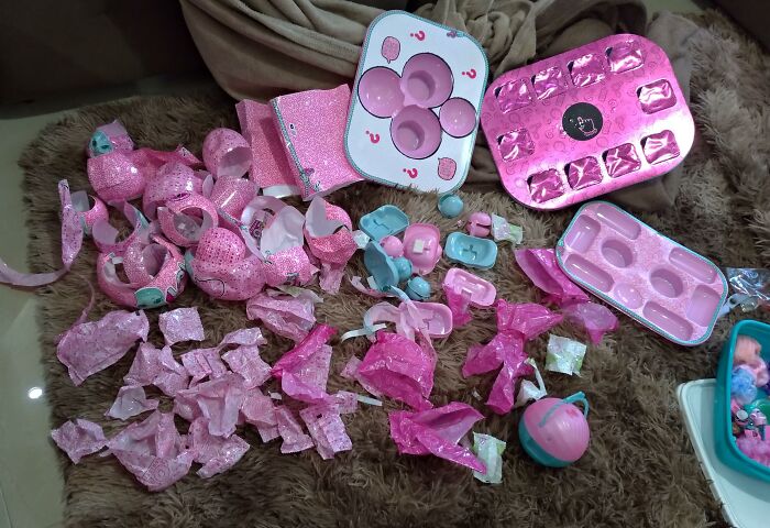
    The Amount Of "Disposable" Plastic That Comes In A Toy Case With 4 Dolls.

    Massive pile of plastic trash from toy packaging, showing terrible product design

    [deleted] Report

    ADVERTISEMENT
    #9

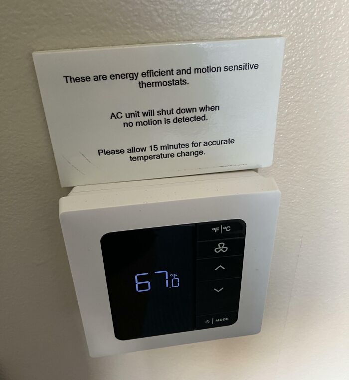
    This Hotel Thermostat Turns Off The AC When No Motion Is Detected. Guess What I Am Not Doing When Sleeping?

    A motion-sensitive thermostat displaying 67 degrees with an irritating sign as an example of terrible product design

    StellarSloth Report

    Toni Ahlgren
    Community Member
    36 minutes ago Created by potrace 1.15, written by Peter Selinger 2001-2017

    There's no concept of AC where we come from. When traveling we would never sleep with the AC on, that would just get us sick. We only have the AC on full blast 30 mins before going to bed. All good.

    ADVERTISEMENT

    Good product design is about creating things that are usable and delight consumers. People need to keep coming back to the invention, either because it's intriguing or because it's easy to use. That’s why UX and UI researchers spend a lot of time on trials and tests, or else they might end up with something atrocious.

    According to Cambridge Design Technology, a good product should empathize with the user’s needs and solve their problems in an uncomplicated way. A good example is when Coca-Cola changed its smooth bottle to one with contours so people could grip it better, and it also looked aesthetically pleasing.

    #10

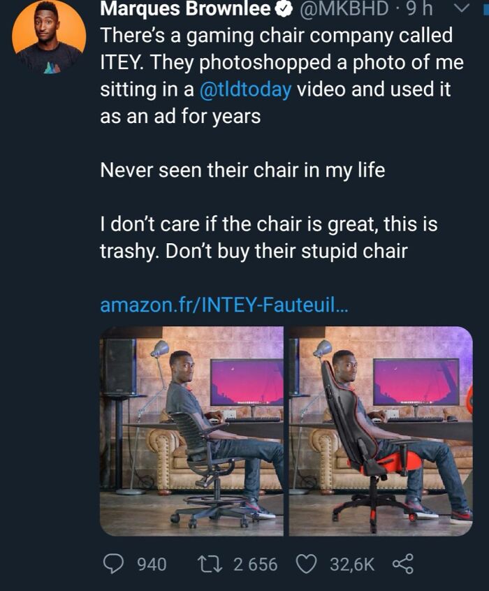
    Trashy Company

    A Tweet by Marques Brownlee exposing a company that photoshopped him into their chair, showing terrible product design.

    Smartix04 Report

    ADVERTISEMENT
    #11

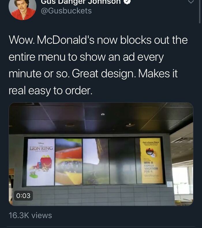
    This Mcdonalds Menu

    A Tweet criticizing McDonald's digital menu boards for replacing food choices with ads as a terrible product design.

    SkepticHQ Report

    BarkingSquirell
    Community Member
    48 minutes ago Created by potrace 1.15, written by Peter Selinger 2001-2017

    We've got 4 businesses within a short block of each other that are now doing the same thing.

    View more comments
    #12

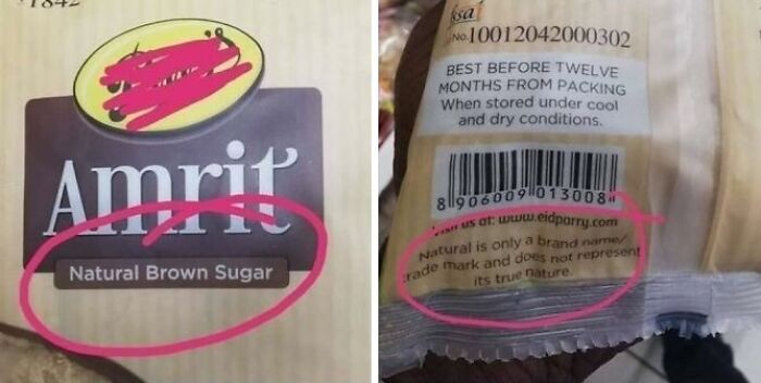
    Natural My Foot

    Product packaging of brown sugar illustrating terrible product design with deceptive marketing

    93arkhanov93 Report

    Kira Okah
    Community Member
    20 minutes ago Created by potrace 1.15, written by Peter Selinger 2001-2017

    Natural is not a regulated term in India, whee this product is from, or in most of the world. It's presence on a product is meaningless, just like the amount of shock I get when this is the fifth(?) time that bp have posted this same image.

    The world is full of amazing products that have been adapted and reinvented to keep fulfilling consumers' needs. According to Analogy, a hardware design studio, a classic example is the Heinz Ketchup bottle, which used to be heavy and resulted in messy, slow pours.

    ADVERTISEMENT

    Eventually, many frustrated customers pushed the company to change the packaging to an upside-down squeeze bottle that let the ketchup come out faster and more smoothly. This simple change let gravity do the work, so users didn't have to do more to get what they wanted.

    #13

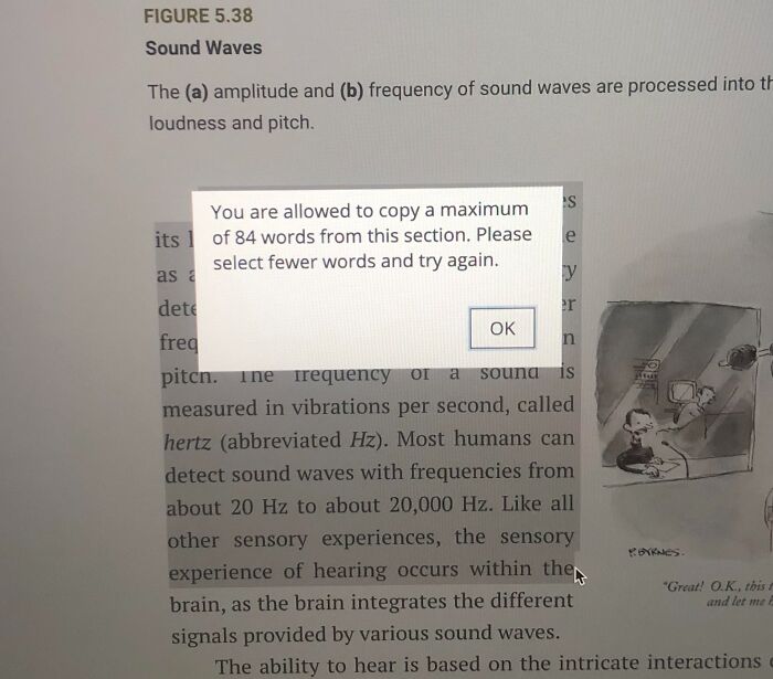
    My $200 Textbook Won’t Let Me Copy Paste More Then 84 Words To Make A Study Guide

    An e-textbook popup restricting text copying to a maximum of 84 words, showing terrible product design.

    [deleted] Report

    BarkingSquirell
    Community Member
    45 minutes ago Created by potrace 1.15, written by Peter Selinger 2001-2017

    Could just do it the old-fashioned, continuous way.

    ADVERTISEMENT
    #14

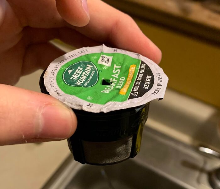
    Keurig Sensor Blocks Your Brew Unless It's "K-Cup Compatible", AKA Has Scannable Foil. Slap On An Old Foil To A 3rd Party Cup And Suddenly No Issue

    A coffee pod with a small filter basket, highlighting terrible product design

    OfficialUNESCO Report

    #15

    The Packaging Of This Drink

    Double-walled cup design where the inner cup slips out, showing terrible product design

    B_ugz Report

    Kira Okah
    Community Member
    15 minutes ago Created by potrace 1.15, written by Peter Selinger 2001-2017

    This makes more sense when watching the actual video on the OP.

    View more comments

    Sometimes the smallest changes lead to the best product design, and Dyson understood this, which is why they completely changed their vacuum bags. Their founder realized the machine’s suction weakened as the dust bag filled, so he set out to fix it.

    Instead of changing the bags, Dyson created 5,127 prototypes and eventually decided to remove the receptacle completely. Instead, the company began using cyclone technology that separated dirt without blocking airflow, and that redesign completely changed the consumer experience.

    Never miss a story that brings joy to the world. Add us on Google

    #16

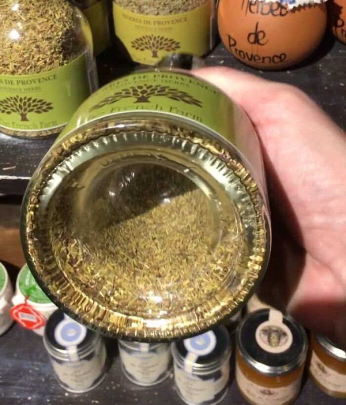
    Nice, Big Bottle Of Herbs Of Prov... Whaaa?

    Spice jar with an excessively recessed bottom showcasing terrible product design

    JohnRFL Report

    ADVERTISEMENT
    ADVERTISEMENT
    #17

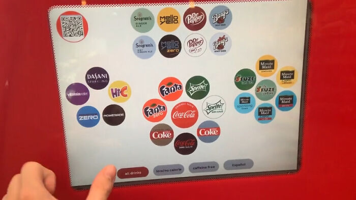
    Making You Buy A Coca-Cola Product By Hiding The Water

    Confusing beverage dispenser screen layout showing Terrible Product Design

    downvoteforwhy Report

    PenguinEmp
    Community Member
    24 minutes ago Created by potrace 1.15, written by Peter Selinger 2001-2017

    Must be American. Our machines have a dedicated water button on the machine not the screen.

    #18

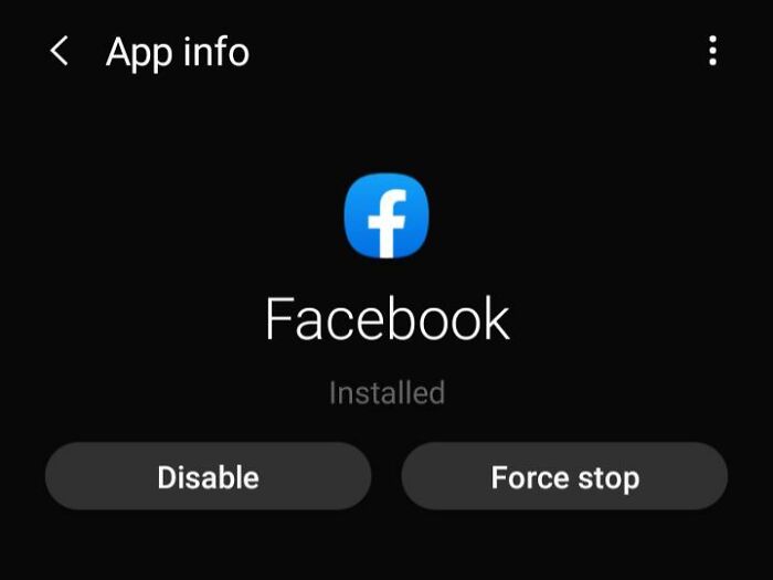
    The Fact That I Can't Uninstall Facebook

    Terrible Product Design showing preinstalled Facebook app that can only be disabled

    [deleted] Report

    Ace
    Community Member
    Premium
    1 minute ago Created by potrace 1.15, written by Peter Selinger 2001-2017

    Phone provided by network operator as part of package? Still, at least you can disable it, so it's just a bit of storage it's taking up. More common with some of the google products on Android phones, the Chrome browser, for example, which I refuse to use.

    When it comes to perfecting a product, it’s important to forget the old saying ‘don’t judge a book by its cover.’ According to Tekglide, a consulting firm, people almost always choose a digital or physical item based on its appearance, which is why designers need to make sure consumers are drawn to their inventions. 

    The best way to do this is to use clean, neat elements that help people feel calm and intrigued. Too much messiness or chaos can feel overwhelming, so even with fonts and colors, designers should opt for sleek, streamlined ideas. People also respond well to simple elements or drawings rather than products with walls of text.

    ADVERTISEMENT
    #19

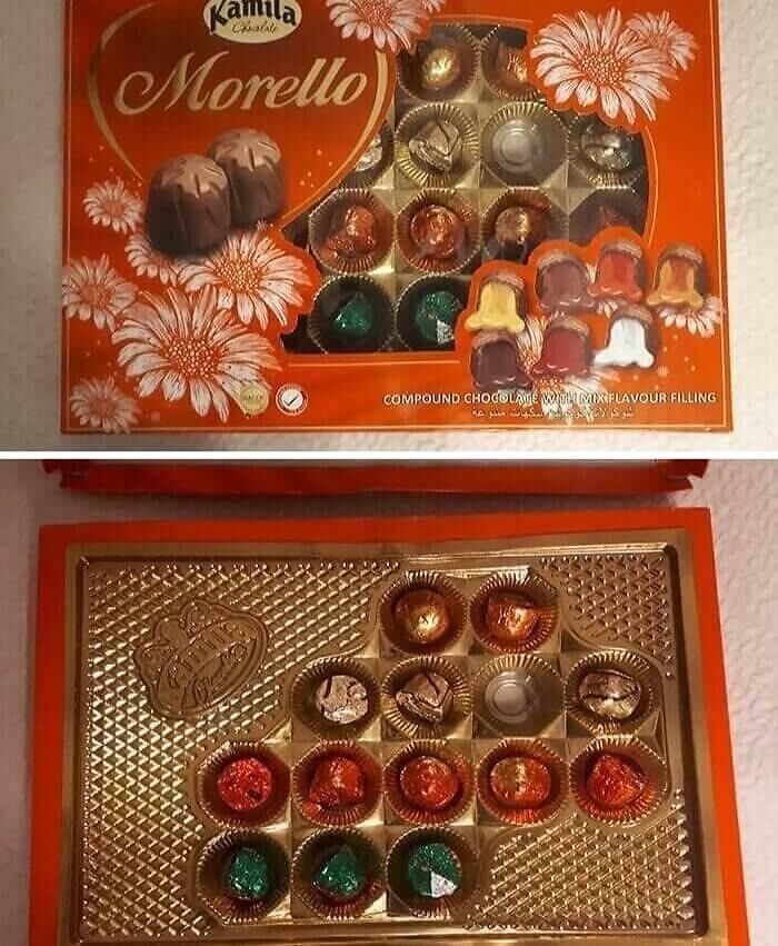
    Arguably The Most Infuriatingly Designed Chocolate Boxes

    A chocolate box with hidden empty spaces under packaging, showing terrible product design.

    TheGrandHydra Report

    #20

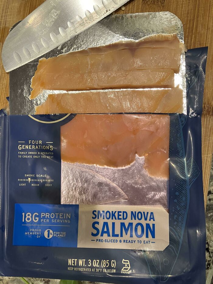
    Transparent Salmon Package Tinted Pink

    A package of smoked salmon with deceptive packaging showing very few actual slices of fish.

    Solenkata Report

    ADVERTISEMENT
    #21

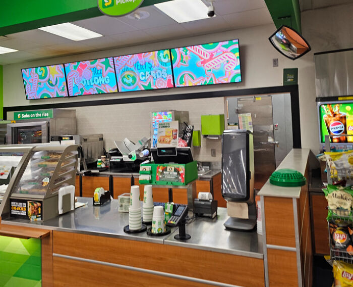
    Completely Covering Your Only Menu With Ads

    Subway counter with out-of-order menu screens showing colorful graphics, demonstrating terrible product design

    Mr_Impossibro Report

    BarkingSquirell
    Community Member
    39 minutes ago Created by potrace 1.15, written by Peter Selinger 2001-2017

    Duplicate, but worth mentioning twice.

    As you may have noticed from this list, some designers expect consumers to roll with the punches and accept the weirdest ideas ever. Unfortunately, this attitude won’t work in the long run because people want smooth, efficient, quick-working inventions.

    Anything that makes an individual’s day better without requiring many steps is exactly what they’ll choose over anything flashy. With digital products especially, designers need to make sure their invention works on any device without lag, or users will drop like flies.

    ADVERTISEMENT
    #22

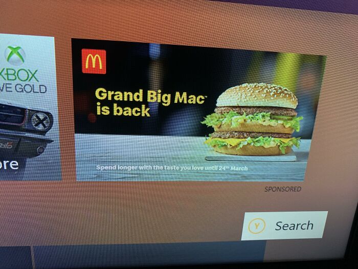
    I Love Ads On My £250 Console That I Continue To Pay £6 A Month To Play On

    An Xbox interface showing a large McDonald's advertisement as a terrible product design example.

    TS_Optics Report

    BarkingSquirell
    Community Member
    40 minutes ago Created by potrace 1.15, written by Peter Selinger 2001-2017

    I accepted Netflix with ads due to the price differential. They are almost all provincial gambling ads.

    #23

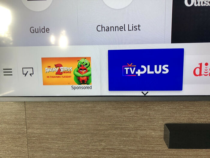
    Unremovable Ads On My $2,500 Samsung Smart TV

    An ad for Angry Birds on a smart TV dashboard, showing a terrible product design with unwanted ads in the UI.

    BrownLandlord Report

    #24

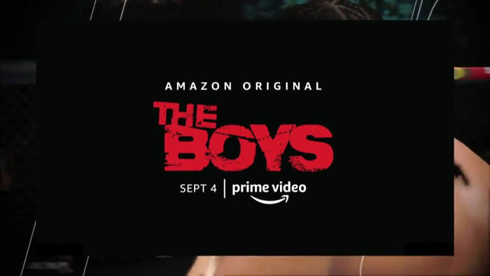
    Ea Decided To Add Full-On Commercials In The Middle Of Gameplay In A $60 Game A Month After It's Release So It Wasn't Talked About In Reviews

    An ad for The Boys on Amazon Prime, an example of terrible product design with intrusive advertisements.

    Ydino Report

    B.F. Gibb
    Community Member
    46 minutes ago Created by potrace 1.15, written by Peter Selinger 2001-2017

    Advertising everywhere is driving me bonkers. There's only so much we can consume, and frankly I actively avoid products whose ads a*****t my senses enough. Fück you capitalism.

    View more comments
    ADVERTISEMENT

    A major part of good product design is accessibility, which means an item should be made with different types of people and their capabilities in mind. For digital products, inventors need to consider font size, contrasting colors so nothing fades into the background, and adjustable text.

    Physical products should be easy to manage, hold, and use, not complicated or bulky. The best way for designers to assess an item's accessibility is to run multiple tests with a variety of people and keep making prototypes until something fits.

    ADVERTISEMENT
    #25

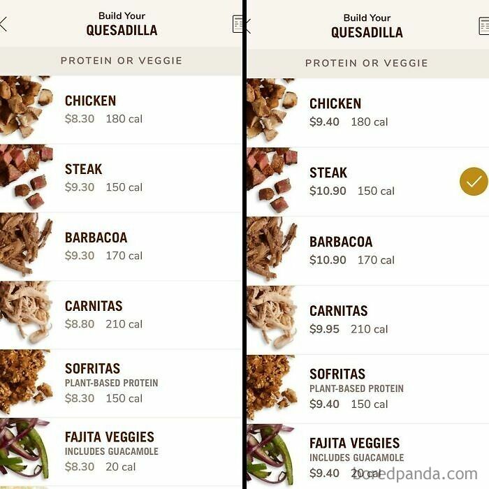
    Chipotle Goes All-Out Advertising That For The Next Week Delivery Is Free, And Then Casually Makes The Delivery Menu Priced Higher Than The Regular One

    Side by side price comparison of building a quesadilla, a terrible product design that increases the price for the same food.

    Arucious Report

    #26

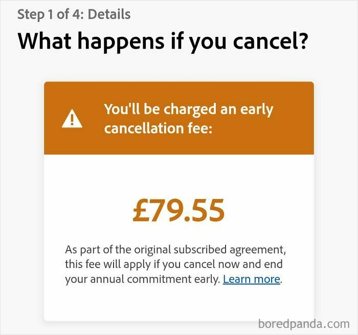
    It Was A Free Trial Plan

    Adobe subscription cancellation screen displaying a costly early cancellation fee of 79.55 pounds.

    overthinkingit91 Report

    #27

    My Age Preferences Are There For A Reason, Tinder

    A Tinder notification stating they expanded user preferences without consent, demonstrating terrible product design.

    AppleSlize Report

    Being a designer isn’t easy, but it can be fulfilling if you make a product everybody likes. Unfortunately, some inventors are so chaotic they might be playing tricks on people with terrible products, as you can see in the photos in this list.

    If you’ve ever come across something that’s been horribly designed, we’d love to see it. So please share your photos and experiences so we can all know what to avoid.

    ADVERTISEMENT
    ADVERTISEMENT
    #28

    Felt Like This Sub Would Appreciate This Statement

    A tweet criticizing user interfaces that change NO to Maybe Later, illustrating terrible product design.

    the_gaming_princess Report

    #29

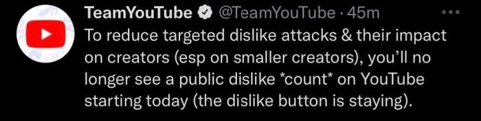
    Dislikes Helped You Know If A Video Was A Scam, Misleading Or Had False Information

    Twitter screenshot of TeamYouTube announcing the removal of public dislike counts, a terrible product design

    LeuxD Report

    Kira Okah
    Community Member
    1 minute ago Created by potrace 1.15, written by Peter Selinger 2001-2017

    And browser addons can show that number, so it is still possible to see how badly Disney slop remakes get ratioed.

    #30

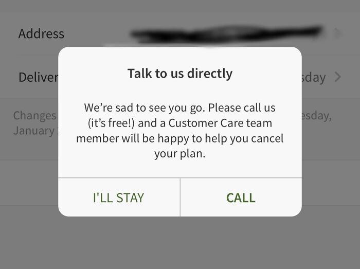
    Hellofresh. If I Don’t Need To Call To Make Orders, I Shouldn’t Need To Call To Unsubscribe

    A subscription cancellation screen with a dark pattern, showing terrible product design

    goldollazz Report

    Lily bloom
    Community Member
    30 minutes ago Created by potrace 1.15, written by Peter Selinger 2001-2017

    It's annoying but if you call and just say you want to cancel because you simply can't afford it (even if you can) they realize pretty quickly they aren't getting a commission on your call and will cancel your plan easily

    #31

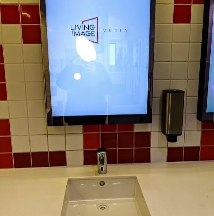
    They Replaced Half The Mirrors In My Local Shopping Mall's Bathroom With Advertising Boards!

    A mirror with a bright screen in the middle, an example of terrible product design

    BradleyZ17 Report

    ADVERTISEMENT
    ADVERTISEMENT
    #32

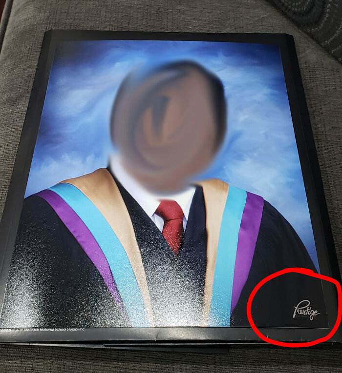
    I Paid $55 To Remove The Company Watermark They Put On The Face, Just To Have Them Put Their Logo On The Printed Copy

    A graduation portrait with a misplaced company logo showing terrible product design

    EightBitMemory Report

    #33

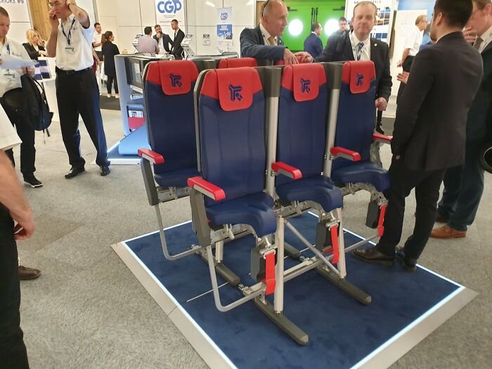
    Literal Hell For Budget Flyers.(Standing Seats)

    Extremely narrow and cramped prototype airplane seats as a terrible product design example

    DistinctScene0 Report

    Kira Okah
    Community Member
    1 minute ago Created by potrace 1.15, written by Peter Selinger 2001-2017

    This is an unapproved concept, tat quite likely won't be approved given tat the design is against most aviation laws in the world.

    View more comments
    #34

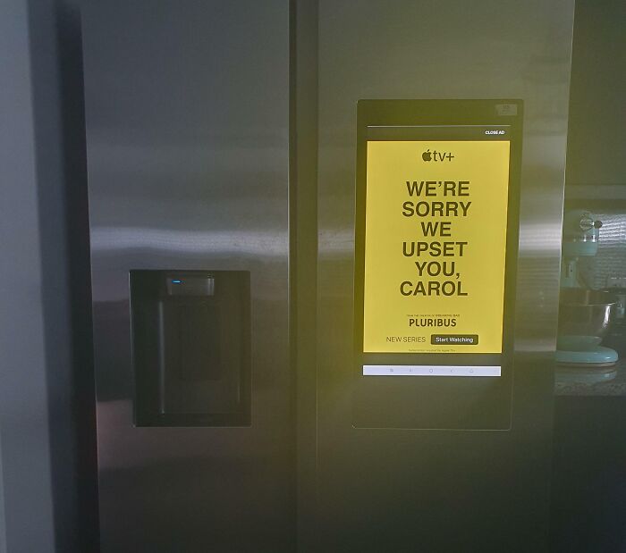
    Apparently My Samsung Fridge Has Ads Now

    Smart refrigerator screen displaying intrusive advertisement illustrating terrible product design

    Shellnanigans Report

    Kira Okah
    Community Member
    1 minute ago Created by potrace 1.15, written by Peter Selinger 2001-2017

    Isn't this is the fridge advert that caused someone to be hospitalised?

    #35

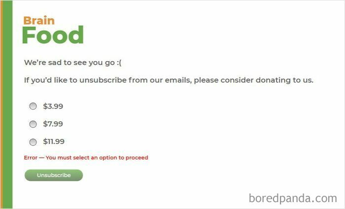
    You Have To Pay To Unsubscribe From This Terrible Company

    Terrible Product Design newsletter requiring a donation to unsubscribe

    3-141592653589793239 Report

    BarkingSquirell
    Community Member
    45 minutes ago Created by potrace 1.15, written by Peter Selinger 2001-2017

    I am becoming more disturbed as I read. It's my own fault for thinking society isn't going to h@ll in a hand basket.

    View more comments
    ADVERTISEMENT
    ADVERTISEMENT
    #36

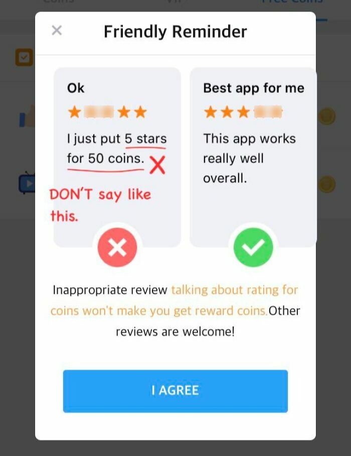
    Ok This Is Really Funny

    Terrible Product Design example of an app popup demanding high ratings for coins

    that-one-redditer Report

    Lily bloom
    Community Member
    26 minutes ago Created by potrace 1.15, written by Peter Selinger 2001-2017

    Why are stars 2 & 3 censored? New terribly offensive 2~3 reference I'm unaware of?

    #37

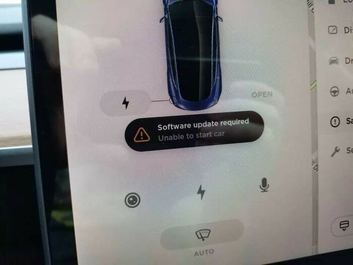
    I Firmly Believe That Tesla Is Anything But Jerks, And Can Even Think Of A Couple Of Reasons Why They Added This Feature

    A car screen displaying a software update required warning that prevents starting, a terrible product design

    HipstaBarista Report

    #38

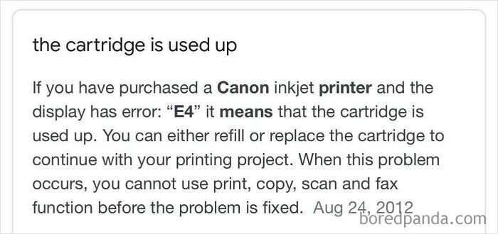
    Canon Inkjet Printer Doesn’t Allow You To Scan Papers When The Ink Cartridges Run Out

    A screenshot explaining that a Canon printer blocks scanning functions when ink is low, a terrible product design

    z197655 Report

    BarkingSquirell
    Community Member
    36 minutes ago Created by potrace 1.15, written by Peter Selinger 2001-2017

    Well, it is after all a "print"er.

    #39

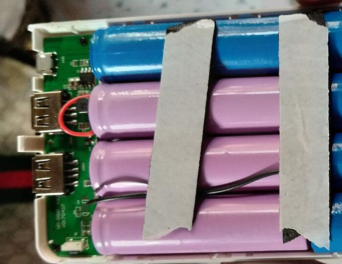
    My Brother Bought A 20000mah Powerbank It Couldn't Fully Charge His Phone So My Mom Opened The Powerbank And They Found This... Only 3 Batteries Are Connected To The Powerbank And The Rest Are Dummies

    A power bank opened to show batteries taped together, a terrible product design safety hazard

    Silent_Death96 Report

    ADVERTISEMENT
    ADVERTISEMENT
    #40

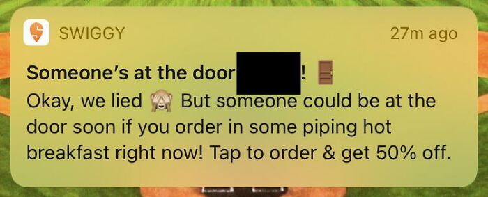
    Food Delivery Service That Tells You “Someone Is At The Door! Okay We Lied 🙈”

    A misleading notification from a delivery app, an example of terrible product design

    [deleted] Report

    #41

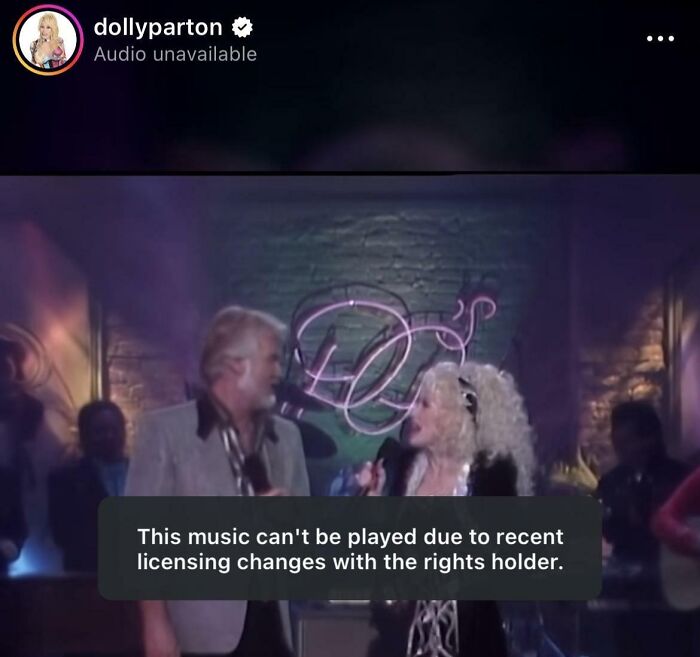
    Dolly Parton’s Instagram Page The Day After Her Passing

    A Dolly Parton music video blocked by licensing issues on social media, showing terrible product design.

    MiddleAgeWeirdoMeep Report

    #42

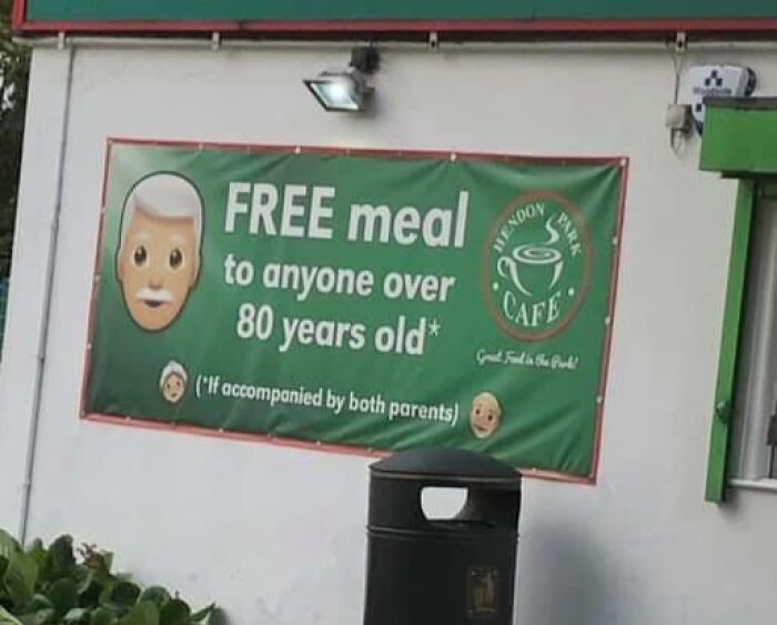
    Such A Great Deal!

    Cafe banner offering free meals with unrealistic terms, showing terrible product design.

    Guevarra25 Report

    #43

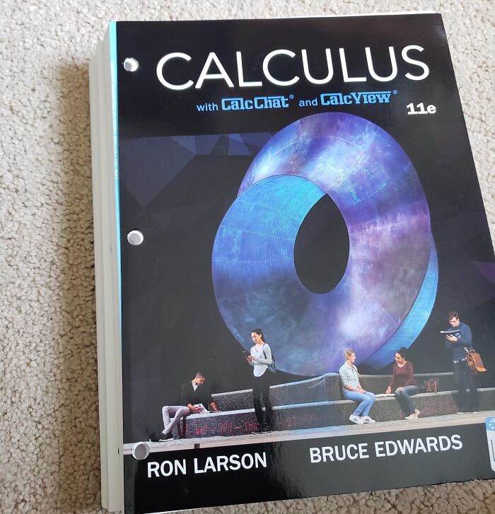
    Spending $175 On A Textbook Only To Receive A 2 Inch Stack Of Unbound Papers. Binder Sold Separately!

    A calculus textbook with pre-punched binder holes that cut right through printed text, showing terrible product design

    FrenchiToasti Report

    ADVERTISEMENT
    ADVERTISEMENT
    #44

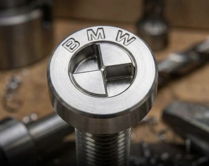
    Bmw New Patented Screw-Head Designed To Limit Repairs To Authorized Dealers And Prevent Independent Servicing

    A patented BMW roundel-shaped s***w head designed to stop self-repair, a terrible product design example

    jaapgrolleman Report

    Forrest Hobbs
    Community Member
    10 minutes ago Created by potrace 1.15, written by Peter Selinger 2001-2017

    Er, there have been an awful lot of s***w and bolt head designs intended to prevent things being undone. This sort of thing isn't even slightly new. Sometimes, the intention is perfectly legitimate. For example, it would have been a good idea to fit such fasteners to Comstar and Astralite motorcycle wheels, just to make sure no-one ever did try to take them apart. (what am I on about? Link follows, for the curious)

    View more comments
    #45

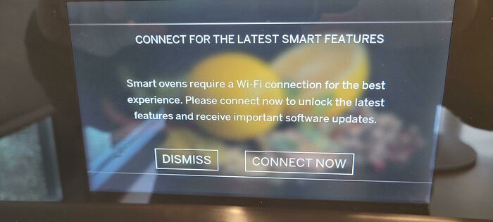
    Oven Air Fryer Function Refuses To Work Without WiFi Connection. Ge Profile Pts700sn. Do Not Buy

    A smart oven display requiring a Wi-Fi connection, demonstrating terrible product design

    Firree Report

    #46

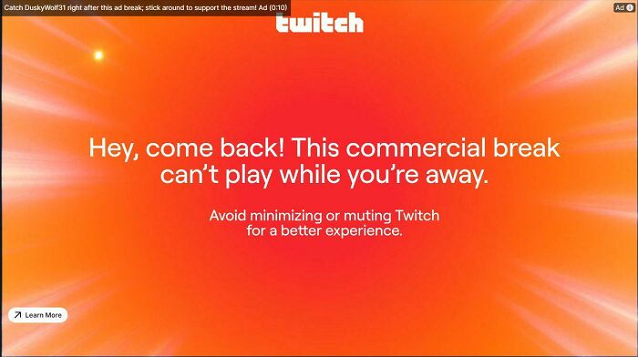
    Twitch Will Now Pause Ads When Switching Tabs

    An annoying Twitch ad pause message showing terrible product design

    LuckyDiamondGaming Report

    #47

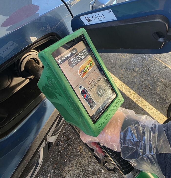
    We Can't Even Pump Fuel Anymore Without Holding A Digital Billboard (Netherlands)

    A gas pump with a built-in advertisement displaying terrible product design

    gaius_julius_caegull Report

    ADVERTISEMENT
    ADVERTISEMENT
    #48

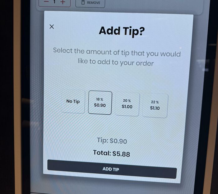
    Self Checkout In The Airport Prompts You For A Tip

    An order summary screen showing a forced tip prompt for a single bottle of water.

    theWet_Bandits Report

    BarkingSquirell
    Community Member
    35 minutes ago Created by potrace 1.15, written by Peter Selinger 2001-2017

    I hate this forced tipping that is plaguing our nation.

    #49

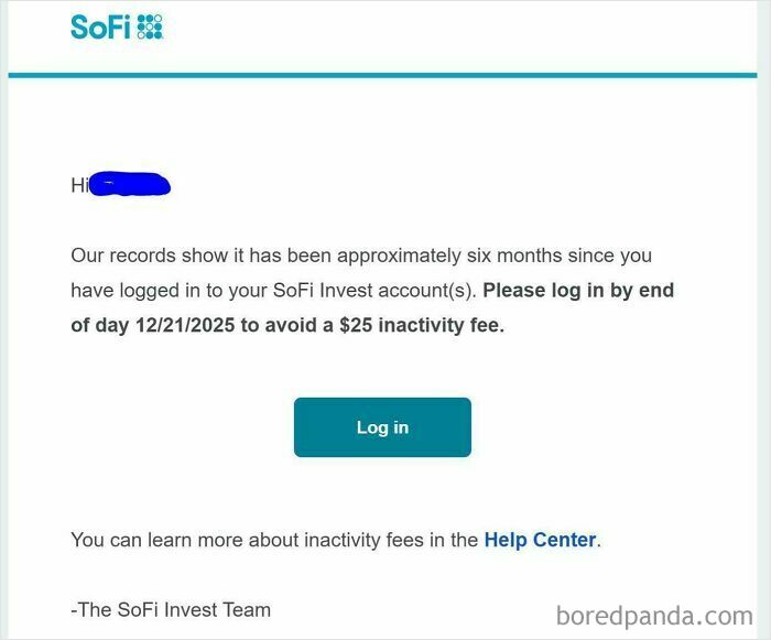
    I Canceled My Account Immediately After Getting This Email

    A SoFi email notification showing terrible product design with inactivity fees

    edhuge Report

    #50

    No Duolingo, You May Not Put An Ad For Your Subscription On My Lock Screen

    A smartphone lockscreen with an annoying ad, a terrible product design example.

    Odog0001 Report

    #51

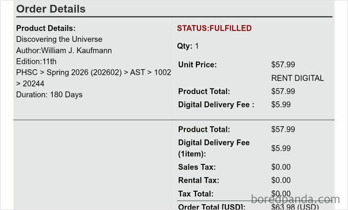
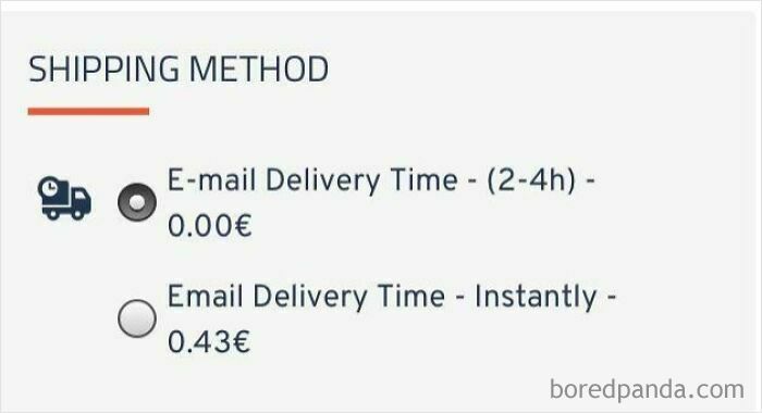
    Paying A “Digital Delivery Fee” For A Rented Pdf Textbook 🤨

    An online order checkout receipt charging a digital delivery fee for a rental, showing terrible product design

    Afton_0077 Report

    ADVERTISEMENT
    ADVERTISEMENT
    #52

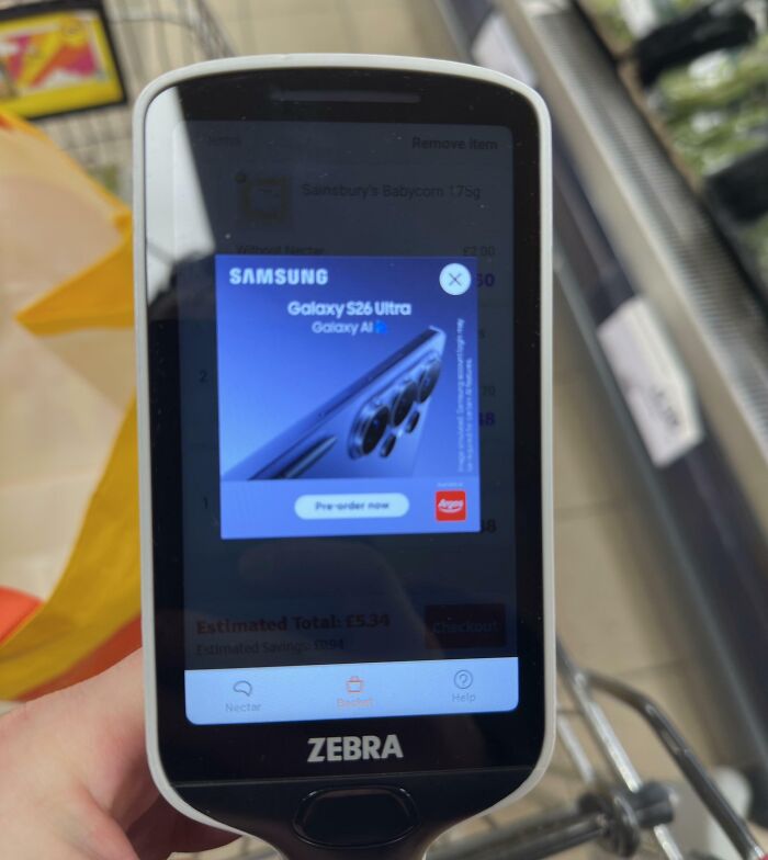
    Advert While Scanning

    A handheld scanner showing a Samsung ad, a terrible product design that disrupts shopping

    indeclin3 Report

    #53

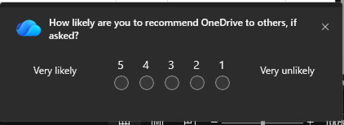
    Microsoft Reveresed The Scale To Catch Users Instinctively Clicking Left For A Low Rating

    Confusing rating scale from five to one, an example of terrible product design

    distracted6 Report

    #54

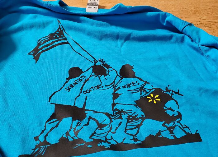
    Walmart Employee Here. We Were Given These Shirts Today. Walmart Profits Billions Off Of This Pandemic, Then Compares Their Sacrifice To Ww2 Veterans

    A bright blue shirt with a terrible product design that features a Walmart logo next to doctors, scientists, and nurses.

    TehAwkwardOne Report

    #55

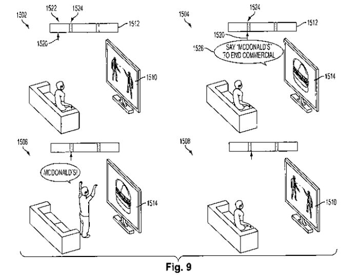
    Sony Was Granted A Patent To Make A TV That Will Only Stop Showing A Commercial Once You Stand Up And Say The Brand Name Out Loud

    A patent diagram displaying a terrible product design that requires shouting brand names at the TV

    [deleted] Report

    ADVERTISEMENT
    ADVERTISEMENT
    #56

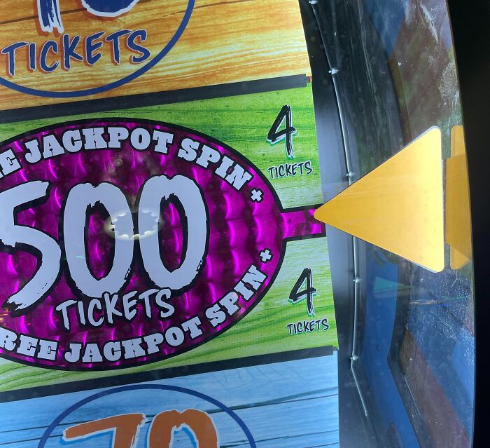
    Dave & Busters Spin Game Landed On The 500 And It Only Gave Me 4 Tickets. Showed To Manager And Said It Needed To Be In The Middle

    An arcade spin game showing a terrible product design where the pointer misses the win slot

    Dohello Report

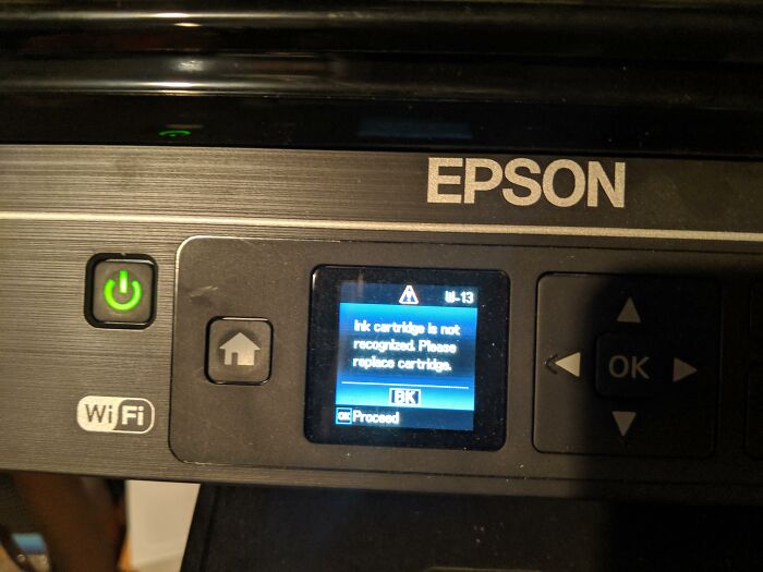
    #58

    My Printer Just Did A Firmware Update And No Longer Recognizes My Third-Party Ink

    Epson printer screen showing an unrecognized ink cartridge error, a terrible product design

    sumofty Report

    #59

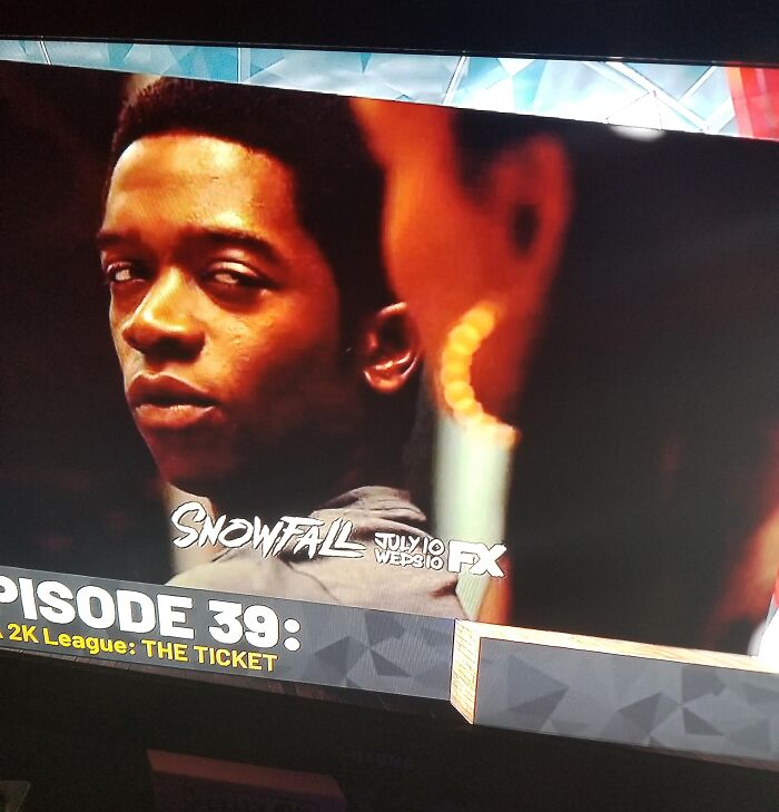
    2k19 Is A Retail 60$ Game. They Put Non Skippable Ads In From Another Company

    TV screen showing show information blocking the actors face, a terrible product design

    Bulletz4Brkfzt Report

    ADVERTISEMENT
    ADVERTISEMENT
    #60

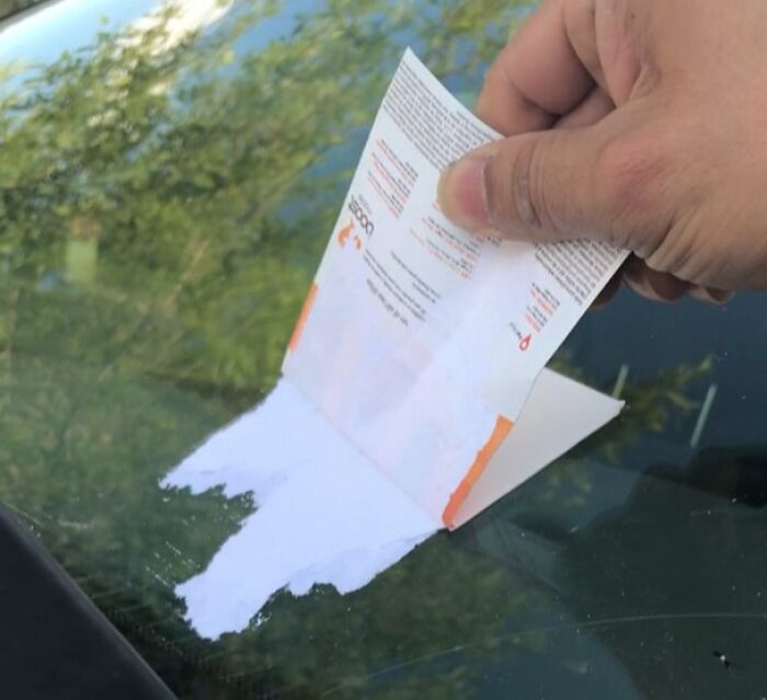
    Phone Ad That Was Glued To Our Car

    Adhesive parking notice tearing and leaving paper residue on a windshield

    _tonebalone_ Report

    #61

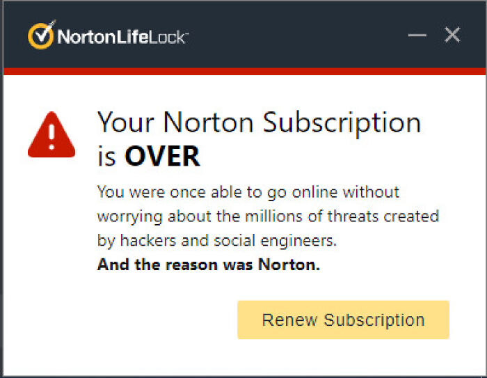
    Norton Security After Canceling Subscription

    Norton subscription pop-up with confusing wording, a clear example of terrible product design.

    DerpDuck2233 Report

    BarkingSquirell
    Community Member
    35 minutes ago Created by potrace 1.15, written by Peter Selinger 2001-2017

    I've got some sort of McAfee lesser virus which constantly pops up in BP. Tried removing it by deleting the *exe file to no avail. Pandas?

    #62

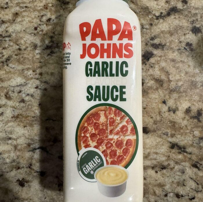
    This Packaging Gotta Be Illegal, Right?

    A bottle of Papa Johns Garlic Sauce that has a terrible product design because the bottle cannot stand upside down

    LilBozgor01 Report

    #63

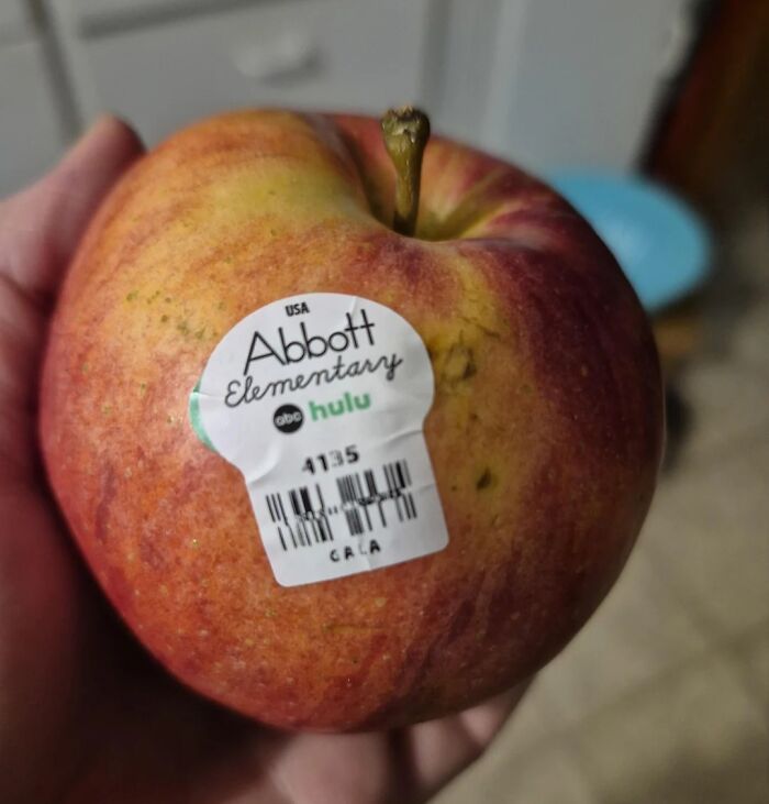
    I Guess Apples Have Advertisements On Them Now

    An apple with an advertising sticker on it showing a terrible product design that ruins the fruit

    Acceptable_Let_215 Report

    BarkingSquirell
    Community Member
    45 minutes ago Created by potrace 1.15, written by Peter Selinger 2001-2017

    Maybe a nice teacher will get a polished apple tomorrow.

    ADVERTISEMENT
    ADVERTISEMENT
    #64

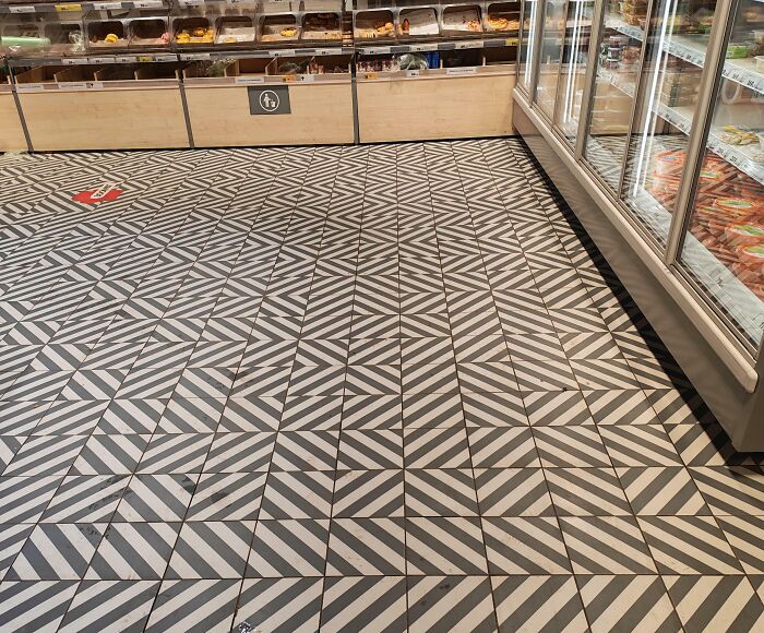
    This Black Lodge Ass Floor Tiling That Supermarkets In My City Have Now

    A confusing supermarket floor pattern showcasing terrible product design

    backroom_mushroom Report

    Lily bloom
    Community Member
    23 minutes ago Created by potrace 1.15, written by Peter Selinger 2001-2017

    Oh my. BP! My virgin eyes are burning. BURNING i say!

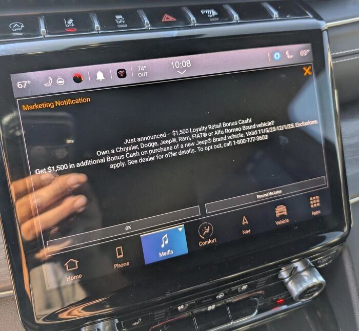
    #65

    My Car Is Getting Advertisements Now?

    A car dashboard display showing an unwanted marketing notification as terrible product design.

    Acceptable_Let_215 Report

    Lily bloom
    Community Member
    21 minutes ago Created by potrace 1.15, written by Peter Selinger 2001-2017

    I have a car! I don't need another car! I'm already driving this car!

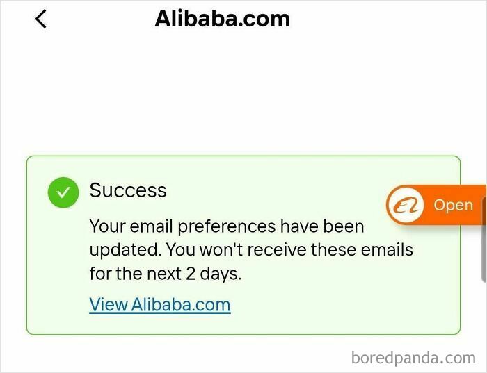
    #66

    Unsubscribe Button Only Pauses Emails For 2 Days

    A notification from Alibaba saying email preferences are paused for only 2 days, a terrible product design

    yashvone Report

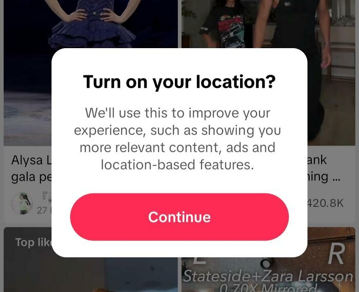
    #67

    Some TikTok Searches Trigger A Location Pop-Up That Cannot Be Closed, Only Accepted

    A mobile app popup asking to turn on location, an example of terrible product design for user privacy

    ChaoticRaccoon Report

    BarkingSquirell
    Community Member
    35 minutes ago Created by potrace 1.15, written by Peter Selinger 2001-2017

    I move on to another site that doesn't demand my location.

    ADVERTISEMENT
    ADVERTISEMENT
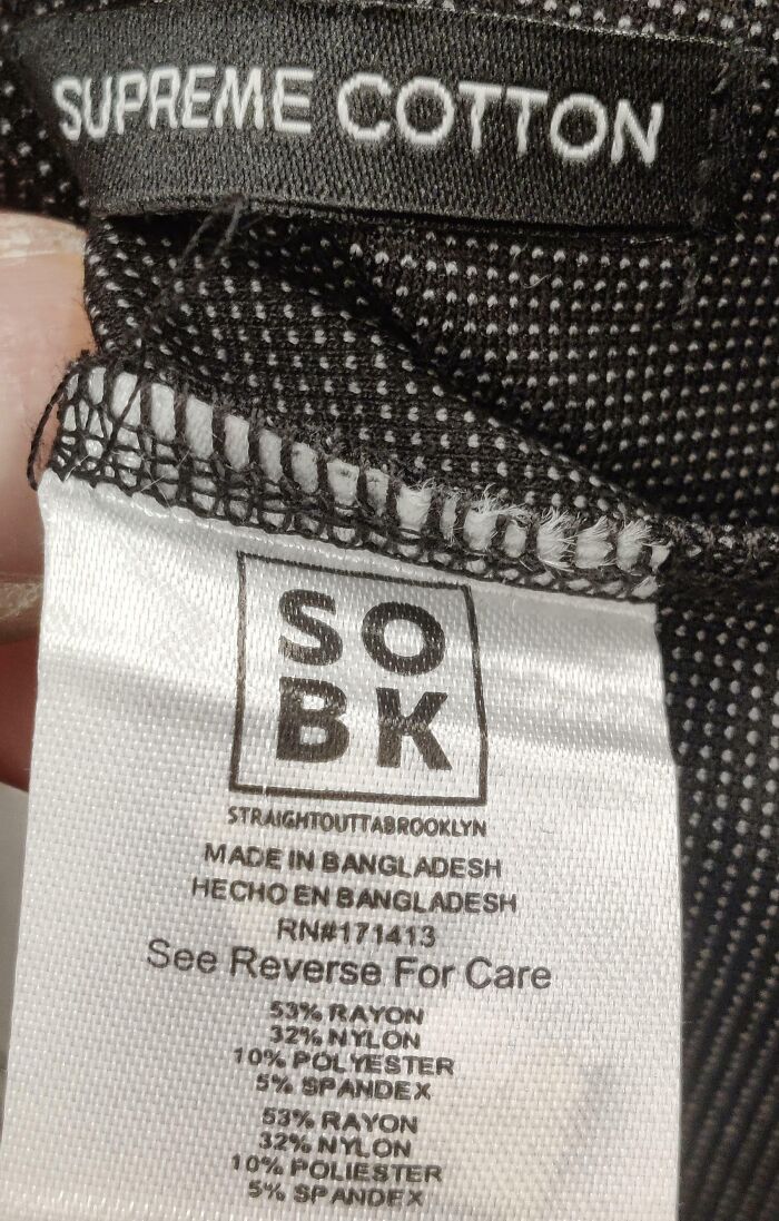
    #68

    States "Supreme Cotton" But Has Zero Cotton

    A clothing label marked Supreme Cotton made of rayon and polyester, showing terrible product design

    mildishclambino Report

    #69

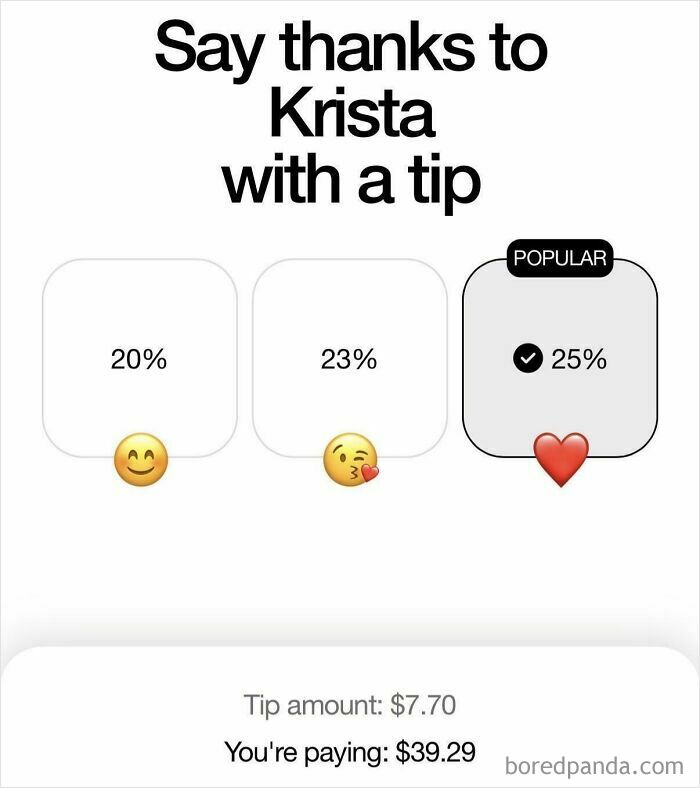
    Minimum 20% Tip And You Don’t Bring Me The Bill

    An app tipping interface with high default percentages and manipulative emojis, illustrating terrible product design.

    MyNameIsNotSurely Report

    #70

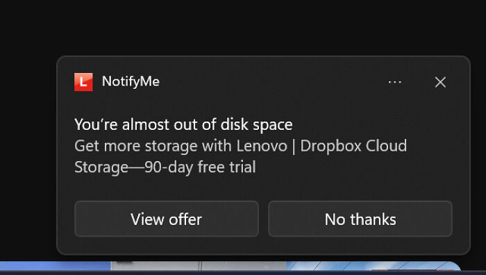
    Lenovo Falsely Tells Users They're Almost Out Of Storage To Get Them To Click The Notification For A Dropbox Ad

    An annoying low disk space notification promoting cloud storage, highlighting terrible product design.

    ObjectiveOk2072 Report

    #71

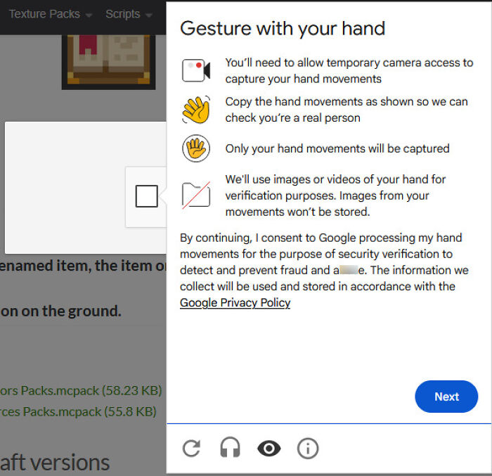
    For Some Recaptchas You Need To Have To Camera To Gesture Your Hand To Complete

    A verification screen asking for camera access to capture hand gestures, showcasing terrible product design.

    Aosoi Report

    Lily bloom
    Community Member
    15 minutes ago Created by potrace 1.15, written by Peter Selinger 2001-2017

    This will not go well when AI suggests offensive gestures to mimic

    ADVERTISEMENT
    ADVERTISEMENT
    #72

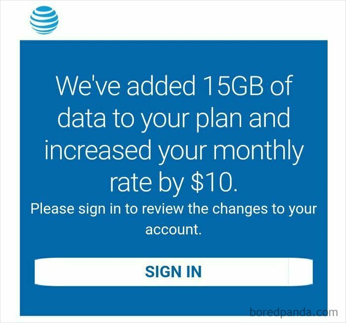
    Yesterday It Is Announced At$t Got Hit With A $60 Million Fine. Today I Get This On My Account

    Screenshot of an AT&T notification auto-adding data and charging more, a terrible product design

    _bennyblanco99_ Report

    B.F. Gibb
    Community Member
    45 minutes ago Created by potrace 1.15, written by Peter Selinger 2001-2017

    I use under 10 GB of data per month. I don't *need* that much.

    #73

    Does This Go Here? It Feels Like A Jerk Move
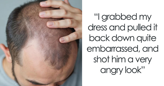
    Mobile game mission screen requiring a real money purchase to progress, showing terrible product design.
    datboy-pissedhimself Report

    #74

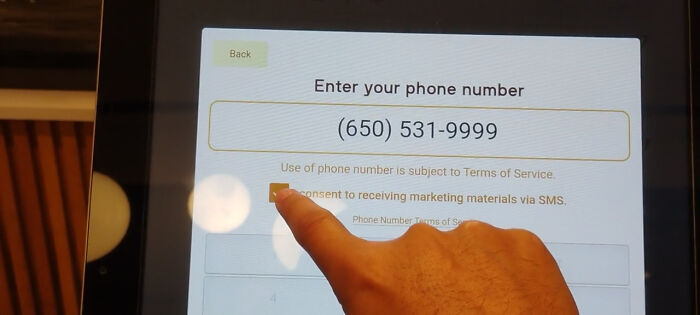
    Can't Order Food Without Accepting To Receive "Marketing Materials"

    An on-screen prompt requiring SMS marketing consent to proceed, an example of terrible product design.

    shekomaru Report