ADVERTISEMENT
Article created by: Monika Pašukonytė

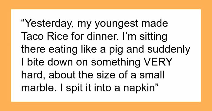
How many times, looking, for example, at the logos of Nike, Adidas or Apple, have we asked ourselves just one question: “Well, couldn’t we have drawn such a simple logo ourselves?” If yes, then let's move on reading. If not, we still move on. How many times have we read the news that some famous design studio redesigned the next big corporate logo for a check with an obscene number of zeros, and in the end just made the font thinner or simply reduced the distance between some details?

And so, every time we read such news, we come across dozens, if not hundreds of comments that the designers simply scammed their clients for money, but actually nothing in the logo has changed. In fact, as is often the case, things are not so clear cut.

Firstly, the famous swoosh was most likely a manifestation of spontaneous genius insight (for which, however, they paid only 35 bucks), and the original version of the Apple logo was complex, artsy and as old-school as possible. Secondly, any change in the logo in a large company is preceded by a long and thorough marketing analysis. Yes, sometimes it turns out a complete fail, as was the case with the 2012 Summer Olympics logo, but more often than not, the idea of saving on logo design doesn't justify itself at all.

Do you want proof? Voila! As many as 47 examples collected by Bored Panda, when the designer just drew something, the marketing manager was either absent or did not think at all, and the boss approved the logo without looking. And the result is what we have - this incredible selection of logos from around the world, on the one hand, beautiful and stylish - but completely inappropriate, you just have to look at it from a different angle. So please feel free to think different, as Steve Jobs once urged us, scroll this selection to the very end, and just enjoy these absolute masterpieces of human short-sightedness.

#1

This Medical Centre’s Logo Is A Flat Line

Logo design with a heartbeat line and "Peak Medical" text showing graphic designers' logo creation oversight.

u/izyzacov Report

RELATED:
    #2

    Girls' Water Polo Team Logo

    Volleyball logo surrounded by sun flames with distorted text showing poor graphic design choices in logos.

    u/Bacicot Report

    #3

    Designer: Can You Describe The Logo You'd Like? Client: It Should Have A Leaky Pipe. But Instead Of Fixing It, Our Plumber Just Puts His Finger In There. And Btw, It Should Still Leak After He Does That

    White plumbing van with a logo showing a hand pointing to a leaking pipe, illustrating graphic designers logo fails.

    u/nickrosener Report

    #4

    This Restaurant’s Logo That Looks Like A Health Grade

    Menu displayed in a restaurant window with a large number 1 as a logo illustrating graphic designers not thinking through logo design.

    u/drobinow Report

    ADVERTISEMENT
    #5

    Design Of The Bottle And Logo Looks Way To Close To A Sunny D Like Drink. If A Kid Couldn't Read This Would Go Bad

    Large yellow antibacterial cleaner bottle on shelf with branding that may be confusing in graphic design logos.

    u/TheElegiast Report

    ADVERTISEMENT
    #6

    This Yogurt Using Biohazards Symbol As Its Logo

    Plastic cup with a logo showing a circular design and some stars, an example of graphic designers' logo work oversight.

    u/ShermanLiu Report

    #7

    Was Stuck Behind This Unfortunate Logo Today

    Van with a logo showing poorly designed graphic design elements illustrating graphic designers not thinking through logos.

    u/Jackarewb Report

    #8

    This Company's Logo Looks Like Somebody Got Pulled Into A Lathe

    Logo design with an unintended graphic element illustrating a person and automotive parts, showing graphic designers' logo mistakes.

    u/Marc815 Report

    ADVERTISEMENT
    #9

    The Flip Zone Has A Rule Of "No Backflips" When There Is Literally A Guy Backflipping In The Logo

    Indoor trampoline park logo with silhouettes showing flips, highlighting graphic designers not thinking through logos effectively.

    u/Xx_BaconPlays_xX Report

    ADVERTISEMENT
    #10

    Prizes On Offer At The Clinic

    Brochures with graphic design logos showing confusing text about winning against diabetes displayed on a rack.

    u/BaronVonStretchmark Report

    #11

    This Sign In The Office Building Where I'm Attending Training

    Black and white logo showing creative but confusing typography design, an example of graphic designers not thinking through their works.

    u/Autiosaaren_lautturi Report

    #12

    Welcome To Devil’s… Alvoole? Elvccle? (Advocate). I Like The Idea, But The Execution Is Not The Best

    Round logo with unreadable text and confusing design outside a building, illustrating graphic designers not thinking through logos.

    u/mantiseses Report

    ADVERTISEMENT
    See Also on Bored Panda
    #13

    This Horrific Cafe Logo

    Cafe entrance with a logo featuring unclear graphic design, showcasing an example of graphic designers not thinking through logos.

    u/Andrew_Reynolds Report

    ADVERTISEMENT
    See Also on Bored Panda
    #14

    3lje Or Blue?

    Graphic designers logo with unusual shapes and lighting, showcasing one of the instances where design choices missed clarity.

    u/FedUpFrog Report

    #15

    The Actual Logo Of A School Near Me

    Logo on a brick wall showing a stylized figure waving, illustrating graphic designers not thinking through logo designs.

    u/MagL33To Report

    ADVERTISEMENT
    See Also on Bored Panda
    #16

    Found At The Austin Airport - It's Texas Like!

    Blue tote bag with a poorly designed Austin Texas logo featuring distorted orange text and a sun graphic.

    u/Sophie_e_m Report

    #17

    Ke Lebab. Restaurant In Stockholm

    Receipt showing a logo with graphic design flaws highlighting instances graphic designers didn't think through logos.

    u/Kalle__Kula Report

    See Also on Bored Panda
    #18

    Ole Let Y, No Matter How I Read This I Will Always Have Questions

    Label on a plastic box showing a logo with eyes incorporated into the letters, an example of graphic design logo flaws.

    u/Tall_Technician_6834 Report

    ADVERTISEMENT
    See Also on Bored Panda