Get Premium
Dark mode theme is available exclusively for premium users. Learn more about the benefits of subscribing.
No fees, cancel anytime.

 Dark Mode Ad-Free Browsing Unlimited Content
 Ad-Free Browsing Unlimited Content Dark Mode
Join 1.2 million Panda readers who get the best art, memes, and fun stories every week!
Maps distort reality because the Earth is a three-dimensional sphere, and any attempt to represent it on a flat surface requires compromise.
It's like trying to make a rectangle out of an orange peel. You have to stretch it, squash it, and tear it to do so.
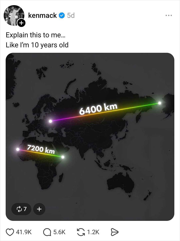
To fully understand the concept, Threads user Ken Mack asked everyone on the platform to explain it in a way that even a 10-year-old would comprehend. And people delivered!
Here are some of the funniest and most creative replies he received.
This post may include affiliate links.
This is a simple and clear (Orange peel reference) explanation of an age old issue. I worked with a Science convention and they always gave a gift to the host city's science education effort. One year that got a GIANT inflatable globe (sort of like a bounce house). The teachers could setup the globe in a school auditorium and the whole class could go inside and see the actual sizes of continents, etc. IT WAS BRILLIANT! Incredibly effective. BTW, the continent of AFRICA is much much larger than any flat map shows.
Different formulas for cutting and stretching the 3D surface of the globe exist, each with its own advantages and drawbacks. These formulas are called projections, because they "project" a 3D surface onto a 2D surface.
The most common today is, without a doubt, the Mercator projection. It was invented in the 16th century by Flemish cartographer Gerardus Mercator, and it was used heavily in shipping navigation. The main advantage of the Mercator projection is that you can follow straight lines on the map by following a constant direction on a compass.
This must be the best explanation for the globe -> mercator(?) projection! 🌍🌎🌏
With the proliferation of the internet, the Mercator projection made a very strong comeback. Its properties proved to fit the way interactive maps work really well, and so it was adopted by Google Maps and other similar services.
But as we see from Ken's image, the Mercator projection has some serious drawbacks, with the biggest one being that it introduces big deformations in the north and south.
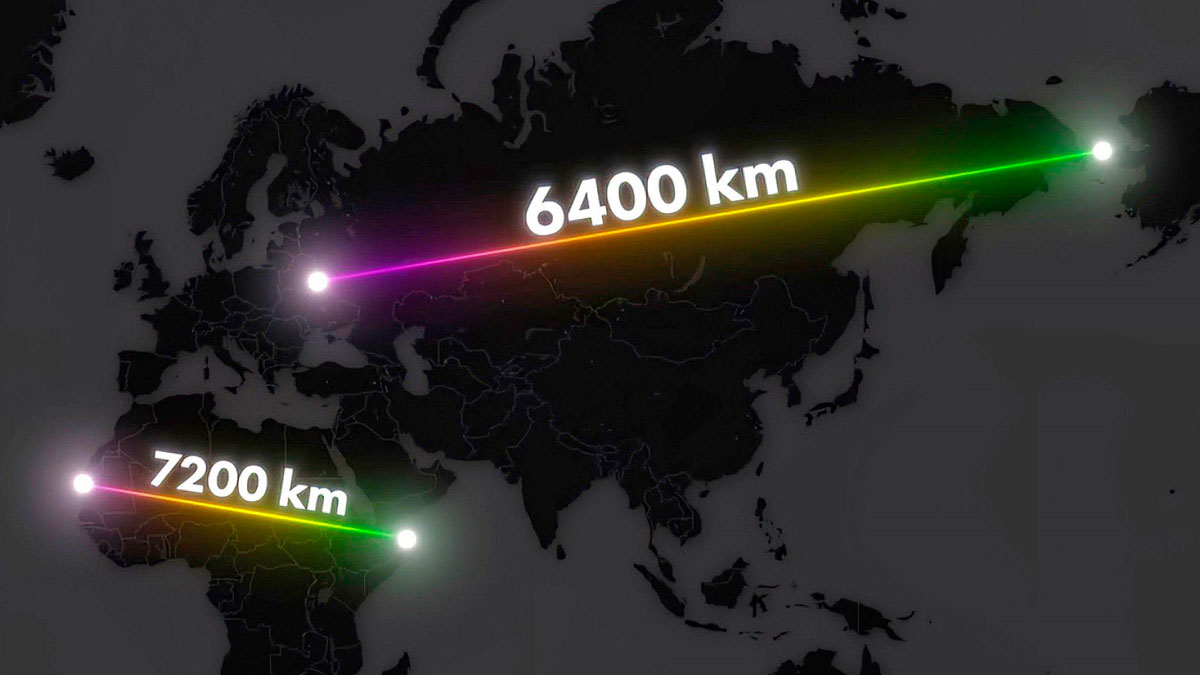
Unfamiliar with the Mercator projection's characteristics, one might think Greenland is roughly the same size as the African continent. But that is far from the truth.
If you superimpose Greenland on Africa, it shrinks to roughly the size of the Democratic Republic of the Congo. In reality, Africa can hold Greenland 14 times: Greenland has a surface area of 2.17 million square kilometres (836,000 square miles), while Africa covers 30.4 million square kilometres (11.7 million square miles), and the DRC is 2.35 million square kilometres (907,000 square miles).
You can play with this yourself on thetruesize.com, where you can "drag and drop" countries and continents on top of each other to see how they compare.
Yep 👍🏻. Upvote for the West Wing, and one of the best episodes 😊. Is the West Wing nearly a ballroom now?
Interestingly, the African Union has even introduced a campaign to encourage governments and international organizations to stop using the Mercator map so that the continent is represented more accurately.
"It might seem to be just a map, but in reality, it is not," AU Commission deputy chairperson Selma Malika Haddadi told Reuters, saying the Mercator fostered a false impression that Africa was "marginal," despite being the world's second-largest continent by area, with over a billion people.
At least you have New Zealand on the map. I have seen many that exclude it. If it wasn't for LoTR, I'm not sure many people would believe New Zealand exists. I'm going to visit in October so I sure hope it's actually there :)
Criticism of the Mercator map is not new, but the 'Correct The Map' campaign, led by advocacy groups Africa No Filter and Speak Up Africa, has revived the debate, urging organizations to adopt the 2018 Equal Earth projection, which aims to reflect countries' true sizes.
"The current size of the map of Africa is wrong," Moky Makura, executive director of Africa No Filter, also told Reuters. "It's the world's longest misinformation and disinformation campaign, and it just simply has to stop."
Fara Ndiaye, co-founder of Speak Up Africa, said the Mercator projection affects Africans' identity and pride, especially for children who might encounter it early in school.
However, this initiative also has its critics. For example, historical researchers Thomas Suárez and Hamish Monk argue that the Mercator projection is not a product of European chauvinism, because all map projections are compromises designed for a particular purpose.
Again, the Mercator projection was a solution to a critical need — plotting a straight line that corresponds to a “straight” line on the Earth.
Plus, the Mercator map's ability to preserve the shape of land masses is the reason why it's still so commonly used in schools.
They are demonstrated. I'd query 'taught' as 10 year olds aren't usually up to spherical trigonometry
"With the dawn of satellites and GPS, the Mercator projection has fallen from favour because it is no longer needed to aid navigation," Monk explained. "Modern cartographers are free to blend equal-area maps, such as the Gall-Peters, with shape-preserving projections, such as the Mercator, and split [the] difference between size and shape."
"But there is no 'correct' map projection, and the idea that the Mercator projection is symptomatic of European imperialism is a modern critique. The fairest way to see the Earth is to study a globe."
Flat Earthers love this one, but only because they don't really understand what it is.
You can tell that advanced civilisation occurred first in the Northern hemisphere, by noting which direction clock hands (which are related to the shadow on a sundial) move.
I just don't think this is accurate. I'd love to see what this person thinks an Afrocentric map would look like. The distortions are due to the Mercator projection, which is a poor attempt to render a spherical object onto a rectangular surface.
Mercator is equally 'wrong' in the Northern and Southern hemispheres; it's most accurate near the equator and hopeless near the poles. It's not race, it's latitude.
disappointed at how many of these comments are claiming that the distortion inherent in the Mercator projection is all a white/imperialist/religious conspiracy, rather than the actual reason that it was the first map that allowed marine navigation to any degree of accuracy.
It might feed into racism and ethnocentrism, but it wasn't created for that purpose.
Load More Replies...disappointed at how many of these comments are claiming that the distortion inherent in the Mercator projection is all a white/imperialist/religious conspiracy, rather than the actual reason that it was the first map that allowed marine navigation to any degree of accuracy.
It might feed into racism and ethnocentrism, but it wasn't created for that purpose.
Load More Replies...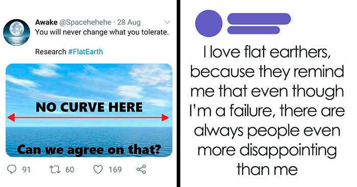


 No fees, cancel anytime


")
")