This Tumblr Thread On Dyslexia-Friendly Fonts Will Change The Way You Think Of Comic Sans And Other Not-So-Popular Fonts
It’s the font that appalls graphic designers, makes typographers cringe, and has been relentlessly mocked on the internet in instances like the famous Doge meme. In 1999, two graphic designers, Dave and Holly Combs, even started a movement to ban it. I am talking the font that has divided (or rather united?) an entire generation—the blessed and the cursed Comic Sans.
And while the only ones with a soft spot for Comic Sans are often primary and secondary school children, this Tumblr thread has put a whole new perspective on the font. In an attempt to win back the love it really deserves, the thread has explained how some of our least popular fonts are perfect for dyslexic people with difficulty in reading.
Incredibly, Comic Sans is not the only dyslexia-friendly font, so read the thread in full to find out why Times New Roman doesn’t have to be your default typeface.
This Tumblr thread has shed light on dyslexia-friendly fonts and it explains why Comic Sans deserves far more love

Image credits: lavandulum

Image credits: not-safe-for-earth

Image credits: not-safe-for-earth

Image credits: invaderxan
Bored Panda reached out to Victoria Buylaert, a graphic designer and social media manager who currently resides in Belgium who was happy to share some insights on Comic Sans and dyslexia-friendly fonts. Victoria runs Captain Creative, a graphic design & social media management studio based in Belgium.
When asked why Comic Sans has become such a widely disliked font, Victoria said the biggest reason is the way the font is used. “Vincent Connore (the creator of comic sans) created the font to put in a speech bulb of a cartoon for Microsoft Bob. Originally the text in the bulb was in Times New Roman, but he found it too serious a font to use, so he designed Comic Sans. Which is also inspired by comics as well.”

Image credits: sweetheart-sona

Image credits: anastasiaoftheironwood

Image credits: writernotwaiting

Image credits: iamhisgloriouspurpose


Image credits: catwinchester
Victoria also explained that Comic Sans is a font that is “more ‘childish’ and pretty ‘informal.’” Hence, it’s used on “birthday invitations, warnings like ‘do not disturb’ that are written in Microsoft Word and then printed and put on the door. Or t-shirts with some kind of cheesy sentence that is sold in souvenir shops all over the world.”
The graphic designer said that she wouldn’t immediately use it in her design (“whether that is social media content or your logo”), “because of the overuse of Comic Sans (see examples above) and the perceptions people created of the font over time.”
The common fear is that it may easily come across as “‘unprofessional,’ ‘not to be taken seriously,’ a ‘joke.’ Or it may look like you didn’t feel like investing in your brand so you just made something in Word, so to speak,” Victoria added.

Image credits: catwinchester

Image credits: pitbullmabari

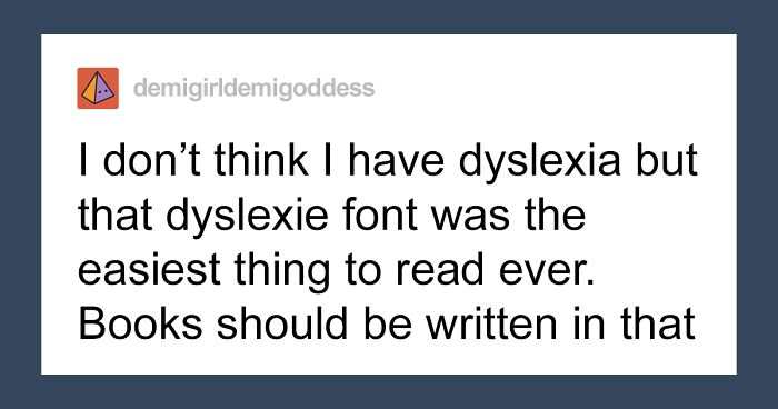
Image credits: demigirldemigoddess


Image credits: lunariens
Having said that, Victoria added that in some situations, the font can absolutely be used. “If you make a meme, for example, or you’re designing something that fits the perceptions people have of the font.” When asked if it’s a bad font, Victoria believes that’s a discussion that can go on for a long time. “Obviously, the font was designed for a reason, so it can be used in a fitting context, in my opinion,” she added.
But when it comes to people with dyslexia, using Comic Sans can be a wonderful solution. “The font someone with dyslexia prefers is subjective. There’s no ‘one font fits all.’ It’s a personal choice. But Comic Sans has been considered a dyslexia-friendly font,” she explained.

Image credits: hashtagyourshirt

Image credits: welcometotheravenclawcommonroom

Image credits: ta-lunelle
It turns out, one of the most disliked fonts probably ever to have existed, the infamous Comic Sans, is recommended by the British Dyslexia Association and the Dyslexia Association of Ireland. In addition, the American Institute of Graphic Arts post from last summer stated that it’s likely the best font for people with dyslexia thanks to its “character disambiguation” and “variation in letter heights.”
Of course, there are fonts that have been designed specifically to help dyslexic people with reading difficulties, and those are Dyslexie and OpenDyslexic. However, they are not as readily available as Comic Sans.

Image credits: kedreeva
According to Lauren Hudgins, whose sister has a learning disability, “The irregular shapes of the letters in Comic Sans allow her to focus on the individual parts of words.”
“While many fonts use repeated shapes to create different letters, such as a ‘p’ rotated to made a ‘q,’ Comic Sans uses few repeated shapes, creating distinct letters (although it does have a mirrored ‘b’ and ‘d’).” The ubiquitous Times New Roman, with all its serifs, is often illegible,” she explained in a piece for The Establishment.
With that in mind, the campaign to ban Comic Sans that was launched in 1999 doesn’t look that innocent. “Using Comic Sans is like turning up to a black-tie event in a clown costume,” the campaign’s co-founder Holly Combs stated a while back.
But no matter how aesthetically troubling it would look to a picky eye in typography, if it’s helping people with reading disabilities, that’s already reason enough to give the infamous font the recognition that it really deserves.
And this is what people had to comment


I love Verdana, that's the font I use the most. And now, I just learnt that it's even a dyslexia-compatible font! Wow.
For some people it works well. Wish I could read it well, make my life easier.
Load More Replies...I find Comic Sans much better than the others, except Dyslexie, that is the best for me. I feel like they have some similarities. Font shaming on Comic Sans is such clichéd ableist garbage, and really of all the difficulties that come with dyslexia, dismissing the font opinion of self appointed aesthetic police isn't too hard.
Tahoma should be about as widespread, and easier than Comic Sans?
Load More Replies...I don't believe anyone really hate Comic Sans. It is just popular public opinion. Some people are very susceptible for peer pressure.
sans serif fonts are horrible to my eyes, it's a shame most websites don't agree. and i'm glad this mentioned the open source version of dyslexie, because it's fantastic! but yeah, i've been writing in comic sans, and it does seem to help, although i switch it to another font while i'm proofreading, to help my brain see it properly.
This. People don't understand why we have serif fonts - they guide your eyes and make texts much easier to read.
Load More Replies...I'm a very fast reader, so fast I will often skip words or entire lines when I'm skimming a text. The problem is it's hard to turn it off. The font and the Beeline really helped with that. I'm gonna use it in my upcoming exam.
Comic sans is also good for young readers because the lower case a looks like the a that they learn to print rather than the weird a that most fonts (including this one) use. I mean who actually writes their a like this?
I can't agree with you more. Who decided to mangle the a like that?
Load More Replies...My best friend has dyslexia - I’ve GOT to let her download the Dyslexie font! She and I both love to write and read, and it’ll be so much easier for her to write for long periods of time
Yes, there are fonts that easier for dyslexic people to read than others, but dyslexia is not a visual disability. It's the result of a significant deficit in phonological processing. The idea of "dyslexic-friendly" fonts has been disproven multiple times.
And the point of the fonts is to increase visual differences in the words to make up for the processing issues.
Load More Replies...Wow, I can't believe these resources are available! This makes such a difference for me. Tomorrow I am contacting my doctors to get the ok to approve Bookshare and Beeline Reader. Every day it takes me hours to read the paper since the lines, words and letters move and reverse, Reading is immensely tiring. Now I will be able to keep up with books, websites, etc. Thank you Bored Panda, this is life changing for me.
I got my 1st computer in 1999. And immediately chose comic sans as my font. Now I find people wanted to ban it as I was choosing it, lol. But I liked it for its informality. And I found it the most comfortable. Which also describes me. ( I'm informal and just want to be comfortable in my clothes,) I still like it. And honestly only just now found out some people hate it. Makes me like it more. Also, I'm an artist.
Not dyslexic, but I have always preferred using verdana, it always looks a lot neater than any of the other fonts.
Arial is not a legitimate font. It's Microsoft's obvious and blatant ripoff of Helvetica (which was scandalous as hell when they did it). Microsoft's goal? Force Arial on everyone in an attempt to push Helvetica out. (It didn't work of course. Helvetica still remains the king of all fonts.)
So there is obviously a bunch of other, decent fonts. Ergo Comic Sans is still trash and shouldn't be used.
I can't read most of these fonts, they make it worse (especially Arial, Verdana, and Dyslexie). But I can't read comic sans either - I process italics better and have to use a hard italic font. Every dyslexic person is different in this regard.
Load More Replies...I love Verdana, that's the font I use the most. And now, I just learnt that it's even a dyslexia-compatible font! Wow.
For some people it works well. Wish I could read it well, make my life easier.
Load More Replies...I find Comic Sans much better than the others, except Dyslexie, that is the best for me. I feel like they have some similarities. Font shaming on Comic Sans is such clichéd ableist garbage, and really of all the difficulties that come with dyslexia, dismissing the font opinion of self appointed aesthetic police isn't too hard.
Tahoma should be about as widespread, and easier than Comic Sans?
Load More Replies...I don't believe anyone really hate Comic Sans. It is just popular public opinion. Some people are very susceptible for peer pressure.
sans serif fonts are horrible to my eyes, it's a shame most websites don't agree. and i'm glad this mentioned the open source version of dyslexie, because it's fantastic! but yeah, i've been writing in comic sans, and it does seem to help, although i switch it to another font while i'm proofreading, to help my brain see it properly.
This. People don't understand why we have serif fonts - they guide your eyes and make texts much easier to read.
Load More Replies...I'm a very fast reader, so fast I will often skip words or entire lines when I'm skimming a text. The problem is it's hard to turn it off. The font and the Beeline really helped with that. I'm gonna use it in my upcoming exam.
Comic sans is also good for young readers because the lower case a looks like the a that they learn to print rather than the weird a that most fonts (including this one) use. I mean who actually writes their a like this?
I can't agree with you more. Who decided to mangle the a like that?
Load More Replies...My best friend has dyslexia - I’ve GOT to let her download the Dyslexie font! She and I both love to write and read, and it’ll be so much easier for her to write for long periods of time
Yes, there are fonts that easier for dyslexic people to read than others, but dyslexia is not a visual disability. It's the result of a significant deficit in phonological processing. The idea of "dyslexic-friendly" fonts has been disproven multiple times.
And the point of the fonts is to increase visual differences in the words to make up for the processing issues.
Load More Replies...Wow, I can't believe these resources are available! This makes such a difference for me. Tomorrow I am contacting my doctors to get the ok to approve Bookshare and Beeline Reader. Every day it takes me hours to read the paper since the lines, words and letters move and reverse, Reading is immensely tiring. Now I will be able to keep up with books, websites, etc. Thank you Bored Panda, this is life changing for me.
I got my 1st computer in 1999. And immediately chose comic sans as my font. Now I find people wanted to ban it as I was choosing it, lol. But I liked it for its informality. And I found it the most comfortable. Which also describes me. ( I'm informal and just want to be comfortable in my clothes,) I still like it. And honestly only just now found out some people hate it. Makes me like it more. Also, I'm an artist.
Not dyslexic, but I have always preferred using verdana, it always looks a lot neater than any of the other fonts.
Arial is not a legitimate font. It's Microsoft's obvious and blatant ripoff of Helvetica (which was scandalous as hell when they did it). Microsoft's goal? Force Arial on everyone in an attempt to push Helvetica out. (It didn't work of course. Helvetica still remains the king of all fonts.)
So there is obviously a bunch of other, decent fonts. Ergo Comic Sans is still trash and shouldn't be used.
I can't read most of these fonts, they make it worse (especially Arial, Verdana, and Dyslexie). But I can't read comic sans either - I process italics better and have to use a hard italic font. Every dyslexic person is different in this regard.
Load More Replies...
120
30