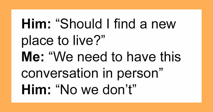
Get Premium
Dark mode theme is available exclusively for premium users. Learn more about the benefits of subscribing.
No fees, cancel anytime.

 Dark Mode Ad-Free Browsing Unlimited Content
 Ad-Free Browsing Unlimited Content Dark Mode
Join 1.2 million Panda readers who get the best art, memes, and fun stories every week!
Everything changes with time and companies are no exception. Big corporations need to keep up with the times not only by changing their policies and products but also by polishing and modernizing their appearance and brand identity. Relating to the customers is, in part, the purpose of a company’s logo. For example, I think we can agree the first Apple logo showing a picture of Sir Isaac Newton or the old Pepsi logo may not have been the worst logos but probably not the best ideas either.
Today there are many corporations, products, brands, services, agencies and other entities using an ideogram (sign, icon) or an emblem (symbol) or a combination of sign and emblem as a logo. However, only a few ideograms people see are recognized without a brand name, such as the Starbucks logo or the Nike Swoosh, and these are now some of the most famous logos in the world.
Let’s look at the history of logos for the most well-known companies such as Ford, Google, Firefox and others. If you are a designer, you will learn a lot from their mistakes in the design process and the resulting long path towards making improvements until reaching the final design. If you are just an ordinary consumer – don’t worry, this is one history lesson that is very entertaining, and you can even impress your friends by sharing the history of the Nike logo. As time goes on, it seems that simplified logos are the best way to go forward whilst referencing the past.
Scroll through to see the logo evolution of famous brands collected by Bored Panda below.
![]()
(via boredpanda)
Manufactured and marketed by PepsiCo, it was first developed and produced in the early 1890’s by Caleb Bradham, a pharmacist in New Bern, North Carolina labeled as “Brad’s drink”. In 1898, Bradham renamed his drink “Pepsi-Cola”.
In 1898, Bradham used a scribbled logo script as the first Pepsi logo to brand the product. When his business got established and people started enjoying his drink, Bradham decided to modify the Pepsi logo into a more customized version of the previous logo script. Thus, in 1905, a modified script logo was introduced, followed by a second change to the Pepsi logo in 1906 with the inclusion of the slogan, “The Original Pure Food Drink” on it.
By 1943, the Pepsi logo adopted a “bottle cap” look that included the slogan, “Bigger Drink, Better Taste”. Later, in 1962, the Pepsi logo was replaced with two bulls-eye marks encircling “Pepsi”, and then again in 1973, into a boxed Pepsi logo with minor typeface changes.
In 1991, Pepsi commemorated the evolution of its scripted Pepsi logo by featuring a logo design with an italic capital typeface. Later at the company’s 100 years celebration in 1998, Pepsi-Cola unveiled a new logo that symbolized the brand’s innovation and global recognition. With one of the longest design processes on this list, Pepsi has reinvented itself every generation to stay current. The before and after shows just how far they have come. (Read more: here and this pdf)
![]()
Is this one of the best inventions or one of the worst logos in Pepsi’s history?
(bamboo for blowatlife.blogspot.com via boredpanda)
![]()
(via boredpanda)
Coca-Cola was first served in 1886 and even then, the first official logo of Coca-Cola was not the script logo. It first appeared in the Atlanta Journal Constitution in 1886 as both a slab serif and chunky sans serif – it wasn’t until mid-1887 that Frank Robinson, Coca-Cola’s bookkeeper, drew the first traces of the Spencerian script logo that we all know.
For the first ten to twenty years, you could probably find a dozen different executions of the Coca-Cola script as the logo was probably drawn over and over for different applications. It isn’t until the 1930s and 1940s that a clear interpretation of the famous logo appears and is used consistently. During the late 1950s and early 1960s, the script logo is placed within a shape, referred to as the “fishtail” logo, which is as off-brand as anything that Coca-Cola has ever done.
In the 1960’s the wave was introduced, a ubiquitous visual today, when Lippincott Mercer was in charge of making the Coca-Cola brand identity more consistent.
“New Coke” introduced in 1985 had a new formula marketing and its own set of logos – that completely ignored the script logo – that left a bad taste in their consumers’ mouths and were considered the worst logos of the company. Around the same time, in 1986, Landor began rolling out an even more developed brand identity that modified the wave among other subtle changes.
Today, Coca-Cola’s iconic logo is amazingly similar to what it was 124 years ago. (Read more: here)
![]()
(via boredpanda)
The original logo was designed by Ron Wayne, who started Apple with Jobs and Woz in 1976. In 1977 White sold his portion of Apple back to Jobs and Woz when they incorporated. The image is a pen and ink illustration of Sir Issac Newton leaning against an apple tree with a portion of a William Wordsworth poem running around the border: “Newton…A mind forever voyaging through strange seas of thought…alone” (Prelude, Book III, Residence at Cambridge)
Steve Jobs decided to scrap this image because he felt that Wayne’s logo was too cerebral and not easily reproduced at small sizes. In 1977, with Wayne gone from the company, Jobs turned to the Regis McKenna Advertising Agency to produce a new, more iconic logo. After several attempts and variations (and a ton of money spent), the result was the most iconic of all Apple logos. The Rainbow Apple logo.
When Jobs returned to Apple in 1997, the company was bleeding money, and Jobs and Co. realized that the Apple logo could be leveraged to their advantage. Placing a large rainbow Apple logo on top of the original Bondi Blue iMac, for example, would have looked silly, childish, and out of place. Not exactly the direction Jobs wanted to lead Apple in. So instead of placing a somewhat minuscule rainbow-colored Apple logo on its products, Apple began placing sizeable and Monochrome styled logos on its products. Apple’s logo evolution goes to show that the best logos are the ones that are most simple. (Read more: here and here)
![]()
(via boredpanda)
The iconic Swoosh logo was designed by Carolyn Davidson in 1971 – “ a graphic design student that Phill Knight met while teaching an accounting class at Portland State University to supplement his then-fledgling business. He paid a grand total of $35! Phill never liked the logo but stuck onto it quoting “I don’t love it, but it’ll grow on me”. 12 years later in 1983, Davidson got an invitation to lunch by Nike where Knight surprised her with a gold Swoosh ring embedded with diamond and an envelope containing Nike stock.
![]()
(via boredpanda)
Since first appearing in the early 1900s, the Shell logo has moved from a realistic rendering of a pecten, or scallop shell, to today’s bold shape with distinctive colors.
Both the word “Shell” and the Pecten symbol may have been suggested to Marcus Samuel and Company (original founders) by another interested party. A certain Mr. Graham (of apparent Scottish origins) imported Samuel’s kerosene into India and sold it as “Graham’s Oil”. He became a director of The “Shell” Transport and Trading Company, and there is some evidence that the Shell emblem was taken from his family coat of arms.
It was around 1915 when the rendering allowed for easier reproduction, shown in the 1930s symbol above.
Colour first appeared with the construction of Shell’s first service stations in California. Not only did Red and yellow help Shell stand out, but they’re also the colors of Spain, where many early Californian settlers were born. Perhaps by displaying Spanish colors, it was hoped an emotional bond would be created.
From the 1950s onwards, the icon became more and more simplified, improving recognition and memorability. The simplified logo from 1971, which is still used today, was designed by the French-born Raymond Loewy, who also created logos for BP and Exxon. (Read more: here)
![]()
(via boredpanda)
The company which became IBM was founded in 1896 as the Tabulating Machine Company by Herman Hollerith, in Broome County, New York (Endicott, New York, where it still maintains very limited operations). It was incorporated as Computing Tabulating Recording Corporation (CTR) on June 16, 1911, and was listed on the New York Stock Exchange in 1916.
IBM adopted its current name in 1924 when it became an international manufacturing company. The logo that was used from 1924 to 1946. The logo is in a form intended to suggest a globe, girdled by the word “International”.
The logo that was used from 1947 to 1956. The familiar “globe” was replaced with the simple letters “IBM” in a typeface called “Beton Bold.”
The logo that was used from 1956 to 1972. The letters “IBM” took on a more solid, grounded and balanced appearance.
In 1972, the horizontal stripes now replaced the solid letters to suggest “speed and dynamism.” This iconic logo (in two versions, 8-bar and 13-bar), as well as the previous one, was designed by graphic designer Paul Rand. (Read more: here)
(via boredpanda)
The origin of today’s world-famous brand Canon can be traced in Precision Optical Instruments Laboratory that was established back in 1933. The first set of cameras was manufactured as a part of a business trial and these early birds were named Kwanon after the Buddhist Goddess of Mercy. Now, this Goddess was the possessor of thousand arms and spat flames.
From the very beginning, the company worked with an ambition of reaching out to the outer world, and as such, the company wanted to adopt a name that would be accepted globally. With this intention, the company name was changed from Kwanon to Canon and it was registered as the logo trademark name of the company in the year 1935. (Read more: here)
![]()
(via boredpanda)
In 1865, Engineer Fredrik Idestam established a wood pulp mill on the banks of the TammerKoski rapids in the town of Tampere, in southern Finland. Later in 1868, he built the second mill by the Nokianvirta River, which gave the Nokia its name. In 1871, Idestam and his friend Leo Mechelin, renamed and transformed the firm into a share company, thereby founding the Nokia Company.
The first logo of Nokia was created in 1866 showing the image of a fish. This image was inspired by the salmon fish of Nokianvirta River.
In 1898, Eduard Polon founded the Finnish Rubber Works, which later became Nokia’s rubber business. The new company tried producing many products like papers, bicycles, car tires, footwear, communication cables, electricity generation pieces of machinery, televisions, aluminum, capacitors, and a lot more.
In 1967, three companies, which were jointly owned since 1922 by Nokia, officially joined together and created Nokia Corporation. After the company merger, Nokia Corporation adopted the logo which was all black rounded shape emblem, in which “Nokia” was written in white.
At the start of its telecommunication equipment manufacturing, Nokia adopted the logo which was quite similar to the current one, but with the light blue color and the arrow-like shape pointing upward. The arrow in the logo represents Nokia’s progress and advancement in the telecommunication industry. (Read more: here)
![]()
(via boredpanda)
Il Giornale was the espresso cafe Howard Schultz opened up in 1986 after failing to convince the original owners of Starbucks to focus on serving espresso beverages. By 1987, the two remaining original owners of Starbucks decided to sell the business and Howard jumped at the chance to buy Starbucks and remake it into the espresso bar concept he had just begun at Il Giornale.
Writing about the design process for the company merger, Howard Schultz wrote: “To symbolize the melding of the two companies [Il Giornale and Starbucks] and two cultures, Terry [Heckler] came up with a design that merged the two logos. We kept the Starbucks siren with her starred crown but made her more contemporary. We dropped the tradition-bound brown, and changed the logo’s color to Il Giornale’s more affirming green.” It’s great to see the before and after of this logo, combining elements of both companies. (Read more: here)
![]()
(via boredpanda)
An interesting case is the refinement of the FedEx logo, where the brand consultants convinced the company to shorten their corporate name and logo from “Federal Express” to the popular abbreviation “Fed Ex”. Besides reinventing their brand identity, they reduced the amount of color used on vehicles (planes, trucks) and saved hundreds of thousands of dollars in paint costs. Also, the right-pointing arrow in the new logo is a subliminal hint of motion.
![]()
(via boredpanda)
Art Paul was working as a freelance designer when he in 1953 was contacted by Playboy founder Hugh Hefner who needed a logo for his new magazine. He created the now famous logo of a rabbit wearing a tuxedo bow tie. Paul went on to design the whole first edition of the magazine and was hired by Hefner as Playboy’s first art director in 1954, a position he held for 30 years.
Speaking about the design process, Playboy magazine claims it once received a letter at its Chicago, Illinois offices with its distinctive “bunny” logo as the only identifying mark, appearing where the mailing address normally appears. The simplified logo is now one of the most recognizable magazine logos around.
![]()
(via boredpanda)
![]()
(via boredpanda)
![]()
(via boredpanda)
![]()
(via boredpanda)
![]()
(via boredpanda)
![]()
(via boredpanda)
![]()
(via boredpanda)
What do you do when your logo is oversaturated with four different logos? Rebrand. This simplified logo represents each of the four companies in the company merger to make its iconic Four Rings logo.
![]()
(via boredpanda)
![]()
(via boredpanda) (Other sources: 123)
502Kviews
Share on Facebook


 No fees, cancel anytime


13
6