Get Premium
Dark mode theme is available exclusively for premium users. Learn more about the benefits of subscribing.
No fees, cancel anytime.

 Dark Mode Ad-Free Browsing Unlimited Content
 Ad-Free Browsing Unlimited Content Dark Mode
Join 1.2 million Panda readers who get the best art, memes, and fun stories every week!
Companies put a lot of effort into distinguishing themselves from others and establishing their unique brand. Over time, people get used to everything businesses associate themselves with, from their values to their logos and slogans. So when a brand introduces some changes, a lot of their customers feel apprehensive about them, especially if the rebrand completely misses the mark.
Many instances of questionable redesigns await you in the list below, and while you’re scrolling through them, don’t forget to express your opinions on whether a rebrand for these specific logos and designs was a good idea or not.
Bored Panda also reached out to Lauren Diana Scalf, a certified business strategist and founder of Empowered Marketing Co, and brand strategist Alicia Nagel, who kindly agreed to chat with us more about rebrands.
This post may include affiliate links.
Lauren Diana Scalf, a certified business strategist and founder of Laurea Consulting, tells us that she's been with many businesses through big shifts, such as new offers, audiences, and seasons.
"And a rebrand is often one of the most exciting (and risky) moves they make. It’s not just about fresh visuals. It’s about clarity, connection, and creating a brand that actually supports where you’re headed next. When strategy and design work together, it can be a game-changer. When they don’t, it shows," she explains.
"A successful rebrand represents an authentic evolution of the brand and company. This means that the brand is flexing up and evolving to authentically reflect who the company is, their market positioning, personality, etc.," adds brand strategist Alicia Nagel.
This one. I can't unsee the K and backwards N. I read that a lot of people googled KN, thinking it was a new car brand 😅
When a redesign is unsuccessful, it confuses people, feels disconnected from the original identity, or loses the emotional connection that customers had with the brand, says Scalf. "It doesn’t matter how 'cool' it looks if it doesn’t feel aligned."
Nagel also notes that a rebrand usually fails when a company spontaneously decides it is something that it isn't. "Just like with people, this breeds distrust. When someone misrepresents who they are or simply reinvents themselves in a way that feels inauthentic, we are turned off and distrust them. The same goes for brands," she explains.
An example of an unsuccessful redesign that Scalf provides is GAP. "The new look felt generic, corporate, and totally disconnected from what people associated with the brand. The backlash was immediate, and they switched back in less than a week.
Another big one was Tropicana’s packaging redesign. They made everything so minimal and abstract that customers didn’t recognize the product on the shelves. Sales dropped by $30 million in just a couple of months. That wasn’t a design issue—it was a strategy issue," she suggested.
Oh no, my memories, my dear memories! Now it feels like I've lost some of my game saves.
Meanwhile, Nagel adds Pepsi to the list of unsuccessful redesigns. "Soft drink Pepsi is notorious for continuously redesigning their logos over the years, and for a while there they had an odd arrangement of swooshes in their circular logo that were not very memorable or impactful.
In 2023, they brought back the retro logo, and, in my opinion, it's about time. It's memorable, visually arresting, is an honest presentation of their swoosh in the circle, and says their brand name loud and proud," she says.
I liked it, in fact, more than a redesign, it's a retro design... trying to look like the 80s logo. Pepsi_bi_1...7f-png.jpg 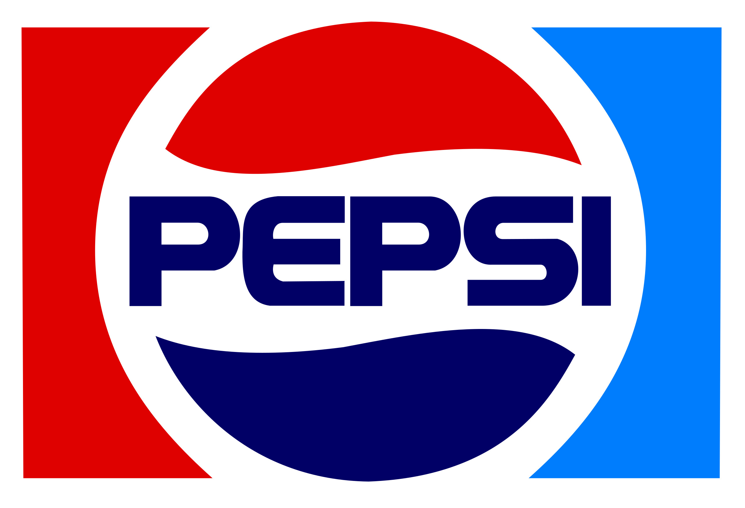
These redesign failures often happen because changes are introduced based on preference or trend, not strategy or data, says Scalf. Some other common causes that she mentions include:
HBO was always the brand channel not Cinemax. They need to change it back to HBO. This is the brand more people are familiar with. Home Box Office
Nagel adds that a rebrand has a higher chance of being unsuccessful if it's done too quickly and is changed too much.
"I never advise a complete rebrand, but a careful re-evaluation of whether the current brand and brand visuals are still an accurate reflection of the company. Often, they could use a little bit of a refresh if it's been a while since they were designed or if it was a low-cost design job to get the company started up. But it's best if a company can keep the brand story and keep some visual aspects of their existing logo," she says.
"If a brand or brand visual identity is changed too much, too quickly, the company risks jeopardizing the positive brand equity they've built over time through their hard work and reputation, and they risk causing distrust in their brand amongst their customers and target audience," she further explains.
"Also, the itch to change for change's sake—this can cause a rebrand failure because it's mostly to do with ego and little to do with an authentic representation of the company."
Scalf seconds that an unsuccessful rebrand can cost customers' trust. "If people don’t recognize you or feel like you’re not 'you' anymore, they pull back. That hesitation impacts everything, sales, loyalty, engagement, and even team morale.
A confusing or misaligned rebrand also makes it harder for people to describe or refer to your business. It muddles your message. And in a crowded market, clarity is everything."
I was going to say the new one looks like they were going for retro, then read the note
To increase their chance of a successful rebrand, companies should carefully plan for it, keeping the customer and their people in mind, says Scalf. "Start with the strategy, not the visuals. Know your people. Know what they value about you. Know where you’re going and how the brand needs to evolve to support that.
Before launching anything, test and get feedback. Ask your most loyal customers what they associate with your brand. Find out what feels essential to keep and what feels outdated. That insight is going to be what's most valuable," she suggests.
"And when it’s time to launch, bring your people along for the journey. Share the story behind the changes. Let them be part of the evolution. People support what they feel connected to. Airbnb did this well when they unveiled their new logo and brand identity. They didn’t just present a new symbol, they shared a story. They explained the deeper meaning, invited the audience into the mission, and made it feel like a movement rather than just a design swap."
Most of these are just returns to an earlier era by removing unnecessary gloss, gradients and flourishes. The logos look less tacky and are easier to see when small (like on a phone screen). Although some of them do lose originality, particularly when the new logo is just black text. Also, trends are circular and now we are moving to a different era of logos that is slowly replacing the flat design of the 2010s.
Several of these “redesigns” are returns to an original logo or branding which likely predates the generation griping about the product being somehow forever ruined because it doesn’t look as it did when they “discovered” it.
I hate the redesign of the German airline Lufthansa. Their old colors were blue and yellow: like a blue crane in a yellow circle surrounded by blue. Now they turned the blue in for white. It's absolutely generic looking. Plus you can't easily distinguish their planes anymore from all the other airlines which uses blue & white.


 No fees, cancel anytime