ADVERTISEMENT

Numbers and facts can be difficult to comprehend when they're merely symbols on the screen. However, data becomes much more evident once it is visualized.

The subreddit r/CooolGuides is an excellent example of this axiom. Its 5.9 million members share charts, diagrams, maps, and other thought-provoking pictures on sports, travel, history, and virtually every subject you can imagine.

We at Bored Panda love them and have already covered the online community numerous times, but they've made so many interesting posts since the last one that we just had to put together a new collection of our recent favorites.

#1

Unlikely Neighborhood Hero

Young opossum in grass with a guide explaining its role in pest control and nature cleanup benefits.

DreamyHon Report

Lost Panda
Community Member
1 year ago

I always thought they were cute

View more comments
RELATED:
    #2

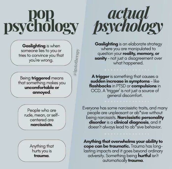
    Psychology Unpacked

    Comparison chart contrasting pop psychology and actual psychology definitions of gaslighting, triggers, narcissism, and trauma.

    ComparisonNo5776 Report

    Multa Nocte
    Community Member
    Premium
    1 year ago

    This. As a psychologist I cringe when people use these words.

    View more comments
    #3

    Secret Clubbing Signals

    Tweet explaining a hand sign system used by a group of girls when clubbing to communicate in loud bars with unique visuals.

    monstrousmastermind Report

    Donkeywheel
    Community Member
    1 year ago

    The last sign is the universal sign for « everything is ok » in any loud environment (flying, skydiving, ground operations) or when speaking is hard or impossible (diving, climbing). It’s completely dumb to use it for signaling a danger.
    View more comments
    #4

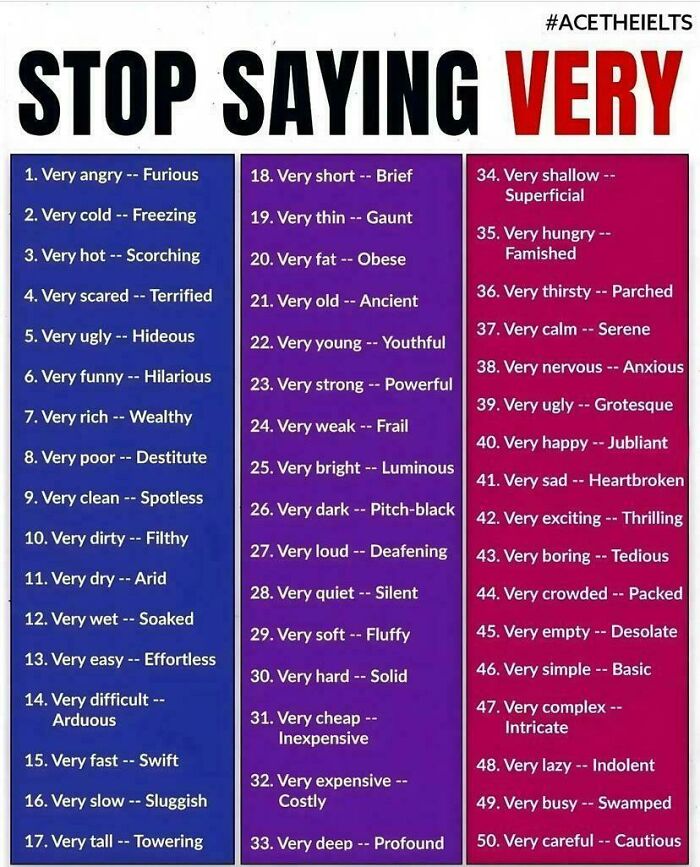
    Upgrade Your Adjectives

    Chart listing 50 alternatives to using the word very with stronger descriptive adjectives for clearer communication.

    TaloulahRu Report

    Ejteh
    Community Member
    1 year ago

    Can somebody sent this to Trump?

    View more comments
    ADVERTISEMENT
    #5

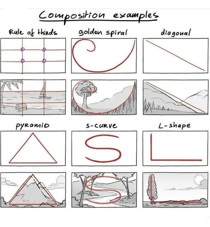
    Visual Playbook Basics

    Diagram showing unique composition charts including rule of thirds, golden spiral, diagonal, pyramid, s-curve, and L-shape guides for visuals.

    bigboobieweewoo Report

    Mreoww
    Community Member
    1 year ago

    This is actually really useful

    View more comments
    ADVERTISEMENT
    #6

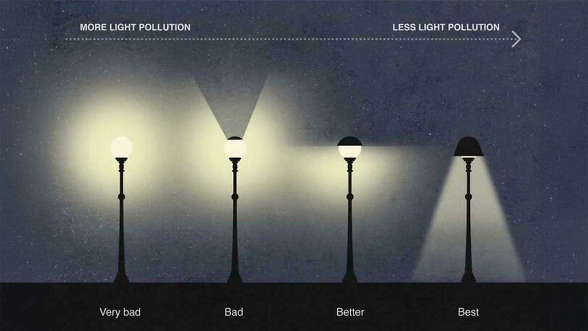
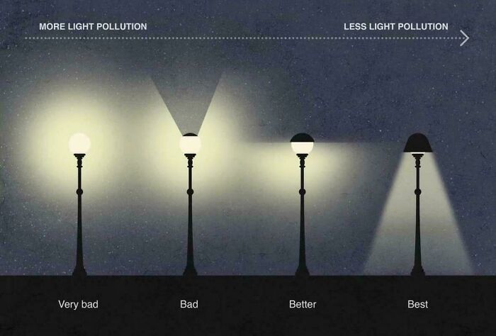
    Shedding Light on Pollution

    Comparison chart showing streetlights with varying light pollution levels from very bad to best efficiency and brightness control.

    backseatofthehearse Report

    Lost Panda
    Community Member
    1 year ago

    I wish they'd do something about the light pollution around me. It bleeds from the nearby town/cities, so right off the lake and I still can't get a nice starry sky.

    View more comments
    #7

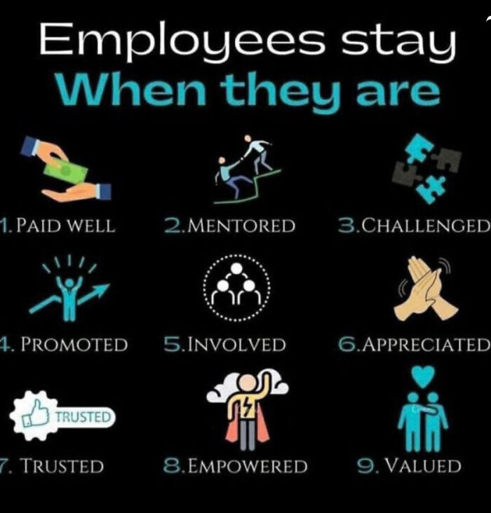
    What Really Keeps Them?

    Infographic showing nine reasons employees stay, highlighting factors like being paid well, mentored, challenged, and empowered.

    SydneyPretty Report

    Lee Gilliland
    Community Member
    Premium
    1 year ago

    Dream on, America.

    View more comments
    #8

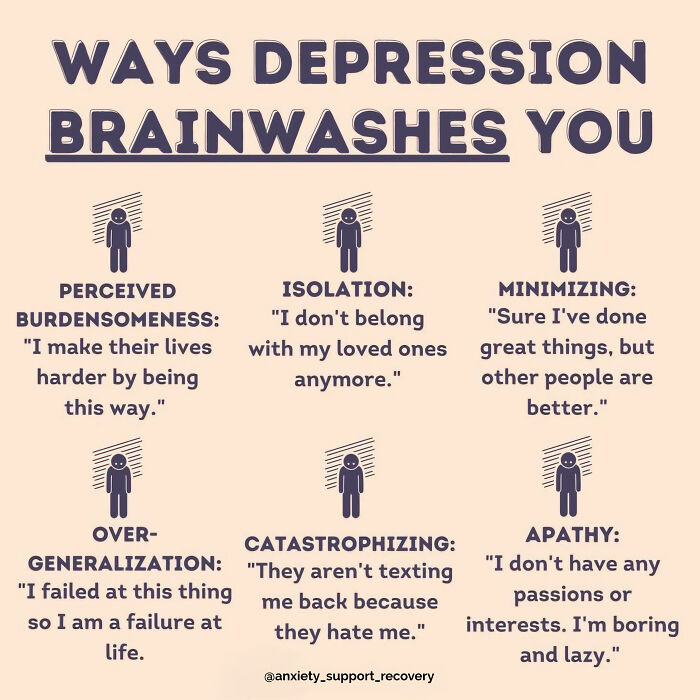
    Hidden Mind Tricks

    Infographic showing unique charts explaining ways depression brainwashes you with examples of negative thoughts.

    anxiety_support Report

    justagirl
    Community Member
    1 year ago

    It appears I am over-generalizing. I'm not diagnosed, but I do that a lot.

    View more comments
    ADVERTISEMENT
    #9

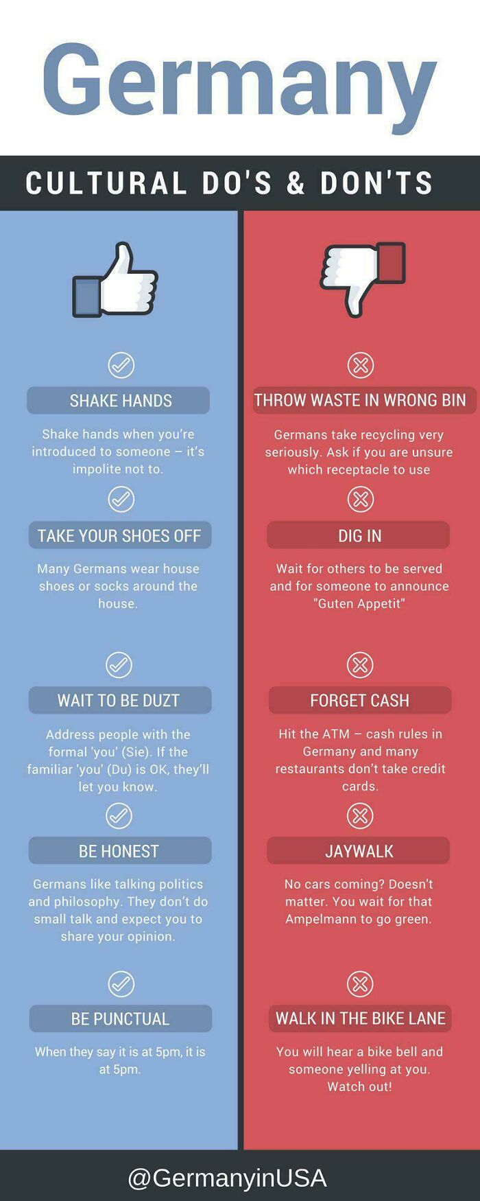
    The Do’s and Don\'ts Shuffle

    Germany cultural do's and don'ts chart showing etiquette tips and common mistakes to avoid in social and public settings.

    Queengirl811 Report

    Mr E
    Community Member
    1 year ago

    I absolutely love that there are no jaywalking laws in New Zealand. I found that out asking some cops I saw jaywalk in Wellington. If it’s safe, cross the road. Because you are an adult.

    View more comments
    ADVERTISEMENT
    #10

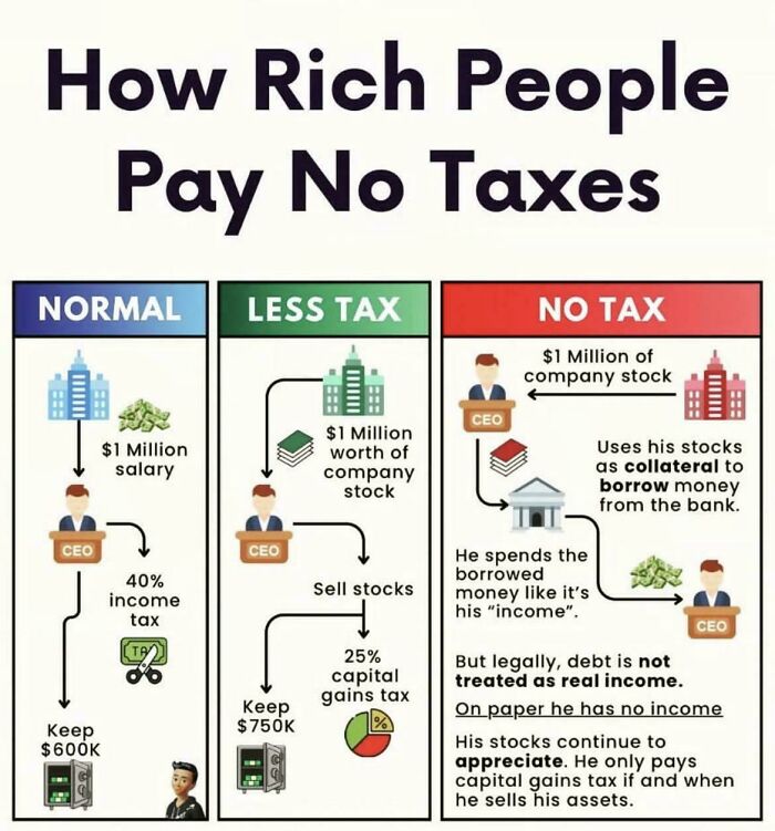
    Tax Tricks Uncovered

    Infographic showing how rich people pay no taxes through salary, company stock, and borrowing strategies with tax implications.

    TubbyPiglet Report

    Ejteh
    Community Member
    1 year ago

    I don't like it. It's like rich people evade responsibility to give back, and help carry the weight of running a nice and stable country. All this weight lands on the back of 'normal' people, while the country deteriorates. There is no lack of money, money gets hoarded up in the wrong places.

    View more comments
    #11

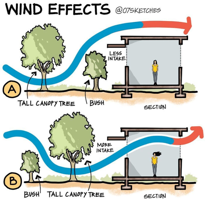
    Breezy Design 101

    Illustration showing wind effects on airflow intake with tall canopy trees and bushes in two different sections.

    sassymusedream Report

    Mreoww
    Community Member
    1 year ago

    Oooh

    View more comments
    #12

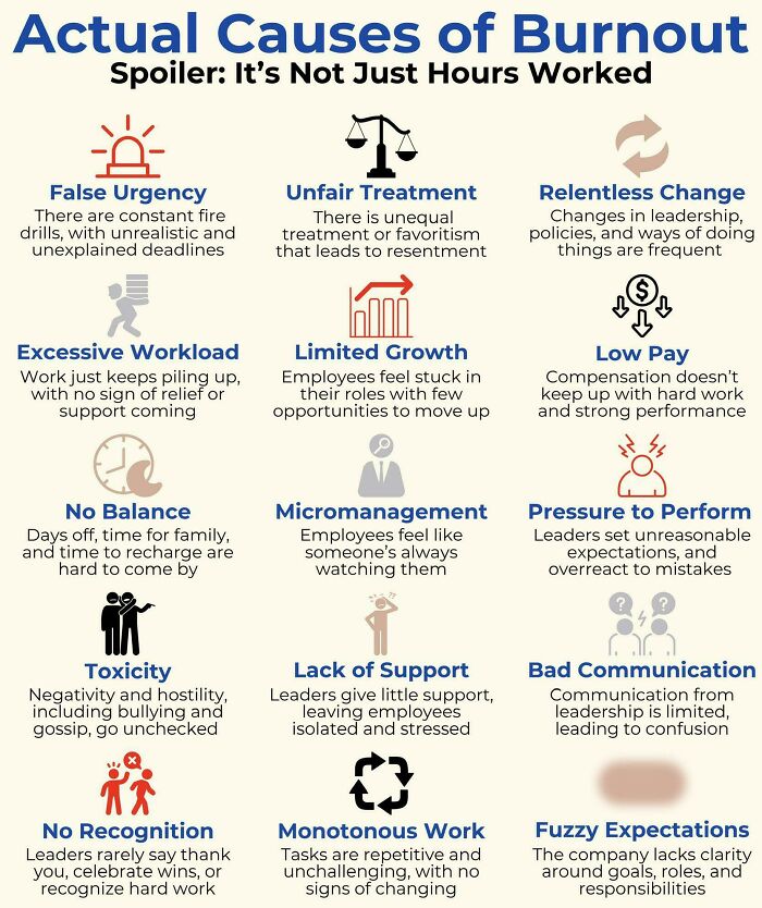
    Burnout Beyond The Clock

    Chart showing actual causes of burnout with visuals highlighting workload, micromanagement, pay, support, and communication issues.

    offensive-but-true Report

    Kalikima
    Community Member
    Premium
    1 year ago

    I left my last job from burnout, and I counted 11 out of 15 on this list. I should send this to my mom and the manager there, to explain my "sudden" departure from the company.

    View more comments
    ADVERTISEMENT
    #13

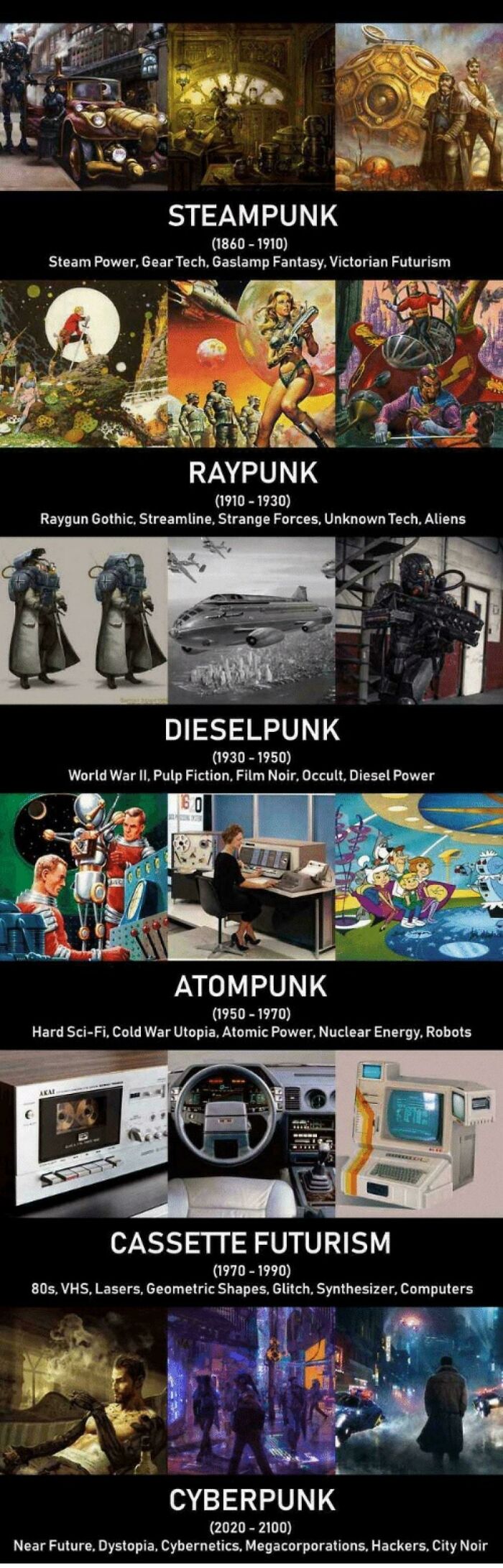
    Tech Through The Ages

    Visual guide showcasing unique punk subgenres with charts and visuals explaining steampunk, raypunk, dieselpunk, atompunk, cassette futurism, and cyberpunk.

    urnaughtygirlf Report

    Nina
    Community Member
    1 year ago

    Between 1990 and 2020 we're just regular punk?

    View more comments
    ADVERTISEMENT
    #14

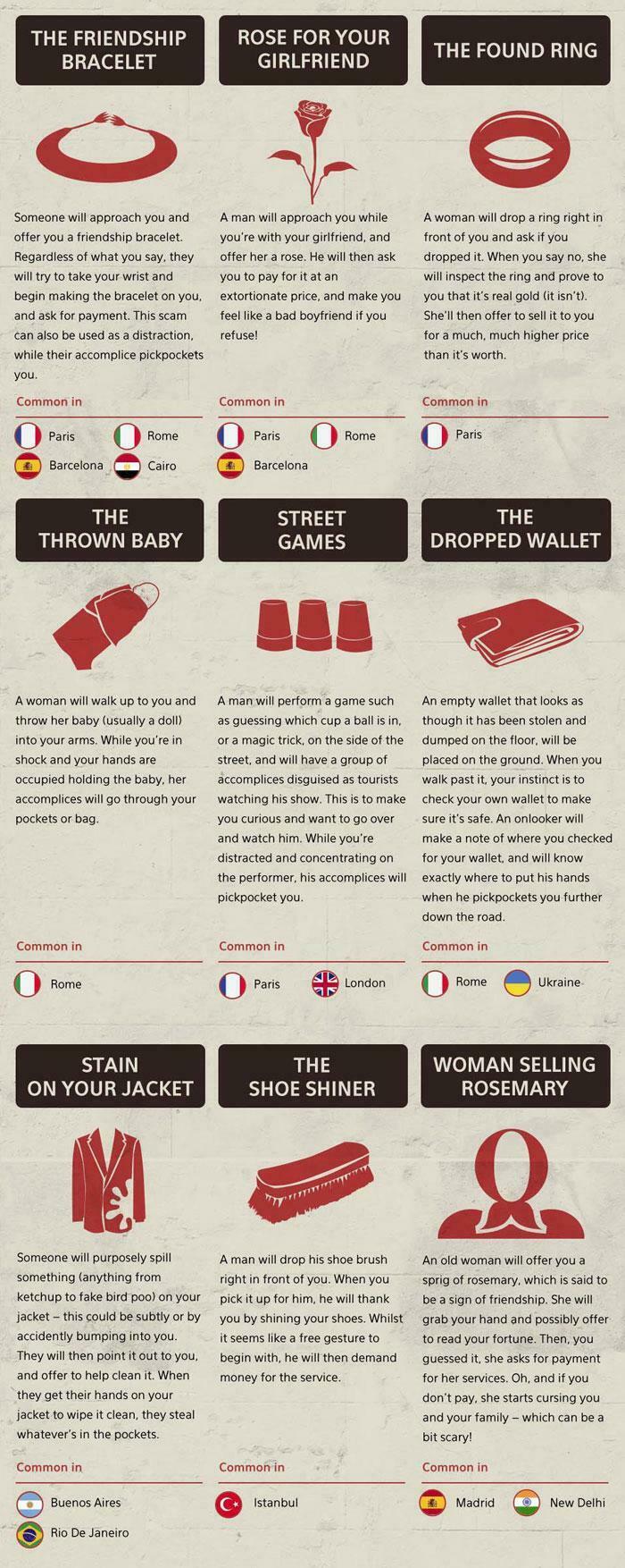
    Street Smarts 101

    Visual guide showing common street scams and pickpocket tricks with illustrations and locations where they occur.

    tribhuz Report

    justagirl
    Community Member
    1 year ago

    that is a concerning amount of pickpocketing.

    View more comments
    #15

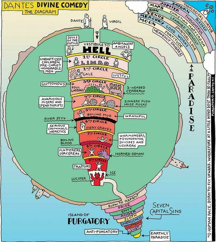
    Layers of Eternal Drama

    Diagram of Dante's Divine Comedy illustrating Hell, Purgatory, and Paradise with labeled circles and seven capital sins.

    Aayush0210 Report

    Lee Gilliland
    Community Member
    Premium
    1 year ago

    Lucifer is supposed to be frozen waists deep in ice. Nobody reads the classics any more.
    View more comments

    Never miss a story that brings joy to the world. Add us on Google

    #16

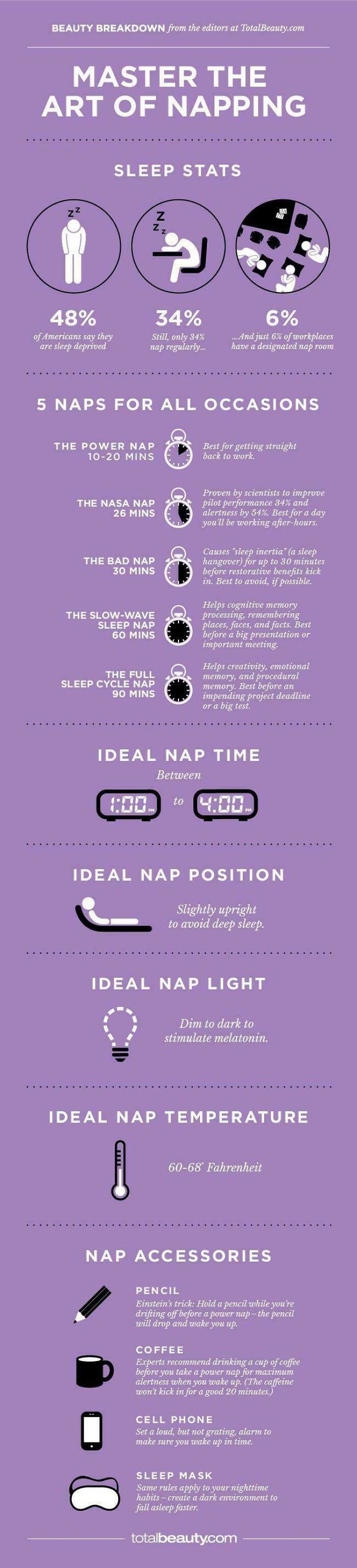
    Nap Like a Pro

    Infographic on napping tips including sleep stats, ideal nap times, positions, light, temperature, and accessories.

    Overude Report

    Michael Largey
    Community Member
    1 year ago

    Sometimes I take a nap. Sometimes the nap takes me.

    View more comments
    ADVERTISEMENT
    #17

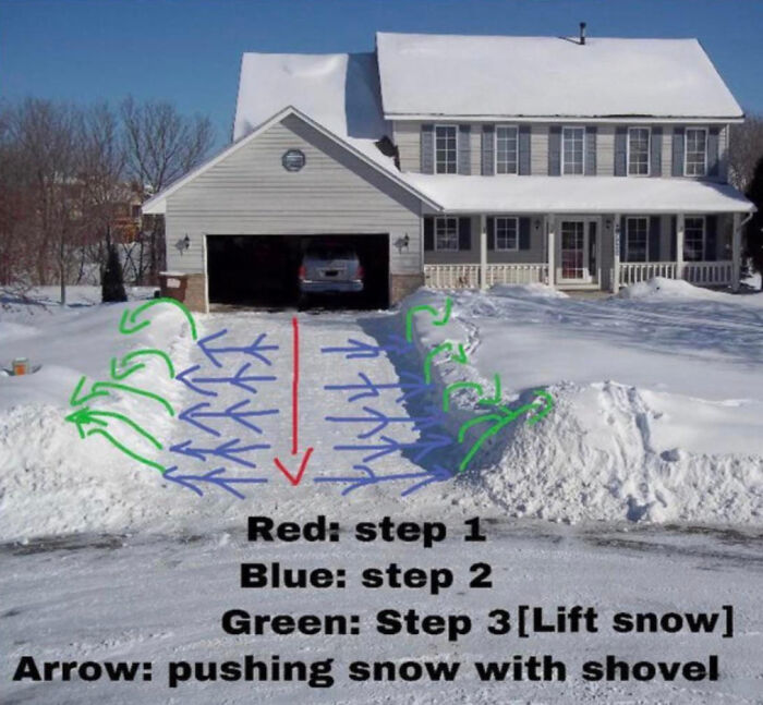
    Snow Shoveling Made Simple

    Diagram showing snow shoveling steps with red, blue, and green arrows demonstrating how to lift and push snow efficiently.

    fieryangeldream Report

    ucp
    Community Member
    1 year ago

    Call Mr Plow, That’s my name, That name again is Mr Plow!

    View more comments
    ADVERTISEMENT
    #18

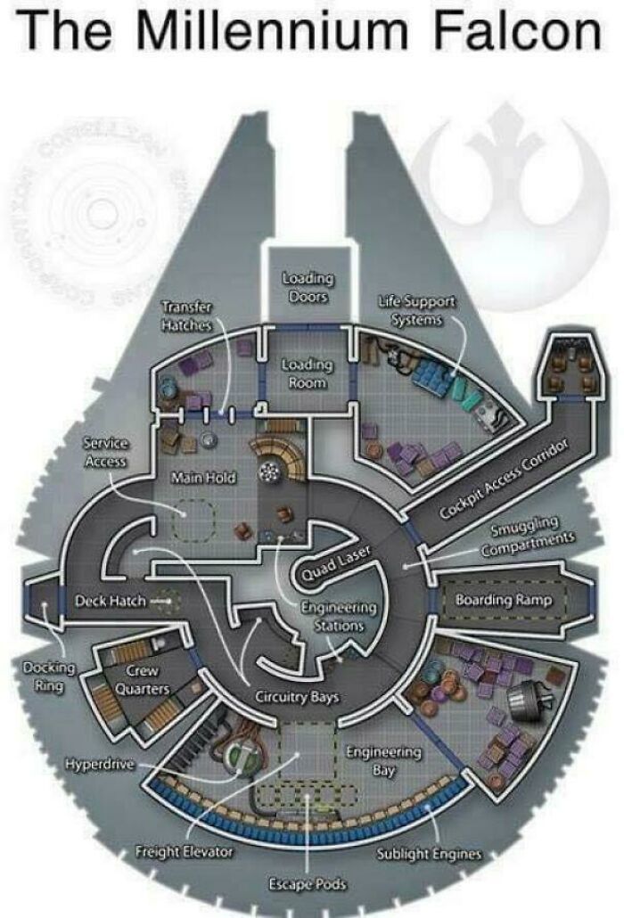
    Spaceship Secrets Uncovered

    Diagram chart of the Millennium Falcon showcasing detailed interior layout with unique engineering and crew quarters sections.

    sunbellgreen Report

    LooseSeal's $10 Banana
    Community Member
    1 year ago

    Not even the best ship on Star Trek.

    View more comments
    #19

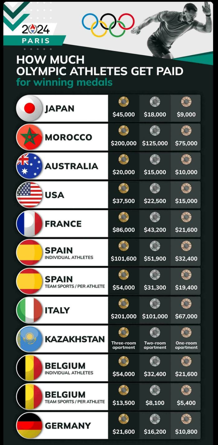
    Medal Money Matters

    Chart showing how much Olympic athletes get paid for winning medals in various countries for 2024 Paris Games.

    johnmichael-kane Report

    Christina Hvurchilova
    Community Member
    1 year ago

    Wow, a three room apartment is no joke! I'd rather have that than money, thanks!
    View more comments
    #20

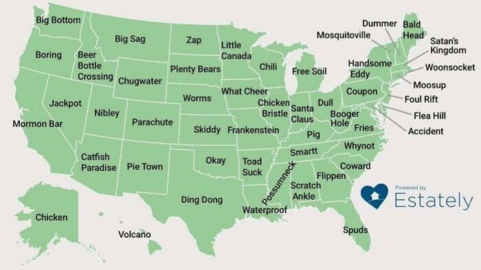
    Geography Gets Weird

    Map of unique and quirky place names across the United States shown in a colorful visual chart.

    Onereasonwhy Report

    James016
    Community Member
    1 year ago

    I read Ding Dong in Leslie Phillips' voice

    View more comments
    ADVERTISEMENT
    #21

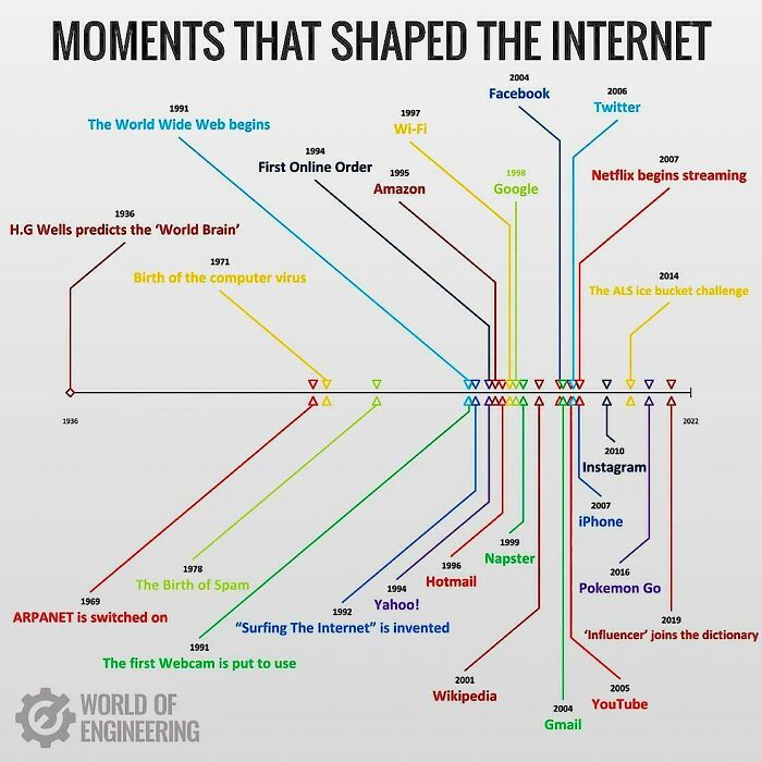
    Iconic Internet Milestones

    Timeline chart showing unique moments that shaped the internet with key events and milestones in internet history.

    DrNinnuxx Report

    Λjvo
    Community Member
    1 year ago

    Why is the "ice bucket challenge" among moments that shaped the internet?

    View more comments
    ADVERTISEMENT
    #22

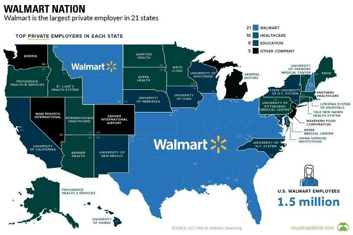
    Walmart’s Coast-to-Coast Grip

    Map showing Walmart as top private employer in 21 states, highlighting key employers in healthcare, education, and other sectors.

    urfavnewsecretx Report

    Roland Nijveld
    Community Member
    1 year ago

    So either Walmart or health insurance companies

    View more comments
    #23

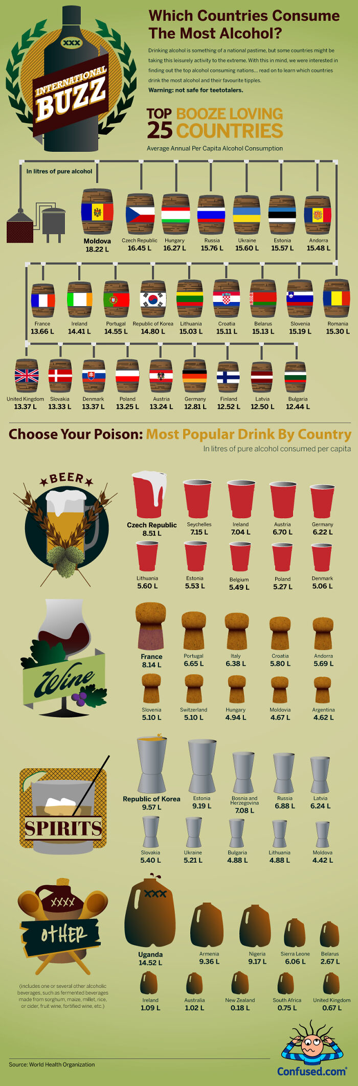
    Top Booze Hotspots Revealed

    Infographic showing top alcohol consuming countries, average annual per capita alcohol consumption, and popular drinks by country in unique charts.

    everydayasl Report

    Sian E
    Community Member
    1 year ago

    Slovakia and Denmark are mislabelled.

    View more comments
    #24

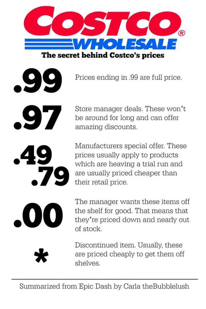
    Decoding Price Codes

    Costco price secrets chart explaining meanings of .99, .97, .49, .79, .00, and * price endings for discounts and deals.

    magicall_dreammerr Report

    James' Journeys
    Community Member
    1 year ago

    This chart is incorrect in the manager mark down aspect (.97). That is a corporate buyer markdown; $.88 is a GM markdown because their store needs to move that item immediately. Also, there's a # symbol that denotes an item's price had been changed by the buyer due to a code date about expired. Once those have been sold the price will go back to normal. An EPC on a sign denotes the warehouse GM or AGM marked the item down for a reason and corporate buying wasn't involved.

    View more comments
    ADVERTISEMENT
    #25

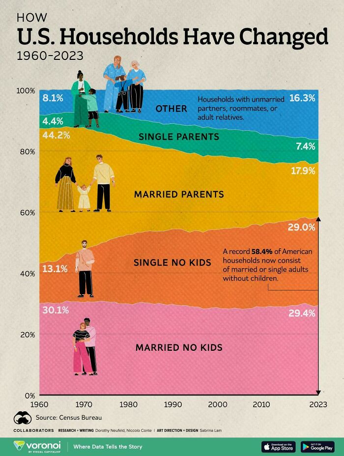
    Living Arrangements Evolved

    Chart showing how U.S. households have changed from 1960 to 2023 with various family types by percentage.

    moktadirr_ Report

    Wild Cream
    Community Member
    1 year ago

    Single no kids 😎 (except I have a bf, we just aren’t moving in together)

    View more comments
    ADVERTISEMENT
    #26

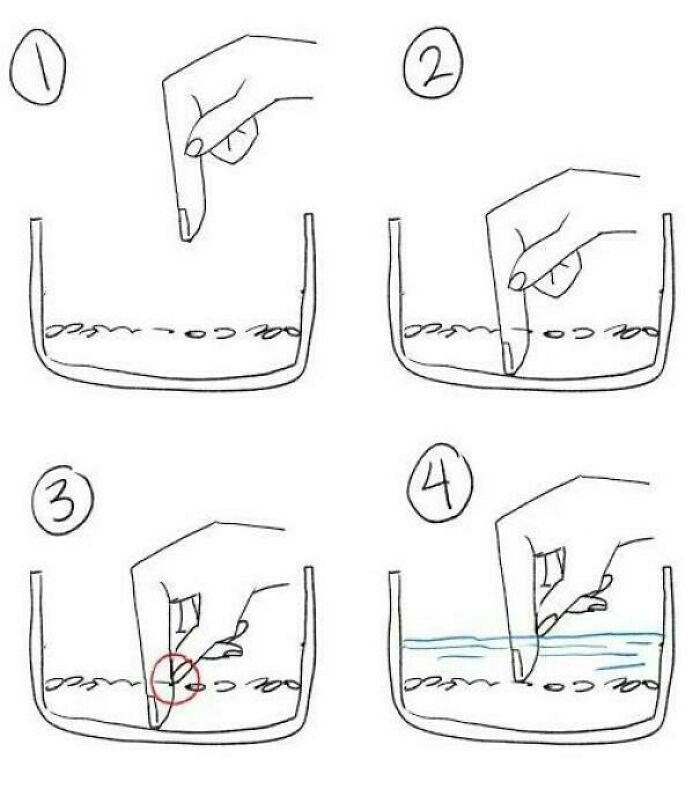
    Finger Tricks 101

    Hand-drawn unique visual guide showing steps of placing fingers in a container with objects and water for observation.

    inquiryspell Report

    Mreoww
    Community Member
    1 year ago

    I mean it’s cool and fun. But this is most certainly not what we do with our rice. We use measuring cups for the rice grains and water.

    View more comments
    #27

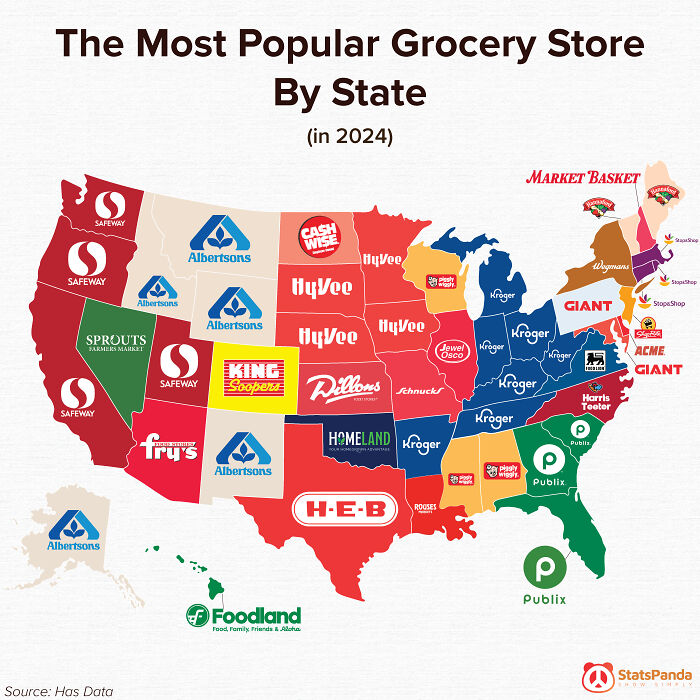
    Grocery Wars Uncovered

    Map showing the most popular grocery store by state in 2024 as part of unique charts and guides visuals.

    Dremarious Report

    Geoffrey Scott
    Community Member
    1 year ago

    Kinda sad that Meijer, in Michigan, which is Michigan based, is not listed. Go to for produce for sure.

    View more comments
    #28

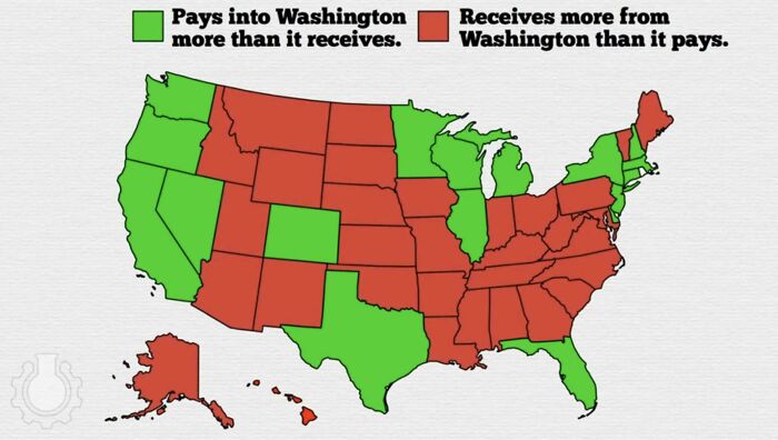
    Who’s Winning the Money Game?

    US map chart showing states paying more into Washington versus states receiving more from Washington in federal funds.

    Illustrious_Job_6260 Report

    FreeTheUnicorn
    Community Member
    1 year ago

    In general the get more out of the federal government are the ones moaning about people on welfare.

    View more comments
    ADVERTISEMENT
    #29

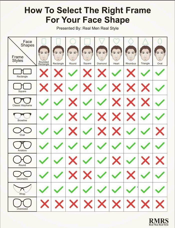
    Frames That Fit Faces

    Chart showing how to select the right eyeglass frames for different face shapes with green checks and red crosses.

    Admirable-binladen Report

    Lost Panda
    Community Member
    1 year ago

    Now if I just knew my face shape

    View more comments
    ADVERTISEMENT
    #30

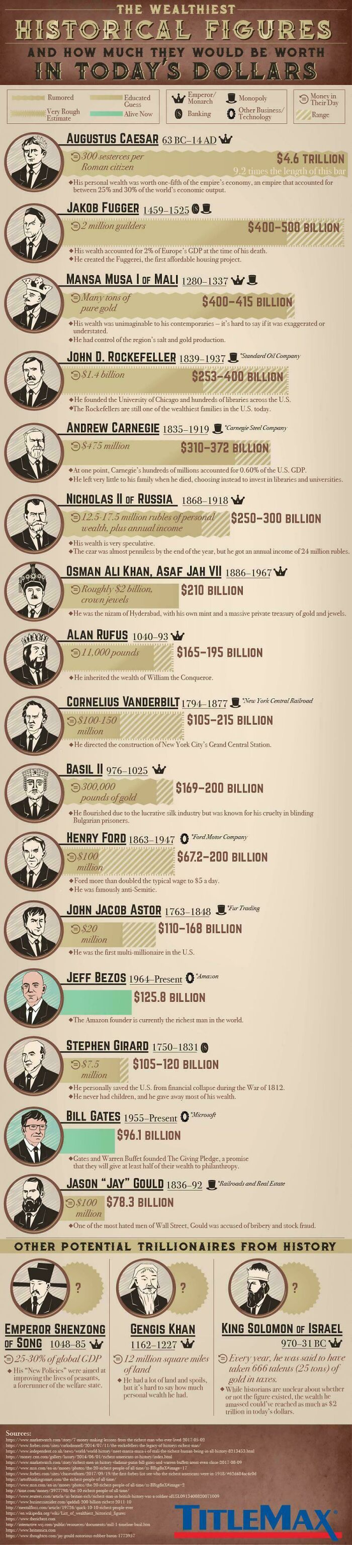
    History’s Heaviest Wallets

    Infographic showing wealth estimates of historical figures converted to today's dollars with visual bars and portraits.

    tfhalford Report

    Jenn C
    Community Member
    1 year ago

    In 1324 Mansa Musa went on a pilgrimage to Mecca. On the way he gave so much gold to the poor and bought so many souvenirs with gold that he caused a recession in Egypt that lasted 10 years. When he heard what he had caused he borrowed all of the gold back at high interest rates

    View more comments
    #31

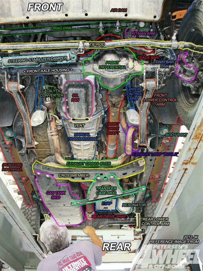
    Underneath the Grit

    Underbody image of a vehicle showing detailed labeled charts and guides of mechanical parts and components.

    GrassChew Report

    Uncle Panda
    Community Member
    Premium
    1 year ago (edited)

    Step 1 - Determine if you are under the car on purpose. Step 2 - Scream or take time to look around?

    View more comments
    #32

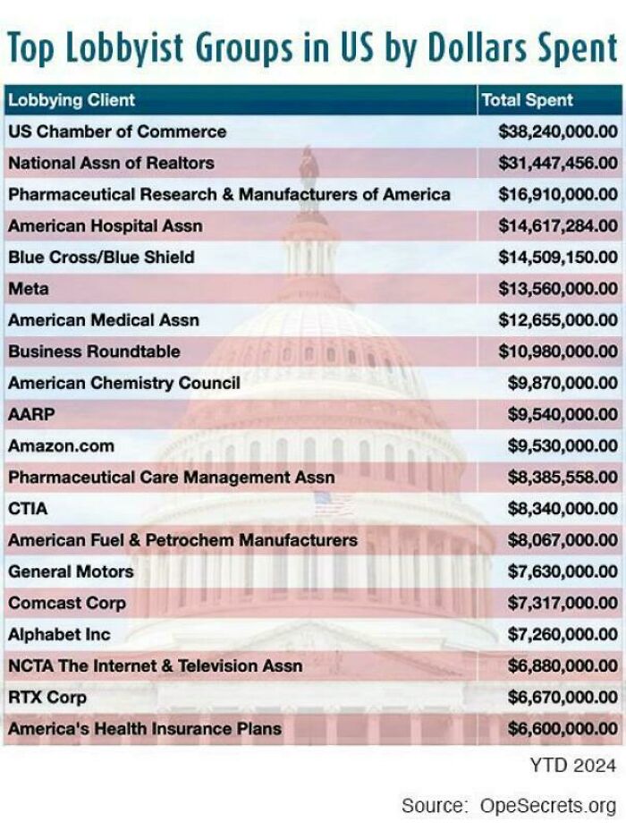
    Cash Talks Louder

    Chart showing top US lobbyist groups by dollars spent in 2024 with organizations like US Chamber of Commerce and Meta.

    levine2112 Report

    TTorrest Author
    Community Member
    1 year ago

    We are never getting free healthcare.

    View more comments
    ADVERTISEMENT
    #33

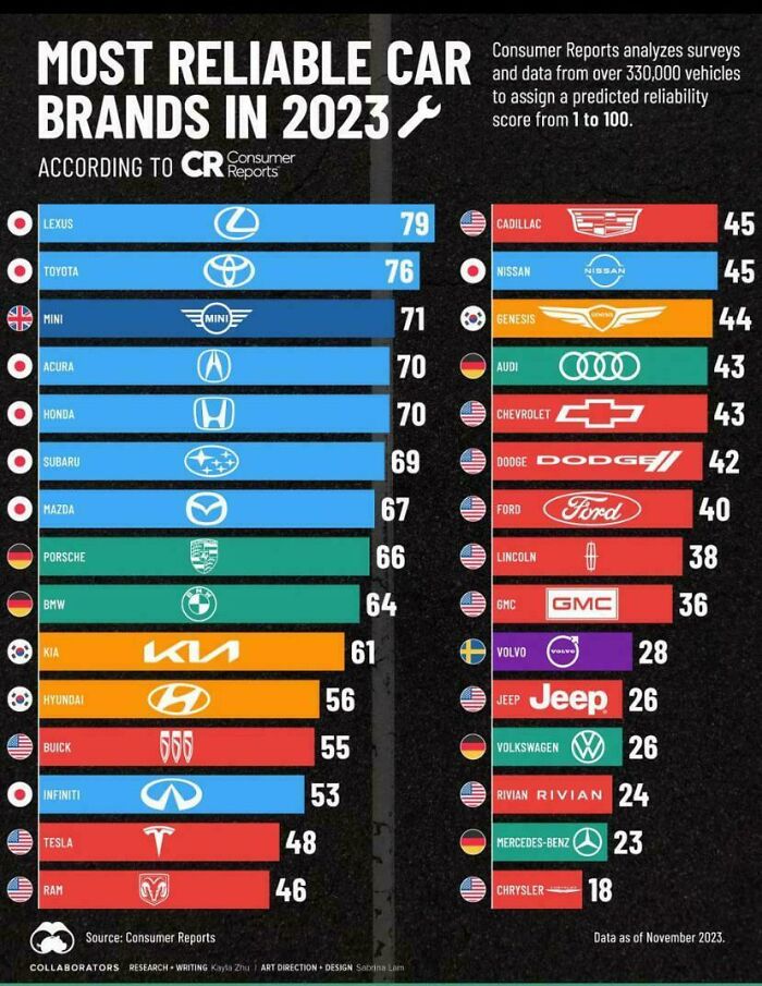
    Ranking The Ride Quality

    Chart showing most reliable car brands in 2023 with reliability scores based on Consumer Reports data.

    WestArtichoke712 Report

    Ejteh
    Community Member
    1 year ago

    Where are the French brands? Peugeot, Citroën, etc

    View more comments
    ADVERTISEMENT
    #34

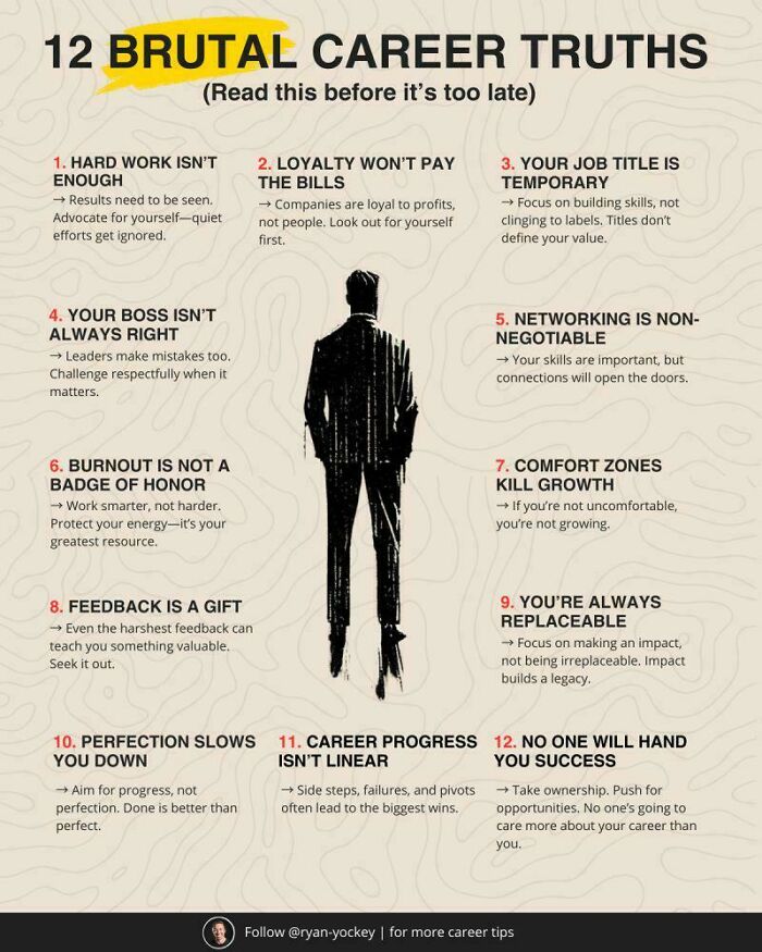
    Work Smarter, Not Harder

    Infographic showing 12 brutal career truths with key advice on work, growth, feedback, and success in career development.

    bayern80 Report

    Verena
    Community Member
    1 year ago

    Number 7 is bulldhit. Making me feel uncomfortable dos not trigger me to grow. It triggers me to take my knowledge to a company that does not believe in some dumb charts. During the padt 50 yesrs, that strategy paid off perfectly, actually and figuratively

    View more comments
    #35

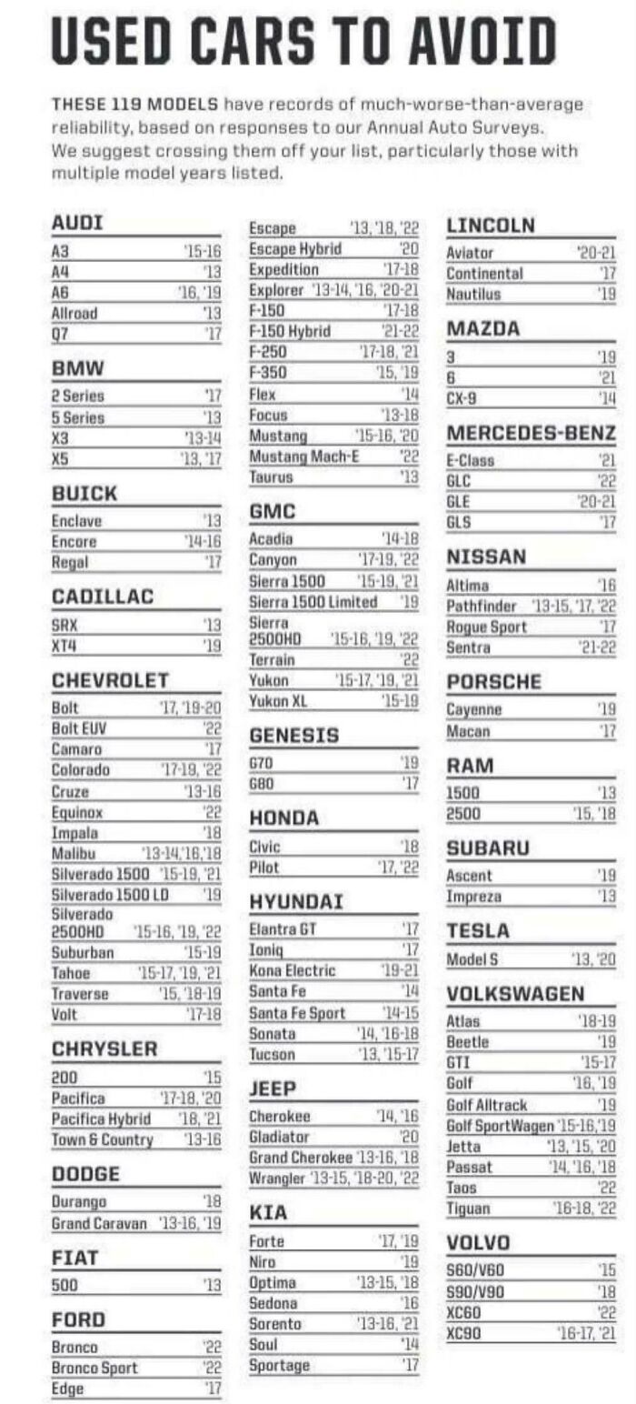
    Reliability Red Flags

    Chart listing used cars to avoid based on reliability reports from annual auto surveys across various brands and models.

    PittOlivia Report

    Roland Nijveld
    Community Member
    1 year ago

    And not a single Toyota on the list while it's one best selling brands in the US

    View more comments
    #36

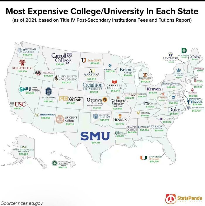
    Pricey Pursuits Across America

    Map of most expensive colleges and universities in each US state with tuition fees, showcasing unique charts and visual guides.

    Mister__Magoo Report

    Verena
    Community Member
    1 year ago

    Okay, now the same for European countries. Or Europe.

    View more comments
    ADVERTISEMENT
    #37

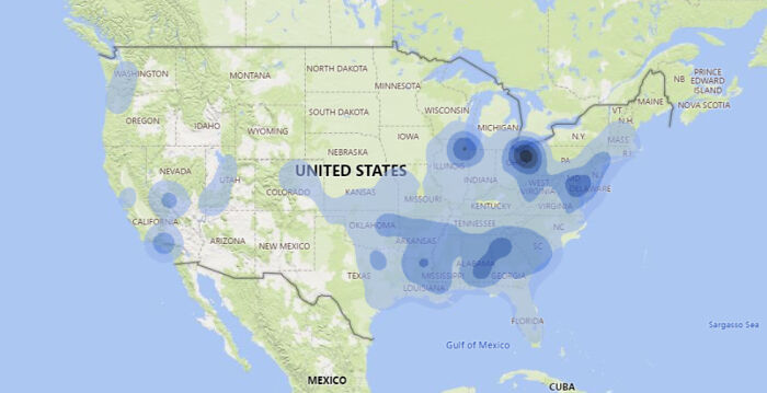
    Hidden Hotspots Revealed

    Heatmap chart showing concentration of data points across various regions in the United States, a unique visual guide.

    Brix001 Report

    michael reid
    Community Member
    1 year ago

    Where's the big black dot and why would it be there? Brit asking

    Jenn C
    Community Member
    1 year ago (edited)

    Northernn Ohio. Flat and nothing but cornfields here.

    Load More Replies...

    Russell Bowman
    Community Member
    1 year ago

    I remember, it was a longtime ago, that the speed limit in Montana was 70 at night ... and "reasonable and proper" in daylight

    TTorrest Author
    Community Member
    1 year ago

    Man, does everyone speed that excessively in Ohio or are the cops just ticket-happy?

    detective miller's hat
    Community Member
    1 year ago

    It's probably because everyone is trying to drive out of Ohio as fast as possible.

    Load More Replies...


    SkyyCaramba
    Community Member
    1 year ago

    that big dot in tx is my hometown :(.

    Rich Black
    Community Member
    1 year ago

    Especially if you have an out of state tag, or are DWB . . .

    Kat Alison
    Community Member
    1 year ago

    Places where people are unwilling to pay taxes—so localities slap a “fee” on every event they can, and the cops write LOTS of speeding tickets.


    Emily Ly
    Community Member
    1 year ago

    Considering I had a friend get a ticket for going 26 in a 25, I can attest to that big blue spot on Ohio.

    Tom Faehnle
    Community Member
    1 year ago

    Yep, can confirm it's Ohio! Between State Patrol and local it can be ridiculous. If you drive an area enough, you'll learn where the hang-outs are.

    View more comments
    ADVERTISEMENT
    #38

    Only One’s Got Issues

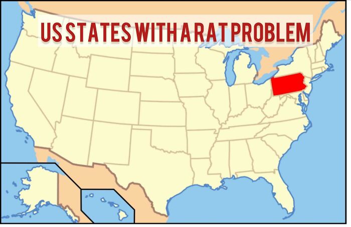
    Map highlighting US states with a rat problem, focusing on visual data from unique charts and guides.
    silromen Report

    FreeTheUnicorn
    Community Member
    1 year ago

    I thought Hegseth was from the Midwest.
    View more comments