Get Premium
Dark mode theme is available exclusively for premium users. Learn more about the benefits of subscribing.
No fees, cancel anytime.

 Dark Mode Ad-Free Browsing Unlimited Content
 Ad-Free Browsing Unlimited Content Dark Mode
Join 1.2 million Panda readers who get the best art, memes, and fun stories every week!
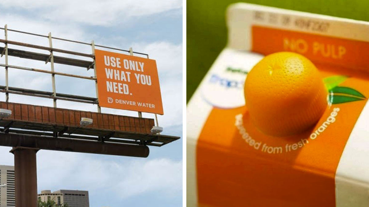
In a world full of bland buildings, boring advertisements, and beige clothing, it can be extremely satisfying when you encounter a visual feast. Whether that’s vibrant produce beautifully arranged at the farmer’s market, stunning bouquets of flowers, or a billboard that’s cleverly designed, you can’t help but appreciate it.
And if you’re looking for some aesthetically pleasing inspiration today, pandas, you’ve come to the right place. We visited r/Design and compiled a list of their most popular posts below. From clever magazine covers to gorgeous doors, we hope you enjoy these images. And be sure to upvote the ones that would have definitely grabbed your attention too!
This post may include affiliate links.
If you’re not an artist, website designer, graphic designer, interior decorator, or architect, you might not think about design much in your everyday life. Sure, you probably picked out some cute pieces of artwork to display in your apartment, and maybe you’ll want to design some invitations for your birthday party. But you may not be an expert when it comes to design.
The reality, however, is that that doesn’t really matter. We can all tell whether or not something is visually pleasing, aesthetic, and practical. So your opinion on this matter matters! As you make your way through this list, feel free to critique the examples you see and decide how impressed you are by their designs.
Now, when it comes to what technically constitutes good design, according to legendary industrial designer Dieter Rams, there are ten key principles. First, good design must be innovative. It must also make a product useful and be aesthetic at the same time. Rams also believed that good design makes a product understandable.
Meanwhile, good design is unobtrusive, honest, and long-lasting. It should be thorough down to the last detail, and it should be environmentally friendly. Finally, Rams said that good design requires as little design as possible. Less is more!
As we can see from this list, good design can be spotted and executed anywhere and everywhere. We don’t have to settle for looking at things that make us sad. And when it comes to your business, good design can lead to great profits. Crowdspring notes that good design will make a strong first impression. When customers see your logo, they’ll immediately resonate with it if they like the design. In fact, memorable logos are 71.6% more likely to receive positive responses from consumers.
There was a kid in my class with a stutter. None of the other kids at school bullied him over it, even though there were a bunch of really bad apples (mostly racist). The teachers however? Most of them kept bringing it up and he frequently lost points in oral exams over it. It only stopped when his parents threatened to lawyer up. A lot of teachers at my school were huge bullies. They even bullied each other! And sometimes for the stupidest reasons, like running marathons, being skinny or having a PhD!
At the same time, great design can help foster relationships with customers. If consumers enjoy interacting with your site, looking at your products, and having your brand in their home, they just might become loyal customers. And, of course, good design means that your products and site are easy to use, which will definitely keep customers happy.
Nowadays, it’s crucial for businesses to utilize social media. And on those platforms, looks are extremely important. If your posts are well designed, customers will be more likely to share and interact with them. You might even be able to go viral if you’ve got designs that wow social media users. While we all would like to pretend that we don’t judge a book by its cover, it’s no secret that you’ll be in a much better place if your cover looks fantastic.
When it comes to physical and digital examples of great design that we see every day, Fortune has compiled a list of the 100 greatest designs of modern times. Coming in at numbers one and two are both products from Apple: the iPhone and the Macintosh computer. Next, Fortune applauds Google Search Engine, the Eames Fiberglass Armchair, the Sony Walkman TPS-L2, OXO Good Grips Peeler, Uber Rideshare, Netflix Streaming, Lego Building Blocks, and the iPod.
It always infuriates me how islamophobes in my country are always like "those backward crazy muhammads who live in dilapidated desert huts and build b0mbs in them" while every picture of a mosque I've seen is the most wonderful work of art.
After the top ten, Fortune notes that Google Maps, the Apollo 11 Mission, and the Akari Lamp 1A are some of the most impressive examples of design from the past century. Then, we’ve got another Apple product on the list: the MacBook Pro. And then, the humble Post-it Notes. Rounding out the rest of the top 20 are the Boeing 747, Polaroid SX-70, Model S Sedan, Nokia 3210, and the Savoy vase. Clearly, excellent design can be in anything. You just have to think outside the box to create it!
Are you enjoying these extremely satisfying examples of design, pandas? Keep upvoting the photos that impress you, and let us know if you can think of any other examples of perfect design that you’ve spotted in the wild. Then, if you want to continue your visual feast, we’ve got another article full of great design for you to check out next right here!
The reason people don't look down is because they *do* notice the homeless person and anyone whose lived in a city knows that making eye contact with a homeless person is likely to cause problems. Many are mentally unwell and will react aggressively or start spouting nonsense at you.
As somebody who is 70+, I depend on 'light touch contact' to keep my balance going up and down stairs. This would allow it would losing touch, even around corners. There are also some metal designs that do this well. This has more class, though.
Trippy! I love it! It feels like it's drawing you into that kitchen.
I've seen this quite a few times now and it's never been identified as a dorm room. It's supposed to be a kid's room.
Technically, it's a bunch of metal pieces welded together, but still nice
Juicy Salif by Philippe Starck, one of his most famous works
It's now a common design for embroidery scissors, i have several blue and purple ones.
OMG. I’m posting a second comment because I noticed an irritating flaw in the design. Apparently the restaurant’s name is ‘Sula’, as per Reddit. This entire time I thought it was ‘iula’. Why? Because the first letter is letter i in Hindi. It’s quite obviously Hindi, not English, which would be obvious to those who know the language. Moreover, the line at the top? That’s how you write in Hindi. So i thought the word was a mix of Hindi and English letters. In case anyone wants a better design that mixes Hindi and English, as comparison, look at the logo of the company “Soch”. There is no ambiguity with soch.


 No fees, cancel anytime