Get Premium
Dark mode theme is available exclusively for premium users. Learn more about the benefits of subscribing.
No fees, cancel anytime.

 Dark Mode Ad-Free Browsing Unlimited Content
 Ad-Free Browsing Unlimited Content Dark Mode
Join 1.2 million Panda readers who get the best art, memes, and fun stories every week!
How many times, looking, for example, at the logos of Nike, Adidas or Apple, have we asked ourselves just one question: “Well, couldn’t we have drawn such a simple logo ourselves?” If yes, then let's move on reading. If not, we still move on. How many times have we read the news that some famous design studio redesigned the next big corporate logo for a check with an obscene number of zeros, and in the end just made the font thinner or simply reduced the distance between some details?
And so, every time we read such news, we come across dozens, if not hundreds of comments that the designers simply scammed their clients for money, but actually nothing in the logo has changed. In fact, as is often the case, things are not so clear cut.
Firstly, the famous swoosh was most likely a manifestation of spontaneous genius insight (for which, however, they paid only 35 bucks), and the original version of the Apple logo was complex, artsy and as old-school as possible. Secondly, any change in the logo in a large company is preceded by a long and thorough marketing analysis. Yes, sometimes it turns out a complete fail, as was the case with the 2012 Summer Olympics logo, but more often than not, the idea of saving on logo design doesn't justify itself at all.
Do you want proof? Voila! As many as 47 examples collected by Bored Panda, when the designer just drew something, the marketing manager was either absent or did not think at all, and the boss approved the logo without looking. And the result is what we have - this incredible selection of logos from around the world, on the one hand, beautiful and stylish - but completely inappropriate, you just have to look at it from a different angle. So please feel free to think different, as Steve Jobs once urged us, scroll this selection to the very end, and just enjoy these absolute masterpieces of human short-sightedness.
This post may include affiliate links.
Its a " double entendre " and its hilarious lol, you can see it as half an Apple lol, of a fire spitting a*s, thats actually Smart.
Hello? Is this John Constantine? Yea. So I got a Hell Baby? We might need to perform an exorcism..
🎶 We’re going on a trip in our favorite Spac Eship! Zooming through the sky! Lil Einsteins!
Yes that's Martel. It's a high end chocolaterie in Switzerland.
Load More Replies...It's terrible and a little interesting at the same time. Not what I would've gone with, but it almost looks the way chocolate or icing does when you are using a piping bag and trying to write in cursive. If that's what they were going for, it's a bit clever.
Martel. It's a Swiss chocolate company that's been around since 1818. And probably hasn't updated their logo since then 😆
Load More Replies...Not like kids these days in America can read cursive anyways. We stopped teaching it years ago.
WHAT LANGUAGE EVEN IS THIS ??? i mean i know it's supposed to be english bUT WHAT
It says "MarTel". This isn't even the worst cursive I've ever seen. Not a great logo choice...
I thought of a doctor's writing too when I saw this.
Load More Replies...And instead of selling chocolate they sell falafel! I think you're on to something. Whereas the sign designer must have just been on something.
Load More Replies...This is why it's so important to get an outside opinion on these things.
That looks like somebody's name scrawled in cheap icing on a Carvel's "Cookie Puss" ice cream birthday cake.
Martel... in Dutch, this means: to torture. I certainly wouldn't visit that place
Ugly, but at least it's unambiguously readable and doesn't have suggestive imagery.
"Elia Martel! SAY HER NAME! You R***d her, you Mu***red her, you Kil**d her children!"
To be fair, the name "Morsel' for a restaurant is a fail in any font.
We have a local restaurant named "Locust Table". Just the name is a turnoff!
Load More Replies...HMMM..that B looks familiar! Where have I seen it before!? The M looks original but that B…HMMM…HMMmMmmMmMmm
People attend art school to major in graphics, mainly to master concepts and technology. For four years they create logos and layouts, then rip each other to shreds for errors much much lesser than these.
My mom went to college for graphic design for 4 years. Nearly this whole list made me cringe horribly.
Load More Replies...I can't stop laughing at #15, that company is in the town I grew up in, I've seen that logo a million times and never realized how bad (good?) it really is! Then again this is the same place where one year the girls lacrosse team made and sold *female empowerment* t-shirts with the slogan, "We'll beat you on the field, and then we'll beat you off!" and not one coach/teacher realized until it was far too late. 100% true story. 🤣
These get re-ordered according to votes. Which one are you referring to?
Load More Replies...Have you seen the Torres Strait Islander flag? torres-str...-image.jpg 
My inner artist has been triggered by this post. I want to redesign a lot of these.
You should redesign them then create a list for bored panda :)
Load More Replies...The title is assuming professional designers created all of them. There are lots of business owners who think a pro designer is too expensive and unnecessary...
Oh, come on BP. 48 images shortened to 45 is just silliness.
TIL if you want to score big on the upvotes, just repeat what the title of the image is and/or make a crude sex reference.
either a doggo or not something good. i prefer seing the dog
Load More Replies...To be fair, it is the client who has the final say. Even the most experienced designer may suggest what the designer knows will look good, but whether the client has good judgement or bad judgement, the client makes the final decision, not the designer.
I honestly can't believe the owners agreed to those things. OR maybe they were too embarassed to admit how stupid they were.............after they paid!!
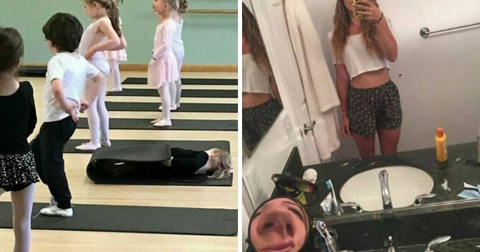
Or this childrens’ dance studio near me…. https://photos.app.goo.gl/2uXKEUZx8nBxvyJ39
scrolled down here to find other graphic designers who, like me, this post hurt me in my soul. now, to quietly weep
Where is that salad meme cat when we need it (to read stuff in the right order).
Some are almost impossible to read while others point out how much the internet has ruined us.
People attend art school to major in graphics, mainly to master concepts and technology. For four years they create logos and layouts, then rip each other to shreds for errors much much lesser than these.
My mom went to college for graphic design for 4 years. Nearly this whole list made me cringe horribly.
Load More Replies...I can't stop laughing at #15, that company is in the town I grew up in, I've seen that logo a million times and never realized how bad (good?) it really is! Then again this is the same place where one year the girls lacrosse team made and sold *female empowerment* t-shirts with the slogan, "We'll beat you on the field, and then we'll beat you off!" and not one coach/teacher realized until it was far too late. 100% true story. 🤣
These get re-ordered according to votes. Which one are you referring to?
Load More Replies...Have you seen the Torres Strait Islander flag? torres-str...-image.jpg
My inner artist has been triggered by this post. I want to redesign a lot of these.
You should redesign them then create a list for bored panda :)
Load More Replies...The title is assuming professional designers created all of them. There are lots of business owners who think a pro designer is too expensive and unnecessary...
Oh, come on BP. 48 images shortened to 45 is just silliness.
TIL if you want to score big on the upvotes, just repeat what the title of the image is and/or make a crude sex reference.
either a doggo or not something good. i prefer seing the dog
Load More Replies...To be fair, it is the client who has the final say. Even the most experienced designer may suggest what the designer knows will look good, but whether the client has good judgement or bad judgement, the client makes the final decision, not the designer.
I honestly can't believe the owners agreed to those things. OR maybe they were too embarassed to admit how stupid they were.............after they paid!!
Or this childrens’ dance studio near me…. https://photos.app.goo.gl/2uXKEUZx8nBxvyJ39
scrolled down here to find other graphic designers who, like me, this post hurt me in my soul. now, to quietly weep
Where is that salad meme cat when we need it (to read stuff in the right order).
Some are almost impossible to read while others point out how much the internet has ruined us.


 No fees, cancel anytime


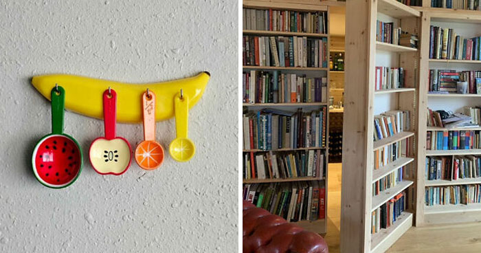
. I Like The Idea, But The Execution Is Not The Best")


")
")


")