ADVERTISEMENT

Good design has a few simple rules: simplicity, clarity, and visual appeal. Some designs, however, fail to execute all of these criteria. Bad design can be disappointing; it can be dull and uninspiring, but when it starts to veer into the realm of the offensive, that’s when you know you have a problem.

Bored Panda has made you a compilation of signs, labels, and other awfully designed objects that might make you say: “Who approved this?” There’s no way such inappropriate designs could’ve made it through a professional’s eyes, yet they did, it seems. Check these out if you’re looking for a few moments to laugh, cringe, and shake your head in ridiculous disbelief.

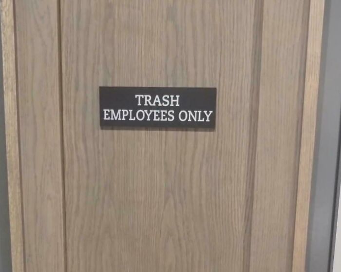
#1

I Hope They Have A Room For Good Employees As Well

A door with a sign reading Trash Employees Only, a hilariously awful design fail.

FireKing9372 Report

monsieur mabel
Community Member
2 months ago

...goals !

View more comments
RELATED:
    #2

    …

    A hilariously awful design fail on a German School sign, with a stick figure appearing to point a gun at students.

    dentexetneb Report

    Nathaniel He/Him Cis-Het
    Community Member
    Premium
    2 months ago

    Directions to the school? Take a hard right.

    View more comments
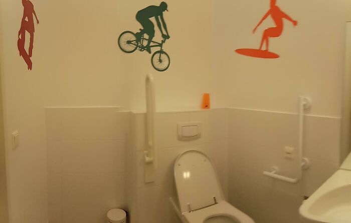
    #3

    "We Need To Decorate The Toilet For The Disabled." "Say No More"

    A hilariously awful design fail: a toilet with extreme sports decals like biking and surfing above it.

    WiggelingOversnipe Report

    Barbara Burns
    Community Member
    2 months ago

    Great.

    View more comments
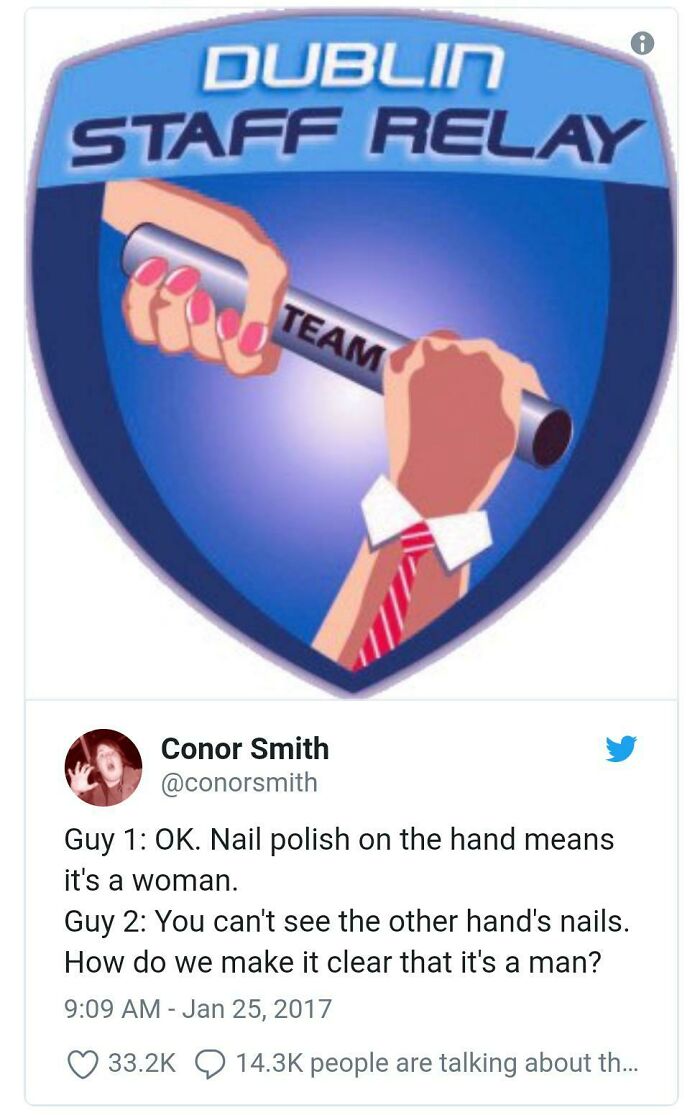
    #4

    The Gender Of The Arms Is Super Important

    A hilariously awful design fail in a Dublin Staff Relay logo featuring a man's hand with pink nail polish.

    APinkNightmare Report

    WindySwede
    Community Member
    2 months ago (edited)

    Disney is that you? ⤵⤵⤵

    View more comments
    ADVERTISEMENT
    #5

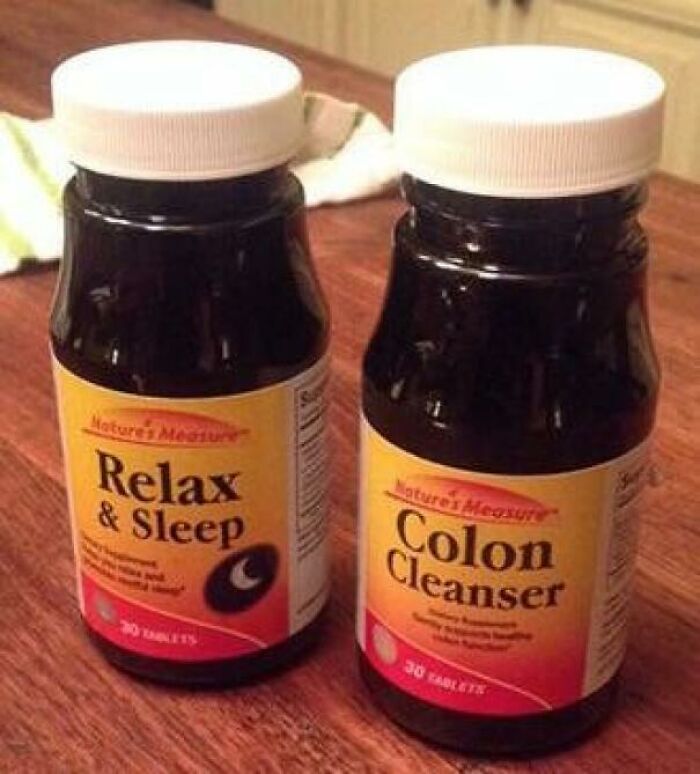
    Well, My Night Was Almost Ruined

    An awful design fail with two bottles of supplements, one labeled Relax & Sleep and the other Colon Cleanser, side by side.

    johnnysmart Report

    Nathaniel He/Him Cis-Het
    Community Member
    Premium
    2 months ago

    I would swap the pills in the bottles and wait....

    View more comments
    ADVERTISEMENT
    #6

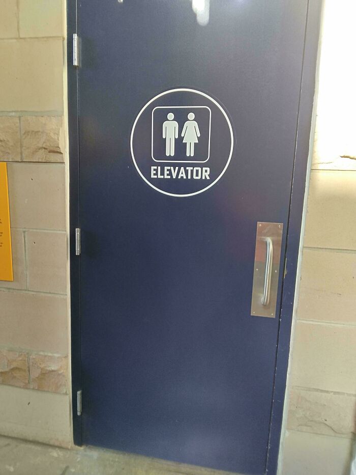
    Great To Know That Both Genders Can Use This Elevator

    A hilariously awful design fail: a blue door with a sign indicating it is an elevator, but it is a solid door.

    8R403N Report

    Kira Okah
    Community Member
    2 months ago

    Odd door for a lift.

    View more comments
    #7

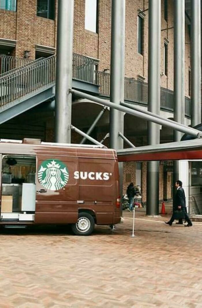
    What Brand Of Van Is This?

    An awful design fail showing a Starbucks van with the word S***S written on its side.

    LimpMathematician247 Report

    General Anaesthesia
    Community Member
    2 months ago

    Truth in advertising.

    View more comments
    #8

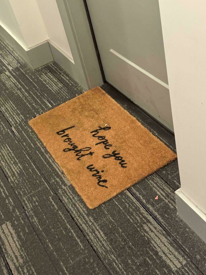
    “Hope You Brought Urine”

    A doormat with a hilariously awful design that reads I hope you brought wine, a funny design fail.

    Montreseur Report

    Nathaniel He/Him Cis-Het
    Community Member
    Premium
    2 months ago

    "This mat is soggy! And smells... "

    View more comments
    ADVERTISEMENT
    #9

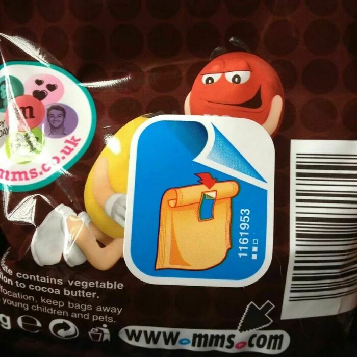
    I Really Don't Want To Know What's Under That Sticker

    A bag of M&Ms with an instruction sticker, highlighting an awful design fail.

    [deleted] Report

    nut nibbler
    Community Member
    2 months ago

    My profile name says it all.

    View more comments
    ADVERTISEMENT
    #10

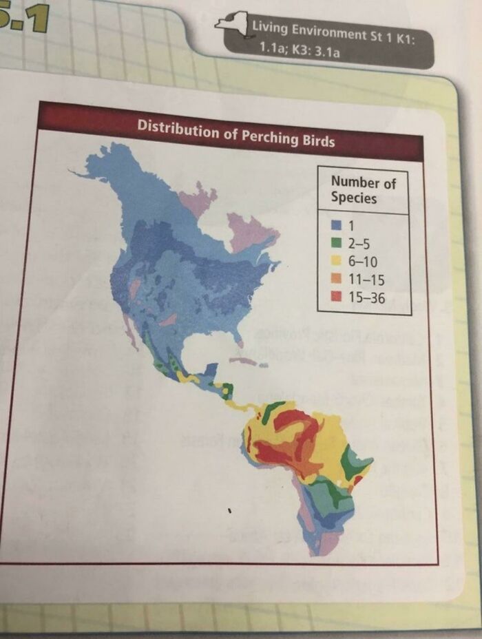
    For Reasons Unknown, South America Has Completely Been Replaced By Africa

    Map of North and South America showing the distribution of perching birds, an awful design fail.

    logstain Report

    Daisydaisy
    Community Member
    Premium
    2 months ago

    Pretty sure the Sahara Desert doesn't have way more birds than anywhere else

    View more comments
    #11

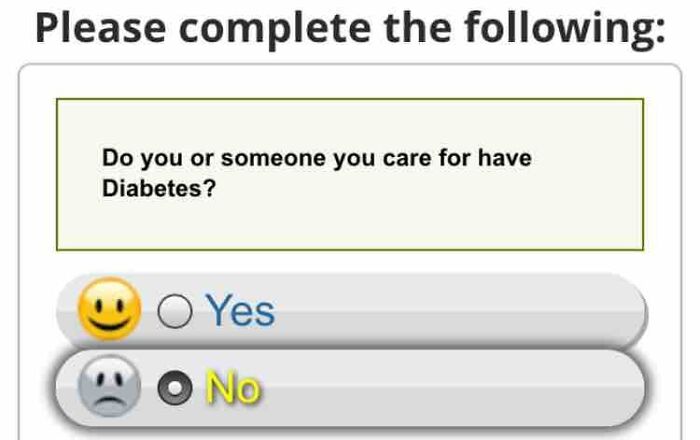
    Well Then

    A hilariously awful design fail with a survey question that has Yes and No options represented by happy and sad emojis.

    AFA_Falcon1396 Report

    Edo Sayle
    Community Member
    2 months ago

    😃

    View more comments
    #12

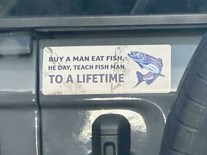
    Buy A Man Eat Fish

    A hilariously awful design fail: a bumper sticker with grammatically incorrect text about fish, a design fail.

    skankboy Report

    Ravenkbh
    Community Member
    2 months ago

    Me fish you long time!

    View more comments
    ADVERTISEMENT
    #13

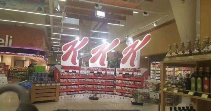
    The Sign In This Grocery Store

    A hilariously awful design fail in a supermarket with a display spelling out K*K.

    [deleted] Report

    Val
    Community Member
    2 months ago

    Trump's favorite store.

    View more comments
    ADVERTISEMENT
    #14

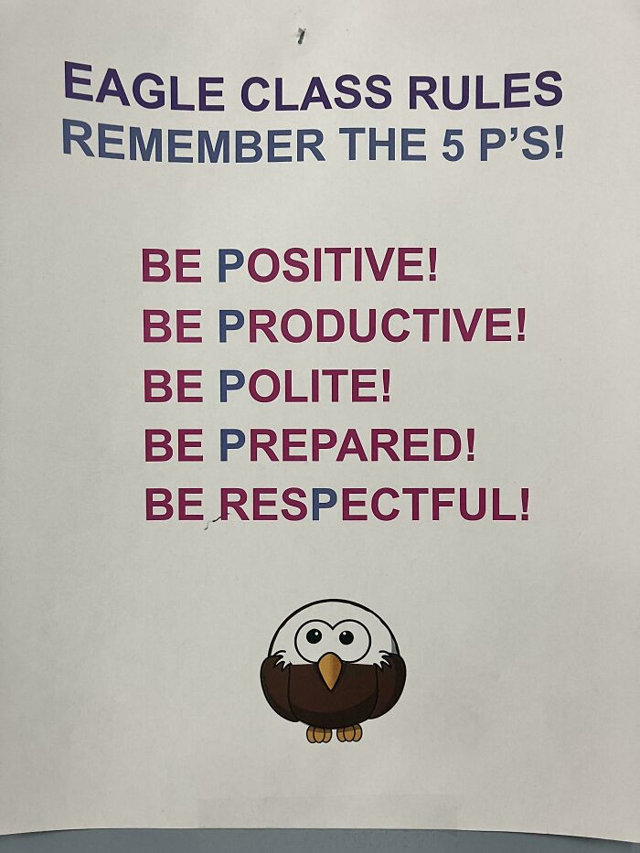
    Ah Yes, The 5 P’s

    An awful design fail poster listing 5 P's with the last P being respectful instead of starting with P.

    Billybob_and_Barnaby Report

    Nathaniel He/Him Cis-Het
    Community Member
    Premium
    2 months ago

    Be Pesrectful. Corrected it.

    View more comments
    #15

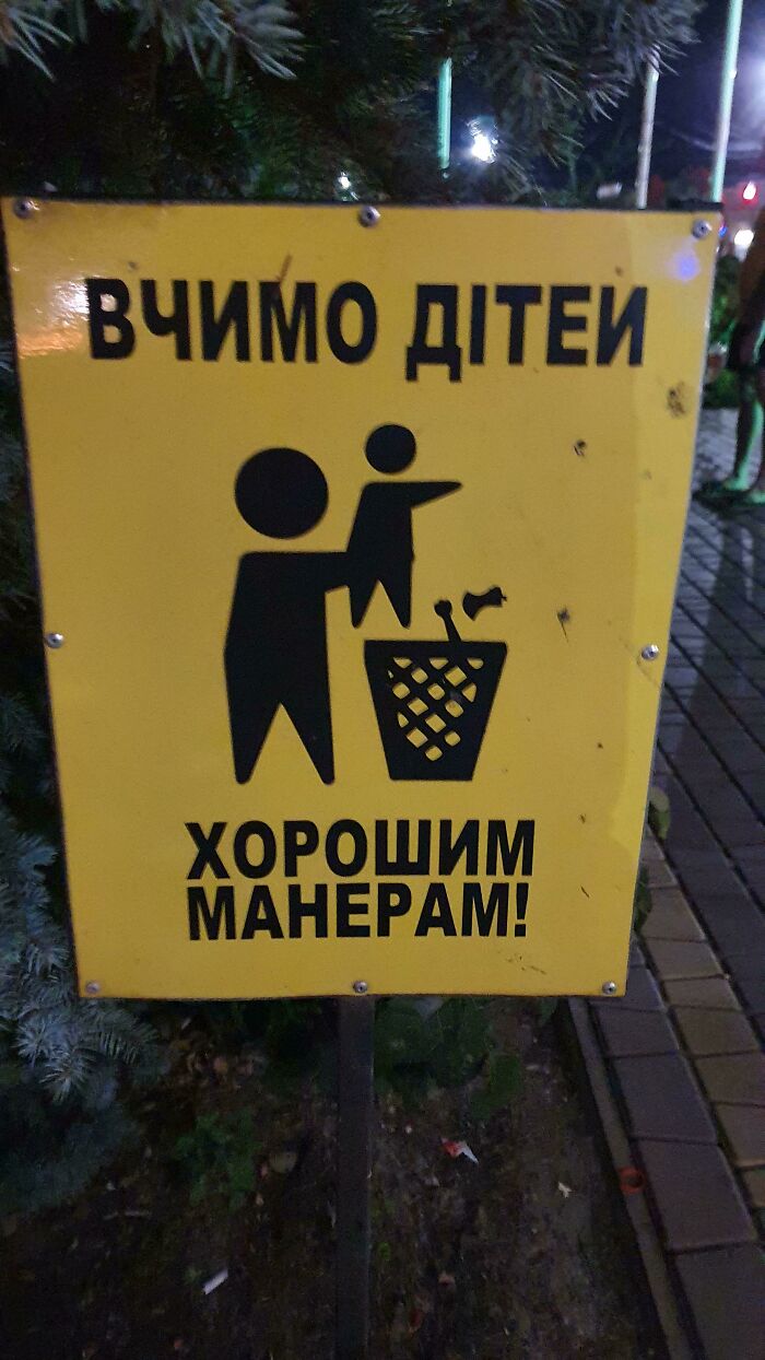
    The Sign Says "Teaching Kids Good Manners", But It Looks Like You're Just Yeeting The Baby Into Trash

    A yellow sign depicting a person throwing a child into a trash can, an awful design fail.

    alphaMrWave Report

    Inigo Montoya
    Community Member
    2 months ago

    I never know which bins to use, so this is helpful.

    View more comments

    Never miss a story that brings joy to the world. Add us on Google

    #16

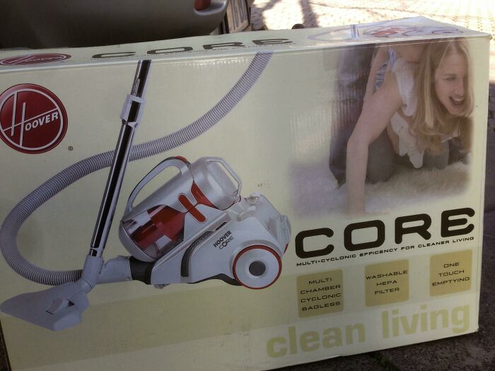
    Well, Now That The Floors Are Clean

    A Hoover CORE vacuum cleaner box, displaying an unfortunate design fail with the model.

    [deleted] Report

    nut nibbler
    Community Member
    2 months ago

    What attatchments does it have, crevice tool, upholstery brush, ball gag?

    View more comments
    ADVERTISEMENT
    #17

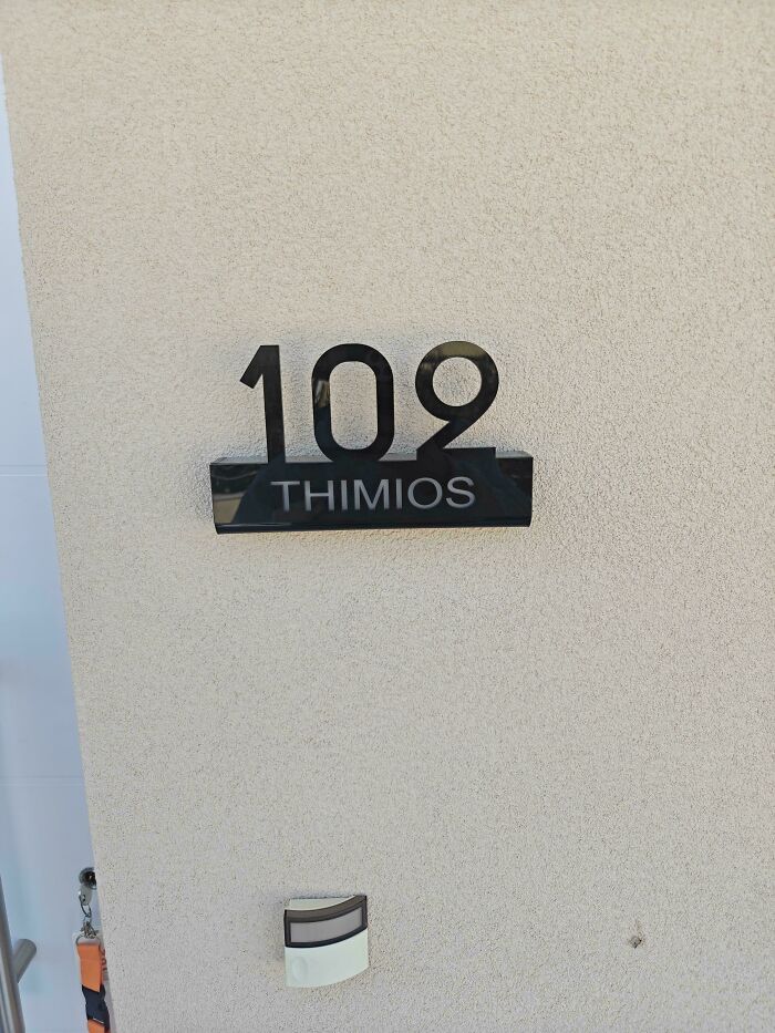
    Could Not Find My 102 Apartment

    House number 109 with the name THIMIOS below, where the 109 casts a shadow that makes it look like it says Thimios above. An awful design fail.

    L_Imperatore10 Report

    chickpea me
    Community Member
    2 months ago

    Don't be distracted by the number. Look up Thimios instead.

    View more comments
    ADVERTISEMENT
    #18

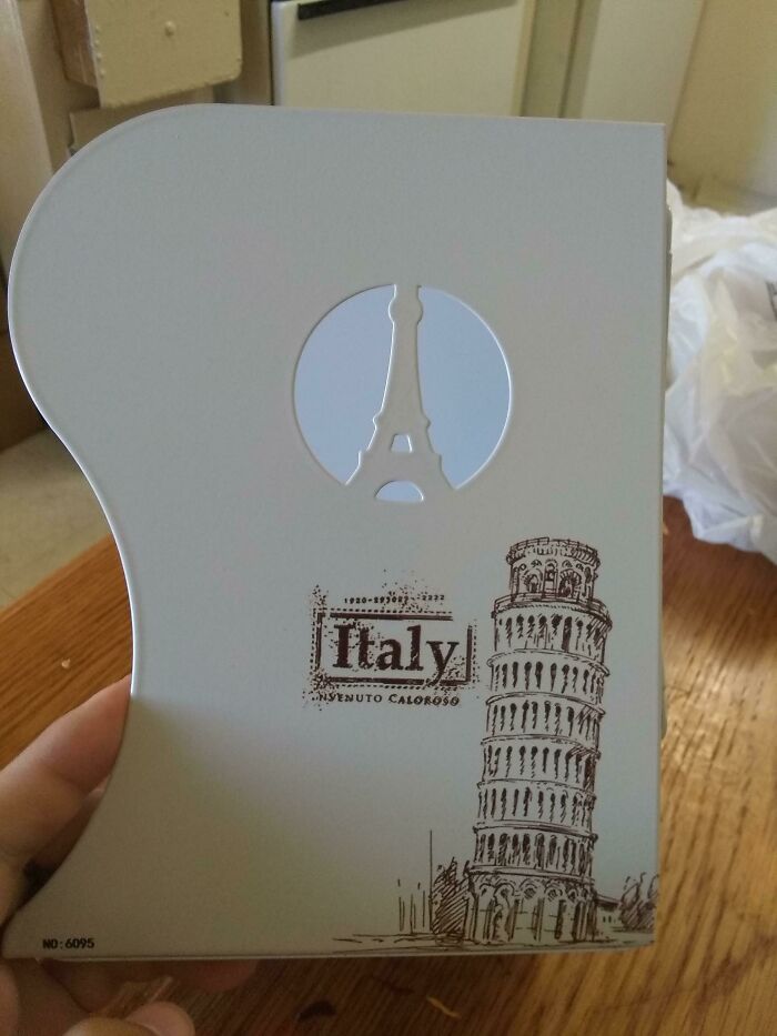
    Got This As A Gift And Honestly I Don't Want To Throw It Away Just Because It's Terribly Funny

    An awful design fail showing a souvenir from Italy with the Eiffel Tower cut out, mixing landmarks.

    AmberedVal Report

    Pork Chop
    Community Member
    2 months ago

    The leaning tower of Eiffel.

    View more comments
    #19

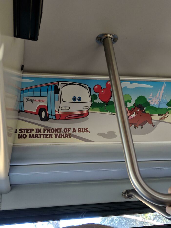
    Nice Place To Cut Off The Sign Disney

    A design fail on a Disney Transport bus, with an advertisement featuring Pumbaa appearing to chase a bus with a Mickey balloon, and a sign saying 'R step in front of a bus, no matter what'.

    ImSheen Report

    Val
    Community Member
    2 months ago

    Hakuna Matata.

    View more comments
    #20

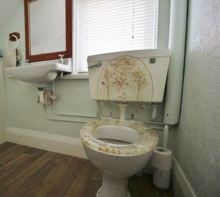
    Toilet Seat Makes It Looks Like Someone Didn't Quite Make It

    A toilet with a hilariously awful design, featuring a transparent seat filled with small, unsettling objects.

    PanthermalUnderwear Report

    Nathaniel He/Him Cis-Het
    Community Member
    Premium
    2 months ago

    When I have eaten too much cheese...

    View more comments
    ADVERTISEMENT
    #21

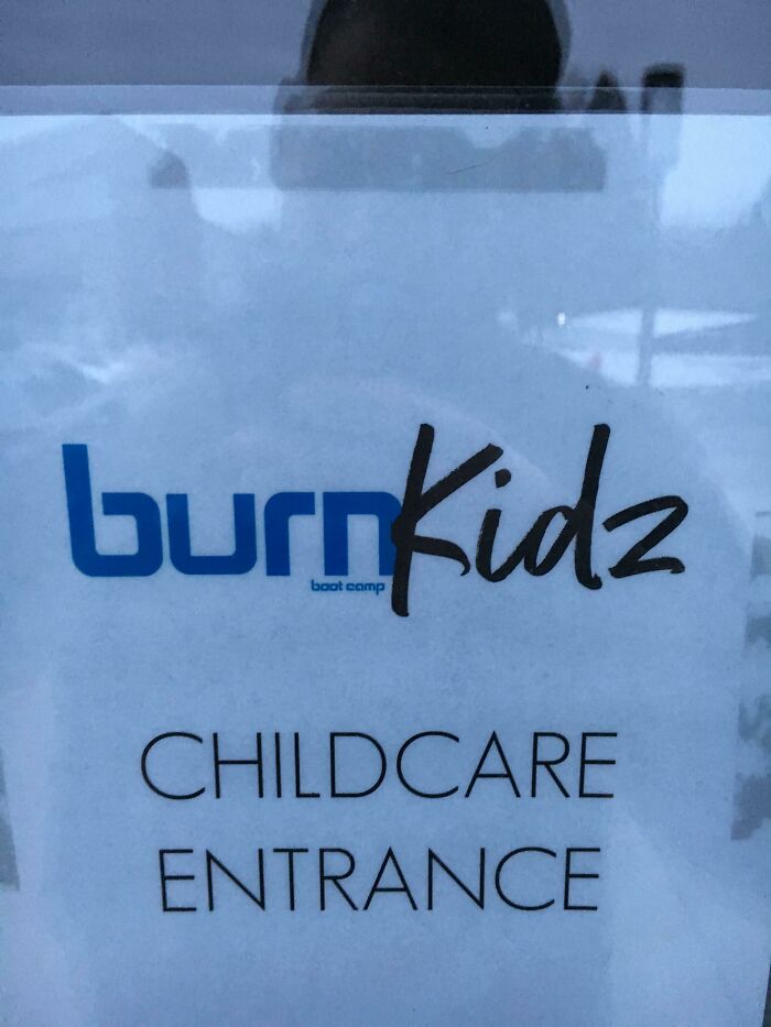
    This Sign At A Fitness Club Is A Little Sadistic

    A sign for Burn Kidz childcare, an example of awful design fails.

    MrTurtleFerguson Report

    Partypants
    Community Member
    2 months ago

    Yeah, you have to burn them before you eat them to get that nice crisp.
    View more comments
    ADVERTISEMENT
    #22

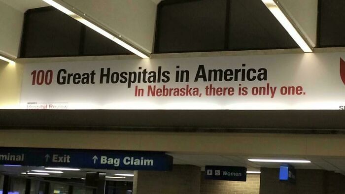
    Well, Uh.... Thanks For The Warning?

    A hilariously awful design fail: an advertisement for 100 Great Hospitals in America, stating In Nebraska, there is only one.

    [deleted] Report

    chickpea me
    Community Member
    2 months ago

    With 50 states still very promising.

    View more comments
    #23

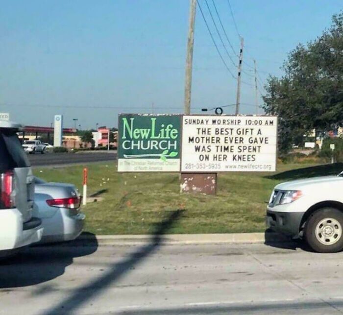
    This Sign

    A church billboard with an awful design fail, saying: The Best Gift a Mother Ever Gave Was Time Spent On Her Knees.

    0bjective_Butter Report

    Val
    Community Member
    2 months ago

    HA. Sorry, my mind is 10 years old.

    View more comments
    #24

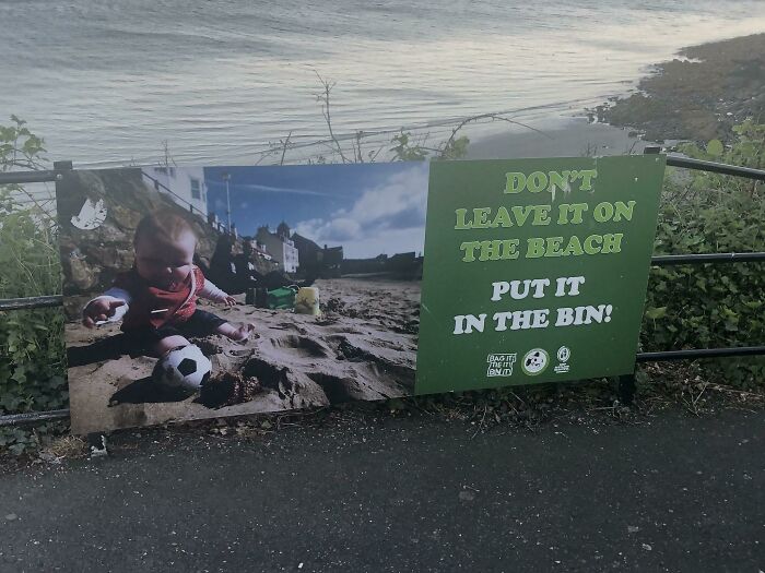
    Sign At A Local Beach

    A beach sign with a baby playing in the sand, next to text that is an awful design fail.

    joefife Report

    GatorGran
    Community Member
    2 months ago

    I think they did that in #25

    View more comments
    ADVERTISEMENT
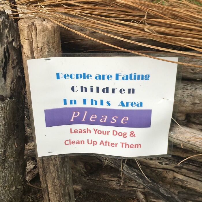
    #25

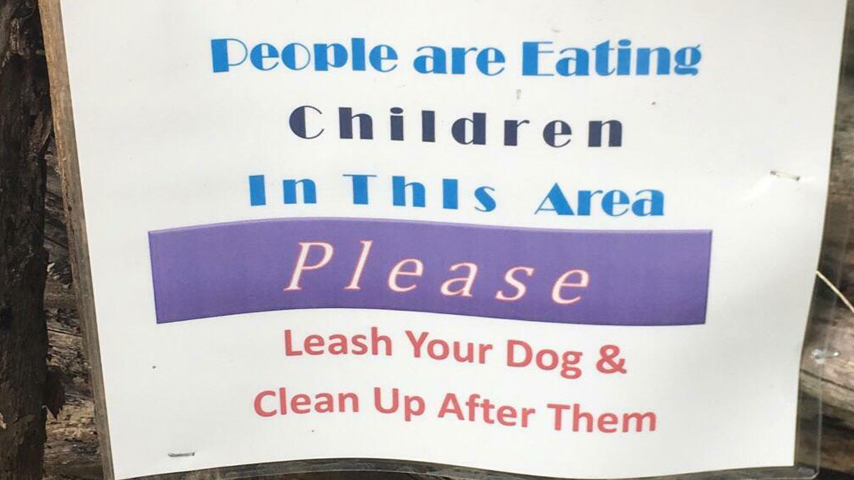
    This Terribly Worded Sign I Saw Today. Sorry, I’ll Pick Up My Dog’s Poop... Wouldn’t Want To Ruin Your Child Eating Experience

    An awful design fail on a sign reading: People are Eating Children In This Area Please Leash Your Dog & Clean Up After Them.

    KevenNotKevin Report

    sturmwesen
    Community Member
    2 months ago

    They don't clean up after themselves. that's why you see pacifiers, shoes and socks everywhere. sometimes they even let them roam before eating them and in summer they wash them at the river. /jk

    View more comments
    ADVERTISEMENT
    #26

    This Isn’t How You Play Tennis…

    An image advertising a tennis training tool, poorly photoshopped with a golfer, a hilarious design fail.

    summitrock Report

    UncleJon_TheMadScientist
    Community Member
    2 months ago

    I can just picture the ball on the elastic band snapping back right into his "buddies" 😵‍💫

    View more comments
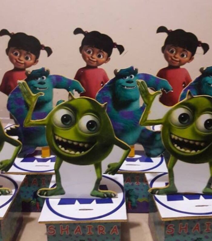
    #27

    Um Im Pretty Sure Mike Doesnt Have 2 Eyes

    Monsters Inc. Mike Wazowski and Boo cutouts on party favors, an example of design fails.

    [deleted] Report

    Mama Oddling
    Community Member
    2 months ago

    So wrong

    View more comments
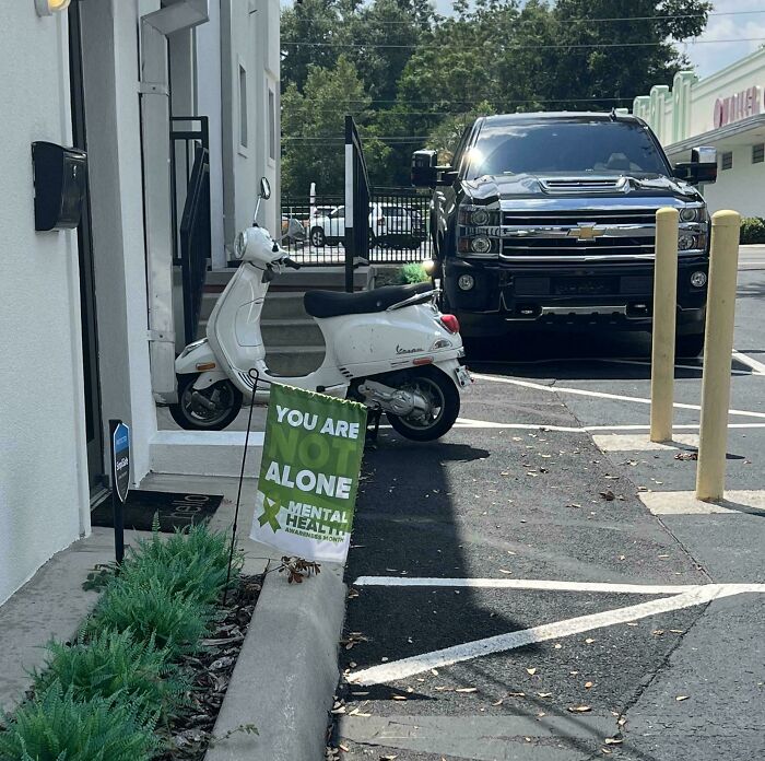
    #28

    Wait. Am I Alone?

    An awful design fail: a You Are Not Alone Mental Health Awareness sign partially hidden behind a parked scooter.

    tinynugget Report

    WhyamIhere?
    Community Member
    2 months ago

    I'm colourblind, what does this say? Yeah, it says they're alone but am I missing something? It's a mental health sign and weird spacing so... idk, help :(

    View more comments
    ADVERTISEMENT
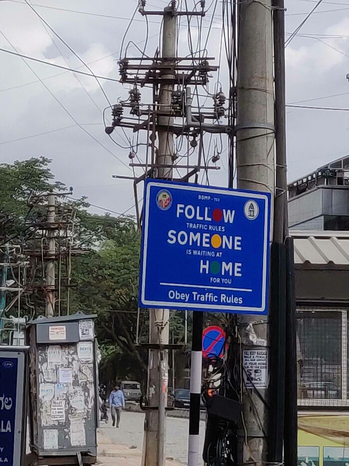
    #29

    A Sign That Looks Like It Says "Follow Someone Home"

    A hilariously awful design fail on a traffic sign: Follow Someone Home. Obey Traffic Rules.

    TabCompletion Report

    Nathaniel He/Him Cis-Het
    Community Member
    Premium
    2 months ago

    In my defence to the stalking charge I was only doing what the sign told me!

    View more comments
    ADVERTISEMENT
    #30

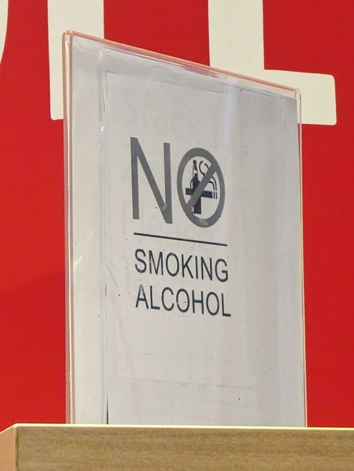
    "No Smoking Alcohol"

    A hilariously awful design fail with a sign that reads NO SMOKING ALCOHOL, poorly designed.

    dylanh333 Report

    Nathaniel He/Him Cis-Het
    Community Member
    Premium
    2 months ago

    I didn't know you could?

    View more comments
    #31

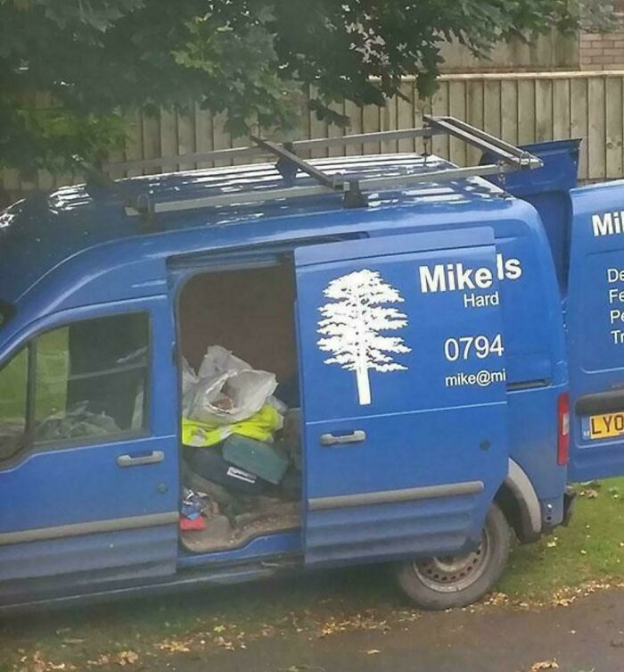
    Yeah About That Van

    A blue van with a tree logo and text 'Mike is Hard,' an example of awful design fails.

    practicalsargent Report

    Seán Baron
    Community Member
    Premium
    2 months ago

    Good for you, Mike.

    View more comments
    #32

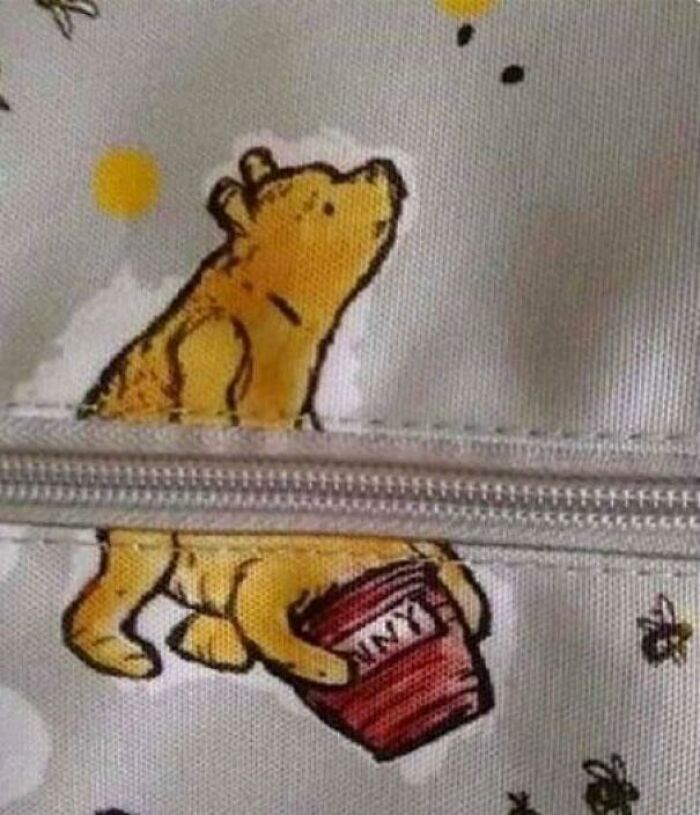
    🤔

    Winnie the Pooh split by a zipper, creating an awkward design fail on a bag.

    TheHolyCringe Report

    A. Br.
    Community Member
    2 months ago

    Got to get that honey

    View more comments
    ADVERTISEMENT
    #33

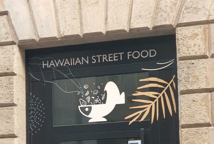
    It Just Looks Like A Toilet

    A hilariously awful design fail: a Hawaiian street food sign with an odd fish bowl graphic and a palm leaf.

    KahiaNyaaa Report

    Val
    Community Member
    2 months ago

    Huh. It looks like a fishbowl to me.

    View more comments
    ADVERTISEMENT
    #34

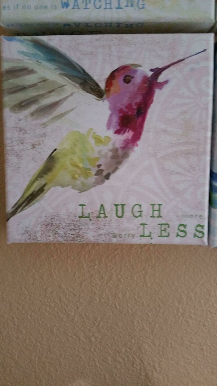
    Laugh Less

    A painting of a hummingbird with the text LAUGH more and worry LESS, but the words are poorly spaced, an awful design fail.

    zuksamy Report

    Nathaniel He/Him Cis-Het
    Community Member
    Premium
    2 months ago

    This is the motto of Bored Panda recently.

    View more comments
    #35

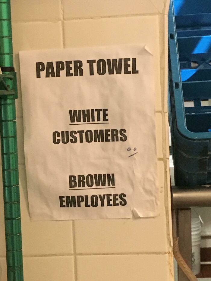
    This Paper Towel Sign

    An awful design fail, a sign for paper towel dispenser: White Customers, Brown Employees.

    dargombres Report

    Nathaniel He/Him Cis-Het
    Community Member
    Premium
    2 months ago

    Aside from the accidental racism, why would you have separate paper towels?

    View more comments
    #36

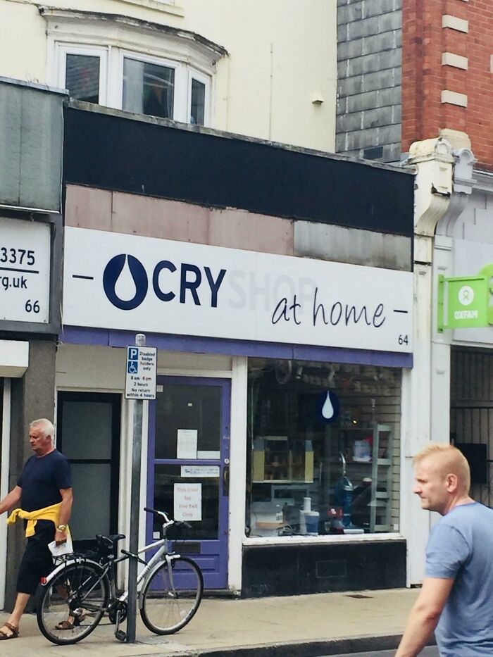
    Poor Colour On This Shop Sign

    An awful design fail for a storefront sign that reads OCRY SHOP at home with a tear drop logo.

    gwinny121 Report

    Edo Sayle
    Community Member
    2 months ago

    I always do!

    View more comments
    ADVERTISEMENT
    #37

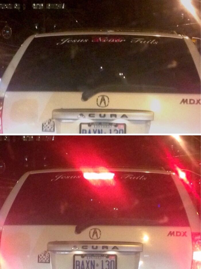
    I Think Jesus Failed You This Time

    A hilariously awful design fail on a car's rear window where brake lights reveal hidden text, turning Jesus Never Fails into Jesus Fails.

    cadobbers Report

    Edo Sayle
    Community Member
    2 months ago

    This comment has been deleted.

    ADVERTISEMENT
    #38

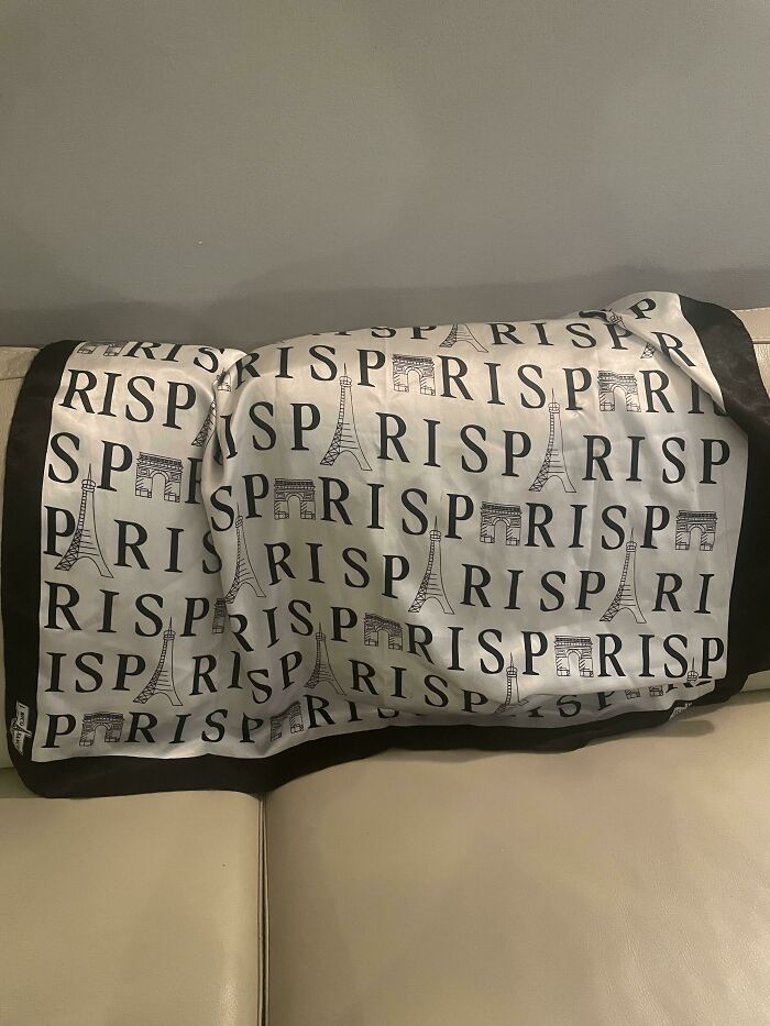
    Take A Trip To Risp

    A pillow with the word PARIS and Eiffel Tower repeated, an awful design fail with a spelling error.

    unscot Report

    I am not you
    Community Member
    2 months ago

    When they finally use the Eiffel Tower as the letter A, that turns out wrong for someone, too.

    #39

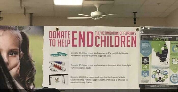
    Sign I Saw At The Dmv

    A hilariously awful design fail with a banner that poorly phrases a message to end children victimization.

    vvxHolden Report

    Edo Sayle
    Community Member
    2 months ago

    I do wish to end children

    View more comments
    #40

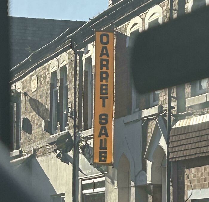
    Oaaabt 8aub (Carpet Sale)

    A vertical orange sign on a brick building that reads GARRET SALE instead of CARPET SALE, an awful design fail.

    erikapleaseshutup Report

    nm
    Community Member
    2 months ago

    A semi-transparent banner.

    View more comments
    ADVERTISEMENT
    #41

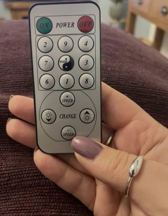
    The Arrangement Of The Buttons On This Remote

    A hand holding a remote control with a confusing layout, an awful design fail.

    Pinky_Crusher_5 Report

    nm
    Community Member
    2 months ago

    Either vertically or horizontally the totals are always 15.

    View more comments
    ADVERTISEMENT
    #42

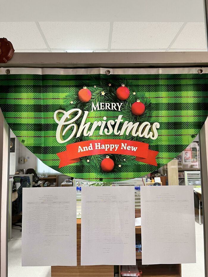
    Happy New, Everyone!

    A hilariously awful design fail with a Christmas banner saying Merry Christmas And Happy New, missing a word.

    tcatsninfan Report

    Top Notcher
    Community Member
    2 months ago

    Happy new ball

    #43

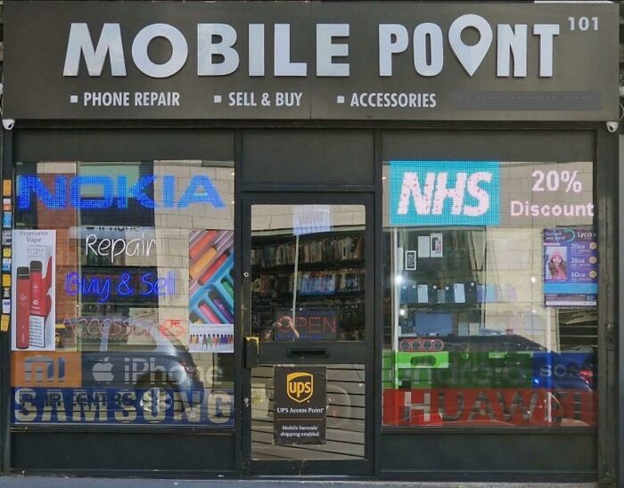
    Mobile Poont? Surely The O Would Have Served Better As The Point Icon!

    A hilariously awful design fail on a mobile phone shop sign, with Mobile Point accidentally spelled as Mobile Poont.

    punchypariah Report

    Kira Okah
    Community Member
    2 months ago

    Found it, and yes the frontage sign does look like that.

    #44

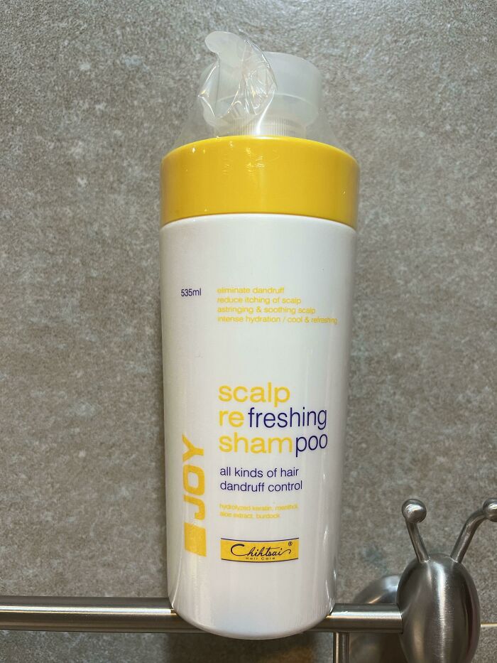
    The Words They Chose To Have Standout Color

    A shampoo bottle with confusing and poorly formatted text, showcasing a design fail.

    hansolo625 Report

    Dl B
    Community Member
    2 months ago

    Why does the end of the rod look like a large insect?

    View more comments
    ADVERTISEMENT
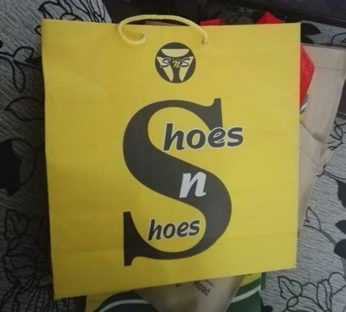
    #45

    Now That’s Just Bad Design

    A yellow shopping bag with black lettering that reads Hoes n Shoes, a hilariously awful design fail.

    [deleted] Report

    Nathaniel He/Him Cis-Het
    Community Member
    Premium
    2 months ago

    Donny Sharts favourite shop.

    View more comments
    ADVERTISEMENT
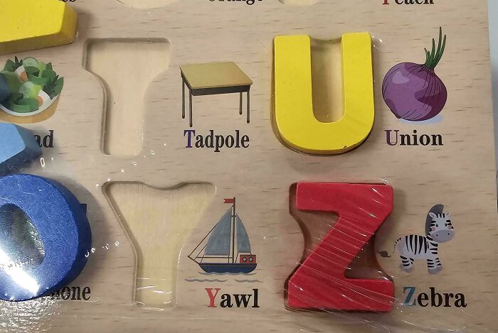
    #46

    I Left The Union Under The Tadpole

    A hilariously awful design fail: an alphabet puzzle with incorrect or oddly chosen words for letters, like 'Union' for U.

    N1NJACQUES Report

    Kira Okah
    Community Member
    2 months ago

    Well, a yawl is a a rather obscure type of boat. Very unusual to have that on here too.

    View more comments
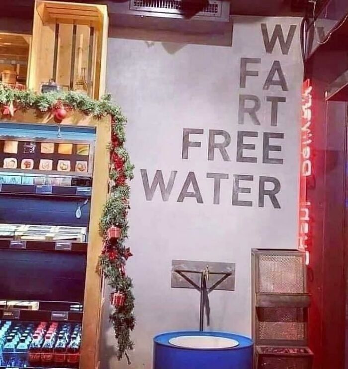
    #47

    Letters Are Not Aligned Well. But The Water Is Fart Free!

    A hilariously awful design fail with a sign that reads W FART FREE WATER, next to a store display with garland.

    Thatgothchickyouhate Report

    Nathaniel He/Him Cis-Het
    Community Member
    Premium
    2 months ago

    It was fart free, until Colin came along.

    View more comments
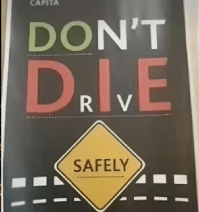
    #48

    What?

    A sign with a hilariously awful design that reads DON'T D.R.I.V.E SAFELY, a clear design fail.

    DemonOfUnholyFat Report

    Barbara Burns
    Community Member
    2 months ago

    Don't Drive Safely?

    View more comments
    ADVERTISEMENT
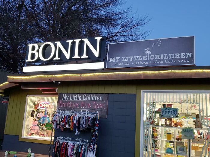
    #49

    Two Shops Next To Each Other. They Might Want To Think About Moving One Of The Signs Somewhere Else

    An exterior shot of Bonin and My Little Children shops, showcasing some design fails.

    dindthe Report

    Elladine DesIsles
    Community Member
    2 months ago

    I am relieved to shared that while these two businesses still exist in Eugene, OR, they are no longer neighbours. According to Google Maps, "My Little Children" was successful enough, in spite of this location, to have relocated to bigger digs across town. Meanwhile, Bonin took on a couple of partners and also expanded at the pictured address, becoming BKS CPAs. (I felt the need to check, as I am related to French Canadian Bonins).

    View more comments
    ADVERTISEMENT
    #50

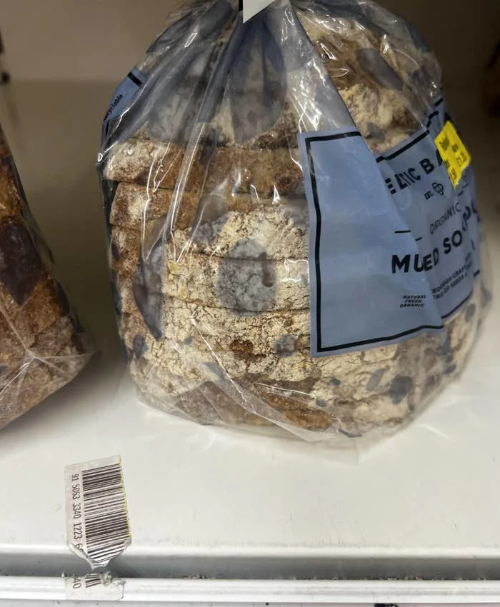
    This Awful Bread Packaging Design, Which Looks Exactly Like Mould:

    A bag of bread with a severe mold design fail, clearly past its prime and unappealing.

    anon Report

    I am not you
    Community Member
    2 months ago

    Moldybread,For mold enthusiasts

    View more comments
    #51

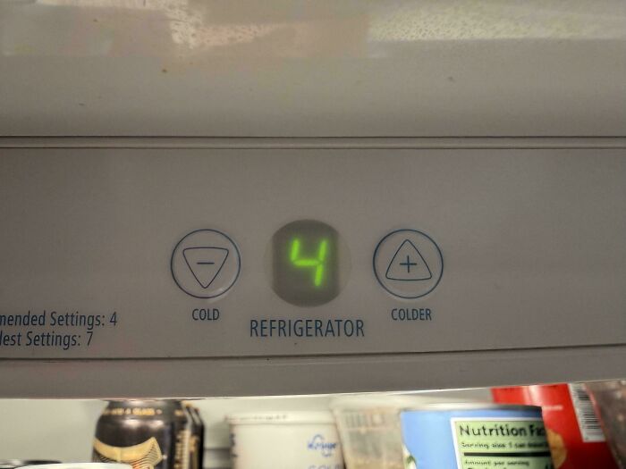
    The Buttons To Change Temp On My Fridge

    Hilariously awful design fail: A refrigerator temperature control with 'Cold' and 'Colder' buttons, a clear design fail.

    MrNobodyX3 Report

    David Paterson
    Community Member
    2 months ago

    Cool.

    #52

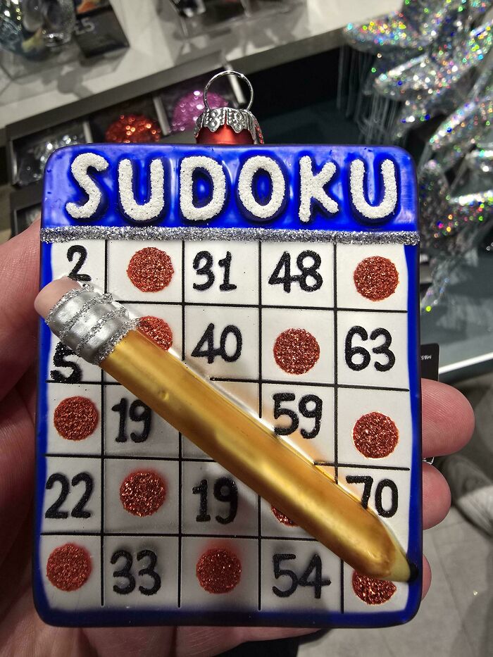
    This "Sudoku" Christmas Tree Decoration Is Clearly A Bingo Card

    A hilariously awful design fail Sudoku bingo card Christmas ornament with a pencil, displaying numbers and red glitter circles.

    Conorcat Report

    Nitnutnoo
    Community Member
    Premium
    2 months ago

    bindoku

    View more comments
    ADVERTISEMENT
    #53

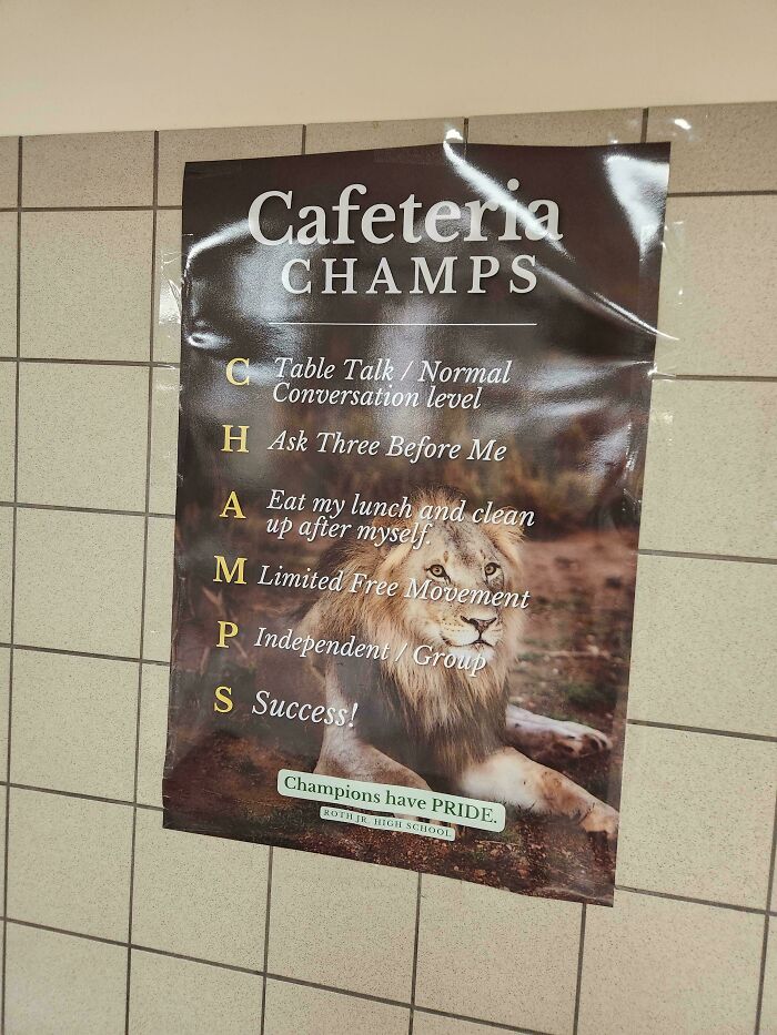
    Champs (Found This At A School I Went To For A Chess Match)

    A poster with an awful design fail, listing school rules with an acronym that doesn't quite fit, a design fail.

    randomgy-1-2- Report

    Edo Sayle
    Community Member
    2 months ago (edited)

    People don't get the point of these, do they? EDIT: also - limited free movement? Sounds quite American to me.

    View more comments
    ADVERTISEMENT
    #54

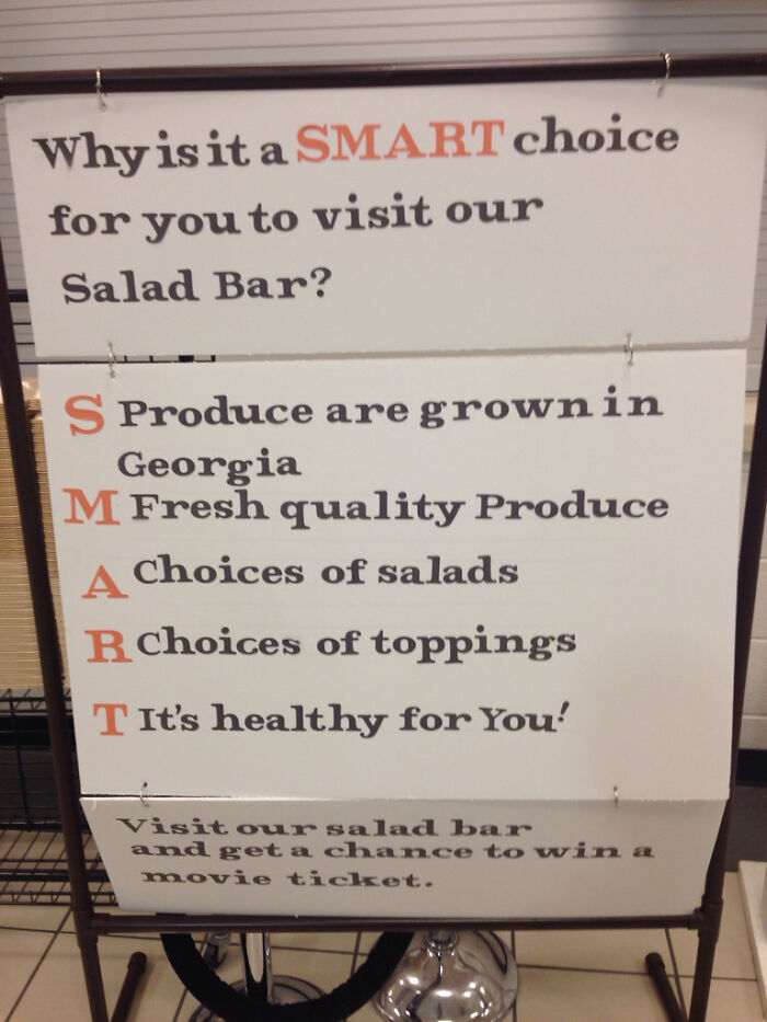
    This Is Horrendous

    A sign promoting a salad bar, but with an awful design fail where the acronym makes no sense, a design fail.

    [deleted] Report

    Val
    Community Member
    2 months ago

    Salads are not safe for us in Michigan right now.

    View more comments
    #55

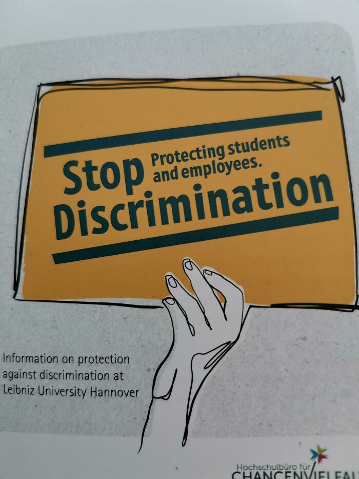
    Stop Doing What?

    A hilariously awful design fail on a Stop Discrimination poster where the text is awkwardly placed on a drawing of a hand holding a sign.

    BeamTRS Report

    elianah howey
    Community Member
    1 month ago

    DISCRIMINATION ✊✊✊✊✊

    #56

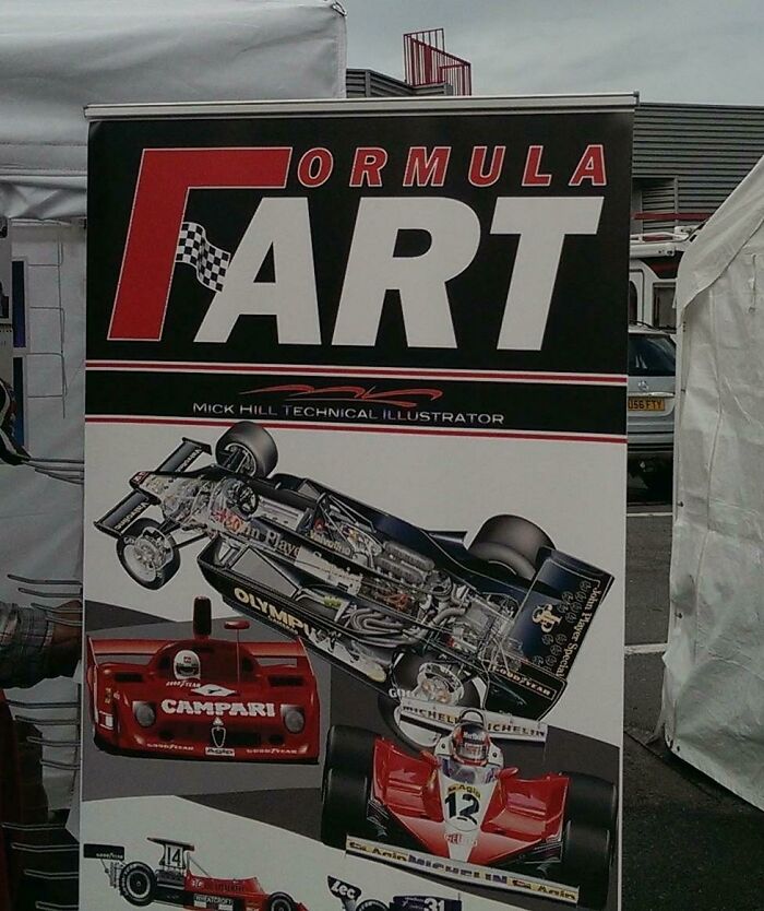
    Promotional Poster For 'Formula Art' Accidentally Suggests A Much Gassier Business

    A banner for a car racing event with the title FORMULA FART, a hilarious and awful design fail.

    Pantoffel86 Report

    Val
    Community Member
    2 months ago

    Oh yeah, my husband works there.

    View more comments
    ADVERTISEMENT
    #57

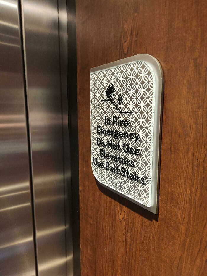
    Yep, I'll Definitely Know What To Do "In Fire Emergency", Hilton Garden Inn Cherry Creek (Denver)

    A dark wood and metal sign with a hard-to-read patterned overlay, an awful design fail for an elevator.

    wereweasle Report

    Lee
    Community Member
    2 months ago

    Maybe try and take a proper picture to show that it is completely legible when facing it, plus I can read it no problem even at the bad angle

    ADVERTISEMENT
    #58

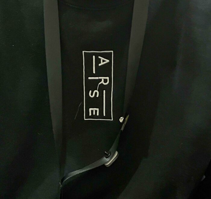
    Shirt That’s Supposed To Say “Arise” Says “Arse”

    A black shirt with the word 'A**E' printed on it, highlighted as a hilarious design fail.

    OhMyLordScat Report

    Demdumpin
    Community Member
    2 months ago

    Bottoms up

    #59

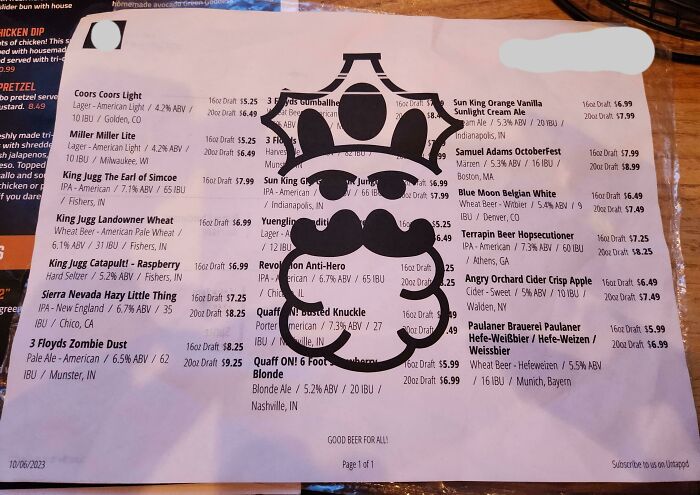
    The Restaurant Logo On This Menu Blocks The Words And Makes It Impossible To Read

    A hilariously awful design fail on a beer menu with a large, obstructing logo of a king with a mustache.

    grifeweizen Report

    #60

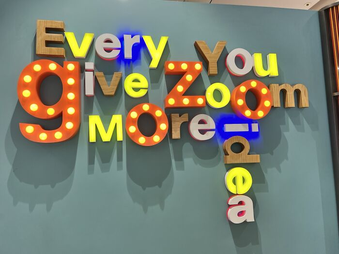
    Every You Give Zoom More Idea?

    A wall art display with jumbled words in different fonts and lights, a hilariously awful design fail.

    mirest Report

    Lady Gypsy Rain
    Community Member
    Premium
    2 months ago

    It’s like someone scattered a bunch of scrabble tiles and made words for points

    View more comments
    ADVERTISEMENT
    #61

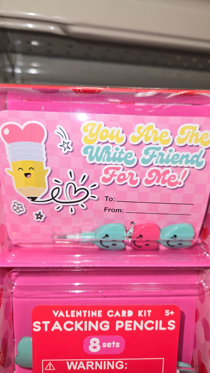
    Had To Do A Double-Take Because Of This Font

    A Valentine's card kit with hilariously awful design, featuring the misspelled phrase YOU ARE THE WRITE FRIEND FOR ME.

    featherwolf Report

    Nathaniel He/Him Cis-Het
    Community Member
    Premium
    2 months ago

    The Alt Right can celebrate Valentine's day as well you know!

    View more comments
    ADVERTISEMENT
    #62

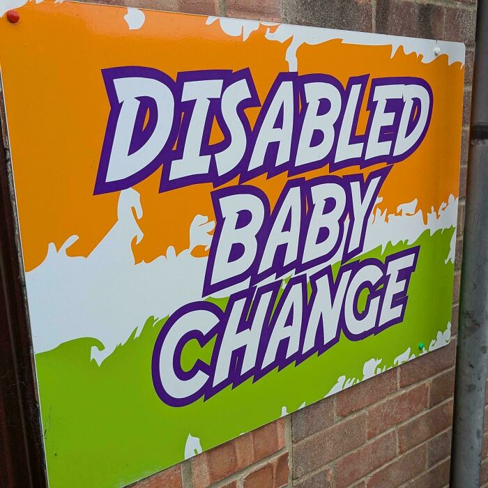
    Punctuation Matters, Even On A Toilet Sign

    A sign with hilariously awful design that reads DISABLED BABY CHANGE with poor kerning on the words.

    MoonDustAllergy Report

    GatorGran
    Community Member
    2 months ago

    I don't wanna see any able bodies babies in here.

    View more comments
    #63

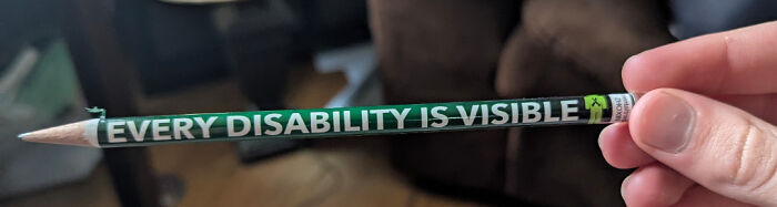
    This Pencil Used To Say "Not Every Disability Is Visible"

    A hilariously awful design fail on a pencil, stating Every Disability Is Visible, which is ironically misleading.

    PolyPenguinDev Report

    meow point1
    Community Member
    2 months ago

    It's "too cool to do d r u g s" all over again!

    View more comments
    #64

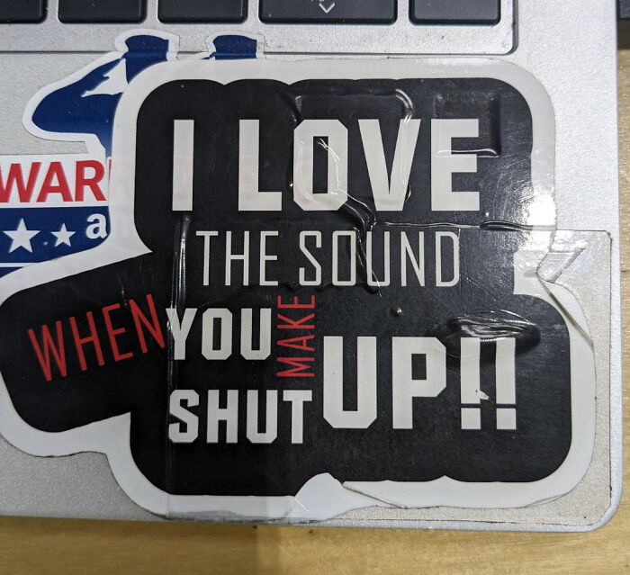
    I Love The Sound When You Make Up!! Shut

    A sticker with text that is an awful design fail, saying, I love the sound when you make you shut up.

    TBOHB Report

    Eggwodd
    Community Member
    Premium
    2 months ago

    I also love the sound that's made when people shut up.

    ADVERTISEMENT
    #65

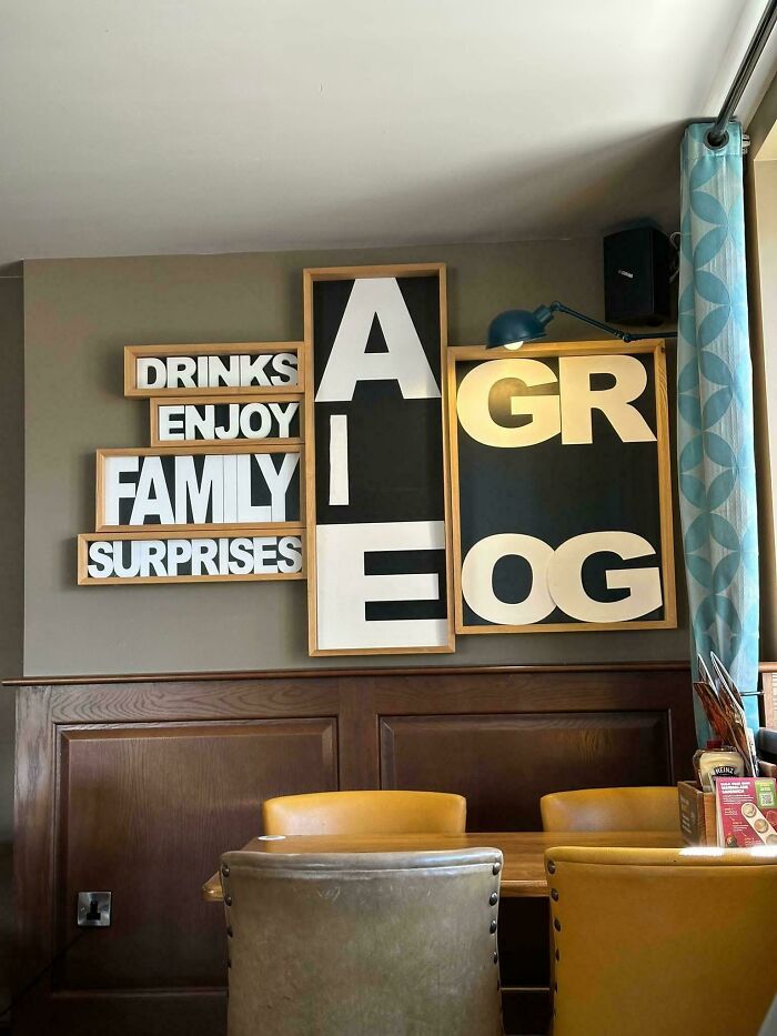
    I’m Proud To Say This Only Took Me 5 Minutes To Figure Out

    An awful design fail featuring mismatched letter signs on a wall, forming an incoherent message, a design fail.

    Blood_sweat_and_beer Report

    Elladine DesIsles
    Community Member
    2 months ago

    I'm just going to assume the lesson here is that once you start with drinks, nothing else makes sense.

    View more comments
    ADVERTISEMENT
    #66

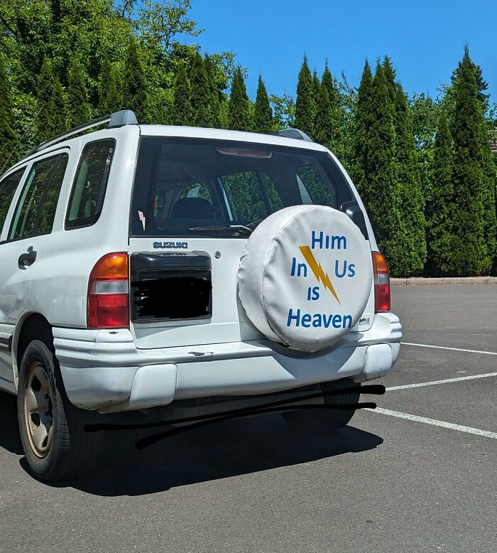
    Him In Us Is... Heaven?

    The back of a white Suzuki with a tire cover that reads Him in us is heaven, a confusing design fail.

    shmamien Report

    Eggwodd
    Community Member
    Premium
    2 months ago

    Church van from #40.

    View more comments
    #67

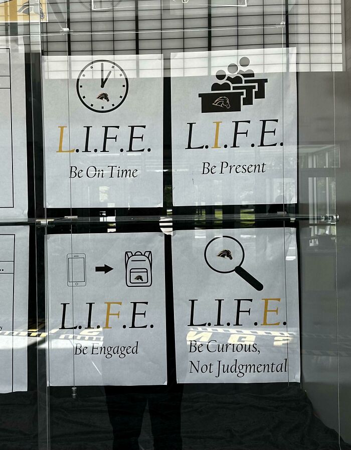
    For The Life Of Me, I Have No Idea How The Pictures And Captions Correspond To The Acronym

    Four posters with the acronym L.I.F.E. and different rules, demonstrating a design fail for a positive message.

    Sandsandtheirfanboys Report

    Edo Sayle
    Community Member
    2 months ago

    I see the caption and image connections, but no clue for the acronym

    View more comments
    #68

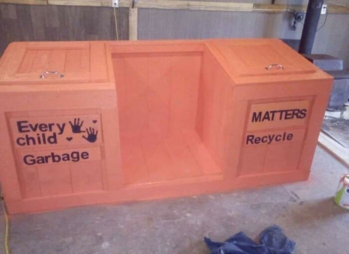
    Just Feel Bad About This One, Good Intentions Gone Wrong

    A poorly designed waste bin with 'Every child Garbage' and 'MATTERS Recycle' labels. An example of design fails.

    toastisfree Report

    ADVERTISEMENT
    #69

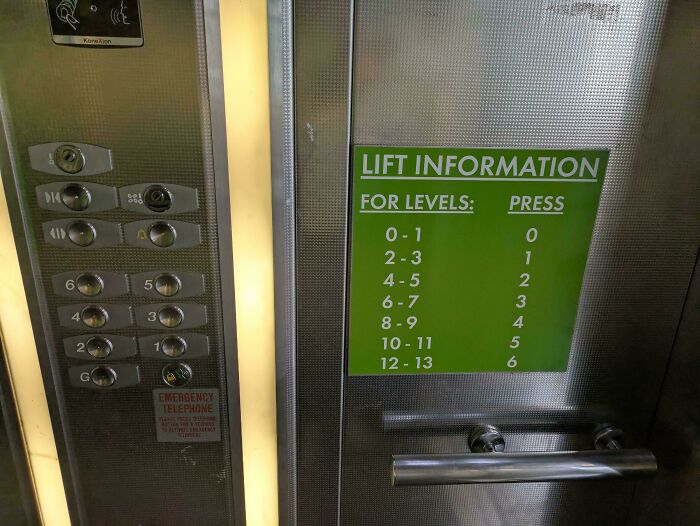
    I Was Wondering Why I Kept Ending Up On The 4th Floor After Pressing 2

    A confusing elevator panel and green sign with lift information, an awful design fail.

    ChrysisIgnita Report

    I am not you
    Community Member
    2 months ago (edited)

    This one is easy to understand,for me, at least. Ptess 1 and the elevator stop at 2nd floor first,then the 3dh. Press 5 and it stopp at 10th first,then the 11th. Possibly a temporary solution until they get it replaced with a new panel?

    ADVERTISEMENT
    #70

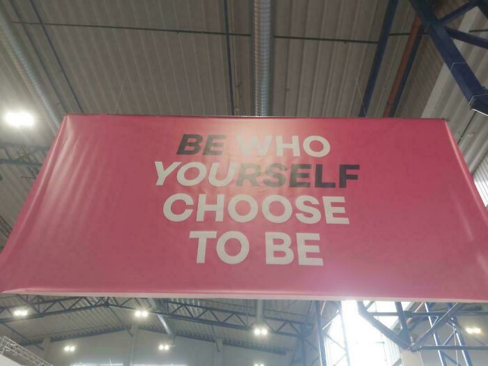
    It's From A Design School Too

    A hanging banner with a confusing design fail, reading BE WHO YOURSELF CHOOSE TO BE.

    Right-Dot4471 Report

    #71

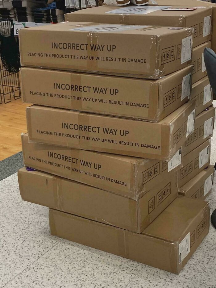
    Designed To Fail!

    A hilariously awful design fail stack of cardboard boxes with the warning INCORRECT WAY UP and an arrow pointing up.

    h4yth4m-1 Report

    Marilyn Holt
    Community Member
    2 months ago

    So this is just stupid.

    View more comments
    #72

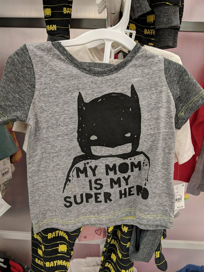
    As We All Know Batman's Mom Is A Very Well Known Superhero

    A hilariously awful design fail: a Batman shirt that says My Mom is My Super Hero.

    daboring1 Report

    Edo Sayle
    Community Member
    2 months ago

    My mom is the (d**d) superhero. BTW name one hero with all their parents alive. This joke isn't only for batman

    View more comments
    ADVERTISEMENT
    #73

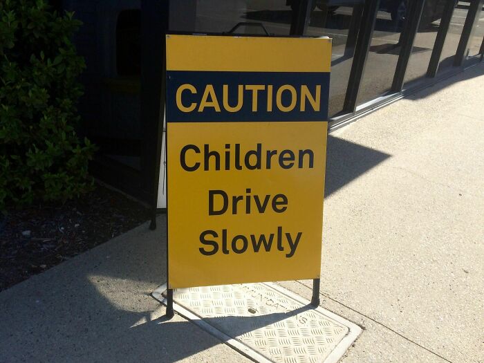
    This Sign Needs A Little Fine-Tuning

    A sign with an awful design fail: CAUTION CHILDREN DRIVE SLOWLY, meaning children are driving.

    HembraunAirginator Report

    NightOwlPanda
    Community Member
    2 months ago

    Well it's hard for them to reach the pedals.

    View more comments
    ADVERTISEMENT
    #74

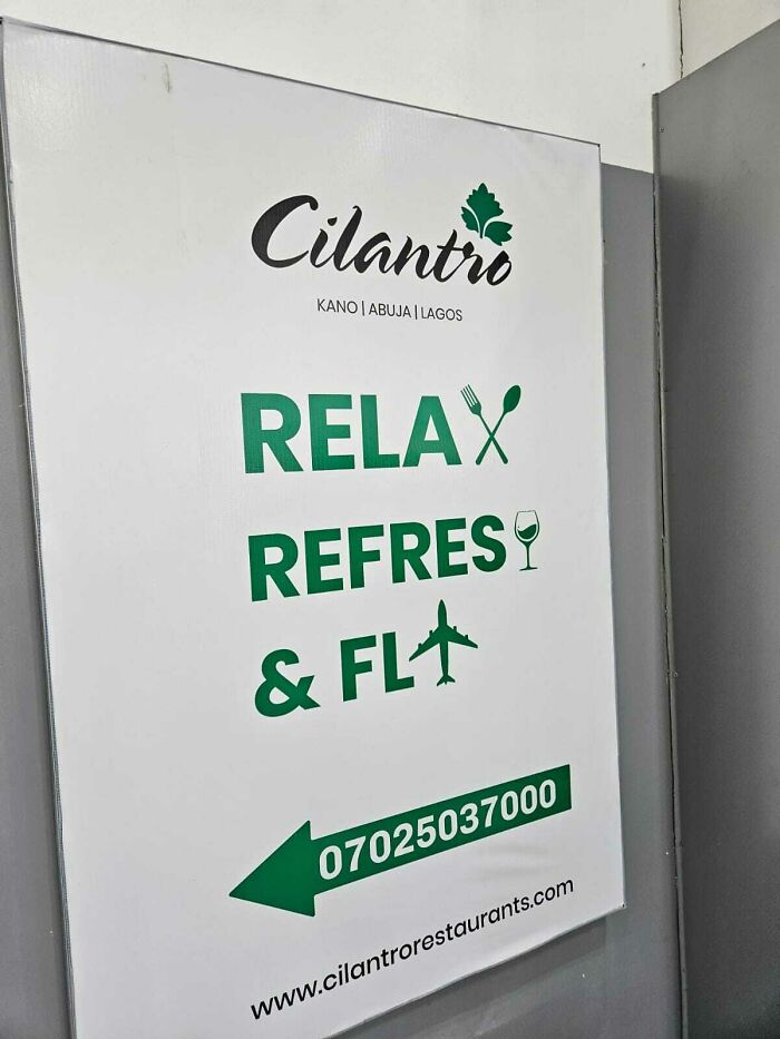
    Since A Wine Glass Naturally Looks Like The Letter 'H' And An Aircraft Like A 'Y'

    A white sign with green text and a phone number, an awful design fail for a restaurant.

    CaptainPonahawai Report

    nut nibbler
    Community Member
    2 months ago

    Relaxcutlery Refreswine Flplane

    View more comments
    #75

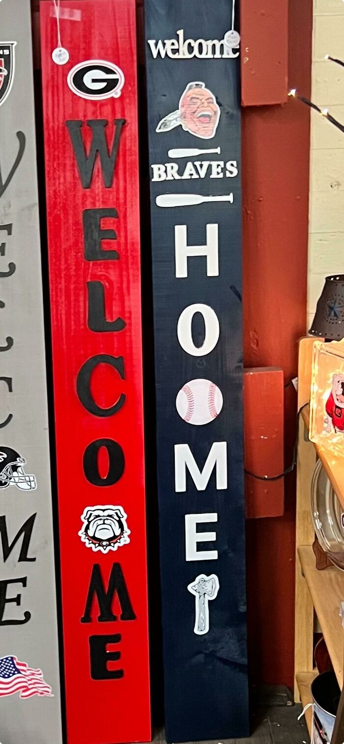
    “If Only There Was An Object That Looked Like An ‘O’” Is Only The Start Of This One

    Two welcome signs with sports themes, one red and one blue, displaying awful design fails.

    AVdev Report

    Chich the witch
    Community Member
    Premium
    2 months ago

    I can easily imagine someone pointing this out during proofing and some w****r going "No, its going out like this"

    #76

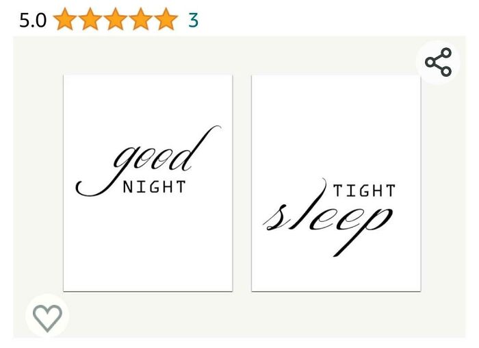
    Found On Amazon- Good Night, Tight Sleep To You All

    A hilariously awful design fail with white posters displaying good night and sleep tight with mismatched fonts.

    Hufflepuffleupagus Report

    Dave Van Beurden
    Community Member
    Premium
    2 months ago (edited)

    Had many good nights, my sleep hasn't been tight since my twenties
    View more comments
    ADVERTISEMENT
    #77

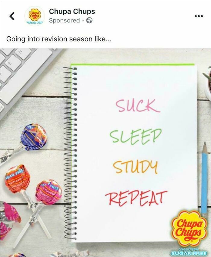
    Terrible Lollipop Slogan

    A social media ad with a design fail, showing a notebook with the phrase SUCK SLEEP STUDY REPEAT.

    Frosty_23 Report

    Val
    Community Member
    2 months ago

    That's college for ya.

    View more comments
    ADVERTISEMENT
    #78

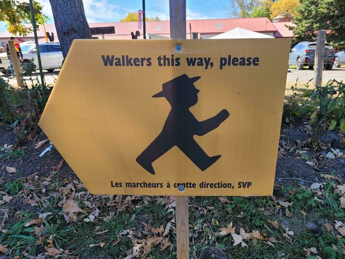
    Which Way Do I Walk?

    A hilariously awful design fail: a yellow sign with a walker symbol pointing in an odd direction for pedestrians.

    ConsistentLab8661 Report

    BarkingSquirell
    Community Member
    2 months ago

    And it better be the funny walk, too.

    View more comments
    #79

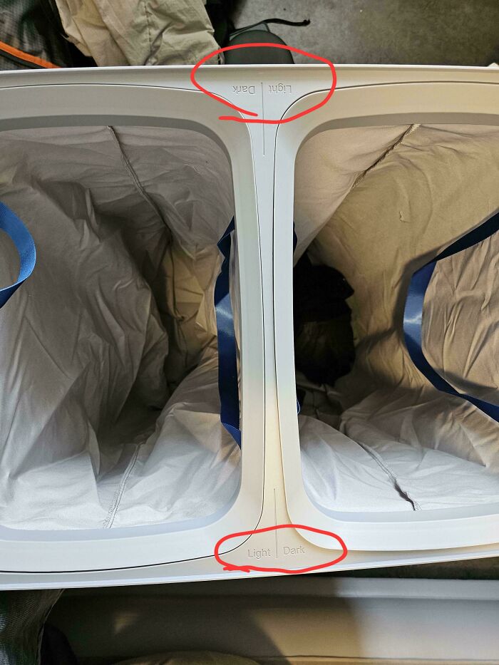
    This Double Laundry Bag With Contradictory Notation

    A laundry sorter with reversed labels, dark over light and light over dark. A design fail.

    memescauseautism Report

    An Interlicktual
    Community Member
    2 months ago

    So you place it to a wall an ready only one Side?

    #80

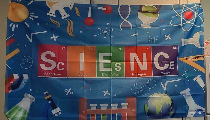
    Sienc Or Sciesnce

    A banner spelling SCIENCE using periodic table elements Sc, I, Es, N, Ce. A design fail with incorrect elements.

    MicromonicsTTV Report

    Vivian McBride
    Community Member
    2 months ago

    "Sciesnce"

    View more comments
    ADVERTISEMENT
    #81

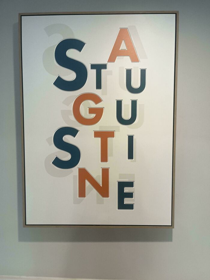
    Saw This In A Hotel In St.augustine

    A hilariously awful design fail with the word AUGUSTINE vertically spelled as STU GU STI NE with orange and blue letters.

    _BORK- Report

    DooDah Man
    Community Member
    2 months ago

    I don't even bother anymore.

    View more comments
    ADVERTISEMENT
    #82

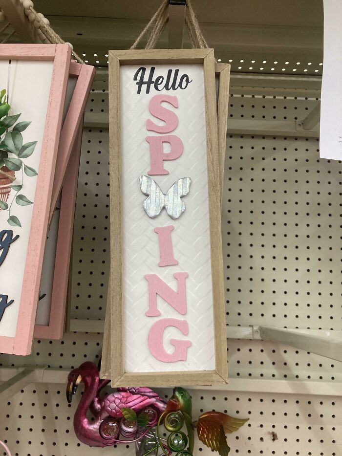
    I Love Sping

    A hanging wooden sign with the word Hello at the top and the word SPRING written vertically with a butterfly, an awful design fail.

    MackensieM08 Report

    Patrick van den Houten
    Community Member
    2 months ago

    i love spying too

    View more comments
    #83

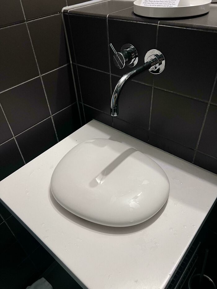
    This “Sink” In My Swedish Hotel Room

    Hilariously awful design fail: A bathroom sink with an awkward, flat design causing water to pool, a clear design fail.

    elevencharles Report

    Upstaged75
    Community Member
    2 months ago

    You might as well just dump a glass of water on the floor.

    #84

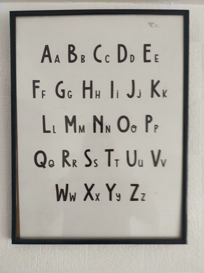
    Upper And Lower Case

    An alphabet poster with inconsistent uppercase and lowercase letters, a hilariously awful design fail.

    bongobills Report

    Edo Sayle
    Community Member
    2 months ago

    Only Y J and I are different lol

    View more comments
    ADVERTISEMENT
    #85

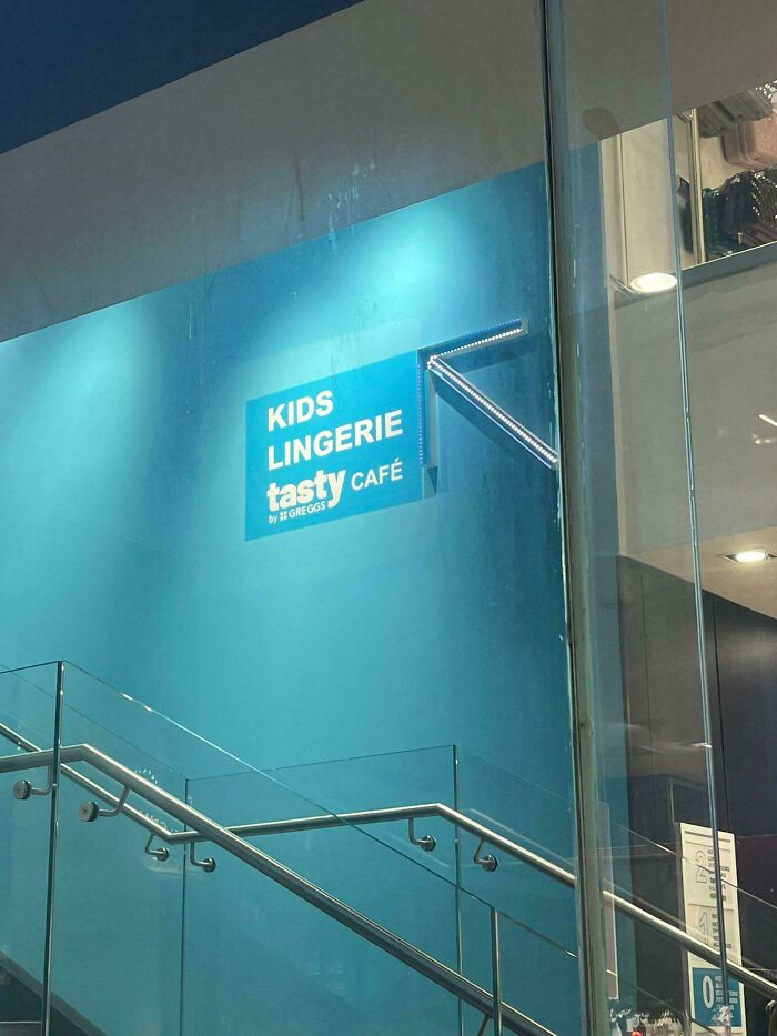
    Kids Lingerie 🤔 Not A Good Design

    A hilariously awful design fail: a sign pointing upstairs to 'Kids Lingerie Tasty Cafe', a confusing combination.

    slysam69 Report

    Fire Singer
    Community Member
    2 months ago

    Adding the "Tasty Cafe" to this list just makes it even worse!

    ADVERTISEMENT
    #86

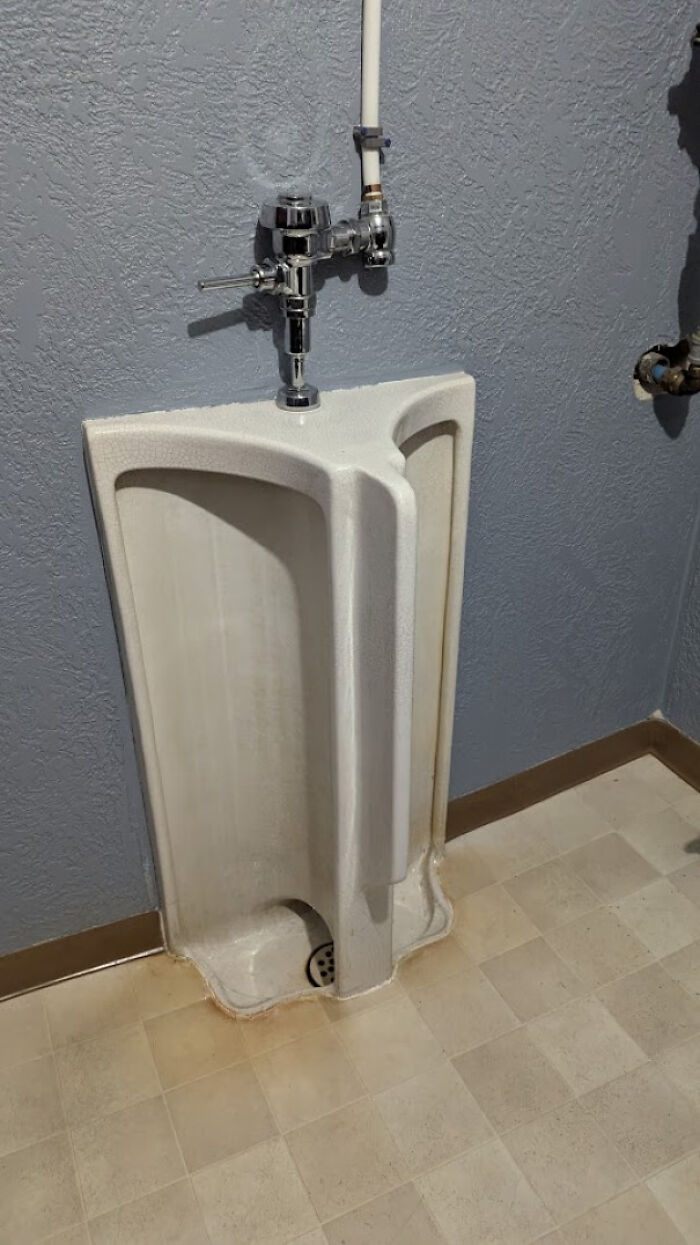
    The World's Worst Urinal. At Least You Can't Cross The Streams

    A urinal with a baffling triangular design, a design fail that someone should be held responsible for.

    5parky Report

    DooDah Man
    Community Member
    2 months ago

    You know someone had to authorize this design.

    View more comments
    #87

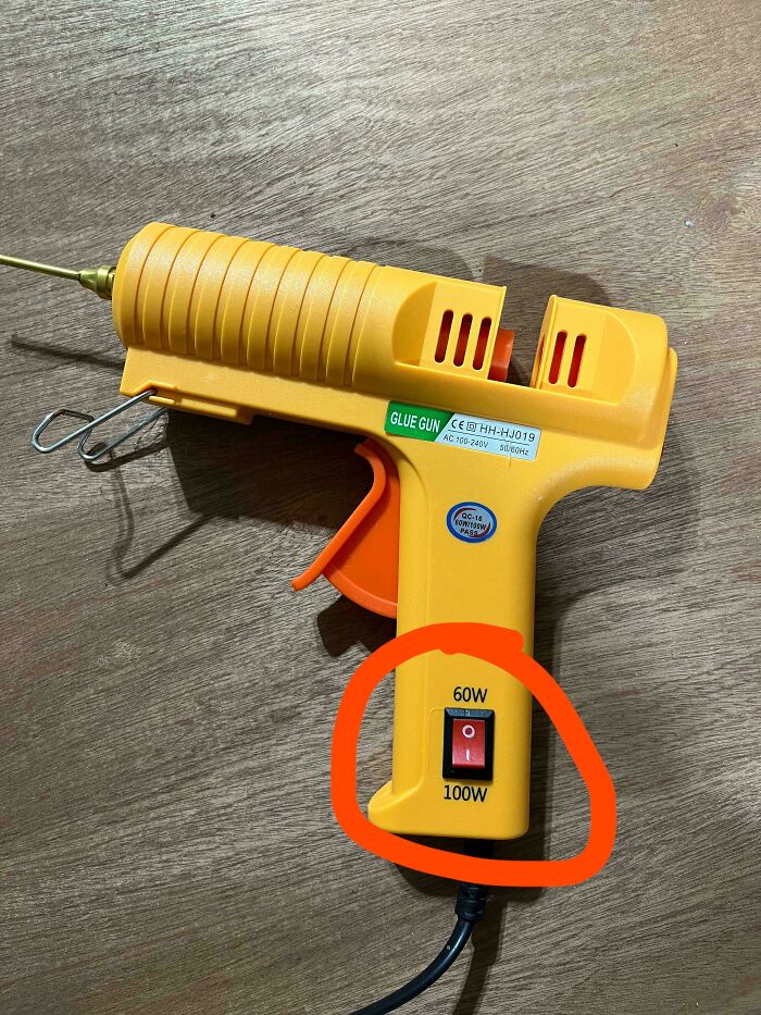
    So Is It Off Or Set To 60 Watts?

    Hilariously awful design fail: A glue gun with a 60W/100W switch labeled 100W/60W, a clear design fail.

    jbosh999 Report

    livvygt18
    Community Member
    2 months ago

    Yes

    View more comments
    #88

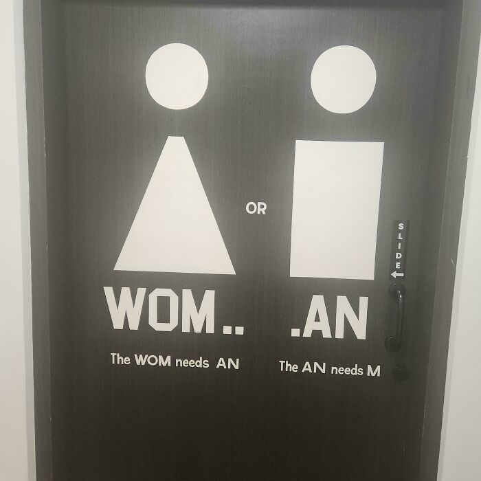
    The An Needs M

    A black restroom door with confusing Wom.. .An text and icons. A hilarious design fail.

    32oz____ Report

    ADVERTISEMENT
    #89

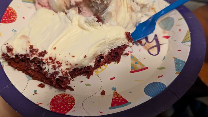
    This Birthday Plate Where The Balloon Strings Just Look Like Hair

    A hilariously awful design fail birthday cake with red velvet and white frosting on a party plate with a blue fork.

    FtMFandomBoy Report

    I am not you
    Community Member
    2 months ago

    I would try to remove the "hairstrands" right away.😁And then I thought they were mine. I shed like my dog do,in the spring.

    ADVERTISEMENT
    #90

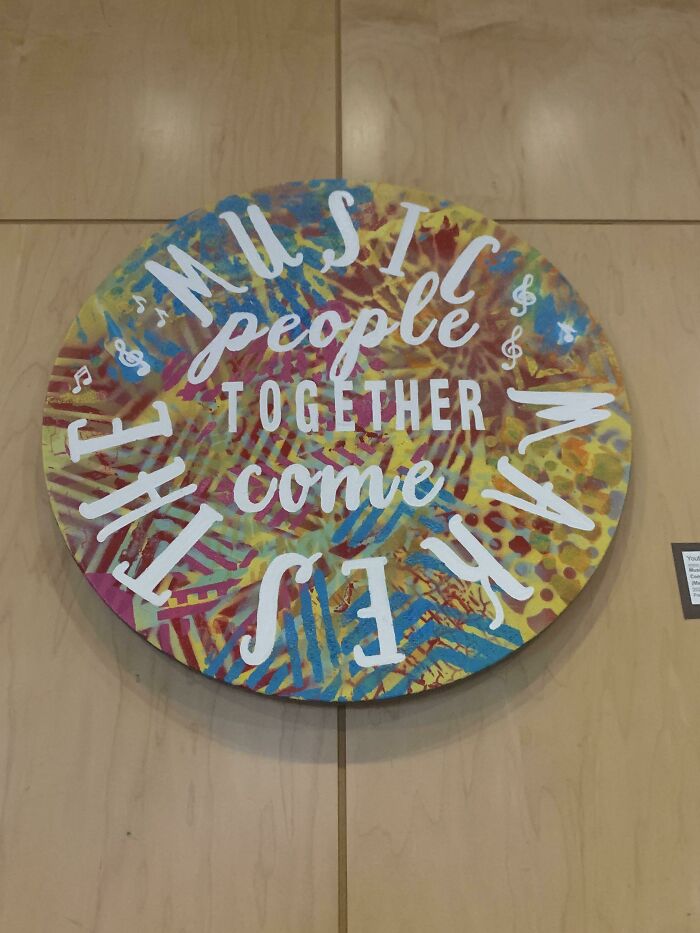
    Music People Together Come Makes The

    A circular art piece with a confusing arrangement of words, a design fail that is hard to read.

    Careless_Eggplant777 Report

    Elladine DesIsles
    Community Member
    2 months ago

    I read "Music makes the people together come" but that really isn't an improvement, is it?

    #91

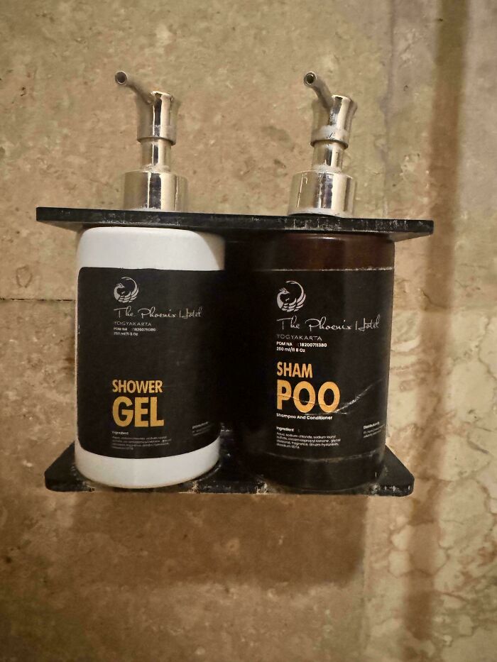
    Another Unfortunate Line Break

    A hotel shower with two bottles labeled shower gel and sham p*o, a hilarious design fail.

    Cheap-Menu9081 Report

    Ilan Elron
    Community Member
    2 months ago

    eschew sham p*o, demand the real thing!

    #92

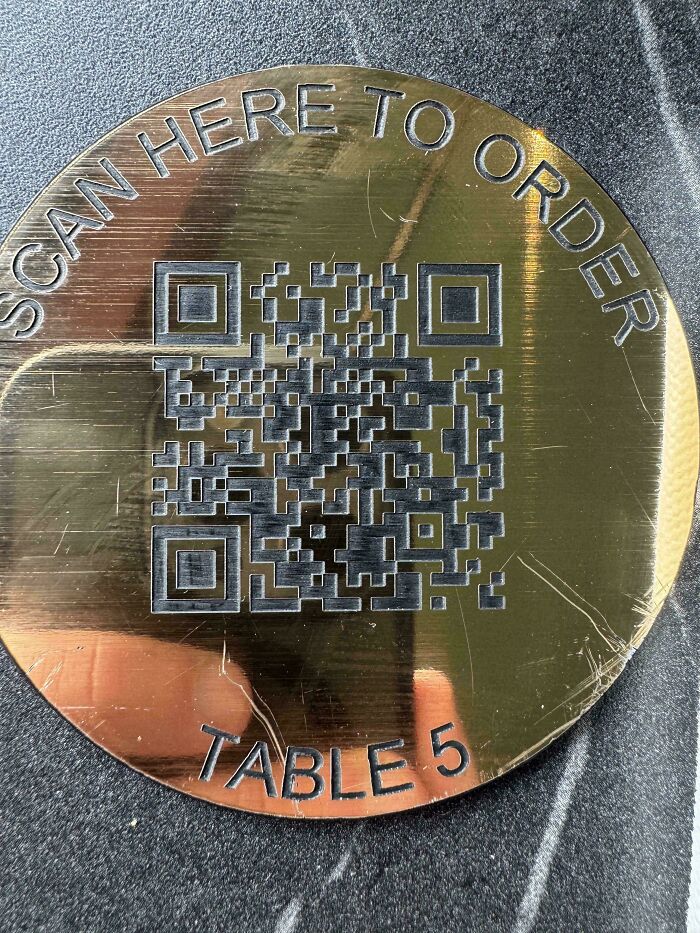
    Menu Only Available Through Reflective Qr Code

    Hilariously awful design fail: A scratched, reflective QR code making it unscanable, a clear design fail.

    Professional_Shine97 Report

    Fire Singer
    Community Member
    2 months ago

    If I don't know going in they only do QR codes I won't leave, but I won't go back that's for sure. I know that's a grumpy old lady thing but I'm a grumpy old lady.

    View more comments
    ADVERTISEMENT
    #93

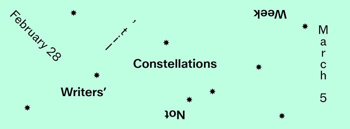
    Apparently This Is A Promo For A Writer's Festival

    A hilariously awful design fail: a calendar showing constellation dates with mismatched or upside-down text.

    simsimdimsim Report

    setsuriseikou
    Community Member
    2 months ago

    Looks like it's Not

    ADVERTISEMENT
    #94

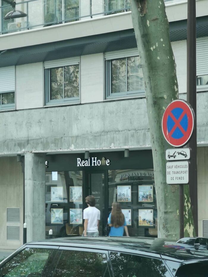
    My Friend Saw This Real Estate Agency In Paris

    A sign in front of a real estate office with a partially obscured name showing a hilarious awful design fail.

    Binoz518 Report

    #95

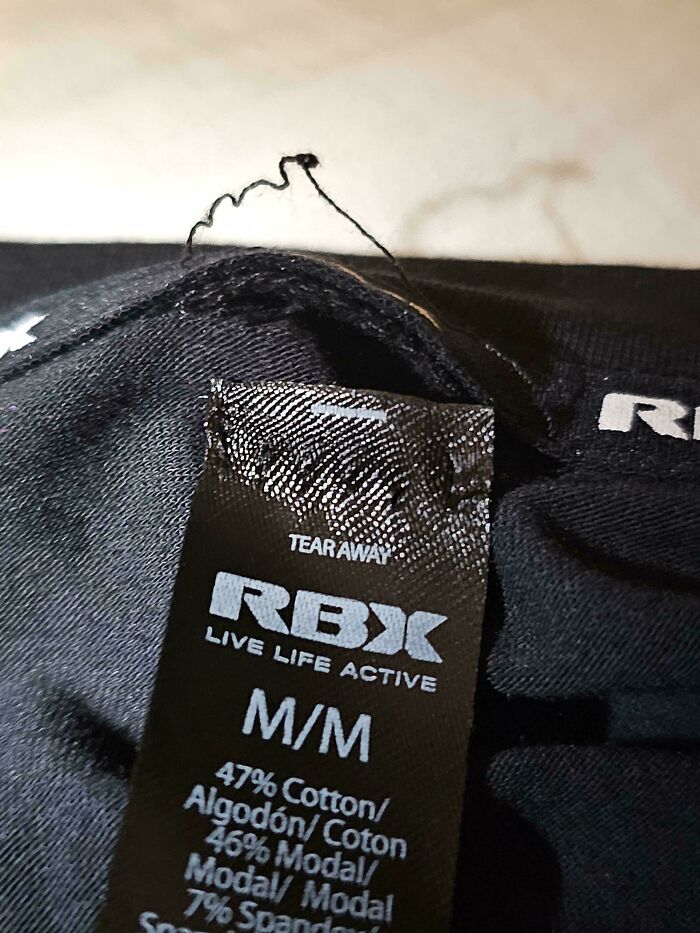
    "Tear Away" Tag. So That Was A Lie

    A clothing tag marked M/M for size, an awful design fail.

    RayzTheRoof Report

    Fire Singer
    Community Member
    2 months ago

    I've had this happen before with a tear away tag. I was probably an irrational level of mad, but I was fuming! It had ONE job!!

    View more comments
    #96

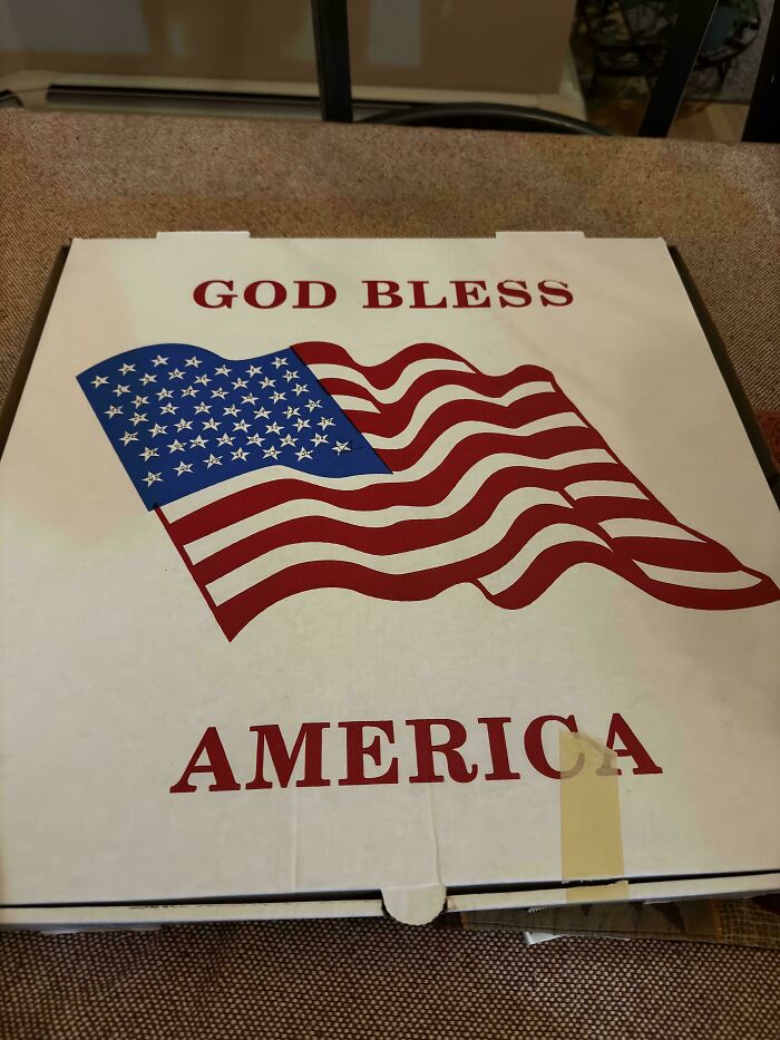
    God Bless The 51 States Of America

    A pizza box with an American flag and God Bless America, a hilariously awful design fail.

    HrZ_Player Report

    Vivian McBride
    Community Member
    2 months ago

    District of Columbia? Puerto Rico? Which one got added?

    View more comments
    ADVERTISEMENT
    #97

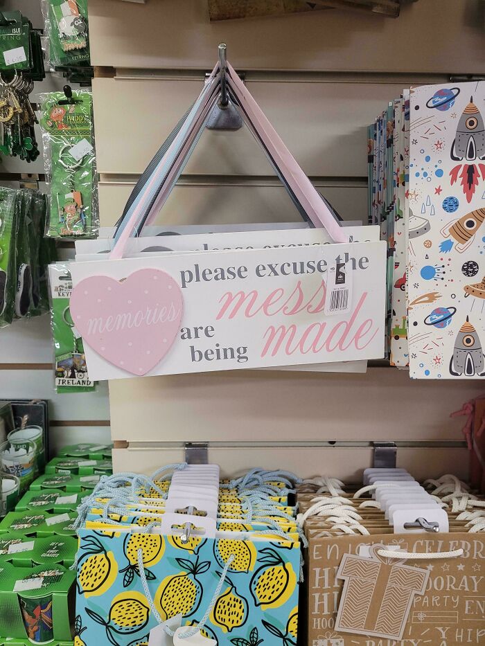
    Please Excuse The Mess Made, Memories Are Being

    A hilariously awful design fail sign that reads please excuse the mess memories are being made, hanging in a store.

    Zendo7777 Report

    ADVERTISEMENT
    #98

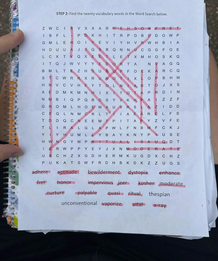
    This Impossible Word Search For Kids, That Perhaps Aims To Teach Young People A Lesson In Failure:

    A hilariously awful design fail: a word search with highlighted answers, some of which are not valid words.

    anon Report

    Nathaniel He/Him Cis-Het
    Community Member
    Premium
    2 months ago

    Usually the words have some connection in word searches. What is the theme here?

    View more comments
    #99

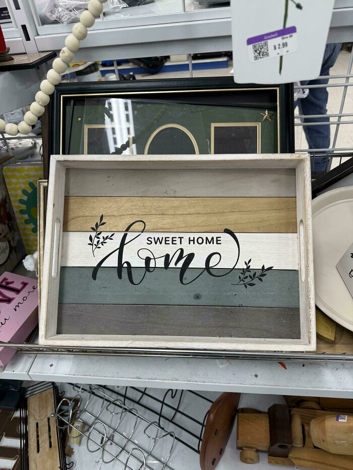
    Sweet Home Home!

    A home decor sign with sweet home home text, an awful design fail.

    Worldly-Return-9417 Report

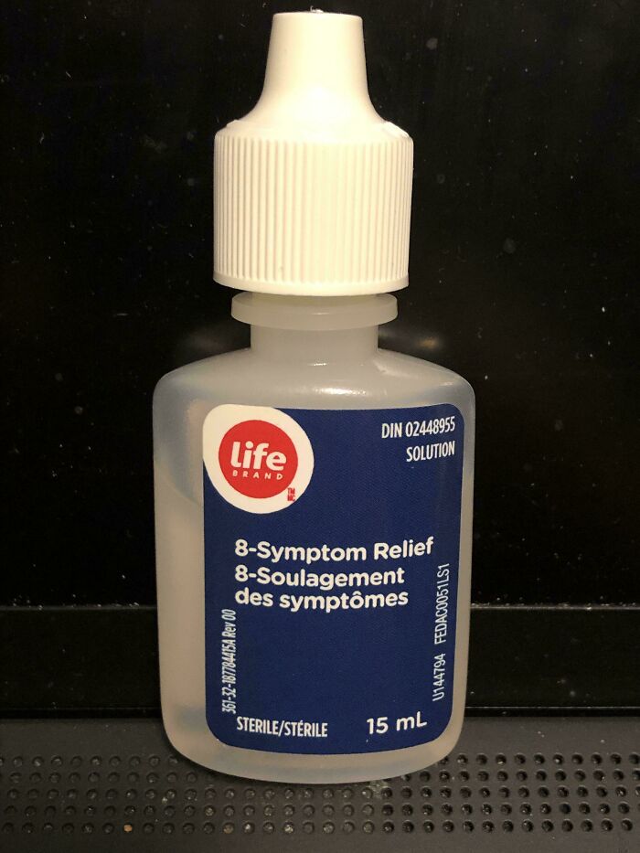
    #100

    Eye Drop Bottle Does Not Note That It Is Eye Drops

    Hilariously awful design fail: An 8-symptom relief bottle with French text poorly aligned, a clear design fail.

    gachunt Report

    Elladine DesIsles
    Community Member
    2 months ago

    To be fair, this would have been sold packaged in a box with additional information on it (I don't think I ever purchased this exact product, but I have purchased Life Brand eye drops from Shoppers D**g Mart here in Canada; it's the in-house store brand). It would only be a problem if one forgot what the product was after purchasing (and these are tiny bottles with a short shelf life once opened).

    View more comments
    ADVERTISEMENT
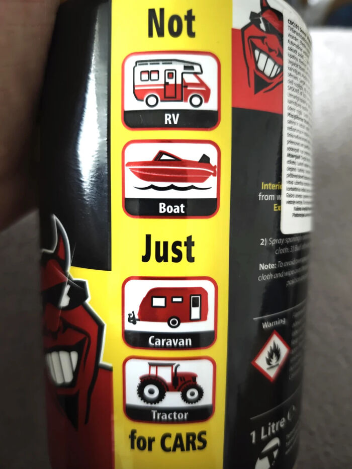
    #101

    I Really See What They Were Going For Here, But Um, It's Terribly Misleading

    A product label with confusing icons and text indicating it is not just for cars. An awful design fail.
    C***yDesign Report

    I am not you
    Community Member
    2 months ago

    Just caravan and tractor for cars. Got it.

    ADVERTISEMENT