ADVERTISEMENT

Every time you go out into the world, signs, placards, and lines of text greet you almost everywhere. These pieces of writing provide crucial information about streets and businesses, and give context to what’s happening all around. Most of us don’t even think about the signs we see until something feels off.

That’s why we finally decided to draw your attention to the most incomprehensible texts out there that just baffle the mind with how badly they’ve been written. Hopefully this list leaves you with plenty of chuckles and makes you take a much closer look at signs in the wild.

#1

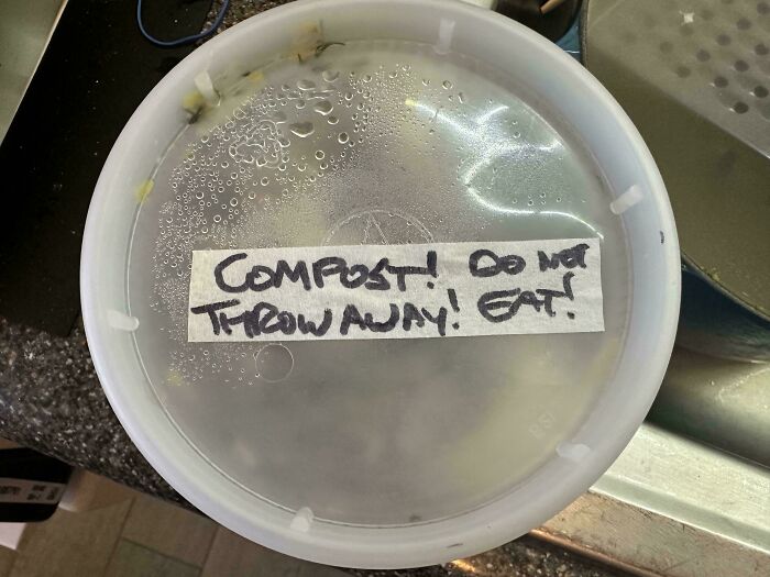
Compost! Do Not Throw Away! Eat!

Hilarious badly designed signs with confusing handwritten label on a clear food container

dubstep-party Report

Panda-sized Potato
Community Member
4 hours ago

A simple line could have fixed this.

RELATED:
    #2

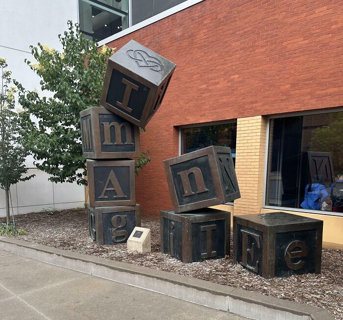
    Imangie

    Stacked block sculpture spelling out words with confusing placement, an example of terribly designed signs.

    voldie127 Report

    sbj
    Community Member
    Premium
    50 minutes ago

    Imagine how much they'd drunk when they came up with this

    View more comments
    #3

    Yferc Ooxie Uope Rden

    A terribly designed sign on a square window decal with confusing jumbled letters in black and red

    LumberJackk6 Report

    Space Invader
    Community Member
    4 hours ago

    If that's my experience, that food contained the wrong kind of mushrooms....

    View more comments

    Most of the time, when we think of signs, we think of businesses with placards, posters, or noticeboards advertising their products and services. According to A Guy That Designs, strong, well-written text creates a good first impression on potential customers and can also help increase traffic over time.

    ADVERTISEMENT

    Many people think signs are an old-school way to advertise, but that’s not true; they can still draw attention, increase visibility, and show how a company’s products differ from the rest. It also helps to keep the information on these placards short and to the point so readers can decide quickly.

    #4

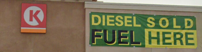
    Diesel Sold Fuel Here

    A gas station banner reading DIESEL SOLD FUEL HERE, showcasing a badly designed sign.

    AlligatorMass Report

    #5

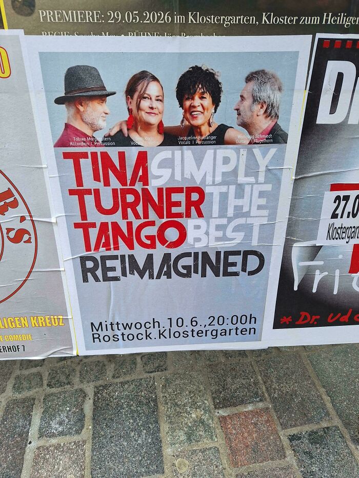
    Tina Simply Turner The Tango Best

    Concert poster with overlapping colored text creating badly designed signs

    Hefty-Comfortable991 Report

    Ge Po
    Community Member
    Premium
    3 minutes ago

    well, it's reimagined, alright

    View more comments
    ADVERTISEMENT
    #6

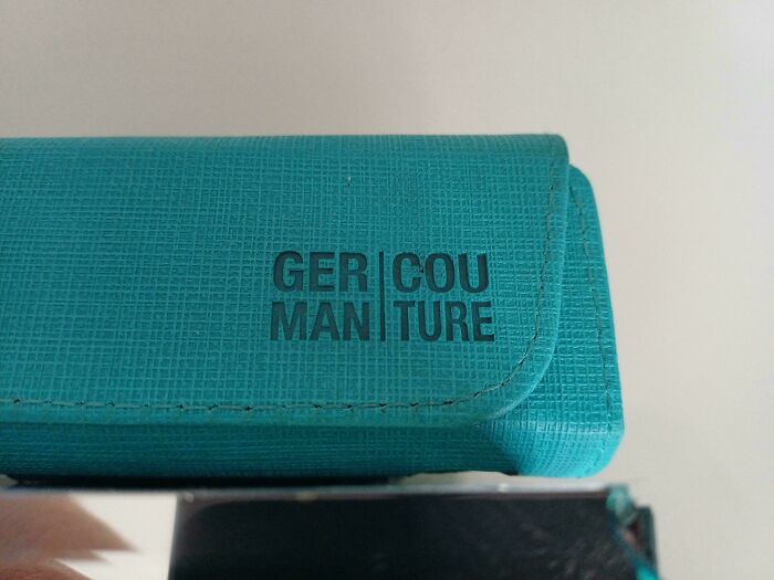
    Gercou Manture

    A teal case with awkwardly split brand text demonstrating badly designed signs

    Nabuchodnozzar Report

    ADVERTISEMENT

    When we think about signs, we might think of billboards or noticeboards above businesses, but signs have changed and developed over the years. Today, companies know they need to attract customers, so they might use LED placards, interactive advertisements, and lit signs to draw people's attention.

    Some businesses also customize their noticeboards with their logo’s specific color and font to improve recall. Companies selling multiple products and services might benefit from scrolling signs that show people all their options. Even talking and moving billboards draw attention and interest from casual bystanders.

    #7

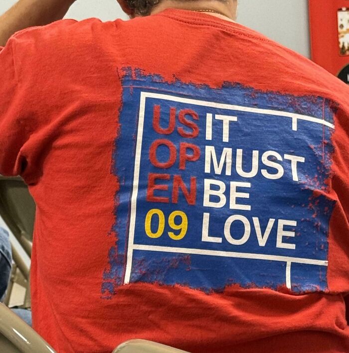
    Usit Opmust Enbe 09love

    A person wearing a red t-shirt with a confusing graphic layout representing terribly designed signs.

    Shervivor Report

    #8

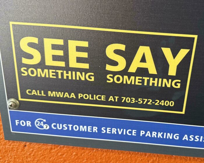
    See Say Something Something

    A poorly formatted sign reading SEE SAY SOMETHING SOMETHING, demonstrating a badly designed sign.

    OutOfTouch_303 Report

    #9

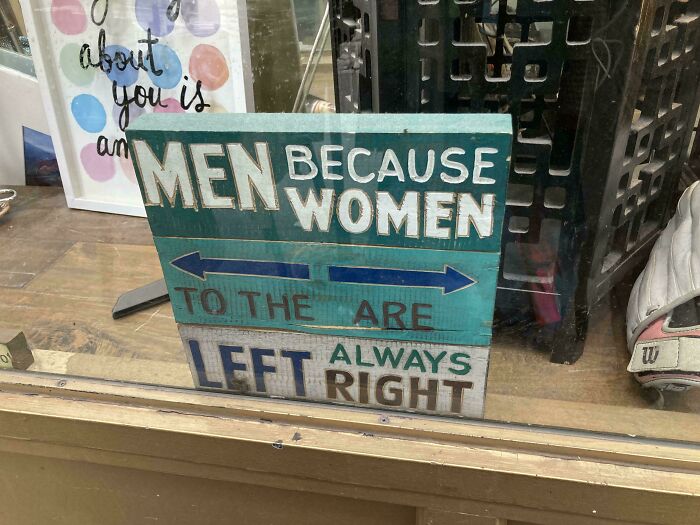
    Men Because Women

    Hilarious badly designed wooden sign with confusing layout about men to the left and women always right.

    StalinDoge64 Report

    Panda-sized Potato
    Community Member
    4 hours ago

    Left always right.

    View more comments
    ADVERTISEMENT

    When someone wants to choose the right sign for their business, they must first consider where it will be placed so they can size it for the right viewers. If it’s going to be hung up like a billboard, the text, image, and design must be visible so potential customers can read everything.

    ADVERTISEMENT

    For smaller placards, business owners need to make sure everything is aesthetically pleasing and not text-heavy, which can be overwhelming. If something is pleasant to look at, people are more likely to take it in for longer and also remember it. That’s why companies should focus on signs that deliver a clear message and leave a lasting impression.

    #10

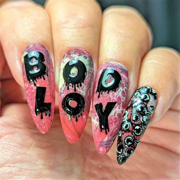
    Bodloy

    Nails painted to read bodily fluids out of order, representing hilarious badly designed signs with awkward layout.

    TomLakeCharles Report

    sbj
    Community Member
    Premium
    47 minutes ago

    Whatever they're supposed to say this design is awful

    View more comments
    #11

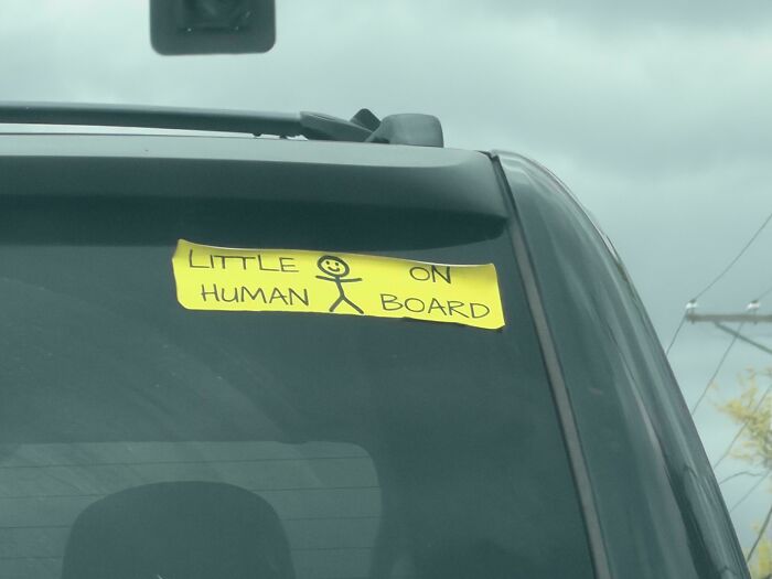
    Little On Human Board

    Handmade little human on board bumper sticker on car window, an example of hilarious badly designed signs.

    IDidIt_Twice Report

    #12

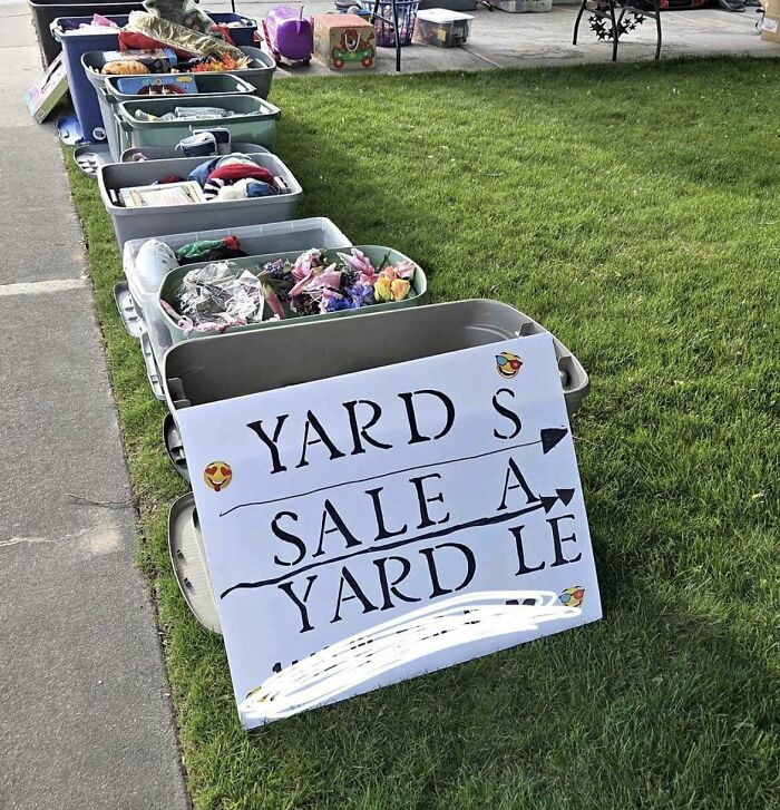
    Yard S Sale A Yard Le

    A hand-painted sign for a garage sale with mismatched and confusing word placement, an example of terribly designed signs.

    SturdyWarshinMachine Report

    Space Invader
    Community Member
    4 hours ago

    Yardle is obviously a form of Wordle. But the rules seem to be wonky, judging by the attempts...

    ADVERTISEMENT

    It’s clear that these funny and weirdly written placards probably generate more laughs than actual business. That’s why companies need to be careful what they write and how it appears to consumers. In fact, research has found that nearly 90% of people noticed specific signs and could recall what was written on them.

    ADVERTISEMENT

    This means folks are paying attention, and businesses need to get their products and services in front of the public in an impactful, easy-to-understand way. Especially in areas with heavy foot traffic, these spots are great for setting up an interesting placard that draws attention. The only catch is that everything on those signs needs to be proofread to ensure quirky or weird messaging doesn’t show up.

    #13

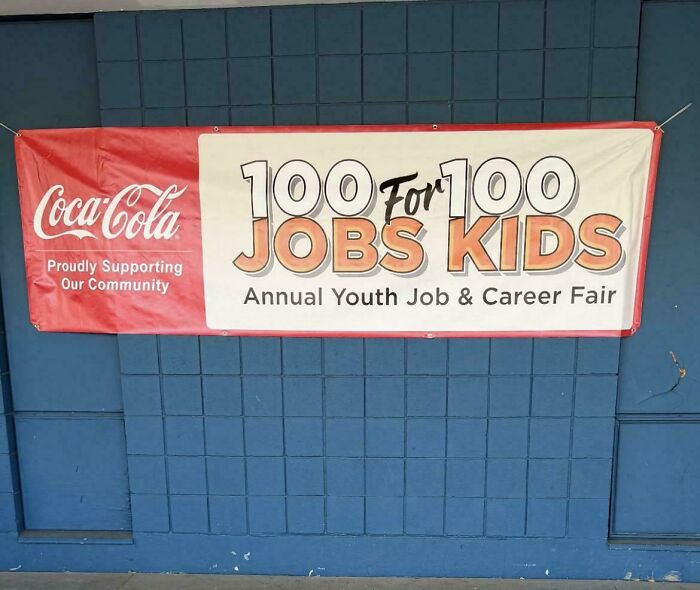
    100 For 100 Jobs Kids

    Community event banner that reads 100 JOBS FOR 100 KIDS awkwardly, exemplifying hilarious badly designed signs.

    lazypeach0 Report

    sbj
    Community Member
    Premium
    45 minutes ago

    Coco-cola supporting child labour? surely not

    View more comments
    ADVERTISEMENT
    #15

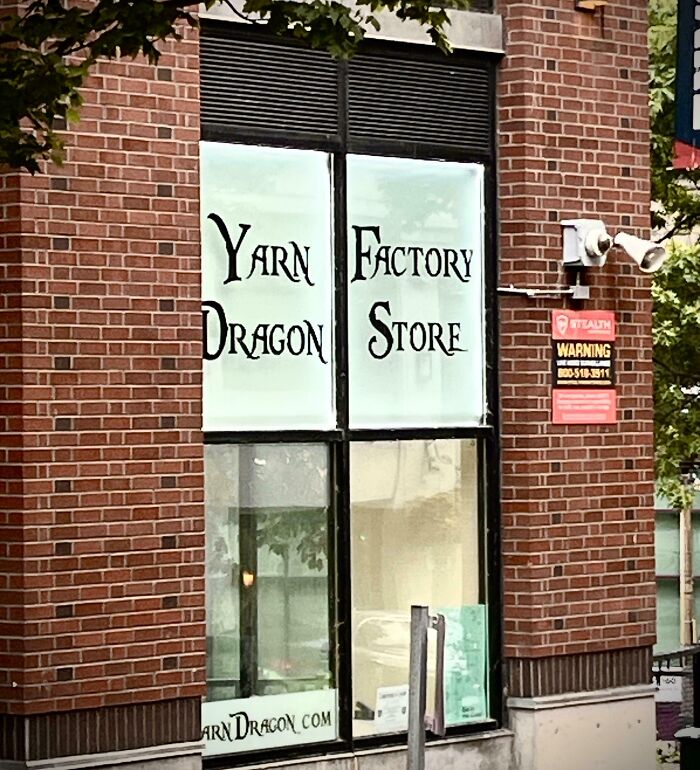
    Yarn Factory Dragon Store

    A storefront window with confusingly formatted text layout showcasing terribly designed signs.

    PropadataFilms Report

    Balseraph
    Community Member
    1 hour ago

    Not in need of a yarn factory, but the prospect of a dragon store has my attention.

    View more comments

    When companies get innovative with their signs, it can truly take their business to the next level, and one way to do this is with vehicle graphics. These special placards can be placed on cars, vans, and trucks to grab customers' attention and serve as an ongoing reminder of the business’s products.

    What’s great about moving signs is that you can always swap them out for new ideas and edit them to fit different themes. Adaptiveness is what makes text and advertising good so that companies can always meet their customer’s needs and captivate their interest.

    ADVERTISEMENT

    Never miss a story that brings joy to the world. Add us on Google

    #16

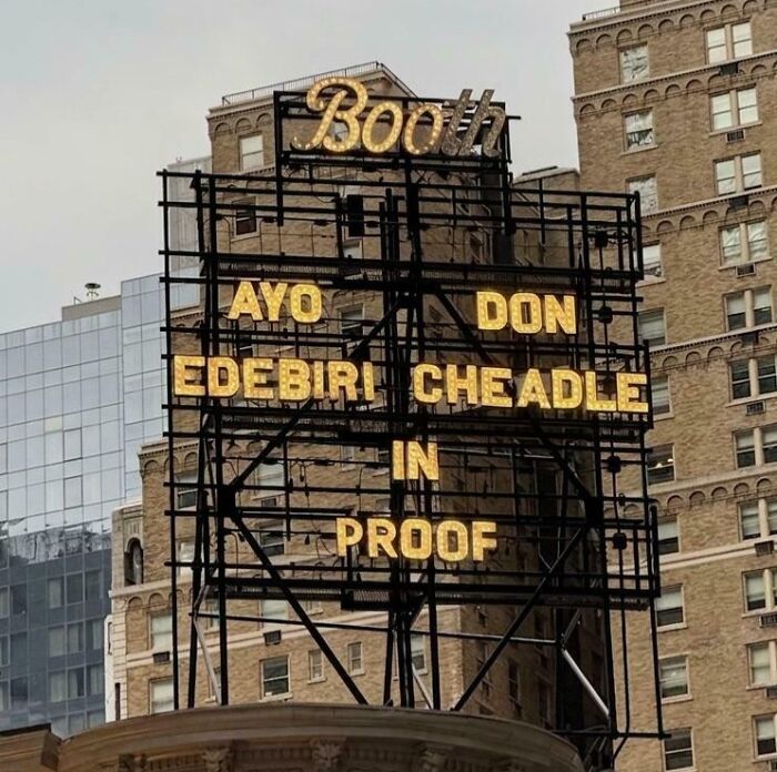
    Ayo Don Edebiri Cheadle

    A theater marquee with confusingly arranged actor names, featuring terribly designed signs.

    freeman687 Report

    #17

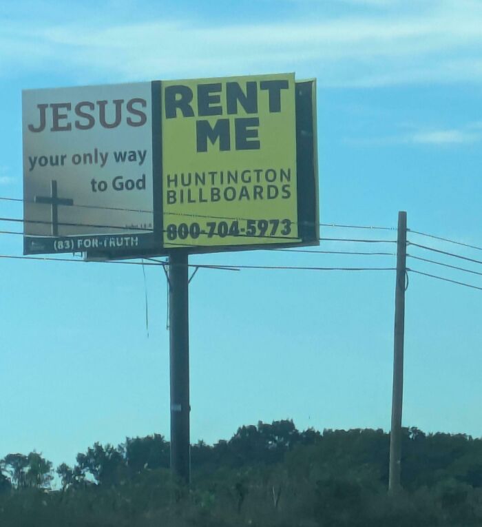
    Jesus Rent Me

    A roadside billboard with poorly aligned text layout showing terribly designed signs.

    FoxAlternative4234 Report

    ADVERTISEMENT
    #18

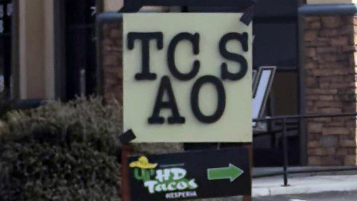
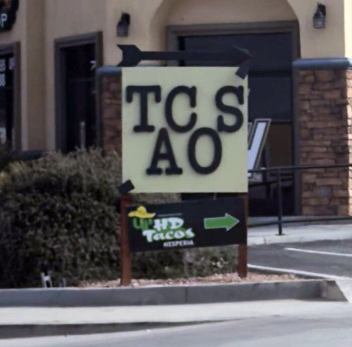
    Tc S Ao

    A confusing outdoor sign displaying scrambled letters in a terribly designed signs fail.

    heysavnac Report

    Edo Sayle
    Community Member
    4 hours ago

    T.C. S. A.O.

    A sign's quality can make or break its message by affecting customer acquisition, brand image, and the company’s local reputation. According to Medash Signs, 68% of people surveyed feel that a store’s placards or notices reflect the standard of its service or product.

    52% of folks also don’t feel like entering shops and businesses with poorly made or terrible signs outside. This means customers sometimes get hung up on a company's first impression and may find it hard to change their mind.

    #19

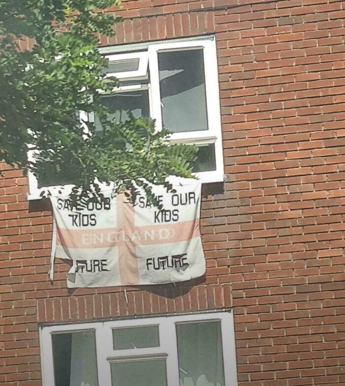
    Save Our Save Our Kids Kids England Future Future

    A flag with confusing text hanging outside a window showing badly designed signs.

    Wanita_1972 Report

    Elladine DesIsles
    Community Member
    3 hours ago

    Hey, British Pandas, am I wrong in guessing there's some sort of racism/xenophobia behind this one? That would be consistent with the minimal level of both spatial and grammatical competence it displays.

    View more comments
    ADVERTISEMENT
    #20

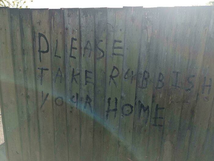
    Please Take Rubbish Your Home

    Graffiti on a wooden fence with misplaced words creating a badly designed sign.

    NowHearsThis Report

    ADVERTISEMENT
    #21

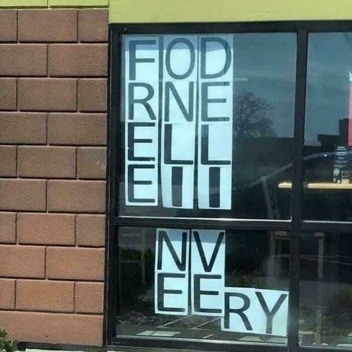
    Fodrne

    Confusing window sign with misplaced letters showcasing a badly designed sign.

    Jneum23 Report

    Maartje
    Community Member
    13 minutes ago

    OK I have no idea.

    It’s clear when business owners value their brand image because they put a lot of effort into their signs, posters, and placards. This kind of thought and creativity shines through and often attracts people even more, as they might find the branding funny, interesting, and clever.

    On the other hand, companies that treat their signage as an afterthought are easy to spot because they don’t mind spelling mistakes, grammatical errors, or incomprehensible text on their billboards. This suggests they may be focusing on the wrong things, and customers eventually notice these details too.

    #22

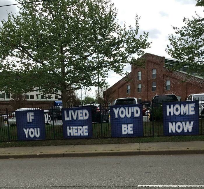
    If Lived You’d Home You Here Be Now

    Blue signs on a fence featuring poorly ordered text creating a badly designed sign.

    depressiveagressive Report

    Multa Nocte (she/her 8647)
    Community Member
    Premium
    3 hours ago

    Firesign Theatre!!!!

    #23

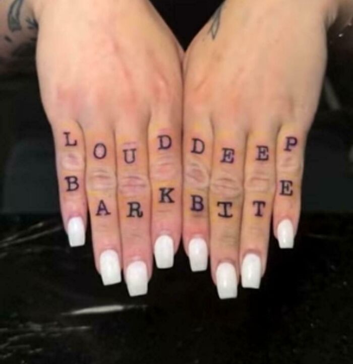
    Loud Deep Bark Bite

    Finger tattoos with confusing vertical text alignment, an example of terribly designed signs.

    Dewellah Report

    idowno
    Community Member
    4 hours ago

    Red flag Run away

    View more comments
    ADVERTISEMENT
    ADVERTISEMENT
    #24

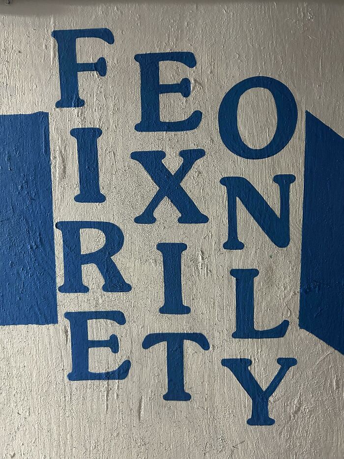
    Feo Ixn Ril Ety

    A wall with confusing text painting illustrating badly designed signs

    AStanHasNoName Report

    Maartje
    Community Member
    11 minutes ago

    If I have to stop to figure this out during a fire..

    Clearly written, interesting signs matter far more to customers than anything else, and a survey by Custom Neon on 1000 people found that over 76% visited a store mainly because of its attractive signage. 66% of people formed a bad opinion of a shop because of its placard or notice.

    Over 75% of individuals bought something from a business because its sign caught their eye, and 70.5% would avoid entering a store without an outside notice. Most folks also said they were drawn to bright, colorful designs, and 83.2% said the text on a sign mattered a lot.

    #25

    Stay Stop Human AI

    Protester holding a sign with badly designed signs layout reading Stay Human, Stop AI in an awkward order.

    Sterbucks Report

    Maartje
    Community Member
    11 minutes ago

    Maybe humans are doomed.

    ADVERTISEMENT
    #26

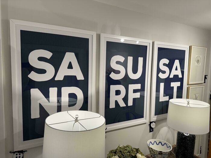
    Sa Su Sa

    Framed wall art prints displaying badly designed signs with poorly formatted letters spelling sand, surf, and salt.

    HTHID Report

    #27

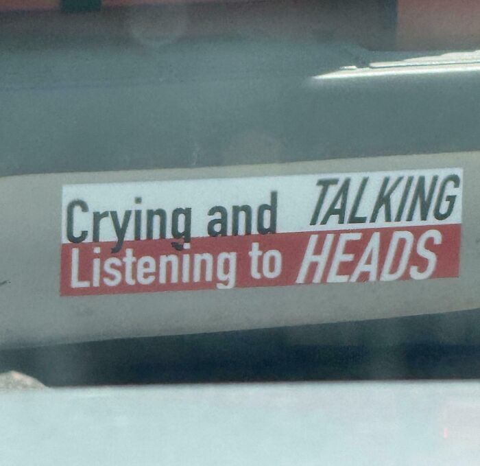
    Crying, Talking, Listening To Heads

    A car sticker reading Crying and TALKING Listening to HEADS, showing terribly designed signs.

    DeezNutsPickleRick Report

    ADVERTISEMENT

    Whether a business owner likes it or not, signage is extremely important and can make or break customers’ opinions. That’s why companies need to pay close attention to what they write on notices and placards, or they’ll end up with typos, errors, and mistakes like this that make them a laughingstock.

    We’d love to know if you’ve ever come across a silly sign in real life. What did it say, and do you think weird notices like this are funny? Do share your opinions in the comments below.

    #28

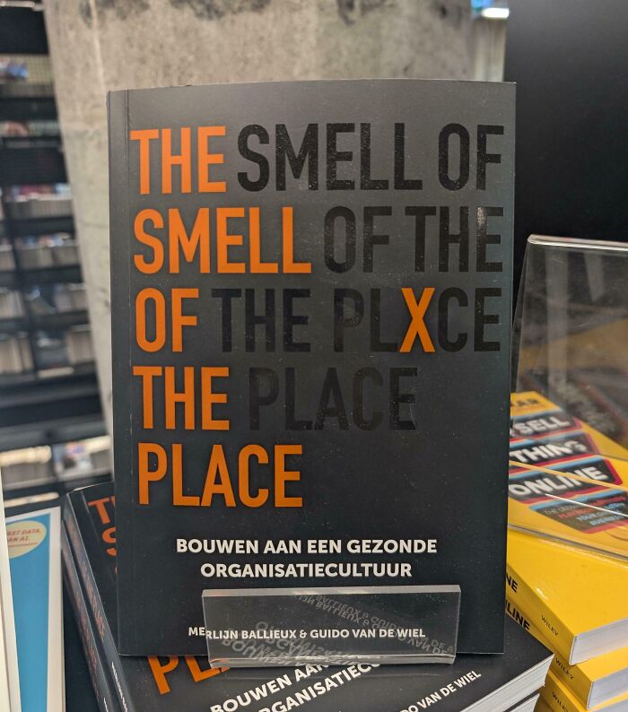
    The Smell Of Smell Of The Of The Plxce The Place Place

    A terribly designed sign on a book cover featuring repetitive confusing text with the words smell and place

    xGnarRx Report

    Maartje
    Community Member
    10 minutes ago

    Ja dat is tragisch.

    ADVERTISEMENT
    #29

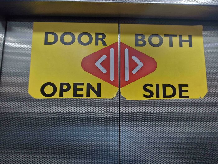
    Door Both Open Side

    Hilarious badly designed signs on elevator doors reading DOOR BOTH OPEN SIDE with arrows split across the middle

    Snorkel9999 Report

    #30

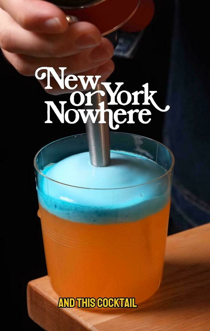
    New Or York Nowhere

    Hilarious badly designed signs like text reading New or York Nowhere layered confusingly above a cocktail

    ymgraal Report

    SCP 4666
    Community Member
    7 minutes ago

    New York or now here?

    #31

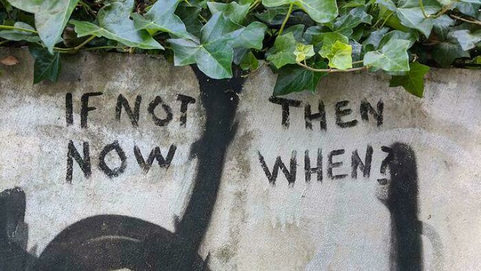
    If Not Then Now When?

    Hilarious badly designed signs like graffiti on a stone wall reading IF NOT NOW THEN WHEN split awkwardly

    rvedotrc Report

    ADVERTISEMENT
    #32

    Hans A.r. Zimmer Rahman

    A movie screen credit displaying music by Hans Zimmer and A. R. Rahman showing badly designed text layout

    ChickenWings2708 Report

    ADVERTISEMENT
    #33

    An Evening John With Legend

    Concert stage screen displaying poorly arranged text in a funny, hilarious badly designed sign layout.

    Fiyeroni88 Report

    #34

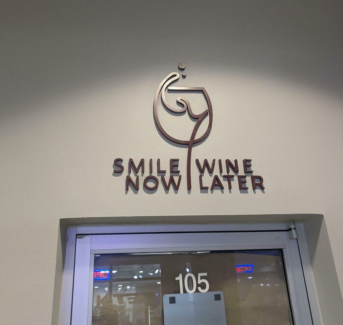
    Smile Wine Now Later

    A terribly designed sign above a door that reads Smile Now Wine Later in a confusing layout

    nexthoudini Report

    #35

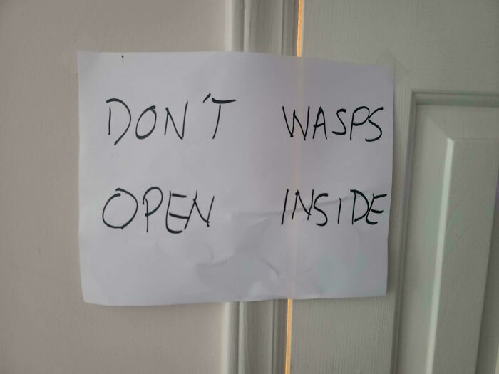
    Sign My Dad Put Up On The Bathroom Door After Our Roomate Got Attacked By Wasps (Don't Open, Wasps Inside)

    Paper sign with confusing formatting reading DON'T WASPS OPEN INSIDE, a hilarious badly designed sign on a door.

    Principle_Napkins Report

    Panda-sized Potato
    Community Member
    3 hours ago

    This one is a The Walking D**d reference.

    ADVERTISEMENT
    #36

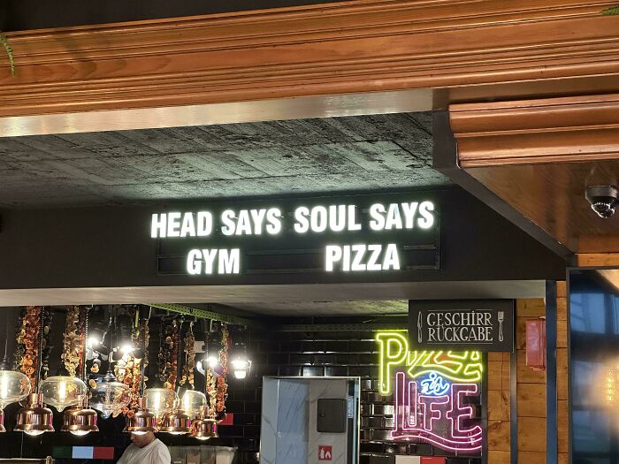
    Head Says Soul Says Gym Pizza

    An illuminated restaurant sign featuring badly designed signs stating HEAD SAYS GYM SOUL SAYS PIZZA.

    KurtThiemann Report

    ADVERTISEMENT
    #37

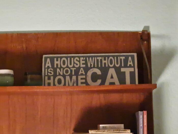
    A House Without A Is Not A Home Cat

    A wooden home decor plaque with badly designed signs showing mismatched text placement about houses and cats.

    iinlustris Report

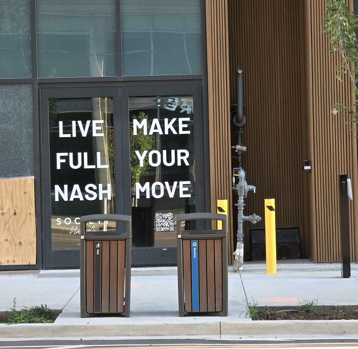
    #38

    Live Make Full Your Nash Move!!

    A terribly designed sign on glass doors with confusing layout reading Live Full Nash Make Your Move

    littlesimba013 Report

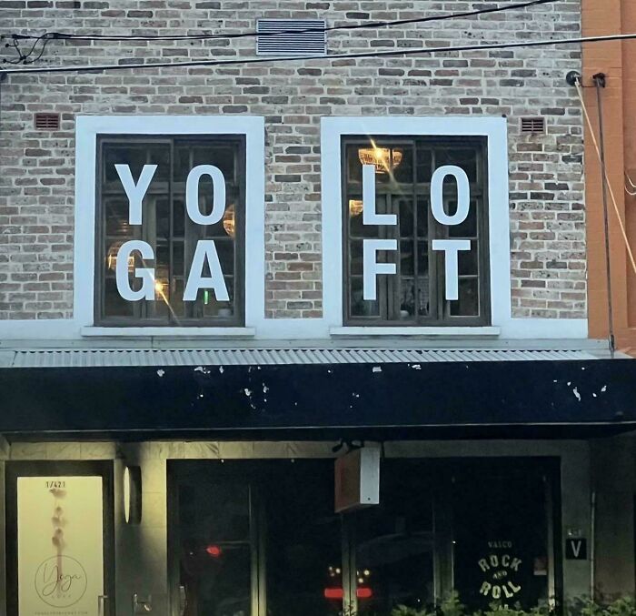
    #39

    YOLO Gaft

    A window sign showing badly designed signs with text reading YOGA LOFT confusingly split across windows.

    dog-_-biscuits Report

    ADVERTISEMENT
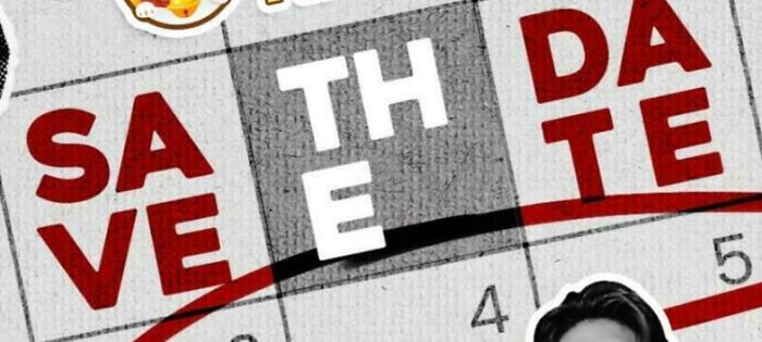
    #40

    Sathda Veete

    Hilarious badly designed crossword-style save the date text creating an awkward layout.

    nose_of_sauron Report

    ADVERTISEMENT
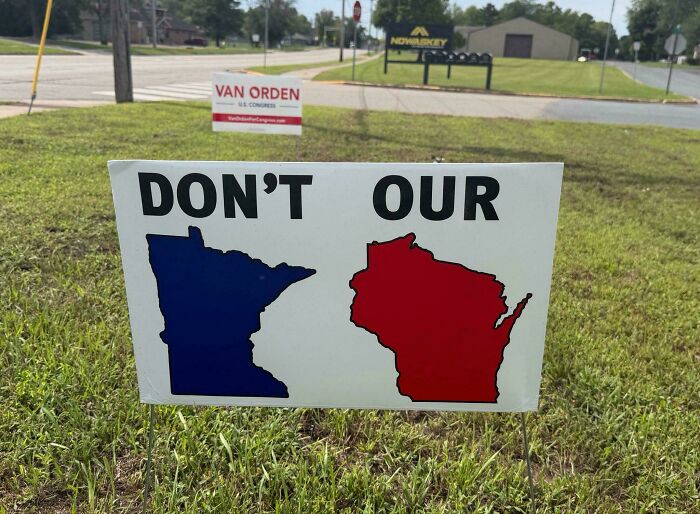
    #41

    Don't Our Minnesota Wisconsin

    Lawn political sign with confusing layout representing badly designed signs.

    RandallBoggs_12 Report

    #42

    Pflugerob Villegyn

    Medical office building exterior featuring confusingly colored typography as badly designed signs.

    bossDocHolliday Report

    #43

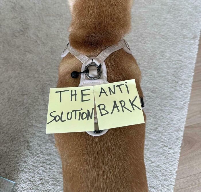
    The Anti-Solution Bark

    A dog with notes taped to its back forming a funny example of terribly designed signs.

    pirateofmemes Report

    ADVERTISEMENT
    #44

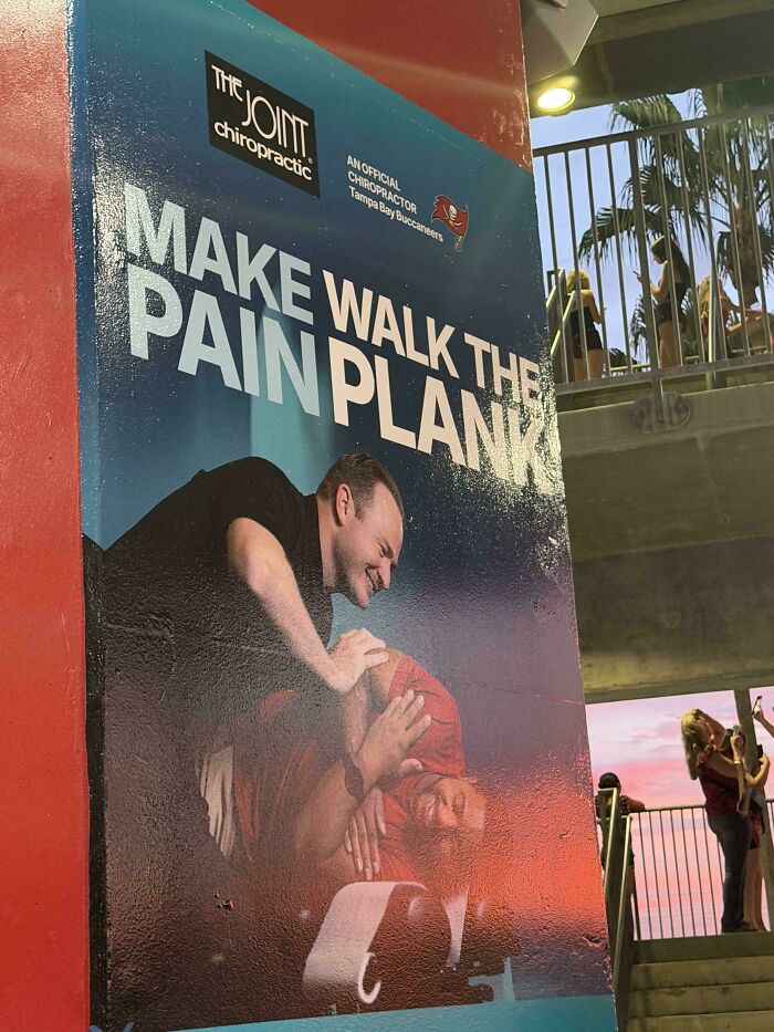
    Make Walk The Pain Plank

    Poster with confusing text alignment demonstrating badly designed signs for chiropractic care.

    ineptorganicmatter Report

    ADVERTISEMENT
    #45

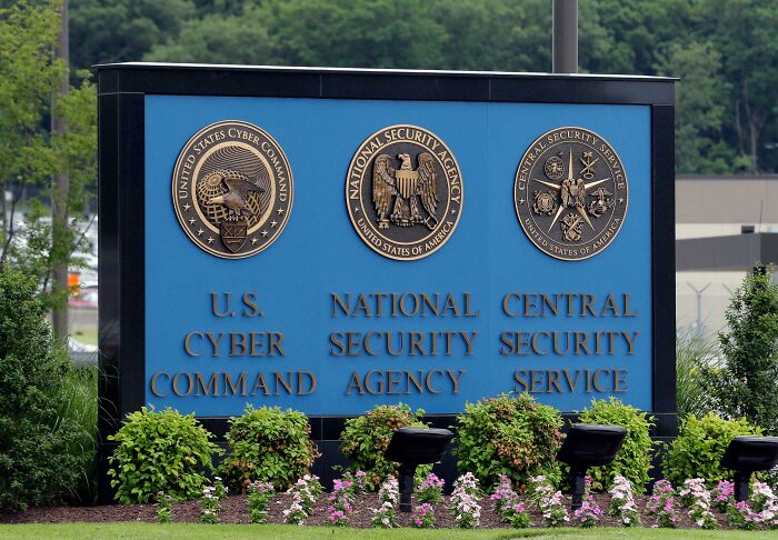
    U.S. National Central Cyber Security Security Command Agency Service

    Official government agency entrance billboard representing hilarious badly designed signs with alignment issues.

    FreidasBoss Report

    #46

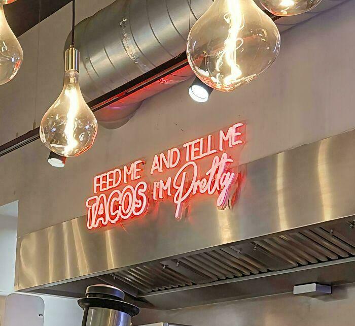
    Feed Me And Tell Me Tacos I’m Pretty

    A restaurant neon sign with confusing text layout featuring hilarious badly designed signs about tacos.

    ThePersonDudeGuy716 Report

    Panda-sized Potato
    Community Member
    3 hours ago

    Tacos you're pretty.

    #47

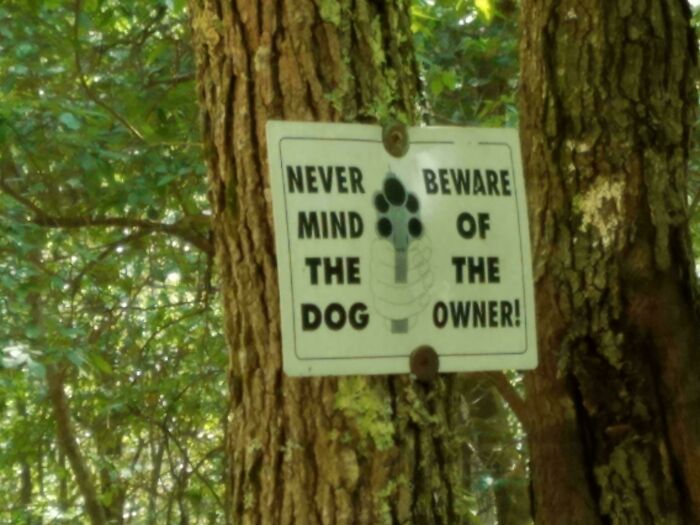
    Never Beware Mind Of The The Dog Owner

    Warning sign on a tree with confusing layout, an example of hilarious badly designed signs in nature.

    CreepyTeddyBear Report

    ADVERTISEMENT
    #48

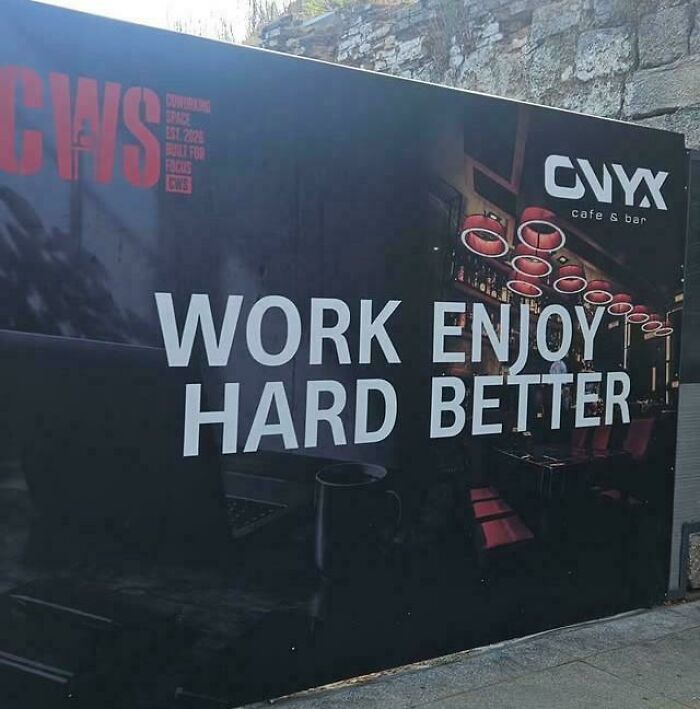
    Work Enjoy.. Hard Better

    Hilarious badly designed signs showing confused text reading work enjoy hard better on a cafe wall.

    Street-Hal0 Report

    ADVERTISEMENT
    #49

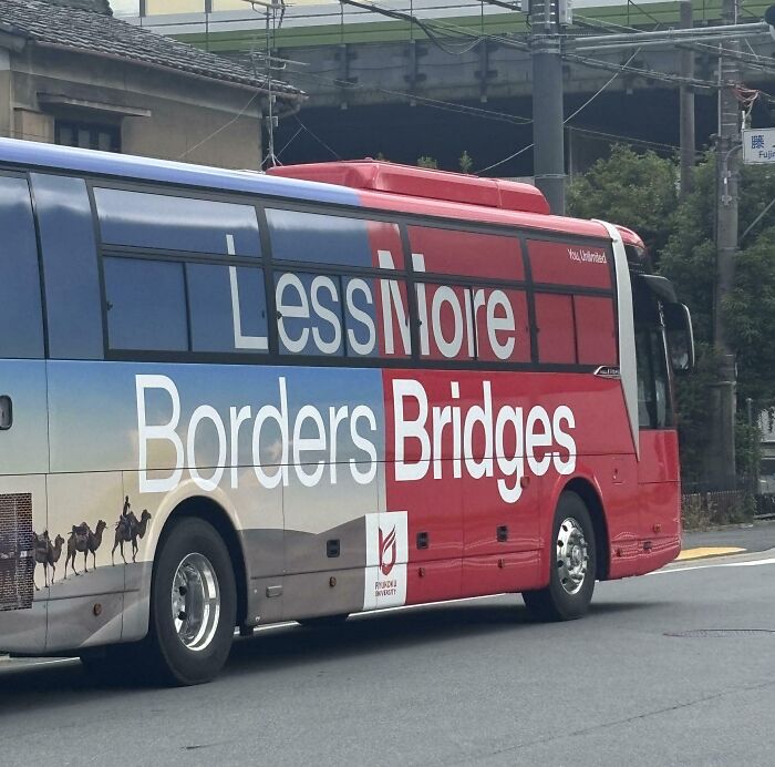
    Less More Borders Bridges

    A red and blue bus with confusing text formatting showcasing terribly designed signs.

    27OwlySnow Report

    #50

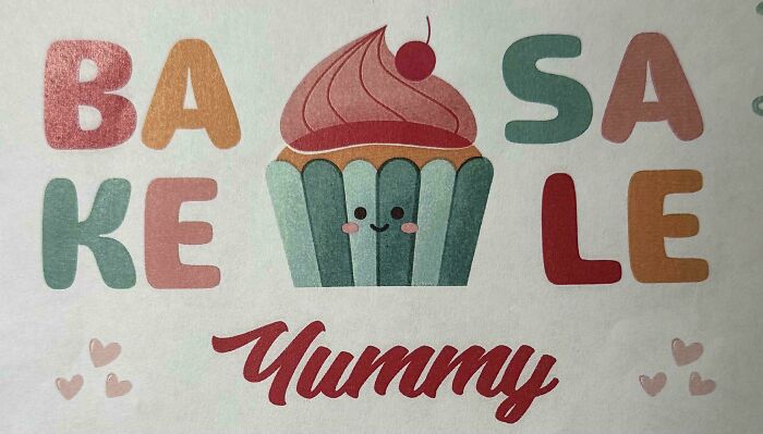
    Basa Kele

    Colorful cupcake artwork with split text BAKESALE, an example of badly designed signs on a poster.

    CaptainKnightwing Report

    #51

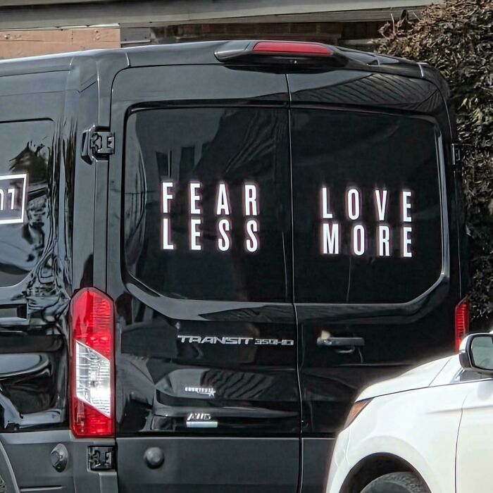
    Fear Love Less More!

    Black van doors showing badly designed signs split in half, reading FEAR LESS LOVE MORE in a confusing layout.

    Grubernator Report

    ADVERTISEMENT
    #52

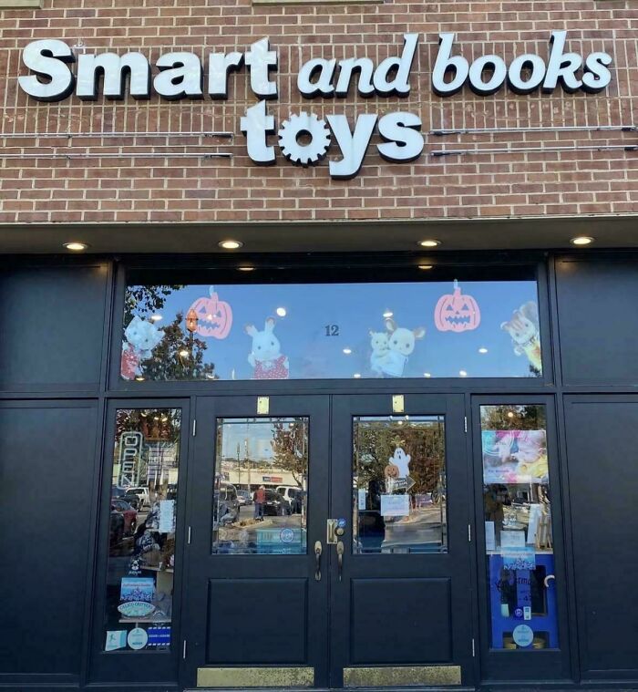
    Smart And Books Toys Store

    Storefront signage with confusingly arranged word order, showing badly designed signs.

    Inappropriate-Ebb Report

    ADVERTISEMENT
    #53

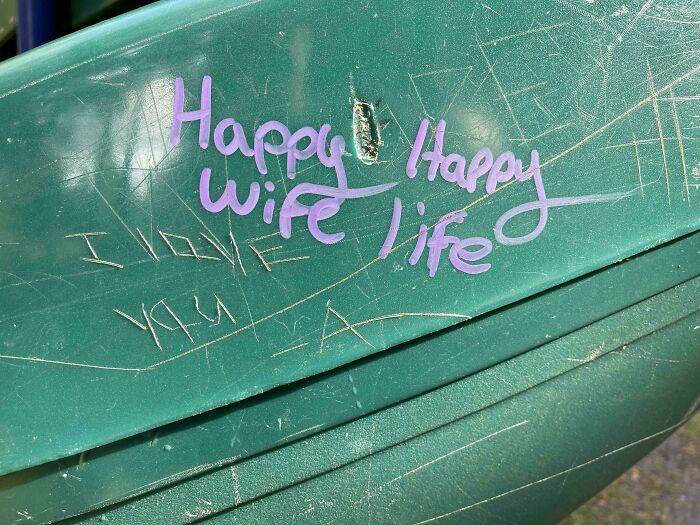
    Happy Happy Wife Life

    Graffiti on a green surface with confusing layout, illustrating badly designed signs.

    rufusjivefunk Report

    #54

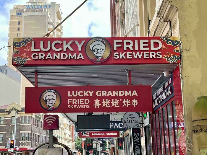
    Lucky Fried Grandma Skewers

    Restaurant signage with awkward text placement, an example of badly designed signs.

    FatTwatson Report

    #55

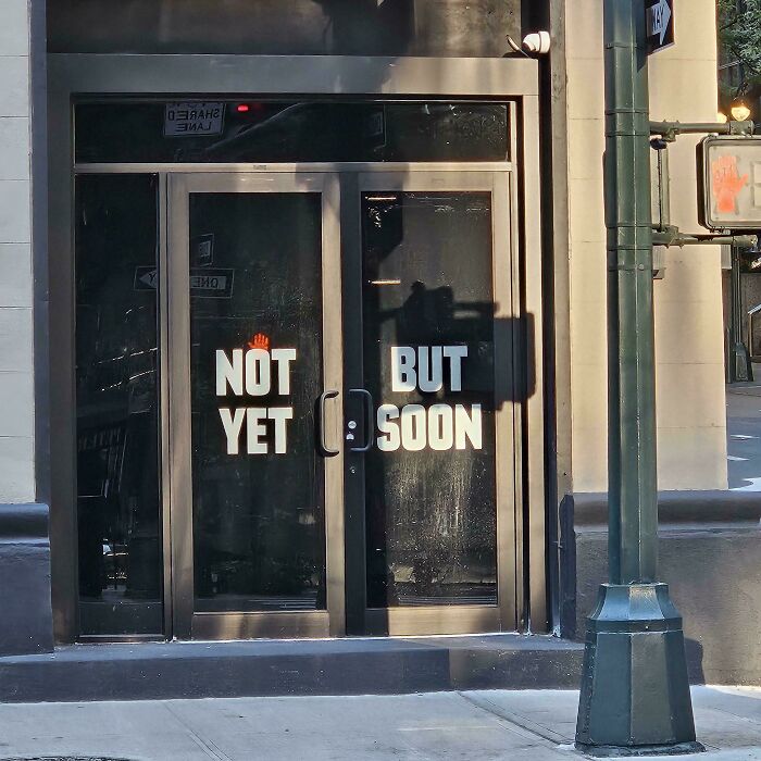
    Not But Yet Soon

    Storefront glass doors with confusing text alignment, showing badly designed signs.

    International-Care16 Report

    ADVERTISEMENT
    #56

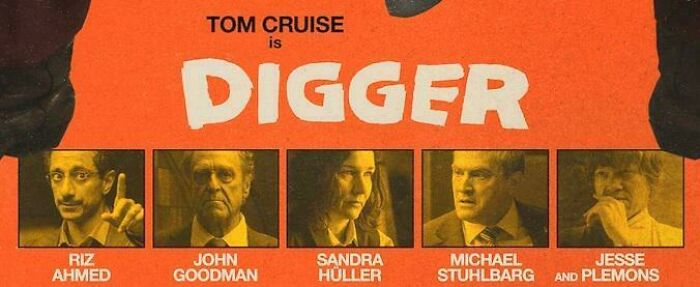
    Jesse & Plemons

    Hilarious badly designed signs on a movie poster featuring actor names printed above mismatched faces

    attackpotato Report

    ADVERTISEMENT
    #57

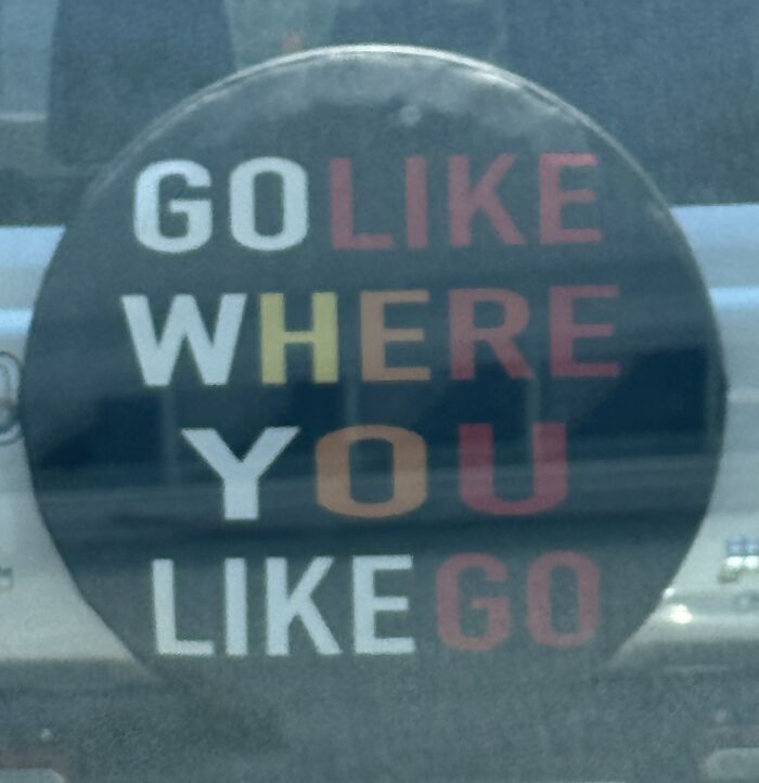
    Go Like Where You Like Go

    Hilarious badly designed signs on a car spare tire cover with confusingly placed text

    joller Report

    #58

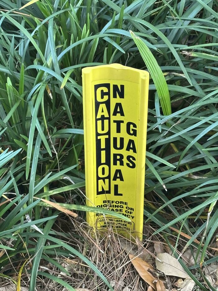
    Cn Aa Utg Tua Irs Oa Nl

    Yellow natural gas caution marker with scrambled vertical text, an instance of hilarious badly designed signs.

    JMDToaster Report

    #59

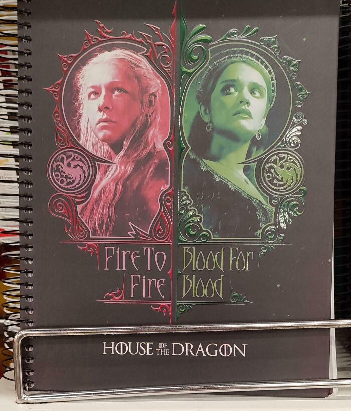
    Fire To Blood For Fire Blood

    A poorly designed notebook sign with confusing text layout reading Fire To Blood For Fire Blood.
    AlphaTheMonster Report

    ADVERTISEMENT
    #60

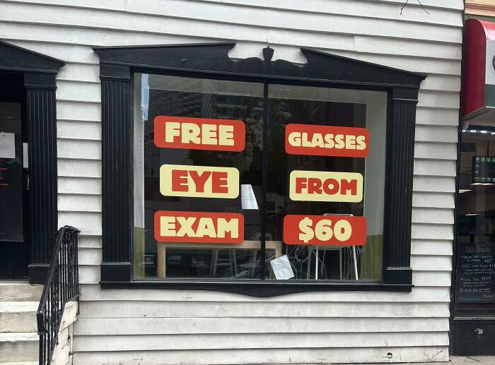
    Free Glasses!

    A storefront window with confusing signage about free eye exams and glasses, representing terribly designed signs.

    consolation123 Report

    ADVERTISEMENT
    #61

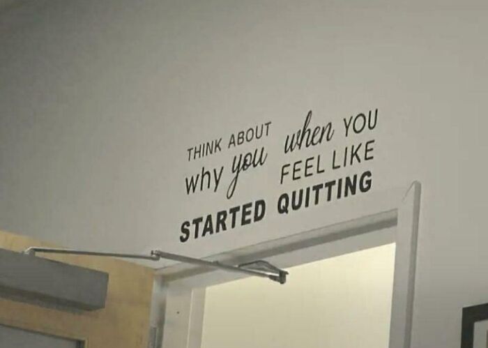
    Think About Why You When You Feel Like Started Quitting

    A wall decal with poorly formatted inspirational text above a doorway, featuring terribly designed signs.

    FloatyFloatyCloud Report

    Space Invader
    Community Member
    4 hours ago

    When you have to scribble that over the door, a lot of people must be thinking constantly of quitting that place. And if they didn't, they certainly will after seeing this...

    #62

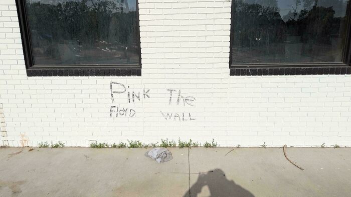
    Pink The Floyd Wall

    Graffiti on a white brick wall reading Pink The Floyd Wall, an example of a badly designed sign.

    OnlyANerdUsesReddit Report

    #63

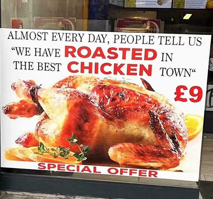
    "We Have Roasted In The Best Chicken Town"

    A badly designed sign advertising roasted chicken with confusing text layout.

    anon Report

    ADVERTISEMENT
    #64

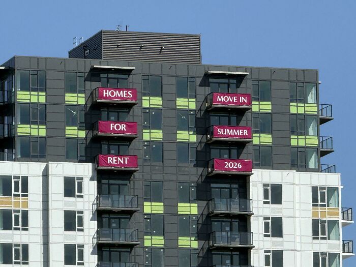
    Homes Move In For Summer Rent 2026

    Apartment building balconies displaying promotional banners with confusing order, an example of badly designed signs.

    -1701- Report

    ADVERTISEMENT
    #65

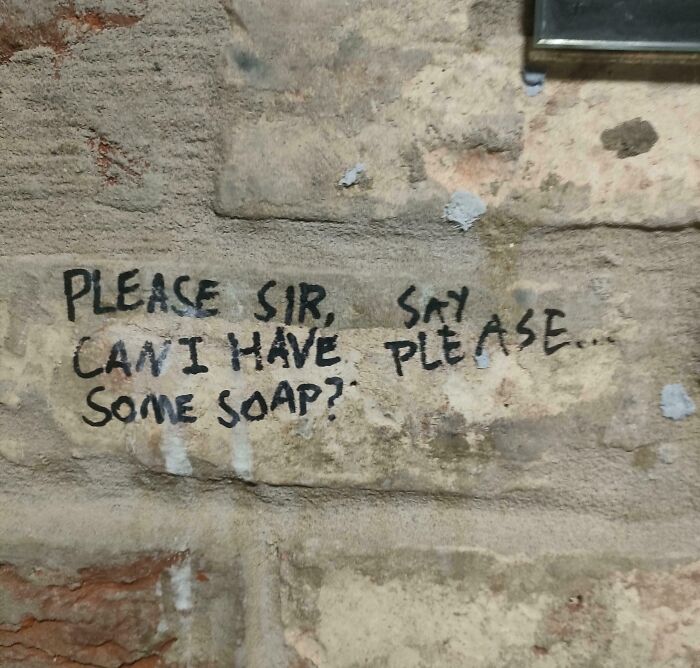
    Please Sir, Say Can I Have Please... Some Soap?
    Handwritten text on a stone wall asking for soap, featuring confusing and terribly designed signs layout.

    PolebagEggbag Report

    #66

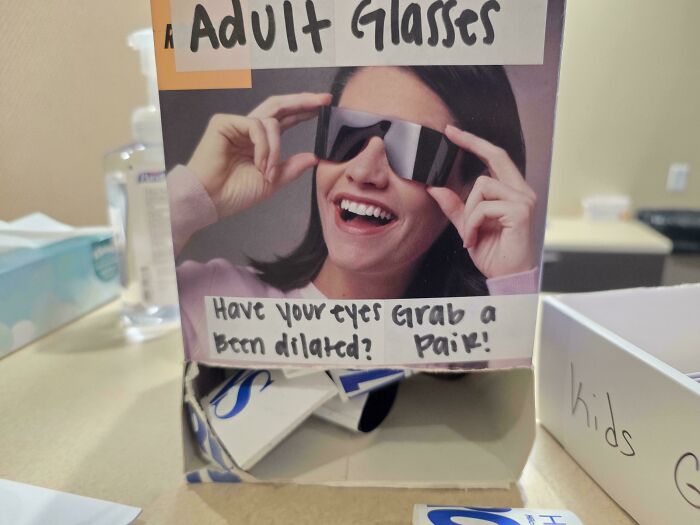
    Have Your Eyes Grab A Been Dilated? Pair!

    Eyewear display box with confusing handwritten text instructions, an example of hilarious badly designed signs.

    SilvrSabl Report

    #67

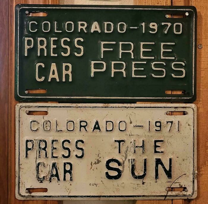
    Press The Car Sun

    Vintage Colorado license plates with confusing text layout, serving as badly designed signs.

    HinsdaleCounty Report

    ADVERTISEMENT
    #68

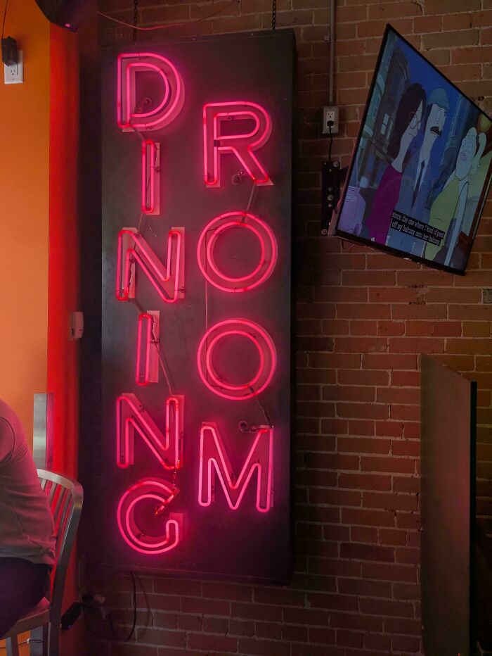
    Drionionmg

    A glowing pink neon sign spelling Dining Room in a confusing vertical layout, an example of badly designed signs.

    rizmk Report

    ADVERTISEMENT
    #69

    Never Being Stop You

    Cartoon drawing of a cute animal with confusingly arranged text, an example of hilarious badly designed signs.

    _FisterRoboto_ Report

    #70

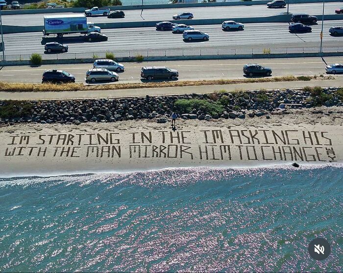
    I’m Starting In The I’m Asking His With The Man In The Mirror Him To Change Way

    Song lyrics written on the sand showing poorly ordered text and badly designed signs

    TheRealQuasar Report

    #71

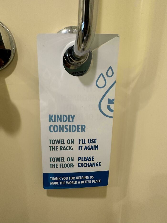
    Towel On I’ll Use. The Rack : It Again

    Hotel bathroom door hanger featuring badly designed signs text layout.

    chandu1256 Report

    ADVERTISEMENT
    #72

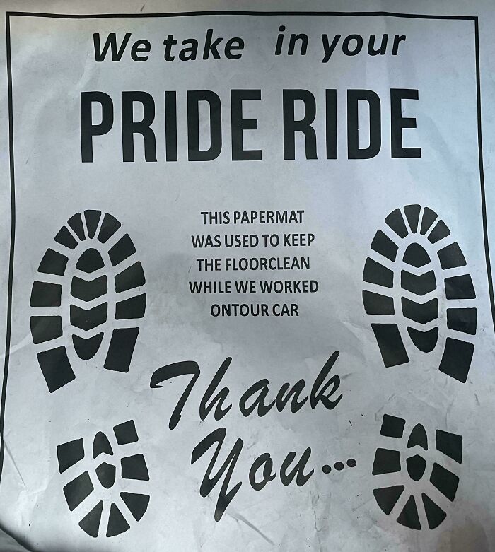
    We Take In Your Pride Ride

    Paper floor mat from a car service with badly designed signs and formatting.

    HalfShelli Report

    ADVERTISEMENT
    #73

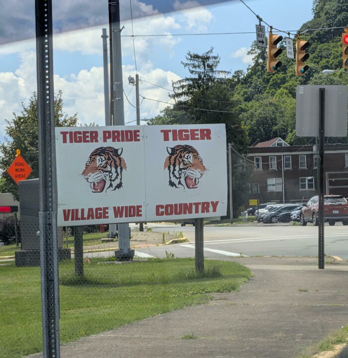
    Tiger Pride Tiger Village Wide Country

    A roadside sign with confusing tiger mascot text, demonstrating terribly designed signs.

    TyrannyOfBobBarker_ Report

    #74

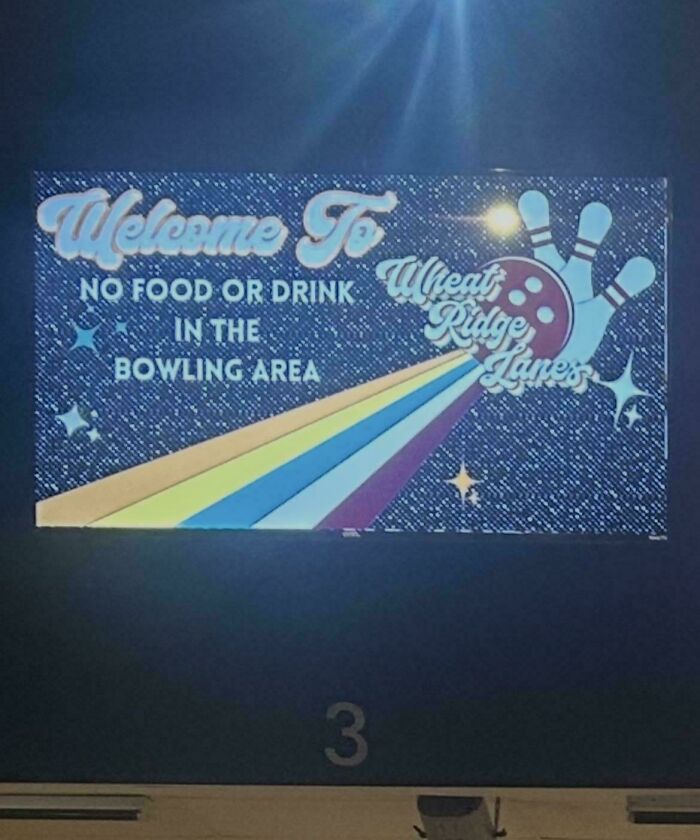
    Welcome To No Food Or Drink In The Bowling Area
    A badly designed sign at Wheat Ridge Lanes with confusing rules and layout.

    ketchupinmyear Report

    #75

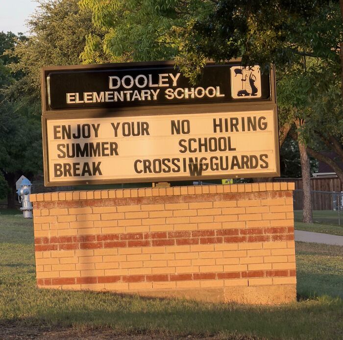
    Enjoy Your No Hiring Summer School Break Crossingguards

    A school marquee sign with jumbled text layout, illustrating terribly designed signs.

    Dj_AA Report

    ADVERTISEMENT
    #76

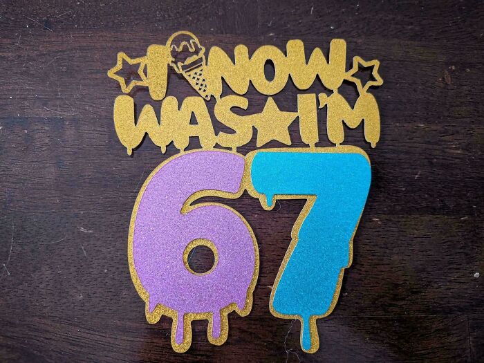
    I Now Was I'm 67

    A cake topper with confusing lettering showing badly designed signs

    1billsfan716 Report

    ADVERTISEMENT
    #77

    From & Imported Domestic Ingredients

    A chocolate milk carton with confusing text as an example of badly designed signs

    rioryan Report

    #78

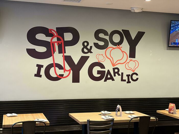
    Sp Soy & Icy Garlic

    Confusing wall graphic displaying badly designed signs text that mixes spicy soy and icy garlic phrases.

    BalloonCS Report

    #79

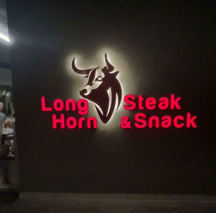
    Long Steak Horn & Snack

    A glowing restaurant sign, an example of terribly designed signs with confusing layout.

    AccidentNo3917 Report

    ADVERTISEMENT
    #80

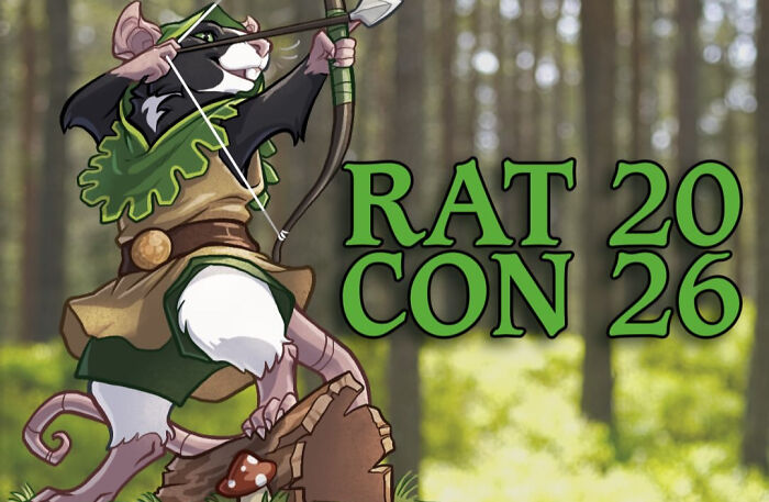
    Rat 20 Con 26

    Hilarious badly designed signs including poster text reading RAT 20 CON 26 with a rat archer illustration

    BigWangersIncTm Report

    ADVERTISEMENT
    #81

    Live Pet Fast Dogs

    A person wearing a tank top with a badly designed sign layout reading LIVE PET FAST DOGS

    MostDankEmblem Report

    #82

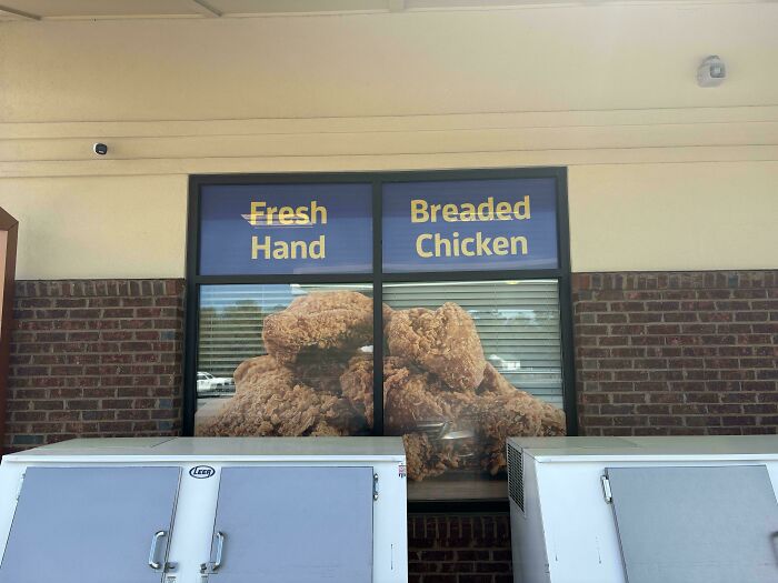
    Fresh Breaded Hand Chicken

    A restaurant store front featuring a badly designed sign that reads Fresh Hand Breaded Chicken

    Heron_Silent Report

    #83

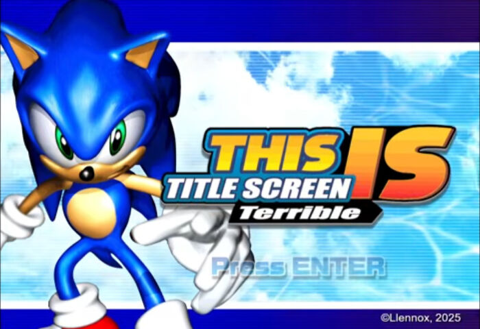
    This Is Title Screen Terrible

    A video game title screen featuring Sonic with a badly designed layout reading THIS IS TITLE SCREEN Terrible

    seenlikesmcr Report

    ADVERTISEMENT
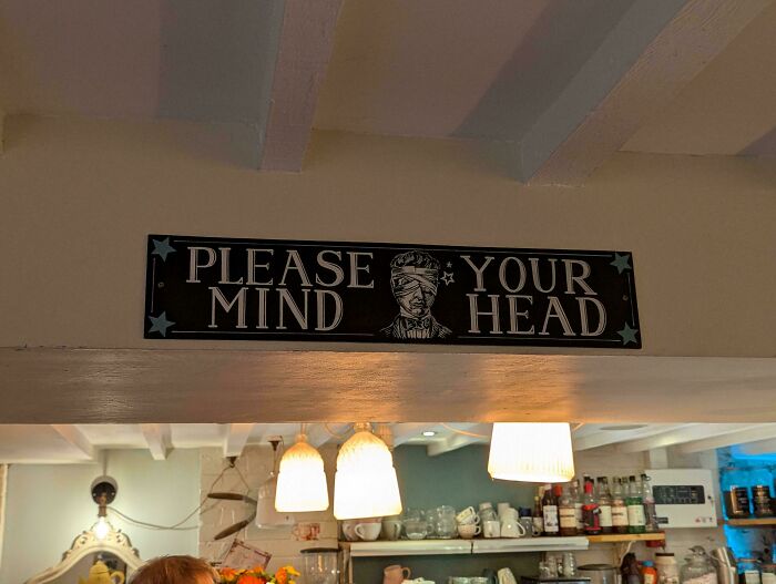
    #84

    Please Your Mind Head

    A badly designed sign that reads PLEASE YOUR MIND HEAD with a blindfolded face graphic

    itskdog Report

    ADVERTISEMENT
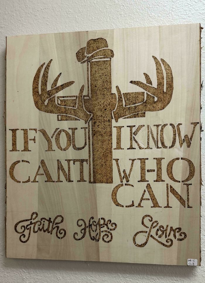
    #85

    If You I Know

    Wooden art piece with confusing layout text, serving as an example of a hilarious badly designed sign.

    Anananabooboo Report

    #86

    Wanna Some Up? Spice Things

    An advertisement featuring badly designed signs with confusing word order reading WANNA SOME SPICE THINGS UP.

    imnottosureaboutthat Report

    #87

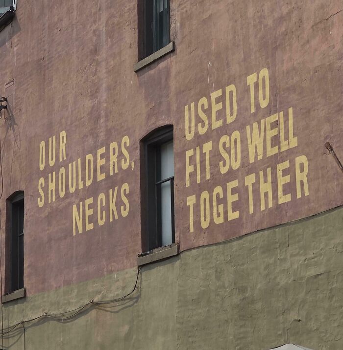
    Our Shoulders, Used To Necks Fit So Well Together

    A terribly designed sign painted on a brick wall with confusingly layout text reading Our Shoulders Necks

    BadgerlandBandit Report

    ADVERTISEMENT
    #88

    Tothne Geerss

    A white box featuring scrambled and unreadable text design as an example of terribly designed signs.

    utterlyuncool Report

    idowno
    Community Member
    4 hours ago

    All the previous ones were fine, but this one is bad.

    ADVERTISEMENT
    #89

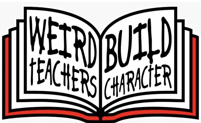
    Weird Build Teachers Character

    Open book graphic with confusing text layout showing badly designed signs.

    we_gon_ride Report

    #90

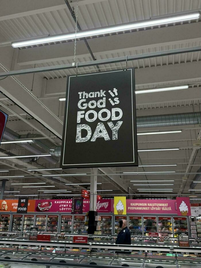
    Thank It God Is Food Day

    Grocery store hanging banner showcasing hilarious badly designed signs with jumbled text about food day.

    Pupupuuro Report

    #91

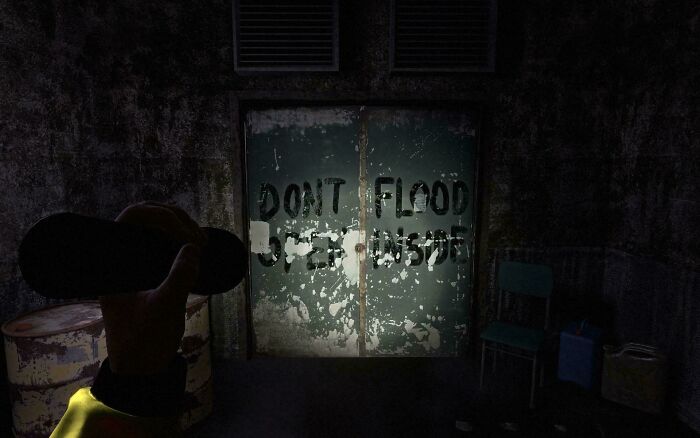
    Dont Flood Open Inside

    Dark room doors displaying badly designed signs with spray-painted text saying DONT FLOOD OPEN INSIDE.

    iHateSystemD_ Report

    ADVERTISEMENT
    #92

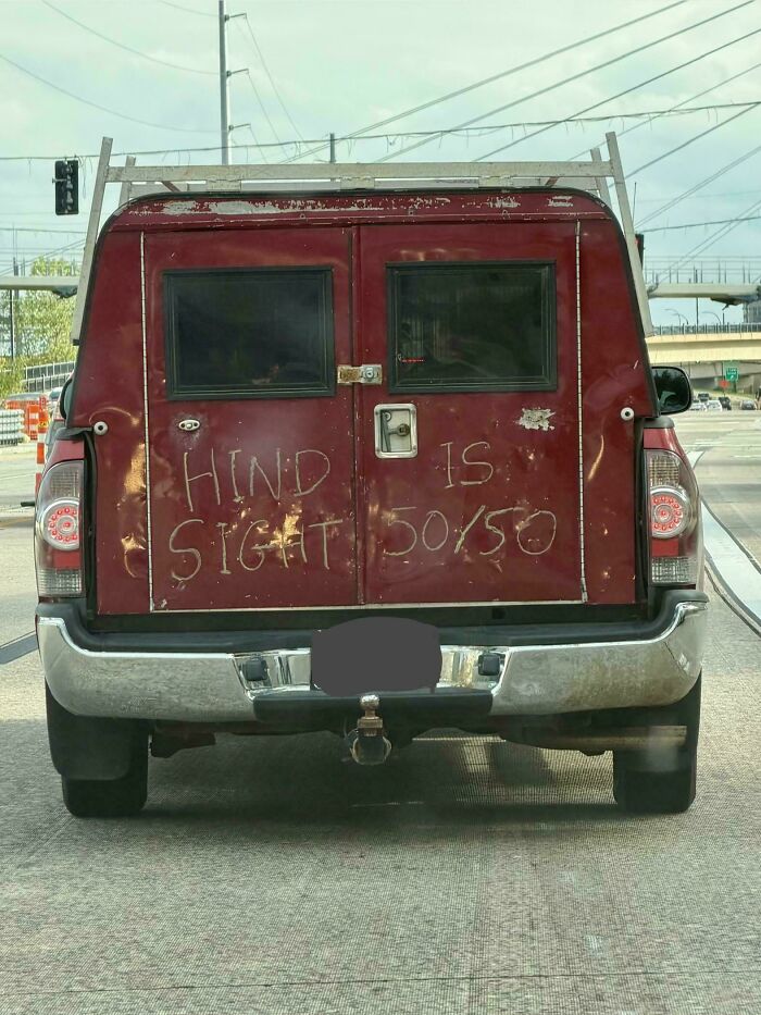
    Hind Is Sight 50/50

    Hand-scratched text on a red truck door serving as one of many badly designed signs reading HINDSIGHT IS 50/50.

    wanderingfern33 Report

    ADVERTISEMENT
    #93

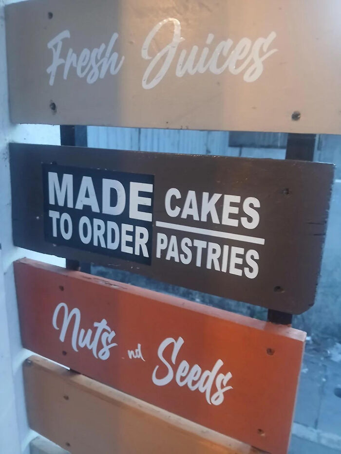
    Made Cakes To Order Pastries

    A poorly aligned wooden menu, perfect example of badly designed signs.

    XComhghall Report

    #94

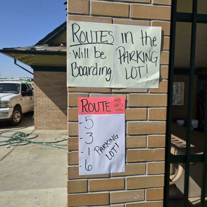
    Routes In The Will Be Parking Boarding Lot!

    Hilarious badly designed signs with poorly formatted handwritten direction papers on a brick wall

    TeacatWrites Report

    #95

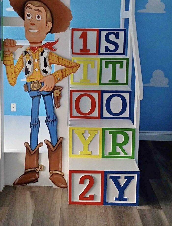
    1s Tt Oo Yr 2y

    A poorly designed Toy Story cutout next to stairs as an example of terribly designed signs.

    Curlyyaz Report

    ADVERTISEMENT