ADVERTISEMENT

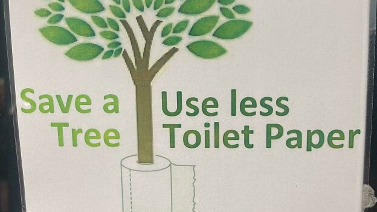
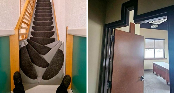
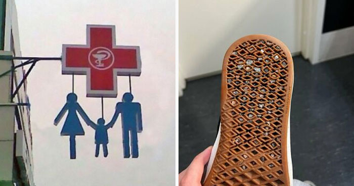
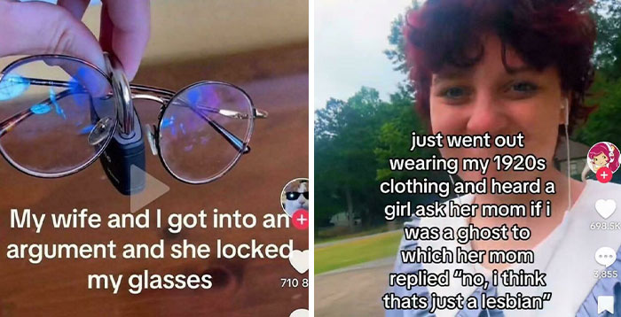
If someone is tasked with creating a sign, the most important thing to keep in mind is ensuring that their message is clear. Whether they’re advertising for a company, fundraising for a charity, or trying to find their lost cat, if people can’t read their sign, it’s pointless. 

But sometimes, even if viewers can read it, they still take it to mean something completely different than what the author intended. We took a trip to a subreddit that’s dedicated to sharing comically bad signs. All of these photos feature signs that make absolutely no sense when read from left to right, so their messages were completely lost. Enjoy scrolling through these hilarious pics, and be sure to upvote the designs that you can’t believe people thought would be a good idea!

#1

Save A Useless Tree Toilet Paper

A sign with poor design humorously encourages using less toilet paper to save trees.

mbelf Report

UnclePanda
Community Member
Premium
15 minutes ago Created by potrace 1.15, written by Peter Selinger 2001-2017

Don't poopoo this - we're wiping out all the trees.

View more comments
RELATED:
    #2

    We Don't Care. Stop

    Hilariously confusing message from poor sign design: a billboard with WE DON'T CARE. STOP.

    Feeling-Cobbler-3581 Report

    Bonesko
    Community Member
    46 minutes ago Created by potrace 1.15, written by Peter Selinger 2001-2017

    I'll stop, but you don't need to be rude

    #3

    We Back. Stop Pain

    A hilariously confusing message from poor sign design with a shop front sign reading 'THE BACK SHOP WE BACK STOP PAIN'.

    bashothebanana Report

    You might assume that you’re an expert on signage based purely on the fact that you’ve seen thousands of them. Nowadays, it’s kind of impossible to avoid them. We’re bombarded with signs when driving on the highway, walking down the street, passing any business, and even when we open up any webpage. In fact, the average person consciously sees about 100 ads per day, many of which come in the form of signs.

    ADVERTISEMENT

    But just because we’re all used to seeing signs doesn’t mean that we have the skills to create them. As we can clearly see from this list, it’s harder than it looks! Apparently, it’s extremely important to get a second, third, or perhaps even a tenth opinion before sending a sign to print. Or you might get roasted online for creating a ridiculous message like “We Don’t Care, Give Up.”      

    #4

    Do You Fitter? Want Stronger?

    A hilariously confusing message from poor sign design with a sign reading 'Do you fitter? Want stronger? To feel better?'

    throughthebreeze Report

    ADVERTISEMENT
    #5

    Mc D A U I Rl+vi Tr E Lu S N R It Ge Y

    A hilariously confusing message from poor sign design with letters that read 'MC DI AU VE RL +E RI TR IL UY S N IT R GEY.'

    ExNihiloAdInfinitum Report

    #6

    One I Gonna Wings Day Am Grow

    A woman's back with a tattoo of bat wings and a confusing message that says ONE I GONNA WINGS DAY AM GROW, showing poor sign design.

    FuckerJames Report

    Bonesko
    Community Member
    41 minutes ago Created by potrace 1.15, written by Peter Selinger 2001-2017

    One I gonna regret day got this tattoo

    ADVERTISEMENT

    If you want to avoid the mistakes that have been made on this list, Vistaprint published “The Ultimate Guide To Signage Design,” so we’ll share some of their wisdom with you, pandas. First, they note that there are different types of signs that serve various purposes, so it’s important to understand the specific niche you want to fit into first.

    Designing a billboard is different from designing a banner, and A-frames, digital screens, shop fronts, and flags all have their unique requirements as well. So step one requires doing lots of research. Peruse loads of inspiration first, and understand exactly what you want (and don’t want) before committing to anything concrete. 

    #7

    Please The Shoes Take Off

    A hilariously confusing sign design that reads Please Take The Shoes Off, an example of poor sign design.

    popopornado Report

    #8

    Hi Do Not Mix Please The Beans

    A hilariously confusing sign design for beans reads: Great Price. Hi Do Not Mix. Please The Beans.

    fearless_moth56 Report

    Bonesko
    Community Member
    40 minutes ago Created by potrace 1.15, written by Peter Selinger 2001-2017

    If it said sincerely instead of please it'd make sense

    ADVERTISEMENT
    ADVERTISEMENT
    #9

    Fourskin Co. Season

    A hilariously confusing poor sign design, showing a metal cutout sign on a building that reads FOURSKIN CO SEASON.

    calebthelee Report

    Bonesko
    Community Member
    45 minutes ago (edited) Created by potrace 1.15, written by Peter Selinger 2001-2017

    Is it f******n season already

    Once you’ve made it to the drafting stage of designing a sign, it’s important not to get too attached to any one idea. Feel free to play around and experiment to ensure you find the best possible design. And once you do believe that you’re making progress, you’ll have to get reviews and feedback from people whose opinions you trust. It’s not always easy to hear critiques, but it’s much better to hear them in the drafting stage than after you’ve printed 300 signs.   

    #10

    If Your Drink Reading This Water

    Graffiti with poor sign design on a concrete wall reads 'If You're Reading This... Drink Water', a confusing message.

    Far_Performance_4013 Report

    #11

    Safe Are Best, Spaces The Places!

    A hilariously confusing message from poor sign design with a sign on a tree that reads 'SAFE ARE BEST SPACES THE PLACES.'

    olliebean333 Report

    ADVERTISEMENT
    #12

    Please Order Ring Food The Bell Thank For You

    A hilariously confusing message on a sign reads 'Please Order Ring Food The Bell Thank For You'.

    laurenweeener Report

    ADVERTISEMENT

    When it comes to the most important elements of sign design, Vistaprint says color, typography, graphics and images, material, texture, and size and scale are crucial to consider. You want the sign to stand out, but in a good way. You need the font to be legible and appropriate for the message, but the correct size as well. The text should be concise, perfectly visible, and engaging. Ideally, the message will be one that people remember and something that’s consistent with the rest of the brand.

    #13

    (Berlin) More Who Than Are A You Gym

    An external view of a gym building with a poor sign design that reads MORE WHO THAN ARE A GYM YOU, creating a confusing message.

    martisio054 Report

    #14

    Lucky Fried Geandma Skewers

    A hilariously confusing message on a restaurant sign: Lucky Fried Grandma Skewers.

    cuavas Report

    ADVERTISEMENT
    #15

    Pflugerqb Villegyn

    A building at night with a confusing sign design that reads Pfluger OB Ville Gyn in neon pink and white letters.

    Broke-Down-Toad Report

    As for some of the most common mistakes sign designers tend to make, Forbes warns that a lack of contrast can ruin any great message. If the text doesn’t stand out from the background, nobody will be able to read it. But that doesn’t mean the colors should clash. There’s a fine line between having a bold contrast and hurting people’s eyes when they look at the sign.

    ADVERTISEMENT

    Never miss a story that brings joy to the world. Follow on Google News

    #16

    Date 5 The 4 Save 26 (Supposed To Say Save The Date 5/4/26)

    A hilariously confusing message on a beach, 'DATE 5 THE 4 SAVE 26', written in sand next to a couple.

    lisahanniganfan Report

    ADVERTISEMENT
    #18

    Twisted Bar And Monkey Grill

    A bar and grill sign with poor design reads 'Twisted Bar & Monkey Grill', creating a hilariously confusing message.

    maharahji Report

    Daniel Atkins
    Community Member
    9 minutes ago Created by potrace 1.15, written by Peter Selinger 2001-2017

    Do you grill the monkeys or are they running the place.

    Something else to consider is the artwork featured on a sign. The words might be the most important part, but the images featured play a huge role too. It’s extremely important to put artwork in front of many eyes to ensure that it won’t be misconstrued. This means having viewers look at it from various distances to see if it translates from close up and far away. And if your company has a logo, it’s wise to include that in any and all signage too. 

    #19

    Wish Dream Do, It, It, It!

    A sign with poor design on a wooden table displays a confusingly split message: Wish Dream Do It.

    Wednesdaaayyy Report

    ADVERTISEMENT
    #20

    The MA Good RI Satan

    A hilariously confusing message in stained glass reads 'THE GOOD SA' and 'MA RI TAN', forming 'The Good Samaritan'.

    superyoshi013021 Report

    ADVERTISEMENT
    #21

    They Prove Wrong Can't Him Rip Charlie

    A hilariously confusing message on a sign that reads 'They prove wrong can't him R.I.P. Charlie' above memorial candles.

    weetabixbandit Report

    Elladine DesIsles
    Community Member
    46 minutes ago Created by potrace 1.15, written by Peter Selinger 2001-2017

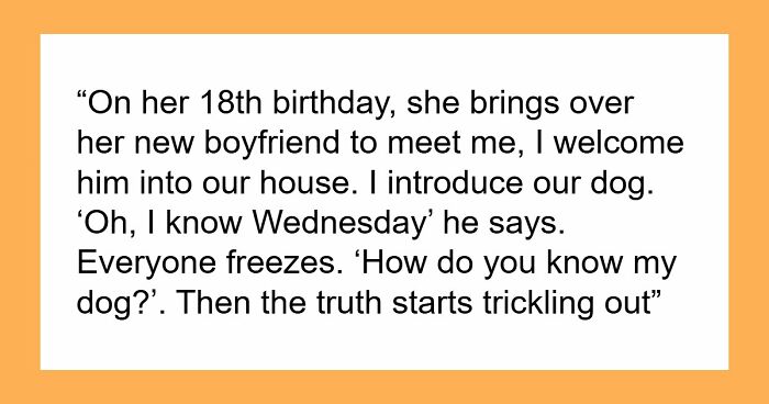
    I can read this just fine, though I'd rather not. And yes, he was wrong, provably so. Very, very wrong.

    Finally, sign designers (de-sign-ers?) have to remember that their work doesn’t exist in a vacuum. They must consider the context in which people will view their messages. If the design doesn’t match the location where it will be seen, it’s never going to be effective. For example, what works well on a billboard in the center of a city might be pointless on a beachside boardwalk. Remember all of these factors if you want to get your point across. 

    #22

    Welcome Tattoo To The Street

    A hilariously confusing message on a sign banner that reads 'WELCOME to the TATTOO STREET'

    wyqsuy Report

    WindySwede
    Community Member
    45 minutes ago Created by potrace 1.15, written by Peter Selinger 2001-2017

    Well, graffiti are the tattoo of the streets?

    #23

    Black Black Power Pride

    Black Power and Black Pride written on separate sidewalk slabs, creating a subtly confusing message with poor sign design.

    BertaniWasBehindIt Report

    ADVERTISEMENT
    ADVERTISEMENT
    #24

    Wash Plyur Eaown Secup

    A sign with poor design reads Wash Ply Your Ea Own Se Cup, demonstrating a hilariously confusing message.

    Healthy_Donut8351 Report

    Are you enjoying these hilarious sign fails, pandas? Keep upvoting the ones that you can’t believe were actually printed, and let us know in the comments below what the worst sign you’ve ever spotted out in the wild was. Then, if you’re interested in checking out another list from Bored Panda featuring the same subreddit, look no further than right here!

    #25

    We Am Arebitious

    A blue banner with a hilariously confusing message that reads We Am Are Bit Ious, a prime example of poor sign design.

    WENUS_envy Report

    #26

    Be Pet Gay Dogs

    A hilariously confusing message on a window with rainbow flags reading Be Gay Pet Dogs, an example of poor sign design.

    HvyMtl1sLfe Report

    ADVERTISEMENT
    #27

    Bunk Single Metal Pine Beds Beds Beds Beds

    A hilariously confusing message on the side of a delivery truck: Bunk Single Metal Pine Beds Beds Beds Beds.

    nomanslandishome Report

    ADVERTISEMENT
    #28

    Be Work Have Brave Hard Fun

    A sign design creating a confusing message: Be Work Have Brave Hard Fun.

    Vencero_JG Report

    #29

    Ghafy Oapoo Dslru A N

    A sign design creating a confusing message: God Has A Plan For You.

    disboicito420 Report

    #30

    Can't Ram Dodge It It!!

    A hilariously confusing message on a pickup truck tailgate: Can't Ram, Dodge It!!

    FlipRedward Report

    ADVERTISEMENT
    #31

    Twenty The One Cure Pilots And Many More

    A concert poster with poor sign design, hilariously confusing the band names Twenty One Pilots and The Cure.

    Ludu8 Report

    ADVERTISEMENT
    #32

    Feed Me And Tell Me Tacos I'm Pretty

    A neon sign with poor sign design that reads Feed Me Tacos and Tell Me Im Pretty, leading to a confusing message.

    LaChazzz Report

    #33

    Now This Watch Drive

    A golf-themed cake with a hilariously confusing message: Now watch this drive, featuring a golfer design.

    LeastRequirement944 Report

    #34

    Make Not Art Trash

    A sign design in an art room that reads Make Art Not Trash, with colorful artwork and tables in the background.

    rawfodoc Report

    WindySwede
    Community Member
    36 minutes ago Created by potrace 1.15, written by Peter Selinger 2001-2017

    Well, applies to to many of the modern arts and craps (crafts) these days. Some are really shajt and people pay for them??

    ADVERTISEMENT
    #35

    Check Leave Out Happy

    A hilariously confusing sign design that reads Check Leave Out Happy in green and black letters on a white polka dot wall.

    Flaky_Opportunity479 Report

    ADVERTISEMENT
    #36

    Please Skate, Do Not Board, Ride In Store

    A retail shelf displaying multiple skateboards with a confusing sign design that reads: PLEASE DO NOT RIDE SKATE BOARD IN STORE.

    SanaJisu Report

    #37

    Burbur Gerger?

    A restaurant window with 'BURBUR GERGER' written in large letters, an example of hilariously confusing sign design.

    haerien Report

    #38

    Leftovers Smorgs To Take Only Cannot Be Go Can Be What You Taken Purchased Can Eat

    Hilariously confusing message from poor sign design: a sign with confusing rules about leftovers and smorgs.

    yeehaw1005 Report

    WindySwede
    Community Member
    43 minutes ago Created by potrace 1.15, written by Peter Selinger 2001-2017

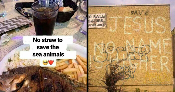
    So if I dont eat it, you will throw it in the trash, and I cant take it with me?

    ADVERTISEMENT
    #39

    Make War, Art Not

    Hilariously confusing message from poor sign design: car with MAKE ART NOT WAR.

    SuperchargedV6 Report

    ADVERTISEMENT
    #40

    We Indian Brew Only

    Cafe signs with poor design show 'We Indian Brew Only' and 'Filter Coffee' over coffee beans, humorously confusing.

    Conan_Black Report

    #41

    Trans Intolerance Rights Must Are Not Human Be Rights Tolerated

    A hilariously confusing message from poor sign design with text 'TRANS INTOLERANCE RIGHTS MUST ARE NOT HUMAN BE RIGHTS TOLERATED.'

    PhoenixfischTheFish Report

    #42

    We Bad, Fix Jobs

    A hilariously confusing message on a sign reads 'WE BAD FIX JOBS' on a building for Climate Masters, Inc.

    Chrisofthegreen Report

    ADVERTISEMENT
    #43

    Hot Onion Corn, Dogs Ring Dogs

    A roadside food stand with a confusing message on its sign, HOT ONION CORN DOGS RING DOGS, due to poor sign design.

    phigene Report

    ADVERTISEMENT
    #44

    We Who R We R

    An arm tattoo with the confusing message We Who R We, a result of poor sign design.

    Chemical-Finger6452 Report

    #45

    For Squeeze Service Me

    A pink pig figure labeled For Squeeze Service Me, creating a hilariously confusing message from poor sign design.

    Melancholy_Rainbows Report

    #46

    You Don't Get To My Judge Pain

    A sticker on a pole with a confusing message, YOU DON'T GET TO JUDGE MY PAIN, showcasing poor sign design.

    OriginalUsername590 Report

    ADVERTISEMENT
    #47

    Will Be You My Player For Two Life?

    A wooden pallet sign with a hilariously confusing message asking WILL BE YOU MY PLAYER FOR TWO LIFE, demonstrating poor sign design.

    Super_Awesome_H Report

    ADVERTISEMENT
    #48

    Boga Arme Ds

    A hilariously confusing sign design on a cabinet that spells out BOGARDS and BOARDS, with board games stacked on top.

    Po3ito Report

    #49

    Do Not For Any Block Amount The Aisle Of Time

    A hilariously confusing sign design that reads Do Not For Any Block Amount The Aisle Of Time, showcasing poor sign design.

    RunnySmoky Report

    #50

    Equaffass Aliectass Tyionin Advsinded Entcerica Ureityted

    Six framed posters with poor sign design on a living room wall, creating a hilariously confusing message from words like Equality and Dedication.

    timmie1606 Report

    ADVERTISEMENT
    #51

    Don't X-Mas Open Inside

    A miniature door decoration with a wreath, featuring a poor sign design that creates a confusing message for X-mas.

    I_have_a_dragon Report

    ADVERTISEMENT
    #52

    Jataorfo Paveieod Nernnt Seal

    A restaurant sign with poor sign design for Japanese Tavern Oriental Food, causing a confusing message.

    HAVARDCH95 Report

    #53

    No Added Apple Sugar Cake

    A hilariously confusing sign design on a cake package reads: No Added Apple Sugar Cake.

    zipniko Report

    #54

    Mind When Your Head Leaving

    A hilariously confusing sign design warning to mind your head when leaving.

    CornSeller Report

    ADVERTISEMENT
    #55

    Cant Your Hear Horn

    A hilariously confusing sign design on a white car reads: Driver is Old. Can't Your Hear Horn. Can't Your See Finger.

    eventualist Report

    WindySwede
    Community Member
    38 minutes ago Created by potrace 1.15, written by Peter Selinger 2001-2017

    Driver needs to not drive if not safe on road (but scrambled)

    ADVERTISEMENT
    #56

    Walk Better Your Brain Way To Health

    A hilariously confusing sign design in a mall reads: Walk Better Your Brain Way To Health.

    Skbit Report

    #57

    Please Snacks Open Inside

    Poor sign design on a wooden box reading Please Snacks Open Inside, surrounded by quirky planters and candy jar.

    drunkbettie Report

    WindySwede
    Community Member
    39 minutes ago Created by potrace 1.15, written by Peter Selinger 2001-2017

    No worries, I have my own snacks... 😬

    #58

    If This Is… You’re All You Do… Missing Most Of The Gym

    A gym pillar with confusing sign design displaying a message across four panels: IF THIS IS ...YOU'RE ALL YOU DO... MISSING MOST OF THE GYM.

    Maka91 Report

    ADVERTISEMENT
    #59

    Fuck Suck Ice My Dick

    A small white sign with hand-written confusing message lying on asphalt next to a white painted line, showing poor sign design.

    mickeytr33s Report

    ADVERTISEMENT
    #60

    Popo Pepe Yes Yes

    A poorly designed Popeyes sign with text PO PE YES displayed vertically, creating a confusing message.

    LazaroFilm Report

    #61

    One Cant Our Month Hold History

    A green banner with yellow and red text, displaying confusing sign design that reads: ONE CANT OUR MONTH HOLD HISTORY.

    TheLambbread Report

    #62

    Hot Smoke Fish Chicken Pork Pull Chop Pork

    A handwritten sign by a road with a confusing message for food items like 'Hot Fish Pork Chop' and 'SMOKE Chicken Pull Pork'.

    breakfree89 Report

    ADVERTISEMENT
    #63

    Free Chinese Delivery Cuisine

    A sign with a confusing message: 'FREE CHINESE DELIVERY CUISINE', suggesting poor sign design.

    SirSwegginton Report

    ADVERTISEMENT
    #64

    I’m Your Ooo Arirang 20.03.2026 You’re My Hope

    A hilariously confusing message from a BTS fan's leg tattoos, including 'I'm your', 'you're my', 'Arirang', and 'hope'.

    KaitoSeishin Report

    #65

    The A Novel Of The Titanic Girl On The Titanic

    Hilariously confusing message from poor sign design: a book titled THE GIRL ON THE TITANIC.

    lisahanniganfan Report

    #66

    Take David It Grutman Personal

    Hilariously confusing message from poor sign design: a book titled TAKE IT PERSONAL DAVID GRUTMAN.

    iansee Report

    ADVERTISEMENT
    #67

    God U Rip

    The back of a pickup truck with a confusing message written on the windows, an example of poor sign design.

    jaweissavl Report

    ADVERTISEMENT