Get Premium
Dark mode theme is available exclusively for premium users. Learn more about the benefits of subscribing.
No fees, cancel anytime.

 Dark Mode Ad-Free Browsing Unlimited Content
 Ad-Free Browsing Unlimited Content Dark Mode
Join 1.2 million Panda readers who get the best art, memes, and fun stories every week!
Good design has a few simple rules: simplicity, clarity, and visual appeal. Some designs, however, fail to execute all of these criteria. Bad design can be disappointing; it can be dull and uninspiring, but when it starts to veer into the realm of the offensive, that’s when you know you have a problem.
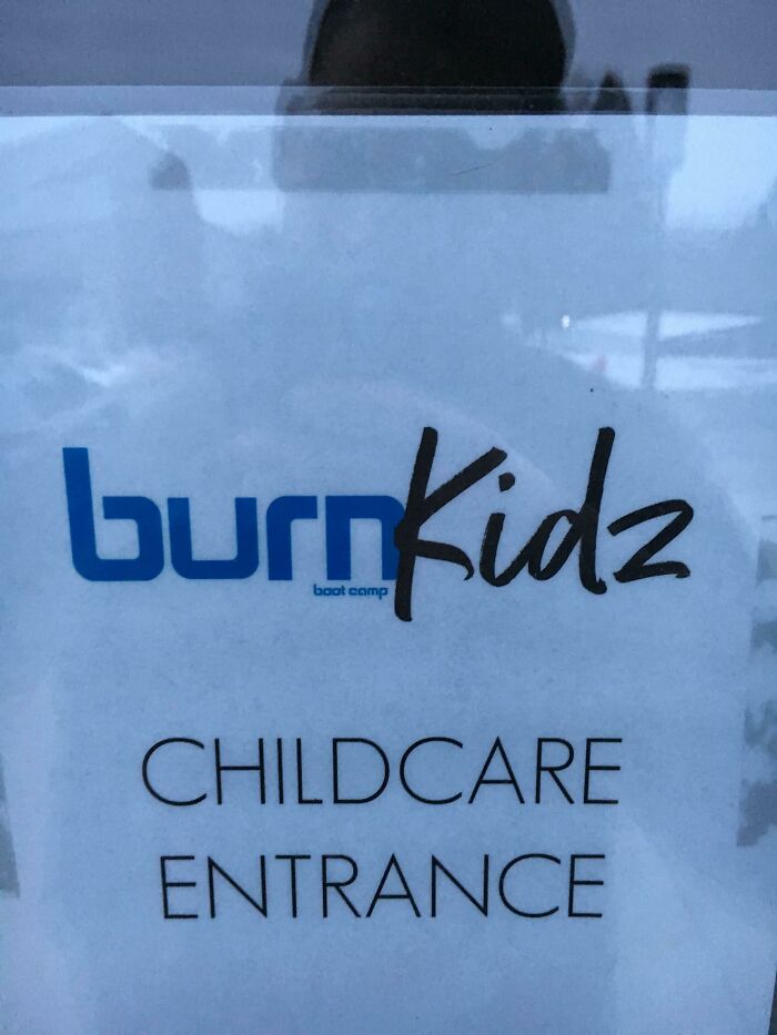
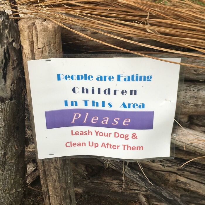
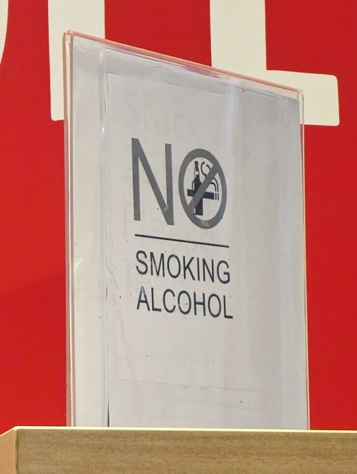
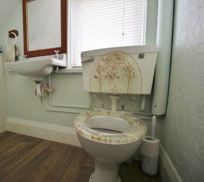
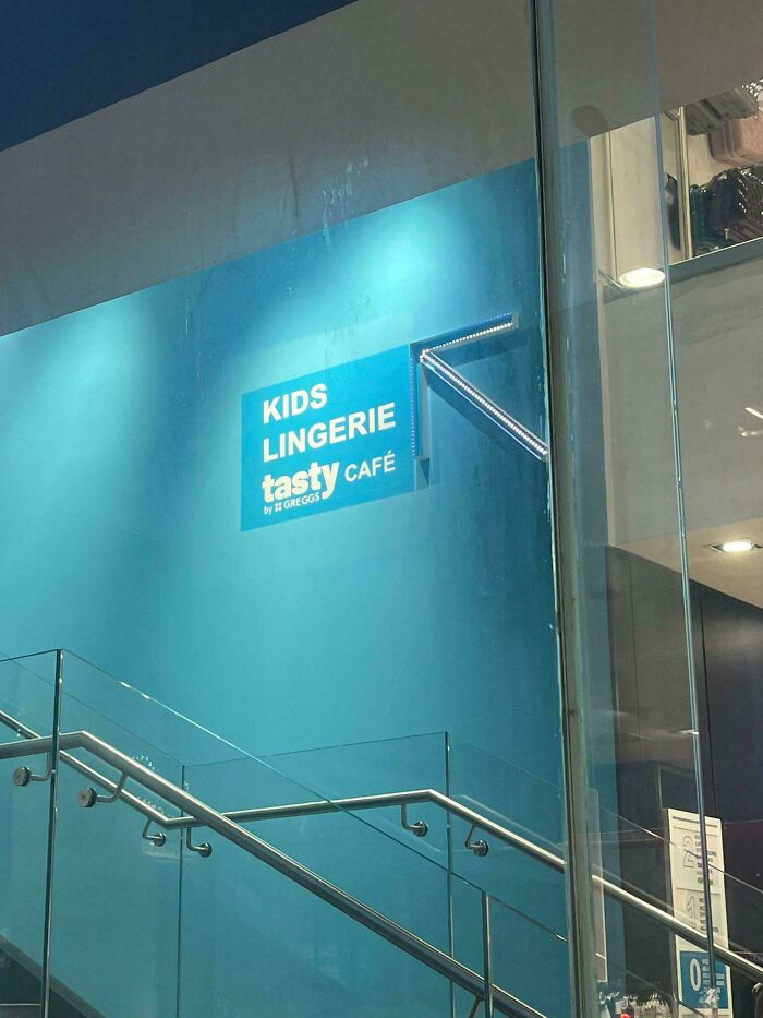
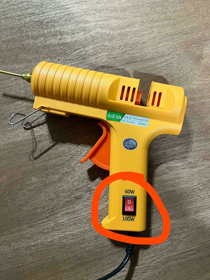
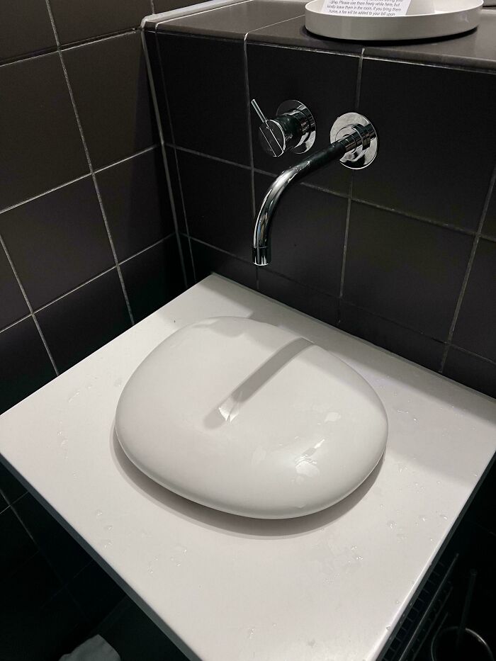
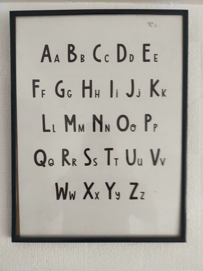
Bored Panda has made you a compilation of signs, labels, and other awfully designed objects that might make you say: “Who approved this?” There’s no way such inappropriate designs could’ve made it through a professional’s eyes, yet they did, it seems. Check these out if you’re looking for a few moments to laugh, cringe, and shake your head in ridiculous disbelief.
This post may include affiliate links.
Bad design doesn’t always have to be offensive to be bad. Brands and designers have made some bad decisions over the years, and some blunders have resulted in quite the public shaming. Take the Tropicana rebrand in 2009, for example. The juice brand renewed its packaging to what consumers deemed “bland” and “generic,” resulting in sales dropping by 20% in just two months.
The design wasn’t offensive or bad per se, but it took away something the consumers were used to. “We underestimated the deep emotional bond they had with the original packaging,” the president at Tropicana North America, Mr. Campbell, explained.

“What we didn’t get was the passion this very loyal small group of consumers have," Campbell went on. "That wasn’t something that came out in the research. […] Those consumers are very important to us, so we responded.” Tropicana went back to the old design, and the whole ordeal is said to have cost them around $27 million.
GAP had a similar oopsie with their logo back in 2010. The American retailer probably reached some kind of a record for how short their logo was officially changed for — less than a week. Instead of its signature blue square with the white “GAP” inside, the retail giant chose a logo in a Helvetica font and a blue square on the end of the “P.”
The idea behind the new logo was to honor the “heritage through the blue box while still taking it forward,” according to the then-president of Gap North America, Marka Hansen. Yet the public disagreed.
“The addition of the blue square seems to be hated on a united front — it just looks cheap, tacky and very dull,” award-winning logo designer Jon Pink told The BBC. “So whilst including some connection of the original logo makes perfect sense in business terms, this illustrates perfectly that logic and reason can play second fiddle to gut instinct.”

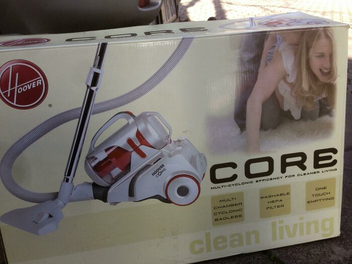
What attatchments does it have, crevice tool, upholstery brush, ball gag?
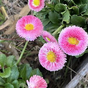
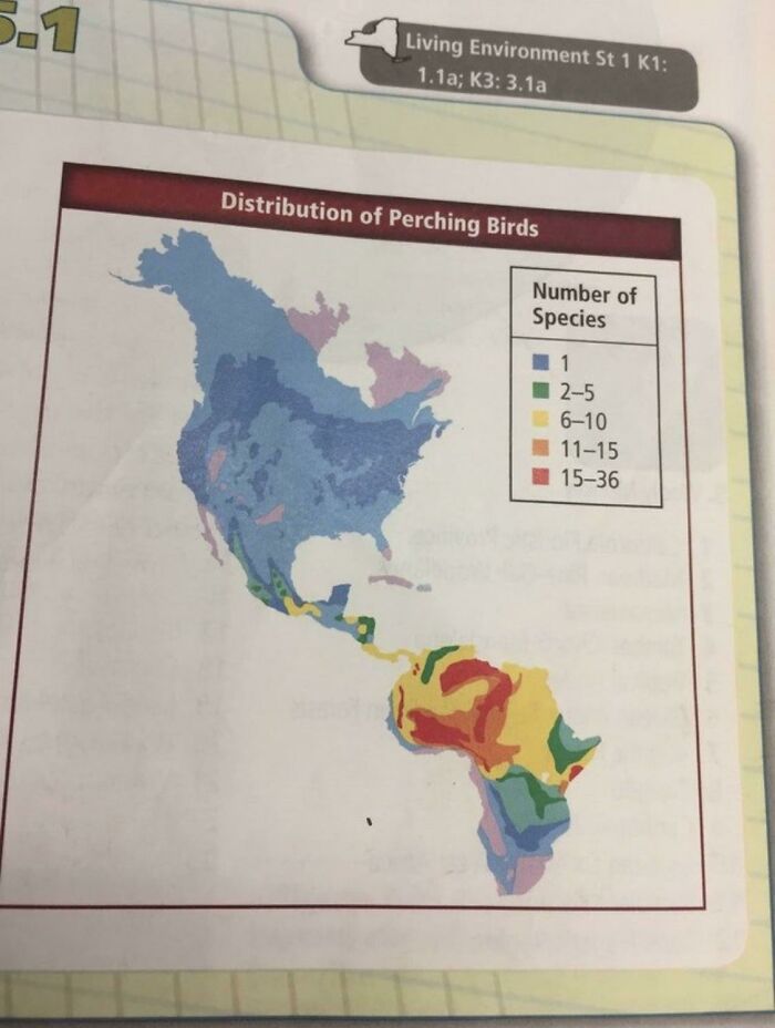
Pretty sure the Sahara Desert doesn't have way more birds than anywhere else
A more worldwide logo fail was the 2012 London Olympics logo controversy. The logo was supposed to represent a jigsaw puzzle and the year 2012, and its creators, who were paid £400,000 for their work, saw it as dynamic, modern, and flexible. However, the public disagreed. People likened it to a scraggly piece of graffiti vandalism, a mosaic of beer mats, and a “broken” symbol of Hitler’s Germany.
Only a few hours after its unveiling, the London 2012 Olympics logo had its own petition to get it changed. 3,000 people signed it in only a few hours, signaling that people felt quite negatively about it.
The public outrage didn’t result in a change of logos. On the contrary, marketing experts and athletes alike praised it for being “dynamic,” evoking movement, and in the words of the former Olympics minister in the UK, Tessa Jowell, “very, very edgy.”
Do you think design needs to be edgy, Pandas? Which one of these design blunders would’ve benefitted from a little less edge, do you think? Let us know your thoughts about the entries on this list in the comments! And if you’d like to see some examples of good design, check out our previous publication about the times designers nailed it and got praised online!

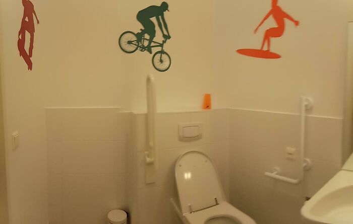
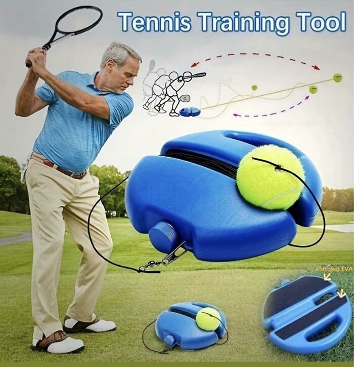
I can just picture the ball on the elastic band snapping back right into his "buddies" 😵💫


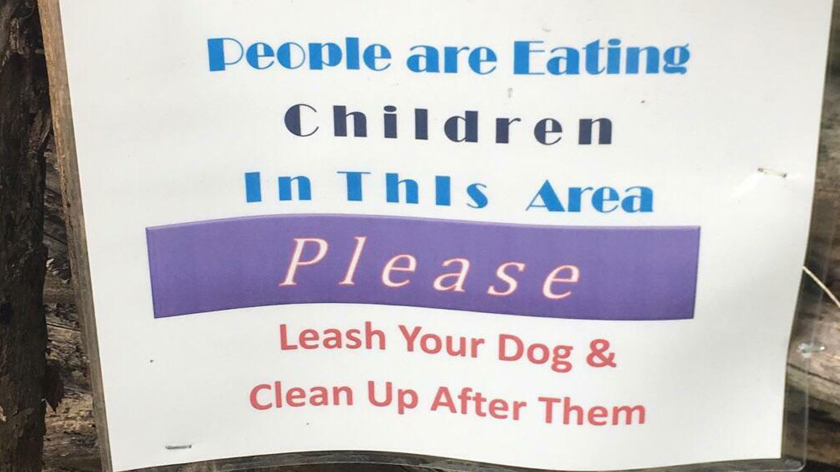
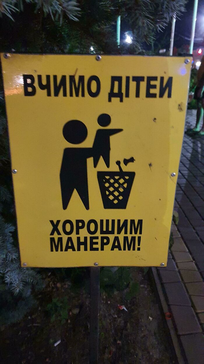
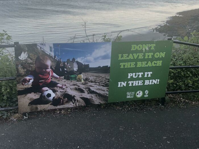
They don't clean up after themselves. that's why you see pacifiers, shoes and socks everywhere. sometimes they even let them roam before eating them and in summer they wash them at the river. /jk
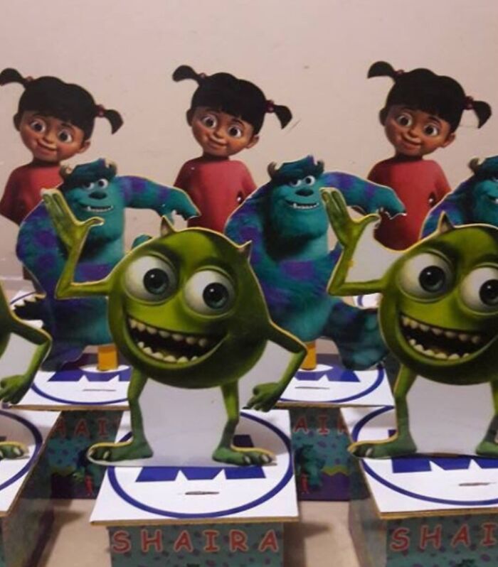
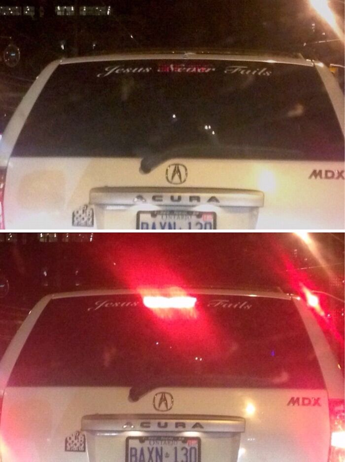
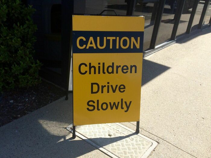
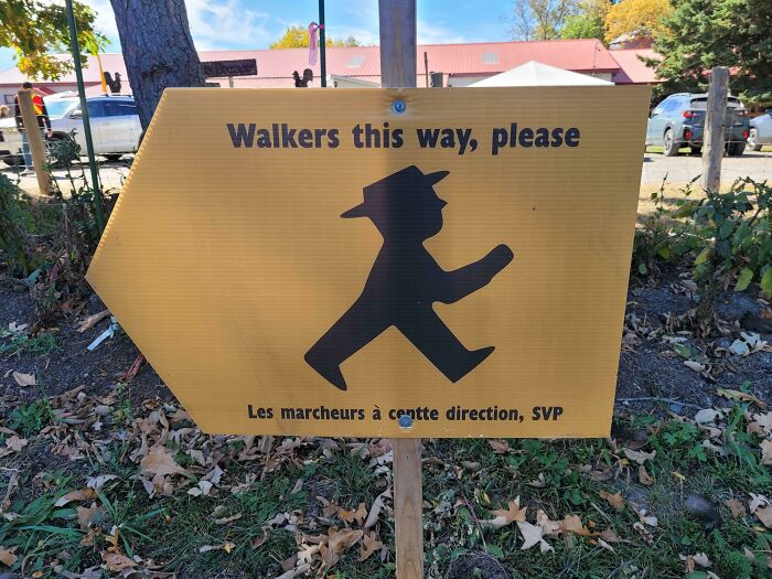
In my defence to the stalking charge I was only doing what the sign told me!
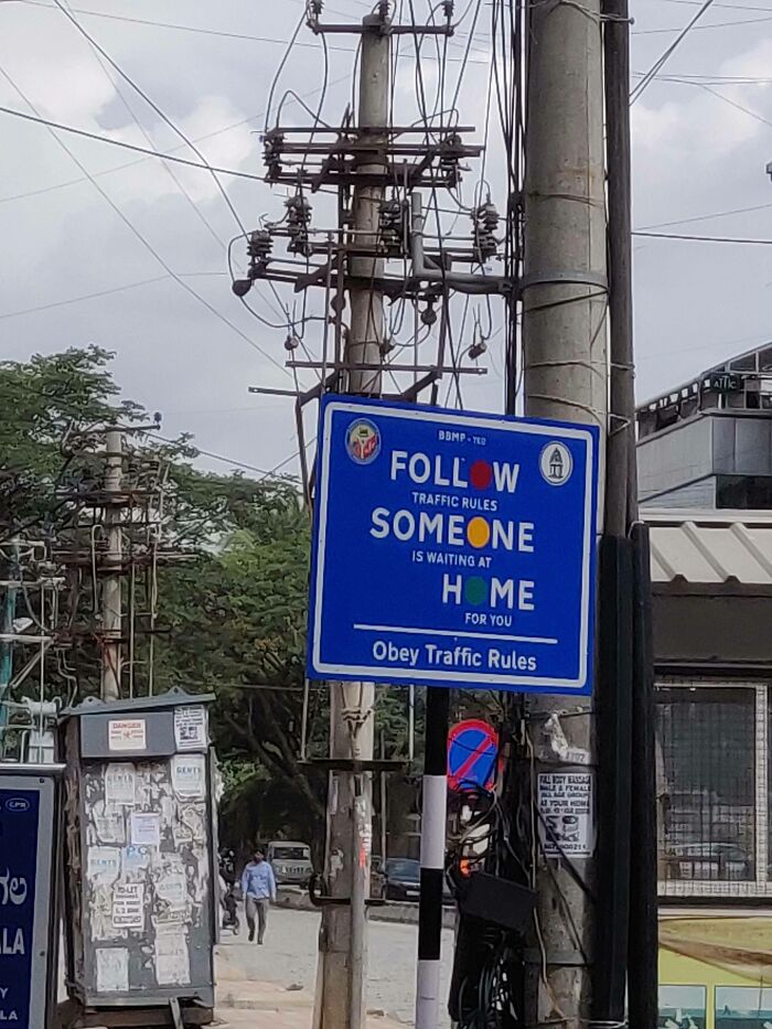
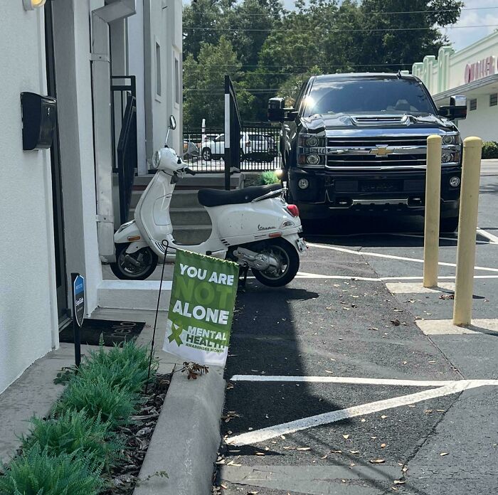
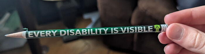
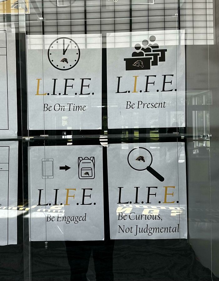
I'm colourblind, what does this say? Yeah, it says they're alone but am I missing something? It's a mental health sign and weird spacing so... idk, help :(

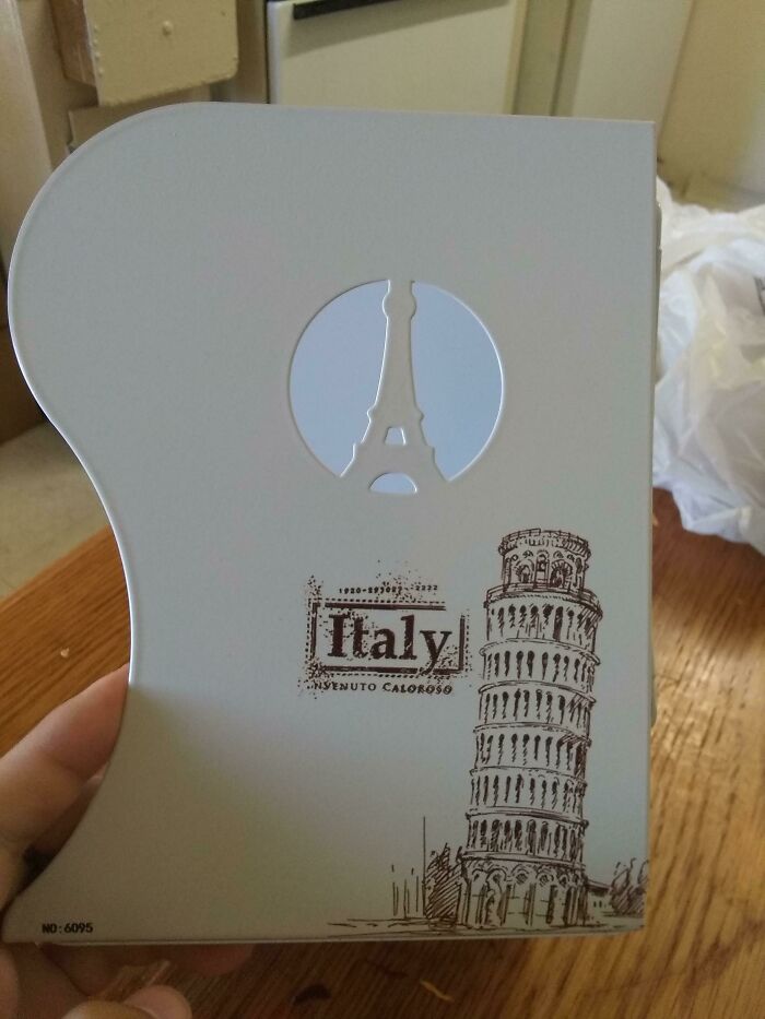
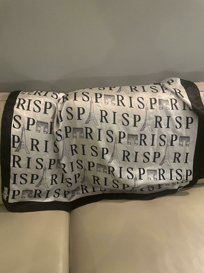
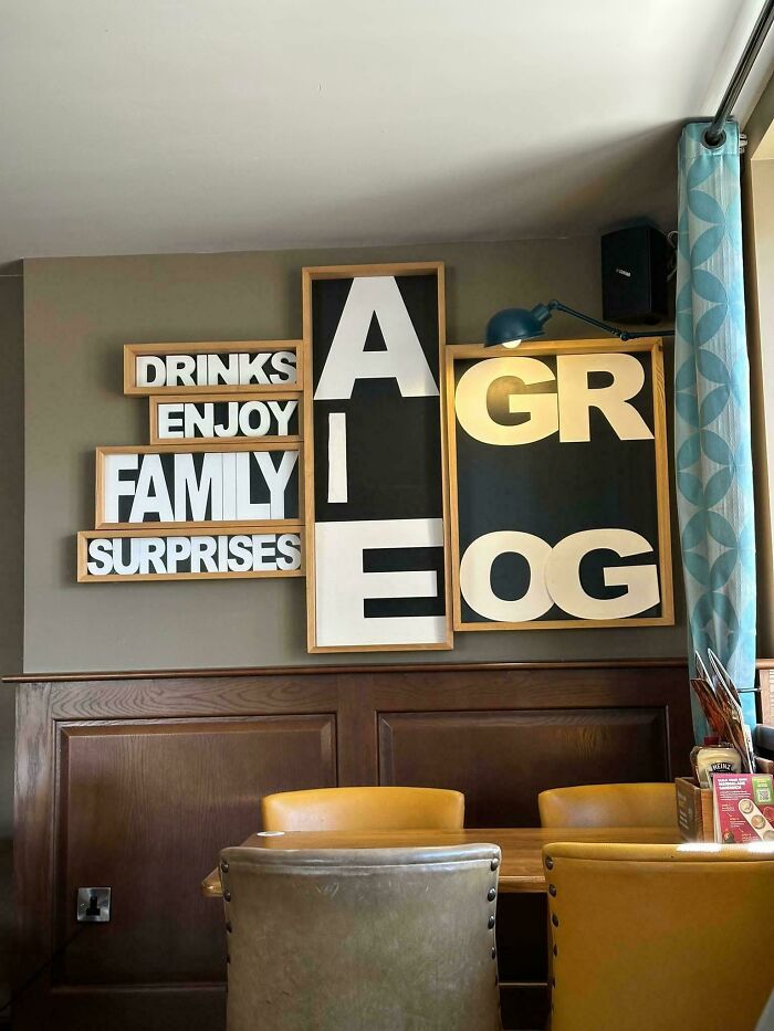
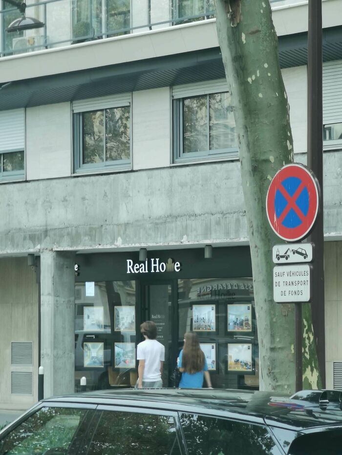
When they finally use the Eiffel Tower as the letter A, that turns out wrong for someone, too.
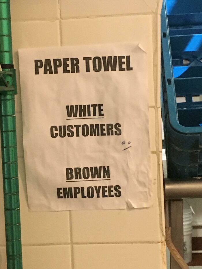
Aside from the accidental racism, why would you have separate paper towels?
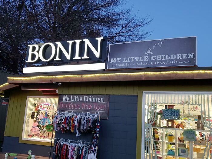
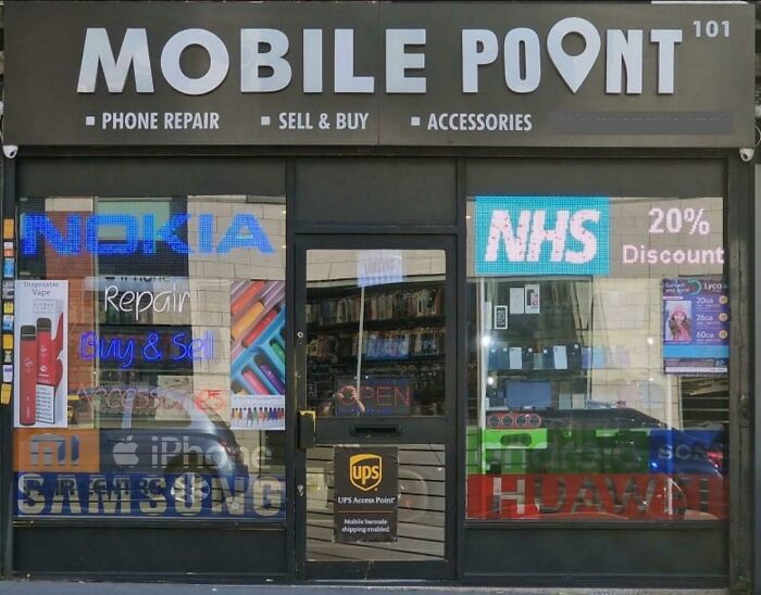
I am relieved to shared that while these two businesses still exist in Eugene, OR, they are no longer neighbours. According to Google Maps, "My Little Children" was successful enough, in spite of this location, to have relocated to bigger digs across town. Meanwhile, Bonin took on a couple of partners and also expanded at the pictured address, becoming BKS CPAs. (I felt the need to check, as I am related to French Canadian Bonins).
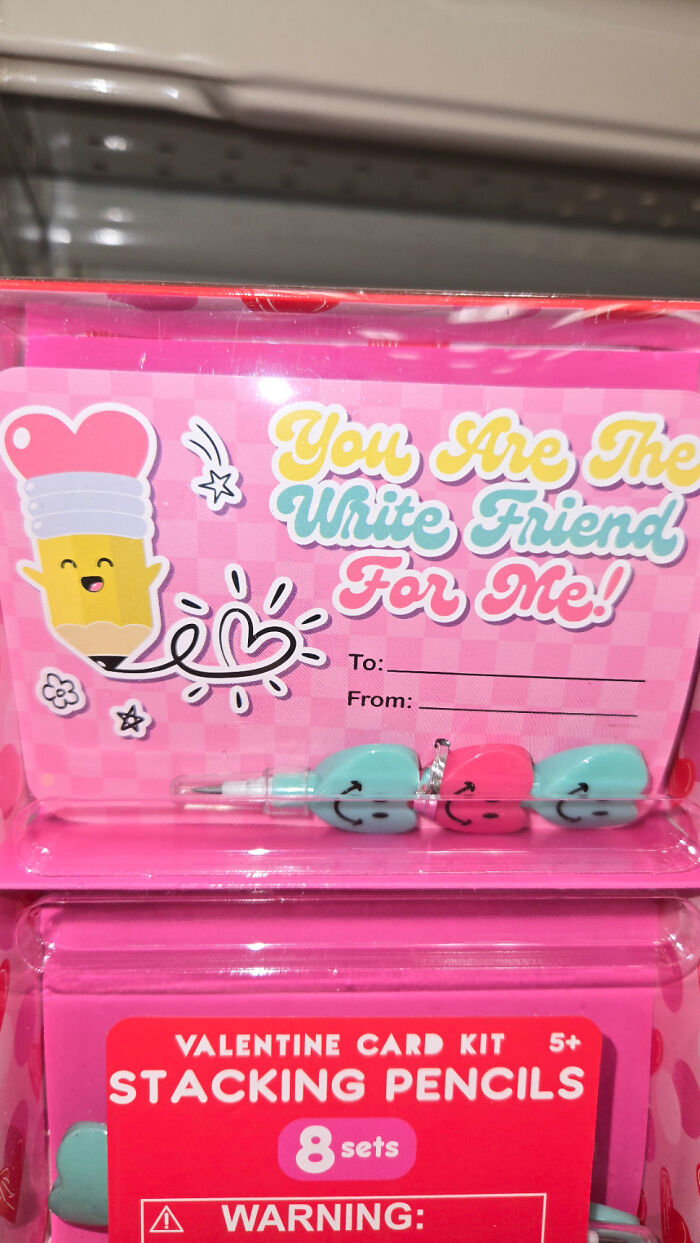
The Alt Right can celebrate Valentine's day as well you know!

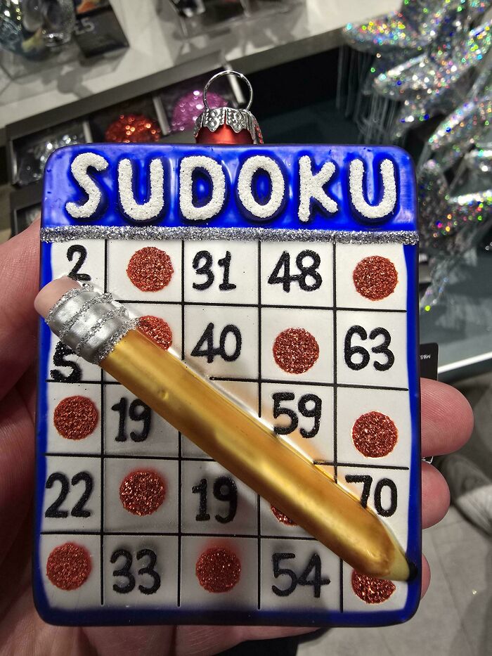
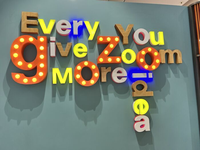
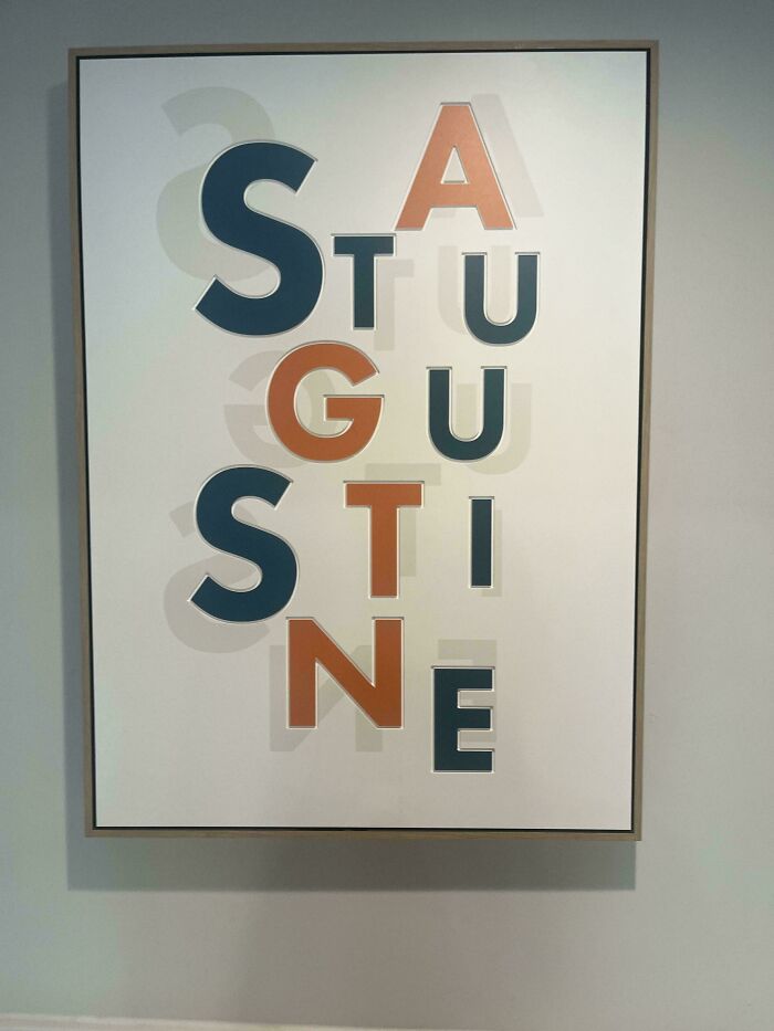
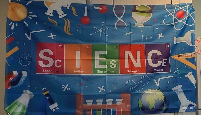
It’s like someone scattered a bunch of scrabble tiles and made words for points
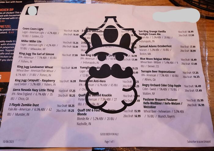
I'm just going to assume the lesson here is that once you start with drinks, nothing else makes sense.
I can easily imagine someone pointing this out during proofing and some w****r going "No, its going out like this"
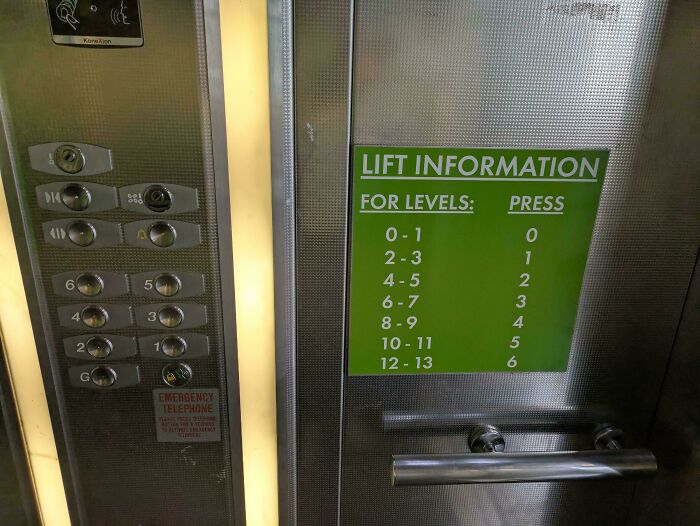
This one is easy to understand,for me, at least. Ptess 1 and the elevator stop at 2nd floor first,then the 3dh. Press 5 and it stopp at 10th first,then the 11th. Possibly a temporary solution until they get it replaced with a new panel?

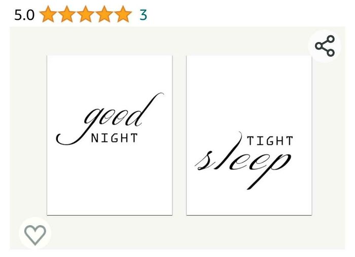
Had many good nights, my sleep hasn't been tight since my twenties
I would try to remove the "hairstrands" right away.😁And then I thought they were mine. I shed like my dog do,in the spring.
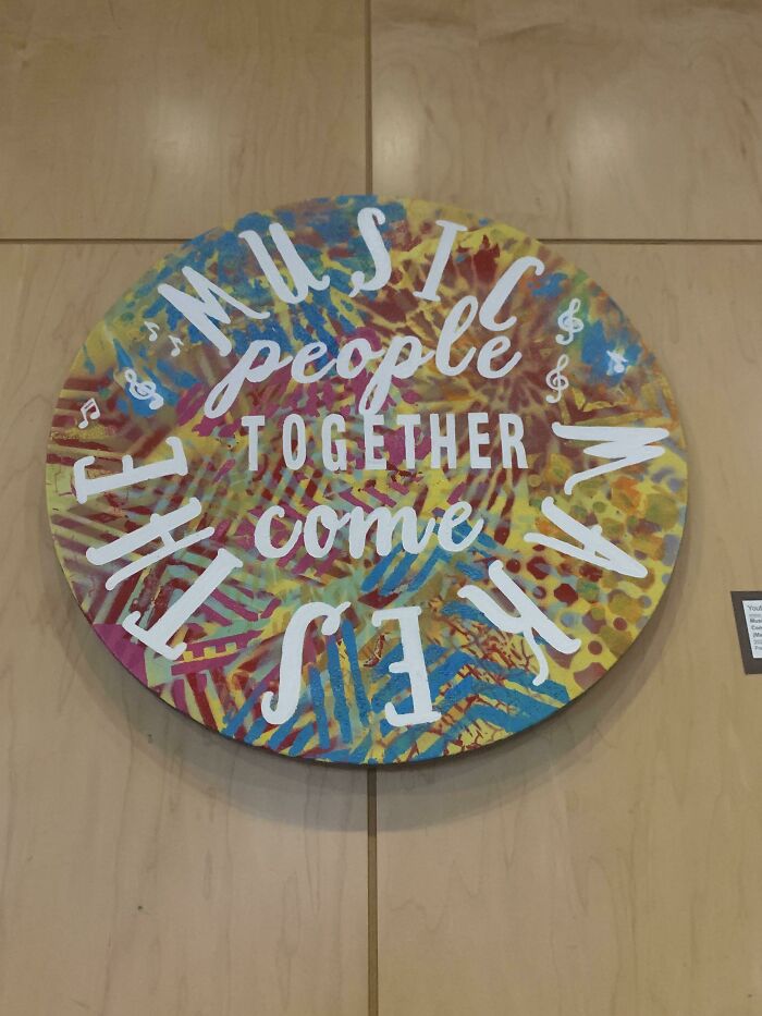
I read "Music makes the people together come" but that really isn't an improvement, is it?
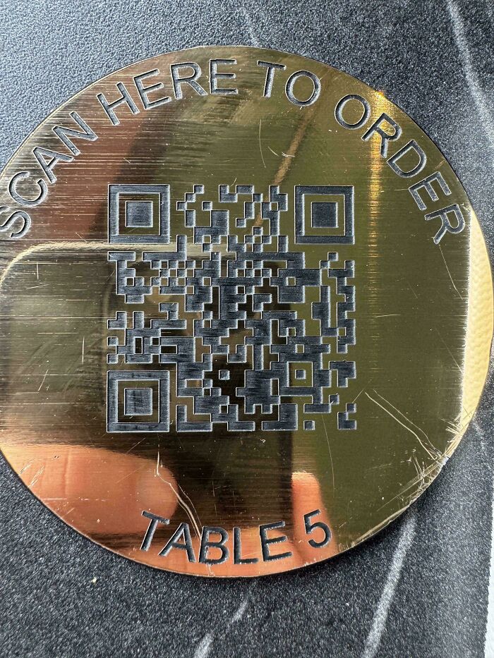
If I don't know going in they only do QR codes I won't leave, but I won't go back that's for sure. I know that's a grumpy old lady thing but I'm a grumpy old lady.
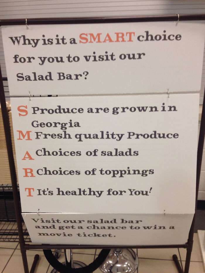
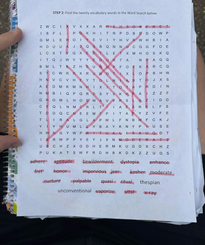
Usually the words have some connection in word searches. What is the theme here?
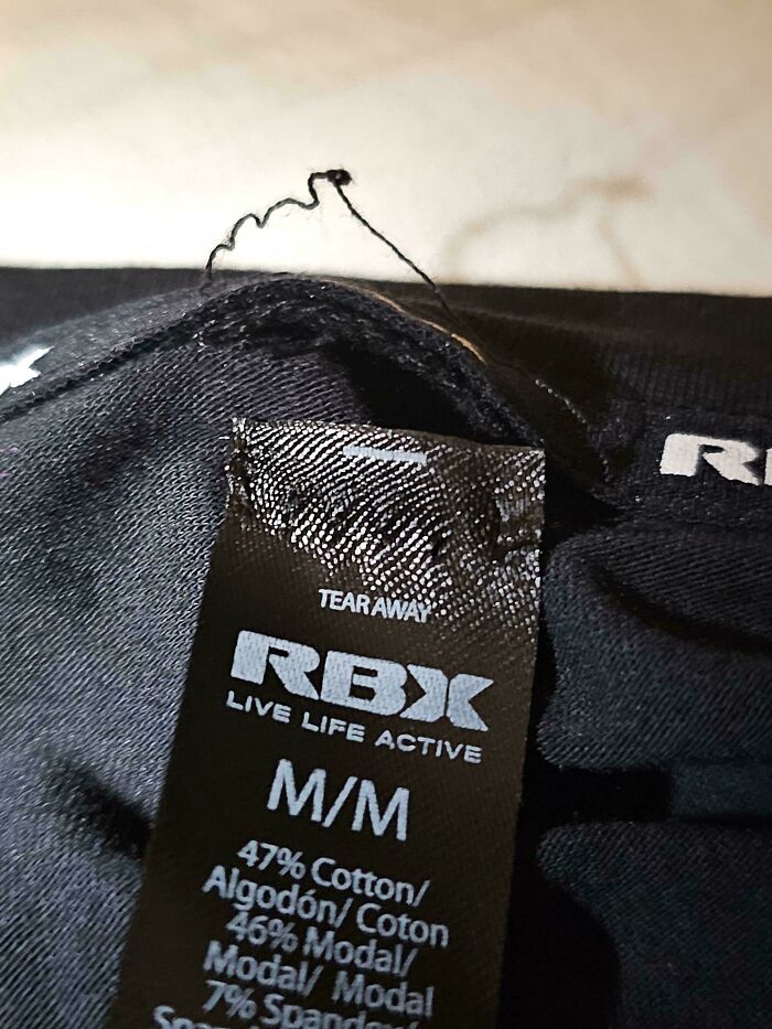
I've had this happen before with a tear away tag. I was probably an irrational level of mad, but I was fuming! It had ONE job!!
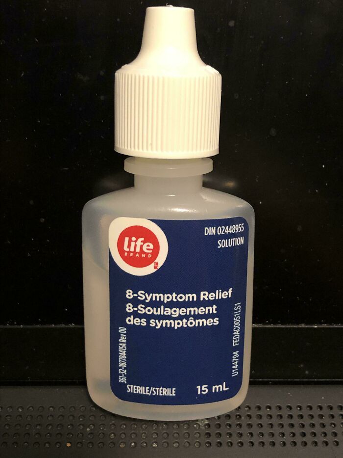
To be fair, this would have been sold packaged in a box with additional information on it (I don't think I ever purchased this exact product, but I have purchased Life Brand eye drops from Shoppers D**g Mart here in Canada; it's the in-house store brand). It would only be a problem if one forgot what the product was after purchasing (and these are tiny bottles with a short shelf life once opened).

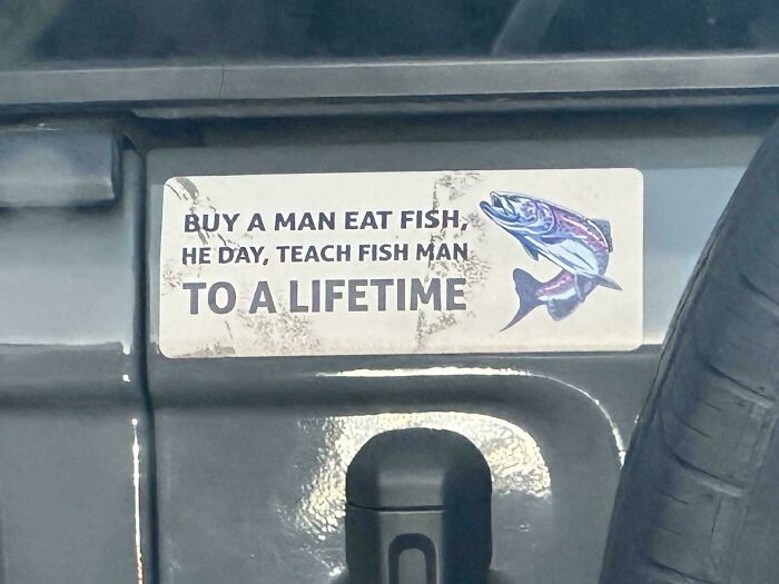
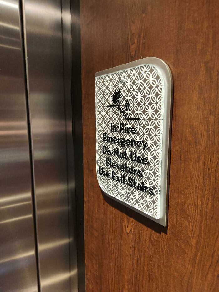
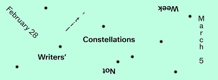
I like the fun ones where the meaning is clear even though the text is garbled. That's not a fault, that's a feature.
I like the fun ones where the meaning is clear even though the text is garbled. That's not a fault, that's a feature.



 No fees, cancel anytime