Get Premium
Dark mode theme is available exclusively for premium users. Learn more about the benefits of subscribing.
No fees, cancel anytime.

 Dark Mode Ad-Free Browsing Unlimited Content
 Ad-Free Browsing Unlimited Content Dark Mode
Join 1.2 million Panda readers who get the best art, memes, and fun stories every week!
Not all designs are made equal. And some designers aren’t aware of their epic fails until it is far, far too late. If you consider yourself creative and have good taste, you might want to either look away or do the opposite—stare until it hurts.
The ‘Bad Designs’ online community shames some of the worst designs that have ever been unleashed on the public, and they are a constant reminder that everyone makes mistakes. We have collected photos of the most egregious offenders, and they’re as horrible as they are funny. It’s a wonder that they ever made it off the drawing board!
This post may include affiliate links.
Jessica was tunashamed - deservedly - after using the work breakroom microwave to heat her stinky lunch
Legendary designer Dieter Rams came up with 10 fundamental, iconic principles of design that continue to shape how many creatives approach projects today.
His principles are:
The beauty of Rams’ principles of good design is that they are nearly universal. They can be applied even to our digital landscape and app design, too, not just building interiors and product designs.
That being said, there are no such things as timeless rules. Even Rams’ principles might need to be (slightly) adapted and adjusted, and possibly even expanded with so many changes in the tech industry.
Meanwhile, you have to account for people’s tastes and preferences as well. Not every design—however balanced between function and form—will appeal to every customer. But just because someone doesn’t like what you’ve made doesn’t make your design ‘bad.’ There’s simply a disconnect between what you’re offering and what someone else wants and needs.
And yet, this should not be an excuse for pumping out low-quality designs by claiming that someone, somewhere, will still enjoy them. If you are a designer or run a design business, you need your products to be commercially viable. And that means appealing to more than tiny niches of consumers with bizarre tastes. Without (semi) mass appeal, your business won’t last long.
There are a bunch of other awful ramps around the premises, but this is definitely the worst one.
During an earlier in-depth interview, international freelance graphic designer Laura Vanagaite, who specializes in branding and social media content creation, walked the Bored Panda team through design failures.
“We judge design work anyway for its design, and our eye catches mistakes very fast,” she told us previously.
“Our brain needs less than a second to bring up a judgment, and way more time to rationalize on the topics of ‘bad’ and ‘good,’” the graphic designer told Bored Panda earlier.
“Once we spot a mistake, we tend to stop collaborating with the agency or brand because we believed that they are more reliable and able to deliver a good result. If the final result is made with mistakes, you definitely don’t want to waste your time to clean up a mess again and as well pay for the badly done service.”
"Faith based cafe"? Shouldn't it be a food based cafe'? Why would they care about the customers choice of partner???
Hey-I don't know about you other Pandas- but I LOVE walking out of the bathrooms with the front of my clothes drenched. Nothing says style and sophistication like a huge water stain on your cr0tch.
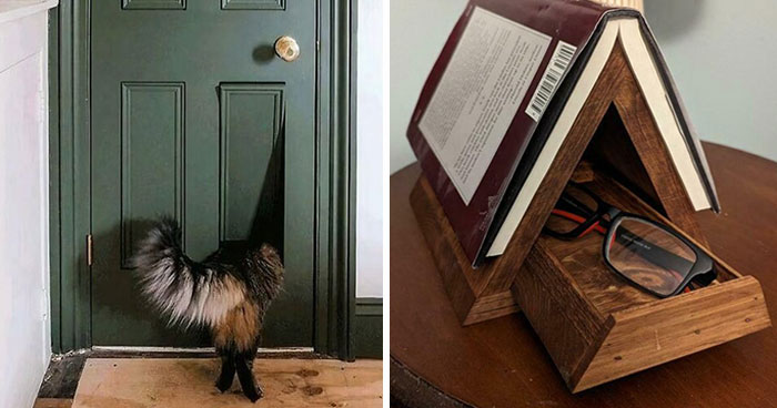
when the designer prioritizes aesthetics over practicality
(this is a bag of dog treats)
From the graphic designer’s perspective, for any business, building trust with their customers is vital.
There can be various reasons for poor designs. For example, it might be due to a breakdown in communication. Or the designer working on a particular project was less skilled than the team assumed.
“When most people hear ‘human error,’ they do not see the details; they see the person who is completely to blame,” the graphic designer explained to Bored Panda. “But this should always be foreseen by the manager who is in charge from the beginning.”
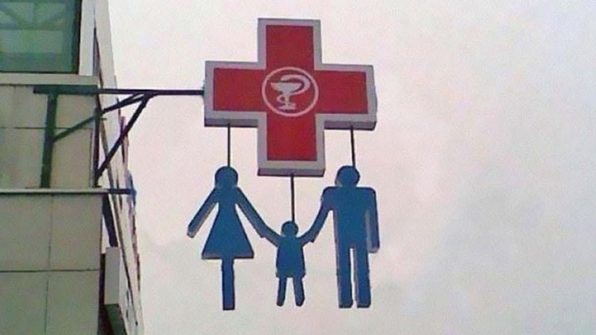
Just stand in Panama and look at what seems like north. Or stand there and laugh out loud.
Since it appears to be for dogs, shouldn't it say 'Bark, woof, woof'?
“When you hire an expert in any field, you expect that things will be done the right way and that the mistakes that you would have made won’t happen. If it is a team, it means that the project manager did not pay attention to the final design and just approved it without looking, which shows a lack of professionalism and also not caring too much about the client and the project.”
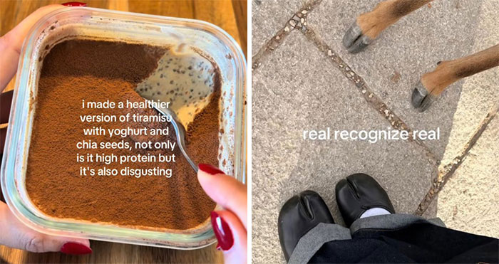
Too cold and sticky. Make a mess of the bed. Mommy wouldn’t be happy.
“To define the role of the client and designer, from the beginning there should be a clear brief from the clients' side and as well the designer should come up with the most important questions which will be solved in the design process,” Vanagaite told the Bored Panda team.
According to her, the designs are reviewed either by a board or with the project manager.
“Once everything gets approved from the management part, then it can be sent to the client to receive either corrections or the complete approval.”
She noted that communication is absolutely vital here. Designers shouldn’t be left to work alone throughout the process. “It is teamwork and the support both from the management part and the creative part that is a must.”
The ‘Bad Designs’ online group, active since the spring of 2016, recently celebrated its 10th anniversary. Over the past decade, the community has been inviting people to feast their eyes on the “horrible designs of humankind.”
They wittily note how the subreddit is “a place to show spelling mistakes, poor гeadaьiliтy and overall bad designs!” The members of the community are known in the group as “bad designers,” while those currently online are jokingly referred to as “designing something bad.”
The moderators running ‘Bad Designs’ ask that the community members only post designs that are very visibly, obviously bad. If it’s not clearly in plain sight, it shouldn’t be posted. What’s more, the mods emphasize that designs that are purposefully made to be bad or funny shouldn’t be shared in the group.
Once you’ve upvoted the pics that you loved to hate the most, why not share your thoughts in the comments? Which of these designs hurt you the most, and why?
What have been your biggest personal creative work-related fails that still make you wince and cringe with embarrassment to this day? Let us know!
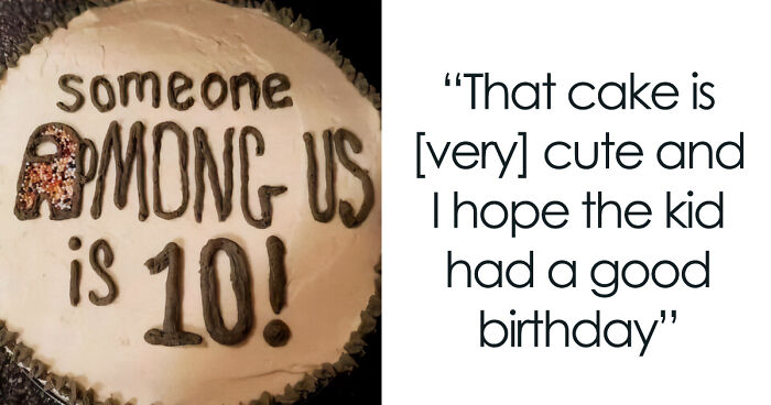
Poor choice of background colours. I mean, yeah, I hope his birthday was heavenly, but....
I have a Lenovo laptop where the numpad is positioned one row higher than on 99.9% of laptops. I truly, from the bottom of my heart, hate it.
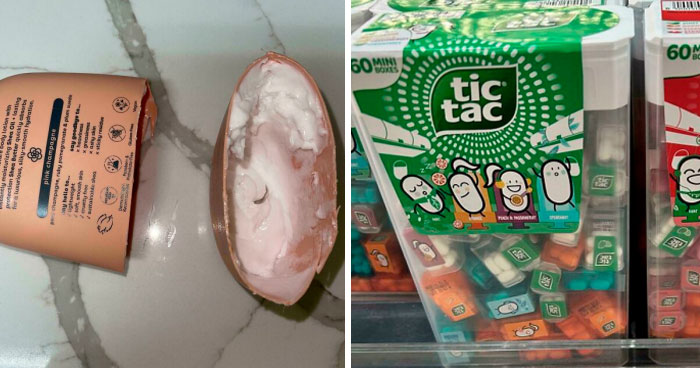
I was at Petco and saw this bag of dog food. I’ve never seen it before. I’m both intrigued and disgusted by it.
It's like my old Geocities websites from when I was a teenager in the 1990s XD
Are you running in a wheelchair with euros stucked up in your b.utt?
My friend bought me scissors because he knew I needed some for something important, but he bought me THIS, I don't already have scissors bro???!!?? And all the knives in my house are a little too weak because the house I live in was originally a grandpa's house and he left me most his stuff, like all the knives, but since he was old, THESE ARE NON SHARP KNIVES, Wich don't help me at all. I don't understand how a human being taught this was a good design, but remember, it's just a design, a BAD DESIGN (OMG CRAAZYY NAME DROOP)
The designer should sit on this every day for 1 hour for the rest of their life.
If it didn't have the stupid text on the bottom, that would be a cute design. I would want to add real rhinestones to that design, though.
We have employed a new designer, everyone say hello to (Checks paper) "Yoda"...
It used to be a good luck symbol until a homicidal maniac changed it pure evil
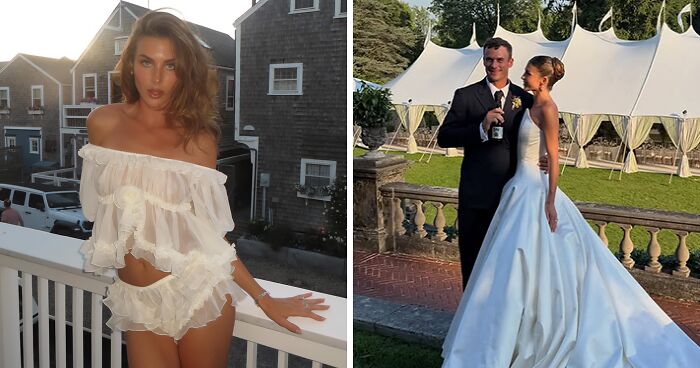
Prom dress? Like okay, is perfectly fitting in the intro of an adult movie from the '90s.

These were great! Usually they are just repeats of signs Pandas have seen over and over, so it was nice to see some fresh material. A lot of voting and replies to enjoy.
These were great! Usually they are just repeats of signs Pandas have seen over and over, so it was nice to see some fresh material. A lot of voting and replies to enjoy.


 No fees, cancel anytime