Shocking Effects Of Deforestation Exposed In Brutal Print Ads
206Kviews
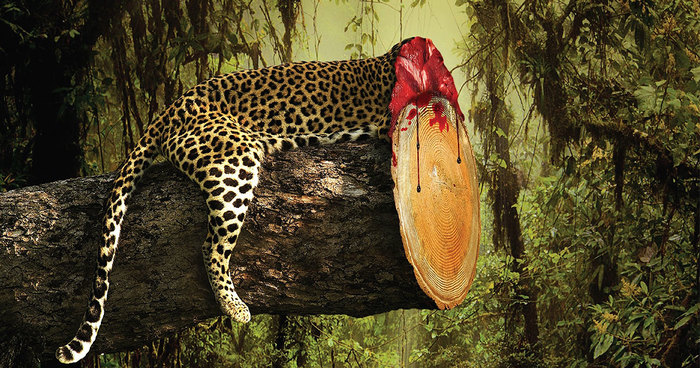
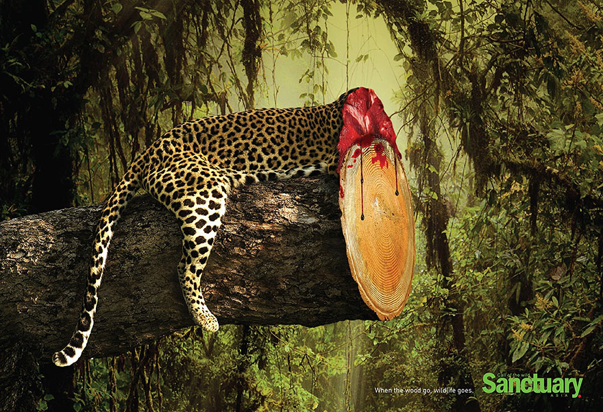
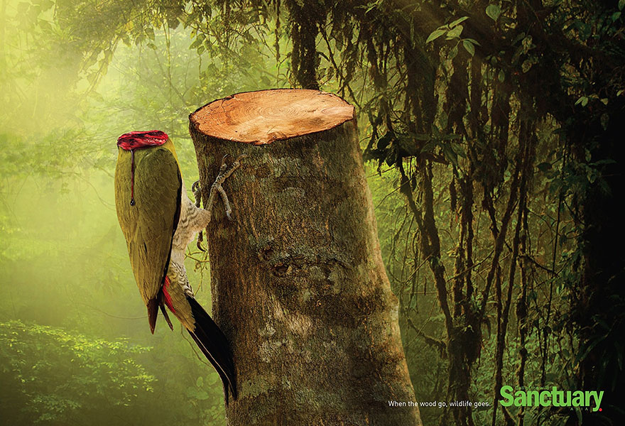
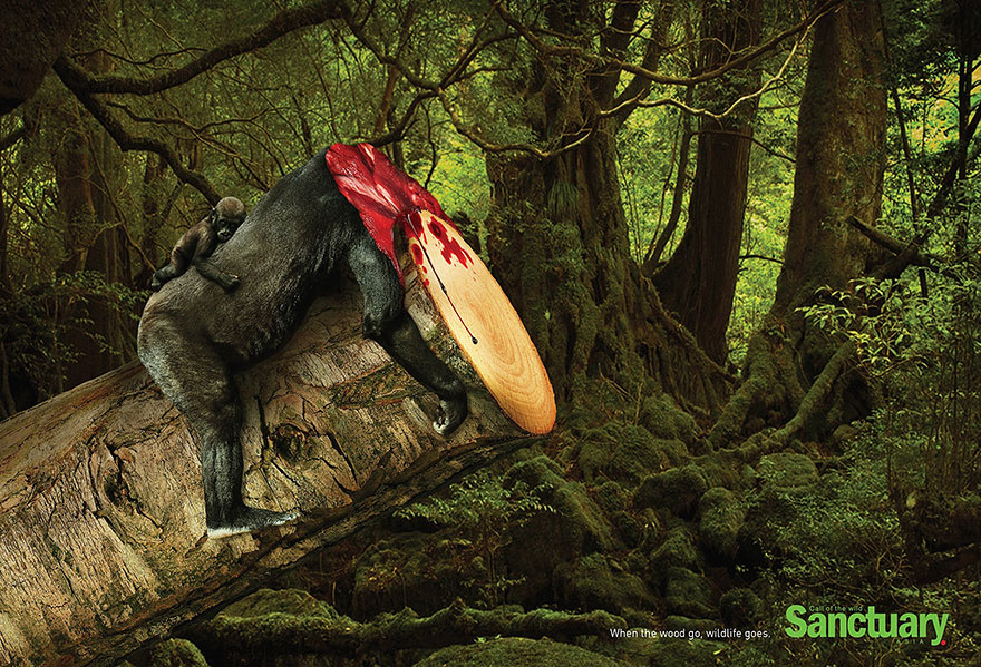
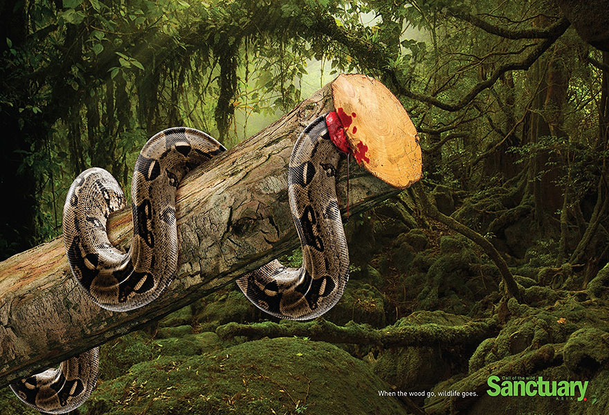
These images are gruesome and brutal, but they have to be shown because of their important message – they raise awareness of the often unseen casualties of deforestation around the world. Creative and art director Ganesh Prasad Acharya, together with copywriter Kaushik Katty Roy, created these social ads for Sanctuary Asia, one of the first and greatest environmental news magazines in India.
The slogan on these ads, “When the wood go, wildlife goes” drives home the point made by these macabre images – when you cut down habitats, you might as well kill the animals that live there as well. Rainforests contain as much as 80% of the world’s biodiversity, so their rapid destruction in South America and Asia is a serious problem.
More info: adsoftheworld.com (h/t: designtaxi, adeevee)
206Kviews
Share on Facebook
Loud and clear i thought... Humans don't realise with there unhealthy habbits do to nature and at the end to there selfs...
Exactly what i was thinking. In the future not long from now that whole forest you cut down is really harming the enviroment!!!
This comment is hidden. Click here to view.
PEOPLE don't realiZe WHAT thEIr educational haBits do to THEMselves. Credibility... out the window. such grammar. wow.
Actually, realise and realize are both acceptable.....realize is mostly used in America and Canada.....REALISE is used mostly in Europe.lol
Maybe the person that wrote the comment you so harshly make fun of, is not native to your language? A little courtesy goes a long way.
Joseph don't be a dick. This is the internet, not an English exam.
If you lose credibility to a statements because someone has worse grammar then you... "Wow, all content they say must be wrong!"
Yeah, and you seem to have a couple of incomplete sentences out there. Not to mention the failure to capitalise certain letters.
Ooops, my mistake, you where talking about the title of the article. Sorry.
Pretty hectic images, but a bit boring. all things happening from the left side of image and the photoshopped branch stands out so much.
Well, it's a collection of print ads, not a gallery. There's no need for variability when the pictures are supposed to go alone anyway.
Boring?????? I think maybe you burnt your brain and heart out with too much education.
He gave his opinion, with which I agree. Those seem pretty much the same, except for the animal chosen. I was expecting a bit more as well.
Boring as a composition, not the concept those are different issues :)
I agree with him too
True! They all send the same message, nothing wrong with that but I don't see a lot of versatility. Great photography/Photoshop skills tho.
The photoshop skills are just about the only thing that is lacking here. Just look at the lightning on the snake, it just doesn't match up.
my thoughts exactly.
and the name of the website proves it. :)
and the name of the website also stands for it. :)
I understand that your comment wasn't a critique of the message, but the actual artwork itself
Your obviously entitled to your opinion. That said... You can't see the forest for the trees.
The comments below are a testament to the ignorance of the world. Rather than see a message you chose to critique the penmanship .