Get Premium
Dark mode theme is available exclusively for premium users. Learn more about the benefits of subscribing.
No fees, cancel anytime.

 Dark Mode Ad-Free Browsing Unlimited Content
 Ad-Free Browsing Unlimited Content Dark Mode
Join 1.2 million Panda readers who get the best art, memes, and fun stories every week!

30submissions
Finished
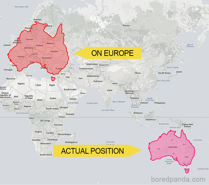
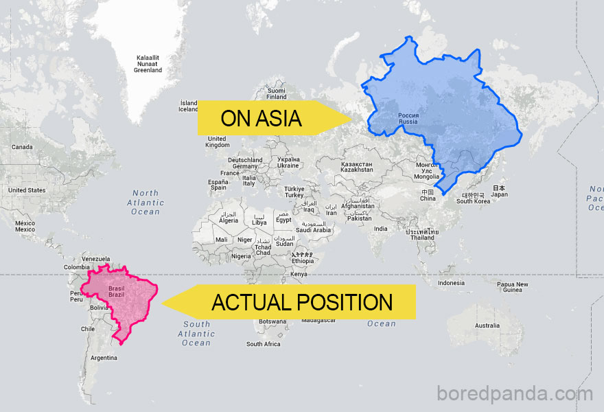
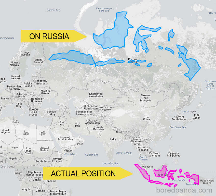
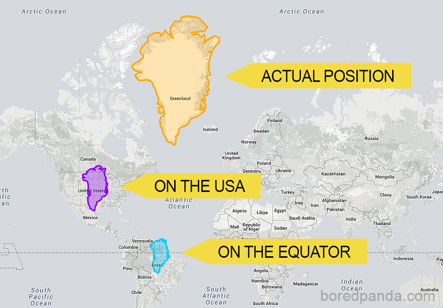
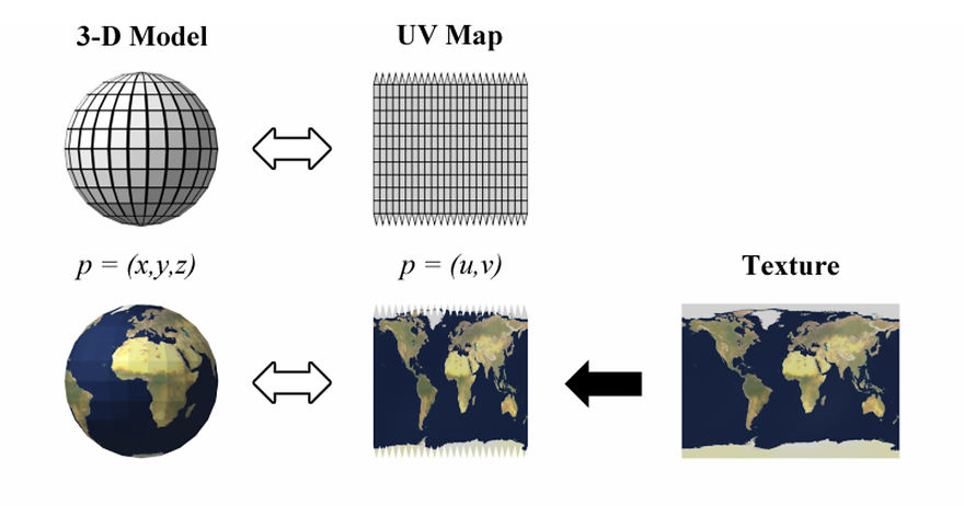
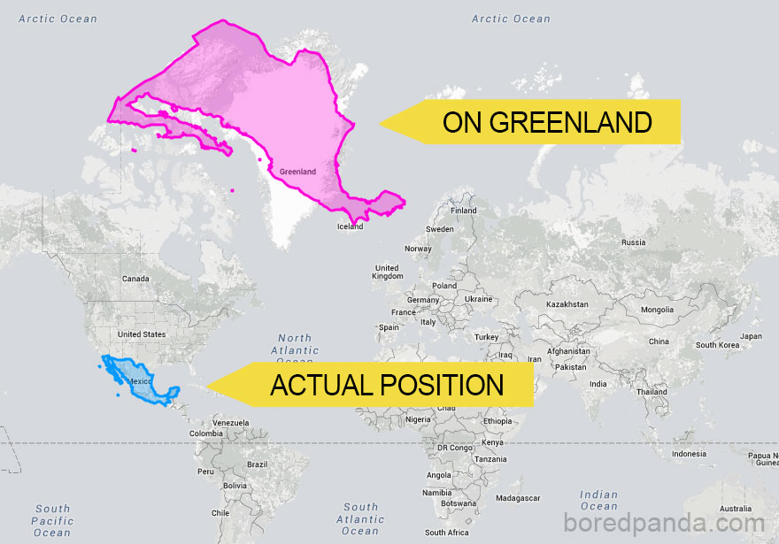
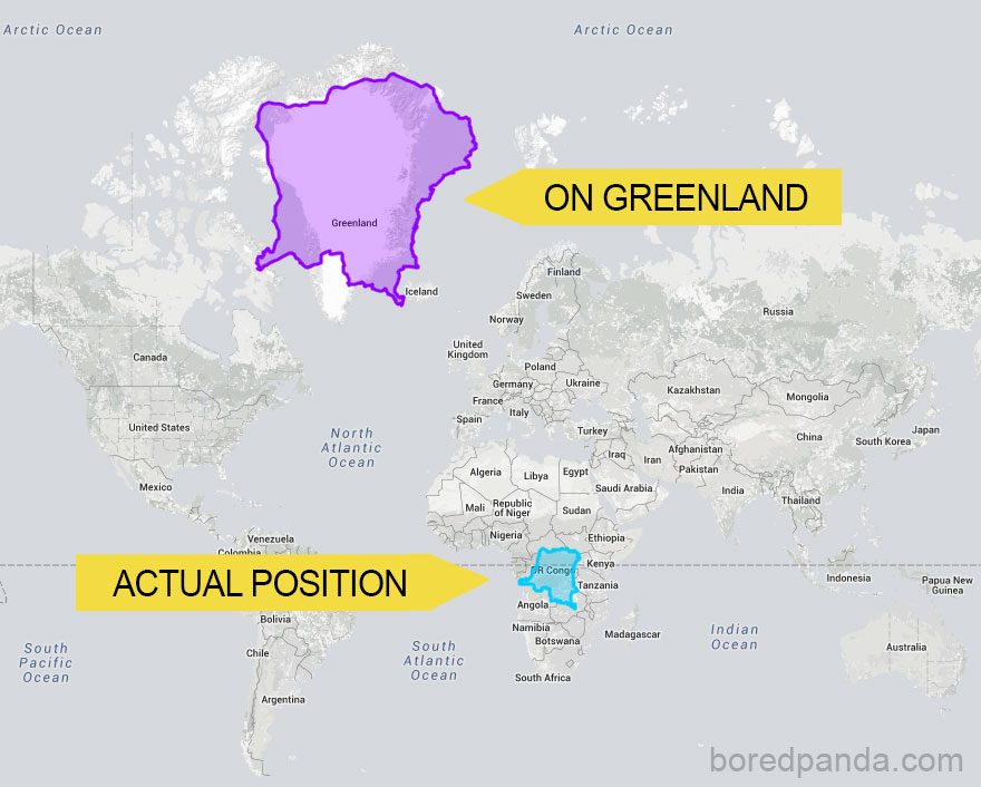
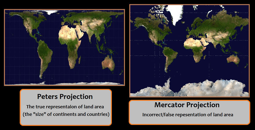
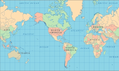
Ever wondered why Greenland looks as big as Africa on the map? It’s because of something called the Mercator projection. Putting a 3-D planet on a two-dimensional world map was challenging for early cartographers. So, a Flemish geographer and cartographer named Gerardus Mercator came up with a solution for the most accurate world map.
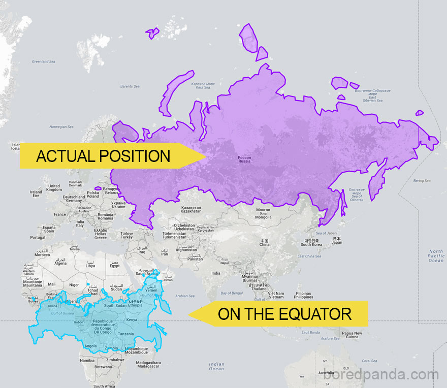
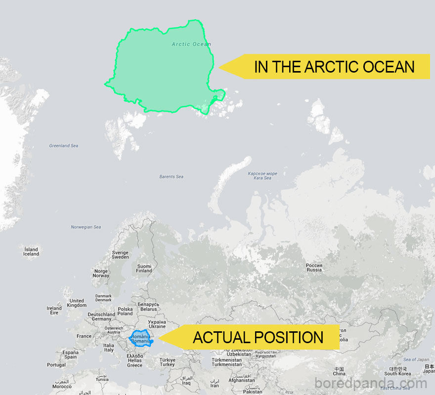
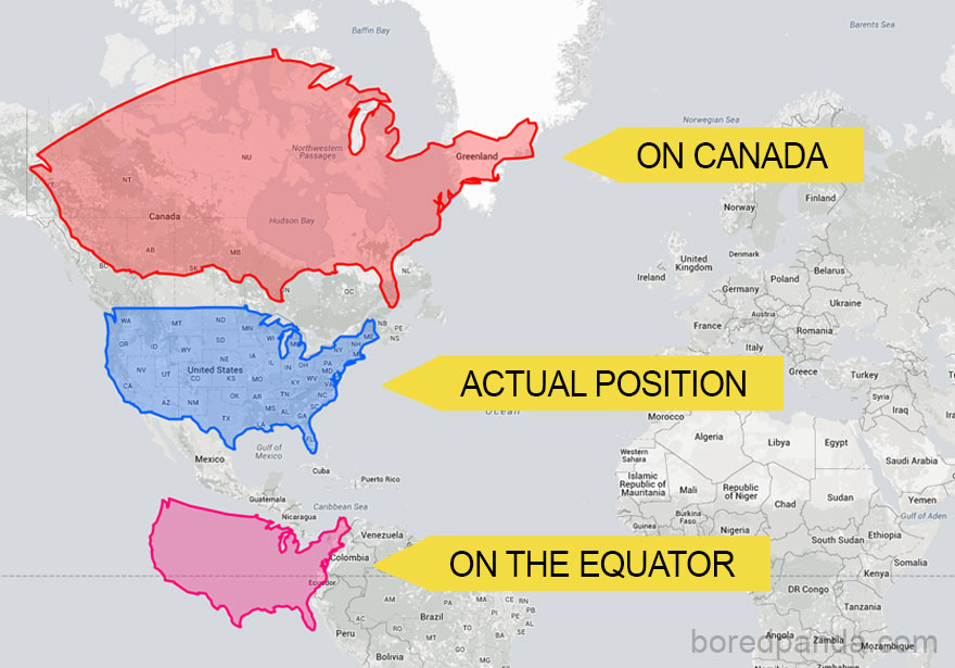
In 1569, he designed an atlas that could be accurately used for navigation. Still, the downside was that his system distorted the size of objects depending on their position relative to the equator.
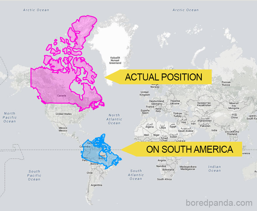
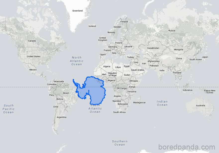
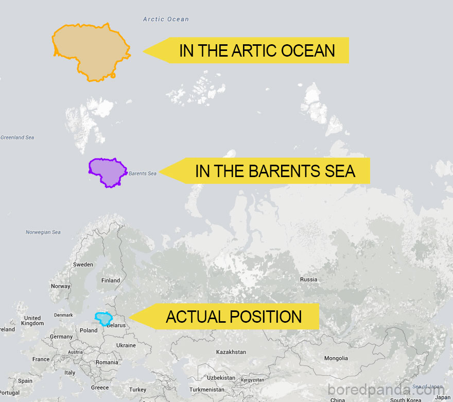
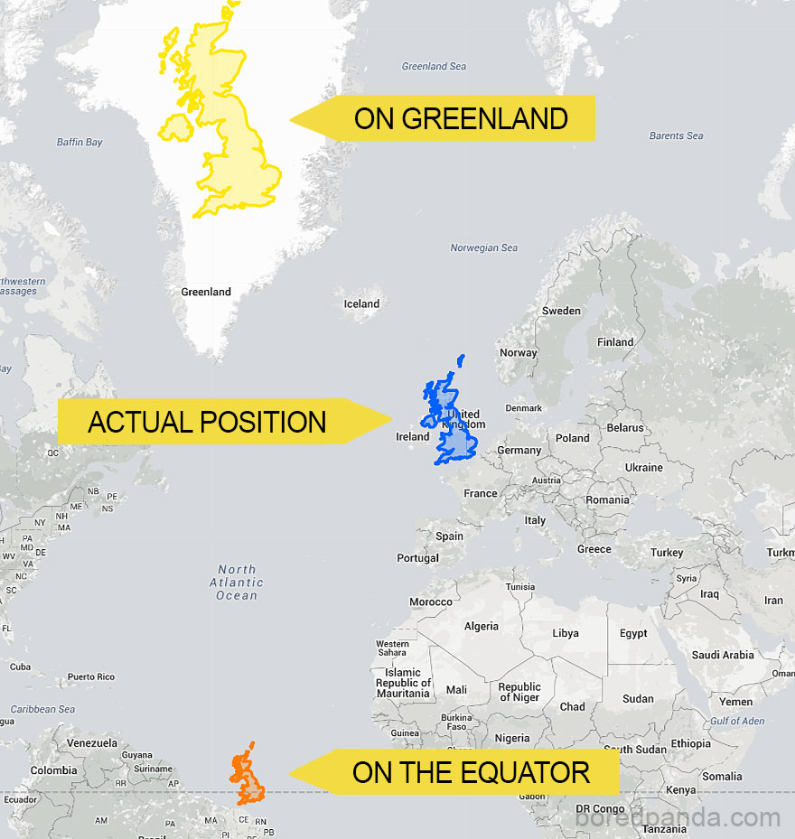
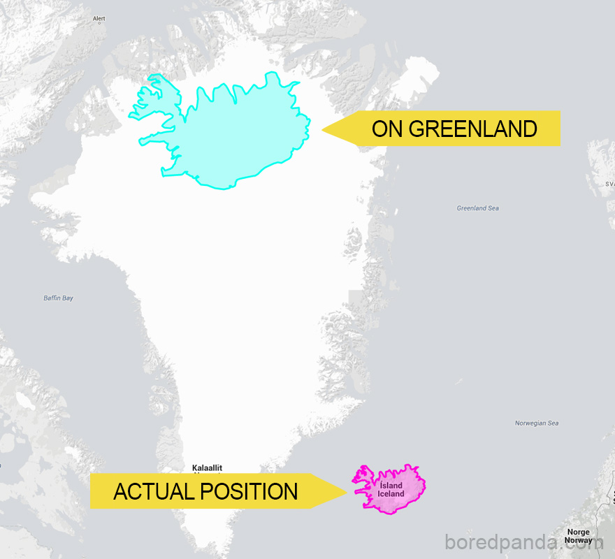
Because of this, landmasses like Antarctica and Greenland appear much bigger than they are. Though there are around 40 types of map projections, from conical to polyhedral and retroazimuthal, depicting the actual size of the world, this one is still used the most because of its convenience and simplicity, even by Google Maps. None of these projections can be titled the real world map because they all depict the same Earth through a different lens.
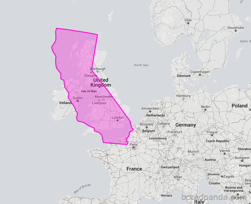
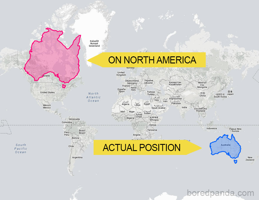
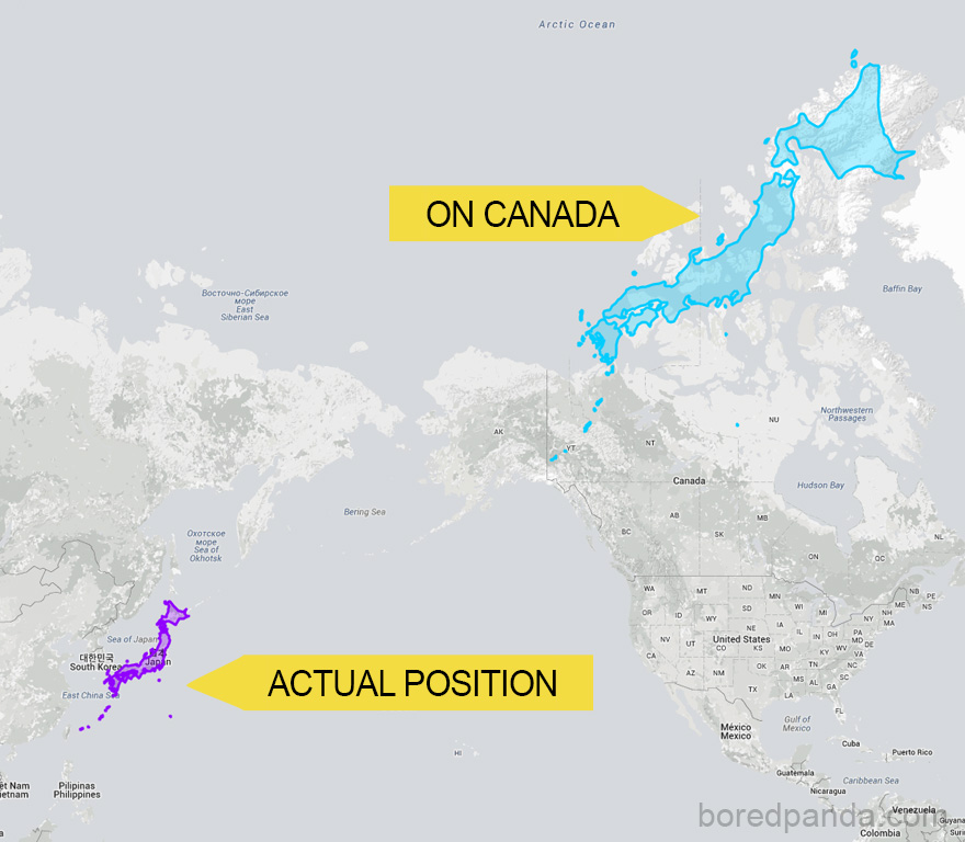
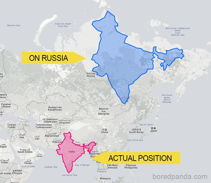
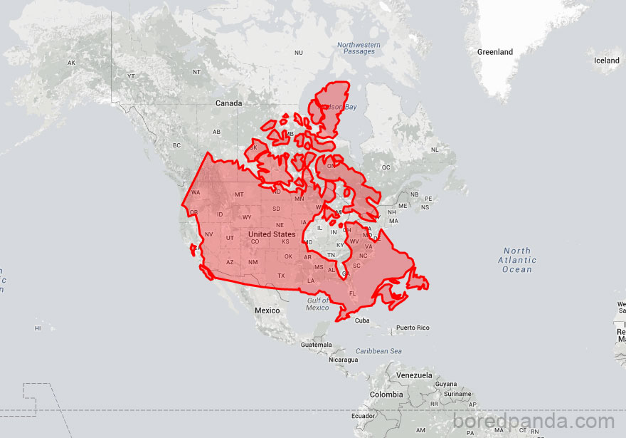
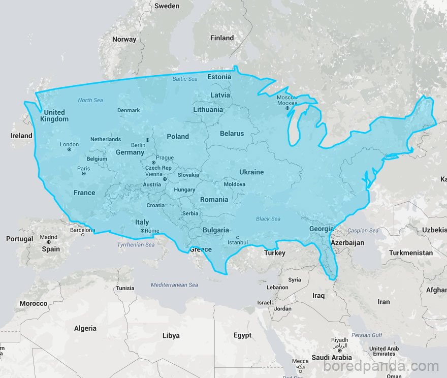
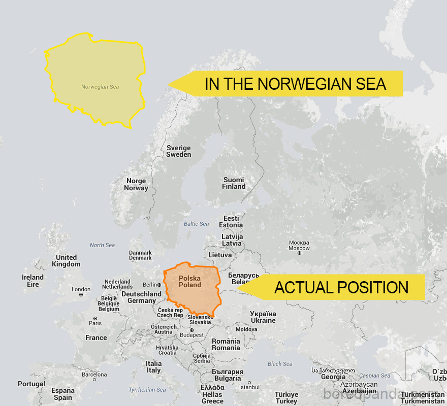
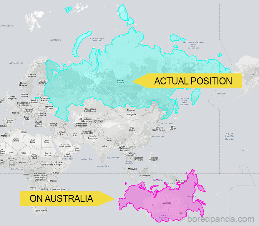
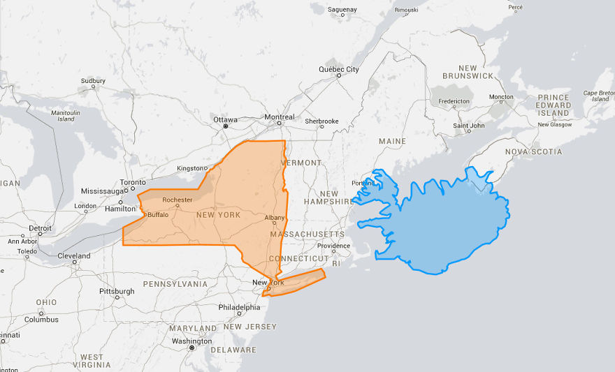
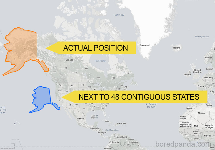
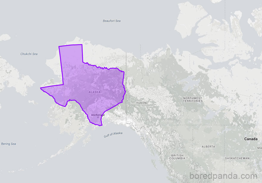
So, what does the real-world map look like? To show how incorrect our understanding of countries by size is, a website called thetruesize.com lets you move land masses into different locations. This helps you understand the actual size of countries.
We at Bored Panda played a bit with this tool, and what we found will change your perspective on our planet’s geography. The website lets you juxtapose two countries to compare their relative size, and if you’re wondering which countries are the best to live in, we explored that too.
Here’s what the real size of countries looks like.
This post may include affiliate links.

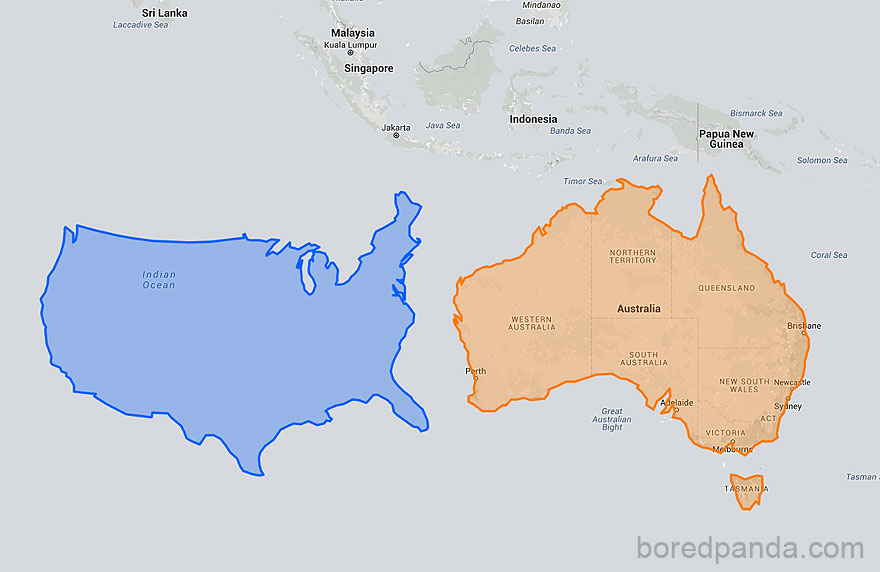
Size of contiguous United States Not counting Alaska & Hawaii, the 48 contiguous states occupy a combined area of 3.12 million sq. mi. While Australia is 2.99 million sq miles - I never realized they were so close in size!
I don't get why the map was done so inaccuratelly? can somone explain?

The map of the earth is a 2 d representation of a 3 d object, that's why the size is different, because the map is distorted.

Nope. The width of South America at its widest point is 2,705 miles (4,353 km), The width of Canada at its widest point is 5,780 miles (9,306 km).

It all has to do with putting a round object onto a flat, rectangular presentation. Locations near the poles get stretched and distorted, appearing much larger. The point of the map is that IF Japan was in that particular geographic location (closer to the North Pole), it would look much larger when transcribed onto a flat map.
Wholly Molley! No wonder I get so many customer service agents in India.... that is one HUGE country.

but 2/3rds of Canada is uninhabitable because it's in the f-ing article circle.

You should move this to the top for the dimwits. This is a great series of posts. Thanks for sharing - fun stuff :D




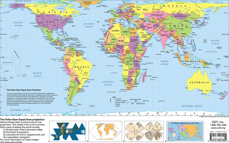
"Peters" (actually Gall-Peters, as Gall came up with the projection long before) is no truer than Mercator overall. The key phrase here is area: Gall-Peters is designed to preserve relative areas, while Mercator preserves direction and shape. "True representation of land area" and "Incorrect/false representation of land area" are not entirely false statements, but they are too easily read as "Gall-Peters good, Mercator bad!" Which is simply not the case. But despite the famous West Wing scene, in fact there are many better projections than Gall-Peters for showing the whole world — and they have been and continue to be in use in most major publications related to maps and geography for many, many years. There's no single most popular projection, but Mollweide, Winkel Tripel, and perhaps Robinson remain some of the most common. In short: each projection has its own uses, and its own shortcomings. Mercator was never meant to be the only projection ever used.

By almost the same size do you really mean less than half as big as Alaska?



This is widely known phenomenon: the problem with our world maps is that we try to map a round object on a flat surface. As far as I know, there is no mathematical method to map it 1:1. Because of this setup, our view on countries on world maps are distorted. Also nice fact: depending on where you buy your map, it's different everywhere, as each country places itself in the middle of the map

Fun & true fact : Canada don't place himself in the center on the map, we actually put the Atlantic Ocean/Europe in the center (like #12; #14). This way we don't hurt anyone.
Load More Replies...

One thing that never amazes me is the ignorance of people. :)
Load More Replies... This is widely known phenomenon: the problem with our world maps is that we try to map a round object on a flat surface. As far as I know, there is no mathematical method to map it 1:1. Because of this setup, our view on countries on world maps are distorted. Also nice fact: depending on where you buy your map, it's different everywhere, as each country places itself in the middle of the map
Fun & true fact : Canada don't place himself in the center on the map, we actually put the Atlantic Ocean/Europe in the center (like #12; #14). This way we don't hurt anyone.
Load More Replies... One thing that never amazes me is the ignorance of people. :)
Load More Replies...


















 No fees, cancel anytime