Get Premium
Dark mode theme is available exclusively for premium users. Learn more about the benefits of subscribing.
No fees, cancel anytime.

 Dark Mode Ad-Free Browsing Unlimited Content
 Ad-Free Browsing Unlimited Content Dark Mode
Join 1.2 million Panda readers who get the best art, memes, and fun stories every week!
18submissions
1week left
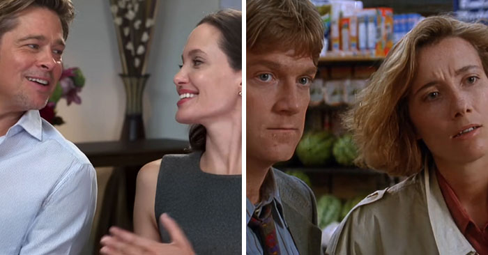
We live in the age of replicas, look-alikes, and stolen ideas. It feels like everything good has been done already, whether it’s a song, a painting, or a clever TV commercial. The fear of being unoriginal is stronger than ever if you’re trying to produce something entirely new.
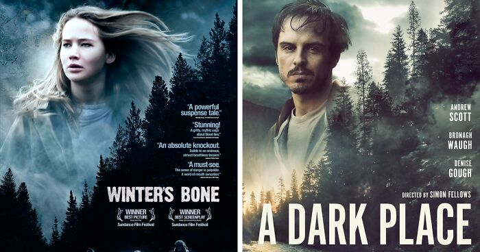
And while some try their best to come up with fresh ideas, others decide there’s no point in trying too hard. This time, we are looking at some examples of copycats in the film industry, where movie posters are everything but original.
From the suspiciously similar Babel (2006) and Savages (2012) poster designs, to the look-alike Inception (2010) vs. Geostorm (2017), these can’t be just mere coincidences... or can they? Whoever came up with these poster ideas surely has no problem with being unoriginal, and this may as well be somewhat of a liberating feeling.
(h/t: Letterboxd users Bri and Malaine)
Discover more in 'Hello I’d Like To Report A Poster Theft': People Showcase 30 Movie Posters That Are Suspiciously Similar
Click here & follow us for more lists, facts, and stories.
This post may include affiliate links.
Bored Panda reached out to filmmaker and entrepreneur Romina to find out if such look-alike movie posters are innocent coincidences or sinister copies. Romina explained that both things can be true in these cases: “Sometimes copies are coincidental and other times they're not. The use of similar design elements, though, is indeed deliberate.”
Romina also said that it’s quite possible that the same graphic designers were used to produce the film posters, and if that happens, “they end up with similar styles.” In that case, a look-alike poster is not a copy, but rather it reflects the style of a particular designer.
“It is common to copy or 'take inspiration' from other works. If it isn't broken, why fix it?” Romina said this is part of the storytelling process which is as old as time itself. For example, “Shakespeare's stories have been told over and over again.”
Having said that, Romina assured that people still genuinely care about original ideas. “The possibilities are endless as new ways of storytelling are developed, like VR, for example.” It’s really up to artists and designers to decide which direction they want to go.
Creating a captivating movie poster that will draw people to the cinema theaters is not as simple as you may think. The successful ones often follow a time-proven sales formula that can be traced in any movie poster you’d like to hang on your wall. It’s known as AIDA.
The first A in the AIDA formula stands for "attention." A good movie poster is one that grabs your attention on the street and steals it for some time. Whether it features the film’s main characters, establishes an intriguing level of plot, or presents a major plot point, it should be captivating.
The second part of the formula stands for iconography, which is basically showing without telling. The use of strong imagery and visual cues is what makes the design effective.
Another important feature in a good film poster design is "interest." This means that your poster should offer a fresh perspective or an unusual point of view. Sometimes it puts the viewers into the middle of a scene from the film. Often, it sparks an inner curiosity as you wish to find out more.The last bit of the magic AIDA formula stands for appeal, which combines both creative and aesthetic efforts to produce a poster that will serve as a form of art on its own.
On the other hand, there’s always a danger of making your poster too artsy, as it should carry appeal for both die-hard fans and passersby on the streets alike. Long-lasting appeal in poster designs is usually found in classical movies and high-budget blockbusters.


 No fees, cancel anytime