6 Old Buildings From Around The World Renovated By Graphic Designers
At the very beginning, people developed architecture design according to their needs. Protection from the elements and other dangers was the main reason for building a shelter. Over time, other aspects became important too, like seeing from inside the house, being more comfortable, the house looking better. The city also became part of the home. Interior and exterior design became more and more important.
Due to lack of knowledge and materials, the old houses were stumpy, the windows were small, walls thick and crooked. However, people learned. The windows became bigger, the walls - slicker, and the overall design ideas - more elegant and beautiful.
So what would be the next step in creative design? These graphic designers asked the same question and created a series of CG renderings to renovate six old houses from the 21st century, using current and future house renovation and design trends.
More info: budgetdirect.com.au
This post may include affiliate links.
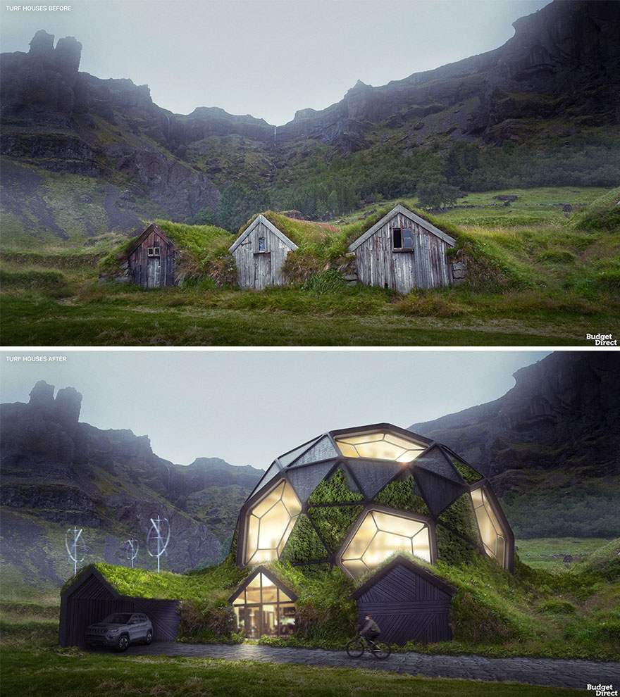
Turf Houses Renovated (Iceland)
An Icelandic turf house consists of a wooden frame stuffed with blocks of turf (grass still embedded in the earth) on a stone foundation. Only the front around the doorway is bared. The entrance leads to a big hall (sometimes via an antechamber) with a firepit in the middle.
Our renovated turf house complex plays with the ‘badly hidden’ appearance of traditional turf houses, which seem to sink back into the landscape. The steel-frame dome looks partly natural yet completely alien. Panels of turf and timber alternate with glass windows, using reflections to create an improbable, angular mound of grass, wood, and… clouds! In a subtler touch, the wooden planks that form the facades have been rearranged at decorative angles.
Evey time I see a house with huge windows my first thought is that it's lovely and it would be great for my plants- but that's immediately tempered by the house hunting refrain of the midwest, 'how much would it cost to heat that???'
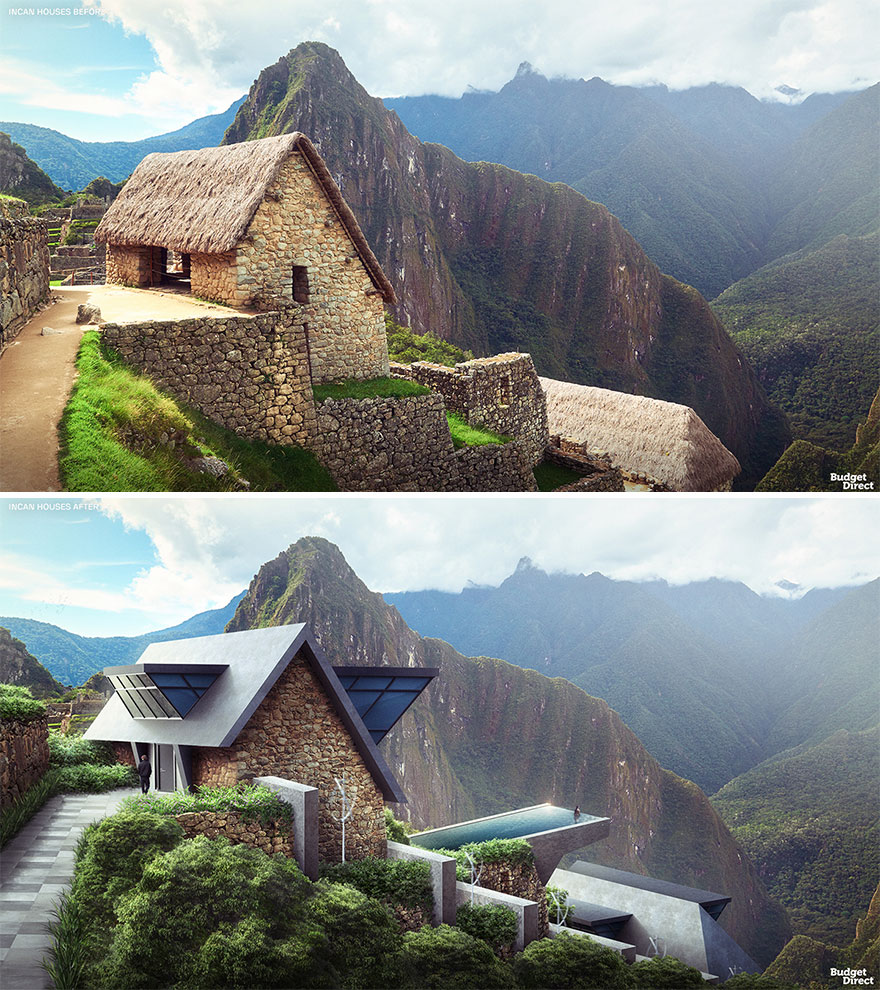
Incan Houses Renovated (Peru)
Incan architecture is renowned for the precise and sophisticated use of stone blocks. However, more humble Incan homes would often be built from unworked field stones or even adobe bricks. Roofs were sloped and usually made of thatched grass or reeds on a wood or cane frame.
The settlement we chose to renovate boasts a particularly exhilarating view. We wanted to amplify the strangeness of the arrangement and create more space. We did so by designing wedge-shaped volumes of black concrete and glass that seem like prisms penetrating the rooves. The centerpiece is an infinity pool suspended from the top property, creating an unparalleled mountain view experience.
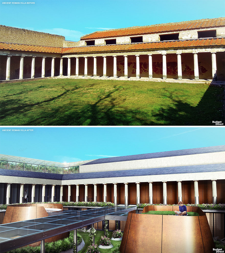
Ancient Roman Villa Renovated (Italy)
Villa architecture in ancient Rome was very diverse in design. But as a general rule, an entrance door in the middle of the façade would open up into a corridor leading to a courtyard. This would be the heart of life in the Roman home. Corinthian style columns or pilasters hung with retractable doors separated the courtyard from the surrounding rooms.
How do you extend an enclosed courtyard? We’ve dug down to create a second level. An island hot tub and lawn add recreational options. They are reached by a glass bridge that allows light to reach the extra guest rooms around the new, lower courtyard. Solar brick roofs power the complex, while a greenhouse on top provides homegrown fruits and vegetables for the residents.
I like the digging down idea here. But these copper towers seem oddly placed, if the idea is to create a sunny garden or courtyard down there.
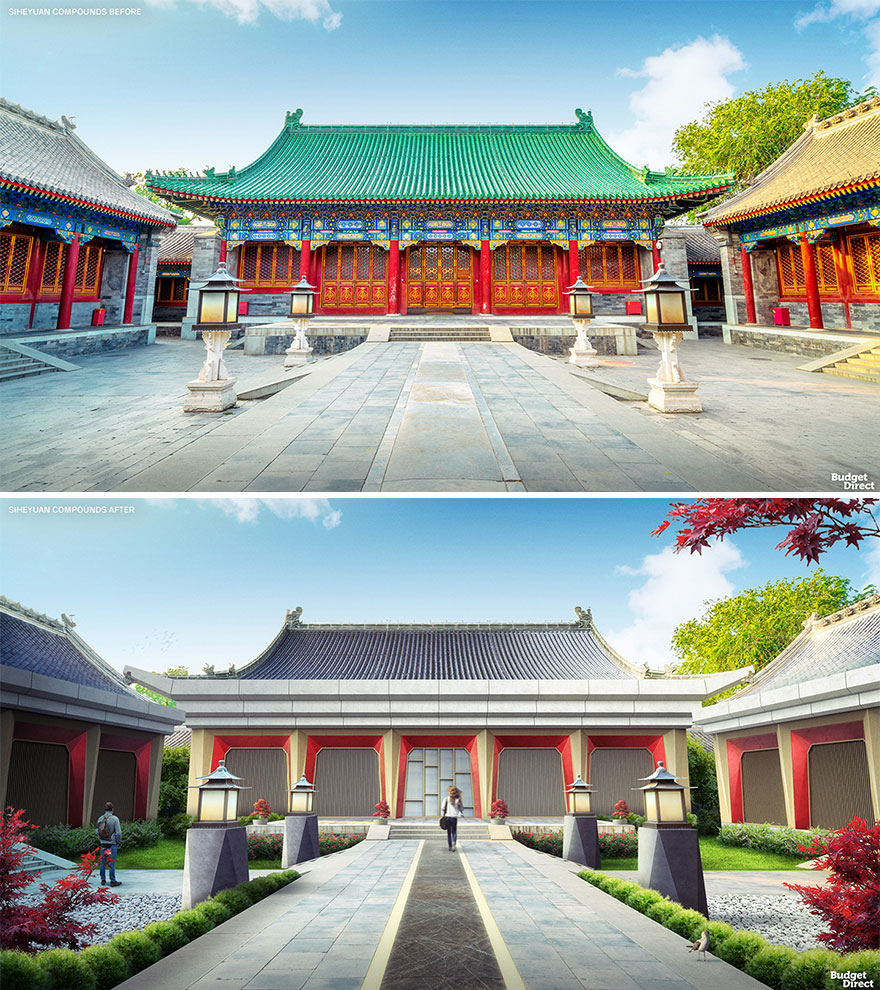
Siheyuan Compounds Renovated (China)
Chinese Siheyuan date back to the Western Zhou Period (1045–770 BC). A typical siheyuan is symmetrical and features four buildings around a quadrangular courtyard. These home complexes were built according to strict height, design, color, and decoration restrictions, depending on the status of the owner.
As such, our updated siheyuan boasts an overdue cosmetic makeover. New columns and facades feature angular surfaces, creating a clean-cut, stoic, yet kinetic vibe. The beautiful original roofs have been kept mostly intact, but the addition of solar panels adds a welcome touch of sustainability. Finally, the courtyard has been treated to new grass and pebble areas useful for meditation and play.
Can I say that this reminds me of the Cultural Revolution in a way? There is so much erasing going on in this one. As if to say, "get rid of our traditions. They were all so evil."
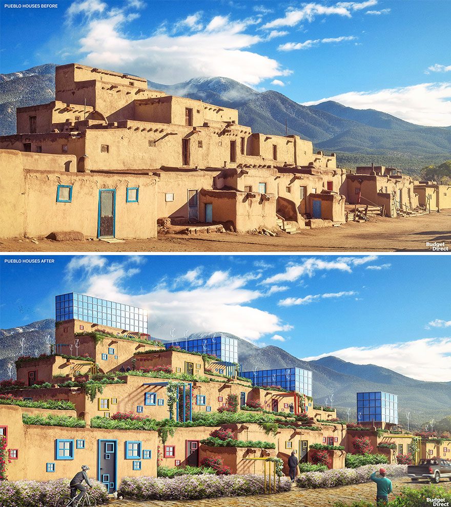
Pueblo Houses Renovated (United States)
Traditional pueblo houses were constructed from adobe bricks or limestone blocks. They had as many as five storeys, each set back from the floor below to create a pyramid-type shape. The walls were very thick and, with multiple families in each building, there wasn’t much space.
Our architects have created more room to live while maintaining the social feel of the pueblos. New semi-open terraces feature glazed prisms for social gatherings, offering epic ‘observatory deck’ views over the plains of America’s south-west. The prisms are augmented with photovoltaic glass panels on the facades so that these modernized homes can run on renewable energy.
Welcome to your public sun-driven glass oven. And again a lot of those helix wind turbines cannot catch too much wind so close to the buildings.
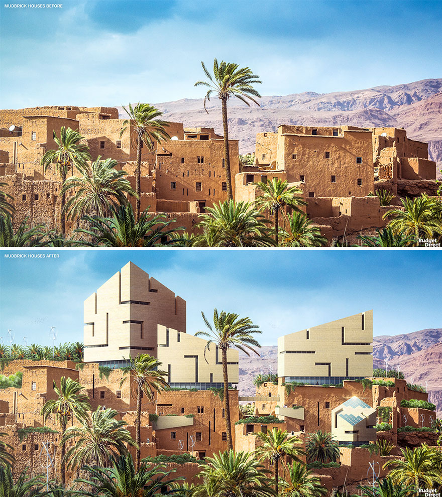
Mudbrick Houses Renovated (Ancient Egypt)
Three thousand years ago, most Egyptian people lived in houses made of mudbrick. In fact, the word for a mudbrick, ‘adobe’, comes from the ancient Egyptian word, “dbe.” There was very little wood available in ancient Egypt, but when the Nile flooded, it was practical to make bricks from the resultant mud combined with straw. Entire families would occupy a single room, although in hot weather they might sleep on the roof.
The narrow windows of the original buildings were designed to keep the mudbrick houses cool. Our updated version features prism-like extensions made of clean-cut limestone, which is ideal for blocking heat from the outside. Our architects wanted to create a visual clash by placing futuristic forms atop historic ruins – the slit windows and slanted roofs add that dynamic, modern look.
Instead of clashing. . . How about some futuristic water storage, and indoor cooling?
First of all, these are not renovations, they are renderings. And second of all, the ideas are horrible.
I think most of these renovations add things that really clash with the original structures and architectural elements. Why do it this way? How about adding modern upgrades that are harmonious with the styles from the past?
I totally agree. With a little more effort, you can modernise the traditional without making it look like out of place. But I found this post entertaining. Kinda like a joke, to be honest. With all respect to the respective artists.
Load More Replies...I would have liked most of these as new projects that corporate traditional elements, but if it's applied to existing architecture where it's necessary to remove much of the original I'm out 😅

 Dark Mode

 No fees, cancel anytime


