ADVERTISEMENT

People love to learn, but we don’t really like it when it’s hard. Luckily, some ways to learn are easier than others. Research shows that we’re more likely to engage with new information when it’s presented in more fun ways than just plain text. For example, we understand graphs 25.5% faster than text and 46.5% faster than data in tables.

If that’s really so, then you’ll probably love this list of cool charts and guides, Pandas! We’ve collected some of the most interesting and visually pleasing graphs from several Instagram pages about our world: pop culture, wildlife, population density, obesity, and many more. So, if you’d like to learn the types of the most common errors online, symptoms of COVID-19, and what cleaning products you should never mix, but presented in a cool way, then this is just for you.

RELATED:
    #2

    A chart showing 12 common cognitive distortions to help decide faster and understand complex things.

    cool_guides Report

    hannahbahngswife
    Community Member
    4 hours ago Created by potrace 1.15, written by Peter Selinger 2001-2017

    I think we all know way too much people who are "owning the truth" types.

    #4

    A chart displaying the top 3 most popular sports in the world by fans to decide faster.

    chit_chart Report

    Howl's sleeping castle
    Community Member
    3 hours ago Created by potrace 1.15, written by Peter Selinger 2001-2017

    I remember one old report, 90% of the cricket fans are Indians.

    View more comments
    ADVERTISEMENT
    ADVERTISEMENT
    ADVERTISEMENT
    #9

    A chart warning against mixing cleaning products, a complex safety topic, to help decide faster what not to do.

    cool_guides Report

    BarBeeGirl
    Community Member
    4 hours ago Created by potrace 1.15, written by Peter Selinger 2001-2017

    I learned the hard way to not mix bleach and ammonia (specifically dog pee)

    View more comments
    ADVERTISEMENT
    #10

    A chart of cat tail positions to decide faster, explaining feline emotions like friendly, angry, and submissive.

    cool._.guides Report

    Min (she/her)
    Community Member
    Premium
    11 minutes ago Created by potrace 1.15, written by Peter Selinger 2001-2017

    Derisive? They really are mocking us!

    #11

    An infographic illustrating six vegetables that are the same plant (Brassica Oleracea), to help decide faster.

    cool_guides_ Report

    Roman Arendt
    Community Member
    3 hours ago Created by potrace 1.15, written by Peter Selinger 2001-2017

    Wait, Kohlrabi is Kohlrabi in English?

    #12

    A chart detailing shark attacks by human activity, including surfers, swimmers & waders, snorkelers & divers, and inflatable rafts.

    chit_chart Report

    SkyBlueandBlack
    Community Member
    4 hours ago Created by potrace 1.15, written by Peter Selinger 2001-2017

    A wise surfer once said: you don't have to swim faster than the shark; you just have to swim faster than the other people in the water.

    View more comments
    ADVERTISEMENT
    #13

    Chart showing the happiest countries, useful to decide faster on quality of life metrics.

    chit_chart Report

    random_froggg (she/they 86/47)
    Community Member
    2 hours ago Created by potrace 1.15, written by Peter Selinger 2001-2017

    Fun fact, Iceland also has (or at least had) the greatest anti-depressant use per capita of any country.

    ADVERTISEMENT

    Never miss a story that brings joy to the world. Follow on Google News

    ADVERTISEMENT
    #17

    An eat the rainbow chart illustrating the health benefits of different colored foods, helping decide faster.

    cool._.guides Report

    random_froggg (she/they 86/47)
    Community Member
    2 hours ago Created by potrace 1.15, written by Peter Selinger 2001-2017

    If anyone’s confused, free radicals in this context doesn’t mean blueberries will repel protestors, lol. Free radicals are unbonded oxygens in your body that can cause issues if they get to be too many. Science pandas, correct me if I’m wrong.

    View more comments
    ADVERTISEMENT
    #19

    A tattoo pain chart showing areas of least to most pain on a human body, helping decide faster.

    cool_guides_ Report

    The Doom Song
    Community Member
    3 hours ago Created by potrace 1.15, written by Peter Selinger 2001-2017

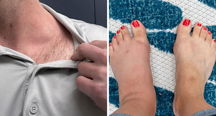
    Two of my tattoos are in a "least pain" area and I can tell you after 3.5 hours and 5.5 hours each I was in quite a lot of pain.....

    View more comments
    ADVERTISEMENT
    #21

    Charts depicting British beliefs about aliens and life on Mars to help decide faster on public opinion.

    chit_chart Report

    Ru Bee
    Community Member
    3 hours ago Created by potrace 1.15, written by Peter Selinger 2001-2017

    Me. Erm no.... They may have existed but due to the immense vastness of time the likelihood of them existing at the same time as us is essentially zero.

    View more comments
    ADVERTISEMENT
    #24

    Chart illustrating countries with highest percentage of child obesity, helping to decide faster on health initiatives.

    chit_chart Report

    random_froggg (she/they 86/47)
    Community Member
    2 hours ago Created by potrace 1.15, written by Peter Selinger 2001-2017

    I think the absolutely delicious food of the top 2 countries might help explain it

    View more comments
    ADVERTISEMENT
    #25

    Chart detailing top fashion photography agencies and gender representation, aids in understanding industry trends to decide faster.

    chit_chart Report

    random_froggg (she/they 86/47)
    Community Member
    2 hours ago

    This comment has been deleted.

    ADVERTISEMENT
    #26

    Chart explaining how to decide faster with a visual representation of hospital beds by country.

    chit_chart Report

    random_froggg (she/they 86/47)
    Community Member
    2 hours ago (edited) Created by potrace 1.15, written by Peter Selinger 2001-2017

    U.S isn’t on here because the bed isn’t included in your stay. Hit your deductible limit and insurance won’t cover it? Can’t afford insurance? Oh well, yes we have plenty of empty beds but you’ll have to stay on the floor. /satire (sort of)

    #27

    Chart explaining how to decide faster by visualizing pollution from the industrial revolution.

    chit_chart Report

    Min (she/her)
    Community Member
    Premium
    21 minutes ago Created by potrace 1.15, written by Peter Selinger 2001-2017

    Is the EU a country now?

    ADVERTISEMENT
    ADVERTISEMENT
    #31

    A chart explaining different types of coffee, a complex topic, to help decide faster what to drink.

    cool_guides Report

    The Doom Song
    Community Member
    4 hours ago Created by potrace 1.15, written by Peter Selinger 2001-2017

    I'll take a flat white with skim milk please...

    ADVERTISEMENT
    ADVERTISEMENT
    ADVERTISEMENT
    ADVERTISEMENT
    ADVERTISEMENT
    ADVERTISEMENT
    ADVERTISEMENT
    ADVERTISEMENT
    #46

    Chart illustrating the longest human space flights to help decide faster on space mission durations.

    chit_chart Report

    Janissary35680
    Community Member
    Premium
    53 minutes ago Created by potrace 1.15, written by Peter Selinger 2001-2017

    These are the "voluntary" longest human space flights. There was one (Frank Rubio, Sergey Prokopyev, and Dmitry Petelin @ 371 days) and a few that were nearly as long for “involuntary” reasons. My favorite (311 days) is Sergei Krikalev, who went up a Soviet and came down a Russian. (🎵🎶Ground Control to Major Tom🎶🎵 & 🎶🎵Station Mir to Ground Control🎵🎶)

    #47

    A chart showing top grossing movies at the box office, simplifying complex entertainment data.

    chit_chart Report

    The Doom Song
    Community Member
    4 hours ago Created by potrace 1.15, written by Peter Selinger 2001-2017

    I remember going to see Titanic with my mum and we were in line and I said to mum "I don't know why we are going to see this when we know the boat sinks right" and some idiot in line next us goes "Really? You spoilt the movie for me!" They were not joking either....

    View more comments
    #48

    A chart visually compares public beliefs about aliens and religious figures, simplifying complex ideas.

    chit_chart Report

    Janissary35680
    Community Member
    Premium
    48 minutes ago (edited) Created by potrace 1.15, written by Peter Selinger 2001-2017

    Which is strange because both are equally likely.😄

    ADVERTISEMENT
    ADVERTISEMENT
    ADVERTISEMENT