Get Premium
Dark mode theme is available exclusively for premium users. Learn more about the benefits of subscribing.
No fees, cancel anytime.

 Dark Mode Ad-Free Browsing Unlimited Content
 Ad-Free Browsing Unlimited Content Dark Mode
Join 1.2 million Panda readers who get the best art, memes, and fun stories every week!
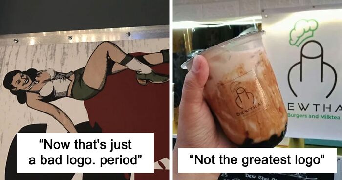
How many times, looking, for example, at the logos of Nike, Adidas or Apple, have we asked ourselves just one question: “Well, couldn’t we have drawn such a simple logo ourselves?” If yes, then let's move on reading. If not, we still move on. How many times have we read the news that some famous design studio redesigned the next big corporate logo for a check with an obscene number of zeros, and in the end just made the font thinner or simply reduced the distance between some details?
And so, every time we read such news, we come across dozens, if not hundreds of comments that the designers simply scammed their clients for money, but actually nothing in the logo has changed. In fact, as is often the case, things are not so clear cut.
Firstly, the famous swoosh was most likely a manifestation of spontaneous genius insight (for which, however, they paid only 35 bucks), and the original version of the Apple logo was complex, artsy and as old-school as possible. Secondly, any change in the logo in a large company is preceded by a long and thorough marketing analysis. Yes, sometimes it turns out a complete fail, as was the case with the 2012 Summer Olympics logo, but more often than not, the idea of saving on logo design doesn't justify itself at all.
Do you want proof? Voila! As many as 47 examples collected by Bored Panda, when the designer just drew something, the marketing manager was either absent or did not think at all, and the boss approved the logo without looking. And the result is what we have - this incredible selection of logos from around the world, on the one hand, beautiful and stylish - but completely inappropriate, you just have to look at it from a different angle. So please feel free to think different, as Steve Jobs once urged us, scroll this selection to the very end, and just enjoy these absolute masterpieces of human short-sightedness.
This post may include affiliate links.
Its a " double entendre " and its hilarious lol, you can see it as half an Apple lol, of a fire spitting a*s, thats actually Smart.
Hello? Is this John Constantine? Yea. So I got a Hell Baby? We might need to perform an exorcism..
🎶 We’re going on a trip in our favorite Spac Eship! Zooming through the sky! Lil Einsteins!
My brain went weird and I read Steamed Abortions
Load More Replies..."NEW YORK STEAK 'N LOBSTER." Followed by a Chinese chop at the end. Someone was super proud of this.
omg thank you I could not figure the lobster part out
Load More Replies...I can make the word ‘stroke’ which is what I’m having right now trying to read this.
It look like when you write a happy birthday sign without measuring how big the letters should be
I just can't seem to find the restaurant! There should be a sign...What the?
Ohhh! You're supposed to rearrange the letters in order to eat there so, uh... BLEAKEST SNORT or maybe SKELETON BRATS, who knows 😆
"Steak 'N Lobster". (the L is the giant line through the middle containing the words "New York")
Load More Replies...Could easily come up with something better. In one of my focus groups, it has become blatantly apparent that if a person doesn't understand withing a few seconds, the majority of people will walk on by.
My 4-year-old Granddaughter created a Christmas ornament for her parents. Her photo was in the middle, surrounded by her name. Unfortunately, while all 5 letters were there, they were spread around the photo in no particular order. Commercial signs like this one is confusing to kids and adults alike.
It says STLOTEBEASRK'N. We learned this word back in elementary school. How can you all have forgotten?
Or possibly Klingon? If it is Klingon cuisine I am definitely not stepping foot in that place. 😂
Load More Replies...It took me far longer than I'd care to admit to figure out this was supposed to say Steak 'N Lobster! 🤦♀️
The alphabet soup in these posts...getting worse as I scroll.
it took me a really long time to figure it said "steak 'n' lobster"
I'm convinced these designers know exactly what they're doing, and I'm so here for it. 🤣
Oohh~ Steak 'n Lobster (the "Town House"-picture gave the hint on how to read this one) down, right to left, Up the L and down, right to left again
This sign doesn't help people that have trouble reading, and there are lots of them.
Stoner graphic designers. Line down the middle cuts it in half. Basic fail.
Gotta admit, this is a "stumper" and need some 'xplain'n for what it is supposed to represent.
An accurate representation of my ADHD brain 😭 seriously my thoughts are so all over the place that I just read that as if it was just written normally
Trying to go left to right as best I could I got either: Slott Bee Ask 'N R or Slot Tee Bask 'N R With the first one maybe the restaurant owner's last name is Slott, possibly Bee Slott, or the Bee has to do with the decor and menu. Honey in everything and beeswax candles everywhere. 🤣 Yes, I know it says STEAK 'N LOBSTER. I'm not truly trying to make sense of gibberish. But it's fun to play around with it!
10min and reminding myself that I need to read that vertically... 🤦 ...Steak n' Lobster ...
That's not how you spell stoat, but if they're delicious - well, ok then.
I'm going to need you to repeat that please. And if you could use English this time that would be great. 🤣
Load More Replies...You work up an appetite trying to decipher just WTF it is trying to say.
HMMM..that B looks familiar! Where have I seen it before!? The M looks original but that B…HMMM…HMMmMmmMmMmm
People attend art school to major in graphics, mainly to master concepts and technology. For four years they create logos and layouts, then rip each other to shreds for errors much much lesser than these.
My mom went to college for graphic design for 4 years. Nearly this whole list made me cringe horribly.
Load More Replies...I can't stop laughing at #15, that company is in the town I grew up in, I've seen that logo a million times and never realized how bad (good?) it really is! Then again this is the same place where one year the girls lacrosse team made and sold *female empowerment* t-shirts with the slogan, "We'll beat you on the field, and then we'll beat you off!" and not one coach/teacher realized until it was far too late. 100% true story. 🤣
These get re-ordered according to votes. Which one are you referring to?
Load More Replies...Have you seen the Torres Strait Islander flag? torres-str...-image.jpg 
My inner artist has been triggered by this post. I want to redesign a lot of these.
You should redesign them then create a list for bored panda :)
Load More Replies...The title is assuming professional designers created all of them. There are lots of business owners who think a pro designer is too expensive and unnecessary...
Oh, come on BP. 48 images shortened to 45 is just silliness.
TIL if you want to score big on the upvotes, just repeat what the title of the image is and/or make a crude sex reference.
either a doggo or not something good. i prefer seing the dog
Load More Replies...To be fair, it is the client who has the final say. Even the most experienced designer may suggest what the designer knows will look good, but whether the client has good judgement or bad judgement, the client makes the final decision, not the designer.
I honestly can't believe the owners agreed to those things. OR maybe they were too embarassed to admit how stupid they were.............after they paid!!
Or this childrens’ dance studio near me…. https://photos.app.goo.gl/2uXKEUZx8nBxvyJ39
scrolled down here to find other graphic designers who, like me, this post hurt me in my soul. now, to quietly weep
Where is that salad meme cat when we need it (to read stuff in the right order).
Some are almost impossible to read while others point out how much the internet has ruined us.
People attend art school to major in graphics, mainly to master concepts and technology. For four years they create logos and layouts, then rip each other to shreds for errors much much lesser than these.
My mom went to college for graphic design for 4 years. Nearly this whole list made me cringe horribly.
Load More Replies...I can't stop laughing at #15, that company is in the town I grew up in, I've seen that logo a million times and never realized how bad (good?) it really is! Then again this is the same place where one year the girls lacrosse team made and sold *female empowerment* t-shirts with the slogan, "We'll beat you on the field, and then we'll beat you off!" and not one coach/teacher realized until it was far too late. 100% true story. 🤣
These get re-ordered according to votes. Which one are you referring to?
Load More Replies...Have you seen the Torres Strait Islander flag? torres-str...-image.jpg
My inner artist has been triggered by this post. I want to redesign a lot of these.
You should redesign them then create a list for bored panda :)
Load More Replies...The title is assuming professional designers created all of them. There are lots of business owners who think a pro designer is too expensive and unnecessary...
Oh, come on BP. 48 images shortened to 45 is just silliness.
TIL if you want to score big on the upvotes, just repeat what the title of the image is and/or make a crude sex reference.
either a doggo or not something good. i prefer seing the dog
Load More Replies...To be fair, it is the client who has the final say. Even the most experienced designer may suggest what the designer knows will look good, but whether the client has good judgement or bad judgement, the client makes the final decision, not the designer.
I honestly can't believe the owners agreed to those things. OR maybe they were too embarassed to admit how stupid they were.............after they paid!!
Or this childrens’ dance studio near me…. https://photos.app.goo.gl/2uXKEUZx8nBxvyJ39
scrolled down here to find other graphic designers who, like me, this post hurt me in my soul. now, to quietly weep
Where is that salad meme cat when we need it (to read stuff in the right order).
Some are almost impossible to read while others point out how much the internet has ruined us.


 No fees, cancel anytime


")
")


. I Like The Idea, But The Execution Is Not The Best")


")