Get Premium
Dark mode theme is available exclusively for premium users. Learn more about the benefits of subscribing.
No fees, cancel anytime.

 Dark Mode Ad-Free Browsing Unlimited Content
 Ad-Free Browsing Unlimited Content Dark Mode
Join 1.2 million Panda readers who get the best art, memes, and fun stories every week!
Empathy is an underrated superpower in the professional world. You don’t just need regular intelligence to be a good designer—emotional intelligence can raise the quality of your work, too. And that means putting yourself in the client, consumer, or user’s shoes and understanding their wants and needs.
Not everyone can set their ego aside and think about others, including product, graphic, interior, and other designers. Our team has collected some of the most mind-blowingly awful and hilarious designs that hurt to look at and make you wonder how nobody spotted the incoming failures before production started. Scroll down for a list of images where you can safely say, “I could do better,” and you’d be right.
This post may include affiliate links.
Design icon Dieter Rams has 10 principles of good design that are relevant to all professionals to this day. For him, good design is innovative, makes a product useful, aesthetic, makes a product understandable, unobtrusive, honest, long-lasting, thorough to the last detail, environmentally friendly, and has as little design as possible.
No matter if you’re designing a poster, building, tech product, or piece of furniture, you can avoid plenty of mistakes if you at least keep these principles in mind. Ideally, what you should be aiming for is a healthy balance between function and form, without obsessing over either one too much.
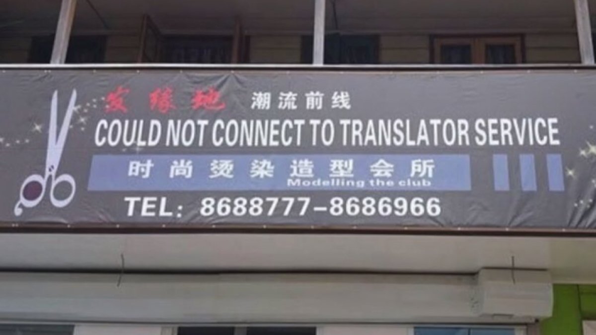
Well, very easy and fast way to see which stalls are occupied /s
Function without form ignores humanity’s need for beauty and eye-pleasing details. What’s more, you need more than function to sell products, and visually appealing designs get sales.
Meanwhile, form without function leads to aesthetic yet uncomfortable products that are mainly there to look artsy without much substance. In both of these cases, the designer fundamentally misinterprets their clients’ needs.
If good design embraces clarity, bad design revolves around confusion.
So you can use scissors to bust out the packaging cutter that you didn’t need because you own scissors? This makes my head hurt
Poorly-designed products often hide their main function through unnecessary, convoluted features. They are not intuitive, nor are they self-explanatory. So, they push consumers away.
What’s more, bad designs are also distracting, difficult to use, forgettable, and short-lived.
There are many reasons why these mistakes happen in a design setting, but mainly, it usually involves a lack of feedback, for example, from the designer’s peers, superiors, clients, focus groups, family, friends, etc. The more constructive criticism you can get, the better the product… so long as you don’t let go of your vision to try to appeal to everyone all at once.
Peephole installed with the assumption that no normal person would want to just have a large un- curtained window in their front door
Setting your tastes and personal preferences aside, not all design decisions are equal. Some are objectively better than others because they take the wants and needs of the end users into account.
In other words, good design is empathetic and consumer-friendly. Bad design, on the other hand, is solely driven by the creator’s ego and lacks self-awareness and foresight.
A fender bender? Grand theft auto? Which accident are we talking?
Turning boys into syrup is horribly inefficient - The human body only contains around 5 gramm pure sugar
Of course, every professional makes mistakes. That’s how we all learn, improve, and grow. However, how you respond to failures says a ton about your work ethic, character, and priorities. Being criticized and getting rejected is unpleasant, but it is an unavoidable part of life.
There is a world of difference between having a growth mindset and a fixed mindset. And it can make all the difference for any professional’s career, whether they’re in design or not.
Someone with a growth mindset fundamentally believes that they have the capacity to learn and improve. For example, a designer with a growth mindset, who makes low-quality designs and gets feedback from their supervisor, accepts what they’re being told and knows that they can meaningfully develop their skills.
Of course, individuals with a growth mindset are not naive. They understand that improving their skills requires lots of time, effort, and energy. However, they have internalized that success is possible through their consistent and focused actions.
For people who have a fixed mindset, these things are not as obvious.
Fixed mindset individuals tend to focus mainly on the restrictive and negative aspects of their life experience. Their self-esteem is very limited, so they question their ability to learn anything new.
What’s more, they are convinced that everyone else gets better results and that they don’t struggle as much.
For them, success isn’t guaranteed with enough effort.
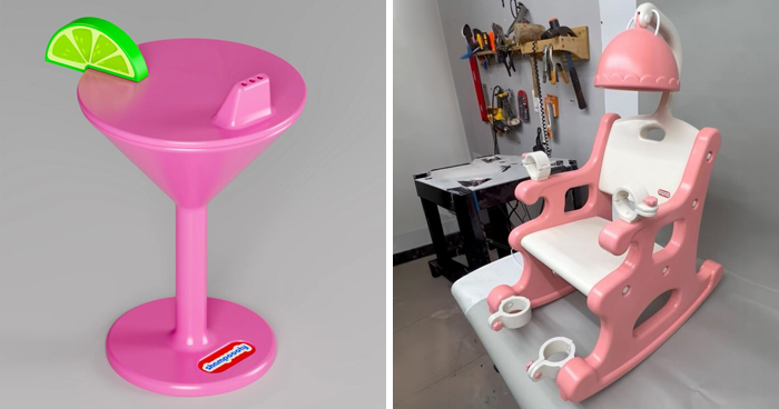
I think they might be hiring. Not sure though, it’s not very clear
In a design context, having a fixed mindset might involve a young professional giving up because their first few ideas or prototypes didn’t land.
Instead of embracing the (hopefully constructive) criticism they received and focusing on polishing their skills, they give up or feel envious of their other, more successful colleagues.
On the flip side, a growth mindset-oriented design professional would see their failure as an opportunity to hone their skills, become more aware of their blind spots, and create something better.
Putting out an awful, hilariously designed product or poster can be the springboard toward something better.
Having a good sense of humor and laughing at your own mistakes can take some of the sting from failure, too!
Feel free to share your thoughts in the comments after you’ve finished laughing and cringing, Pandas.
Which of these designs did you enjoy hating the most, and why? Meanwhile, were there any designs that we’ve featured here that you actually think are semi-decent?
What are the very worst product, graphic, and interior design decisions that you’ve spotted this week? Tell us all about it!
And yet I can't find those d**n white robes some people think I wear /s
there's a gramatical error here. In french, plurial is "les" so it should be les t**s now
"Heal thy burgers, for the salad doth not quell thy hunger" - Wendy McDonald
Elephants are shìtting out children? Has anybody told David Attenborough?


 No fees, cancel anytime