ADVERTISEMENT

Most things go through a few drafts, for good reason. In a similar vein, proofreaders will often get a second set of eyes on some project. However, there are some folks in charge out there who feel that one and done is all it takes and are pretty insistent that their ideas work despite, well, the mountain range of evidence to the contrary.

So we’ve gathered some of the worst design fails from across the internet to make you feel a bit better about your own not-so-successful attempts at making something. Get comfortable as you scroll through, upvote your favorites and be sure to share your own thoughts and stories in the comments below.

RELATED:
    #2

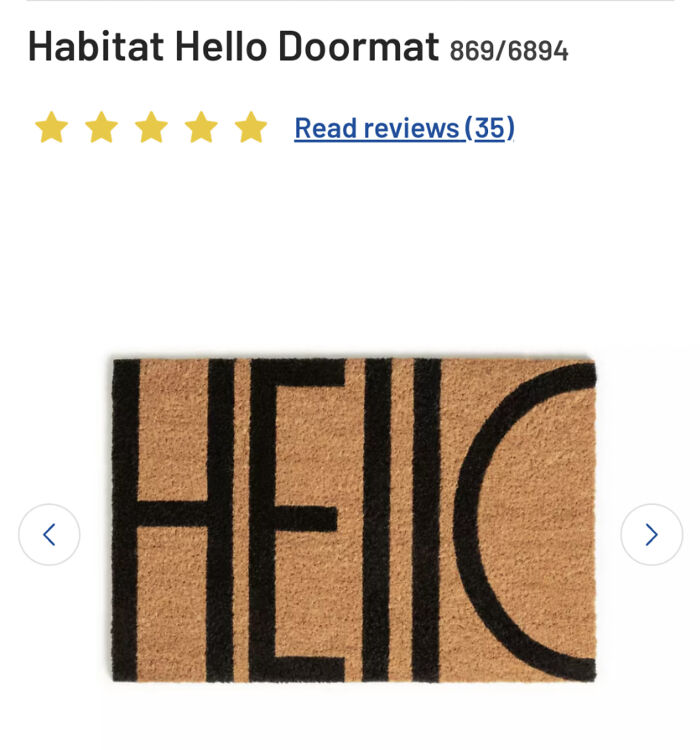
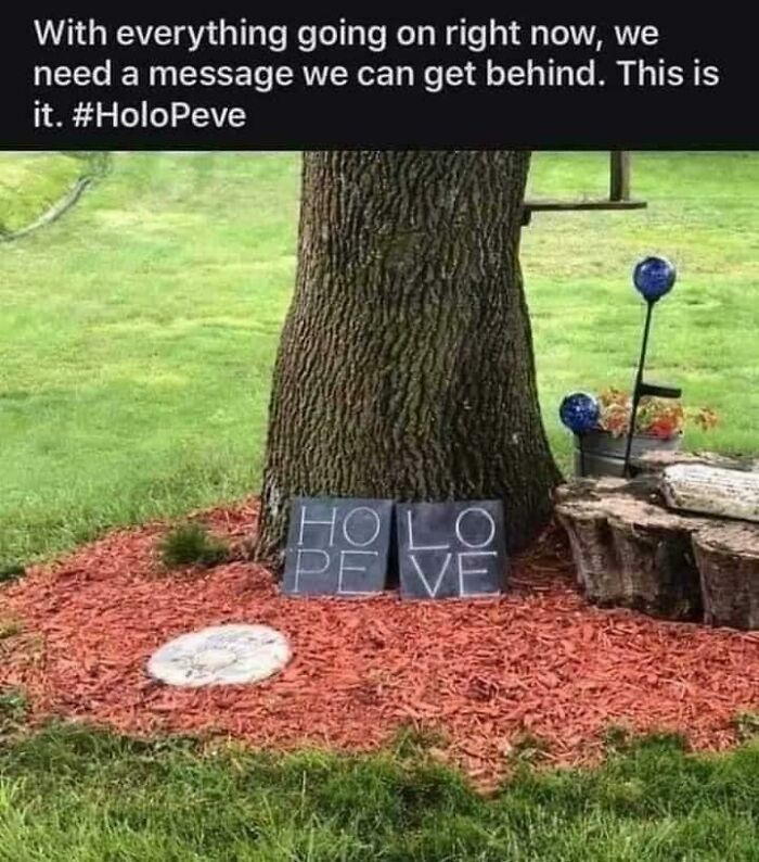
    He||c, It's Me

    A doormat with a design fail where the word HELLO is cut off, illustrating an impressive design fail.

    LolaFrisbeePirate Report

    Michael Largey
    Community Member
    2 hours ago Created by potrace 1.15, written by Peter Selinger 2001-2017

    🎶🎵 "Hello, I must be going / I cannot stay, I came to say,/ "I must be going" / I'm glad I came but just the same / I must be going, la-la!" 🎵🎶 - Groucho Marx, "Animal Crackers"

    View more comments

    The humor in bad design boils down to something surprisingly deep. Psychologists (or at least Germans) call it schadenfreude, that little spark of pleasure we get from watching someone else’s misfortune, the often referenced schadenfreude, it often shows up strongest when the mistake feels like it was avoidable or self-inflicted.

    ADVERTISEMENT

    A door handle installed upside down or a crosswalk sign pointing directly into a wall doesn’t just make us laugh, it makes us feel a tiny bit smug, like surely we would have caught that. Of course most of us wouldn’t have, but that’s beside the point. The appeal isn’t cruelty so much as recognition. We’ve all stared blankly at a shower handle wondering which direction means hot, and seeing that confusion turned into a viral photo makes the whole shared human experience of being baffled by objects feel a little less lonely.

    #4

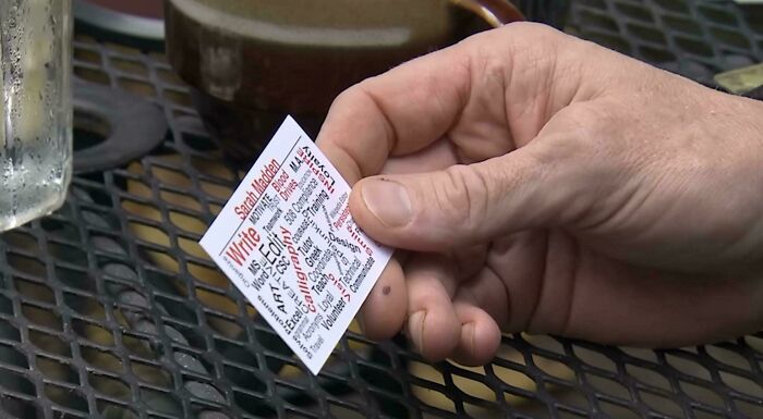
    Business Card That Was Handed To Gordon Ramsay On Hotel Hell

    A hand holding a small card with densely packed text, an impressive design fail in its readability.

    Potato_Stains Report

    ADVERTISEMENT
    #5

    "Lets Hang Out Together"

    A humorous design fail of a wall drawing showing two stick figures with musical notes for heads and the text Music connects people.

    RealDaBaby416 Report

    Nathaniel He/Him Cis-Het
    Community Member
    Premium
    3 hours ago Created by potrace 1.15, written by Peter Selinger 2001-2017

    Gloomy Sunday. Billie Holliday. If you know, you know.

    View more comments
    #6

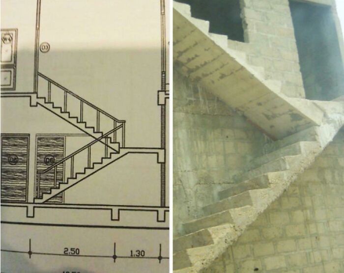
    Dream Job

    A split image showing a staircase blueprint on the left and a concrete staircase built incorrectly, a major design fail.

    [deleted] Report

    Rose Stewart
    Community Member
    14 minutes ago Created by potrace 1.15, written by Peter Selinger 2001-2017

    🎶🎵Dumb ways to d*e🎵🎶

    ADVERTISEMENT

    There’s also a satisfying sense of justice tucked into these posts. Somewhere out there, a person got paid to design a parking sign, a menu, or a building entrance, and somehow ended up creating something that actively works against the people using it. When that gets exposed and mocked online, it scratches an itch related to fairness and accountability, the same itch that makes us enjoy watching overconfident people get humbled.

    #7

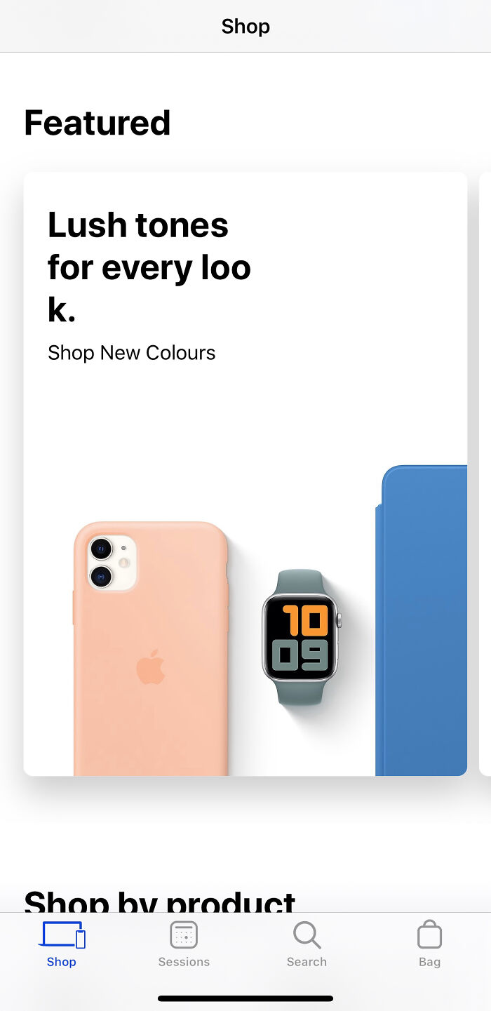
    Finally The Colour Hues Of My ‘Loo’ Is Taken Care Of. Thanks Apple !!!

    A smartphone screenshot showing a product advertisement with the word 'look' misspelled as 'loo k', indicating a design fail.

    bluecapella Report

    #8

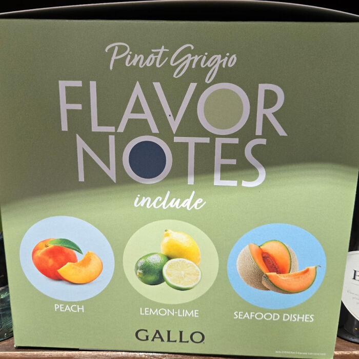
    This Glorious "Flavor Note" Of Pinot Grigio

    A box advertising Pinot Grigio flavor notes, with an odd inclusion of seafood dishes, an impressive design fail.

    DarkSea719 Report

    Ru Bee
    Community Member
    3 hours ago Created by potrace 1.15, written by Peter Selinger 2001-2017

    Melon, that's the word you were looking for 🍈

    View more comments
    ADVERTISEMENT
    ADVERTISEMENT

    Nobody actually gets hurt by a poorly placed light switch, which keeps the whole thing squarely in the realm of harmless fun rather than mean spirited ridicule. So what actually makes design bad in the first place? Cognitive scientist Don Norman spent decades studying exactly this, and his book on the subject basically argues that good design should be invisible.

    #10

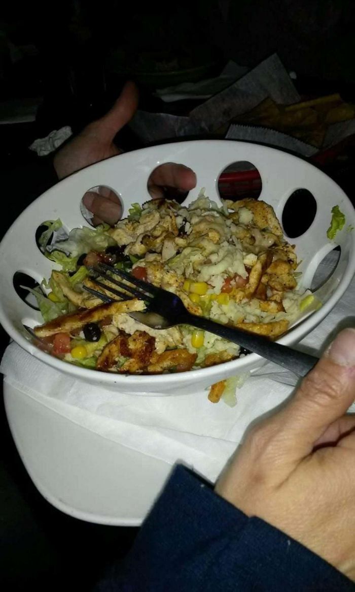
    Beautiful Plating..wait What?

    A salad served in a bowl with large, inconvenient holes around the rim, an obvious design fail.

    [deleted] Report

    #12

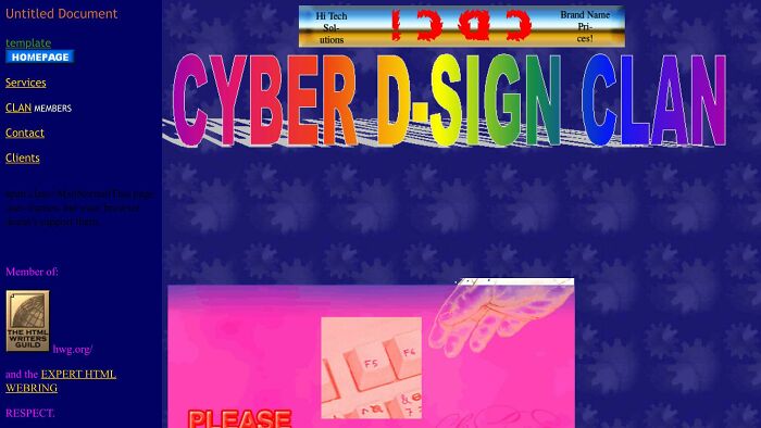
    This “Website”

    A chaotic website design with rainbow text 'CYBER D-SIGN CLAN' and a pink background, showcasing a significant design fail.

    Extreme-Fee Report

    Nathaniel He/Him Cis-Het
    Community Member
    Premium
    3 hours ago Created by potrace 1.15, written by Peter Selinger 2001-2017

    I remember a time when the internet was all like this.

    View more comments
    ADVERTISEMENT
    ADVERTISEMENT

    When something works the way your brain expects it to, you don’t even notice the design at all, you just glide through the task. Norman argued that when people struggle to use an everyday object, it is almost never their fault. It’s the object’s fault for failing to communicate clearly how it’s supposed to work. His most famous example is the humble door that gets pushed when it should be pulled, now nicknamed a Norman door in his honor, and once you learn the term you will never stop noticing them.

    #13

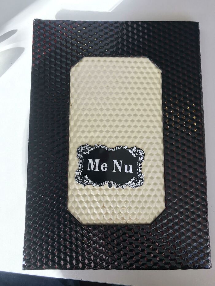
    Everything About This Menu Triggers Me

    A close-up of a restaurant menu cover with 'Me Nu' spelled out, highlighting a hilarious design fail.

    Zardashtbaran Report

    #14

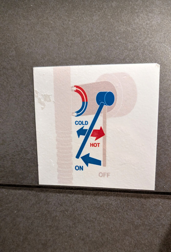
    Why Is Every Hotel Trying To Reinvent Shower Controls

    A confusing diagram explaining faucet controls, an impressive design fail in its own way.

    koreanforrabbit Report

    Dsparkle
    Community Member
    6 minutes ago Created by potrace 1.15, written by Peter Selinger 2001-2017

    I don't get it someone help me which one is off and which is coldD:

    View more comments
    #15

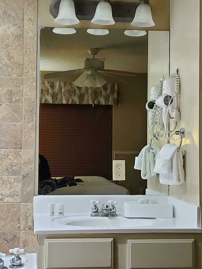
    This Mirror At The Resort Im Staying At

    A bathroom mirror reflecting a bedroom with a ceiling fan, a common design fail in hotel room layouts.

    JestARandomBIGirl Report

    ADVERTISEMENT

    Bad design tends to share a few consistent traits. It ignores how people actually behave in favor of how a designer imagines they should behave. It buries obvious functions under decorative nonsense. It gives no feedback, so users have no idea whether their click, tap, or push actually did anything.

    Never miss a story that brings joy to the world. Follow on Google News

    #16

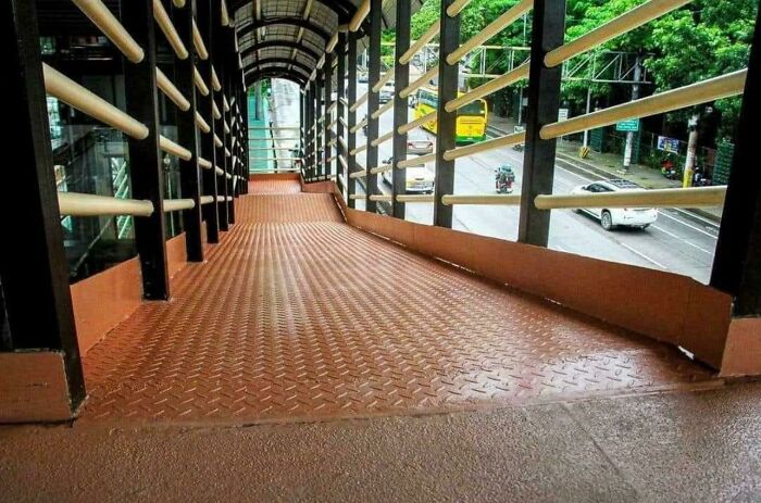
    This Wheelchair Ramp In The Philippines

    An accessibility ramp that is extremely steep, showcasing a clear design fail in public infrastructure.

    okwolf6705 Report

    ADVERTISEMENT
    #17

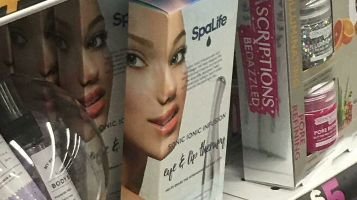
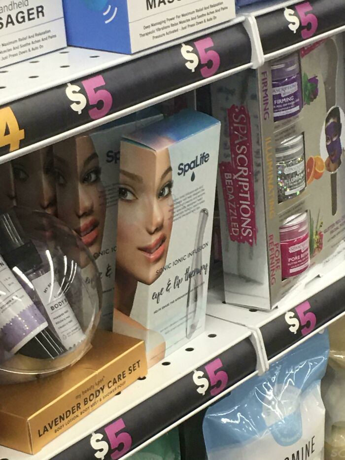
    I Literally Found This And Have Nothing To Say Except... You Had One Job

    A SpaLife box with a woman's face printed across two sides, creating a distorted Design Fails.

    [deleted] Report

    BarBeeGirl
    Community Member
    43 minutes ago Created by potrace 1.15, written by Peter Selinger 2001-2017

    Thought was good. E*******n not so much

    #18

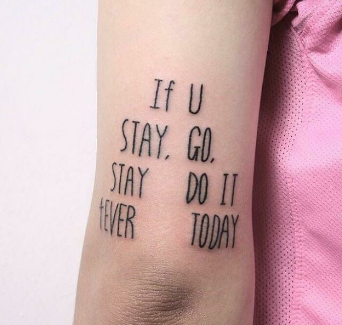
    Uhhhhh

    A tattoo with a confusing quote, If U Stay, Go. Stay Do It Fever Today, an impressive design fail.

    Harambeslastwish Report

    Nathaniel He/Him Cis-Het
    Community Member
    Premium
    3 hours ago Created by potrace 1.15, written by Peter Selinger 2001-2017

    Guessing that is 4EVER, but at this angle it looks like FEVER.

    View more comments
    ADVERTISEMENT

    Usability researchers at the Nielsen Norman Group have spent years cataloging these patterns into a widely used set of principles, and as outlined on their site, things like visibility, consistency, and error prevention show up again and again as the difference between something that feels effortless and something that makes you want to throw your phone across the room. When a form asks you to enter a date in three different formats depending on which screen you're on, that's not a small inconvenience, it's a full heuristic violation dressed up as a minor annoyance.

    #20

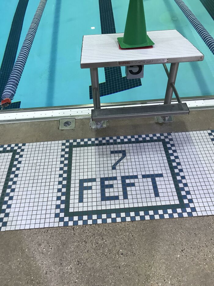
    My Pool Is 7 Feft Deep Operantly

    A swimming pool deck with 7 FEET written in tiles where the water is only 5 feet deep, a clear design fail.

    300_Black0ut Report

    ADVERTISEMENT
    ADVERTISEMENT

    What makes these fails so shareable, though, is that most of them aren’t hidden in some technical backend nobody sees. They’re staring you right in the face on a staircase, a bathroom door, or a poorly cropped billboard. Visual absurdity travels fast because you don’t need any special expertise to spot it.

    #22

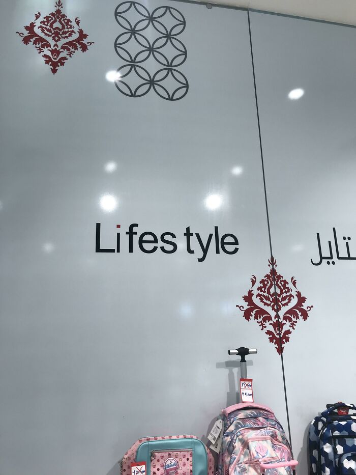
    The Kerning On This One Made Me Throw Up

    A store window displaying LIFESTYLE with a lowercase 'f', a noticeable design fail.

    Zardashtbaran Report

    BarBeeGirl
    Community Member
    41 minutes ago Created by potrace 1.15, written by Peter Selinger 2001-2017

    Kerning is a desktop publishing word meaning spacing between words (in case you were wondering). I know this from a former profession

    View more comments
    #23

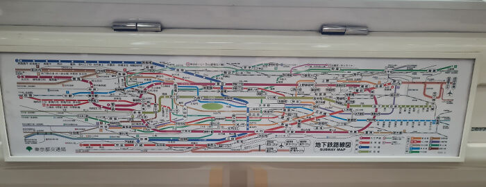
    The Tokyo Subway Map Has... Legibility Issues

    A highly complex and confusing subway map, an impressive design fail in its own way.

    themediumdane Report

    RS
    Community Member
    1 hour ago Created by potrace 1.15, written by Peter Selinger 2001-2017

    eh, they also have maps for each color line I'm pretty sure (?). I haven't been in fifteen years tho.

    View more comments
    #24

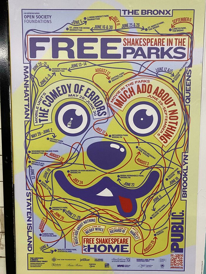
    Woof

    A convoluted map for Free Shakespeare in the Parks, with an illegible design representing a Design Fails.

    [deleted] Report

    Michael Largey
    Community Member
    2 hours ago (edited) Created by potrace 1.15, written by Peter Selinger 2001-2017

    There are dogs in Shakespeare. Lady MacBeth taking her Scottish terrier out for its walk - "Out, d**n Spot!"

    View more comments
    ADVERTISEMENT
    ADVERTISEMENT

    Anyone can look at a bench installed facing a brick wall and understand, instantly and completely, that a mistake was made somewhere between the blueprint and the concrete. That universal readability is exactly why these posts keep spreading and why scrolling through a pile of them feels less like judging strangers and more like bonding with everyone else who has ever stared at a confusing object and thought, who approved this.

    #25

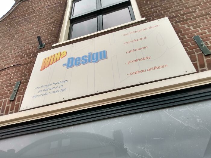
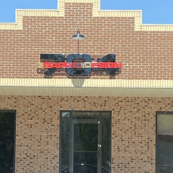
    Someone Suggested I Should Post This Here

    A sign for Witte Design on a brick building, an example of design fails due to poor contrast and legibility.

    holyelmo_ Report

    StrangeOne
    Community Member
    18 minutes ago Created by potrace 1.15, written by Peter Selinger 2001-2017

    Was there a sign design contest at a local Junior High school in the 90s?

    #26

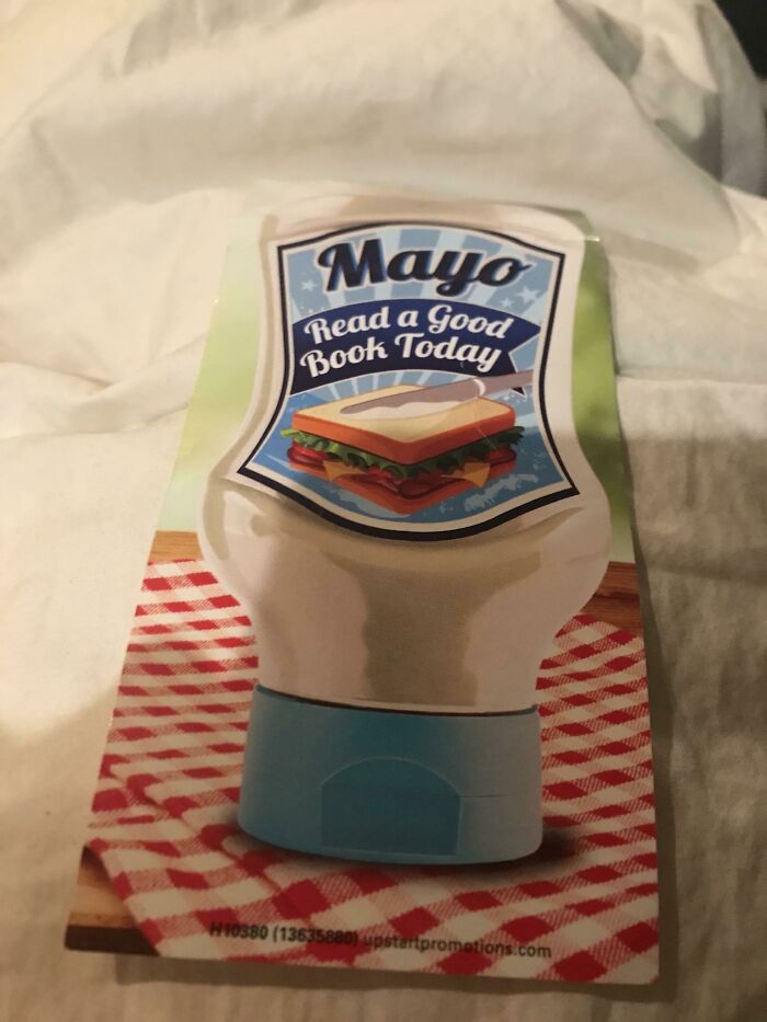
    Mayo Sandwich? Look Closely Where They Are Spreading It

    A bookmark shaped like a mayonnaise bottle with the words Mayo Read a Good Book Today, an example of design fails.

    [deleted] Report

    #27

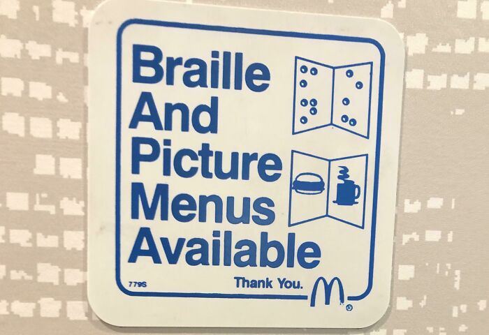
    The Sign Was Not In Braille

    A white sticker with blue text: Braille And Picture Menus Available, featuring a design fail in the acronym BAPMA.

    rasalghularz Report

    Ru Bee
    Community Member
    3 hours ago Created by potrace 1.15, written by Peter Selinger 2001-2017

    Possible so your guide puppa can let you know 🐶 🦮 🐕 🐕‍🦺 🐩

    ADVERTISEMENT
    ADVERTISEMENT
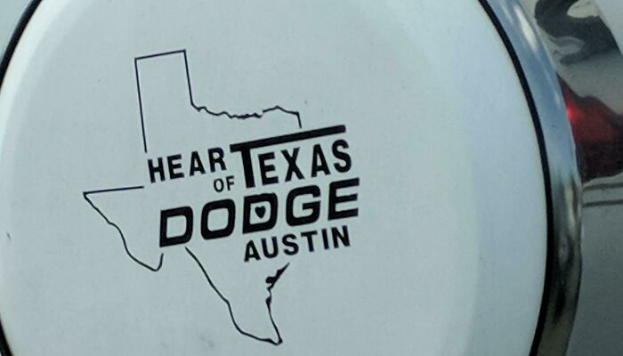
    #29

    Hear Of Texas

    A poorly designed logo with the words Hear of Texas Dodge Austin inside an outline of the state of Texas, showcasing design fails.

    slackjohn Report

    #30

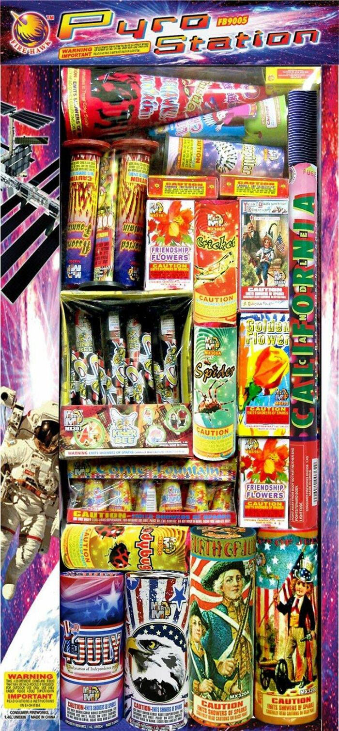
    Why Do 99% Of Firework Packages Look So Poorly Designed, As If Someone Was Trying To Shove In As Many Photo Effects As Possible

    A crowded display of fireworks labeled Pyrotechnic Station, a design fail with too many competing elements.

    Extreme-Fee Report

    #31

    Official Seal Of St. Francois Count, Mo

    The Great Seal of St. Francois County, featuring an eagle, American flag, map, and a bible, a design fail due to complexity.

    desertSkateRatt Report

    Apocalyptic Excavator
    Community Member
    2 hours ago Created by potrace 1.15, written by Peter Selinger 2001-2017

    Grade 4 of primary school, our fist graphic desig lessons in the practical informatic course.
    View more comments
    ADVERTISEMENT
    #32

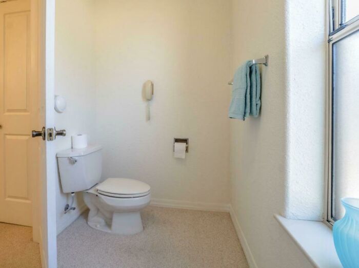
    This Hurts The Soul

    A toilet in a bathroom with a telephone on the wall, a funny design fail.

    mersonstail Report

    ADVERTISEMENT
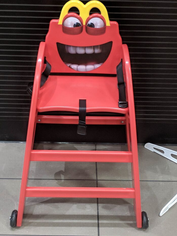
    #34

    Im Going To Burger King

    A frightening red high chair resembling a McDonald's character, a design fail that is impressive in its own way.

    Poo-et Report

    Ru Bee
    Community Member
    3 hours ago Created by potrace 1.15, written by Peter Selinger 2001-2017

    I will eat your child... And your soul!

    View more comments
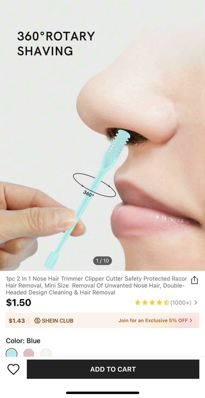
    #35

    Whose Hand Is That??

    Person demonstrating a nose hair trimmer, highlighting a funny design fail in product presentation.

    limenitisarthemis901 Report

    Ejteh
    Community Member
    3 hours ago Created by potrace 1.15, written by Peter Selinger 2001-2017

    A nose trimmer for giants. But all joking aside, All the AI pics when buying something online (not even temu or webshops like that) pisses me off. I want real pictures of real product exactly for this reason! Scale.

    View more comments
    ADVERTISEMENT
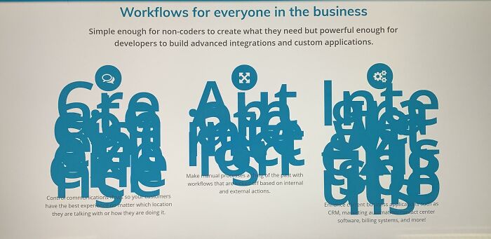
    #36

    This Vendor’s Website Kind Of Failed

    A business slide with overlapping and unreadable text, exemplifying poor Design Fails in presentation.

    koreanforrabbit Report

    ADVERTISEMENT
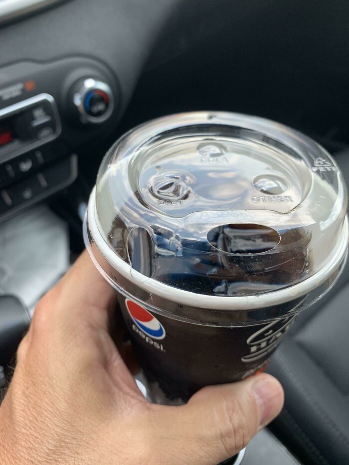
    #37

    This Harvey’s Sippy Lid - Has A Hole To Drink From And Another One To The Left That Pots Your Drink All Over Your Lap!

    A Pepsi cup with a lid that has a straw hole and two other sealed holes labeled DIET and OTHER, showing design fails.

    iambf999 Report

    #38

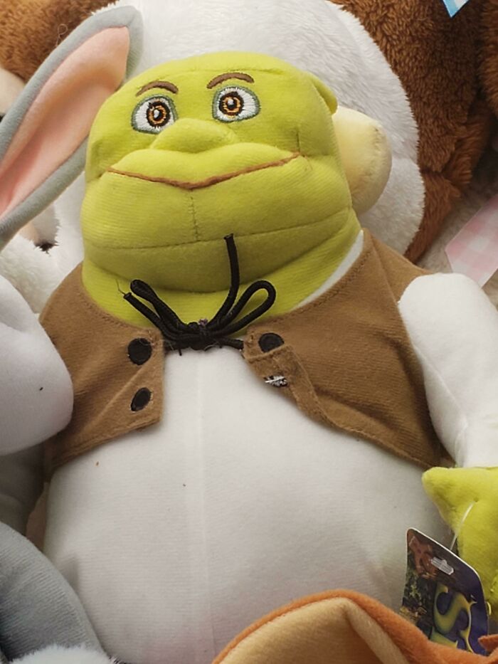
    Schreck, What Happened To You?

    Shrek plush toy with an unusual design, showcasing an impressive design fail.

    knottycrochetlady Report

    Gail Lott
    Community Member
    Premium
    28 minutes ago Created by potrace 1.15, written by Peter Selinger 2001-2017

    He's seen some shizz

    #39

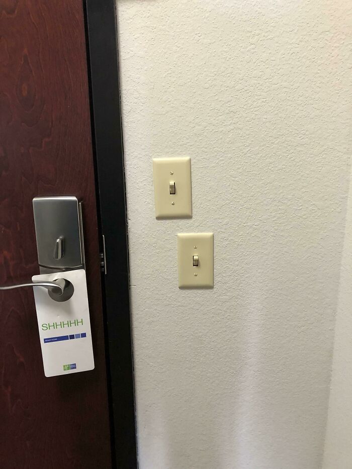
    Nice Alignment Here

    Two light switches placed unevenly on a wall next to a wooden door with a 'SHHHH' sign, a clear design fail.

    Travl2Much Report

    Rodney Boathand
    Community Member
    3 hours ago Created by potrace 1.15, written by Peter Selinger 2001-2017

    They are far enough out-of-line that it's a pass where I come from

    View more comments
    ADVERTISEMENT
    #40

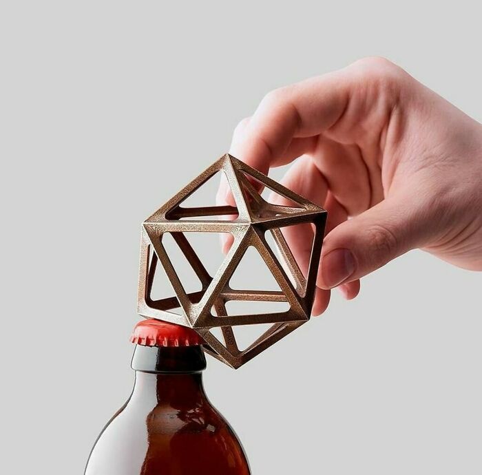
    Let's Make A Bottle Opener That's Hard To Use, Hard To Hold, And Uses Twice The Materials!

    Hand holding a geometric bottle opener over a beer bottle, an impressive example of design fails.

    Zoomwafflez Report

    Ru Bee
    Community Member
    3 hours ago Created by potrace 1.15, written by Peter Selinger 2001-2017

    This is just fun, probably for D and D fans.

    View more comments
    ADVERTISEMENT
    #41

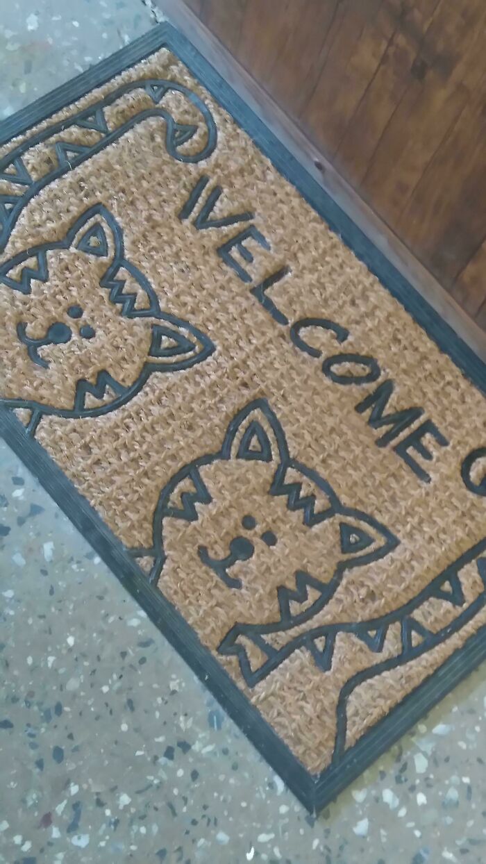
    \velcome

    A welcome mat featuring cat design fails and the word WELCOME on a patterned floor.

    RainisTheCat Report

    StrangeOne
    Community Member
    11 minutes ago Created by potrace 1.15, written by Peter Selinger 2001-2017

    Velcome. I vant to drink your blood.

    #42

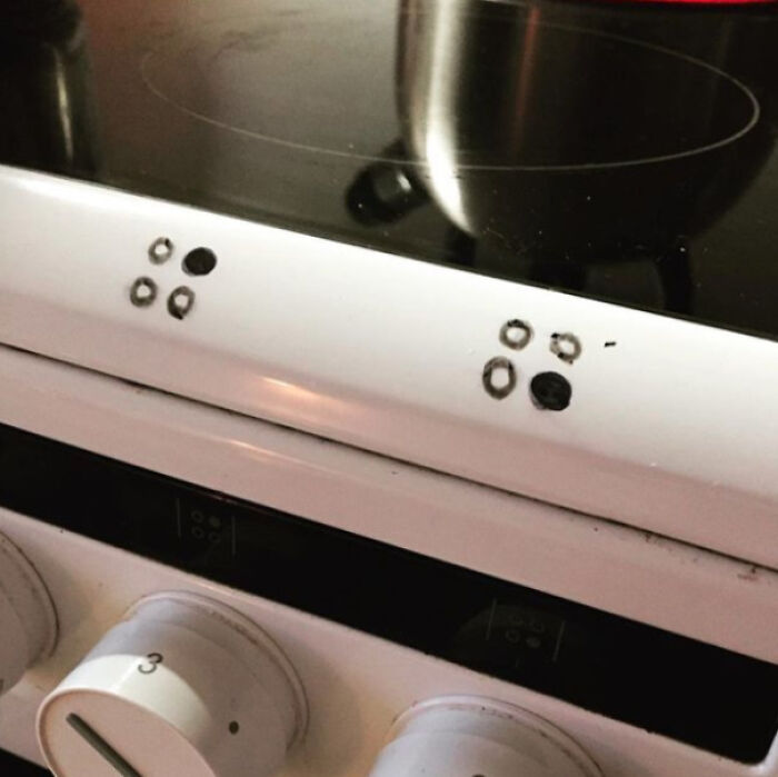
    I Had To Hack It To Make It Work

    A close-up of a stove top with confusingly placed symbols for the burners, an example of design fails.

    pm_me_your_lat_long Report

    #43

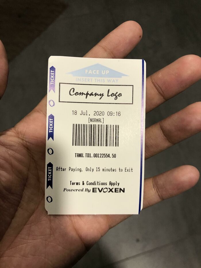
    Inser Company Logo Here

    A hand holding a ticket with a QR code and instructions, highlighting an impressive design fail in the ticket layout.

    NotTheKyrie Report

    AnnaB
    Community Member
    Premium
    20 minutes ago Created by potrace 1.15, written by Peter Selinger 2001-2017

    AI being sarcastic when it can't even spell 'Insert' correctly.

    ADVERTISEMENT
    #44

    I’m Filing For Benefits After These Va Email Color Schemes Ruined My Eyes

    A website section with the VA logo and social media icons, showing an impressive design fail in layout.

    [deleted] Report

    ADVERTISEMENT
    #45

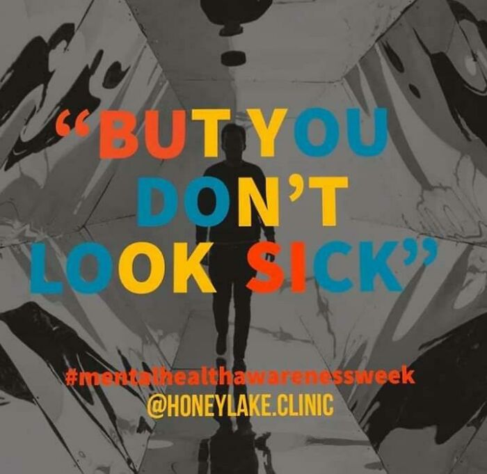
    Why The Colors?

    A person silhouetted in a reflective hallway with the words BUT YOU DON'T LOOK SICK, an example of design fails.

    Redheadedmb Report

    Nikole [8647]
    Community Member
    2 hours ago (edited) Created by potrace 1.15, written by Peter Selinger 2001-2017

    "BUSI TYN'TOK OUDOLOCK" Edit: I think I just summoned a demon.

    View more comments
    #46

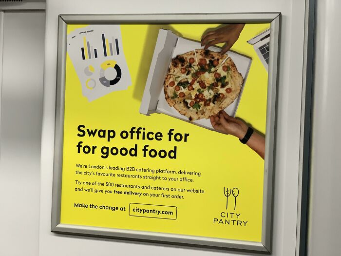
    Swap Office For For Good Food

    An advertisement for City Pantry food delivery, a design fail that is impressive in its own way with too many details.

    Cr0w1ey Report

    ADVERTISEMENT
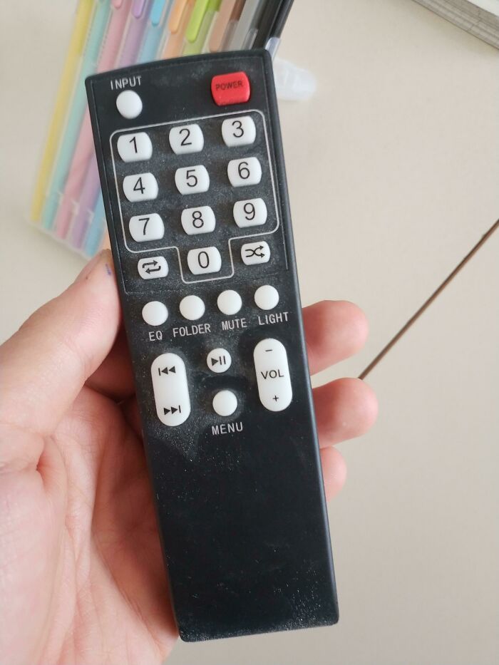
    #48

    Look At This Volume Button

    A hand holding a remote control with two play/pause buttons, highlighting an impressive design fail.

    alessandroias Report

    ADVERTISEMENT
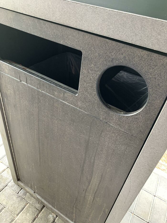
    #49

    Hmmmm, Which One Should I Use?

    A dark gray recycling bin with a rectangular opening and a circular opening, both for waste, a design fail.

    foxpoison00 Report

    ADVERTISEMENT
    #52

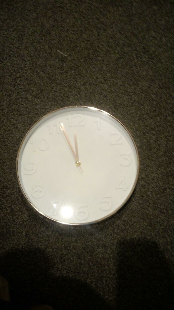
    White Clock White Numbers

    A white round clock with raised numbers and gold hands on a dark carpet, showing a design fail of legibility.

    big-nose-leka Report

    Ru Bee
    Community Member
    3 hours ago Created by potrace 1.15, written by Peter Selinger 2001-2017

    This really isn't an issue. I have 2 watches without numerals. No problem.

    ADVERTISEMENT
    #53

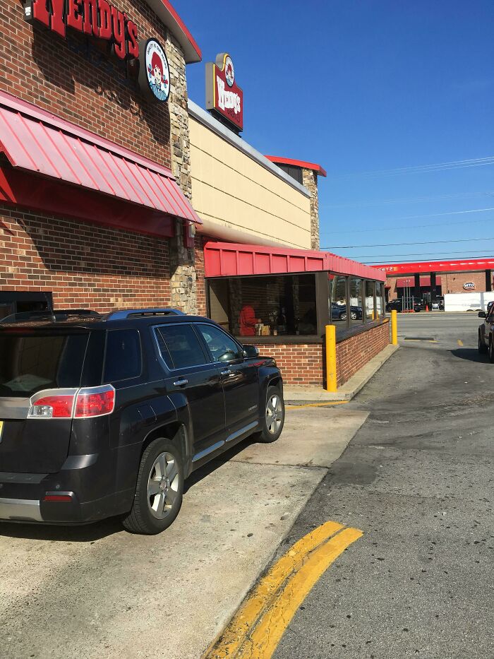
    Wendy’s Drive-Thru?

    A black SUV parked awkwardly close to a Wendy's drive-thru window, highlighting a design fail in parking lot layout.

    MrRSTEELE Report

    Lily bloom
    Community Member
    1 hour ago Created by potrace 1.15, written by Peter Selinger 2001-2017

    Trying to bring back the sunroom wherever they can

    #54

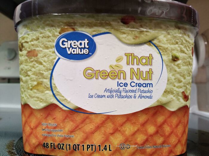
    Excuse Me, "Where Can I Get "That Green Nut?"

    Great Value pistachio ice cream labeled 'That Green Nut Ice Cream', highlighting a funny design fail.

    XxBananaGirlxX Report

    #55

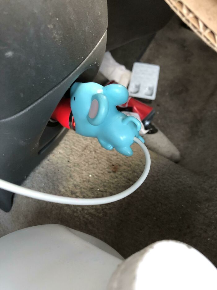
    My Sisters Wire Straightener

    A blue elephant-shaped car charger design fails plugged into an outlet, with a white cable extending.

    phoenix_killa87 Report

    ADVERTISEMENT
    #56

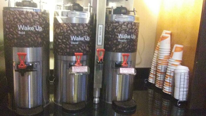
    The Middle Coffe Machine "Wake Up-Decaf"

    Three coffee dispensers labeled Wake Up Bold, Decaf, and Regular, with mismatched warning signs, highlighting design fails.

    thesurvivalkidyt Report

    ADVERTISEMENT
    #58

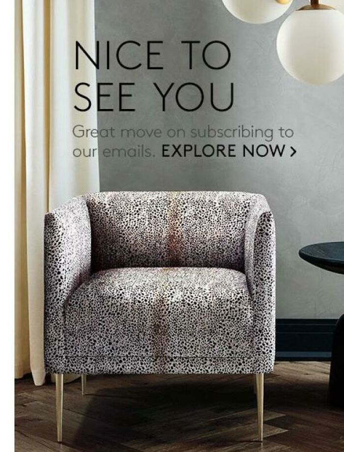
    This Pree Stained Looking “Designer” Chair

    An upholstered armchair with a black and white speckled pattern that appears discolored, illustrating a design fail.

    Rainbow-Death Report

    Ru Bee
    Community Member
    3 hours ago Created by potrace 1.15, written by Peter Selinger 2001-2017

    Wipe your a**e on our chair.

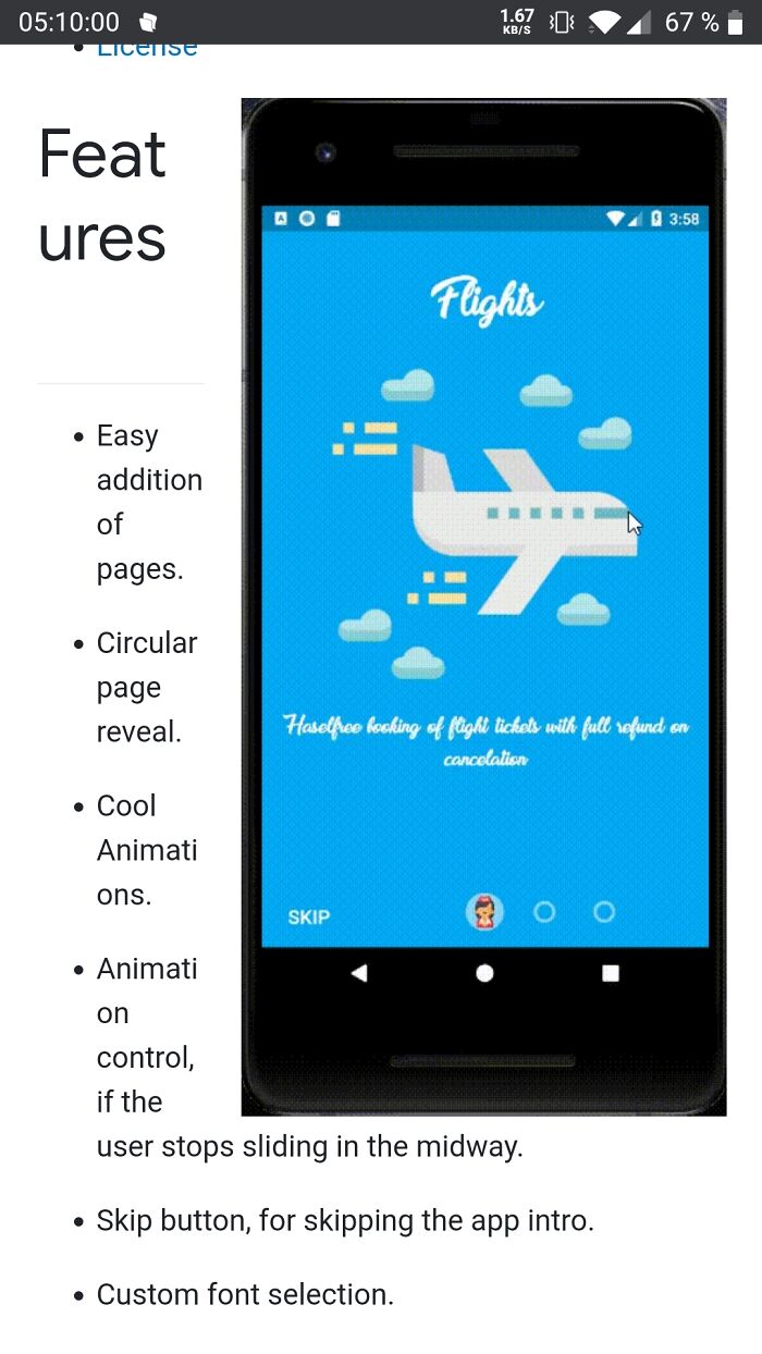
    #59

    Feat Ures

    A smartphone screen showing an app design fail with misaligned text, showcasing an impressive design fail.

    Jaymobie Report

    Elladine DesIsles
    Community Member
    2 hours ago Created by potrace 1.15, written by Peter Selinger 2001-2017

    I'm more concerned about the "Haselfree booking."

    ADVERTISEMENT
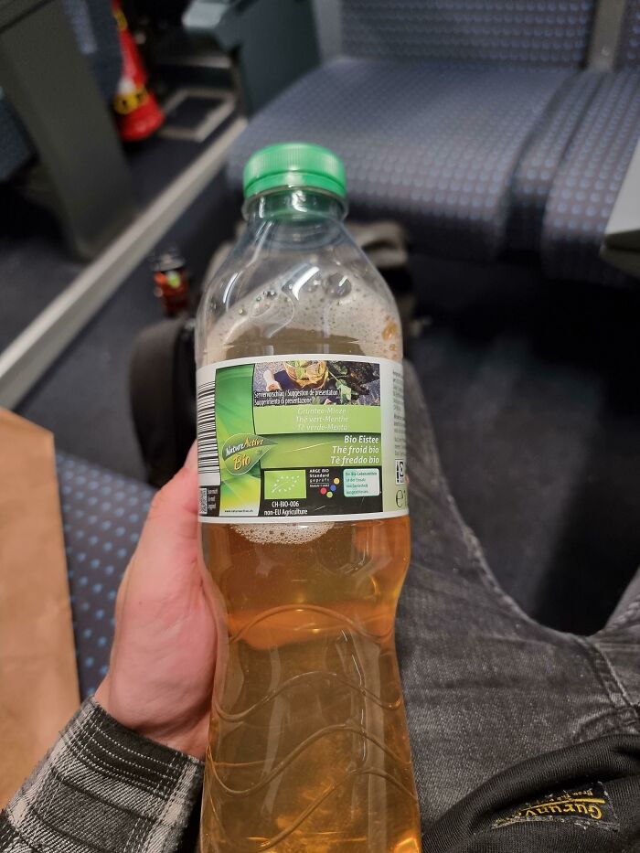
    #60

    A Designer's Nightmare

    A bottle of iced tea with a very long and detailed label, a design fail that is impressive in its own way.

    Urbex_Badger Report

    Nathaniel He/Him Cis-Het
    Community Member
    Premium
    3 hours ago Created by potrace 1.15, written by Peter Selinger 2001-2017

    Question 1. What is the designer's nightmare? Question 2. Is that a bottle of pee?

    View more comments
    ADVERTISEMENT
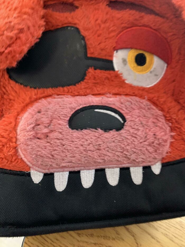
    #62

    The Strap Goes Through His Eye

    A close-up of a red, furry character plush with an eye patch and large design fails mouth.

    bdude1000 Report

    WiredPig
    Community Member
    38 minutes ago Created by potrace 1.15, written by Peter Selinger 2001-2017

    You've obviously not seen Foxy from Five Nights at Freddy's.... because thats Foxy's look.

    View more comments
    #63

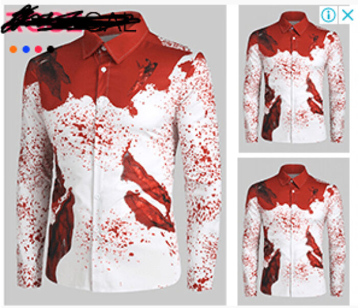
    Yeah So This Ad On Youtube Is Creeping Me Out

    A white shirt with red splatter design fails, resembling a bloody mess, displayed with smaller views.

    [deleted] Report

    ADVERTISEMENT
    #64

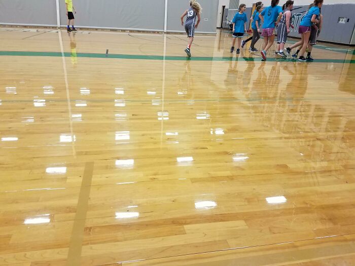
    Tastefully Colored Sidelines On A Basketball Court

    Children playing on a glossy gym floor that reflects the ceiling lights, showcasing an interesting design aspect.

    NoLikeTrump Report

    ADVERTISEMENT
    #65

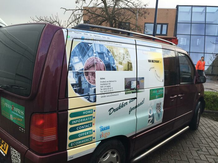
    The Company Car Of A Printing Company In The Netherlands

    A van wrapped in an advertisement showing a browser window as a design fail.

    dhoomz Report

    #66

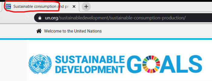
    [un] See This Tab

    A browser tab showing Sustainable consumption and production, highlighting a design fail in the URL.

    Trypoappreciation Report

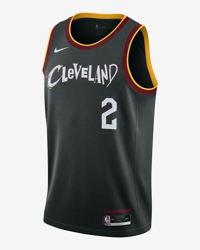
    #67

    Cleveland Cavaliers 2021 City Edition Jersey Is Straight Up Barf

    Cleveland Cavaliers jersey with a funny design fail, the number 2 appearing in the middle of Cleveland.

    [deleted] Report

    ADVERTISEMENT
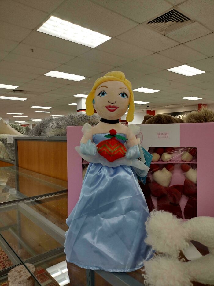
    #68

    Cinderella Got Some Issues~

    A plush doll of Cinderella with a disproportionate head and small features, displaying a clear Design Fails.

    SorbetCharming9448 Report

    ADVERTISEMENT
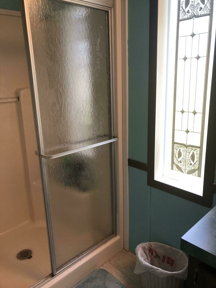
    #69

    Window Right Next To The Shower

    A shower stall next to a window with stained glass design fails, in a bathroom with blue walls.

    saturndatboi Report

    Nathaniel He/Him Cis-Het
    Community Member
    Premium
    3 hours ago Created by potrace 1.15, written by Peter Selinger 2001-2017

    Depends what floor you are on, and if anyone can overlook the room?

    View more comments
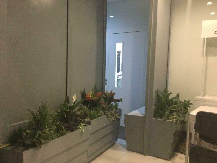
    #70

    Ah So Does That Mean Sticks Only?

    An indoor hallway with planters on the left, leading to a doorway, exemplifying modern design.

    HamzaDoesStuffsYT Report

    #71

    Signs Are Hard

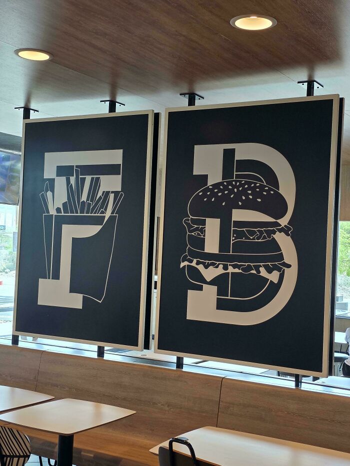
    Restaurant wall art with a funny design fail, the number 73 with a burger and fries as part of its design.

    Zac9088 Report

    ADVERTISEMENT
    #72

    This Duck Is Pretty Hung

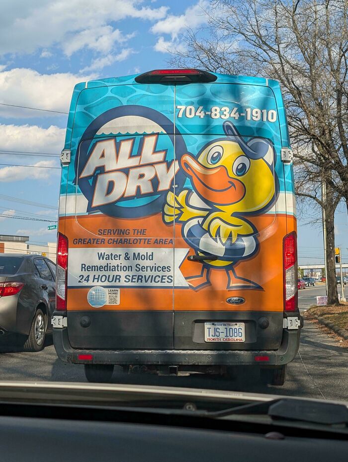
    Van with a funny design fail, an advertising duck looking like it is peeing on the side of the vehicle.

    NoSatisfaction5807 Report

    TotallyNOTAFox
    Community Member
    26 minutes ago (edited) Created by potrace 1.15, written by Peter Selinger 2001-2017

    Pretty small for a duck actually... (Useless animal facts useful for once)

    View more comments
    ADVERTISEMENT
    #73

    The Label For This Novelty Bottle Of Candy Has Always Bugged Me

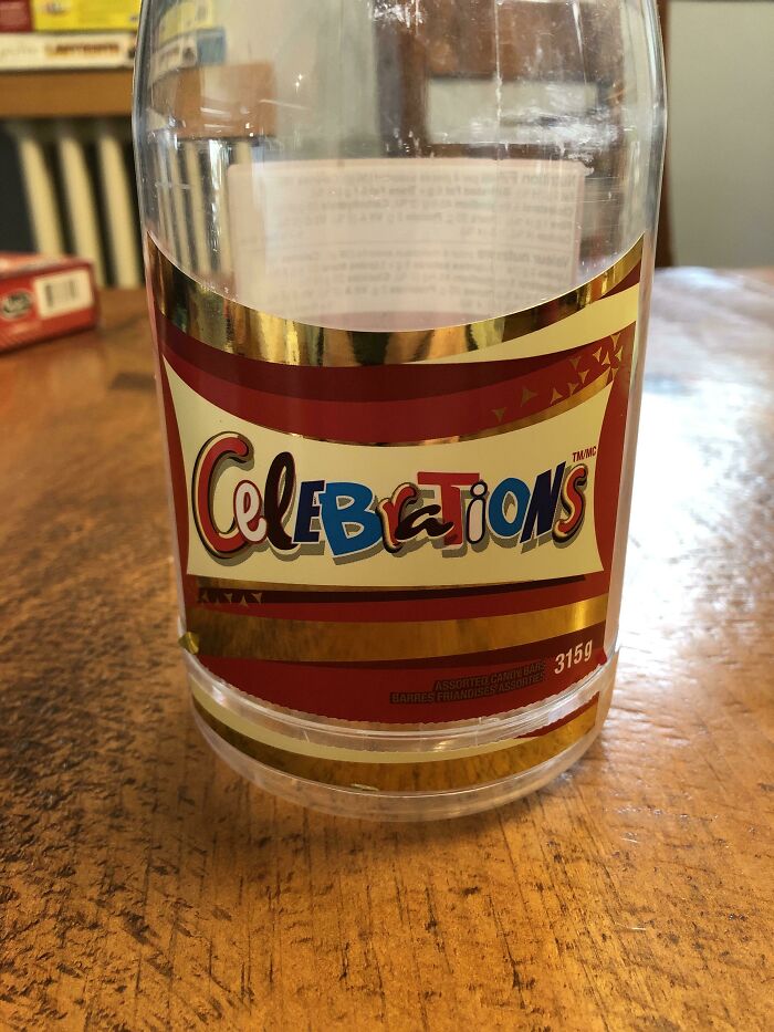
    A clear plastic bottle with a label reading 'Celebrations' but with a noticeable spelling error, exemplifying a design fail.

    CaptWineTeeth Report

    Ru Bee
    Community Member
    3 hours ago Created by potrace 1.15, written by Peter Selinger 2001-2017

    It's the lettering for each type of chocolate bar in the selection.

    View more comments